The Economist Design System
The Economist's editorial design system as a DESIGN.md file. Red #e3120b, navy CTA #1f2e7a, EconomistSerif 44px hero, 18 components. For React, Next.js, and AI tools.
Add shadcn.io to your AI agent. · Pro It installs blocks, icons and templates in your design system from a prompt, with Pro.
Set up MCP- Primary
- #1f2e7a
- Typeface
- EconomistSans
- Shape
- Soft
- Base radius
- 0px
- Colors
- 21
- Type tokens
- 13
- Components
- 18
- Spacing values
- 9
About
About The Economist DESIGN.md
Curated by Dov Azencot · Updated May 13, 2026 · Source economist.com (opens in a new tab)
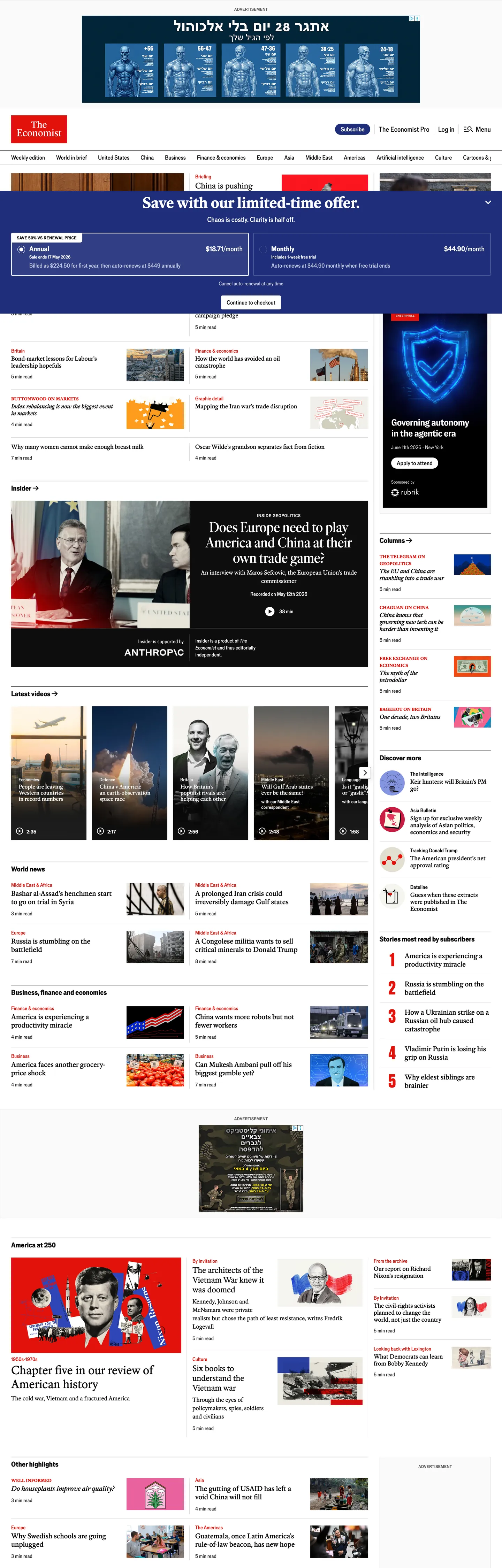
The Economist's homepage reads like the print edition shrunken to a 1440px column — a white canvas, a tight serif-and-sans duet, and the single rationed red rule above each city-named section label. Where most news publishers spend their accent budget on hero banners and feature tiles, The Economist treats Economist Red (#e3120b) as ink: 78 occurrences across the page, all of them carrying text or a 1px border, none of them filling a button or a card. The only saturated fill above the fold is the navy `#1f2e7a` Subscribe pill in the masthead — a Chicago-20 voltage borrowed from the brand's broader newspaper palette rather than the red the wordmark uses. The mood is weekly-paper formal, not breaking-news loud.
This DESIGN.md packages the editorial surface into one machine-readable spec built on the Google Labs format. Inside: 21 colors tokens covering the London greyscale ladder (London-5 through London-100), the rationed Economist Red plus its 42 and 60 variants, the Chicago navy used for CTAs, and the secondary city-named accents that appear on data graphics; 12 typography tokens laddering EconomistSerif (44px hero through 17px body) and EconomistSans (20px nav through 13px byline); 4 corner-radius values from 4px cards to 20px pills to 50% avatars; a 9-step spacing scale built on a 4px base; and 18 components specifications covering the masthead, hero banner, section flag, Insider row, weekly-edition card, and the Subscribe CTA.
Feed the file to Claude, Cursor, or GitHub Copilot and the agent reproduces the weekly-newspaper voice — white canvas, red-as-rule, navy-as-CTA, EconomistSerif headlines above EconomistSans chrome, 1px hairlines instead of drop shadows. Reference the tokens directly to paste hex values into Tailwind config or CSS variables. The system is worth studying because almost no other mainstream news brand commits this hard to a single rationed accent — most publishers spend red on hero callouts and feature backgrounds; The Economist saves it for category flags and inline rules, and the discipline reads as authority.
What makes it distinct
5
- Rationed brand redEconomist Red (#e3120b) appears 78 times, always as text or 1px border, never as background fill or CTA voltage
- Navy CTA voltageprimary Subscribe button takes Chicago-20 navy (#1f2e7a) at a 20px pill, the only place a saturated fill exists above the fold
- Two-family serif-and-sans duetEconomistSerif for headlines, EconomistSans for chrome, both proprietary, both with old-style and lining figure variants
- Four-radius geometry4px on cards and inputs, 20px on the Subscribe pill, 32px on tag chips, 50% on avatar circles; nothing in between
- Eight greyscale laddera literal London-named scale runs from London-5 (#0d0d0d) through London-100 (#ffffff), structuring every hairline and surface
economist.com
Live at economist.com
A snapshot of the brand in production. Scroll the frame to see the whole page.
Colors
21 colors
The Economist's system runs on #1f2e7a as its primary voltage, used in 2 of 18 components. Type is set in EconomistSans across 13 tokens from 13px to 44px, weights 400–700. Shape language is soft — components average 14px corner radius, with no sharp interactive edges.
Brand & Accent
Sparing, CTA-only voltage · 5
Surface
Page and card backgrounds · 4
Text
Headlines, body, captions · 6
Borders & Hairlines
Dividers, outlines, rules · 2
Other
Specialty colors · 4
Typography
13 type tokens
Set in EconomistSans across 13 tokens, from 13px to 44px, weights 400–700. Shown in its own stack: where the font isn't installed, the fallback the file names stands in.
- display-hero44px · weight 700 · lh 1 · tracking 0pxThe quick brown fox jumps over the lazy dog
- display-lg40px · weight 500 · lh 1.1 · tracking 0pxThe quick brown fox jumps over the lazy dog
- headline-md34px · weight 400 · lh 1.176 · tracking 0pxThe quick brown fox jumps over the lazy dog
- headline-sm23px · weight 400 · lh 1.217 · tracking 0pxThe quick brown fox jumps over the lazy dog
- story-title20px · weight 500 · lh 1.2 · tracking 0pxThe quick brown fox jumps over the lazy dog
- story-deck17px · weight 500 · lh 1.176 · tracking 0pxThe quick brown fox jumps over the lazy dog
- body-serif17px · weight 400 · lh 1.412 · tracking 0pxThe quick brown fox jumps over the lazy dog
- section-flag20px · weight 700 · lh 1.2 · tracking 0pxThe quick brown fox jumps over the lazy dog
- nav-link17px · weight 400 · lh 1.412 · tracking 0pxThe quick brown fox jumps over the lazy dog
- button-label17px · weight 500 · lh 1.176 · tracking 0pxThe quick brown fox jumps over the lazy dog
- body-sans15px · weight 400 · lh 1.333 · tracking 0pxThe quick brown fox jumps over the lazy dog
- eyebrow-strong15px · weight 600 · lh 1.333 · tracking 0pxThe quick brown fox jumps over the lazy dog
- caption-mono13px · weight 500 · lh 1.846 · tracking 0pxThe quick brown fox jumps over the lazy dog
Layout
Radii and spacing
5 corner radii and 9 spacing values. Shape language: soft.
Radii
- none0px
- card4px
- pill20px
- chip32px
- full9999px
Spacing
- xxs2px
- xs4px
- sm8px
- md12px
- base16px
- lg24px
- xl32px
- 2xl48px
- 3xl64px
Components
18 components
Each rendered from its tokens (color, type, radius, padding) on The Economist's own canvas.
- Masthead Bandmasthead-bandMasthead Band
- Wordmark Flagwordmark-flagWordmark Flag
- Top Navtop-navTop Nav
- Nav Link Basenav-link-baseNav Link Base
- Nav Link Hovernav-link-hoverNav Link Hover
- Button Primarybutton-primaryButton Primary
- Button Primary Hoverbutton-primary-hoverButton Primary Hover
- Button Secondarybutton-secondaryButton Secondary
- Section Flagsection-flagSection Flag
- Category Eyebrowcategory-eyebrowCategory Eyebrow
- Hero Bannerhero-bannerHero Banner
- Story Cardstory-cardStory Card
- Story Rowstory-rowStory Row
- BylinebylineByline
- Type here…text-inputText Input
- Tag Chiptag-chipTag Chip
- Hairline Dividerhairline-dividerHairline Divider
- Avatar Circleavatar-circleAvatar Circle
In use
The system, in use
The Economist's tokens on the kind of product it builds.
Build something people actually use.
A short paragraph of marketing copy that previews how the brand's display tier and body tier read together. Two sentences is usually enough.
FAQ
The Economist design system FAQ
Common questions about The Economist's tokens, components, and how to use this DESIGN.md in your project.
Read next
Related reading
Specs, directories, and component libraries that pair with this design system.
- Browse all design systemsThe full directory of DESIGN.md files on shadcn.io, with live mockups for each.shadcn.io
- The Economist — official siteThe weekly-newspaper editorial brand whose homepage this DESIGN.md spec captures.economist.com (opens in a new tab)
- The DESIGN.md specificationGoogle Labs' open spec for machine-readable design system files.github.com (opens in a new tab)
Use it
Use The Economist in your project
One machine-readable file. Drop it into Claude, Cursor, or any AI tool that reads DESIGN.md.
Download the DESIGN.md
One machine-readable file: every color, type, radius, spacing, and component token of The Economist.
Feed it to your AI tool
Drop it into Claude, Cursor, or GitHub Copilot. The agent writes React components and Tailwind classes that match The Economist's visual language.
Reference the tokens directly
Or paste the values into your Tailwind config, CSS variables, or component library: every color, size and radius is a quoted, ready-to-copy value.
Read the full DESIGN.md: overview, rationale, do’s and don’ts
Overview
The Economist's homepage is a weekly-newspaper editorial system that ports the print masthead, section flags, and hairline rules onto a 1440px column with almost no marketing chrome. The canvas is London-100 ({colors.canvas} — #ffffff), the ink is London-5 ({colors.ink} — #0d0d0d), and the rule between sections is London-85 ({colors.hairline} — #d9d9d9) at 1px. The wordmark — a small red flag in the top-left masthead — uses Economist Red ({colors.brand-red} — #e3120b) as its only chromatic fill on the entire homepage. Every other appearance of red is text or a 1px top rule.
Rationed red as rule: where most news publishers spend their accent budget on hero banners and feature tile fills, The Economist treats {colors.brand-red} (#e3120b) as ink. The extractor logs 78 total occurrences split exactly between text (39) and 1px border (39), with zero background fills and zero shadows. Red lives entirely on section flags ("Britain", "United States", "China"), category eyebrows, and the 1px top rule that separates story groups. The discipline reads as authority — the brand never shouts in red because the wordmark already carries the voltage.
Voltage split: the only saturated fill above the fold is the navy {colors.primary} (#1f2e7a — Chicago-20) Subscribe pill in the top masthead. Unlike the convention of using the wordmark color for primary CTAs, The Economist routes the action through the broader newspaper palette's deep blue. Red carries identity; navy carries action. This is not red-as-CTA; it is red-as-rule and navy-as-action.
Type runs a two-family duet. EconomistSerif carries every editorial moment from 44px hero headlines down to 17px body paragraphs, across weights 400/500/700, with three variant cuts for old-style figures (OsF), lining figures (LF), and small caps (SC). EconomistSans handles every chrome and metadata moment — navigation, buttons, bylines, eyebrows — at 13–20px across weights 400/500/600/700. Both families are proprietary to The Economist Group; both expose tabular and oldstyle figure variants for data journalism.
Key Characteristics:
- Rationed brand voltage:
{colors.brand-red}(#e3120b) used as text and 1px rule only — 78 occurrences, zero fills, zero shadows. - Split voltage: navy
{colors.primary}(#1f2e7a) carries the Subscribe CTA at a 20px pill — the only saturated fill above the fold. - Two-family serif-and-sans duet: EconomistSerif (44px hero through 17px body) and EconomistSans (20px section flag through 13px byline).
- Four-radius geometry: 4px card, 20px Subscribe pill, 32px tag chip, 50% avatar circle — nothing in between.
- London-named greyscale ladder: London-5 (#0d0d0d) through London-100 (#ffffff) structures every hairline, surface, and ink role.
- City-named secondary palette: Chicago navy, Tokyo pink, Hong Kong mint, Singapore orange, New York amber — used almost exclusively in data-journalism charts, never on the homepage as decoration.
- Top masthead is the only dark band: London-5 strip with white text and the navy pill. Below it, the surface stays pure white through the entire scroll.
- Zero drop shadows on body content:
{colors.hairline}(#d9d9d9) 1px borders separate every story group. The single shadow token (--mb-shadow-offset-md) is reserved for floating menus.
Colors
Brand
- Economist Red (
{colors.brand-red}— #e3120b) — frequency 78. Used as text (39), border (39), background (0), shadow (0). The wordmark color, declared in CSS as--ds-color-economist-redand--mb-colour-brand-red. Carries the Britain/US/China section flags and the 1px rule above every category eyebrow. Never appears as a background fill on the homepage. - Brand Red 60 (
{colors.brand-red-60}— #f6423c) — declared as--mb-colour-brand-red-60. A lighter red variant reserved for hover and inverted-accent borders. Appears as--mb-border-accent-inversein the spec. - Brand Red 42 (
{colors.brand-red-42}— #cc100a) — the darker red variant for pressed and emphasis states. Declared as--mb-colour-brand-red-42.
CTA Voltage
- Chicago-20 Navy (
{colors.primary}— #1f2e7a) — frequency 3, all as background fill on the Subscribe pill. The single saturated fill above the fold. Where most news brands route the primary CTA through the wordmark color, The Economist deliberately uses a Chicago-20 navy from the broader city palette — red carries identity, navy carries action.
Greyscale Ladder (London)
- London-5 (
{colors.ink}— #0d0d0d) — frequency 1594. Used as text (798), border (792), shadow (2), background (2). The dominant ink across the page. Carries every headline, body paragraph, nav link, and 1px hairline that isn't red. The total of 1594 is by far the largest in the extraction — London-5 plus white is roughly 80% of the visible surface. - London-10 (
{colors.ink-soft}— #1a1a1a) — declared as--ds-color-london-10. A near-black variant used on the masthead band background and certain dark surfaces. - London-20 (
{colors.ink-muted}— #333333) — frequency 66. Used as text (33), border (33). Form input borders and secondary text. Slightly softer than London-5. - London-35 (
{colors.body-grey}— #595959) — declared as--mb-border-emphasised-inverse. Used for inverted emphasis borders on dark surfaces. - London-40 (
{colors.body-grey-soft}— #666666) — the softest body grey. Used sparingly for tertiary metadata. - London-70 (
{colors.hairline-soft}— #b3b3b3) — frequency 1. The softest hairline tier, used on disabled states. - London-85 (
{colors.hairline}— #d9d9d9) — frequency 20. Used as border (11), text (7), shadow (2). The default 1px hairline declared as--mb-border-standard. Separates story groups, masthead from body, byline from deck. - London-95 (
{colors.canvas-soft}— #f2f2f2) — frequency 77. Used as background (36), text (21), border (20). The pale grey wash on tag chips, secondary card surfaces, and the newsletter card. - London-100 (
{colors.canvas}— #ffffff) — frequency 293. Used as background (16), border (139), text (137). The dominant canvas. The white border count is unusually high because every floating card sits inside a 1px white inner ring against the page surface.
Surface
- Chicago-90 Cool Surface (
{colors.surface-cool}— #e0e2eb) — declared as--mb-colour-canvas-chicago-90. A faint blue-tinted neutral used on certain data-journalism panels and the information-state surface. - Los Angeles-90 Warm Surface (
{colors.surface-warm}— #ebe9e0) — declared as--mb-colour-canvas-los-angeles-90. A faint warm neutral used on lifestyle and culture sections.
Link
- Legacy Link Blue (
{colors.link-legacy}— #0000ee) — frequency 52. Used as text (26), border (26). The browser-default link blue, still applied to certain inline references and footer links. Not a brand decision so much as a deliberate refusal to override the user-agent stylesheet on legacy link surfaces.
City-Named Chart Palette
- New York Amber (
{colors.chart-amber}— #f9c31f) — declared as--ds-color-new-york-55. Data-journalism amber. Doubles as the 1843 Magazine sub-brand color (--mb-colour-1843-brand-zurich). - Hong Kong Mint (
{colors.chart-mint}— #1dc9a4) — declared as--ds-color-hong-kong-45. Data-journalism mint, used on positive-trend chart lines. - Tokyo Tomato (
{colors.chart-tomato}— #e2365b) — declared as--ds-color-tokyo-55. A pinker red than the brand voltage, used on chart lines and the error-status surface light variant. - Chicago Blue (
{colors.chart-blue}— #475ed1) — declared as--ds-color-chicago-55. A brighter navy than the Subscribe-pill Chicago-20, used on information-state chips and data series.
These city-named hues are visible across the page only inside chart components — they never appear as decorative tile fills on the homepage, which keeps the editorial register strictly black-white-red-navy.
Typography
Font Family
Two proprietary families do every job. EconomistSerif (transitional serif, declared in CSS as --mb-typeface-serif) ships in three variant cuts — EconomistSerifLF (lining figures), EconomistSerifOsF (oldstyle figures), and EconomistSerifSC (small caps) — exposed through the --ds-type-system-serif-lining, --ds-type-system-serif, and --ds-type-system-serif-smallcaps aliases. EconomistSans (humanist sans, declared as --mb-typeface-sans) ships in matching LF/OsF/SC cuts plus a headline-weight cut (--ds-type-system-sans-headline) reserved for display moments. There is also an EconomistSerifDisplay (a tighter cut for hero scale) and a GTZirkon fallback (TEG Sans) for The Economist Group's corporate surfaces.
Open-source substitutes: Source Serif Pro or Lora for EconomistSerif, Source Sans 3 or Inter for EconomistSans, Playfair Display for EconomistSerifDisplay.
Hierarchy
| Token | Size | Weight | Line Height | Letter Spacing | Use |
|---|---|---|---|---|---|
{typography.display-hero} | 44px | 700 | 1.0 | 0 | Hero banner headline ("Save with our limited-time offer.") |
{typography.display-lg} | 40px | 500 | 1.1 | 0 | Cover-story feature serif display |
{typography.headline-md} | 34px | 400 | 1.176 | 0 | Section feature card headline |
{typography.headline-sm} | 23px | 400 | 1.217 | 0 | Inline feature callouts |
{typography.story-title} | 20px | 500 | 1.2 | 0 | Story tile headline in the main feed |
{typography.story-deck} | 17px | 500 | 1.176 | 0 | Story deck and secondary serif link |
{typography.body-serif} | 17px | 400 | 1.412 | 0 | Long-form body paragraph |
{typography.section-flag} | 20px | 700 | 1.2 | 0 | Section flag (Insider, Britain, China) |
{typography.nav-link} | 17px | 400 | 1.412 | 0 | Top navigation link, secondary chrome |
{typography.button-label} | 17px | 500 | 1.176 | 0 | Subscribe and secondary button label |
{typography.body-sans} | 15px | 400 | 1.333 | 0 | Body sans for chrome and metadata |
{typography.eyebrow-strong} | 15px | 600 | 1.333 | 0 | Strong eyebrow above a story (often red) |
{typography.caption-mono} | 13px | 500 | 1.846 | 0 | Byline, timestamp, and tag chip text |
Principles
Serif for narrative, sans for chrome. Every editorial headline and body paragraph is set in EconomistSerif. Every navigation link, button label, byline, and tag chip is set in EconomistSans. The boundary is strict — there is no serif button label and no sans story headline on the homepage. The weight ladder runs 400/500/600/700, with display reserved for 700 and most body work at 400 or 500. Letter spacing is essentially zero across every token — the brand trusts the proprietary letterforms rather than tracking, even at 44px hero scale.
Line heights are tight in display (1.0–1.2) and relaxed in body (1.33–1.85), with the unusual 1.846 leading on the caption-mono token producing a printed-byline rhythm where the timestamp sits visibly below the deck.
Layout
Spacing System
- Base unit: 4px with 2px micro-step. The extracted spacing array shows 8px (frequency 61), 16px (17), 24px (17), 12px (12), and 32px (9) as the dominant values.
- Tokens:
{spacing.xxs}2px ·{spacing.xs}4px ·{spacing.sm}8px ·{spacing.md}12px ·{spacing.base}16px ·{spacing.lg}24px ·{spacing.xl}32px ·{spacing.2xl}48px ·{spacing.3xl}64px. - Section padding (vertical): 32–48px between major homepage sections. Story rows themselves are tighter — 16px gaps.
- Card internal padding: 16–24px interior on story cards; the hero banner expands to 32px.
- Inline spacing: category eyebrows sit ~8px above headlines; headlines sit ~12px above decks; bylines sit ~8px below decks.
Grid & Container
- Max content width: ~1376px (the hero banner inner width captured in the primary CTA component).
- Column patterns: a 12-column underlying grid resolves into a feature-card top band, a 4-column story grid, and a 2-column Insider/Briefing split below.
- Container padding: 16px mobile / 32px desktop on the outer edges.
- Gutters: 16–32px between columns, tighter (8–12px) inside story groups.
Whitespace Philosophy
The Economist treats whitespace like a printed newspaper treats column rules — a 1px line does the work that 24px of empty canvas would do on a SaaS marketing page. The page is dense by SaaS standards but airy by newspaper standards. Most story groups are separated by a single {colors.hairline} (#d9d9d9) 1px rule plus 16–24px of vertical breathing room. There is no 64px wash between sections; the hairline carries the boundary, and the eye reads down the page like a newspaper column.
Border Radius Scale
{rounded.none}0px: the wordmark flag, section flag rule, and every hairline divider.{rounded.card}4px: story cards, text inputs, newsletter card.{rounded.pill}20px: Subscribe pill, secondary navigation pills, the only "pillable" moment.{rounded.chip}32px: tag chips and metadata badges.{rounded.full}50% / 9999px: avatar circles, play buttons, icon containers.
Four discrete radii is deliberate. There is no 8px or 12px middle tier — the brand wants either editorial-square (0–4px) or fully-pilled (20px+), not a softened in-between. The 4px card radius is so small it reads as a square at first glance; the 20px Subscribe pill reads as the single pill moment on the entire homepage.
Elevation
The Economist's depth philosophy is hairline-as-elevation. The extracted CSS exposes exactly two shadow tokens — --mb-shadow-offset-sm and --mb-shadow-offset-md, both at rgba(13,13,13,0.15) — and neither appears on the visible homepage chrome. Hierarchy is carried by 1px {colors.hairline} (#d9d9d9) borders, by the contrast between the white canvas and the London-5 masthead band, and by the rationed red rule above each section.
| Level | Treatment | Use |
|---|---|---|
| 0 | No border, no shadow | Default canvas text |
| 1 | 1px {colors.hairline} (#d9d9d9) hairline | Story-card and story-row dividers |
| 2 | 1px {colors.ink} (#0d0d0d) ink border | Emphasis borders on dark surfaces |
| 3 | 1px {colors.brand-red} (#e3120b) rule | Section flag rules, category eyebrow underlines |
| 4 | rgba(13,13,13,0.15) 0.25rem 0.5rem | The single floating-menu shadow, only on dropdowns |
| 5 | rgba(13,13,13,0.3) backdrop wash | Modal backdrop overlay |
When something needs to stand out, it doesn't get a shadow — it gets a 1px hairline or a section flag in red. The white canvas stays perfectly flat throughout the scroll, and hierarchy is carried by typography weight, by hairline color, and by the rationed red rule.
Shapes
The shape register is essentially binary. Editorial chrome — wordmark flag, section flags, hairline dividers, body type — is rendered at {rounded.none} (0px). Action chrome — the Subscribe pill, secondary navigation pills, tag chips — takes 20px or 32px radii. There is no intermediate softening on a button, no 8px card, no 12px input. Story cards take the smallest non-zero radius (4px) so they read as nearly-square from a meter away but soften under close inspection — a deliberate compromise between "this is a printed page" and "this is a tappable card on a phone".
The avatar circle and play-button icons take 50%, the only fully-circular shapes in the system. There is no rounded-rectangle "softened pill" between 4px and 20px — the brand chooses an extreme and commits to it.
Components
Top Chrome
masthead-band — The thin dark strip at the very top of the page. London-5 (#0d0d0d) fill, white text, 44px height, 8×32px padding. Holds the "Subscribe", "My account", and "Sign in" links plus the locale selector.
wordmark-flag — The small red flag holding the wordmark in the top-left. Economist Red (#e3120b) background, white text, 0px radius, 8×12px padding. The only place red appears as a background fill on the entire page.
top-nav — The main navigation strip below the masthead. White canvas, London-5 (#0d0d0d) link color, EconomistSans 17px / 400, 1px London-85 (#d9d9d9) bottom hairline, 16×32px padding.
nav-link-base / nav-link-hover — Default nav links sit at London-5 (#0d0d0d). On hover, they transition to Economist Red (#e3120b) with no underline — the rationed red carrying interactive feedback. 130ms ease.
Buttons
button-primary — Subscribe pill. Chicago-20 navy (#1f2e7a) fill, white text, EconomistSans 17px / 500, {rounded.pill} 20px radius, 6×16px padding, 32px height, 100px width. The only saturated fill above the fold. Hover transitions to London-5 (#0d0d0d) fill with white text — even hover refuses to brighten the navy, deepening it to ink instead.
button-secondary — White canvas, London-5 (#0d0d0d) text, 1px London-5 border, same 20px pill geometry as the primary. Used for "Sign in" and secondary chrome actions.
Editorial Bits
section-flag — The bold red label that opens each section (Insider, Britain, United States, China, Business, Finance). Transparent fill, Economist Red (#e3120b) text in EconomistSans 20px / 700, with a 1px red top rule above the label. The defining brand move — every visit to the homepage encounters a stack of these red flags marching down the page.
category-eyebrow — Smaller red text above a single story headline. Economist Red (#e3120b) in EconomistSans 15px / 600. Used to mark the geographic or topical scope of a single piece (e.g., "Britain" above "Why Labour is losing the youth vote").
hero-banner — The wide horizontal banner promoting the subscription offer. Chicago-20 (#1f2e7a) fill, white text, EconomistSerif 44px / 700 headline, 32px padding, no radius. Spans the full content width.
story-card — The 1px-bordered tile holding a single story. White canvas, London-5 (#0d0d0d) headline in EconomistSerif 20px / 500, 1px London-85 (#d9d9d9) border, {rounded.card} 4px radius, 16px interior padding.
story-row — Inline horizontal story rows (used in the Insider list and the Briefing rail). White canvas, EconomistSerif 17px / 500 headline, separated from siblings by a 1px London-85 (#d9d9d9) bottom rule, 16px vertical padding.
byline — The author-and-timestamp metadata line. EconomistSans 13px / 500 with 1.846 leading in London-35 (#595959). The unusual line-height creates a printed-byline rhythm where the timestamp sits visibly below the deck.
tag-chip — Topical tag (e.g., "Politics", "Ukraine"). London-95 (#f2f2f2) fill, London-5 (#0d0d0d) text in EconomistSans 13px / 500, {rounded.chip} 32px radius, 4×12px padding. The most pilled element in the system.
Forms
text-input — Newsletter signup input. White canvas, London-5 text, 1px London-20 (#333333) border, EconomistSans 15px / 400, {rounded.card} 4px radius, 8×12px padding, 40px height. On focus, the border deepens to London-5 (#0d0d0d) with a 2px accent — no chromatic glow.
Geometry
hairline-divider — A 1px London-85 (#d9d9d9) horizontal rule. The most-used elevation primitive in the entire system. Carries the boundary between story rows, between sections, and between the masthead and the body.
avatar-circle — Author photo circle. 32px diameter, London-95 (#f2f2f2) fallback fill, {rounded.full} 50% radius. Always 1:1 aspect-ratio.
Do's and Don'ts
Do
- Use
{colors.brand-red}(#e3120b) only as text or 1px border. The extracted page logs 39 text occurrences and 39 border occurrences and zero fills — match the discipline. - Route every primary CTA through
{colors.primary}(#1f2e7a) navy at a 20px pill. The Subscribe button is the canonical pattern. - Set headlines in EconomistSerif at weights 400/500/700. The serif carries every editorial moment from 17px body through 44px hero.
- Separate story groups with a single 1px
{colors.hairline}(#d9d9d9) rule, not 48px of empty canvas.
Don't
- Don't use
{colors.brand-red}(#e3120b) as a background fill anywhere except the small wordmark flag in the top-left. Painting a hero banner or a feature tile red breaks the rationing — the homepage extraction shows 0 background occurrences for red across 1925 scanned elements. - Don't use a third radius value between 4px and 20px. There is no 8px or 12px tier in the system; introducing one softens the binary editorial-square versus action-pill register.
- Don't set body paragraphs in EconomistSans. The serif-for-narrative / sans-for-chrome boundary is strict — every long-form story body and every story-card headline must take EconomistSerif.
- Don't add a drop-shadow to story cards. The system uses 1px
{colors.hairline}(#d9d9d9) borders, not layered elevation. The two shadow tokens in the CSS are reserved for floating menus and modal backdrops only. - Don't use the navy
{colors.primary}(#1f2e7a) on secondary buttons or links. The navy is reserved for the primary CTA and the hero banner; expanding it to "Sign in" or inline links breaks the voltage split. - Don't set a button label in EconomistSerif. Buttons always take EconomistSans — the sans-for-action rule is the typographic correlate of the four-radius geometry.
- Don't introduce a chart color (#f9c31f amber, #1dc9a4 mint, #e2365b tomato, #475ed1 blue) onto the homepage as decoration. The city-named palette lives inside data-journalism components only; using Hong Kong mint as a tile fill imports a data semantic the brand doesn't intend.
Known Gaps
- Article-detail body typography: the long-form reading view past the homepage (article pages, pull quotes, footnote rules) is not fully captured. The homepage covers ~80% of the surface area readers encounter.
- Data-journalism chart specifications: the city-named palette (Singapore, Hong Kong, Tokyo, Shanghai, New York, Chicago, Paris, Los Angeles) is documented as color tokens, but the chart-component specifications — line weights, point markers, legend treatments — are not in scope.
- 1843 Magazine sub-brand: the sister publication shares infrastructure but renders an entirely different palette (1843-brand-zurich #ffbb1a and 1843-brand-red #b30000) and serif treatment. Not included here.
- Espresso mobile app: The Economist Espresso runs a separate mobile-first identity with different masthead and section-flag conventions. Not captured.
- Podcasts and Films surfaces: the audio and video product pages have distinct hero treatments that are not in this spec.
- Full form validation states: the text-input focus state is captured, but error, success, and disabled treatments are not separately tokenized.
News & Publishing
More systems like this
More DESIGN.md files in News & Publishing.
Pricing
Build it with Pro
The DESIGN.md files are free. Pro adds 6,000+ blocks, premium templates and the MCP server, so your AI editor builds in your system for you.
4.9/5 out of 5 · 150+ reviewsfrom 150+ founders and developers.
Billing
Billed once a year in USD. Cancel anytime.
- How many people can use the license.
- Client work, SaaS products and anything you charge for.
- Production-ready React sections: hero, pricing, features, dashboards and more.
- Complete multi-page sites you can ship as they are.
- React icons from every major library, installable with one command.
- Presets that restyle every block, in light and dark.
- Lets your AI editor search, preview and install blocks for you.
- Priority requests are answered first.
Individual
For personal projects & open source
$32instead of $49/mo
$389 billed yearly
- Seats: 1 seat
- Commercial use: Personal & open source only
- Pro blocks: 6,000+ blocks
- Templates: All 14 templates
- React icons: 294k+ icons
- Themes: All 59 themes
- MCP server: Basic usage
- Support: Standard
Team
Most popularFor freelancers, agencies & startups
$66instead of $99/mo
$789 billed yearly · ≈ $13/dev/mo
- Seats: Up to 5 seats
- Commercial use: Included
- Pro blocks: 6,000+ blocks
- Templates: All 14 templates
- React icons: 294k+ icons
- Themes: All 59 themes
- MCP server: High usage
- Support: Priority
Organization
For companies with larger teams
$132instead of $199/mo
$1,589 billed yearly
- Seats: Unlimited seats
- Commercial use: Included
- Pro blocks: 6,000+ blocks
- Templates: All 14 templates
- React icons: 294k+ icons
- Themes: All 59 themes
- MCP server: Unlimited usage
- Support: Priority
Billed once a year in USD. Cancel anytime.
Individual
For personal projects & open source
$32instead of $49/mo
$389 billed yearly
- How many people can use the license.Seats: 1 seat
- Client work, SaaS products and anything you charge for.Commercial use: Personal & open source only
- Production-ready React sections: hero, pricing, features, dashboards and more.Pro blocks: 6,000+ blocks
- Complete multi-page sites you can ship as they are.Templates: All 14 templates
- React icons from every major library, installable with one command.React icons: 294k+ icons
- Presets that restyle every block, in light and dark.Themes: All 59 themes
- Lets your AI editor search, preview and install blocks for you.MCP server: Basic usage
- Priority requests are answered first.Support: Standard
Team
Most popularFor freelancers, agencies & startups
$66instead of $99/mo
$789 billed yearly · ≈ $13/dev/mo
Everything in Individual, plus
- How many people can use the license.Seats: Up to 5 seats
- Client work, SaaS products and anything you charge for.Commercial use: Included
- Lets your AI editor search, preview and install blocks for you.MCP server: High usage
- Priority requests are answered first.Support: Priority
Organization
For companies with larger teams
$132instead of $199/mo
$1,589 billed yearly
Everything in Team, plus
- How many people can use the license.Seats: Unlimited seats
- Lets your AI editor search, preview and install blocks for you.MCP server: Unlimited usage
- Secure checkout via Stripe
- Code lives in your repo
- Keep what you've shipped if you cancel
- License terms
Your system, built for you
Every block, template and icon, installed by your AI agent in your design system. The DESIGN.md files stay free.