Earthly Design System
Earthly's marketing-site design system: electric cyan #00d4ff and neon green #00ff88 on near-black navy. Roboto display, ambient glow cards, 8px base radius. For React, Next.js, and AI tools.
Add shadcn.io to your AI agent. · Pro It installs blocks, icons and templates in your design system from a prompt, with Pro.
Set up MCP- Primary
- #00d4ff
- Typeface
- Roboto
- Shape
- Mixed
- Base radius
- 8px
- Colors
- 15
- Type tokens
- 12
- Components
- 14
- Spacing values
- 8
About
About Earthly DESIGN.md
Curated by Dov Azencot · Updated May 19, 2026 · Source earthly.dev (opens in a new tab)
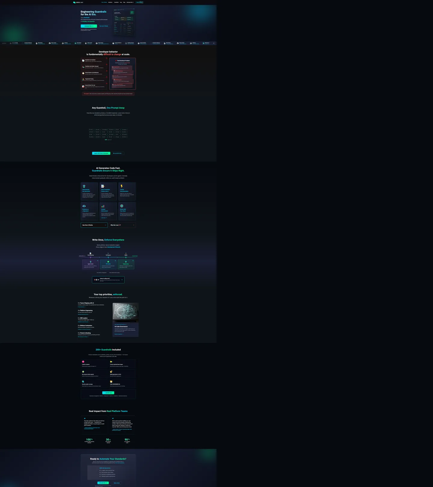
Earthly's marketing page reads as a dark-mode developer tool whose design choices prioritize legibility of code and status information over conventional SaaS marketing aesthetics. The canvas is a near-black navy (#0a0e1a), the display headline "Engineering Guardrails for the AI Era" sits in near-white at 46px / weight 800 in Roboto, and the primary CTA button is a diagonal cyan-to-green gradient pill — the only polychromatic interactive element on the page. Where Vercel holds its dark canvas flat and Linear tints theirs with violet, Earthly injects neon-spectrum glow from behind the card surfaces to create depth: cyan halos pulse around feature cards, green halos mark success states, purple halos indicate AI features. The glow system replaces both drop shadows and background-color banding as the depth mechanism.
The dual-fluorescent palette is the distinctive technical choice. Electric cyan (#00d4ff) is wired into 16 CSS variables — logo color, card border color, inline code color, link default, button hover shadow, and CTA gradient — making it the highest-frequency brand signal in the system. Neon green (#00ff88) wired into 9 variables handles success states, nav hover color, link hover, and the CTA gradient terminus. The two colors never appear at full opacity as background fills — they always appear at reduced opacity in glow layers or at full opacity as text and border strokes. This keeps the neon palette from overwhelming the dark navy canvas.
The type system is single-family Roboto across all scales, with significant weight variation doing the hierarchy work: the hero h1 at weight 800 is the heaviest moment, section h2s at weight 700, card titles at weight 700–800, and body copy at weight 400. The result reads closer to a developer documentation site (MDN, ReadTheDocs) than to a typical SaaS marketing page. Feed this file to an AI coding tool and it reproduces the glow-card system, the gradient CTA, and the dual-fluorescent nav hover on a near-black canvas.
What makes it distinct
5
- Dual-fluorescent paletteelectric cyan (#00d4ff) as the brand voltage and neon green (#00ff88) as the success/action accent, both deployed on a near-black navy canvas
- Ambient glow instead of shadowcards use CSS radial-glow halos (cyan-40 opacity, green-30 opacity) rather than drop shadows to create depth on the dark surface
- Roboto across all tiersa single family from the 46px hero h1 (weight 800) to the 11px metadata label (weight 400), with no display-family switch
- 8px default radius, circular badgessmall conservative rounding on content cards and code blocks, with full-circle (50%) for icon badge containers
- Gradient CTAthe primary button uses a diagonal cyan-to-green gradient rather than a flat brand fill, making it the only polychromatic element in the interactive tier
earthly.dev
Live at earthly.dev
A snapshot of the brand in production. Scroll the frame to see the whole page.
Colors
15 colors
Earthly's system runs on #00d4ff as its primary voltage, used in 5 of 14 components. Type is set in Roboto across 12 tokens from 11px to 46px, weights 400–800. Shape language is mixed across 14 components, blending pills, soft rounds, and squarer corners.
Brand & Accent
Sparing, CTA-only voltage · 1
Surface
Page and card backgrounds · 3
Text
Headlines, body, captions · 5
Borders & Hairlines
Dividers, outlines, rules · 1
Semantic
Status, errors, success, links · 1
Other
Specialty colors · 4
Typography
12 type tokens
Set in Roboto across 12 tokens, from 11px to 46px, weights 400–800. Shown in its own stack: where the font isn't installed, the fallback the file names stands in.
- display-xl46px · weight 800 · lh 51pxThe quick brown fox jumps over the lazy dog
- display-md40px · weight 700 · lh 48px · tracking 0.5pxThe quick brown fox jumps over the lazy dog
- heading-lg24px · weight 800 · lh 29px · tracking -0.12pxThe quick brown fox jumps over the lazy dog
- heading-md20px · weight 700 · lh 32px · tracking 0.5pxThe quick brown fox jumps over the lazy dog
- heading-sm17px · weight 700 · lh 27pxThe quick brown fox jumps over the lazy dog
- body-lg16px · weight 400 · lh 24pxThe quick brown fox jumps over the lazy dog
- body-md15px · weight 400 · lh 23pxThe quick brown fox jumps over the lazy dog
- body-sm14px · weight 400 · lh 22pxThe quick brown fox jumps over the lazy dog
- button-md16px · weight 700 · lh 20px · tracking 0.32pxThe quick brown fox jumps over the lazy dog
- nav-link16px · weight 600 · lh 20px · tracking 0.32pxThe quick brown fox jumps over the lazy dog
- caption11px · weight 400 · lh 18pxThe quick brown fox jumps over the lazy dog
- mono-sm12px · weight 400 · lh 20pxThe quick brown fox jumps over the lazy dog
Layout
Radii and spacing
8 corner radii and 8 spacing values. Shape language: mixed.
Radii
- none0px
- sm6px
- md8px
- lg10px
- xl12px
- 2xl14px
- 3xl20px
- full50%
Spacing
- xs2px
- sm4px
- base8px
- md10px
- lg12px
- xl16px
- 2xl20px
- 3xl60px
Components
14 components
Each rendered from its tokens (color, type, radius, padding) on Earthly's own canvas.
- Button Primarybutton-primaryButton Primary
- Button Secondarybutton-secondaryButton Secondary
- Top Navtop-navTop Nav
- Nav Linknav-linkNav Link
- Hero Headinghero-headingHero Heading
- Section Headingsection-headingSection Heading
- Body Paragraphbody-paragraphBody Paragraph
- CardcardCard
- Card Successcard-successCard Success
- Icon Badgeicon-badgeIcon Badge
- Type here…text-inputText Input
- Code Blockcode-blockCode Block
- Status Badgestatus-badgeStatus Badge
- FooterfooterFooter
In use
The system, in use
Earthly's tokens on the kind of product it builds.
Build something people actually use.
A short paragraph of marketing copy that previews how the brand's display tier and body tier read together. Two sentences is usually enough.
import { build } from "./build"

export async function main() {
  const result = await build()
  console.log("done", result)
}
FAQ
Earthly design system FAQ
Common questions about Earthly's tokens, components, and how to use this DESIGN.md in your project.
Read next
Related reading
Specs, directories, and component libraries that pair with this design system.
- Browse all design systemsThe full directory of DESIGN.md files on shadcn.io, with live mockups for each.shadcn.io
- Earthly — official siteEarthly's public marketing site — the source of truth for the live tokens captured in this file.earthly.dev (opens in a new tab)
- The DESIGN.md specificationGoogle Labs' open spec for machine-readable design system files — the format this page is built on.github.com (opens in a new tab)
Use it
Use Earthly in your project
One machine-readable file. Drop it into Claude, Cursor, or any AI tool that reads DESIGN.md.
Download the DESIGN.md
One machine-readable file: every color, type, radius, spacing, and component token of Earthly.
Feed it to your AI tool
Drop it into Claude, Cursor, or GitHub Copilot. The agent writes React components and Tailwind classes that match Earthly's visual language.
Reference the tokens directly
Or paste the values into your Tailwind config, CSS variables, or component library: every color, size and radius is a quoted, ready-to-copy value.
Read the full DESIGN.md: overview, rationale, do’s and don’ts
Overview
Earthly's marketing site reads as a developer-tool dashboard rather than a conventional SaaS marketing page. Glow over shadow. Instead of drop shadows or background-color zebra-banding to create depth on the dark canvas, Earthly uses CSS radial-glow halos — cyan behind feature cards, green behind success indicators, purple behind AI feature cells — as its sole elevation mechanism. The result is a page that feels lit from within rather than stacked.
The dual-fluorescent palette distinguishes Earthly from every other CI/CD tool in the space. Netlify and GitHub Actions both run on near-black or gray surfaces with a single accent; CircleCI uses green-on-white. Earthly deploys two neon voltages simultaneously — electric cyan as the primary brand signal (156 total uses) and neon green as the success/action accent (39 uses) — and keeps them disciplined by never using either as a full-opacity flat fill on large surfaces. They appear only as strokes, glow layers, and gradient stops.
Typography is single-family Roboto at extreme weight range — weight 800 on the 46px hero h1, weight 400 on 11px caption metadata. There is no display family switch. The effect is closer to a developer documentation site (ReadTheDocs, Rustdoc) than to a startup marketing page, which suits the engineering-guardrails positioning.
Key Characteristics:
- Near-black navy canvas (
{colors.canvas}— #0a0e1a) with a blue undertone — not pure black, not violet-graphite. The blue undertone makes the cyan glow system readable. - Dual-fluorescent system: cyan (
{colors.primary}— #00d4ff) for logo, borders, inline code, and links; neon green ({colors.secondary}— #00ff88) for success states, hover, and the CTA gradient terminus. - Glow depth layer using 9 cyan, 9 green, 3 purple rgba variables — no drop shadows anywhere.
- Gradient CTA button (cyan → neon green, 135°) — the only polychromatic fill in the interactive tier.
- Roboto from weight 400 to 800 across all tiers; no second font family.
- 8px base radius on content cards with 50% circles on icon badge containers — conservative compared to the pill-first radius systems on consumer SaaS.
- Card borders in cyan at 30% opacity (
--border-card: rgba(0, 212, 255, 0.3)) rather than a structural hairline.
Colors
Brand
- Cyan Primary (
{colors.primary}— #00d4ff): frequency 158. Used as text (47), border (84), shadow (7), gradient (19), background (1). Wired as --el-cyan, --logo-cyan, --link-default, --code-inline, --border-card. The highest-frequency brand signal; appears in 16 CSS custom properties. - Neon Green (
{colors.secondary}— #00ff88): frequency 39. Used as text (5), bg (6), border (11), shadow (2), gradient (15). Wired as --success, --logo-green, --link-hover, --type-policy. The success and action accent, also the CTA gradient terminus. - Green Alt (
{colors.secondary-alt}— #34f8b6): frequency 39. Used as text (7), border (31), gradient (1). Wired as --el-green, --nav-hover, --after-green. A slightly cooler mint variant of the neon green, used for nav hover states and certain border contexts.
Semantic
- Error (
{colors.error}— #ff6464): frequency 32. Used as text (10), bg (5), border (17). Wired as --error, --border-error, --icon-red, --before-red, --enforce-block-pr. The system's single warning/error tone. - AI Purple (
{colors.ai-purple}— #a855f7): frequency 5. Wired as --ai-purple, and the three glow-purple variables. Marks AI-specific feature cells; distinct from the brand cyan and green. - AI Purple Light (
{colors.ai-purple-light}— #d8b4fe): frequency 16. Used as text (8) and border (8). Wired as --ai-purple-light. The text-safe tint of the AI purple family.
Text
- Ink (
{colors.ink}— #f5f5f5): frequency 735. The dominant body and heading text. Near-white with slight warmth. Wired as --text-primary, --el-white, and the glass-white variables. - Ink Secondary (
{colors.ink-secondary}— #a0aec0): frequency 235. Used as text (118) and border (117). Secondary text: body paragraphs, sub-labels, metadata rows. Wired as --text-secondary, --logo-lunar-text. - Ink Muted (
{colors.ink-muted}— #718096): frequency 34. Tertiary text — feature cell descriptions, footer nav links. Wired as --text-muted, --icon-gray. - Ink Subtle (
{colors.ink-subtle}— #6b7280): frequency 14. The lightest text tone — placeholders, draft-state badges. Wired as --text-placeholder, --enforce-draft. - Ink Tertiary (
{colors.ink-tertiary}— #c7d2e0): frequency 12. Used as text (6) and border (6). Wired as --text-tertiary, --text-light-gray.
Surface
- Canvas (
{colors.canvas}— #0a0e1a): frequency 76. The primary page floor — most background fills merge from #0a0e1a / #0d1117 / #0f1419 variants. Wired as --bg-main, --bg-dark, --bg-section-dark. - Surface-1 (
{colors.surface-1}— #1a1f35): frequency 18. Elevated card and icon-badge surfaces. Wired as --bg-card, --icon-bg. - Surface Deepest (
{colors.surface-deepest}— #06090f): the floor of the darkest section bands and code blocks. Wired as --bg-deepest.
Hairline
- Hairline (
{colors.hairline}— #a0aec0): structural border value shared with the ink-secondary text tone, used at reduced opacity for card outlines and dividers.
Typography
Font Family
Roboto runs the entire system from the 46px hero h1 to the 11px caption metadata. Fallback stack: -apple-system, "system-ui", "Segoe UI", Oxygen, Ubuntu, Cantarell, sans-serif. No display family switch, no mono brand voice. Roboto's utilitarian character maps directly to the engineering-tool positioning. The code blocks and inline code elements use SF Mono / Fira Code / Cascadia Code / Consolas — a practical developer monospace stack, not a brand voice.
Hierarchy
| Token | Size | Weight | Line Height | Use |
|---|---|---|---|---|
{typography.display-xl} | 46px | 800 | 51px | Hero h1 ("Engineering Guardrails for the AI Era.") |
{typography.display-md} | 40px | 700 | 48px | Section h2s ("Developer behavior is fundamentally difficult to change at scale.") |
{typography.heading-lg} | 24px | 800 | 29px | Card category headers, feature-grid section titles |
{typography.heading-md} | 20px | 700 | 32px | Card h3 titles |
{typography.heading-sm} | 17px | 700 | 27px | Sub-card titles, accordion headers |
{typography.body-lg} | 16px | 400 | 24px | Feature descriptions, longer body paragraphs |
{typography.body-md} | 15px | 400 | 23px | Default running text |
{typography.body-sm} | 14px | 400 | 22px | Caption rows, tooltip text |
{typography.button-md} | 16px | 700 | 20px | CTA button labels |
{typography.nav-link} | 16px | 600 | 20px | Top-nav links (0.32px letter-spacing) |
{typography.caption} | 11px | 400 | 18px | Metadata labels, status annotation strips |
{typography.mono-sm} | 12px | 400 | 20px | Code blocks and inline code samples |
Principles
Weight 800 is the loudest typographic moment — reserved for the hero h1 and large feature section titles only. Weight 700 handles h2s and card titles. Weight 400 carries all body text. No italic, no uppercase-tracked label tier — the system avoids the "DEVELOPERS" shout pattern and lets weight alone carry hierarchy.
Note on Font Substitutes
Roboto is open-source (Google Fonts). Inter at the same weights transfers cleanly — slightly narrower letterforms, but the hierarchy structure maps 1:1. The monospace stack (SF Mono, Fira Code, Cascadia Code, Consolas) is already a practical multi-fallback chain; any of these fonts may be loaded as a primary.
Layout
Spacing System
- Base unit: 8px.
- Tokens:
{spacing.xs}2px ·{spacing.sm}4px ·{spacing.base}8px ·{spacing.md}10px ·{spacing.lg}12px ·{spacing.xl}16px ·{spacing.2xl}20px ·{spacing.3xl}60px. - Section padding (vertical): 100×40px on major landing sections (
{spacing.3xl}× 2 for top/bottom). - Card internal padding:
{spacing.2xl}(20px) on standard feature cards;{spacing.lg}(12px) on compact icon-badge rows. - Button padding: 7×10px — compact for a developer tool, deliberate against the looser padding on consumer SaaS.
Grid & Container
- Max content width: ~520px on the hero text column; the hero splits into a two-column layout with the product screenshot/terminal panel on the right.
- Feature grid: 3-column grid at desktop for the capability cards; collapses to 2-column on tablet, 1-column on mobile.
- Logo wall: horizontal scrolling strip of customer logos in muted gray tones, sitting immediately below the hero.
Rhythm
The page alternates between dense dark bands (feature cards with cyan glow borders, code demo panels) and slightly-lighter dark editorial (text-heavy sections with muted-gray text on the dark canvas). Unlike systems that use background-color shifts to signal section changes, Earthly relies on the glow system — a band with cyan-glowing cards reads as a distinct visual moment from a text-only editorial band on the same canvas color.
Elevation
The system has no traditional shadow tier. Elevation is expressed entirely through the glow system:
- Glow-card elevation:
{colors.surface-1}(#1a1f35) card fill +rgba(0, 212, 255, 0.3)border + optional radial-glow background in cyan-15 or cyan-20. This is the workhorse elevated surface. - Success-card elevation: same structure but with
rgba(0, 255, 136, 0.4)border and green-20 glow. - AI-card elevation:
rgba(168, 85, 247, 0.2)border and purple-20 glow. - Code block depth:
{colors.surface-deepest}fill with cyan text — no glow, the darkest surface reads as the lowest tier.
No drop shadows, no box-shadow with offset values. Every surface sits flat; the glow fills the role that shadow would fill in a lighter-mode system.
Shapes
The radius scale is conservative-utilitarian with full-circle icon badges:
{rounded.none}0px — hero edges, section dividers.{rounded.sm}6px — smallest chip surfaces, status-badge text containers.{rounded.md}8px — the default card radius (48 occurrences — most common radius on the page).{rounded.lg}10px — medium card variant.{rounded.xl}12px — larger card surfaces (21 occurrences).{rounded.2xl}14px — tabs, select inputs.{rounded.3xl}20px — the primary CTA button pill (not a full pill — 20px on a ~36px tall button).{rounded.full}50% — icon badge containers (24 occurrences — fully circular at any square element).
The system deliberately avoids the 50px pill that consumer SaaS favors. The CTA at 20px reads as rounded-button, not pill — a technical-tool visual register that matches Vercel, Render, and Railway more than Segment or Intercom.
Components
button-primary — The gradient CTA. Diagonal cyan-to-neon-green gradient fill, near-black text, Roboto 16px / 700, 20px radius, 7×10px padding, 36px height. "Download for Free" is the canonical instance.
button-secondary — Transparent fill, near-white text, 1px cyan border, same 20px radius and 7×10px padding. Used for "Read the Docs" and secondary action CTAs.
top-nav — Dark canvas surface, 48px height, 0×20px padding. Earthly wordmark flush left, product links center (How It Works, Solutions, Blog, Docs, Blog, Community, Pricing), Get Started CTA flush right.
nav-link — Transparent, cyan text at Roboto 16px / 600 / 0.32px tracking. The nav link color reads as the brand voltage directly in the nav bar — a design choice that makes the primary color its own nav label rather than a held-in-reserve CTA.
hero-heading — Near-white text, Roboto 46px / 800. No tracking, no letter-spacing — the weight alone carries the authority.
section-heading — Same near-white, Roboto 40px / 700 / 0.5px tracking. Used on "Developer behavior is fundamentally difficult to change at scale." and other major section h2s.
body-paragraph — Ink-secondary (#a0aec0) text at Roboto 15px / 400. The muted-blue-gray body tone against the dark canvas is the system's most-used text combination.
card — {colors.surface-1} fill, near-white title text, cyan border at 30% opacity, 12px radius, 15px padding. The primary feature card used in the 3-up capability grid.
card-success — Same structure as card but with neon-green border at 40% opacity and green-20 glow — used for success/completion feature cells.
icon-badge — {colors.surface-1} fill, circular (50%), 36×36px, cyan icon inside. Icon badge containers throughout the feature grid.
text-input — {colors.surface-1} fill, near-white text, muted hairline border, 12px radius, 7×10px padding, 34px height.
code-block — {colors.surface-deepest} fill, cyan text (inline code reads as brand accent), monospace 12px / 400, 8px radius, 12×16px padding. Code demo panels throughout the page.
status-badge — Transparent fill, neon-green text and border, Roboto 11px / 400, 6px radius, 2×6px padding. "BLOCK", "PASS", and enforcement-state indicators in the product demo panels.
footer — Deep canvas fill, muted text, Roboto 14px / 400, 60×40px padding.
Do's and Don'ts
Do deploy the dual-fluorescent palette exclusively on the dark navy canvas. Both electric cyan and neon green are high-chroma colors calibrated for the #0a0e1a background; rendering them on a white or mid-gray surface would produce a garish, neon-sign effect.
Do use the glow system — not drop shadows — for card elevation. The system defines 21 rgba glow variables for a reason; adding traditional box-shadow with a Y-offset to feature cards would layer two depth cues and destroy the floating-light aesthetic.
Do use {colors.secondary-alt} (#34f8b6) for nav hover states and border accents where you want a slightly cooler mint rather than the saturated neon green. The two greens are interchangeable at small scales but visually distinct at full-size fills.
Do keep the CTA gradient orientation at 135° (diagonal). The cyan-to-green gradient is the only polychromatic fill in the interactive tier; changing the angle to horizontal or vertical flattens the visual energy the diagonal produces.
Don't render the cyan or neon green as full-opacity flat background fills on large surfaces. Both colors operate as strokes, glows, and gradient stops — using #00d4ff as a background-color on a full-width hero section would overwhelm the dark canvas rather than accenting it.
Don't introduce a third color family for marketing accents. The system has a defined role for each: cyan for brand/structure/code, green for success/action, purple for AI features only. Adding an orange or yellow for a new feature area would break the disciplined dual-voltage grammar.
Don't increase the CTA button height beyond 44px or border-radius beyond 20px. The compact 36px / 20px combination is intentional — it signals "developer tool" rather than "consumer app." A large pill CTA at 56px / 50px would read as Pendo or Intercom, not as a CI/CD tool.
Don't use Roboto at weight 400 for the h2 display tier. The section h2 needs weight 700 minimum to read against the body-paragraph text at 15px / 400 on a dark canvas — the contrast between display and body is entirely weight-dependent in a single-family system.
Known Gaps
- Dark-only: the entire captured marketing surface is dark-mode. A light mode is not exposed in the marketing tokens.
- Hover and focus states: the gradient CTA has a box-shadow hover (
--shadow-button-hover: rgba(0, 212, 255, 0.3)) declared but not fully captured in the static extraction. Full interactive state matrix is not represented. - Form states: the text input captures the resting state only; error, focus, and disabled variants are not exposed.
- Motion: the hero uses animated text cycling through "AI prompts / standards / AGENTS.md files / eng wikis / cursor rules" — easing and timing are not captured.
- Product surfaces: this DESIGN.md captures the earthly.dev marketing site. The Earthly build runner, the Satellite product interface, and the documentation site (docs.earthly.dev) carry their own surface tokens and component sets.
- Enforcement-state palette: the extraction surfaces six enforcement-specific color tokens (--enforce-block-pr, --enforce-block-deploy, --enforce-draft, --enforce-report-pr, --enforce-score) that map to the product's guardrail severity system. These are product-surface tokens, not marketing tokens.
Developer Tools & IDEs
More systems like this
More DESIGN.md files in Developer Tools & IDEs.
Pricing
Build it with Pro
The DESIGN.md files are free. Pro adds 6,000+ blocks, premium templates and the MCP server, so your AI editor builds in your system for you.
4.9/5 out of 5 · 150+ reviewsfrom 150+ founders and developers.
Billing
Billed once a year in USD. Cancel anytime.
- How many people can use the license.
- Client work, SaaS products and anything you charge for.
- Production-ready React sections: hero, pricing, features, dashboards and more.
- Complete multi-page sites you can ship as they are.
- React icons from every major library, installable with one command.
- Presets that restyle every block, in light and dark.
- Lets your AI editor search, preview and install blocks for you.
- Priority requests are answered first.
Individual
For personal projects & open source
$32instead of $49/mo
$389 billed yearly
- Seats: 1 seat
- Commercial use: Personal & open source only
- Pro blocks: 6,000+ blocks
- Templates: All 14 templates
- React icons: 294k+ icons
- Themes: All 59 themes
- MCP server: Basic usage
- Support: Standard
Team
Most popularFor freelancers, agencies & startups
$66instead of $99/mo
$789 billed yearly · ≈ $13/dev/mo
- Seats: Up to 5 seats
- Commercial use: Included
- Pro blocks: 6,000+ blocks
- Templates: All 14 templates
- React icons: 294k+ icons
- Themes: All 59 themes
- MCP server: High usage
- Support: Priority
Organization
For companies with larger teams
$132instead of $199/mo
$1,589 billed yearly
- Seats: Unlimited seats
- Commercial use: Included
- Pro blocks: 6,000+ blocks
- Templates: All 14 templates
- React icons: 294k+ icons
- Themes: All 59 themes
- MCP server: Unlimited usage
- Support: Priority
Billed once a year in USD. Cancel anytime.
Individual
For personal projects & open source
$32instead of $49/mo
$389 billed yearly
- How many people can use the license.Seats: 1 seat
- Client work, SaaS products and anything you charge for.Commercial use: Personal & open source only
- Production-ready React sections: hero, pricing, features, dashboards and more.Pro blocks: 6,000+ blocks
- Complete multi-page sites you can ship as they are.Templates: All 14 templates
- React icons from every major library, installable with one command.React icons: 294k+ icons
- Presets that restyle every block, in light and dark.Themes: All 59 themes
- Lets your AI editor search, preview and install blocks for you.MCP server: Basic usage
- Priority requests are answered first.Support: Standard
Team
Most popularFor freelancers, agencies & startups
$66instead of $99/mo
$789 billed yearly · ≈ $13/dev/mo
Everything in Individual, plus
- How many people can use the license.Seats: Up to 5 seats
- Client work, SaaS products and anything you charge for.Commercial use: Included
- Lets your AI editor search, preview and install blocks for you.MCP server: High usage
- Priority requests are answered first.Support: Priority
Organization
For companies with larger teams
$132instead of $199/mo
$1,589 billed yearly
Everything in Team, plus
- How many people can use the license.Seats: Unlimited seats
- Lets your AI editor search, preview and install blocks for you.MCP server: Unlimited usage
- Secure checkout via Stripe
- Code lives in your repo
- Keep what you've shipped if you cancel
- License terms
Your system, built for you
Every block, template and icon, installed by your AI agent in your design system. The DESIGN.md files stay free.