E2B Design System
E2B's marketing system runs IBM Plex Mono everywhere — uppercase headlines, mono nav links, zero-radius rectangular CTAs, yellow highlighter accents. Tokens for React, Next.js, and AI coding tools.
Add shadcn.io to your AI agent. · Pro It installs blocks, icons and templates in your design system from a prompt, with Pro.
Set up MCP- Primary
- #ff8800
- Typeface
- IBM Plex Mono
- Shape
- Sharp
- Base radius
- 4px
- Colors
- 18
- Type tokens
- 14
- Components
- 15
- Spacing values
- 10
About
About E2B DESIGN.md
Curated by Dov Azencot · Updated May 18, 2026 · Source e2b.dev (opens in a new tab)
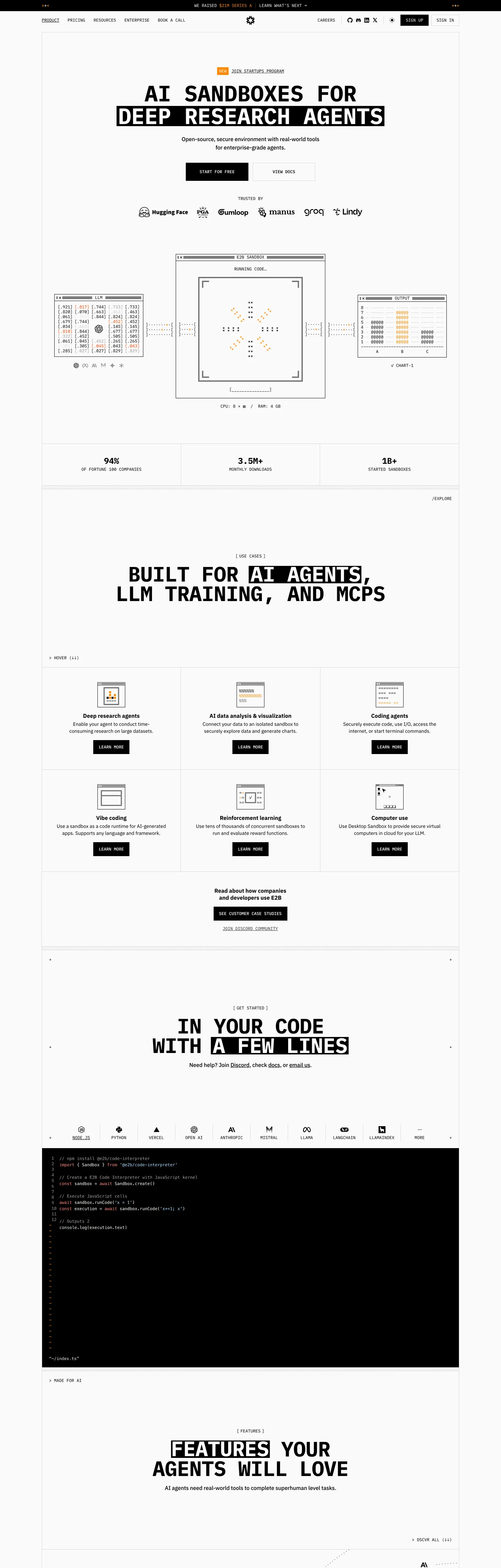
E2B's marketing site does the move most agent-infrastructure brands won't commit to: it renders the entire page in IBM Plex Mono with uppercase headlines, uppercase labels, uppercase CTAs, and zero-radius rectangular buttons. The hero h1 "AI SANDBOXES FOR DEEP RESEARCH AGENTS" sits at 64px IBM Plex Mono 700 in ink-black, with the words "DEEP RESEARCH AGENTS" painted in a yellow highlighter-marker bar — like someone swiped a real marker across the printout. The primary CTA "START FOR FREE" is a black rectangle (zero corner radius) with white mono text. Where Daytona pairs Inter display with Berkeley Mono labels and Vercel commits to Geist Sans on matte black, E2B commits to all-mono on near-white with the yellow highlighter as the single chromatic move.
The DESIGN.md file packages the system into a machine-readable spec for React and AI tools. Inside: 18 colors tokens — ink-black canvas-text, off-white canvas, the highlighter-yellow brand voltage, four gray text tiers, a constellation of model-vendor accent colors (cobalt OpenAI orangered, gemini violet, anthropic coral, meta cobalt, mistral amber) wired into CSS as `--color--accent-*` properties, plus a single mode-inverted near-black for the dark code-snippet panel. 17 typography tokens span IBM Plex Mono at three explicit weight families (400, 500, 700) across display, heading, body, label, button, and divider tiers — plus a small IBM Plex Sans tier for testimonial body copy. 4 radius tokens centered on 0px (the rectangular CTA) with one 64px outer-corner radius for hero containers.
Feed this file to Claude or Cursor and it reproduces E2B's specific moves: all-mono uppercase voice, yellow highlighter-bar accent painted behind keywords, zero-radius rectangular CTAs instead of pills, ASCII-style framed product cards, and the model-vendor accent palette wired as `--color--accent-openai`, `--color--accent-gemini`, `--color--accent-anthropic`, `--color--accent-meta`, `--color--accent-mistral`. The one move worth borrowing only if your audience is technical: the highlighter-bar treatment behind keywords. Most teams should reserve color highlights for inline `<mark>` tags inside body copy; E2B pushes the convention up into the hero h1 itself and the restraint of using only one highlighter color is what keeps it from feeling decorative.
What makes it distinct
5
- All-mono brand voiceIBM Plex Mono carries every display, every nav link, every body paragraph, every button label and every section divider in uppercase with tight -0.32px tracking
- Yellow highlighter-bar accent`#ff8800` orange-yellow paints behind keywords in headlines like a literal marker swipe, the single chromatic move on the page
- Zero-radius rectangular CTAsthe primary 'START FOR FREE' button uses a 0px corner radius with ink-black fill and white mono text, no pill or pseudo-pill softening
- ASCII-framed product cardssix cards below the fold sit in hairline boxes with terminal-style corner brackets and uppercase mono labels
- Terminal-pamphlet rhythmthe page reads more like a printed-output zine than a SaaS marketing site; the only sans-serif on the page is the IBM Plex Sans body inside testimonial cards
e2b.dev
Live at e2b.dev
A snapshot of the brand in production. Scroll the frame to see the whole page.
Colors
18 colors
E2B's system runs on #ff8800 as its primary voltage, used in 2 of 15 components. Type is set in IBM Plex Mono across 14 tokens from 12px to 64px, weights 400–700. Shape language is sharp — components average 0px corner radius, favoring crisp rectangles.
Brand & Accent
Sparing, CTA-only voltage · 6
Surface
Page and card backgrounds · 4
Text
Headlines, body, captions · 5
Borders & Hairlines
Dividers, outlines, rules · 1
Other
Specialty colors · 2
Typography
14 type tokens
Set in IBM Plex Mono across 14 tokens, from 12px to 64px, weights 400–700. Shown in its own stack: where the font isn't installed, the fallback the file names stands in.
- display-xl64px · weight 700 · lh 64px · tracking -0.32pxThe quick brown fox jumps over the lazy dog
- display-lg60px · weight 700 · lh 56px · tracking -0.8pxThe quick brown fox jumps over the lazy dog
- display-md40px · weight 400 · lh 40pxThe quick brown fox jumps over the lazy dog
- heading-md24px · weight 400 · lh 24pxThe quick brown fox jumps over the lazy dog
- body-md16px · weight 500 · lh 24px · tracking -0.16pxThe quick brown fox jumps over the lazy dog
- body-sm14px · weight 400 · lh 20pxThe quick brown fox jumps over the lazy dog
- body-sm-bold14px · weight 700 · lh 20pxThe quick brown fox jumps over the lazy dog
- body-sans-bold16px · weight 700 · lh 20pxThe quick brown fox jumps over the lazy dog
- mono-label12px · weight 400 · lh 14pxThe quick brown fox jumps over the lazy dog
- mono-label-medium12px · weight 500 · lh 14pxThe quick brown fox jumps over the lazy dog
- mono-body16px · weight 400 · lh 20pxThe quick brown fox jumps over the lazy dog
- button-md12px · weight 500 · lh 14pxThe quick brown fox jumps over the lazy dog
- nav-link14px · weight 400 · lh 20pxThe quick brown fox jumps over the lazy dog
- code-block12px · weight 400 · lh 18pxThe quick brown fox jumps over the lazy dog
Layout
Radii and spacing
4 corner radii and 10 spacing values. Shape language: sharp.
Radii
- none0px
- sm2px
- md4px
- full64px
Spacing
- xs4px
- sm6px
- base8px
- md12px
- lg16px
- xl24px
- 2xl32px
- 3xl40px
- 4xl44px
- 5xl48px
Components
15 components
Each rendered from its tokens (color, type, radius, padding) on E2B's own canvas.
- Button Primarybutton-primaryButton Primary
- Button Secondarybutton-secondaryButton Secondary
- Top Navtop-navTop Nav
- Nav Linknav-linkNav Link
- Hero Headinghero-headingHero Heading
- Hero Heading Highlighthero-heading-highlightHero Heading Highlight
- Section Headingsection-headingSection Heading
- Section Heading Highlightsection-heading-highlightSection Heading Highlight
- Body Paragraphbody-paragraphBody Paragraph
- Mono Dividermono-dividerMono Divider
- Card Productcard-productCard Product
- Code Panelcode-panelCode Panel
- Logo Chiplogo-chipLogo Chip
- Type here…text-inputText Input
- FooterfooterFooter
In use
The system, in use
E2B's tokens on the kind of product it builds.
Build something people actually use.
A short paragraph of marketing copy that previews how the brand's display tier and body tier read together. Two sentences is usually enough.
FAQ
E2B design system FAQ
Common questions about E2B's tokens, components, and how to use this DESIGN.md in your project.
Read next
Related reading
Specs, directories, and component libraries that pair with this design system.
- Browse all design systemsThe full directory of DESIGN.md files on shadcn.io, with live mockups for each.shadcn.io
- E2B — official siteE2B's public marketing site — the source of truth for the live tokens captured in this file.e2b.dev (opens in a new tab)
- The DESIGN.md specificationGoogle Labs' open spec for machine-readable design system files — the format this page is built on.github.com (opens in a new tab)
Use it
Use E2B in your project
One machine-readable file. Drop it into Claude, Cursor, or any AI tool that reads DESIGN.md.
Download the DESIGN.md
One machine-readable file: every color, type, radius, spacing, and component token of E2B.
Feed it to your AI tool
Drop it into Claude, Cursor, or GitHub Copilot. The agent writes React components and Tailwind classes that match E2B's visual language.
Reference the tokens directly
Or paste the values into your Tailwind config, CSS variables, or component library: every color, size and radius is a quoted, ready-to-copy value.
Read the full DESIGN.md: overview, rationale, do’s and don’ts
Overview
E2B's marketing site does the move most agent-infrastructure brands hesitate to commit to. All-mono-uppercase. Every headline, every nav label, every CTA, every section divider sits in IBM Plex Mono uppercase with -0.32px tracking. The hero h1 "AI SANDBOXES FOR DEEP RESEARCH AGENTS" renders at 64px IBM Plex Mono 700 in ink-black on an off-white canvas, with the phrase "DEEP RESEARCH AGENTS" painted in a yellow highlighter-marker bar — {colors.primary} (#ff8800) rectangle behind the type as if a real marker had swiped across a printed page. Where Daytona pairs Inter display with Berkeley Mono labels and Vercel commits to Geist Sans on matte black, E2B commits to all-mono on near-white and lets the highlighter swipe do the single chromatic move.
The system's chromatic discipline is the inverse of Cloudflare's voltage-as-canvas. Highlighter-orange {colors.primary} (#ff8800) is the only brand-layer color, appearing 77 times in the captured page (36 text, 5 background, 36 border) — almost all as horizontal marker-bar fills painted behind keywords in headlines. The page CSS exposes a constellation of model-vendor accents ({colors.accent-openai} orangered, {colors.accent-anthropic} coral, {colors.accent-gemini} violet, {colors.accent-meta} cobalt, {colors.accent-mistral} amber) wired as --color--accent-openai, --color--accent-anthropic, etc., but these are reserved exclusively for vendor logos in the integration callouts — they never bleed into the brand chrome.
The shape language is zero-radius rectangles. The primary CTA "START FOR FREE" is an ink-black rectangle with white mono text, 0px corner radius. The secondary "VIEW DOCS" is the same rectangle transparent with a 1px ink border. Every product card below the fold sits in a zero-radius hairline-bordered frame with ASCII-style terminal-corner brackets at the four corners. The single 64px radius in the extraction belongs to a small handful of icon-container outer corners; nothing else softens. Compare to Cloudflare's full-pill CTAs or Daytona's 57px pseudo-pill — E2B sits at the opposite extreme, treating rounded corners as a chrome decoration the page doesn't need.
Key Characteristics:
- IBM Plex Mono across every spoken surface — display, heading, body, button, nav, section divider — in uppercase with tight tracking. The only sans on the page is IBM Plex Sans for testimonial body copy at 14-16px.
- Yellow highlighter-bar
{colors.primary}(#ff8800) painted behind keywords in headlines like a literal marker swipe — the single chromatic moment on the page. - Zero-radius rectangular CTAs (
{component.button-primary}0px corners with ink-black fill); the single 64px radius in the system belongs to small icon containers. - ASCII-framed product cards: six cards below the fold sit in hairline-bordered boxes with terminal-corner brackets at all four edges, mono labels, and minimal pictogram icons.
- Three explicit IBM Plex Mono weight families wired as
--mono-400,--mono-500,--mono-700— a deliberate weight-system split for label / button / display tiers. - Model-vendor accent palette (
{colors.accent-openai},{colors.accent-anthropic},{colors.accent-gemini},{colors.accent-meta},{colors.accent-mistral}) wired as--color--accent-*properties; reserved exclusively for vendor logos in integration callouts. - Off-white
{colors.surface-1}(#fafafa) page floor with pure white{colors.canvas}(#ffffff) inside cards — a quiet warmth move that softens the all-mono harshness without crossing into cream. - Ink-black
{colors.surface-3}(#1f1f1f) code-snippet panel below the fold renders with white mono text and syntax-coral / syntax-sky accents — the only chromatic-inversion moment on the page.
Colors
Brand
- Highlighter Orange (
{colors.primary}— #ff8800): frequency 77 (36 text, 5 background, 36 border). Wired in CSS as--color--brand. The single brand voltage — painted as horizontal marker-bar fills behind keywords in headlines ("DEEP RESEARCH AGENTS," "AI AGENTS," "A FEW LINES"). Distinct from the cobalt OpenAI orangered{colors.accent-openai}; the brand orange is yellower and the OpenAI orange is redder.
Surface
- Canvas (
{colors.canvas}— #ffffff): frequency 184 (70 text, 46 background, 68 border). Wired as--color--bg-primary,--color--content-keep-white,--color--content-on-black. The pure-white inside-card fill — used everywhere a card sits on the slightly-warmer page floor. Merges three near-white tones in the extraction. - Surface-1 (
{colors.surface-1}— #fafafa): wired as--color--bg-primaryand--color--bg-primary-hover. The off-white page floor — a quieter warmth move than Cloudflare's cream, but a deliberate softening from pure white. - Surface-2 (
{colors.surface-2}— #ebebeb): frequency 36 (1 text, 33 background, 2 border). Wired as--color--bg-tertiary,--color--stroke-secondary,--color--bg-secondary. The form-input fill and the secondary surface tone for "search" callouts. - Surface-3 (
{colors.surface-3}— #1f1f1f): wired as--color--bg-dark-secondaryand--color--cta-primary-hover. The ink-near-black surface used inside the code-snippet panel below the fold — distinct from pure ink so the white mono text reads with slight softening.
Text
- Ink (
{colors.ink}— #000000): frequency 835 (386 text, 35 background, 414 border). The dominant text color across every tier — hero headlines, section h2s, body paragraphs, button text on the inverted code panel. Wired as--color--content-primary,--color--black,--color--cta-primary,--color--stroke-codesnippet. - Ink Secondary (
{colors.ink-secondary}— #333333): frequency 648 (355 text, 293 border). Wired as--color--content-secondary. The secondary running-text tone — body paragraphs beneath the hero, product-card descriptions. - Ink Tertiary (
{colors.ink-tertiary}— #666666): frequency 71 (36 text, 35 border). Wired as--color--content-tertiary. Tertiary captions, nav-link inactive state, footer-link tone. - Ink Quad (
{colors.ink-quad}— #999999): frequency 10 (5 text, 5 border). Wired as--color--content-quad. The lightest gray text tier — used for meta and footnote rows.
Hairline
- Hairline (
{colors.hairline}— #d6d6d6): frequency 27 (1 background, 26 border). Wired as--color--stroke-primary. The dominant border tone — carries 1px outlines on every product card and the ASCII-corner-bracket frames.
Accent
- Link (
{colors.link}— #0000ee): frequency 201 (105 text, 96 border). The cobalt-blue link color — appears on text links inside body copy and inside footer-link clusters. The saturated value reads as a deliberate throwback to default browser-link blue.
Model-Vendor Accents
- OpenAI (
{colors.accent-openai}— #ff4500): frequency 10. Wired as--color--accent-openai. The orangered OpenAI brand tone, reserved for the OpenAI logo callout. Distinct from the brand-layer{colors.primary}highlighter-orange. - Anthropic (
{colors.accent-anthropic}— #cc7d5d): wired as--color--accent-anthropic. The Anthropic brand coral, reserved for the Anthropic logo callout. - Gemini (
{colors.accent-gemini}— #8e75b2): wired as--color--accent-gemini. The Google Gemini brand violet, reserved for the Gemini logo callout. - Meta (
{colors.accent-meta}— #0467df): wired as--color--accent-meta. The Meta brand cobalt, reserved for the Meta/Llama logo callout. - Mistral (
{colors.accent-mistral}— #ffa300): wired as--color--accent-mistral. The Mistral brand amber, reserved for the Mistral logo callout.
Code Syntax
- Syntax Coral (
{colors.syntax-coral}— #ff7b72): frequency 14 (7 text, 7 border). The terminal-error coral inside the code-snippet panel — distinct from any brand accent. - Syntax Sky (
{colors.syntax-sky}— #a5d6ff): frequency 6 (3 text, 3 border). The light-blue syntax accent inside the code-snippet panel.
Typography
Font Families
The system runs almost entirely on IBM Plex Mono — declared in CSS as three explicit weight families (--mono-400, --mono-500, --mono-700). Display, heading, body, button, nav link, and section divider all use the mono. The single sans tier is IBM Plex Sans, reserved for testimonial body copy at 14-16px and a small handful of secondary callouts. Fallbacks walk monospace and sans-serif respectively; the sans family is also declared as --font-family-sans.
The all-mono commitment is the typographic signature. Most developer-platform marketing pages reserve mono for code samples and use a sans for everything else (Linear, Stripe, Vercel). E2B inverts the relationship — sans is the exception, mono is the rule.
Hierarchy
| Token | Size | Weight | Line Height | Letter Spacing | Use |
|---|---|---|---|---|---|
{typography.display-xl} | 64px | 700 | 64px | -0.32px | Hero h1 ("AI SANDBOXES FOR DEEP RESEARCH AGENTS") |
{typography.display-lg} | 60px | 700 | 56px | -0.8px | Section h2 ("BUILT FOR AI AGENTS, LLM TRAINING, AND MCPS") |
{typography.display-md} | 40px | 400 | 40px | 0 | Smaller section displays |
{typography.heading-md} | 24px | 400 | 24px | 0 | Sub-section titles |
{typography.body-md} | 16px | 500 | 24px | -0.16px | Default running text (IBM Plex Sans) |
{typography.body-sm} | 14px | 400 | 20px | 0 | Caption rows, footer text (IBM Plex Sans) |
{typography.body-sm-bold} | 14px | 700 | 20px | 0 | Bold inline emphasis inside body copy (IBM Plex Sans) |
{typography.body-sans-bold} | 16px | 700 | 20px | 0 | Product card titles and small-h2 (IBM Plex Sans) |
{typography.mono-label} | 12px | 400 | 14px | 0 | Uppercase section labels ("[ USE CASES ]", "[ FEATURES ]") |
{typography.mono-label-medium} | 12px | 500 | 14px | 0 | Slightly-heavier uppercase nav labels |
{typography.mono-body} | 16px | 400 | 20px | 0 | Mono running text inside code-context callouts |
{typography.button-md} | 12px | 500 | 14px | 0 | Primary and secondary button labels ("START FOR FREE", "VIEW DOCS") |
{typography.nav-link} | 14px | 400 | 20px | 0 | Top-nav link labels (IBM Plex Sans) |
{typography.code-block} | 12px | 400 | 18px | 0 | Inline code spans inside the code-snippet panel |
Principles
Display weight goes all the way to 700 — unusually heavy for a marketing site — because the mono uppercase voice needs the weight to read at the 60-64px display sizes without feeling thin. Letter-spacing tightens to -0.32 / -0.8px at display sizes to prevent the uppercase mono from feeling stretched. Section labels render at 12px IBM Plex Mono 400 with normal tracking, often wrapped in square brackets like [ USE CASES ] or [ FEATURES ] to reinforce the printed-pamphlet aesthetic.
The yellow highlighter-bar treatment is the single chromatic typographic move. Behind specific keywords inside headlines, the system paints a flat {colors.primary} rectangle as if a real highlighter marker had swiped across the type. The treatment is consistent: every band has at most one highlight per headline, and the highlighted phrase carries the same display weight as the surrounding text — only the background fill changes.
Note on Font Substitutes
IBM Plex Mono is open-source (SIL OFL) and ships everywhere — no substitute needed. For a tighter alternative with similar glyph proportions, JetBrains Mono or Berkeley Mono carry close-enough metrics; iA Writer Mono is the closest open-source proxy if you need slightly-narrower characters. IBM Plex Sans is similarly open-source; no substitute is needed for the testimonial body tier.
Layout
Spacing System
- Base unit: 4px (with 8px and 16px as the dominant modules; 4px appears 69 times in the captured page).
- Tokens:
{spacing.xs}4px ·{spacing.sm}6px ·{spacing.base}8px ·{spacing.md}12px ·{spacing.lg}16px ·{spacing.xl}24px ·{spacing.2xl}32px ·{spacing.3xl}40px ·{spacing.4xl}44px ·{spacing.5xl}48px. - Section padding (vertical): the major editorial bands sit at 44×40px (6 occurrences) and 28×32×40px (9 occurrences) — tighter than most marketing pages and reinforcing the pamphlet rhythm.
- Card internal padding:
{spacing.5xl}(48px) for product cards; 28×32×40px for the irregular feature cells. - Top-nav padding: 16×0px vertical, 0×16px horizontal — a thin 46px-high band.
Grid & Container
- Max content width: ~1080px on the section displays and the 3-up product grid; the hero band sits in a wider ~1280px container so the highlighted phrase can extend toward the page edges.
- Hero: 2-column split — left text block ("AI SANDBOXES FOR DEEP RESEARCH AGENTS" + sub-paragraph + dual CTAs) paired with the integration-diagram callout on the right.
- Trusted-by strip: 6-column row of vendor logos (Hugging Face, Cumiloop, Mooves, Groq, Lindy) rendered in monochrome ink.
- Use-cases grid: 3-column x 2-row grid of ASCII-framed product cards ("Deep research agents / AI data analysis & visualization / Coding agents / Vibe coding / Reinforcement learning / Computer use") with corner-bracket frames.
- Code-snippet band: full-bleed ink-black panel with white mono code samples, sitting between editorial bands.
- Features grid: 4-column horizontal row of product feature cards anchored by minimal pictogram icons.
Rhythm
The page alternates between printed-pamphlet editorial bands (the hero, the use-cases grid, the features grid) and inverted code-snippet panels (the ink-black band with white mono code). Every section is divided by an uppercase mono label wrapped in brackets — [ USE CASES ], [ FEATURES ], [ GET STARTED ] — and every band terminates on the same off-white page floor. The yellow highlighter swipe inside each headline anchors the editorial rhythm visually, repeating across three or four bands as the single chromatic recurrence.
Elevation
The system has essentially no shadow tier. The captured page has zero #000000 shadow occurrences — there is no soft drop shadow on cards, no halo on buttons, no resting elevation anywhere. Hairline borders ({colors.hairline} carries the 1px outlines on every product card) do the entire elevation job.
- Flat (no shadow): every product card, every code panel, the hero, the footer — 100% of surfaces.
- Hairline outlines:
{colors.hairline}(#d6d6d6) marks every card border at 1px. The ASCII-corner-bracket treatment at the four corners of product cards is decorative rather than functional — the actual containment comes from the hairline border. - Code panel inversion: the dark code-snippet band uses
{colors.ink}(#000000) fill against the off-white page floor — the high tonal contrast reads as a punched-in window rather than as an elevated surface.
Shapes
The radius scale is rectangular-first, with only one outlier:
{rounded.none}0px — the dominant radius. Every button, every product card, every code panel, every form input. The "START FOR FREE" CTA, the "VIEW DOCS" secondary, every nav link, every section divider — all 0px corners.{rounded.sm}2px — declared in extraction but rarely rendered.{rounded.md}4px — also declared, used on a small number of utility chips.{rounded.full}64px — frequency 7. Used exclusively for the outer corners of small icon containers and avatar chips inside testimonial cards.
There is no 8 / 12 / 16 / 24px middle tier. The system is functionally binary: rectangular (0px) for every chrome surface, or 64px for the small handful of icon avatars. The choice reinforces the printed-pamphlet aesthetic — rounded corners would soften the chrome and read as a generic SaaS marketing page.
Components
button-primary — The signature CTA. Ink-black {colors.ink} fill, white text, {typography.button-md} (12px IBM Plex Mono 500), {rounded.none} 0px corners, 8x14px padding, 32px height, 1px ink-black border. "START FOR FREE" is the canonical instance.
button-secondary — Transparent fill with ink text and a 1px ink-black border. {rounded.none} 0px corners, 8x14px padding, 32px height. "VIEW DOCS" is the canonical instance, paired directly beside the primary CTA in the hero.
top-nav — White {colors.canvas} surface, 46px height, 0x16px horizontal padding. E2B wordmark flush left, product nav links (Product / Pricing / Resources / Enterprise / Book a Call / What's Next) center-left, "Sign Up / Sign In" cluster flush right. A persistent announcement bar above the nav carries the "USE CASES / STARTUPS PROGRAM / LEARN WHAT'S NEW" links.
nav-link — Transparent background, ink text in {typography.nav-link} (14px IBM Plex Sans / 400), 16x0px padding. No hover background visible in the captured surface.
hero-heading — Ink text on the transparent canvas, {typography.display-xl} (64px IBM Plex Mono 700, uppercase, -0.32px tracking).
hero-heading-highlight — The yellow {colors.primary} marker-bar variant — same 64px IBM Plex Mono 700 type, but painted on a flat orange-yellow rectangle background with 0x8px padding. "DEEP RESEARCH AGENTS" is the canonical instance inside the hero h1.
section-heading — Ink text, {typography.display-lg} (60px IBM Plex Mono 700, uppercase, -0.8px tracking). Used for "BUILT FOR AI AGENTS, LLM TRAINING, AND MCPS" and "FEATURES YOUR AGENTS WILL LOVE."
section-heading-highlight — The yellow marker-bar variant of the section heading — same 60px IBM Plex Mono 700 type, painted on the orange-yellow rectangle. "AI AGENTS" and "A FEW LINES" are the canonical instances.
body-paragraph — Default ink-secondary {colors.ink-secondary} running-text at {typography.body-md} (16px IBM Plex Sans 500). The workhorse paragraph style — the only sans on the editorial chrome.
mono-divider — Mono ink-tertiary text at {typography.mono-label} (12px IBM Plex Mono 400), uppercase. Carries section dividers wrapped in brackets — [ USE CASES ], [ FEATURES ], [ GET STARTED ].
card-product — White {colors.canvas} fill, ink text, 1px {colors.hairline} border, {rounded.none} 0px corners, 28x32x40px padding. The default content card on the marketing surface — anchors every product-grid tile with a small pictogram icon, an IBM Plex Sans 700 title, and a 1-2 line description in {colors.ink-secondary}. ASCII-style corner brackets at the four corners are added as decorative SVG overlays, not as border-radius.
code-panel — Ink-black {colors.ink} fill, white text, {rounded.none} 0px corners, 24px padding. The full-bleed code-snippet band uses inline syntax accents ({colors.syntax-coral} for keywords, {colors.syntax-sky} for strings) and renders an entire JavaScript sample of import { Sandbox } from "@e2b/code-interpreter".
logo-chip — Transparent fill, ink-black logo at 32px uniform height. The customer trust strip renders all marks in monochrome ink regardless of source color — Hugging Face, Cumiloop, Mooves, Groq, Lindy.
text-input — {colors.surface-2} (#ebebeb) fill, ink-tertiary text, 1px matching border, {rounded.none} 0px corners, 30px left padding (for an inline search icon), 40px height.
footer — White {colors.canvas} fill, ink-tertiary text at {typography.body-sm}, 48x16px padding. The "MADE FOR DEVS" closing band sits in a thin bordered row at the page bottom.
Do's and Don'ts
Do keep the yellow highlighter-bar {colors.primary} (#ff8800) reserved for keyword fills behind headlines only. The treatment is the system's signature chromatic move; bleeding it into button fills, link accents, or hover states would erase the marker-swipe metaphor and turn the page into a generic orange-accent dev brand.
Do use IBM Plex Mono uppercase for every spoken surface — display, heading, button, section divider. The all-mono commitment is the typographic signature; substituting a sans for headlines would turn E2B into a generic agent-infrastructure marketing page.
Do keep the primary CTA radius at {rounded.none} 0px. The rectangular "START FOR FREE" button is the warmest interactive element on the page precisely because it doesn't soften with a pill or pseudo-pill; adding rounding reads as a chrome dilution.
Do scope the model-vendor accent palette ({colors.accent-openai}, {colors.accent-anthropic}, {colors.accent-gemini}, {colors.accent-meta}, {colors.accent-mistral}) to vendor logos and integration callouts only. Outside those contexts they compete with the highlighter-orange and dilute the single-voltage discipline.
Don't soften the off-white surface {colors.surface-1} (#fafafa) into a warm cream or matte gray. The page floor is a deliberately quiet 2% warmth move — pushing further into cream territory crosses into Cloudflare-style chromatic warming, and pulling back to pure white removes the softening the all-mono harshness needs.
Don't render the highlighter-bar phrase in italic or with a sans display variant. The yellow rectangle treatment requires the highlighted phrase to use the same display weight as the surrounding text — only the background changes; substituting the type style breaks the marker-swipe metaphor.
Don't add drop shadows or atmospheric gradients to the product cards. The system is completely flat — depth comes from hairline borders and the ASCII-corner-bracket decoration; adding a shadow tier reads as a generic SaaS dashboard component.
Don't uppercase the body-copy IBM Plex Sans paragraphs. The uppercase treatment is reserved for the mono voice; body copy stays in sentence-case at IBM Plex Sans 500 to preserve the readable contrast against the all-mono headlines.
Known Gaps
- Dark mode: the captured marketing surface is light-only. The page CSS exposes a parallel
--dark--*token system (with ink-black backgrounds and white content tokens) for an alternate mode, but the rendered page does not currently switch into it. - Hover and focus states: the captured page surfaces a CTA hover token
--color--cta-primary-hover: #1f1f1f, but the full state matrix (focus rings, active press, disabled tints) is not represented in the rendered surfaces. - Form input error states:
{component.text-input}carries the resting state only; error and validation styling are not exposed on the captured marketing surface. - Motion: the integration-diagram callout in the hero animates with stepping pulses, but the spec captures end-state values only. Easing curves, pulse rates, and stagger timing live in the live page runtime.
- Product surfaces: this DESIGN.md captures the marketing site only. The E2B dashboard (
e2b.dev/dashboard) carries a richer token system — sandbox cards, runtime gauges, log streams, billing panels — that is not represented here. - Highlighter-bar mechanism: the orange marker-bar treatment is hard-coded as a wrapping
<span>with a background-color fill rather than as a declared CSS utility class. The convention is consistent across headlines but not exposed as a reusable token. - Model-vendor accent scope: the page declares accent tones for OpenAI, Anthropic, Gemini, Meta, and Mistral. Other model providers (Cohere, AI21, xAI, etc.) are not represented in the captured palette — adding them would presumably follow the same
--color--accent-{vendor}pattern.
AI & LLM Platforms
More systems like this
More DESIGN.md files in AI & LLM Platforms.
Pricing
Build it with Pro
The DESIGN.md files are free. Pro adds 6,000+ blocks, premium templates and the MCP server, so your AI editor builds in your system for you.
4.9/5 out of 5 · 150+ reviewsfrom 150+ founders and developers.
Billing
Billed once a year in USD. Cancel anytime.
- How many people can use the license.
- Client work, SaaS products and anything you charge for.
- Production-ready React sections: hero, pricing, features, dashboards and more.
- Complete multi-page sites you can ship as they are.
- React icons from every major library, installable with one command.
- Presets that restyle every block, in light and dark.
- Lets your AI editor search, preview and install blocks for you.
- Priority requests are answered first.
Individual
For personal projects & open source
$32instead of $49/mo
$389 billed yearly
- Seats: 1 seat
- Commercial use: Personal & open source only
- Pro blocks: 6,000+ blocks
- Templates: All 14 templates
- React icons: 294k+ icons
- Themes: All 59 themes
- MCP server: Basic usage
- Support: Standard
Team
Most popularFor freelancers, agencies & startups
$66instead of $99/mo
$789 billed yearly · ≈ $13/dev/mo
- Seats: Up to 5 seats
- Commercial use: Included
- Pro blocks: 6,000+ blocks
- Templates: All 14 templates
- React icons: 294k+ icons
- Themes: All 59 themes
- MCP server: High usage
- Support: Priority
Organization
For companies with larger teams
$132instead of $199/mo
$1,589 billed yearly
- Seats: Unlimited seats
- Commercial use: Included
- Pro blocks: 6,000+ blocks
- Templates: All 14 templates
- React icons: 294k+ icons
- Themes: All 59 themes
- MCP server: Unlimited usage
- Support: Priority
Billed once a year in USD. Cancel anytime.
Individual
For personal projects & open source
$32instead of $49/mo
$389 billed yearly
- How many people can use the license.Seats: 1 seat
- Client work, SaaS products and anything you charge for.Commercial use: Personal & open source only
- Production-ready React sections: hero, pricing, features, dashboards and more.Pro blocks: 6,000+ blocks
- Complete multi-page sites you can ship as they are.Templates: All 14 templates
- React icons from every major library, installable with one command.React icons: 294k+ icons
- Presets that restyle every block, in light and dark.Themes: All 59 themes
- Lets your AI editor search, preview and install blocks for you.MCP server: Basic usage
- Priority requests are answered first.Support: Standard
Team
Most popularFor freelancers, agencies & startups
$66instead of $99/mo
$789 billed yearly · ≈ $13/dev/mo
Everything in Individual, plus
- How many people can use the license.Seats: Up to 5 seats
- Client work, SaaS products and anything you charge for.Commercial use: Included
- Lets your AI editor search, preview and install blocks for you.MCP server: High usage
- Priority requests are answered first.Support: Priority
Organization
For companies with larger teams
$132instead of $199/mo
$1,589 billed yearly
Everything in Team, plus
- How many people can use the license.Seats: Unlimited seats
- Lets your AI editor search, preview and install blocks for you.MCP server: Unlimited usage
- Secure checkout via Stripe
- Code lives in your repo
- Keep what you've shipped if you cancel
- License terms
Your system, built for you
Every block, template and icon, installed by your AI agent in your design system. The DESIGN.md files stay free.