Docker Design System
Docker's marketing-site design system as a DESIGN.md file. Repro at 48px/500 for display, Inter for body, electric blue #2560ff wired to every interactive state, 4–8px conservative rounding, 16 colors tokens, 16 components. For React, Next.js, and AI tools.
Add shadcn.io to your AI agent. · Pro It installs blocks, icons and templates in your design system from a prompt, with Pro.
Set up MCP- Primary
- #2560ff
- Typeface
- Inter
- Shape
- Sharp
- Base radius
- 8px
- Colors
- 16
- Type tokens
- 11
- Components
- 16
- Spacing values
- 8
About
About Docker DESIGN.md
Curated by Dov Azencot · Updated May 18, 2026 · Source docker.com (opens in a new tab)
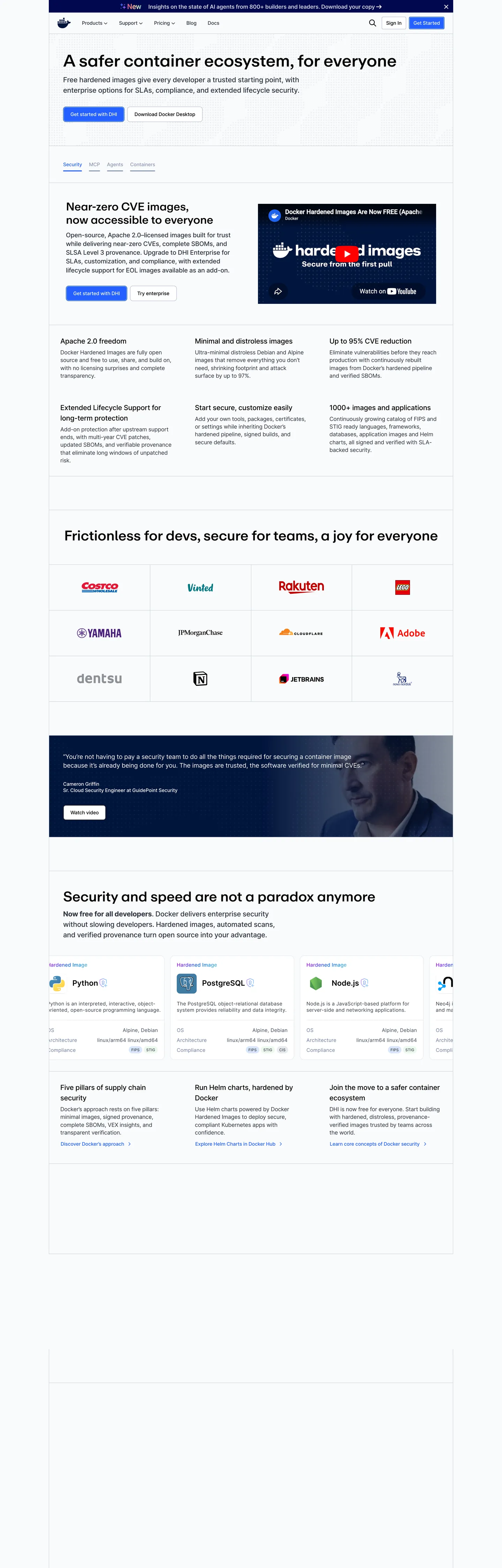
Docker's marketing homepage is not trying to win a design award. The hero is a white surface with a black 48px headline ("A safer container ecosystem, for everyone"), a two-paragraph body explanation, and a side-panel screenshot showing "Hardened Images" with a metric counter. Below the fold: a partner-logo wall (Salesforce, Rakuten, HelloFresh, Adobe, Atlassian), a two-column security feature block, and a testimonial quote. The decorative budget is zero. Where Cloudflare fills the hero canvas with saturated orange and AWS runs spectral gradient thumbnails, Docker gives you a statement and gets out of the way. The entire chromatic system rests on one electric-blue (#2560ff) voltage wired to 30+ CSS custom properties — button fills, link colors, icon fills, tab borders, input focus rings, table accents — and a deep navy-to-dark-slate prose palette.
The typographic split is the system's most distinctive move: **Repro** (a proprietary display sans) carries the 24–48px headline tier at weight 500, while **Inter** carries everything below — body paragraphs at 16–18px, nav links at 14px, labels at 12–14px in weight 400–500. The display/body split means the two faces share weight and rhythm but differ in optical warmth. Repro reads slightly cooler and more geometric at large sizes; Inter reads neutral and trustworthy at small. The combination signals "product company with engineering discipline" without the austerity of a purely monospace system (Bun, Warp) or the editorial weight of a grotesk system (Cloudflare, Docker's own enterprise competitor VMware).
The radius story is binary-conservative: 4px on buttons and interactive chips, 8px on cards. No 12px, 16px, or pill tier. Every surface rounds just enough to not be sharp. This is the opposite of Spline's generous-soft 16px default or Cloudflare's binary small-step-plus-pill — Docker's rounding says "tool, not toy."
What makes it distinct
5
- Single electric-blue voltage#2560ff wired to --buttonPrimaryBackground, --linkColor, --iconColor, and 30+ other CSS custom properties
- Two-family typographyRepro (proprietary) for display headings, Inter for body, labels, and nav links
- Conservative rounding4px on buttons and chips, 8px on cards; no generous pill scale, no 16px default
- Security-metric credibility layerthe hero section names CVE counts and partner logos rather than using decorative brand illustration
- High-frequency dark slate ink#2c333f (644 occurrences) handles label, subhead, and copy roles simultaneously
docker.com
Live at docker.com
A snapshot of the brand in production. Scroll the frame to see the whole page.
Colors
16 colors
Docker's system runs on #2560ff as its primary voltage, used in 2 of 16 components. Type is set in Inter across 11 tokens from 12px to 48px, weights 400–500. Shape language is sharp — components average 4px corner radius, favoring crisp rectangles.
Brand & Accent
Sparing, CTA-only voltage · 3
Surface
Page and card backgrounds · 3
Text
Headlines, body, captions · 4
Borders & Hairlines
Dividers, outlines, rules · 2
Semantic
Status, errors, success, links · 4
Typography
11 type tokens
Set in Inter across 11 tokens, from 12px to 48px, weights 400–500. Shown in its own stack: where the font isn't installed, the fallback the file names stands in.
- display-xl48px · weight 500 · lh 57.6px · tracking -0.6pxThe quick brown fox jumps over the lazy dog
- display-lg40px · weight 500 · lh 48px · tracking -0.5pxThe quick brown fox jumps over the lazy dog
- display-md32px · weight 500 · lh 38.4px · tracking -0.4pxThe quick brown fox jumps over the lazy dog
- display-sm24px · weight 500 · lh 28.8px · tracking -0.3pxThe quick brown fox jumps over the lazy dog
- heading-lg20px · weight 500 · lh 30px · tracking -0.25pxThe quick brown fox jumps over the lazy dog
- heading-md18px · weight 500 · lh 25.2px · tracking -0.225pxThe quick brown fox jumps over the lazy dog
- body-lg18px · weight 400 · lh 25.2px · tracking -0.225pxThe quick brown fox jumps over the lazy dog
- body-md16px · weight 400 · lh 22.4px · tracking -0.2pxThe quick brown fox jumps over the lazy dog
- body-sm14px · weight 400 · lh 18.2px · tracking -0.15pxThe quick brown fox jumps over the lazy dog
- label-md14px · weight 500 · lh 18.2px · tracking -0.15pxThe quick brown fox jumps over the lazy dog
- caption12px · weight 500 · lh 15.6px · tracking -0.15pxThe quick brown fox jumps over the lazy dog
Layout
Radii and spacing
4 corner radii and 8 spacing values. Shape language: sharp.
Radii
- none0px
- xs4px
- sm8px
- full9999px
Spacing
- xs6px
- sm8px
- md12px
- base20px
- lg24px
- xl32px
- 2xl40px
- 3xl48px
Components
16 components
Each rendered from its tokens (color, type, radius, padding) on Docker's own canvas.
- Button Primarybutton-primaryButton Primary
- Button Secondarybutton-secondaryButton Secondary
- Button Tertiarybutton-tertiaryButton Tertiary
- Top Navtop-navTop Nav
- Nav Linknav-linkNav Link
- Hero Headinghero-headingHero Heading
- Section Headingsection-headingSection Heading
- Body Paragraphbody-paragraphBody Paragraph
- Body Paragraph Mutedbody-paragraph-mutedBody Paragraph Muted
- CardcardCard
- Card Accentcard-accentCard Accent
- Type here…text-inputText Input
- Tab Activetab-activeTab Active
- Tab Inactivetab-inactiveTab Inactive
- Logo Chiplogo-chipLogo Chip
- FooterfooterFooter
In use
The system, in use
Docker's tokens on the kind of product it builds.
Build something people actually use.
A short paragraph of marketing copy that previews how the brand's display tier and body tier read together. Two sentences is usually enough.
FAQ
Docker design system FAQ
Common questions about Docker's tokens, components, and how to use this DESIGN.md in your project.
Read next
Related reading
Specs, directories, and component libraries that pair with this design system.
- Browse all design systemsThe full directory of DESIGN.md files on shadcn.io, with live mockups for each.shadcn.io
- Docker — official siteDocker's public marketing site — the source of truth for the live tokens captured in this file.docker.com (opens in a new tab)
- The DESIGN.md specificationGoogle Labs' open spec for machine-readable design system files — the format this page is built on.github.com (opens in a new tab)
Use it
Use Docker in your project
One machine-readable file. Drop it into Claude, Cursor, or any AI tool that reads DESIGN.md.
Download the DESIGN.md
One machine-readable file: every color, type, radius, spacing, and component token of Docker.
Feed it to your AI tool
Drop it into Claude, Cursor, or GitHub Copilot. The agent writes React components and Tailwind classes that match Docker's visual language.
Reference the tokens directly
Or paste the values into your Tailwind config, CSS variables, or component library: every color, size and radius is a quoted, ready-to-copy value.
Read the full DESIGN.md: overview, rationale, do’s and don’ts
Overview
Docker's marketing homepage does not attempt to impress with color or decoration. Single-Voltage Technical Credibility. The hero is a white surface, a 48px Repro headline, a metric counter showing CVE reduction, and a partner-logo wall. Where Cloudflare announces its brand with a full-canvas orange hero and Vercel uses matte black, Docker uses white and lets the security numbers do the persuasion. The system is built around a single electric-blue voltage (#2560ff) wired to 30+ CSS custom properties — buttons, links, icons, focus rings, tab borders, table accents — making it visually consistent without being visually exciting. This is the same restraint discipline Stripe uses, but without Stripe's serif headlines or mesh gradients.
The two-family typography — Repro for 24–48px display, Inter for everything below — divides responsibility clearly: Repro signals brand identity at the moment of first contact (headline, section h2), Inter carries the reading work (body, labels, nav). Unlike Cloudflare, which uses FT Kunst Grotesk across all tiers, Docker's split acknowledges that a single display family optimized for large sizes is rarely optimal at 14px body.
Conservative-technical rounding: 4px buttons, 8px cards. No pill. No 16px default. The conservatism is a positioning signal — Docker's nearest peer in the dev-tools category, Kubernetes, uses 8px as its only radius; Docker's tighter 4px CTA matches the "tooling" register.
Key Characteristics:
- Pure white canvas (
{colors.canvas}— #f9fafb) with{colors.surface-1}(#efefef) for card and code-block backgrounds. - Single electric-blue voltage (
{colors.primary}— #2560ff) across 29 rendered occurrences — the only chromatic brand element. - High-frequency dark-slate ink (
{colors.ink-slate}— #2c333f, 644 occurrences) as the label, subhead, and copy workhorse. - Repro display family at 24–48px / weight 500–700; Inter body family at 12–20px / weight 400–500.
- Conservative binary rounding: 4px buttons, 8px cards. No larger radius tier.
- 8px base spacing. Section padding at 48×40px. Button at 8×12px.
- Security-credibility positioning: partner-logo grid (Salesforce, Rakuten, HelloFresh, Adobe, Atlassian) and CVE-count metrics rather than decorative illustration.
- Semantic color set fully declared: error red (#ff5757), warning amber (#f8b60f), success green (#38bd7d) — all zero occurrences on the captured marketing surface but live in CSS variables.
Colors
Brand
- Primary (
{colors.primary}— #2560ff): frequency 29. Used as text (12), background (8), border (9). The single brand voltage — wired as--buttonPrimaryBackground,--linkColor,--iconColor,--highlightColor,--headlineHighlightedColor,--tabActiveAnimationColor, and 20+ more. Every interactive state on the page resolves to this blue. - Primary Dark (
{colors.primary-dark}— #003db5): frequency 7, all border. The button's 1.5px border color wired as--buttonPrimaryBorder. Creates visible definition on the blue-fill CTA without a separate shadow. - Primary Hover (
{colors.primary-hover}— #0d4df2): declared as--tableHighlightBorderColor. Slightly deeper than the primary voltage — used on hover/focus table row borders.
Text
- Ink (
{colors.ink}— #000000): frequency 79. Used as text (42), border (35). Pure black — deployed on headlines and the heavy-contrast tab border. Wired across dozens of focus and active state variables. - Ink Slate (
{colors.ink-slate}— #2c333f): frequency 644 — the dominant body tone. Used as text (343) and border (301). Wired as--labelColor,--subheadColor,--copyColor. The workhorse color: darker than typical body gray but not pure black. - Ink Secondary (
{colors.ink-secondary}— #434c5f): frequency 0 (rendered), declared. Carries--standardCopy,--menuLinkDescriptionColor, disabled button text. - Ink Muted (
{colors.ink-muted}— #6c7e9d): frequency 0 (rendered), declared. Secondary metadata text — input descriptions, placeholder values, card secondary labels.
Surface
- Canvas (
{colors.canvas}— #f9fafb): frequency 105. The near-white page floor and default card/button background. Not pure white — the slight off-white reading reduces glare on a page with zero decorative color. - Surface-1 (
{colors.surface-1}— #efefef): frequency 1. Code-block background, secondary section background. Wired as--codeBoxBackgroundColor,--backgroundSecondary. - Surface-2 (
{colors.surface-2}— #e5f2fc): light blue-tinted surface. Used for quote backgrounds and the nav mega-menu button fill. Wired as--quoteBackground,--menuLinkButtonBackgroundColor.
Hairlines
- Hairline (
{colors.hairline}— #c8cfda): frequency 13, all border. Card outlines, table borders, tab toggle borders. The dominant separation color. - Hairline Soft (
{colors.hairline-soft}— #a9b4c6): frequency 8, all border. Secondary button border, disabled input border, slider track.
Semantic
- Error (
{colors.error}— #ff5757): declared as--inputErrorBorder,--inputRequiredAsteriskColor. Zero rendered occurrences on the marketing surface. - Warning (
{colors.warning}— #f8b60f): declared as--warningCopy,--warningIconFill. Zero rendered occurrences. - Success (
{colors.success}— #38bd7d): declared as--successIconFill,--successCopy. Zero rendered occurrences. - Error Background (
{colors.error-bg}— #fddfdf): declared as--dangerBackground. Zero rendered occurrences.
Typography
Font Families
Two voices: Repro for the display tier (24–48px), carrying the editorial brand identity; Inter for the body tier (12–20px), carrying the reading work. The Repro fallback stack walks Helvetica, Arial, sans-serif; the Inter stack walks Helvetica, Arial, sans-serif identically — the two families share the same fallback, meaning in environments where neither is loaded the page degrades gracefully to system sans.
The split is sharper than Cloudflare's (which uses a single grotesk across all tiers) and more conventional than Spline's (which uses Spline Sans across all tiers). Docker uses one face to signal brand, one face to reduce eye-strain at reading sizes.
Hierarchy
| Token | Size | Weight | Line Height | Letter Spacing | Use |
|---|---|---|---|---|---|
{typography.display-xl} | 48px | 500 | 57.6px | -0.6px | Hero h1 ("A safer container ecosystem, for everyone") |
{typography.display-lg} | 40px | 500 | 48px | -0.5px | Section h2 |
{typography.display-md} | 32px | 500 | 38.4px | -0.4px | Sub-section h2 |
{typography.display-sm} | 24px | 500 | 28.8px | -0.3px | h2 card title |
{typography.heading-lg} | 20px | 500 | 30px | -0.25px | h4 feature-cell heading |
{typography.heading-md} | 18px | 500 | 25.2px | -0.225px | Sub-heading |
{typography.body-lg} | 18px | 400 | 25.2px | -0.225px | Hero sub-paragraph, lead copy |
{typography.body-md} | 16px | 400 | 22.4px | -0.2px | Default running text |
{typography.body-sm} | 14px | 400 | 18.2px | -0.15px | Nav links, captions |
{typography.label-md} | 14px | 500 | 18.2px | -0.15px | Button labels, tab labels, chips |
{typography.caption} | 12px | 500 | 15.6px | -0.15px | Small labels and metadata |
Principles
Repro display tops out at 48px / 500 in the hero. A 48px / 700 variant appears on h2 section headings in the extraction — Docker uses bold weight selectively at the section level rather than the hero level. Inter body at 400 carries the reading register. The negative letter-spacing values (-0.15px to -0.6px) scale proportionally with font size — a standard optical correction that tightens the spacing as size increases.
Note on Font Substitutes
Repro is a proprietary display family. The closest open-source substitute is DM Sans at equivalent weights (the proportions match at 32–48px); Geist is another close option with slightly tighter cap height. Inter is already open-source and requires no substitution.
Layout
Spacing System
- Base unit: 8px (60 occurrences — the dominant module).
- Tokens:
{spacing.xs}6px ·{spacing.sm}8px ·{spacing.md}12px ·{spacing.base}20px ·{spacing.lg}24px ·{spacing.xl}32px ·{spacing.2xl}40px ·{spacing.3xl}48px. - Section padding: 48×40px on major editorial sections (from
6px 12pxbutton →48px 40pxsection: a 1:40 ratio). - Button padding: 8×12px — notably compact compared to Cloudflare (12×24px) or Spline (16×24px).
- Card padding: 24px internal padding on content cards.
Grid & Container
- Max content width: ~1080px for the hero and feature sections.
- Hero layout: left column (headline + body + CTA), right column (product screenshot/metric panel). Split roughly 55/45.
- Partner logo wall: horizontal strip of 6–8 partner logos at uniform grayscale treatment below the hero.
- Feature grid: 3-column grid for "Docker Scout," "Docker Build," "Docker Desktop" feature panels with
{rounded.sm}8px cards. - Security section: 2-column alternating layout — text block left or right, screenshot or metric visual on the opposite side.
Rhythm
The page alternates between editorial prose (headline + 2-3 paragraph body, white canvas) and proof-point grid (logo wall, metric counter, partner testimonial). Unlike Cloudflare's alternating generous/dense bands, Docker's rhythm is more uniform — sections sit at approximately the same vertical cadence, with less dramatic density contrast between bands.
Elevation
The system uses light shadow on interactive elements rather than hairline-only:
- Card hover:
{colors.canvas}background shifts to a slightly elevated tone; shadow appears via CSS on--cardBackgroundHover/--shadowColorHover(hsla(0,0%,100%,.25)). - Nav shadow:
--shadowColor:hsla(0,0%,100%,.08)— a very subtle white-glow for the nav bar on dark contexts. - Focus outline:
--buttonPrimaryFocusOutline:{colors.surface-2}— the sky-blue focus ring on primary button focus states. Not visible on the resting marketing surface. - Tooltip:
--tooltipBackgroundColor:{colors.ink}(#000000) — a pure-black tooltip fill.
Shapes
The radius scale is conservative-binary: 4px for interactive elements, 8px for content surfaces.
{rounded.none}0px — only for nav borders and inlined typography.{rounded.xs}4px — primary and secondary buttons, input fields, small chips. The tightest functional radius, used on all tap targets.{rounded.sm}8px — content cards, feature panels, nav mega-menu surfaces. The dominant card radius.{rounded.full}9999px — reserved for circular avatar marks and toggle switch thumbs; not used on any marketing-surface CTA.
No 12 / 16 / 20px middle tier. No pill CTA. The entire button vocabulary — primary, secondary, tertiary — uses {rounded.xs} 4px. This is the sharpest CTA rounding in the dev-tools segment; even Kubernetes, which has a similarly technical aesthetic, uses 8px on its buttons. Docker's 4px is a deliberate signal.
Components
button-primary — Electric-blue {colors.primary} fill, canvas text, {rounded.xs} 4px radius, 8×12px padding, 36px height, 1.5px {colors.primary-dark} border. "Get Started" in the top nav is the canonical instance.
button-secondary — Canvas fill, ink text, {rounded.xs} 4px radius, 8×12px padding, 36px height, 1.5px {colors.hairline-soft} border. Used for secondary nav actions and "Learn more" card CTAs.
button-tertiary — Canvas fill, {colors.primary} text, no border, {rounded.xs} 4px. Ghost-button style for inline tertiary actions.
top-nav — Canvas {colors.canvas} surface, slate {colors.ink-slate} link text in {typography.label-md} (14px / 500), 58px height, 20×16px nav-link padding. Houses the Docker whale logo, product nav (Products, Developers, Open Source, Pricing), and right-aligned "Sign in" + "Get Started" cluster.
nav-link — Transparent fill, slate ink, 14px / 500, 20×16px padding. Hover state not captured on the resting surface.
hero-heading — Pure-black {colors.ink} text, {typography.display-xl} (48px / 500). Left-aligned on a white canvas with no background color — the hero is a typographic statement, not a visual scene.
section-heading — Pure-black text, {typography.display-lg} (40px / 500) or {typography.display-md} (32px / 500) depending on section weight.
body-paragraph — {colors.ink-slate} text at {typography.body-lg} (18px / 400) for lead paragraphs; {typography.body-md} (16px / 400) for running text.
card — Canvas fill, {colors.hairline} 1px border, {rounded.sm} 8px radius, 24px padding. Default content card for the feature grid.
card-accent — {colors.surface-2} (#e5f2fc) light-blue tinted fill, {rounded.sm} 8px. Used for highlighted feature tiles and the quote background.
text-input — Canvas fill, ink-slate text, {rounded.xs} 4px radius, 8×12px padding, 36px height, 1px {colors.hairline-soft} border.
tab-active — {colors.ink} (pure black) fill, canvas text, no radius, 12×0px padding. The active tab indicator in the product-feature tabbed panel uses a pure-black fill — a deliberate contrast against the blue button primary.
tab-inactive — Transparent fill, {colors.ink-muted} text, no radius.
logo-chip — Canvas fill, partner logo at {rounded.sm} 8px, 12×20px padding. All partner logos rendered in full color (unlike Cloudflare's monochrome-white logo wall or Spline's monochrome treatment).
footer — Canvas fill, muted text, 48×40px padding, {colors.surface-1} top border. The footer continues the white canvas — no dark reversal like AWS's pitch-black footer.
Do's and Don'ts
Do use {colors.primary} (#2560ff) for every interactive state — button fill, link color, icon fill, focus ring, tab border. The system's internal consistency depends on this voltage appearing exclusively as the interactive signal; splitting it into an accent fill AND a neutral interactive color creates ambiguity.
Do keep the button radius at {rounded.xs} 4px for primary and secondary CTAs. Bumping to 8px blurs the distinction between buttons (4px) and cards (8px). Bumping to a pill loses the "tool, not toy" signal entirely.
Do use Repro (or a DM Sans substitute) only for the 24px+ display tier. Below 24px, Inter's optical warmth at small sizes outperforms Repro's geometric proportions; switching Repro into body text reduces readability.
Do treat the testimonial or partner-logo section as a credibility anchor rather than a design moment. Docker's logo wall renders partner marks in full color (not monochrome) — each partner brand retains its own visual identity, signaling that Docker integrates with real enterprise stacks rather than absorbing them.
Don't introduce a 16px or pill radius tier. The binary 4/8px scale is the system's shape signature; a 16px card or a pill CTA imports a consumer aesthetic that contradicts Docker's dev-tool positioning.
Don't use {colors.surface-2} (#e5f2fc) as a hero background. It is a quote-background and nav-accent tone — applying it to the hero surface makes the page feel like a product highlight rather than an editorial statement.
Don't use weight 700 in Repro above 48px. The largest captured instance at 700 weight is 48px on a section h2; the hero h1 uses 500. Inverting this — 700 on the hero, 500 on the section — breaks the hierarchy.
Don't add a shadow to cards on the resting (non-hover) state. Docker's card system uses hairline borders, not shadows, for the resting elevation. Shadows appear only on hover — adding them to all cards makes the page feel webby rather than native-tool.
Known Gaps
- Hero illustration / screenshot: the right-side panel in the captured hero shows a Docker-branded "Hardened Images" UI. The component renders as a screenshot rather than a tokenized component — its internal colors, typography, and layout are product-surface tokens not exposed on the marketing page.
- Hover and focus state matrix: only the resting state is fully captured. Focus rings (
{colors.surface-2}— the sky-blue--buttonPrimaryFocusOutlinestop), disabled tints ({colors.hairline}on disabled button background), and active shadow states are declared in CSS but not rendered in the captured surface. - Dark-variant nav: CSS exposes
--menuAltBackgroundColor: #002978(midnight navy) and--menuAltCopyColor: hsla(0,0%,100%,.8)for an alternate dark navigation state (likely the mega-menu or a sticky scroll variant). This surface is not represented in the resting capture. - Mobile breakpoints: the marketing page at desktop (1280px+) uses a two-column hero layout and a 3-up feature grid. Below 768px both collapse to single-column; responsive token overrides are not captured.
- Product surfaces (Docker Desktop, Docker Hub): this DESIGN.md captures the marketing site only. Docker Desktop's Electron UI and Docker Hub's web dashboard each carry their own design systems distinct from the marketing surface.
- Animation: section entries appear to animate on scroll (fade-in + translate); easing curves and duration values are not in the extracted static tokens.
Developer Tools & IDEs
More systems like this
More DESIGN.md files in Developer Tools & IDEs.
Pricing
Build it with Pro
The DESIGN.md files are free. Pro adds 6,000+ blocks, premium templates and the MCP server, so your AI editor builds in your system for you.
4.9/5 out of 5 · 150+ reviewsfrom 150+ founders and developers.
Billing
Billed once a year in USD. Cancel anytime.
- How many people can use the license.
- Client work, SaaS products and anything you charge for.
- Production-ready React sections: hero, pricing, features, dashboards and more.
- Complete multi-page sites you can ship as they are.
- React icons from every major library, installable with one command.
- Presets that restyle every block, in light and dark.
- Lets your AI editor search, preview and install blocks for you.
- Priority requests are answered first.
Individual
For personal projects & open source
$32instead of $49/mo
$389 billed yearly
- Seats: 1 seat
- Commercial use: Personal & open source only
- Pro blocks: 6,000+ blocks
- Templates: All 14 templates
- React icons: 294k+ icons
- Themes: All 59 themes
- MCP server: Basic usage
- Support: Standard
Team
Most popularFor freelancers, agencies & startups
$66instead of $99/mo
$789 billed yearly · ≈ $13/dev/mo
- Seats: Up to 5 seats
- Commercial use: Included
- Pro blocks: 6,000+ blocks
- Templates: All 14 templates
- React icons: 294k+ icons
- Themes: All 59 themes
- MCP server: High usage
- Support: Priority
Organization
For companies with larger teams
$132instead of $199/mo
$1,589 billed yearly
- Seats: Unlimited seats
- Commercial use: Included
- Pro blocks: 6,000+ blocks
- Templates: All 14 templates
- React icons: 294k+ icons
- Themes: All 59 themes
- MCP server: Unlimited usage
- Support: Priority
Billed once a year in USD. Cancel anytime.
Individual
For personal projects & open source
$32instead of $49/mo
$389 billed yearly
- How many people can use the license.Seats: 1 seat
- Client work, SaaS products and anything you charge for.Commercial use: Personal & open source only
- Production-ready React sections: hero, pricing, features, dashboards and more.Pro blocks: 6,000+ blocks
- Complete multi-page sites you can ship as they are.Templates: All 14 templates
- React icons from every major library, installable with one command.React icons: 294k+ icons
- Presets that restyle every block, in light and dark.Themes: All 59 themes
- Lets your AI editor search, preview and install blocks for you.MCP server: Basic usage
- Priority requests are answered first.Support: Standard
Team
Most popularFor freelancers, agencies & startups
$66instead of $99/mo
$789 billed yearly · ≈ $13/dev/mo
Everything in Individual, plus
- How many people can use the license.Seats: Up to 5 seats
- Client work, SaaS products and anything you charge for.Commercial use: Included
- Lets your AI editor search, preview and install blocks for you.MCP server: High usage
- Priority requests are answered first.Support: Priority
Organization
For companies with larger teams
$132instead of $199/mo
$1,589 billed yearly
Everything in Team, plus
- How many people can use the license.Seats: Unlimited seats
- Lets your AI editor search, preview and install blocks for you.MCP server: Unlimited usage
- Secure checkout via Stripe
- Code lives in your repo
- Keep what you've shipped if you cancel
- License terms
Your system, built for you
Every block, template and icon, installed by your AI agent in your design system. The DESIGN.md files stay free.