DeepSeek Design System
DeepSeek's landing uses a misty gradient canvas, no primary CTA color, and Inter across a five-step slate scale. Tokens for React, Next.js, and AI coding tools via DESIGN.md.
Add shadcn.io to your AI agent. · Pro It installs blocks, icons and templates in your design system from a prompt, with Pro.
Set up MCP- Primary
- #475569
- Typeface
- quote-cjk-patch
- Shape
- Soft
- Base radius
- 6px
- Colors
- 10
- Type tokens
- 5
- Components
- 12
- Spacing values
- 8
About
About DeepSeek DESIGN.md
Curated by Dov Azencot · Updated May 18, 2026 · Source deepseek.com (opens in a new tab)
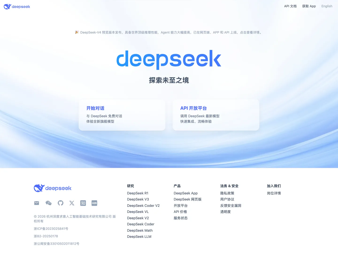
DeepSeek's landing page is the quietest entry point of any major AI lab in 2026. The full-page canvas is a gradient — white at the bottom, a cool misty blue-gray at the top — and against it sits only the wordmark at display scale, a Chinese tagline ("探索未至之境" — "Explore the uncharted territories"), and two entry cards with rounded corners and no background fill. There is no hero section. There is no sub-headline pitch. There is no CTA button in any brand color. Where OpenAI uses a near-black canvas with white display type, Anthropic uses warm cream with editorial serif display, and Google Gemini uses full-spectrum brand colors for each model tier, DeepSeek uses nothing but a gradient and two cards — a restraint so extreme it reads less as minimalism than as institutional confidence. The page assumes you already know why you're here.
The DESIGN.md file captures what little the page exposes: 10 colors tokens covering the five-step slate text palette and the light structural grays; 5 typography tokens all running Inter at weights 400 and 700 across a narrow 14-30px range; 3 border-radius values (6px dominant, 16px and 18px for cards); 8 spacing values; and 12 components definitions covering the gradient hero, the entry cards, the wordmark display, the footer link columns, and the navigation. The extraction captured no primary button component — the page has none. This is the only AI lab landing in the design directory with zero interactive fill components.
Feed this file to an AI coding tool and it reproduces DeepSeek's specific moves: atmospheric gradient canvas instead of a flat background fill, pure slate-scale text without a brand accent, Inter at the same sizes across every tier, and the two-card entry pattern with frosted-glass treatment. The system rewards study if you're building a portal or gateway product that needs to project authority through restraint rather than through conversion optimization. The lesson is negative space as positioning — a page with nothing to prove because the product's reputation precedes it.
What makes it distinct
5
- No primary CTA fillthe two entry cards use frosted-glass backgrounds on a gradient canvas; no button uses a brand-color fill anywhere on the page
- Gradient canvasa white-to-light-blue atmospheric background runs the full-height landing, sourced from --ds-background-start-rgb (214,219,220) and end (255,255,255)
- Five-step slate text palettepure black (#000000) through mid-slate (#475569), cool-slate (#64748b), muted-slate (#94a3b8), and near-white (#ffffff), all Tailwind Slate tokens
- Inter across all tiersthe single typeface with a 15px body and 30px bold display, no separate display family or mono accent
- Bilingual Chinese/English layoutChinese wordmark and Chinese tagline as the hero content, with an English language toggle in the top-right navigation
deepseek.com
Live at deepseek.com
A snapshot of the brand in production. Scroll the frame to see the whole page.
Colors
10 colors
DeepSeek's system runs on #475569 as its primary voltage, used in 4 of 12 components. Type is set in quote-cjk-patch across 5 tokens from 14px to 30px, weights 400–700. Shape language is soft — components average 18px corner radius, with no sharp interactive edges.
Surface
Page and card backgrounds · 3
Text
Headlines, body, captions · 5
Borders & Hairlines
Dividers, outlines, rules · 1
Other
Specialty colors · 1
Typography
5 type tokens
Set in quote-cjk-patch across 5 tokens, from 14px to 30px, weights 400–700. Shown in its own stack: where the font isn't installed, the fallback the file names stands in.
- display-md30px · weight 700 · lh 36pxThe quick brown fox jumps over the lazy dog
- body-lg20px · weight 700 · lh 28pxThe quick brown fox jumps over the lazy dog
- body-md15px · weight 400 · lh 22.5pxThe quick brown fox jumps over the lazy dog
- body-sm14px · weight 400 · lh 20pxThe quick brown fox jumps over the lazy dog
- body-sm-bold15px · weight 700 · lh 22.5pxThe quick brown fox jumps over the lazy dog
Layout
Radii and spacing
4 corner radii and 8 spacing values. Shape language: soft.
Radii
- none0px
- sm6px
- lg16px
- xl18px
Spacing
- xs4px
- sm8px
- md12px
- base24px
- lg32px
- xl40px
- 2xl64px
- 3xl128px
Components
12 components
Each rendered from its tokens (color, type, radius, padding) on DeepSeek's own canvas.
- Top Navtop-navTop Nav
- Nav Linknav-linkNav Link
- Hero Wordmarkhero-wordmarkHero Wordmark
- Hero Taglinehero-taglineHero Tagline
- Hero Canvashero-canvasHero Canvas
- Entry Cardentry-cardEntry Card
- Entry Card Headingentry-card-headingEntry Card Heading
- Entry Card Bodyentry-card-bodyEntry Card Body
- FooterfooterFooter
- Footer Linkfooter-linkFooter Link
- Footer Headingfooter-headingFooter Heading
- Legal Textlegal-textLegal Text
In use
The system, in use
DeepSeek's tokens on the kind of product it builds.
Build something people actually use.
A short paragraph of marketing copy that previews how the brand's display tier and body tier read together. Two sentences is usually enough.
FAQ
DeepSeek design system FAQ
Common questions about DeepSeek's tokens, components, and how to use this DESIGN.md in your project.
Read next
Related reading
Specs, directories, and component libraries that pair with this design system.
- Browse all design systemsThe full directory of DESIGN.md files on shadcn.io, with live mockups for each.shadcn.io
- DeepSeek — official siteDeepSeek's public marketing site — the source of truth for the live tokens captured in this file.deepseek.com (opens in a new tab)
- The DESIGN.md specificationGoogle Labs' open spec for machine-readable design system files — the format this page is built on.github.com (opens in a new tab)
Use it
Use DeepSeek in your project
One machine-readable file. Drop it into Claude, Cursor, or any AI tool that reads DESIGN.md.
Download the DESIGN.md
One machine-readable file: every color, type, radius, spacing, and component token of DeepSeek.
Feed it to your AI tool
Drop it into Claude, Cursor, or GitHub Copilot. The agent writes React components and Tailwind classes that match DeepSeek's visual language.
Reference the tokens directly
Or paste the values into your Tailwind config, CSS variables, or component library: every color, size and radius is a quoted, ready-to-copy value.
Read the full DESIGN.md: overview, rationale, do’s and don’ts
Overview
DeepSeek's landing page operates at a scale of restraint that is genuinely unusual among AI labs in 2026. Negative-space authority. Where OpenAI uses a near-black canvas with white type, Anthropic uses warm cream with editorial serif display, and Google Gemini uses full-spectrum brand colors per model tier, DeepSeek uses a gradient sky and two cards. The page has no hero headline in the marketing sense — the wordmark at display scale IS the headline, the Chinese tagline below it IS the sub-headline, and the two frosted-glass entry cards (Start Chat, API Platform) are the only conversion surface. No CTA button anywhere. No color fill on interactive elements. The system would fail every standard conversion-optimization audit, and it doesn't care.
The palette is a five-step Tailwind Slate ramp: pure black (#000000) for body text at maximum weight, mid-slate (#475569) for secondary text and navigation, cool-slate (#64748b) for tertiary labels, muted-slate (#94a3b8) for the lightest readable text, and near-white (#ffffff) for the canvas. The gradient canvas — misty blue-gray at the top (#d6dbdc approximately) fading to white at the bottom — is the sole chromatic design gesture, and it is not a brand color gesture; it reads as atmosphere rather than as identity. Unlike any other AI lab landing in this directory, DeepSeek's page carries no primary color fill anywhere.
Key Characteristics:
- Atmospheric gradient canvas (cool blue-gray to white, vertical) with no flat-fill hero band.
- Two frosted-glass entry cards as the sole conversion surface — no button components with brand fills.
- Five-step Tailwind Slate palette: the complete structural text system with zero chromatic accent in the UI.
- Inter (via CJK-patched system stack) as the single typeface at 14-30px, weight 400 and 700 only.
- Bilingual Chinese/English layout — Chinese content as the primary brand voice, English toggle in top-right nav.
- Logo blue (#4d6bfe) appears only in the SVG wordmark and the entry card headings — never as a button fill.
- Footer link columns in four categories (Research, Products, Legal & Safety, Join Us) in slim slate text with no decorative separators.
- No shadow on entry cards — depth comes from the white card fill against the gradient canvas alone.
Colors
Structural Text Scale
- Ink (
#000000— frequency 25): Used as text (21), shadow (4). The primary text color at maximum density. Used for the main entry card headings and the Chinese tagline in the hero. The extraction shows it primarily in text and a 4-occurrence shadow (the very subtle card elevation on the entry cards). - Ink Mid (
#475569— frequency 25): Used as text (25). Tailwind Slate 600 — the workhorse secondary text color running navigation links, card body paragraphs, footer body text. The majority of readable UI text runs this value rather than pure black. - Ink Secondary (
#334155— frequency 4): Used as text (4). Tailwind Slate 700 — appears in footer section headings, one step darker than Ink Mid. - Ink Subtle (
#64748b— frequency 2): Used as text (2). Tailwind Slate 500 — tertiary text for the lightest non-muted prose. - Ink Muted (
#94a3b8— frequency 18): Used as text (18). Tailwind Slate 400 — the lightest readable slate; runs legal text, copyright, and the most secondary footer annotations.
Structural Surfaces
- Canvas (
#ffffff— frequency 2): Used as bg (2). The entry card and footer background fill. The full-page canvas is the gradient rather than white — pure white appears only in the entry cards floating against the gradient. - Hairline (
#e5e7eb— frequency 45): Used as border (45). Tailwind Gray 200 — the single border color in the system. Every card border and hairline separator uses this value. 45 occurrences reflect the systematic use of 1px borders across the card and footer grid. - Surface Cool (
#f1f5f9— frequency 2): Used in shadow (2). Appears in the subtle shadow on the entry cards — a nearly-invisible cool-gray shadow against the gradient canvas. - Canvas Start (
#d6dbdc): The gradient top stop, sourced from --ds-background-start-rgb. Not in the color cluster (appears only in CSS variables) but structurally essential.
Brand
- Logo Blue (
#4d6bfe— frequency 4): Used as text (4). The wordmark blue — appears in the DeepSeek SVG logo and in the entry card section headings ("开始对话", "API开放平台" render in this tone). The closest value to a brand identity color, but never used as an interactive fill.
Typography
Font Family
The system declares a single typeface stack: "quote-cjk-patch", Inter, system-ui, -apple-system, "system-ui", "Segoe UI", Roboto, Oxygen, Ubuntu, Cantarell, "Open Sans", "Helvetica Neue", sans-serif. The quote-cjk-patch prefix is a proprietary CJK font patch that ensures Chinese characters render correctly in the bilingual UI — it would be invisible on English-only builds. Effective typeface: Inter. There is no display family, no serif accent, no monospace tier.
Hierarchy
| Token | Size | Weight | Line Height | Use |
|---|---|---|---|---|
display-md | 30px | 700 | 36px | Chinese wordmark tagline / section heading |
body-lg | 20px | 700 | 28px | Entry card section headings |
body-md | 15px | 400 | 22.5px | Navigation links, card body, footer body |
body-sm | 14px | 400 | 20px | Footer links, legal text |
body-sm-bold | 15px | 700 | 22.5px | Footer section headings |
Principles and Substitutes
The type system carries five tokens where most systems carry twelve or more. There is no small caption tier, no label mono tier, no heading-md or heading-sm — just body sizes at two weights. Inter is freely available via Google Fonts. For CJK rendering on a bilingual product, the CJK-patched stack requires attention: Noto Sans SC or Source Han Sans provide the Chinese character coverage that Inter alone lacks.
Layout
The landing runs a single centered-column layout with a max content width of approximately 1230px. The hero occupies the full viewport height with the gradient canvas. Below the fold, the footer runs a four-column link grid against a white canvas.
- Base spacing: 24px module (dominant single value at 2 occurrences; -2px appears 31 times as a text-indent normalization, not a layout value).
- Hero vertical padding: 128px top, 160px bottom — generous vertical space that lets the gradient breathe and positions the entry cards above the page center.
- Entry cards: two-column grid, approximately 440px each, 18px radius, 24x32x28 padding.
- Footer: four-column link grid, 64px top padding, white canvas replacing the gradient.
The page has essentially two zones: the gradient hero (full-bleed, centered content, vertical whitespace-dominant) and the white footer (structural columns, link lists, legal text). No intermediate sections, no feature grids, no testimonial bands. The most minimal page structure in the design directory.
Elevation
The entry cards carry a barely-perceptible elevation. The extraction shows #f1f5f9 (a cool near-white) appearing twice in shadow roles — this is the card's shadow, which is so light it reads as atmospheric haze against the gradient canvas rather than as a discrete shadow layer. There is no shadow tier in any conventional sense; the card depth effect comes almost entirely from the white card fill contrasting against the misty gradient floor. No border-radius shadow, no multi-layer drop shadow, no inner glow.
Shapes
Three radius values cover the entire system:
rounded.none(0px) — navigation and footer text links; no decorative shape treatment.rounded.sm(6px) — the dominant radius, appearing 31 times in the extraction. Used for minor UI surfaces and the nav container.rounded.lg(16px) — entry card outer radius.rounded.xl(18px) — the two main entry cards use 18px radius rather than a round number, suggesting a deliberate choice away from the Tailwind default 16px to achieve a slightly softer visual.
The entry cards are the system's sole shape statement. Everything else is either fully squared or uses the small 6px default.
Components
top-nav — Transparent background, 56px height, 32px horizontal padding. Navigation items in 15px Inter weight 400 mid-slate, with an English language toggle at the right. The nav bar sits above the gradient hero with no background fill — the gradient shows through, making the nav appear to float in the haze.
nav-link — Transparent, mid-slate text at 15px weight 400, 4x8 padding. "API 文档" (API Docs), "获取 App" (Get App), and the "English" toggle — the only three nav items captured.
hero-wordmark — The "deepseek" wordmark in logo blue (#4d6bfe), rendered at display scale via the SVG logo component rather than as typeset text. The visual anchor of the hero.
hero-tagline — "探索未至之境" in 30px Inter weight 700, pure black, centered below the wordmark. The hero's single typeset line.
hero-canvas — Full-viewport gradient background, cool blue-gray to white, 128px top padding, 160px bottom padding. The defining visual statement of the page.
entry-card — White fill, 1px light gray border (#e5e7eb), 18px radius, 24x32x28 padding. The two-column card pair "Start Chat" and "API Platform" floating in the gradient canvas.
entry-card-heading — Logo blue (#4d6bfe) text at 20px weight 700. The card section titles ("开始对话" / "API开放平台"). The one place logo blue appears as rendered text rather than as an SVG fill.
entry-card-body — Mid-slate text at 15px weight 400. The card sub-text ("与 DeepSeek 免费对话" / "调用 DeepSeek 最新模型").
footer — White canvas, 64px top padding, four-column link grid. The footer is the only section that uses a flat white background rather than the gradient.
footer-link — Mid-slate text at 14px weight 400, no underline, 4px bottom padding. Used for all product and research link items in the footer columns.
footer-heading — Slate-700 (#334155) text at 15px weight 700, 12px bottom padding. Column category headings: "研究" (Research), "产品" (Products), "法务 & 安全" (Legal & Safety), "加入我们" (Join Us).
legal-text — Muted slate (#94a3b8) at 14px weight 400. Copyright notice, ICP registration numbers, and compliance identifiers that appear at the base of the footer.
Do's and Don'ts
Do use the gradient canvas as a full-viewport fill — the atmospheric haze is the entire visual identity statement of the landing. Constraining it to a hero band or replacing it with a flat background removes the only design gesture the page makes.
Do keep the five-step slate ramp intact and assign each step to the correct semantic depth. Pure black (#000000) for primary headings, mid-slate (#475569) for secondary prose and navigation, muted-slate (#94a3b8) for legal and caption text. Compressing to two or three steps loses the tonal legibility that gives the minimal page its hierarchy.
Do use 18px radius on the entry cards rather than the more common 16px. The subtle difference distinguishes the card corners from standard Tailwind defaults — a half-degree of softness that reads as intentional rather than default.
Do maintain the bilingual layout hierarchy — Chinese content as primary, English as secondary. If adapting this system for an English-only context, the display heading should run at the same weight (700) and scale (30px) rather than switching to a display font to compensate for the missing Chinese character density.
Don't add a primary CTA button in logo blue (#4d6bfe) to the hero. The entire design argument of this landing is that the product's reputation arrives before the page does; introducing a filled CTA button contradicts that positioning and makes the page read as a conventional conversion-optimized landing that happens to be minimal, rather than as genuine authority.
Don't use {colors.logo-blue} (#4d6bfe) for any surface larger than a heading or a small logo mark. At 4 total occurrences in the extraction, the blue is intentionally rare — scaling it to card fills or section backgrounds would transform an identity signal into a palette color.
Don't introduce shadow elevation beyond the near-invisible haze the entry cards carry. A standard box-shadow: 0 4px 12px rgba(0,0,0,0.1) would make the cards read as a consumer-app modal floating above content — the current barely-there elevation is what keeps them reading as objects resting in the gradient atmosphere.
Don't replace the gradient canvas with a flat near-white or pure white background. The gradient is the page's only design gesture; on a uniform canvas, the wordmark-only layout reads as an unfinished placeholder rather than as confident restraint.
Known Gaps
- Gradient stops: the exact gradient values come from CSS variables (--ds-background-start-rgb: 214,219,220 / --ds-background-end-rgb: 255,255,255) rather than from the color cluster, so they cannot be validated against the extraction's color list. The canvas-start token is an approximation.
- Hover and interaction states: the entry cards presumably change visual state on hover but no hover capture was taken. The absence of an interactive fill color makes the hover state design critical and undocumented here.
- Mobile layout: the desktop-1440px two-column entry card layout is captured. Mobile behavior (card stacking, nav collapse) is not documented.
- Chat product UI: the actual DeepSeek chat interface (chat.deepseek.com) runs a substantially richer dark-mode design with sidebar navigation, message bubbles, and file attachments. None of that is represented here — this file covers the landing page only.
- API documentation site: the API docs site has its own visual system distinct from the landing page.
- Dynamic announcement banner: the top-of-page announcement banner ("DeepSeek-V4 Preview now available") uses inline text and a party-popper emoji — its typography and spacing are not formally captured as tokens here.
- Logo color: the wordmark blue (#4d6bfe) appears in the SVG logo but not as a named CSS variable. Its precise color may vary between contexts (dark background, light background).
AI & LLM Platforms
More systems like this
More DESIGN.md files in AI & LLM Platforms.
Pricing
Build it with Pro
The DESIGN.md files are free. Pro adds 6,000+ blocks, premium templates and the MCP server, so your AI editor builds in your system for you.
4.9/5 out of 5 · 150+ reviewsfrom 150+ founders and developers.
Billing
Billed once a year in USD. Cancel anytime.
- How many people can use the license.
- Client work, SaaS products and anything you charge for.
- Production-ready React sections: hero, pricing, features, dashboards and more.
- Complete multi-page sites you can ship as they are.
- React icons from every major library, installable with one command.
- Presets that restyle every block, in light and dark.
- Lets your AI editor search, preview and install blocks for you.
- Priority requests are answered first.
Individual
For personal projects & open source
$32instead of $49/mo
$389 billed yearly
- Seats: 1 seat
- Commercial use: Personal & open source only
- Pro blocks: 6,000+ blocks
- Templates: All 14 templates
- React icons: 294k+ icons
- Themes: All 59 themes
- MCP server: Basic usage
- Support: Standard
Team
Most popularFor freelancers, agencies & startups
$66instead of $99/mo
$789 billed yearly · ≈ $13/dev/mo
- Seats: Up to 5 seats
- Commercial use: Included
- Pro blocks: 6,000+ blocks
- Templates: All 14 templates
- React icons: 294k+ icons
- Themes: All 59 themes
- MCP server: High usage
- Support: Priority
Organization
For companies with larger teams
$132instead of $199/mo
$1,589 billed yearly
- Seats: Unlimited seats
- Commercial use: Included
- Pro blocks: 6,000+ blocks
- Templates: All 14 templates
- React icons: 294k+ icons
- Themes: All 59 themes
- MCP server: Unlimited usage
- Support: Priority
Billed once a year in USD. Cancel anytime.
Individual
For personal projects & open source
$32instead of $49/mo
$389 billed yearly
- How many people can use the license.Seats: 1 seat
- Client work, SaaS products and anything you charge for.Commercial use: Personal & open source only
- Production-ready React sections: hero, pricing, features, dashboards and more.Pro blocks: 6,000+ blocks
- Complete multi-page sites you can ship as they are.Templates: All 14 templates
- React icons from every major library, installable with one command.React icons: 294k+ icons
- Presets that restyle every block, in light and dark.Themes: All 59 themes
- Lets your AI editor search, preview and install blocks for you.MCP server: Basic usage
- Priority requests are answered first.Support: Standard
Team
Most popularFor freelancers, agencies & startups
$66instead of $99/mo
$789 billed yearly · ≈ $13/dev/mo
Everything in Individual, plus
- How many people can use the license.Seats: Up to 5 seats
- Client work, SaaS products and anything you charge for.Commercial use: Included
- Lets your AI editor search, preview and install blocks for you.MCP server: High usage
- Priority requests are answered first.Support: Priority
Organization
For companies with larger teams
$132instead of $199/mo
$1,589 billed yearly
Everything in Team, plus
- How many people can use the license.Seats: Unlimited seats
- Lets your AI editor search, preview and install blocks for you.MCP server: Unlimited usage
- Secure checkout via Stripe
- Code lives in your repo
- Keep what you've shipped if you cancel
- License terms
Your system, built for you
Every block, template and icon, installed by your AI agent in your design system. The DESIGN.md files stay free.