Daytona Design System
Daytona's rebranded marketing system runs Inter display on a near-black canvas with Berkeley Mono uppercase labels and emerald terminal accents. Tokens for React, Next.js, and AI coding tools.
Add shadcn.io to your AI agent. · Pro It installs blocks, icons and templates in your design system from a prompt, with Pro.
Set up MCP- Primary
- #0000ee
- Typeface
- Inter
- Shape
- Soft
- Base radius
- 8px
- Colors
- 18
- Type tokens
- 13
- Components
- 14
- Spacing values
- 11
About
About Daytona DESIGN.md
Curated by Dov Azencot · Updated May 18, 2026 · Source daytona.io (opens in a new tab)
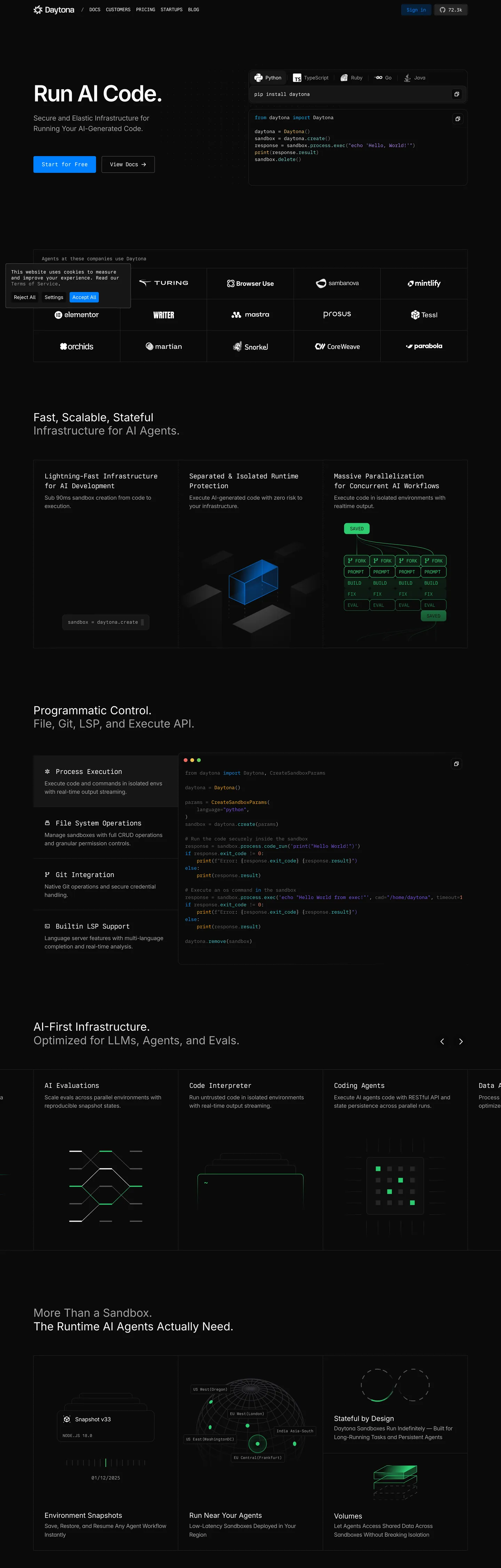
Daytona's recently-rebranded marketing site does what most dev-environment brands hesitate to commit to: a true all-black canvas with white Inter display headlines and Berkeley Mono uppercase labels everywhere. The hero pairs a 48px Inter weight 400 headline "Run AI Code." with a Python code-snippet panel rendered in Berkeley Mono, plus a cobalt-pill "Start for free" CTA and a transparent "View Docs" secondary. Where Vercel keeps its hero matte black with a Geist sans wordmark and Codespaces leans on a Microsoft-blue gradient, Daytona runs ink-black with a licensed monospace doing every label and section divider, plus emerald-green terminal cursors inside the IDE screenshots that anchor every section.
The DESIGN.md file packages the system into a machine-readable spec for React and AI tools. Inside: 18 colors tokens — ink-black canvas, near-black surface tiers (#0a0a0a, #161616), four gray text tiers, a cobalt CTA fill (#0000ee), the single brand-layer emerald (#2ecc71), and a constellation of terminal-syntax accents (cobalt, sky, amber, violet, coral) borrowed from the live IDE screenshots. 13 typography tokens span Inter at display, heading, body, and label tiers, Berkeley Mono for every uppercase label and code sample, plus IBM Plex Mono for the secondary code-snippet tier inside the hero. 8 radius tokens centered on the unusual 57px pseudo-pill that distinguishes Daytona's buttons from generic full-pill CTAs.
Feed this file to Claude or Cursor and it reproduces Daytona's specific moves: true-black canvas instead of a near-black matte, Inter display weight 400 (not 700), Berkeley Mono for every uppercase label and divider, emerald-on-black terminal cursors as the only brand voltage, and the live-IDE-screenshot convention that anchors every section card. The one move worth borrowing only if your product is itself a code-execution platform: emerald-as-cursor. Most teams use green for success badges or chart accents; Daytona reserves it for the literal blinking terminal cursor, and the restraint is what makes it read as evidence rather than decoration.
What makes it distinct
5
- Live-IDE-as-evidenceevery section card is anchored by a small isolated screenshot of the Daytona terminal with emerald-green cursors and Berkeley Mono code samples
- Inter plus Berkeley Monothe marketing voice splits cleanly between Inter sans for prose and Berkeley Mono for every uppercase label, code sample, and small-caps section divider
- Single emerald voltage`#2ecc71` terminal-green is the only brand-layer chromatic moment, reserved for live cursors, success states, and the network-topology diagrams
- Cobalt blue CTAthe primary action pill uses a saturated `#0000ee` web-blue that reads as a deliberate throwback to default browser link color
- 57px pseudo-pill radiusthe system's signature button shape uses an unusual 57px corner rounding rather than the conventional 9999px full pill, soft but not perfectly circular
daytona.io
Live at daytona.io
A snapshot of the brand in production. Scroll the frame to see the whole page.
Colors
18 colors
Daytona's system runs on #0000ee as its primary voltage, used in 1 of 14 components. Type is set in Inter across 13 tokens from 12px to 48px, weights 400–500. Shape language is soft — components average 29px corner radius, with no sharp interactive edges.
Brand & Accent
Sparing, CTA-only voltage · 1
Surface
Page and card backgrounds · 4
Text
Headlines, body, captions · 5
Borders & Hairlines
Dividers, outlines, rules · 1
Other
Specialty colors · 7
Typography
13 type tokens
Set in Inter across 13 tokens, from 12px to 48px, weights 400–500. Shown in its own stack: where the font isn't installed, the fallback the file names stands in.
- display-xl48px · weight 400 · lh 57.6pxThe quick brown fox jumps over the lazy dog
- display-md32px · weight 400 · lh 38.4pxThe quick brown fox jumps over the lazy dog
- heading-md20px · weight 400 · lh 24pxThe quick brown fox jumps over the lazy dog
- body-lg20px · weight 500 · lh 30px · tracking -0.2pxThe quick brown fox jumps over the lazy dog
- body-md16px · weight 400 · lh 25.6px · tracking -0.16pxThe quick brown fox jumps over the lazy dog
- body-sm14px · weight 400 · lh 24px · tracking -0.14pxThe quick brown fox jumps over the lazy dog
- nav-link12px · weight 500 · lh 16.8px · tracking -0.24pxThe quick brown fox jumps over the lazy dog
- mono-lead20px · weight 400 · lh 28px · tracking -0.8pxThe quick brown fox jumps over the lazy dog
- mono-body16px · weight 400 · lh 22.4px · tracking -0.64pxThe quick brown fox jumps over the lazy dog
- mono-label12px · weight 400 · lh 12px · tracking -0.12pxThe quick brown fox jumps over the lazy dog
- mono-divider14px · weight 400 · lh 19.32px · tracking -0.56pxThe quick brown fox jumps over the lazy dog
- code-block14px · weight 400 · lh 21pxThe quick brown fox jumps over the lazy dog
- code-small14px · weight 400 · lh 20pxThe quick brown fox jumps over the lazy dog
Layout
Radii and spacing
8 corner radii and 11 spacing values. Shape language: soft.
Radii
- none0px
- xs1.8px
- sm4px
- md8px
- lg10px
- xl12px
- pill57px
- full9999px
Spacing
- xs4px
- sm8px
- md10px
- base12px
- lg16px
- xl24px
- 2xl32px
- 3xl40px
- 4xl48px
- 5xl64px
- 6xl80px
Components
14 components
Each rendered from its tokens (color, type, radius, padding) on Daytona's own canvas.
- Button Primarybutton-primaryButton Primary
- Button Secondarybutton-secondaryButton Secondary
- Top Navtop-navTop Nav
- Nav Linknav-linkNav Link
- Hero Headinghero-headingHero Heading
- Section Headingsection-headingSection Heading
- Body Paragraphbody-paragraphBody Paragraph
- Body Paragraph Mutedbody-paragraph-mutedBody Paragraph Muted
- Mono Captionmono-captionMono Caption
- Card Featurecard-featureCard Feature
- Code Panelcode-panelCode Panel
- Logo Chiplogo-chipLogo Chip
- Type here…text-inputText Input
- FooterfooterFooter
In use
The system, in use
Daytona's tokens on the kind of product it builds.
Build something people actually use.
A short paragraph of marketing copy that previews how the brand's display tier and body tier read together. Two sentences is usually enough.
import { build } from "./build"

export async function main() {
  const result = await build()
  console.log("done", result)
}
FAQ
Daytona design system FAQ
Common questions about Daytona's tokens, components, and how to use this DESIGN.md in your project.
Read next
Related reading
Specs, directories, and component libraries that pair with this design system.
- Browse all design systemsThe full directory of DESIGN.md files on shadcn.io, with live mockups for each.shadcn.io
- Daytona — official siteDaytona's public marketing site — the source of truth for the live tokens captured in this file.daytona.io (opens in a new tab)
- The DESIGN.md specificationGoogle Labs' open spec for machine-readable design system files — the format this page is built on.github.com (opens in a new tab)
Use it
Use Daytona in your project
One machine-readable file. Drop it into Claude, Cursor, or any AI tool that reads DESIGN.md.
Download the DESIGN.md
One machine-readable file: every color, type, radius, spacing, and component token of Daytona.
Feed it to your AI tool
Drop it into Claude, Cursor, or GitHub Copilot. The agent writes React components and Tailwind classes that match Daytona's visual language.
Reference the tokens directly
Or paste the values into your Tailwind config, CSS variables, or component library: every color, size and radius is a quoted, ready-to-copy value.
Read the full DESIGN.md: overview, rationale, do’s and don’ts
Overview
Daytona's recently-rebranded marketing site does what most dev-environment platforms hesitate to commit to. Live-IDE-as-evidence. Every section card is anchored by a small isolated screenshot of the Daytona terminal — emerald {colors.emerald} (#2ecc71) blinking cursors, Berkeley Mono code samples on near-black panels, and IBM Plex Mono Python snippets in the hero. Where Vercel paints its hero matte black with a single Geist sans wordmark and where Codespaces leans on Microsoft-blue gradients, Daytona runs true ink-black with Inter display, Berkeley Mono uppercase labels, and emerald-cursor terminal screenshots that anchor every section as if the marketing page itself were a documentation site for the live product.
The chromatic system has two distinct voltages and the discipline to keep them separate. Cobalt-blue {colors.primary} (#0000ee) carries every link and the primary CTA pill (240 occurrences in the captured page, almost all on anchors), reading as a deliberate throwback to the default browser link color. Emerald {colors.emerald} (#2ecc71) is the single brand-layer color in the extraction — reserved exclusively for live terminal cursors inside IDE screenshots, the network-topology diagram nodes, and a single inline success-state badge. The remaining accents ({colors.syntax-cobalt}, {colors.syntax-sky}, {colors.syntax-amber}, {colors.syntax-violet}) are terminal-syntax tones borrowed from the IDE screenshots, not brand chrome. The discipline is the inverse of Cloudflare's voltage-as-canvas: Daytona holds two voltages tight in reserve and lets the IDE evidence carry the page.
The typographic split is the structural device. Inter runs every spoken surface — display, heading, body, button, nav — at modest weights (400-500 across the system). Berkeley Mono Regular runs every uppercase label, every section divider, every code sample, and every meta caption — appearing 66 times in the captured page as the dominant labeling voice. A secondary IBM Plex Mono tier carries the Python code snippets inside the hero panel. The pairing is closer to a documentation site (Stripe Docs, MDN) than to a typical SaaS marketing page, and it does the heavy lifting that holding the chromatic palette to two voltages would otherwise leave open.
Key Characteristics:
- True ink-black canvas (
{colors.canvas}— #000000), with secondary surfaces stepping through{colors.surface-1}(#0a0a0a) and{colors.surface-2}(#161616) at 6% and 14% lightness — no matte softening anywhere. - Two chromatic voltages held tight: cobalt-blue
{colors.primary}for every link and the primary CTA pill; emerald{colors.emerald}reserved for live terminal cursors and topology-diagram nodes. - Inter display at weight 400 (not 700) at 48px for the hero, paired with Berkeley Mono Regular at 12-14px for every uppercase label and section divider.
- Live IDE screenshots anchor every section card — Berkeley Mono code on near-black panels with emerald cursors, treated as evidence rather than decoration.
- 57px pseudo-pill button radius — the system's signature corner, neither the conventional 9999px full pill nor a standard 4-8px rounded rectangle.
- Hairline-on-near-black cards:
{colors.surface-3}(#252525) carries 1px borders against{colors.surface-1}(#0a0a0a) fills, lifting feature cards off the canvas through tonal contrast alone. - Customer logo wall renders in muted gray (
{colors.ink-muted}) at uniform size — Sembrance, Mintlify, Browser Use, Turing, Elementor, Maestra, Prosus, Tessl, Orchids, Martian, Snorkel, CoreWeave, parabola, Lovable. - 80×0px section padding on major editorial bands; the hero sits at 128×48px for extra breathing room.
Colors
Brand
- Emerald (
{colors.emerald}— #2ecc71): frequency 3 (1 text, 1 border, 1 gradient). The single brand-layer color in the extraction — reserved for live terminal cursors inside IDE screenshots, the network-topology diagram nodes in the "Massive Parallelization" section, and a single inline success-state badge. The restraint is the brand's typographic signature: one terminal-green, reserved for evidence rather than decoration. - Primary (
{colors.primary}— #0000ee): frequency 240 (120 text, 120 border). The CTA and link color — fills the "Start for free" pill, carries every anchor link on the page, and outlines the primary button on hover. The saturated value reads as a deliberate throwback to default browser-link blue, not a designed brand tone.
Surface
- Canvas (
{colors.canvas}— #000000): frequency 2579 (1285 text, 4 background, 1285 border, 5 shadow). The page floor — true ink-black, no near-black softening. Wired implicitly through Framer's defaults — the page does not expose explicit CSS custom properties for these tones. - Surface-1 (
{colors.surface-1}— #0a0a0a): frequency 63 (50 background, 13 gradient). The first elevation step — feature-card fills and the "Fast, Scalable, Stateful Infrastructure" section background. - Surface-2 (
{colors.surface-2}— #161616): frequency 20 (6 text, 8 background, 6 border). The second elevation step — code-panel fills inside the hero and the "Programmatic Control" section's process-execution panel. - Surface-3 (
{colors.surface-3}— #252525): frequency 14 (1 background, 13 shadow). The hairline border tone — carries 1px outlines on feature cards and code panels against the darker surface tiers.
Text
- Ink (
{colors.ink}— #ffffff): frequency 367 (180 text, 7 background, 180 border). The dominant text color — hero headlines, section h2s, feature-card titles, body paragraphs. - Ink Muted (
{colors.ink-muted}— #a2a2a2): frequency 300 (150 text, 150 border). Secondary running-text — caption rows, "Learn more" links, nav-link inactive state, customer logo tone. Merges two near-equivalent mid-gray tones in the extraction. - Ink Soft (
{colors.ink-soft}— #bbbbbb): frequency 72 (36 text, 36 border). A lighter secondary tier for emphasis within muted copy. - Ink Faint (
{colors.ink-faint}— #666666): frequency 136 (68 text, 68 border). Tertiary captions and meta text inside the IDE screenshots. - Ink Deep (
{colors.ink-deep}— #585858): frequency 13 (6 text, 6 border, 1 shadow). The darkest gray text tone, used for footnote and small-meta rows.
Hairline
- Hairline (
{colors.hairline}— #eeeeee): frequency 38 (19 text, 19 border). The light-gray accent on inverted surfaces — appears inside dark-on-light callouts within IDE screenshots, never on the main marketing chrome.
Terminal Syntax
- Syntax Cobalt (
{colors.syntax-cobalt}— #0080ff): frequency 13 (5 text, 3 background, 5 border). The cobalt syntax accent inside code samples — distinct from the link-blue{colors.primary}. Merges two near-equivalent cobalt tones in the extraction. - Syntax Sky (
{colors.syntax-sky}— #00bbff): frequency 4 (2 text, 2 border). The light-blue terminal accent inside the network-topology diagrams. - Syntax Amber (
{colors.syntax-amber}— #ffaa00): frequency 12 (6 text, 6 border). The terminal-warning yellow inside IDE screenshots — used for in-progress states. - Syntax Violet (
{colors.syntax-violet}— #8855ff): frequency 12 (6 text, 6 border). The terminal-purple accent inside IDE screenshots. - Syntax Teal (
{colors.syntax-teal}— #33cccc): frequency 28 (14 text, 14 border). The Daytona logo color inside the wordmark and the topology-diagram node-type indicator. - Syntax Coral (
{colors.syntax-coral}— #ff8866): frequency 6 (3 text, 3 border). The terminal-error coral accent inside IDE screenshots.
Typography
Font Families
The system runs three voices: Inter (and Inter Variable) for every spoken surface, Berkeley Mono Regular for every uppercase label and section divider, and IBM Plex Mono for the Python code snippets inside the hero panel and inside larger code-sample tiles. Fallbacks walk sans-serif and monospace respectively, with the Inter Placeholder family declared as a webfont-loading fallback.
The pairing of Inter + Berkeley Mono is the typographic signature. Berkeley Mono is licensed (Berkeley Graphics) and uncommon in marketing pages outside design-conscious developer brands like Linear's docs and Vercel's terminal — its presence here signals craft awareness. The secondary IBM Plex Mono inside hero code snippets is open-source and serves a different role: code-as-content rather than label-as-system-voice.
Hierarchy
| Token | Size | Weight | Line Height | Letter Spacing | Use |
|---|---|---|---|---|---|
{typography.display-xl} | 48px | 400 | 57.6px | 0 | Hero h1 ("Run AI Code on Daytona") |
{typography.display-md} | 32px | 400 | 38.4px | 0 | Section h2/h3 ("Fast, Scalable, Stateful Infrastructure for AI Agents") |
{typography.heading-md} | 20px | 400 | 24px | 0 | Sub-section titles, h5 |
{typography.body-lg} | 20px | 500 | 30px | -0.2px | Hero sub-paragraph, lead copy |
{typography.body-md} | 16px | 400 | 25.6px | -0.16px | Default running text |
{typography.body-sm} | 14px | 400 | 24px | -0.14px | Button labels, caption rows |
{typography.nav-link} | 12px | 500 | 16.8px | -0.24px | Top-nav link labels |
{typography.mono-lead} | 20px | 400 | 28px | -0.8px | Larger mono callouts inside IDE screenshots |
{typography.mono-body} | 16px | 400 | 22.4px | -0.64px | Berkeley Mono body samples |
{typography.mono-label} | 12px | 400 | 12px | -0.12px | Uppercase section labels ("PROCESS EXECUTION", "FILE SYSTEM OPERATIONS") |
{typography.mono-divider} | 14px | 400 | 19.32px | -0.56px | Uppercase section dividers ("AI-FIRST INFRASTRUCTURE") |
{typography.code-block} | 14px | 400 | 21px | 0 | IBM Plex Mono Python code samples inside the hero panel |
{typography.code-small} | 14px | 400 | 20px | 0 | IBM Plex Mono inline code spans |
Principles
The hero h1 at 48px / 400 carries no letter-spacing adjustment — Inter at its default tracking does the work, and the modesty of the weight 400 treatment is the move to preserve. Bumping to 700 would turn the editorial dek into a generic SaaS shout and pull focus from the cobalt-pill CTA underneath. Body lead copy sits at weight 500 (slightly heavier than the display) to compensate for its smaller 20px size — an inverted weight relationship that reads as quietly confident.
Berkeley Mono carries the work that an uppercase tracked-wide sans label tier would normally do. The 12px / -0.12px tracking on {typography.mono-label} reads as small-caps without ever being uppercase-set in sans — the mono itself does the small-caps work. Section dividers ("AI-FIRST INFRASTRUCTURE", "MORE THAN A SANDBOX") render at 14px Berkeley Mono uppercase with -0.56px tracking, anchoring each editorial band as if the page were structured like terminal output.
Note on Font Substitutes
Inter is open-source (SIL OFL); no substitute needed. Berkeley Mono is licensed — for an open-source alternative, JetBrains Mono or IBM Plex Mono transfer cleanly at the same sizes (and Daytona ships IBM Plex Mono as the secondary mono inside hero code panels). The slightly-narrower glyph proportions of Berkeley Mono are the distinctive feature; if you need to match them more precisely, iA Writer Mono is the closest open-source proxy.
Layout
Spacing System
- Base unit: 4px (with 8px and 10px as the dominant modules in the extraction — 8px appears 101 times, 10px appears 98 times).
- Tokens:
{spacing.xs}4px ·{spacing.sm}8px ·{spacing.md}10px ·{spacing.base}12px ·{spacing.lg}16px ·{spacing.xl}24px ·{spacing.2xl}32px ·{spacing.3xl}40px ·{spacing.4xl}48px ·{spacing.5xl}64px ·{spacing.6xl}80px. - Section padding (vertical): ~80px between major editorial bands (11 occurrences of 80×0px); the hero sits at 128×48px for extra breathing.
- Card internal padding:
{spacing.2xl}(32px) for{component.card-feature}and 32×32×36px on the irregular extruded feature panels. - Top-nav padding:
{spacing.base}(12px) vertical,{spacing.2xl}(32px) horizontal.
Grid & Container
- Max content width: ~1280px on the section h2 and the 3-up feature grid; the hero band sits inside a narrower ~1080px text + code-panel split.
- Hero: 2-column split — flush-left text block ("Run AI Code on Daytona") paired with a Python code-snippet panel on the right (
pip install daytona+ import + sandbox creation). - Customer logo wall: 5-column grid of monochrome customer marks (Sembrance, Mintlify, Browser Use, Turing, Elementor — repeats below with Maestra, Prosus, Tessl, Orchids, Martian, Snorkel, CoreWeave, parabola, Lovable).
- Feature grid: 3-column row of near-black feature cards each anchored by a small isolated IDE screenshot ("Lightning-Fast Infrastructure" / "Separated & Isolated Runtime Protection" / "Massive Parallelization for Concurrent AI Workflows").
- Programmatic Control band: 2-column layout pairing a left-rail of mono-labeled sections (PROCESS EXECUTION / FILE SYSTEM OPERATIONS / GIT INTEGRATION / BUILT-IN LSP SUPPORT) with a single large IDE screenshot on the right.
- AI-First Infrastructure row: 4-column horizontal-scroll carousel of IDE-screenshot tiles ("AI Evaluations / Code Interpreter / Coding Agents / Data Analysis").
Rhythm
The page alternates between wide editorial bands (the hero, the feature trios) and dense documentation-style sections (the Programmatic Control left-rail, the AI-First Infrastructure carousel). Every band terminates on the same ink-black canvas — there are no atmospheric gradients between bands, and depth comes from {colors.surface-1} cards lifted off the canvas through tonal contrast rather than through any background-color shifts.
Elevation
The system has essentially no shadow tier. The captured page has 5 occurrences of #000000 shadow ink and 13 occurrences of #252525 shadow ink — both confined to the soft resting elevation under feature cards and code panels. The canvas is too dark for traditional drop shadows to read; instead, hierarchy comes from {colors.surface-1} and {colors.surface-2} tiles lifted off the {colors.canvas} floor through tonal contrast.
- Flat (no shadow): hero, body bands, feature cells, logo wall, footer — 99% of surfaces.
- Tonal lift:
{colors.surface-1}(#0a0a0a) cards on{colors.canvas}(#000000);{colors.surface-2}(#161616) panels nested inside{colors.surface-1}cards — the 6 and 14% lightness gaps read as elevation without any shadow being drawn. - Hairline outlines:
{colors.surface-3}(#252525) marks card and code-panel borders against the darker surface tiers. The 14-point lightness gap from surface-2 to surface-3 makes the hairline read on near-black canvases where a pure white-with-alpha border would punch too hard.
Shapes
The radius scale is dual-track — a standard small-step tier plus a signature 57px pseudo-pill:
{rounded.none}0px — only on the dark footer band and full-bleed sections.{rounded.xs}1.8px — micro-rounding on chart and gauge tick marks inside IDE screenshots.{rounded.sm}4px — small UI surfaces inside IDE screenshots and category chips.{rounded.md}8px — icon buttons and dropdown items.{rounded.lg}10px — the dominant card radius for code panels.{rounded.xl}12px — feature-card outer radius.{rounded.pill}57px — the signature button radius, appearing 33 times in the captured page. At the 32-40px button height the 57px radius reads as a fully-rounded pill, but on wider surfaces it carries a slightly-different curve than a true 9999px pill.{rounded.full}9999px — circular icon buttons and the avatar chips inside customer testimonials (rendered as100%in the captured CSS, appearing 18 times).
The 57px choice is the system's signature. It isn't on a 4/8px scale and it isn't the conventional full-pill 9999px — it's a hand-picked value that reads as a pill at button height but carries a distinct curve at larger surfaces.
Components
button-primary — The signature CTA. Cobalt {colors.primary} fill, white text, {typography.body-sm} (14px / 400), {rounded.pill} 57px pseudo-pill, 8x16px padding, 32px height. "Start for free" is the canonical instance.
button-secondary — Transparent fill with white text and a 1px {colors.surface-3} border. {rounded.pill} 57px pseudo-pill, 8x16px padding, 32px height. "View Docs" is the canonical instance, paired directly beside the primary CTA in the hero.
top-nav — Ink-black {colors.canvas} surface, 64px height, 12x32px padding. Daytona wordmark flush left, product nav links (Docs / Customers / Pricing / Startups / Blog) center, "Sign in / Try It" cluster flush right with the cobalt-pill CTA.
nav-link — Transparent background, muted {colors.ink-muted} text in {typography.nav-link} (12px / 500), 0x8px padding. No hover background visible in the captured surface.
hero-heading — White text on the transparent canvas, {typography.display-xl} (48px / 400). The single weight-400 display moment at this size — modesty by tracking and color contrast, not by weight.
section-heading — White text, {typography.display-md} (32px / 400). Used for "Fast, Scalable, Stateful Infrastructure for AI Agents," "Programmatic Control. File, Git, LSP, and Execute API," "AI-First Infrastructure. Optimized for LLMs, Agents, and Evals."
body-paragraph — Default white text at {typography.body-lg} (20px / 500). The hero sub-paragraph and section leads — slightly heavier than the display to balance the smaller size.
body-paragraph-muted — {colors.ink-muted} (#a2a2a2) text at {typography.body-md} for caption rows and secondary explanations under feature cards.
mono-caption — Berkeley Mono at {typography.mono-label} (12px / 400 / -0.12px tracking), uppercase. Carries section dividers ("PROCESS EXECUTION", "AI-FIRST INFRASTRUCTURE") and meta strips inside IDE screenshots.
card-feature — {colors.surface-1} (#0a0a0a) fill, white text, 1px {colors.surface-3} border, {rounded.xl} 12px radius, 32px internal padding. The default content card on the marketing surface — anchors every feature row.
code-panel — {colors.surface-2} (#161616) fill, white text, 1px {colors.surface-3} border, {rounded.lg} 10px radius, 24px padding. The IBM Plex Mono Python code panel in the hero and the IDE-screenshot anchors inside feature cards.
logo-chip — Transparent fill, muted {colors.ink-muted} logo at uniform 40px height. The customer logo wall renders all marks in monochrome gray regardless of source color — Sembrance, Mintlify, Browser Use, Turing, Elementor, Maestra, Prosus, Tessl, Orchids, Martian, Snorkel, CoreWeave, parabola, Lovable.
text-input — {colors.surface-2} fill, white text, 1px {colors.surface-3} border, {rounded.lg} 10px radius, 12x16px padding, 40px height.
footer — Ink-black {colors.canvas} fill, muted {colors.ink-muted} text at {typography.body-sm}, 48x32px padding. No surface contrast against the page floor — the footer continues the canvas with link columns and a subtle Berkeley Mono copyright row.
Do's and Don'ts
Do keep emerald {colors.emerald} (#2ecc71) reserved for live terminal cursors and topology-diagram nodes only. The system has 3 total occurrences of the brand-layer green; multiplying it into success badges, chart accents, or hover states dilutes the only brand-color signal on the page.
Do use Berkeley Mono Regular for every uppercase label and every section divider. The system has no uppercase tracked-wide sans label tier; if you reach for one, you've broken the typographic split that distinguishes Daytona from a generic dark-canvas dev-tools marketing page.
Do anchor every section card with a small IDE screenshot showing the live Daytona terminal. The live-IDE-as-evidence convention is the page's structural device; replacing screenshots with stock illustrations turns the page into a generic dev-tools claim.
Do keep the canvas at pure ink-black {colors.canvas} (#000000), with elevation stepping through {colors.surface-1} and {colors.surface-2} rather than through drop shadows. The IDE screenshots need maximum contrast to read as windows into the live product.
Don't swap the 57px pseudo-pill button radius for a true 9999px full pill. The 57px value is the system's signature — neither standard rounded-rectangle nor perfectly circular — and substituting either reads as a different brand entirely.
Don't use the cobalt-link {colors.primary} (#0000ee) as a card-fill or background color. The cobalt is exclusively a link and CTA color (240 captured occurrences, almost all on anchors); painting it on a surface tile would compete with the emerald terminal accents and erase the link affordance everywhere else.
Don't introduce an intermediate near-black matte tone between the canvas and {colors.surface-1}. The system steps directly from ink-black (0% lightness) to {colors.surface-1} (6% lightness) — inserting a softer matte tier muddies the tonal hierarchy that the cards rely on for elevation.
Don't render the customer logo wall in each company's native brand color. The wall sits in monochrome muted gray ({colors.ink-muted}) at uniform size; full-color logos would create competing chromatic voices on a system that holds voltage to two specific brand voltages.
Known Gaps
- Light mode: the captured marketing surface is dark-only. The Daytona dashboard product carries a light-mode variant but it is not represented in this DESIGN.md.
- Hover and focus states: the captured page does not surface hover states for the primary cobalt CTA or the secondary transparent button; the full state matrix (focus rings, disabled tints) lives inside the product dashboard.
- Form input error states:
{component.text-input}carries the resting state only; error and validation styling are not exposed on the captured marketing surface. - Motion: the network-topology diagram and the live cursor terminals continuously animate on scroll-into-view, but the spec captures end-state values only. Easing curves, cursor blink rates, and stagger timing live in the live Daytona runtime.
- Product surfaces: this DESIGN.md captures the marketing site only. The Daytona dashboard (
app.daytona.io) carries a richer token system — workspace cards, runtime state badges, gauge panels, terminal-output streams — that is not represented here. - 57px radius origin: the unusual 57px pseudo-pill radius is not tied to a declared CSS custom property in the extraction — it's hard-coded on the button components. The choice presumably traces to the Framer design source but is not documented in the captured page.
- Berkeley Mono fonts: the page declares both "Berkeley Mono Regular" and "Berkeley Mono" stacks separately, suggesting a weight-system split that the extraction does not fully resolve. Likely the regular family carries 400 weight and the broader family is a variable-weight fallback.
Developer Tools & IDEs
More systems like this
More DESIGN.md files in Developer Tools & IDEs.
Pricing
Build it with Pro
The DESIGN.md files are free. Pro adds 6,000+ blocks, premium templates and the MCP server, so your AI editor builds in your system for you.
4.9/5 out of 5 · 150+ reviewsfrom 150+ founders and developers.
Billing
Billed once a year in USD. Cancel anytime.
- How many people can use the license.
- Client work, SaaS products and anything you charge for.
- Production-ready React sections: hero, pricing, features, dashboards and more.
- Complete multi-page sites you can ship as they are.
- React icons from every major library, installable with one command.
- Presets that restyle every block, in light and dark.
- Lets your AI editor search, preview and install blocks for you.
- Priority requests are answered first.
Individual
For personal projects & open source
$32instead of $49/mo
$389 billed yearly
- Seats: 1 seat
- Commercial use: Personal & open source only
- Pro blocks: 6,000+ blocks
- Templates: All 14 templates
- React icons: 294k+ icons
- Themes: All 59 themes
- MCP server: Basic usage
- Support: Standard
Team
Most popularFor freelancers, agencies & startups
$66instead of $99/mo
$789 billed yearly · ≈ $13/dev/mo
- Seats: Up to 5 seats
- Commercial use: Included
- Pro blocks: 6,000+ blocks
- Templates: All 14 templates
- React icons: 294k+ icons
- Themes: All 59 themes
- MCP server: High usage
- Support: Priority
Organization
For companies with larger teams
$132instead of $199/mo
$1,589 billed yearly
- Seats: Unlimited seats
- Commercial use: Included
- Pro blocks: 6,000+ blocks
- Templates: All 14 templates
- React icons: 294k+ icons
- Themes: All 59 themes
- MCP server: Unlimited usage
- Support: Priority
Billed once a year in USD. Cancel anytime.
Individual
For personal projects & open source
$32instead of $49/mo
$389 billed yearly
- How many people can use the license.Seats: 1 seat
- Client work, SaaS products and anything you charge for.Commercial use: Personal & open source only
- Production-ready React sections: hero, pricing, features, dashboards and more.Pro blocks: 6,000+ blocks
- Complete multi-page sites you can ship as they are.Templates: All 14 templates
- React icons from every major library, installable with one command.React icons: 294k+ icons
- Presets that restyle every block, in light and dark.Themes: All 59 themes
- Lets your AI editor search, preview and install blocks for you.MCP server: Basic usage
- Priority requests are answered first.Support: Standard
Team
Most popularFor freelancers, agencies & startups
$66instead of $99/mo
$789 billed yearly · ≈ $13/dev/mo
Everything in Individual, plus
- How many people can use the license.Seats: Up to 5 seats
- Client work, SaaS products and anything you charge for.Commercial use: Included
- Lets your AI editor search, preview and install blocks for you.MCP server: High usage
- Priority requests are answered first.Support: Priority
Organization
For companies with larger teams
$132instead of $199/mo
$1,589 billed yearly
Everything in Team, plus
- How many people can use the license.Seats: Unlimited seats
- Lets your AI editor search, preview and install blocks for you.MCP server: Unlimited usage
- Secure checkout via Stripe
- Code lives in your repo
- Keep what you've shipped if you cancel
- License terms
Your system, built for you
Every block, template and icon, installed by your AI agent in your design system. The DESIGN.md files stay free.