CrewAI Design System
CrewAI's marketing system: coral-orange crew branding on a pure-black canvas, Gellix display at weight 400, Interdisplay body, 100px pill cards, 17 colors tokens, 18 components. For React, Next.js, and AI tools.
Add shadcn.io to your AI agent. · Pro It installs blocks, icons and templates in your design system from a prompt, with Pro.
Set up MCP- Primary
- #f75a36
- Typeface
- Interdisplay
- Shape
- Soft
- Base radius
- 8px
- Colors
- 17
- Type tokens
- 13
- Components
- 18
- Spacing values
- 7
About
About CrewAI DESIGN.md
Curated by Dov Azencot · Updated May 19, 2026 · Source crewai.com (opens in a new tab)
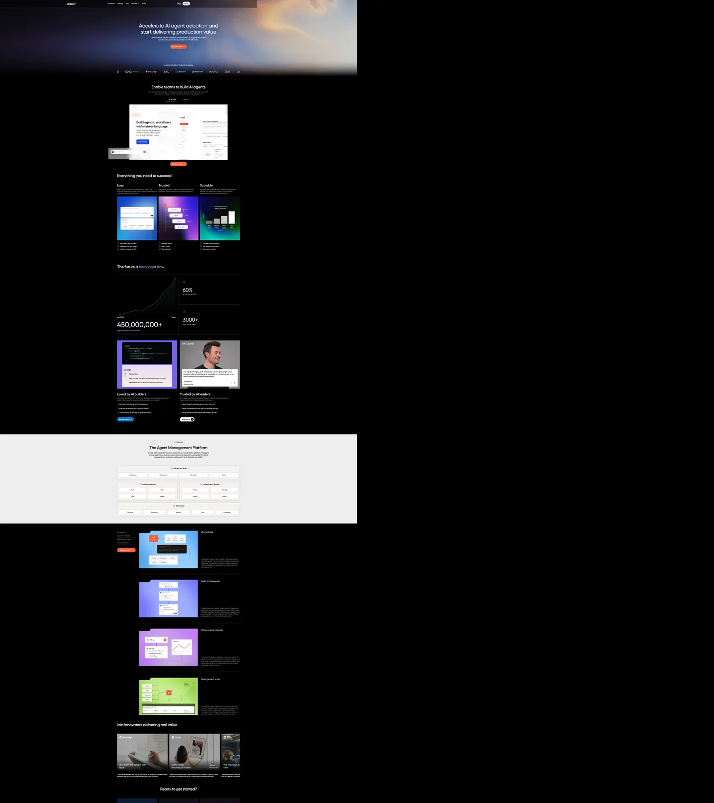
CrewAI's marketing page opens with something most AI-platform brands avoid: a real photograph. The hero background is a full-bleed cinematic image of storm clouds and light rays, saturated enough to read as atmosphere but dark enough to hold white headline text cleanly. "Accelerate AI agent adoption and start delivering production value" runs at 60px in Gellix at weight 400 — the font family holds the heading role while Interdisplay handles every body, label, and UI string below. The single chromatic brand signal is the coral-orange CTA button, which matches the declared --colors-global--crew-branding CSS variable exactly.
The DESIGN.md file packages the system as machine-readable tokens for React and AI tools. Inside: 17 colors tokens anchored on pure black canvas, coral orange voltage, and a two-gray muted tier; 13 typography tokens spanning Gellix at 44–80px display and Interdisplay at 14–20px body; 6 radius values dominated by 100px pill rounding for product screenshot cards; and 18 components definitions covering the photographic hero, the coral CTA, the 100px pill cards in the feature grid, the light-gray inversion band, and the two-column stat blocks. The system also documents a standalone white-canvas section mid-page used for the Agent Management Platform product walkthrough.
Feed this file to Claude or Cursor and it reproduces CrewAI's specific moves: pure-black canvas broken by a single photographic hero, coral-orange voltage at borders and CTAs only, Gellix at modest weight 400 for display, and the 100px pill that makes product screenshots look like enterprise-grade marketing art. The system's most transferable idea is the border-only voltage discipline — coral orange never fills a surface larger than a button, which keeps the black-canvas severity intact while the brand color still reads as present and deliberate.
What makes it distinct
5
- Photographic hero, not a gradientthe above-fold hero is a full-bleed storm-cloud photograph with white headline type over it, not a dark gradient or canvas fill
- Crew branding at borderscoral orange (#f75a36) appears 23 times on the captured page; 20 of those occurrences are as border or CTA fill, never as a background canvas
- Two-voice type systemGellix for every heading level, Interdisplay for body and UI labels; the split signals technical platform with enterprise finish
- 100px pill radiusthe dominant card radius is 100px, rendering product screenshots as large rounded-rectangle tiles rather than sharp or softly-rounded surfaces
- Gray band inversiona mid-page section flips to light gray (#f2f2f2) while the rest of the page holds pure black, creating a two-tone page rhythm without a third hue
crewai.com
Live at crewai.com
A snapshot of the brand in production. Scroll the frame to see the whole page.
Colors
17 colors
CrewAI's system runs on #f75a36 as its primary voltage, used in 1 of 18 components. Type is set in Interdisplay across 13 tokens from 14px to 80px, weights 400–500. Shape language is soft — components average 37px corner radius, with no sharp interactive edges.
Brand & Accent
Sparing, CTA-only voltage · 5
Surface
Page and card backgrounds · 3
Text
Headlines, body, captions · 3
Borders & Hairlines
Dividers, outlines, rules · 2
Other
Specialty colors · 4
Typography
13 type tokens
Set in Interdisplay across 13 tokens, from 14px to 80px, weights 400–500. Shown in its own stack: where the font isn't installed, the fallback the file names stands in.
- display-xl80px · weight 400 · lh 80pxThe quick brown fox jumps over the lazy dog
- display-lg60px · weight 400 · lh 67.8px · tracking -1.2pxThe quick brown fox jumps over the lazy dog
- display-md44px · weight 500 · lh 48.84px · tracking -0.88pxThe quick brown fox jumps over the lazy dog
- heading-md36px · weight 500 · lh 39.96pxThe quick brown fox jumps over the lazy dog
- heading-sm24px · weight 500 · lh 31.92pxThe quick brown fox jumps over the lazy dog
- heading-xs24px · weight 400 · lh 31.92pxThe quick brown fox jumps over the lazy dog
- body-lg20px · weight 400 · lh 26.6pxThe quick brown fox jumps over the lazy dog
- body-md18px · weight 400 · lh 23.94pxThe quick brown fox jumps over the lazy dog
- body-sm16px · weight 400 · lh 22.4pxThe quick brown fox jumps over the lazy dog
- label-md16px · weight 500 · lh 24pxThe quick brown fox jumps over the lazy dog
- label-sm14px · weight 500 · lh 21.28pxThe quick brown fox jumps over the lazy dog
- caption14px · weight 400 · lh 18.62pxThe quick brown fox jumps over the lazy dog
- nav-link14px · weight 400 · lh 20pxThe quick brown fox jumps over the lazy dog
Layout
Radii and spacing
6 corner radii and 7 spacing values. Shape language: soft.
Radii
- none0px
- xs2px
- sm4px
- md8px
- pill100px
- full9999px
Spacing
- xs4px
- sm8px
- md16px
- lg24px
- xl32px
- 2xl40px
- 3xl80px
Components
18 components
Each rendered from its tokens (color, type, radius, padding) on CrewAI's own canvas.
- Button Primarybutton-primaryButton Primary
- Button Primary Hoverbutton-primary-hoverButton Primary Hover
- Button Secondarybutton-secondaryButton Secondary
- Top Navtop-navTop Nav
- Nav Linknav-linkNav Link
- Hero Sectionhero-sectionHero Section
- Hero Headinghero-headingHero Heading
- Section Headingsection-headingSection Heading
- Body Paragraphbody-paragraphBody Paragraph
- Body Paragraph Mutedbody-paragraph-mutedBody Paragraph Muted
- Card Darkcard-darkCard Dark
- Card Featurecard-featureCard Feature
- Gray Bandgray-bandGray Band
- Stat Blockstat-blockStat Block
- Type here…text-inputText Input
- Testimonial Cardtestimonial-cardTestimonial Card
- FooterfooterFooter
- Logo Chiplogo-chipLogo Chip
In use
The system, in use
CrewAI's tokens on the kind of product it builds.
Build something people actually use.
A short paragraph of marketing copy that previews how the brand's display tier and body tier read together. Two sentences is usually enough.
FAQ
CrewAI design system FAQ
Common questions about CrewAI's tokens, components, and how to use this DESIGN.md in your project.
Read next
Related reading
Specs, directories, and component libraries that pair with this design system.
- Browse all design systemsThe full directory of DESIGN.md files on shadcn.io, with live mockups for each.shadcn.io
- CrewAI — official siteCrewAI's public marketing site — the source of truth for the live tokens captured in this file.crewai.com (opens in a new tab)
- The DESIGN.md specificationGoogle Labs' open spec for machine-readable design system files — the format this page is built on.github.com (opens in a new tab)
Use it
Use CrewAI in your project
One machine-readable file. Drop it into Claude, Cursor, or any AI tool that reads DESIGN.md.
Download the DESIGN.md
One machine-readable file: every color, type, radius, spacing, and component token of CrewAI.
Feed it to your AI tool
Drop it into Claude, Cursor, or GitHub Copilot. The agent writes React components and Tailwind classes that match CrewAI's visual language.
Reference the tokens directly
Or paste the values into your Tailwind config, CSS variables, or component library: every color, size and radius is a quoted, ready-to-copy value.
Read the full DESIGN.md: overview, rationale, do’s and don’ts
Overview
CrewAI's marketing site presents a distinctive inversion of the AI-platform default. Border-only voltage. Where most AI brands (Anthropic, OpenAI, Cohere) deploy their brand color as a fill — on hero gradients, CTA blocks, or accent shapes — CrewAI holds coral orange almost entirely at borders and outline strokes. The canvas is pure black, the hero is a real photograph, and the coral CTA button is the single surface where the brand color fills an area larger than a hairline. This restraint makes the orange read as a signal rather than a coat of paint.
The hero photograph is the system's most unusual move. Unlike Linear's vector-art dark canvas or Vercel's typographic hero, CrewAI opens with a full-bleed cinematic image — storm clouds and light rays at dusk — that functions as atmosphere rather than illustration. The headline and CTA float over it as overlaid text, not as a designed composition; the photograph provides the brand character that the sparse chrome cannot. Where Anthropic uses structured editorial serif type to communicate intelligence, CrewAI uses a dramatic sky.
Typography pairs two purpose-built families: Gellix for headings (display, section h2, h3) at modest weights 400–500, and Interdisplay for everything spoken in body or UI contexts. Display tops out at 60px / weight 400 for the hero h1. Section h2 sits at 44px / weight 500. Neither reaches bold — the heaviest weight in the system is 500.
Key Characteristics:
- Coral orange voltage (
{colors.primary}— #f75a36) appears 23 times, 20 of them as border or button fill — never as a background canvas. - Pure black canvas (
{colors.canvas}— #000000) throughout, broken by one light-gray inversion band ({colors.surface-2}— #f2f2f2) and one photographic hero section. - Two-voice type system: Gellix headings + Interdisplay body, both sans-serif, both at weights 400–500 only.
- 100px pill radius dominates card presentation — product screenshot tiles render as large rounded-rectangle marketing art.
- Product feature cards use alternating illustration colors (coral, violet, teal, green) inside the pill-radius tiles while the surrounding page stays monochrome.
- Stat display at 80px Gellix / weight 400 (the loudest typographic moment) for numerical claims like "450,000,000+".
- Email input is borderless-bottom-only — no border-radius, no fill, just a hairline bottom border for the address field.
Colors
Brand
- Crew Branding (
{colors.primary}— #f75a36): frequency 23. Used as background (3), border (20). Wired as--colors-global--crew-branding. The single chromatic brand moment — fills the primary CTA button and two small indicators; otherwise appears only as card borders and outline accents. The coral tone reads warm and urgent against pure black. - Crew Branding Dark (
{colors.primary-dark}— #ca472a): frequency 3. Background fills only — darker hover/pressed state for the primary CTA. Not declared as a CSS variable on the captured surface.
Surface
- Canvas (
{colors.canvas}— #000000): frequency 803 total across all roles — the primary ink color (409), border tone (377), and page floor (7). Pure black dominates the system; it functions simultaneously as canvas and text color because white text on pure black is the only typographic mode the system uses. - Surface-1 (
{colors.surface-1}— #161616): frequency 20. The single "elevated" dark tone — used on feature cards, code-block annotations, and testimonial cards. 25-point lightness gap from pure black reads as elevation without any shadow. - Surface-2 (
{colors.surface-2}— #f2f2f2): frequency 5 as background. The light-gray inversion band mid-page (the Agent Management Platform section). Not a second canvas color — a single editorial break used once. - White (
{colors.white}— #ffffff): frequency 314. Primary text color on the dark canvas (140), borders (143), and card surfaces (30). Pure white, no warm offset.
Text
- Ink Muted (
{colors.ink-muted}— #8e8e8e): frequency 46. Secondary text — body paragraphs below the fold, form placeholder text, and meta-label lines beneath product screenshots. Wired as--colors-global--text-color_invert. - Ink Subtle (
{colors.ink-subtle}— #afafaf): frequency 39. Tertiary text — caption rows, email input placeholder. Wired as--colors-global--text-color_grey.
Hairlines
- Hairline (
{colors.hairline}— #333333): frequency 4. Dark hairline for card borders and section dividers in dark-canvas sections. Wired as--colors-global--border-color. - Hairline Warm (
{colors.hairline-warm}— #ccc5b9): frequency 5. A warm-toned border used on the gray-band card surfaces — slightly warmer than pure gray to echo the coral brand voltage without using it directly.
Accent (product illustrations)
- Accent Blue (
{colors.accent-blue}— #72b6f4): frequency 7. Sky blue — appears inside the "Easy" product illustration tile and in one gradient stop. - Accent Purple (
{colors.accent-purple}— #b86bf6): frequency 1. Violet — appears in one gradient for the "Trusted" product illustration tile. - Accent Dodger (
{colors.accent-dodger}— #1378d1): frequency 3. The "accessible-components" blue, used inside the UI walkthrough screenshot for the Agent Management Platform.
Typography
Font Families
The system runs two voices: Gellix (wired as --_responsive---body--heading-font) for every heading level, and Interdisplay (wired as --_responsive---body--font) for every body, label, button, and nav surface. Both fall back to Arial, sans-serif. There is no monospace family, no serif, and no weight heavier than 500 anywhere on the captured page.
The two-voice split is the system's typographic identity. Gellix holds headings; Interdisplay holds everything else. The distinction is architectural, not visual — both families read similarly at smaller sizes, but Gellix's wider letterform makes it feel more authoritative at the 44–80px display tier.
Hierarchy
| Token | Size | Weight | Line Height | Use |
|---|---|---|---|---|
{typography.display-xl} | 80px | 400 | 80px | Stat numbers ("450,000,000+", "3000+") |
{typography.display-lg} | 60px | 400 | 67.8px | Hero h1 |
{typography.display-md} | 44px | 500 | 48.84px | Section h2 ("Enable teams to build AI agents") |
{typography.heading-md} | 36px | 500 | 39.96px | Section h3 feature headings |
{typography.heading-sm} | 24px | 500 | 31.92px | Sub-section titles |
{typography.body-lg} | 20px | 400 | 26.6px | Lead sub-paragraphs |
{typography.body-md} | 18px | 400 | 23.94px | Default section body |
{typography.body-sm} | 16px | 400 | 22.4px | Running text, card bodies |
{typography.label-md} | 16px | 500 | 24px | Button labels, callout pills |
{typography.caption} | 14px | 400 | 18.62px | Meta labels, footer text |
{typography.nav-link} | 14px | 400 | 20px | Top-nav link labels |
Note on Font Substitutes
Gellix is a licensed display family. Plus Jakarta Sans or DM Sans at the same weight are the closest open-source substitutes at 44–60px display sizes; both have comparable cap height and aperture. Interdisplay is proprietary as well — Inter is the standard substitute and transfers cleanly at every body and label size.
Layout
Spacing System
- Base unit: 8px (57 occurrences — the dominant gap value).
- Tokens:
{spacing.xs}4px ·{spacing.sm}8px ·{spacing.md}16px ·{spacing.lg}24px ·{spacing.xl}32px ·{spacing.2xl}40px ·{spacing.3xl}80px. - Hero top padding: 80px, then 32px horizontal — the hero content zone starts well below the nav.
- Card internal padding: 24px on both dark feature cards and the gray-band card set.
Grid & Container
- Max content width: ~86rem (1376px), from the CSS variable
--_responsive---container--large. - Hero: center-aligned single column, photograph as full-bleed background.
- Feature grid below fold: 3-column card grid for the "Everything you need to succeed" section, each card showing a product illustration inside the 100px pill radius.
- Stat strip: 2-column layout at desktop, showing large Gellix numerals left and a testimonial card right.
- Agent Management Platform: centered single-column walkthrough on the gray-band surface.
Rhythm
The page alternates between pure black editorial (headings, body, stat strips, testimonial) and photographically-decorated black (the hero). The single light-gray break mid-page (the product walkthrough section) reads as an editorial pause before the page returns to black for the feature-detail strip, customer-case section, and footer.
Elevation
The system has no shadow tier — CrewAI's dark-canvas pages use surface-color contrast for elevation. The {colors.surface-1} (#161616) cards lift off the {colors.canvas} (#000000) floor by a 25-point lightness differential. No drop-shadow is visible on the captured surfaces. The exception is a very faint shadow on the hero section overlapping the below-fold content — one occurrence of 0px 0px 6.08px on a contained block — which is decorative glow, not elevation architecture.
Shapes
The radius scale is binary: 100px pill for product screenshot cards, 4px for small UI surfaces.
{rounded.none}0px — hero section, footer, editorial bands.{rounded.xs}2px — the smallest surfaces (checkbox, micro-chips).{rounded.sm}4px — input fields, small badges, inline status chips. 21 occurrences in the captured page.{rounded.pill}100px — the product screenshot cards in the feature grid, the CTA button, the email-list signup button. 24 occurrences. This is the dominant radius and the system's most recognizable shape.{rounded.full}9999px — the logo-chip pills in the partner section, fully circular avatars.
There is no 8 / 12 / 16px tier. The system is binary: either functionally small (4px) or dramatically rounded (100px). The 100px pill on product screenshot cards at 200×260px renders as softly-rounded corners, not circular — at these dimensions it reads as a contemporary "rounded rectangle" rather than a pill shape.
Components
button-primary — Coral orange {colors.primary} fill, white text, 100px pill radius, 13×20px padding, 44px height. "Get started" and "Start your free trial" are the canonical instances. The single surface where the brand voltage fills more than a hairline stroke.
button-primary-hover — Shifts to {colors.primary-dark} (#ca472a) on hover — a darker coral.
button-secondary — Transparent fill, white text, white 1px border, same pill radius. Used for "Learn more" style CTAs.
top-nav — Transparent background over the photographic hero, 48px height, white text throughout. Houses the CrewAI wordmark, nav links (Product / Solutions / Resources / Pricing), and the "Log in" + primary CTA cluster.
hero-section — Full-bleed photographic background, 80×32px padding, centered headline + sub-paragraph + CTA stack. The text floats over the photograph rather than sitting in a designed card.
hero-heading — White text, Gellix 60px / weight 400, -1.2px letter-spacing. The highest typographic moment in the editorial system.
section-heading — White text, Gellix 44px / weight 500, -0.88px letter-spacing. Used for "Enable teams to build AI agents" and other section h2s.
card-dark — The 100px pill card. Surface-1 {colors.surface-1} fill, white text, 100px radius, 24px padding. Houses product screenshot illustrations.
card-feature — 4px radius card for feature-detail rows in the lower-page feature strip. Same surface-1 fill but sharper.
gray-band — Light-gray {colors.surface-2} surface, ink text, 0px radius, 80×32px padding. The Agent Management Platform walkthrough section — the only light surface on the page.
stat-block — Transparent, white Gellix numerals at 80px / weight 400. Used for "450,000,000+" and "3000+" stat claims.
testimonial-card — Surface-1 fill, white text, 4px radius, 24px padding. Houses customer quotes with portrait photography.
text-input — Transparent fill, gray placeholder text, no border-radius, bottom-border-only hairline at {colors.hairline}. The email newsletter capture field in the footer.
logo-chip — Transparent fill, muted-gray logo marks, fully-circular pill. Customer logo wall in the social-proof strip.
footer — Pure black canvas, muted-gray text, 48×32px padding. Continues the canvas without surface contrast.
Do's and Don'ts
Do treat coral orange as a border and CTA fill only. The system captures 23 orange occurrences, and only 3 are background fills (the button). Applying coral to a section background, card fill, or hero gradient would immediately break the system's restraint.
Do keep display headings at weight 400–500. The hero h1 is Gellix at 60px / 400 — the most notable typographic restraint in the system. Bumping to 700 would read as a different brand entirely.
Do use the 100px pill radius for product screenshot tiles. The rounded rectangle treatment is the system's signature card shape; using 8 / 16px radius on the same tiles would make them look like generic SaaS cards.
Do treat the photographic hero as the primary brand-atmosphere delivery mechanism. The page has almost no decorative illustration; the photograph above the fold does all atmospheric work.
Don't use {colors.primary} (#f75a36) as a section background fill — it appears 3 times as a fill in the captured system, all on small button surfaces. Filling a hero or card band with the coral orange would shift the system from border-voltage to canvas-voltage, which is Cloudflare's move, not CrewAI's.
Don't introduce a 12 / 16px radius tier between the 4px small-step and the 100px pill. The binary scale is intentional; a middle tier would dilute the dramatic pill treatment that makes the product screenshot cards distinctive.
Don't apply {colors.surface-2} (#f2f2f2) to more than one section. The light-gray band appears exactly once in the captured page. Adding a second gray band would turn a deliberate editorial break into a layout pattern, which the system does not support.
Don't use {colors.ink-muted} (#8e8e8e) for body paragraphs in the primary dark sections — those paragraphs use white ({colors.white}). Muted gray is reserved for secondary labels and captions only; using it for body text would reduce legibility against the pure black canvas below the threshold the system intends.
Known Gaps
- Hover states beyond button: the full hover matrix for nav links, cards, and the email input is not captured from the marketing surface. Only
{component.button-primary-hover}is documented. - Dark vs. light mode: the captured marketing surfaces are entirely dark-canvas. The gray-band section inverts to light gray but uses ink text without a declared token system for light-mode surfaces.
- Form input validation states:
{component.text-input}holds only the resting bottom-border style; error, success, and focus states are not captured. - Mobile breakpoints: the CSS variable system includes
--_responsive---padding--*tokens at multiple breakpoints but the captured page is desktop-only; mobile nav and single-column card layouts are not documented. - Motion: the feature-illustration cards show gradient overlays that suggest animation on interaction; the easing curves and keyframe timing are not captured from the static screenshot.
- Product surfaces: this DESIGN.md captures the marketing site only. CrewAI Studio (the product itself) carries a separate token set with lighter surfaces, data tables, and agent-graph visualizations not represented here.
- The statistical counter animations: the "450,000,000+" stat appears to use a scroll-triggered counter animation — end-state values only are captured here.
AI & LLM Platforms
More systems like this
More DESIGN.md files in AI & LLM Platforms.
Pricing
Build it with Pro
The DESIGN.md files are free. Pro adds 6,000+ blocks, premium templates and the MCP server, so your AI editor builds in your system for you.
4.9/5 out of 5 · 150+ reviewsfrom 150+ founders and developers.
Billing
Billed once a year in USD. Cancel anytime.
- How many people can use the license.
- Client work, SaaS products and anything you charge for.
- Production-ready React sections: hero, pricing, features, dashboards and more.
- Complete multi-page sites you can ship as they are.
- React icons from every major library, installable with one command.
- Presets that restyle every block, in light and dark.
- Lets your AI editor search, preview and install blocks for you.
- Priority requests are answered first.
Individual
For personal projects & open source
$32instead of $49/mo
$389 billed yearly
- Seats: 1 seat
- Commercial use: Personal & open source only
- Pro blocks: 6,000+ blocks
- Templates: All 14 templates
- React icons: 294k+ icons
- Themes: All 59 themes
- MCP server: Basic usage
- Support: Standard
Team
Most popularFor freelancers, agencies & startups
$66instead of $99/mo
$789 billed yearly · ≈ $13/dev/mo
- Seats: Up to 5 seats
- Commercial use: Included
- Pro blocks: 6,000+ blocks
- Templates: All 14 templates
- React icons: 294k+ icons
- Themes: All 59 themes
- MCP server: High usage
- Support: Priority
Organization
For companies with larger teams
$132instead of $199/mo
$1,589 billed yearly
- Seats: Unlimited seats
- Commercial use: Included
- Pro blocks: 6,000+ blocks
- Templates: All 14 templates
- React icons: 294k+ icons
- Themes: All 59 themes
- MCP server: Unlimited usage
- Support: Priority
Billed once a year in USD. Cancel anytime.
Individual
For personal projects & open source
$32instead of $49/mo
$389 billed yearly
- How many people can use the license.Seats: 1 seat
- Client work, SaaS products and anything you charge for.Commercial use: Personal & open source only
- Production-ready React sections: hero, pricing, features, dashboards and more.Pro blocks: 6,000+ blocks
- Complete multi-page sites you can ship as they are.Templates: All 14 templates
- React icons from every major library, installable with one command.React icons: 294k+ icons
- Presets that restyle every block, in light and dark.Themes: All 59 themes
- Lets your AI editor search, preview and install blocks for you.MCP server: Basic usage
- Priority requests are answered first.Support: Standard
Team
Most popularFor freelancers, agencies & startups
$66instead of $99/mo
$789 billed yearly · ≈ $13/dev/mo
Everything in Individual, plus
- How many people can use the license.Seats: Up to 5 seats
- Client work, SaaS products and anything you charge for.Commercial use: Included
- Lets your AI editor search, preview and install blocks for you.MCP server: High usage
- Priority requests are answered first.Support: Priority
Organization
For companies with larger teams
$132instead of $199/mo
$1,589 billed yearly
Everything in Team, plus
- How many people can use the license.Seats: Unlimited seats
- Lets your AI editor search, preview and install blocks for you.MCP server: Unlimited usage
- Secure checkout via Stripe
- Code lives in your repo
- Keep what you've shipped if you cancel
- License terms
Your system, built for you
Every block, template and icon, installed by your AI agent in your design system. The DESIGN.md files stay free.