Converse Design System
Converse's marketing system as a DESIGN.md file — a black canvas carrying outlined Druk Wide display headlines, Proxima Nova body, and a wider product palette of 12 chromatic CSS variables held for merchandising surfaces.
Add shadcn.io to your AI agent. · Pro It installs blocks, icons and templates in your design system from a prompt, with Pro.
Set up MCP- Primary
- #757575
- Typeface
- proxima nova
- Shape
- Sharp
- Base radius
- 0px
- Colors
- 14
- Type tokens
- 8
- Components
- 15
- Spacing values
- 9
About
About Converse DESIGN.md
Curated by Dov Azencot · Updated May 19, 2026 · Source converse.com (opens in a new tab)
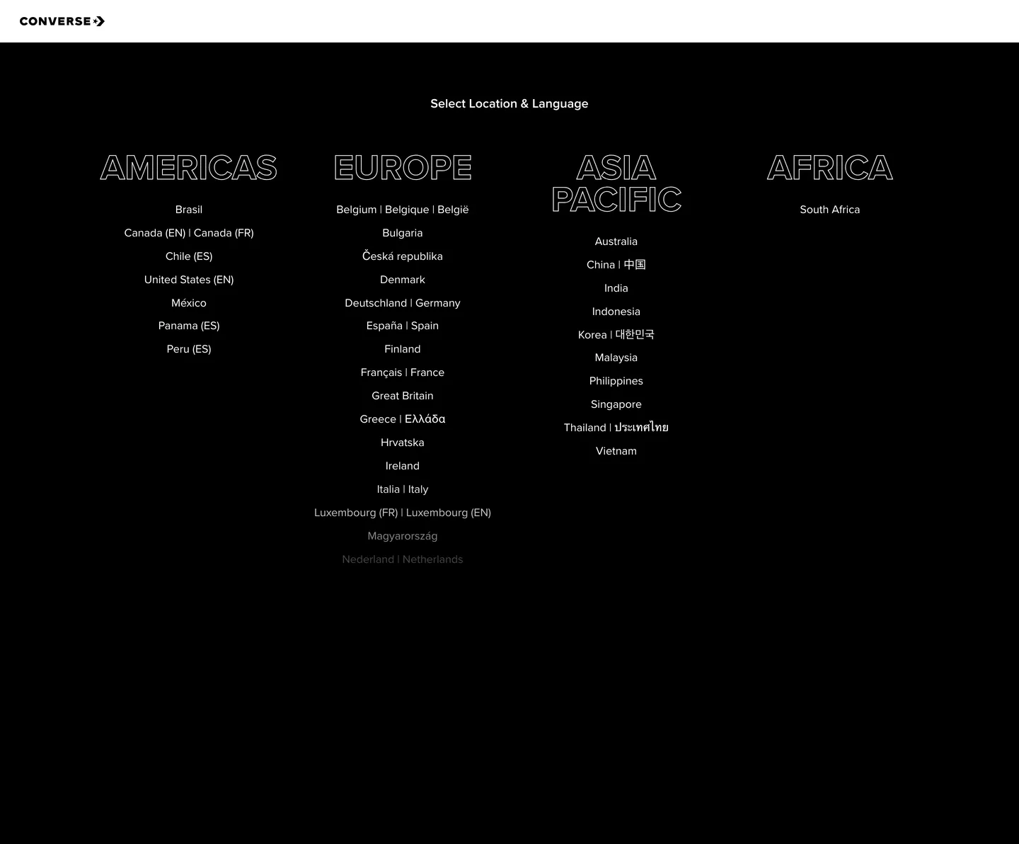
Converse's country-language selector — the surface a US visitor lands on when arriving from a non-localized URL — does something almost no global sneaker brand does at the entry tier. The page is a full-bleed black canvas with four region headlines (AMERICAS, EUROPE, ASIA PACIFIC, AFRICA) rendered in 60-100px outlined Druk Wide, white stroke on the black floor with no fill, sitting in a four-column row at the top of the viewport. The star-chevron wordmark anchors the upper-left corner; a single small "Select Location & Language" label centers above the headline row in Proxima Nova at 18px / 600. Where Nike and Adidas open with full-screen product video and hero imagery, Converse opens with type as monument — the headline forms ARE the page composition, and every country name below them sits as plain unstyled link text in pure white.
The DESIGN.md file packages the system into a machine-readable spec for React tooling. Inside: 14 colors tokens captured from the entry surface and the wider site CSS — a two-tone duotone of pure black and pure white that carries the location selector, plus 10 secondary chromatic variables (Bilbao green, Violetred pink, Royal Purple, Bondi Blue, Lima green, Buttercup yellow, Flamingo orange) held in `:root` and reserved for product detail pages, collection bands, and merchandising chips. Three typography tokens span Druk Wide for outlined display at 50px / 700 uppercase, Proxima Nova at 18px / 600 for sub-display labels, and Proxima Nova at 16px / 400 for body. Spacing runs on a 4px base; the single dominant gap value across the captured page is 12px.
Feed this file to Claude or Cursor and it reproduces Converse's specific moves: outlined Druk Wide display rather than filled display, black canvas rather than the white-canvas convention of consumer e-commerce, sharp corners with zero rounding, and Proxima Nova as the universal body voice. The token references resolve cleanly — `{colors.canvas}` for the pure-black floor, `{colors.ink}` for the pure-white text, `{typography.display-xl}` for the 50px outlined headline tier. The one move worth borrowing for any heritage-streetwear or sneaker brand is the outlined-display treatment: it reads as ink-on-leather stamp rather than as digital chrome, which is the warmth lever Converse leans on instead of a chromatic accent.
What makes it distinct
5
- Outlined display as signatureDruk Wide headlines render at 60-100px in stroked white with no fill, the typographic move that defines the entry surface
- Two-tone entry chromepure black canvas and pure white text carry the location selector; the wider 12-color palette is reserved for product surfaces
- Star-chevron wordmark anchored top-leftthe 1908 monogram sits at 26px in the nav band with no surrounding chrome, no tagline, no surface fill
- Proxima Nova workhorse bodyevery running label, country name, and link sits at 16px / 400 with a 1.31 line-height ratio across the page
- Sharp-corner geometry throughoutzero border-radius on the captured surface, the heritage-streetwear move that rejects soft modern rounding
converse.com
Live at converse.com
A snapshot of the brand in production. Scroll the frame to see the whole page.
Colors
14 colors
Converse's system anchors on #757575 (ink-dim) as its primary color. Type is set in proxima nova across 8 tokens from 12px to 50px, weights 400–700. Shape language is sharp — components average 0px corner radius, favoring crisp rectangles.
Brand & Accent
Sparing, CTA-only voltage · 6
Surface
Page and card backgrounds · 3
Text
Headlines, body, captions · 4
Borders & Hairlines
Dividers, outlines, rules · 1
Typography
8 type tokens
Set in proxima nova across 8 tokens, from 12px to 50px, weights 400–700. Shown in its own stack: where the font isn't installed, the fallback the file names stands in.
- display-xl50px · weight 700 · lh 45pxThe quick brown fox jumps over the lazy dog
- display-lg36px · weight 700 · lh 36pxThe quick brown fox jumps over the lazy dog
- sub-display18px · weight 600 · lh 20.7pxThe quick brown fox jumps over the lazy dog
- body-md16px · weight 400 · lh 20.96pxThe quick brown fox jumps over the lazy dog
- body-sm14px · weight 400 · lh 18.34pxThe quick brown fox jumps over the lazy dog
- caption12px · weight 400 · lh 16pxThe quick brown fox jumps over the lazy dog
- nav-link14px · weight 400 · lh 16pxThe quick brown fox jumps over the lazy dog
- button-md14px · weight 700 · lh 20pxThe quick brown fox jumps over the lazy dog
Layout
Radii and spacing
2 corner radii and 9 spacing values. Shape language: sharp.
Radii
- none0px
- full9999px
Spacing
- xs4px
- sm8px
- md12px
- base16px
- lg24px
- xl32px
- 2xl48px
- 3xl64px
- 4xl96px
Components
15 components
Each rendered from its tokens (color, type, radius, padding) on Converse's own canvas.
- Top Navtop-navTop Nav
- WordmarkwordmarkWordmark
- Nav Linknav-linkNav Link
- Hero Sectionhero-sectionHero Section
- Hero Headinghero-headingHero Heading
- Hero Heading Outlinedhero-heading-outlinedHero Heading Outlined
- Section Headingsection-headingSection Heading
- Sub Displaysub-displaySub Display
- Body Paragraphbody-paragraphBody Paragraph
- Country Linkcountry-linkCountry Link
- Button Primarybutton-primaryButton Primary
- Button Secondarybutton-secondaryButton Secondary
- Type here…text-inputText Input
- CardcardCard
- FooterfooterFooter
In use
The system, in use
Converse's tokens on the kind of product it builds.
Build something people actually use.
A short paragraph of marketing copy that previews how the brand's display tier and body tier read together. Two sentences is usually enough.
FAQ
Converse design system FAQ
Common questions about Converse's tokens, components, and how to use this DESIGN.md in your project.
Read next
Related reading
Specs, directories, and component libraries that pair with this design system.
- Browse all design systemsThe full directory of DESIGN.md files on shadcn.io, with live mockups for each.shadcn.io
- Converse — official siteConverse's public marketing site — the source of truth for the live tokens captured in this file.converse.com (opens in a new tab)
- The DESIGN.md specificationGoogle Labs' open spec for machine-readable design system files — the format this page is built on.github.com (opens in a new tab)
Use it
Use Converse in your project
One machine-readable file. Drop it into Claude, Cursor, or any AI tool that reads DESIGN.md.
Download the DESIGN.md
One machine-readable file: every color, type, radius, spacing, and component token of Converse.
Feed it to your AI tool
Drop it into Claude, Cursor, or GitHub Copilot. The agent writes React components and Tailwind classes that match Converse's visual language.
Reference the tokens directly
Or paste the values into your Tailwind config, CSS variables, or component library: every color, size and radius is a quoted, ready-to-copy value.
Read the full DESIGN.md: overview, rationale, do’s and don’ts
Overview
Converse's entry surface — the country-language selector that a US visitor lands on when arriving from a non-localized URL — strips the brand down to its load-bearing geometry. Outlined monument: four region headlines (AMERICAS, EUROPE, ASIA PACIFIC, AFRICA) render in 50-100px Druk Wide as white stroke on a pure-black canvas with no fill — the negative space inside each letter carries the canvas through, so the headline forms read as architectural framing rather than as decoration. The star-chevron wordmark anchors the upper-left corner at 26px. Where Nike opens with full-screen product video and Adidas opens with athlete photography, Converse opens with type as monument. The country lists below each headline are plain centered links in Proxima Nova at 16px / 400, white on black, with no chrome.
The chromatic restraint reinforces the move. The captured entry surface uses two colors: pure {colors.canvas} (#000000) and pure {colors.ink} (#ffffff). The wider site CSS exposes a 10-color secondary palette — Bilbao green ({colors.accent-bilbao} — #138410), Violetred pink ({colors.accent-violetred} — #f63789), Royal Purple ({colors.accent-royalpurple} — #633bb1), Bondi Blue ({colors.accent-bondiblue} — #00a1b3), Flamingo orange, Monza red — wired into :root as --bilbao, --violetred, --royalpurple, etc. These are held in reserve for product detail pages, collection bands, and merchandising chips; not one of them appears on the entry surface. The brand-voltage role at the entry tier is carried by the outlined display face and the star-chevron wordmark, not by a color.
Heritage-stamp typography: Druk Wide at weight 700 uppercase, outlined rather than filled. The technique reads as vintage band poster or canvas patch — closer to a Chuck Taylor heel stamp than to a SaaS hero. Proxima Nova carries every other surface in the system at 14-18px, weight 400 for body and 600-700 for emphasis. There is no third typeface; the brand split is binary — Druk Wide for monument moments, Proxima Nova for everything else.
Key Characteristics:
- Two-tone entry duotone — pure
{colors.canvas}(#000000) canvas and pure{colors.ink}(#ffffff) text and outline; the wider chromatic palette is held for product surfaces. - Outlined Druk Wide display at 50-100px / 700 uppercase — stroked white with no fill, the brand's signature typographic move.
- Star-chevron wordmark anchored top-left at 26px height with no surrounding chrome, no tagline, no surface fill.
- Proxima Nova carries every body, label, and link surface at 14-18px in weights 400 / 600 / 700.
- 10 secondary chromatic CSS variables (
{colors.accent-bilbao},{colors.accent-violetred},{colors.accent-royalpurple},{colors.accent-bondiblue},{colors.accent-flamingo},{colors.accent-monza}) reserved for merchandising surfaces below the entry tier. - Zero border-radius across the entry surface — sharp corners on every element including buttons, links, and the wordmark plate.
- 4-color neutral ramp —
{colors.ink}white,{colors.ink-muted}(#979797),{colors.ink-dim}(#757575),{colors.ink-soft}(#4a4a4a) — for layered text hierarchy on the wider site. - 4px base spacing unit. Major gaps on the captured surface sit at
{spacing.md}(12px) and{spacing.4xl}(96px) — tight intra-region clustering, wide inter-region rhythm.
Colors
Surface
- Canvas (
{colors.canvas}— #000000): frequency 3. Used as background (1), text (1), border (1). Pure black, wired in CSS as--blackand--radio-color. Carries the entire entry surface — no near-black, no warm undertone. The 25% lightness gap against the outlined white headlines is intentional and maximum. - Surface Soft (
{colors.surface-soft}— #fafafa): wired as--alabaster. Reserved for product-page card surfaces and form-field backgrounds on the wider site; absent from the entry capture. - Surface Warm (
{colors.surface-warm}— #fff2f2): wired as--chablis,--gallery2,--wildsand,--color-neutral-grey-1. A barely-warm cream used as a tonal lift on light product surfaces; absent from the entry capture.
Text
- Ink (
{colors.ink}— #ffffff): frequency 229 — used as text (114) and border (114). The dominant text color across the entry surface, wired as--white. Pure white on pure black with no muted variant for body copy on the captured selector — every link, label, and outlined headline character uses the same value. - Ink Muted (
{colors.ink-muted}— #979797): wired as--color-neutral-grey-7,--dustygray,--color-neutral-grey-3. Reserved for tertiary labels and footer copy on the wider site. - Ink Dim (
{colors.ink-dim}— #757575): wired as--boulder,--color-neutral-grey-4. Secondary label tier on product pages. - Ink Soft (
{colors.ink-soft}— #4a4a4a): wired as--color-neutral-grey-5,--tundora. The darker tier of the neutral ramp used on light-canvas product surfaces.
Hairline
- Hairline (
{colors.hairline}— #e5e5e5): wired as--mercury,--color-neutral-grey-2,--gallery,--cararra,--tab-border,--alto. The single hairline tone in the system — used for tab borders, card outlines, and form-field rules on light surfaces. Absent from the entry capture (the black canvas does not need hairlines).
Secondary palette (held in reserve)
- Bilbao (
{colors.accent-bilbao}— #138410): wired as--bilbao. A saturated mid-green used as a "go" / available / in-stock chip on product pages. - Violetred (
{colors.accent-violetred}— #f63789): wired as--violetred. A hot pink used on Pride and limited-edition collection bands. - Royal Purple (
{colors.accent-royalpurple}— #633bb1): wired as--royalpurple. Holiday and collaboration-collection accent. - Bondi Blue (
{colors.accent-bondiblue}— #00a1b3): wired as--bondiblue. Used on the Run Star / Court Ready performance line. - Flamingo (
{colors.accent-flamingo}— #f35a34): wired as--flamingo,--flamingo2. A warm coral used on heritage Chuck 70 colorways. - Monza (
{colors.accent-monza}— #e00a15): wired as--monza,--punch. The sale / clearance flag color across the catalog.
Typography
Font Families
The system runs two voices: Druk Wide (a licensed Commercial Type display face, wired as --font-family-drukwide) for the outlined monument headlines at the entry tier, and Proxima Nova for every other surface — heading, sub-display, body, button, nav, and caption. Fallbacks for Proxima Nova walk Helvetica, Arial, sans-serif; Druk Wide falls back to Impact, sans-serif.
The pairing is binary: Druk Wide for the four entry-tier monument headlines, Proxima Nova for everything else. There is no third family, no editorial serif, no monospace voice.
Hierarchy
| Token | Size | Weight | Line Height | Use |
|---|---|---|---|---|
{typography.display-xl} | 50px | 700 | 45px | Outlined region headlines (AMERICAS / EUROPE / ASIA PACIFIC / AFRICA) at the entry tier; renders at 100px scaled on wide viewports |
{typography.display-lg} | 36px | 700 | 36px | Section displays on collection pages |
{typography.sub-display} | 18px | 600 | 20.7px | "Select Location & Language" sub-label above the entry headlines |
{typography.body-md} | 16px | 400 | 20.96px | Default running text and country-link list items |
{typography.body-sm} | 14px | 400 | 18.34px | Secondary labels and footer copy |
{typography.caption} | 12px | 400 | 16px | Wired as --fontsizenano; metadata and microcopy |
{typography.nav-link} | 14px | 400 | 16px | Top-nav link labels |
{typography.button-md} | 14px | 700 | 20px | Primary CTA labels on product surfaces |
Principles
The entry headlines render at weight 700 with an outline (white 1-2px stroke on pure black, no fill) at 50px and scale up to ~100px on wide viewports. The outlining is the distinguishing move — a filled Druk Wide headline at the same size would read as generic e-commerce shout; the stroke-only treatment reads as ink-stamp or marquee lettering, closer to a vintage band poster than to a SaaS hero.
Proxima Nova holds three weights — 400 for body and links, 600 for sub-display labels, 700 for buttons and emphasis. The --fontlineheightnormal ratio is 1.31, which is the default leading across body sizes.
Note on Font Substitutes
Druk Wide is a licensed Commercial Type face. The closest open-source substitutes are Bowlby One or Anton at the display tier — both transfer the ultra-condensed wide proportions and read close to Druk at 60-100px display sizes. Inter at the same weights substitutes cleanly for Proxima Nova at 14-18px body sizes; for the 18px / 600 sub-display tier, Manrope at weight 600 is the closest free substitute.
Layout
Spacing System
- Base unit: 4px — the smallest gap value declared in CSS as
--u-spacing-4. - Tokens:
{spacing.xs}4px ·{spacing.sm}8px ·{spacing.md}12px ·{spacing.base}16px ·{spacing.lg}24px ·{spacing.xl}32px ·{spacing.2xl}48px ·{spacing.3xl}64px ·{spacing.4xl}96px. - Dominant gap: 12px — appears 31 times across the captured entry surface as the inter-link spacing inside each country-list column.
- Section padding: ~96px between the top-nav band and the headline row; ~160px from the bottom of the headline row to the footer.
- Hero padding: 0 horizontal at the column level — the four region columns flow edge-to-edge inside a single ~1200px container.
Grid & Container
- Max content width: ~1280px on the entry surface, with the four region columns distributed across the full width at desktop.
- Entry grid: 4-column grid pairing each outlined headline with its country-link list directly beneath; collapses to a 2-column stack on tablet and a single column on mobile.
- Top-nav band: ~60px tall, wordmark anchored top-left at 24px from the left edge; no other nav links on the entry surface itself.
- Footer: absent from the entry capture — the selector surface terminates at the bottom of the country-link columns.
Rhythm
The page holds a single steady tempo: each region headline sits at exactly the same vertical position, each country-link column starts at the same baseline, and every link uses the same 12px vertical gap. There is no atmospheric variation between regions — the rhythm is grid-locked, which reinforces the "monument" reading of the outlined headlines.
Elevation
The system has essentially no shadow tier on the entry surface. The pure-black canvas does not admit traditional drop shadows (they would not read), and the only elevation move is the contrast between the outlined headline forms and the canvas they sit on.
- Flat (no shadow): every element on the captured entry surface — wordmark, headlines, links, footer.
- Outline as elevation: the stroked white headline forms read as raised lettering through pure typographic contrast, not through a layered shadow.
- Hairline outlines:
{colors.hairline}(#e5e5e5) is the wider site's border tone but is absent from the entry capture.
Shapes
The radius scale is binary at its minimum: zero rounding on the entry surface, plus a single full-pill option ({rounded.full} — 9999px) used on icon chips and rounded badges on product pages.
{rounded.none}0px — every element on the captured entry surface. Wordmark, headlines, link hit-targets, the country-list columns, and even the small "Select Location & Language" sub-label all use 0px corners.{rounded.full}9999px — reserved for circular avatar chips and round-icon buttons on product pages.
There is no 4 / 8 / 12px middle tier on the captured surface. The sharp-corner geometry is the heritage-streetwear move: corners stay architectural because the brand is rooted in 1908 basketball-shoe history, not in 2020s SaaS softness.
Components
top-nav — Black {colors.canvas} band, 60px tall, 16x24 padding. Houses only the star-chevron wordmark on the entry surface; no menu links, no search, no cart. On product surfaces the nav expands to include Men / Women / Kids / Collections / Sale link clusters.
wordmark — The Converse star-chevron logo at 26px height, white-on-black, anchored 24px from the left edge of the nav band. No surrounding plate, no tagline, no surface fill.
hero-section — Full-bleed black canvas, ~96x48 padding. Holds the four region headline columns in a 4-column grid.
hero-heading — Filled Druk Wide at {typography.display-xl} (50px / 700) in white. Used on product collection pages.
hero-heading-outlined — The signature treatment. Druk Wide at {typography.display-xl} rendered as a 1-2px white stroke with the canvas color carrying through the letter interiors. Used on the four region headlines (AMERICAS / EUROPE / ASIA PACIFIC / AFRICA) at the entry surface.
section-heading — Druk Wide at {typography.display-lg} (36px / 700) in white, filled. Used on collection-page section headers below the fold.
sub-display — Proxima Nova at {typography.sub-display} (18px / 600) in white. The single instance on the entry surface is the "Select Location & Language" label centered above the headline row.
body-paragraph — Default {typography.body-md} (16px / 400) in white. Used for country names below each region headline.
country-link — Transparent fill, white text at {typography.body-md}, 8x12 padding, zero rounding. Hover state appears to invert (white background on black text) but is not visible on the static capture.
button-primary — White {colors.ink} fill, black {colors.canvas} text, {typography.button-md} (14px / 700), zero rounding, 12x24 padding, 44px height. Used on product PDPs for "Add to bag" and the like; not present on the entry surface.
button-secondary — Transparent fill, white text, 1px white border, zero rounding, 12x24 padding, 44px height. Used for tertiary actions on the wider site.
text-input — Black {colors.canvas} fill, white text, 1px {colors.hairline} border, zero rounding, 12x16 padding, 44px height. Used in the mailing-list signup and search.
card — Black surface, white text, zero rounding, 24px padding. Used for product cards on dark merchandising bands.
footer — Black canvas, muted-gray {colors.ink-muted} text at {typography.body-sm}, 48x24 padding. Absent from the captured entry surface but present on the wider site.
Do's and Don'ts
Do render the entry-tier display headlines with the outlined treatment (white 1-2px stroke, no fill, on {colors.canvas}). The outlining is the brand's load-bearing typographic move; filling the headlines would read as generic e-commerce shout and lose the heritage-stamp identity.
Do keep the entry chrome to two tones — pure {colors.canvas} and pure {colors.ink}. The wider chromatic palette is held in reserve for product pages, collection bands, and merchandising chips. Introducing one of the accent colors at the entry tier breaks the monument framing.
Do anchor the star-chevron wordmark at the upper-left corner with no surrounding chrome. The mark needs to sit alone — adding a tagline, a surface plate, or a pill background dilutes the heritage-stamp reading.
Do keep corners at 0px across the entry surface. Sharp geometry is the heritage-streetwear move; soft 8-16px rounding pulls the surface toward 2020s SaaS softness and away from the 1908 basketball-shoe identity.
Don't render the four region headlines at filled weight 700. The system relies on the stroke-only outline (the negative space inside each letter carries {colors.canvas} through) to read as monument lettering. A filled treatment at the same 50-100px would overwhelm the country-link content beneath and turn the page into a single typographic shout.
Don't introduce a third typeface. The system is binary: Druk Wide for monument moments, Proxima Nova for everything else. Adding a serif editorial face or a monospace metadata tier would break the binary split and dilute the heritage clarity.
Don't swap the canvas from pure {colors.canvas} to a softer near-black or a slightly warm charcoal. The maximum contrast against the stroked white outlines is intentional — a softer canvas would mute the outlines and turn the headlines into ghosts.
Don't apply the secondary chromatic palette ({colors.accent-bilbao}, {colors.accent-violetred}, {colors.accent-royalpurple}) to the entry surface or the top-nav. Those colors are scoped to product PDPs and collection-band merchandising; using them in the chrome turns the brand into a rainbow and breaks the held-in-reserve discipline.
Known Gaps
- Captured surface is the entry selector only: the country-language selector is a transitional surface. The full product site (men's / women's / kids' / collections) carries a different chromatic and typographic register that this DESIGN.md does not represent — a white canvas, photography-led hero, and use of the secondary accent palette on collection bands.
- Hover and focus states: the static capture does not expose hover treatment on the country links. Inversion (white background on black text) is implied by the link convention but not measured.
- Form input error states:
{component.text-input}carries the resting state; error and validation styling lives inside the checkout flow not represented here. - Motion: Druk Wide outlined headlines may animate in (stroke-draw or fade-in) on first paint; the spec captures end-state values only.
- Dark mode / light mode: the entry surface is dark-only. Product pages run on a white canvas with black text — the two-mode split is implied by the surface variants but not captured as a state matrix.
- Mobile breakpoints: the captured surface is 1440px desktop. The 4-column region grid collapses to 2-column and 1-column at smaller widths but exact breakpoint values are not exposed in the CSS variables.
- Secondary chromatic accents: 10 named accent colors are declared in
:root(--bilbao,--violetred,--royalpurple,--bondiblue,--flamingo,--monza,--lima,--buttercup,--mintgreen,--turquoiseblue) but none of them render on the captured entry surface; their semantic roles are inferred from typical e-commerce conventions rather than measured.
E-commerce & Retail
More systems like this
More DESIGN.md files in E-commerce & Retail.
Pricing
Build it with Pro
The DESIGN.md files are free. Pro adds 6,000+ blocks, premium templates and the MCP server, so your AI editor builds in your system for you.
4.9/5 out of 5 · 150+ reviewsfrom 150+ founders and developers.
Billing
Billed once a year in USD. Cancel anytime.
- How many people can use the license.
- Client work, SaaS products and anything you charge for.
- Production-ready React sections: hero, pricing, features, dashboards and more.
- Complete multi-page sites you can ship as they are.
- React icons from every major library, installable with one command.
- Presets that restyle every block, in light and dark.
- Lets your AI editor search, preview and install blocks for you.
- Priority requests are answered first.
Individual
For personal projects & open source
$32instead of $49/mo
$389 billed yearly
- Seats: 1 seat
- Commercial use: Personal & open source only
- Pro blocks: 6,000+ blocks
- Templates: All 14 templates
- React icons: 294k+ icons
- Themes: All 59 themes
- MCP server: Basic usage
- Support: Standard
Team
Most popularFor freelancers, agencies & startups
$66instead of $99/mo
$789 billed yearly · ≈ $13/dev/mo
- Seats: Up to 5 seats
- Commercial use: Included
- Pro blocks: 6,000+ blocks
- Templates: All 14 templates
- React icons: 294k+ icons
- Themes: All 59 themes
- MCP server: High usage
- Support: Priority
Organization
For companies with larger teams
$132instead of $199/mo
$1,589 billed yearly
- Seats: Unlimited seats
- Commercial use: Included
- Pro blocks: 6,000+ blocks
- Templates: All 14 templates
- React icons: 294k+ icons
- Themes: All 59 themes
- MCP server: Unlimited usage
- Support: Priority
Billed once a year in USD. Cancel anytime.
Individual
For personal projects & open source
$32instead of $49/mo
$389 billed yearly
- How many people can use the license.Seats: 1 seat
- Client work, SaaS products and anything you charge for.Commercial use: Personal & open source only
- Production-ready React sections: hero, pricing, features, dashboards and more.Pro blocks: 6,000+ blocks
- Complete multi-page sites you can ship as they are.Templates: All 14 templates
- React icons from every major library, installable with one command.React icons: 294k+ icons
- Presets that restyle every block, in light and dark.Themes: All 59 themes
- Lets your AI editor search, preview and install blocks for you.MCP server: Basic usage
- Priority requests are answered first.Support: Standard
Team
Most popularFor freelancers, agencies & startups
$66instead of $99/mo
$789 billed yearly · ≈ $13/dev/mo
Everything in Individual, plus
- How many people can use the license.Seats: Up to 5 seats
- Client work, SaaS products and anything you charge for.Commercial use: Included
- Lets your AI editor search, preview and install blocks for you.MCP server: High usage
- Priority requests are answered first.Support: Priority
Organization
For companies with larger teams
$132instead of $199/mo
$1,589 billed yearly
Everything in Team, plus
- How many people can use the license.Seats: Unlimited seats
- Lets your AI editor search, preview and install blocks for you.MCP server: Unlimited usage
- Secure checkout via Stripe
- Code lives in your repo
- Keep what you've shipped if you cancel
- License terms
Your system, built for you
Every block, template and icon, installed by your AI agent in your design system. The DESIGN.md files stay free.