CHANEL Design System
CHANEL's marketing design system as a DESIGN.md file. abchanel-corpo uppercase on white canvas, five-step greyscale, zero chromatic accent, 16 components. For React, Next.js, and AI tools.
Add shadcn.io to your AI agent. · Pro It installs blocks, icons and templates in your design system from a prompt, with Pro.
Set up MCP- Primary
- #333333
- Typeface
- abchanel-corpo
- Shape
- Mixed
- Base radius
- 0px
- Colors
- 11
- Type tokens
- 11
- Components
- 16
- Spacing values
- 7
About
About CHANEL DESIGN.md
Curated by Dov Azencot · Updated May 19, 2026 · Source chanel.com (opens in a new tab)
CHANEL's digital system runs a five-step greyscale and stops there. The palette is pure white for the canvas, near-black for the hardest structural elements, and three intermediate greys separating information tiers — middle grey at 767676 for body text and borders (the most frequently used tone in the system, at 367 total occurrences), light grey at 9b9b9b for secondary labels, and warm charcoal at 333333 for heading-weight text. There is no chromatic accent, no brand rouge, no gold-adjacent warm. The identity is carried entirely by abchanel-corpo — a proprietary compressed uppercase typeface that appears on every navigation label, every product category, every section identifier, and the two interlocked C marks of the logo. Where other luxury houses use a brand color as their primary identity signal, CHANEL uses a letterform.
The DESIGN.md file captures 11 colors tokens from the five-step greyscale, 11 typography tokens spanning abchanel-corpo at 11–30px (weight 600, uppercase or lowercase depending on context) and Helvetica at 12–14px (weight 100–300 for body and supporting text), a minimal radius scale (only 40px captured, used for a single pill element), 7 spacing tokens, and 16 components definitions. The extraction confirms one notable detail: CHANEL's body text runs Helvetica at weight 100 — ultra-light, unusual for running prose — which creates a deliberate contrast with the weight-600 uppercase abchanel-corpo labels.
Feed this file to Claude or Cursor and it reproduces CHANEL's specific moves: white canvas, abchanel-corpo uppercase at 12px / 600 for every label and navigation element, Helvetica at ultra-light for body paragraphs, and the absence of any chromatic accent. The discipline worth studying: the system functions because abchanel-corpo is doing the job that brand color normally does — it's the single signal that identifies this as CHANEL rather than any other luxury white-canvas site. Without it, the greyscale and Helvetica could belong to anyone.
What makes it distinct
5
- Proprietary uppercase type as logoabchanel-corpo at 12px bold uppercase, with weight 600, is the brand mark at every scale from the interlocking CC to the navigation label
- Five-step greyscale with no chromatic elementthe entire system runs from pure white through three grey tones to near-black, with zero hue involvement anywhere
- Weight 600 as the only boldabchanel-corpo uses a single weight (600), which reads as simultaneously authoritative and controlled; there is no 700 or 800 tier
- Helvetica as the deliberate supporting voicewhere other brands would use a second proprietary family, CHANEL uses a universal system font, making abchanel-corpo the sole carrier of identity
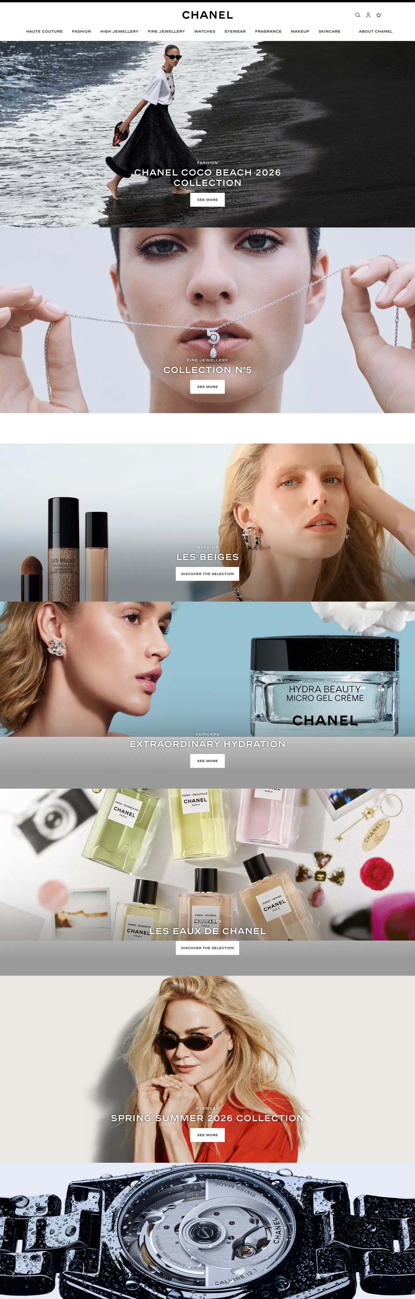
- Full-bleed photography over token decorationthe site's visual richness comes entirely from campaign imagery; the UI chrome is stripped to the minimum that keeps photography centered
chanel.com
Live at chanel.com
A snapshot of the brand in production. Scroll the frame to see the whole page.
Colors
11 colors
CHANEL's system runs on #333333 as its primary voltage, used in 2 of 16 components. Type is set in abchanel-corpo across 11 tokens from 11px to 30px, weights 100–600. Shape language is mixed across 16 components, blending pills, soft rounds, and squarer corners.
Surface
Page and card backgrounds · 3
Text
Headlines, body, captions · 5
Borders & Hairlines
Dividers, outlines, rules · 3
Typography
11 type tokens
Set in abchanel-corpo across 11 tokens, from 11px to 30px, weights 100–600. Shown in its own stack: where the font isn't installed, the fallback the file names stands in.
- display-xl30px · weight 600 · lh 36pxThe quick brown fox jumps over the lazy dog
- display-md12px · weight 600 · lh 18px · tracking 1pxThe quick brown fox jumps over the lazy dog
- heading-sm11px · weight 600 · lh 18pxThe quick brown fox jumps over the lazy dog
- label-md12px · weight 600 · lh 18pxThe quick brown fox jumps over the lazy dog
- body-lg14px · weight 300 · lh 18pxThe quick brown fox jumps over the lazy dog
- body-md14px · weight 100 · lh 18px · tracking 0.1pxThe quick brown fox jumps over the lazy dog
- body-sm12px · weight 300 · lh 18px · tracking 0.5pxThe quick brown fox jumps over the lazy dog
- caption12px · weight 300 · lh 16pxThe quick brown fox jumps over the lazy dog
- button-md14px · weight 300 · lh 18pxThe quick brown fox jumps over the lazy dog
- nav-link12px · weight 600 · lh 18pxThe quick brown fox jumps over the lazy dog
- input-text14px · weight 400 · lh 18pxThe quick brown fox jumps over the lazy dog
Layout
Radii and spacing
3 corner radii and 7 spacing values. Shape language: mixed.
Radii
- none0px
- pill40px
- full9999px
Spacing
- xs5px
- sm9px
- md16px
- base18px
- lg27px
- xl30px
- 2xl72px
Components
16 components
Each rendered from its tokens (color, type, radius, padding) on CHANEL's own canvas.
- Button Primarybutton-primaryButton Primary
- Button Primary Hoverbutton-primary-hoverButton Primary Hover
- Button Secondarybutton-secondaryButton Secondary
- Top Navtop-navTop Nav
- Nav Linknav-linkNav Link
- Hero Headinghero-headingHero Heading
- Section Headingsection-headingSection Heading
- Editorial Labeleditorial-labelEditorial Label
- Body Paragraphbody-paragraphBody Paragraph
- Body Paragraph Strongbody-paragraph-strongBody Paragraph Strong
- CardcardCard
- Product Cardproduct-cardProduct Card
- Editorial Overlayeditorial-overlayEditorial Overlay
- Type here…text-inputText Input
- Label Taglabel-tagLabel Tag
- FooterfooterFooter
In use
The system, in use
CHANEL's tokens on the kind of product it builds.
Build something people actually use.
A short paragraph of marketing copy that previews how the brand's display tier and body tier read together. Two sentences is usually enough.
FAQ
CHANEL design system FAQ
Common questions about CHANEL's tokens, components, and how to use this DESIGN.md in your project.
Read next
Related reading
Specs, directories, and component libraries that pair with this design system.
- Browse all design systemsThe full directory of DESIGN.md files on shadcn.io, with live mockups for each.shadcn.io
- CHANEL — official siteCHANEL's public marketing site — the source of truth for the live tokens captured in this file.chanel.com (opens in a new tab)
- The DESIGN.md specificationGoogle Labs' open spec for machine-readable design system files — the format this page is built on.github.com (opens in a new tab)
Use it
Use CHANEL in your project
One machine-readable file. Drop it into Claude, Cursor, or any AI tool that reads DESIGN.md.
Download the DESIGN.md
One machine-readable file: every color, type, radius, spacing, and component token of CHANEL.
Feed it to your AI tool
Drop it into Claude, Cursor, or GitHub Copilot. The agent writes React components and Tailwind classes that match CHANEL's visual language.
Reference the tokens directly
Or paste the values into your Tailwind config, CSS variables, or component library: every color, size and radius is a quoted, ready-to-copy value.
Read the full DESIGN.md: overview, rationale, do’s and don’ts
Overview
CHANEL's digital system is built on a typographic equation that has no chromatic term. Letterform as logo. Where Balenciaga uses compression and density as its brand statement, and Dior uses Futura's geometry as its historical anchor, CHANEL runs abchanel-corpo — a proprietary uppercase-compressed face — as the brand's sole identity carrier, across every nav label, every editorial identifier, every product heading. The system carries five grey tones and zero hues.
Unlike the convention in luxury fashion digital design of using a brand red, a champagne warm, or a gold accent to signal heritage, CHANEL's visual system makes the interlocking CC mark and the uppercase letterforms of abchanel-corpo carry all that weight. The supporting body voice is Helvetica at weight 100 — not 400, not 300, but the ultra-light register — which makes every body sentence read like a whisper against the weight-600 authority of the labels. The system deliberately widens the perceptual gap between identity type and content type.
The extraction confirms the discipline: 1847 elements scanned, nine color values found, all within greyscale. The dominant tone is medium grey #767676, appearing 367 times — most of it as border and text. It is the workhorse of the system, not the canvas and not the ink.
Key Characteristics:
- abchanel-corpo weight 600 uppercase for every identity-bearing surface — navigation, product category labels, editorial section identifiers, campaign headlines.
- Five-step greyscale:
{colors.canvas}white,{colors.canvas-alt}near-white,{colors.hairline-light}light grey,{colors.ink-light}medium-light,{colors.ink-muted}medium,{colors.ink-medium}dark charcoal,{colors.ink}near-black. - Helvetica at weight 100 for body copy — the ultra-light registers as editorial restraint rather than accessibility-optimized design.
- Zero chromatic accent — the
--swiper-theme-color: #007affis a Swiper library default with zero render occurrences; it is not part of the CHANEL system. - Hard right-angle architecture (zero radius) on all structural surfaces; a single 40px pill element appears for a notification or consent chip.
- Full-bleed photography carries every chromatic moment — fashion, fragrance, and beauty campaigns provide the color that the UI chrome refuses.
Colors
Text & Structural
- Ink Muted (
{colors.ink-muted}— #767676): frequency 367. Used as text (183), border (183), background (1). The workhorse tone — carries both body text and structural dividers simultaneously, making it the single tone doing double duty across both content and structure in the system. - Canvas (
{colors.canvas}— #ffffff): frequency 126. Used as text (57), border (54), background (15). The floor and the primary contrast inversion surface — white-on-dark for editorial overlay text. - Ink Light (
{colors.ink-light}— #9b9b9b): frequency 98. Used as text (49), border (49). Secondary text and lightweight dividers — product subtitle text, supporting navigation labels. - Ink Medium (
{colors.ink-medium}— #333333): frequency 97. Used as text (50), border (47). Heading-weight text and medium-weight structural borders. - Ink (
{colors.ink}— #1d1d1d): frequency 94. Used as text (48), border (46). Near-black for the heaviest structural text — thenavLinkcomponent text color. - Ink Deep (
{colors.ink-deep}— #000000): frequency 40. Used as text (8), border (8), gradient (24). Pure black, primarily for gradient fills on editorial imagery; the hardest structural element in the system.
Hairlines
- Hairline Light (
{colors.hairline-light}— #d8d8d8): frequency 10. Used as text (5), border (5). Light-weight dividers for footer rows and card separators. - Hairline Faint (
{colors.hairline-faint}— #ececec): frequency 1. Used as shadow (1). The faintest possible structural tone — appears once as a shadow.
Canvas Variants
- Canvas Alt (
{colors.canvas-alt}— #f9f9f9): merged into the canvas cluster. A fractionally off-white for alternate-row or secondary surface fills. - Surface Overlay (
{colors.surface-overlay}— #000000): used inbackground-image: linear-gradienton editorial image overlays — the darkening gradient that allows white abchanel-corpo text to read over campaign photography.
Typography
Font Families
The system runs abchanel-corpo for every identity-bearing surface — navigation, editorial labels, product category headings, and the hero h2 overlay — at weight 600 across all sizes (11px to 30px). The body and supporting voice is Helvetica (with Open-Sans and the sans-serif-light system font as fallbacks) at weights 100, 300, and 400. The polarization is intentional: one proprietary compressed face for identity, one universal system font for content.
Hierarchy
| Token | Size | Weight | Line Height | Use |
|---|---|---|---|---|
{typography.display-xl} | 30px | 600 | 36px | Campaign section headlines (abchanel-corpo uppercase) |
{typography.display-md} | 12px | 600 | 18px | Editorial overlay labels, product category section headers with 1px tracking (abchanel-corpo uppercase) |
{typography.heading-sm} | 11px | 600 | 18px | Sub-labels and secondary category identifiers (abchanel-corpo lowercase) |
{typography.label-md} | 12px | 600 | 18px | Standard UI labels, nav badges (abchanel-corpo) |
{typography.body-lg} | 14px | 300 | 18px | Lead body copy, support text (Helvetica light) |
{typography.body-md} | 14px | 100 | 18px | Default body paragraph (Helvetica ultra-light) |
{typography.body-sm} | 12px | 300 | 18px | Caption, metadata, small supporting text |
{typography.caption} | 12px | 300 | 16px | Footer text, secondary metadata |
{typography.button-md} | 14px | 300 | 18px | Button labels (Helvetica light) |
{typography.nav-link} | 12px | 600 | 18px | Navigation links (abchanel-corpo) |
{typography.input-text} | 14px | 400 | 18px | Form input text (Arial) |
Principles
The weight system is binary: 600 for abchanel-corpo identity elements, 100–300 for Helvetica content elements. The gap between weight 600 and weight 100 is the system's primary hierarchy tool — no intermediate weights mediate between them. The abchanel-corpo display-md at 12px/600/1px tracking with uppercase creates the same visual impact as a 30px regular — weight and tracking combine to produce authority at small sizes.
Note on Font Substitutes
abchanel-corpo is proprietary. For open-source substitutes: Univers Condensed Bold approximates the compressed structure; Trade Gothic Condensed No. 18 is historically close. For web deployment, Barlow Condensed at weight 600 is the most accessible free alternative. For the body Helvetica, the system's fallback chain (Open-Sans, sans-serif-light) covers most environments; Helvetica Neue Ultralight or Thin is the correct substitute where Helvetica Neue is available.
Layout
Spacing System
- Base unit: 9px (the dominant value at 8 occurrences, also appears as 9x18 button padding).
- Tokens:
{spacing.xs}5px ·{spacing.sm}9px ·{spacing.md}16px ·{spacing.base}18px ·{spacing.lg}27px ·{spacing.xl}30px ·{spacing.2xl}72px. - Navigation tab padding: 0x16px horizontal and 9px bottom — the nav link sits asymmetrically padded, weighted toward the bottom.
- Product card bottom padding: 72px — generous vertical breathing room beneath each product tile in the grid.
- Section vertical spacing: 72px between major editorial sections.
Grid & Container
- Max content width: approximately 1440px — CHANEL's editorial layout is full-bleed at 1440px viewport width.
- Hero sections: full-bleed photography with abchanel-corpo text overlaid at constrained centered max-width.
- Product grid: image-first tiles with generous 72px bottom padding separating rows.
Rhythm
The page stacks full-bleed editorial photography horizontally, with each band occupying approximately 74vh (captured as a CSS custom property --play-pause-worn-video-bottom-desktop: 20px, indicating video-banner heights near full-viewport). The rhythm is editorial-magazine: large, unbroken photography bands separated by minimal structural chrome.
Elevation
The system has essentially no shadow tier. A single faint shadow token ({colors.hairline-faint} — #ececec, frequency 1 as shadow) marks the full extent of the shadow system. Depth comes instead from:
- Editorial overlay gradients —
linear-gradient(to bottom, rgba(0,0,0,0))torgba(#000000, 0.6)creating photography depth without any explicit shadow element. - Hairline borders (
{colors.hairline}and{colors.hairline-light}) as surface separators. - No surface-tonal lift: the system does not use slightly-darker backgrounds to indicate elevation.
Shapes
The radius philosophy is architectural zero, with a single named exception. Every structural surface — section containers, product cards, navigation, image frames, the text input — runs at zero radius ({rounded.none}). The input field (height: 30px, rounded: none) is noticeably sharp-cornered even by luxury-fashion standards. The one exception is a pill-shaped element using {rounded.pill} (40px), which appears on a tag or notification chip — a concession to legibility on a small interactive target.
The 40px pill on a compact surface (like a 5px-padded label tag) produces a fully-rounded appearance at any height below 80px. The architectural sharpness everywhere else makes this single pill treatment stand out as an intentional affordance marker.
Components
button-primary — Near-black {colors.ink} fill, white text, Helvetica light at {typography.button-md}, zero radius, 9x18 padding, 36px height. No border.
button-secondary — White canvas fill, ink text, 1px medium-grey border ({colors.ink-muted}), zero radius, same 9x18 padding.
top-nav — White canvas, 54px height, bottom hairline border ({colors.ink-muted}). Houses the CHANEL wordmark centered, with abchanel-corpo nav links ("Haute Couture," "Fashion," "Fine Jewellery & Watches," "Watches," "Fragrance & Beauty") on 0x16x9 padding.
nav-link — Transparent, near-black text at {typography.nav-link} (abchanel-corpo 12px/600), 0x16x9 padding, 54px height. The bottom-weighted padding creates a typographic baseline effect where labels sit near the bottom of the nav bar.
hero-heading — White text on photography overlay, abchanel-corpo at {typography.display-xl} (30px / 600). The captured instance: "CHANEL COCO BEACH 2026 / Collection."
section-heading — Ink text, abchanel-corpo at {typography.display-md} (12px / 600 / 1px tracking uppercase). Used for collection category labels.
editorial-label — White text (for use over dark photography), abchanel-corpo at {typography.display-md}. The campaign section identity layer.
body-paragraph — Medium grey {colors.ink-muted} text, Helvetica at {typography.body-md} (14px / 100). The ultra-light weight makes editorial support text recede behind the bold-uppercase labels.
product-card — White canvas, zero radius, 72px bottom padding. Holds product photography, abchanel-corpo label, and supporting details.
editorial-overlay — Black surface overlay, white abchanel-corpo text, 30x7.5x20 padding. Used on full-bleed video and photography sections where the brand identity text reads over imagery.
text-input — White canvas, pure-black text at {typography.input-text} (Arial 14px/400), zero radius, 6x49x5x0 padding (generous right-padding for a search icon), 30px height, medium-grey border. The input is compact and sharp-cornered.
label-tag — Transparent, medium-grey text, abchanel-corpo at {typography.heading-sm} (11px/600), {rounded.pill} 40px radius, 5px padding. The single pill-shape element in the system.
footer — White canvas, medium-grey text, 27x16 padding, light hairline top border.
Do's and Don'ts
Do use abchanel-corpo (or its substitute Barlow Condensed Bold) at weight 600 for every identity-bearing label — navigation, product category heading, editorial section identifier. The system has no other mechanism for brand recognition; the typeface is doing the job that a brand color would do elsewhere.
Do use Helvetica (or system sans-serif) at weight 100 or 300 for body copy. The ultra-light weight is not an error — it is the deliberate contrast that makes the weight-600 abchanel-corpo labels read as authoritative. Using weight 400 for body text narrows that gap and dilutes the hierarchy.
Do let full-bleed photography carry all chromatic content. The UI chrome makes no chromatic gesture; every color impression a visitor receives comes from campaign imagery. Sizing photographs generously (74vh hero sections) is load-bearing in this system, not decorative.
Do apply the asymmetric nav-link padding (0px top, 16px horizontal, 9px bottom) exactly. The bottom-weighted tab structure positions labels typographically at the base of the nav bar rather than centered — a subtle but consistent alignment decision captured in the extraction.
Don't introduce a chromatic accent — not a red sale tag, not a warm badge, not a campaign seasonal color in the UI chrome. The extraction confirms zero non-grey tones in the system. The only color in the UI is what the photography brings; adding a UI accent destroys the photographic-supremacy principle.
Don't use abchanel-corpo at weight below 600 or at lowercase for product names or section headers. The extraction shows the face exclusively at weight 600. The lowercase variant ({typography.heading-sm} at 11px/600) appears only for specific sub-labels, not for primary identity elements.
Don't increase body text weight above 300 for standard paragraph copy. The {typography.body-md} token uses weight 100 for the default running text. Bumping it to 400 normalizes the body weight to the point where the 600-weight labels no longer read as distinctly authoritative.
Don't round the text input or card surfaces. The zero-radius architecture applies to every structural surface. The input field is specifically zero-radius at 30px height — adding rounding turns it into a consumer-app field rather than a luxury form element.
Known Gaps
- Hover and focus states: no hover state captured for nav links, product cards, or buttons. Focus rings and keyboard navigation states are not documented.
- Dark editorial surfaces: some CHANEL campaign microsites and seasonal pages run on dark or black canvas. These are not represented; the captured system is the main site's white-canvas treatment.
- Fragrance and beauty sub-brand treatments: the fragrance and beauty categories use photography with warm and romantic color temperatures that do not correspond to UI tokens in this file.
- Form validation states: the text input error state, success state, and loading state are not captured.
- Video component states: the site uses video banners with play/pause controls (the CSS variable
--play-pause-worn-video-bottom-desktopwas captured), but the video-player UI chrome is not included. - Accessibility on ultra-light body text: Helvetica at weight 100 on a mid-grey (#767676) background may not meet WCAG AA contrast requirements at 12px. The live site's accessibility approach for these cases is not represented in the token file.
E-commerce & Retail
More systems like this
More DESIGN.md files in E-commerce & Retail.
Pricing
Build it with Pro
The DESIGN.md files are free. Pro adds 6,000+ blocks, premium templates and the MCP server, so your AI editor builds in your system for you.
4.9/5 out of 5 · 150+ reviewsfrom 150+ founders and developers.
Billing
Billed once a year in USD. Cancel anytime.
- How many people can use the license.
- Client work, SaaS products and anything you charge for.
- Production-ready React sections: hero, pricing, features, dashboards and more.
- Complete multi-page sites you can ship as they are.
- React icons from every major library, installable with one command.
- Presets that restyle every block, in light and dark.
- Lets your AI editor search, preview and install blocks for you.
- Priority requests are answered first.
Individual
For personal projects & open source
$32instead of $49/mo
$389 billed yearly
- Seats: 1 seat
- Commercial use: Personal & open source only
- Pro blocks: 6,000+ blocks
- Templates: All 14 templates
- React icons: 294k+ icons
- Themes: All 59 themes
- MCP server: Basic usage
- Support: Standard
Team
Most popularFor freelancers, agencies & startups
$66instead of $99/mo
$789 billed yearly · ≈ $13/dev/mo
- Seats: Up to 5 seats
- Commercial use: Included
- Pro blocks: 6,000+ blocks
- Templates: All 14 templates
- React icons: 294k+ icons
- Themes: All 59 themes
- MCP server: High usage
- Support: Priority
Organization
For companies with larger teams
$132instead of $199/mo
$1,589 billed yearly
- Seats: Unlimited seats
- Commercial use: Included
- Pro blocks: 6,000+ blocks
- Templates: All 14 templates
- React icons: 294k+ icons
- Themes: All 59 themes
- MCP server: Unlimited usage
- Support: Priority
Billed once a year in USD. Cancel anytime.
Individual
For personal projects & open source
$32instead of $49/mo
$389 billed yearly
- How many people can use the license.Seats: 1 seat
- Client work, SaaS products and anything you charge for.Commercial use: Personal & open source only
- Production-ready React sections: hero, pricing, features, dashboards and more.Pro blocks: 6,000+ blocks
- Complete multi-page sites you can ship as they are.Templates: All 14 templates
- React icons from every major library, installable with one command.React icons: 294k+ icons
- Presets that restyle every block, in light and dark.Themes: All 59 themes
- Lets your AI editor search, preview and install blocks for you.MCP server: Basic usage
- Priority requests are answered first.Support: Standard
Team
Most popularFor freelancers, agencies & startups
$66instead of $99/mo
$789 billed yearly · ≈ $13/dev/mo
Everything in Individual, plus
- How many people can use the license.Seats: Up to 5 seats
- Client work, SaaS products and anything you charge for.Commercial use: Included
- Lets your AI editor search, preview and install blocks for you.MCP server: High usage
- Priority requests are answered first.Support: Priority
Organization
For companies with larger teams
$132instead of $199/mo
$1,589 billed yearly
Everything in Team, plus
- How many people can use the license.Seats: Unlimited seats
- Lets your AI editor search, preview and install blocks for you.MCP server: Unlimited usage
- Secure checkout via Stripe
- Code lives in your repo
- Keep what you've shipped if you cancel
- License terms
Your system, built for you
Every block, template and icon, installed by your AI agent in your design system. The DESIGN.md files stay free.