Cartier Design System
Cartier's design system as a DESIGN.md file. Brilliant Cut proprietary sans, Fancy Cut editorial serif, near-black #1d1c1c ink, Cartier red #d50032, 7 colors tokens, 15 components. For React, Next.js, and AI tools.
Add shadcn.io to your AI agent. · Pro It installs blocks, icons and templates in your design system from a prompt, with Pro.
Set up MCP- Primary
- #d50032
- Typeface
- Brilliant Cut
- Shape
- Sharp
- Base radius
- 0px
- Colors
- 7
- Type tokens
- 15
- Components
- 15
- Spacing values
- 7
About
About Cartier DESIGN.md
Curated by Dov Azencot · Updated May 19, 2026 · Source cartier.com (opens in a new tab)
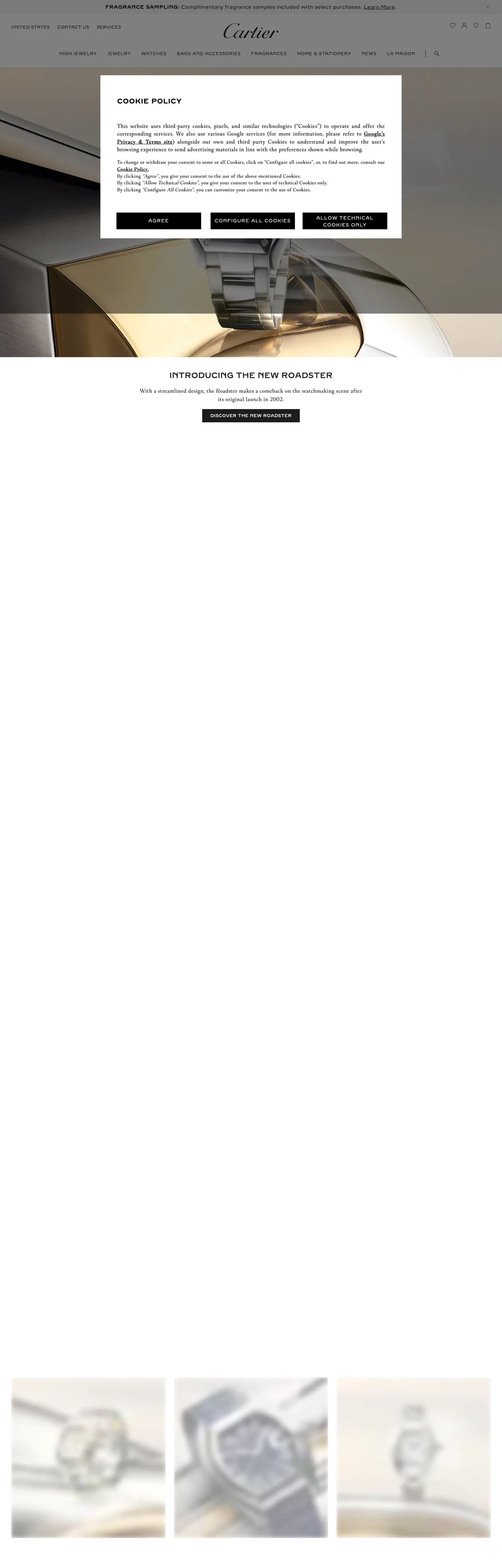
Cartier's marketing site communicates hierarchy without weight. Every surface — from the 22px h2 "INTRODUCING THE NEW ROADSTER" to the 12px nav link "UNITED STATES" — runs uppercase with 0.4–0.8px letter-spacing in Brilliant Cut at weight 400 or 600. The font never goes heavier than 700 (used once in bold inline text) and never goes lighter than 300 (used in Fancy Cut label instances). The authority signal is case, not weight: ALL CAPS at 12px reads as confidently as 22px because both share the same tracking discipline. Where Louis Vuitton distinguishes tiers through size-and-weight ladders and Tiffany leans on its Tiffany Blue to carry brand identity, Cartier holds color almost entirely in reserve and makes the typographic system do all the positional work.
This DESIGN.md file packages the system into 7 colors tokens — the near-black ink that dominates 796 extracted occurrences, a pure white and near-white surface cluster, a mid-gray muted tone, and Cartier red (#d50032) declared but scarcely rendered; 15 typography tokens spanning Brilliant Cut (geometric sans) in five size-weight combinations and Fancy Cut (editorial serif) in three sizes; 1 radius token (the dominant 0px sharp); 7 spacing tokens; and 15 components definitions covering hero heading, body paragraph, navigation, CTA buttons, product card, and subscription input. The extraction captured only 7 colors (one of them through a cookie banner) and zero CSS custom properties — the site's token system lives behind authentication or in a separate style bundle.
Feed this file to Claude or Cursor and it will reproduce Cartier's specific moves: uppercase everywhere, letter-spacing as the emphasis tool rather than weight, near-black ink on white photography, 0px corners, Brilliant Cut proprietary sans with Helvetica as the first public fallback. The most consequential discipline to carry forward: the absence of Cartier red as a decorative accent is not an omission — it is the brand's restraint signal. The red appears once, on the most singular action, which is precisely where scarcity creates authority.
What makes it distinct
5
- Uppercase all-caps conventionevery typographic surface from h2 to nav links to button labels runs uppercase with 0.4–1.5px letter-spacing; weight is irrelevant when case does the authority work
- Near-black #1d1c1c dominant ink796 total occurrences across text (368), border (372), and gradient (50); the system's deepest chromatic move is a near-black, not true black
- Cartier red scarcity#d50032 exists as a CSS color and appears in exactly one background fill; the marketing surface reads as monochrome despite the declared brand voltage
- Sharp 0px corners everywherebuttons, inputs, section dividers, product cards; the Maison communicates precision through geometry, not through softness
- Dual proprietary typefacesBrilliant Cut (geometric sans) for interface chrome, Fancy Cut (editorial serif) for product copy and labels; neither is available on Google Fonts
cartier.com
Live at cartier.com
A snapshot of the brand in production. Scroll the frame to see the whole page.
Colors
7 colors
Cartier's system runs on #d50032 as its primary voltage, used in 1 of 15 components. Type is set in Brilliant Cut across 15 tokens from 12px to 22px, weights 300–700. Shape language is sharp — components average 0px corner radius, favoring crisp rectangles.
Brand & Accent
Sparing, CTA-only voltage · 1
Surface
Page and card backgrounds · 3
Text
Headlines, body, captions · 2
Borders & Hairlines
Dividers, outlines, rules · 1
Typography
15 type tokens
Set in Brilliant Cut across 15 tokens, from 12px to 22px, weights 300–700. Shown in its own stack: where the font isn't installed, the fallback the file names stands in.
- display-md22px · weight 600 · lh 33px · tracking 0.4pxThe quick brown fox jumps over the lazy dog
- heading-md19.2px · weight 700 · lh 26.88px · tracking 0.5pxThe quick brown fox jumps over the lazy dog
- heading-sm16px · weight 600 · lh 24px · tracking 0.5pxThe quick brown fox jumps over the lazy dog
- body-lg16px · weight 400 · lh 24px · tracking 0.5pxThe quick brown fox jumps over the lazy dog
- body-md16px · weight 400 · lh 22.4px · tracking 0.5pxThe quick brown fox jumps over the lazy dog
- body-sm14px · weight 400 · lh 19.6px · tracking 0.5pxThe quick brown fox jumps over the lazy dog
- label-lg14px · weight 600 · lh 23.1px · tracking 0.4pxThe quick brown fox jumps over the lazy dog
- label-md14px · weight 400 · lh 21px · tracking 0.5pxThe quick brown fox jumps over the lazy dog
- label-sm12px · weight 400 · lh 18px · tracking 0.5pxThe quick brown fox jumps over the lazy dog
- label-sm-wide12px · weight 400 · lh 18px · tracking 0.8pxThe quick brown fox jumps over the lazy dog
- label-sm-caps12px · weight 400 · lh 12px · tracking 0.5pxThe quick brown fox jumps over the lazy dog
- button-md13px · weight 400 · lh 20px · tracking 1.5pxThe quick brown fox jumps over the lazy dog
- nav-link12px · weight 400 · lh 18px · tracking 0.5pxThe quick brown fox jumps over the lazy dog
- input-md16px · weight 300 · lh 24px · tracking 0.5pxThe quick brown fox jumps over the lazy dog
- bold-inline14px · weight 700 · lh 21px · tracking 0.5pxThe quick brown fox jumps over the lazy dog
Layout
Radii and spacing
2 corner radii and 7 spacing values. Shape language: sharp.
Radii
- none0px
- full100%
Spacing
- xxs5px
- xs12px
- sm16px
- md20px
- base28px
- lg32px
- xl36px
Components
15 components
Each rendered from its tokens (color, type, radius, padding) on Cartier's own canvas.
- Button Primarybutton-primaryButton Primary
- Button Primary Hoverbutton-primary-hoverButton Primary Hover
- Button Secondarybutton-secondaryButton Secondary
- Button Brandbutton-brandButton Brand
- Top Navtop-navTop Nav
- Nav Linknav-linkNav Link
- Hero Headinghero-headingHero Heading
- Section Headingsection-headingSection Heading
- Body Paragraphbody-paragraphBody Paragraph
- Body Paragraph Serifbody-paragraph-serifBody Paragraph Serif
- CardcardCard
- Product Labelproduct-labelProduct Label
- Caption Smcaption-smCaption Sm
- Type here…text-inputText Input
- Newsletter Bannernewsletter-bannerNewsletter Banner
In use
The system, in use
Cartier's tokens on the kind of product it builds.
Build something people actually use.
A short paragraph of marketing copy that previews how the brand's display tier and body tier read together. Two sentences is usually enough.
FAQ
Cartier design system FAQ
Common questions about Cartier's tokens, components, and how to use this DESIGN.md in your project.
Read next
Related reading
Specs, directories, and component libraries that pair with this design system.
- Browse all design systemsThe full directory of DESIGN.md files on shadcn.io, with live mockups for each.shadcn.io
- Cartier — official siteCartier's public marketing site — the source of truth for the live tokens captured in this file.cartier.com (opens in a new tab)
- The DESIGN.md specificationGoogle Labs' open spec for machine-readable design system files — the format this page is built on.github.com (opens in a new tab)
Use it
Use Cartier in your project
One machine-readable file. Drop it into Claude, Cursor, or any AI tool that reads DESIGN.md.
Download the DESIGN.md
One machine-readable file: every color, type, radius, spacing, and component token of Cartier.
Feed it to your AI tool
Drop it into Claude, Cursor, or GitHub Copilot. The agent writes React components and Tailwind classes that match Cartier's visual language.
Reference the tokens directly
Or paste the values into your Tailwind config, CSS variables, or component library: every color, size and radius is a quoted, ready-to-copy value.
Read the full DESIGN.md: overview, rationale, do’s and don’ts
Overview
Cartier's design system runs on case and tracking, not on color. Uppercase authority: every typographic surface — from the 22px product launch headline "INTRODUCING THE NEW ROADSTER" to the 12px nav link "CONTACT US" — runs uppercase in Brilliant Cut at 0.4–1.5px letter-spacing. No other hierarchy signal exists at the same level. The font weight ranges from 400 to 700, but the weight variation is secondary to the uppercase convention — at 12px / 400 / 0.5px, a Cartier nav link reads with the same positional clarity as a 22px heading because both share the same case discipline. Unlike Louis Vuitton, which uses a size-and-weight ladder to establish hierarchy, and unlike Tiffany, which uses its signature turquoise to create hierarchy through color, Cartier levels every tier by uniformly reducing it to capitals.
The system is near-monochrome. Near-black ink ({colors.ink} — #1d1c1c) dominates the page at 796 extracted occurrences — 368 as text, 372 as border, 50 inside gradients. Cartier red ({colors.primary} — #d50032) is declared in the CSS as a brand-layer color and renders in a single background fill on the captured page. The marketing surface reads as white photography with near-black type and borders; no saturated color appears at scale. This is restraint by architecture, not by omission — the CSS has the red; the marketing system simply does not reach for it.
Key Characteristics:
- Uppercase all-caps on every typographic tier, no exceptions — the brand distinguishes levels through size only, never through case change.
- Near-black
{colors.ink}(#1d1c1c) as the dominant ink — not true black, a very dark warm near-black with 796 total occurrences across text and borders. - 0px corners on every surface: buttons, inputs, product cards, section dividers. No radius is applied to any interface element except a circular pill (100%) used for icon buttons.
- Cartier red
{colors.primary}(#d50032) held to a single background occurrence — scarcity is the policy. - Dual proprietary typefaces: Brilliant Cut (geometric sans, uppercase dominant) and Fancy Cut (editorial serif, for product and body copy).
- Letter-spacing rather than weight as the emphasis signal: 0.4px standard, 0.5px moderate, 0.8px wide, 1.5px maximum on button labels.
- Photography does all chromatic work — gold tones, champagne reflections, and steel surfaces appear exclusively through product photography.
Colors
Ink
- Ink (
{colors.ink}— #1d1c1c): frequency 796 — dominant ink across text (368), border (372), and gradient (50). Not pure black — a very dark warm near-black that reads as black but carries a slight warmth. Every navigation label, product heading, section border, and gradient uses this tone. The page's monochromatic character comes from this single token doing nearly everything. - Ink-Pure (
{colors.ink-pure}— #000000): frequency 39 — used as text (15), background (7), border (15), and shadow (2). Applied on the cookie banner overlay text, the primary-button fill on the consent modal, and shadow values. Slightly cooler and more absolute than{colors.ink}.
Surface
- Canvas (
{colors.canvas}— #ffffff): frequency 56 — clustered from pure white (#ffffff), near-white (#f9f9f9), and off-white (#f5f5f5). Used as text (23) on dark fills, background (14), and border (17). The base page canvas and the background of the white-photography sections. - Surface-1 (
{colors.surface-1}— #f9f9f9): merged into the canvas cluster. The slightly-warm white that appears on product card backgrounds and the subscription banner. - Surface-2 (
{colors.surface-2}— #f5f5f5): the softest warm-white surface step, merged into the canvas cluster.
Hairline
- Hairline (
{colors.hairline}— #8c8c8c): frequency 2 — a mid-gray tone used as border (1) and text (1). The only gray hairline in the system; the dominant border tone is{colors.ink}.
Brand
- Primary (
{colors.primary}— #d50032): frequency 1, as a single background fill. Cartier red — the brand's signature color declared as a brand-layer CSS token. Its near-absence from the marketing surface is intentional; the system treats the red as a signal of maximum priority.
Typography
Font Families
The system runs two proprietary families. Brilliant Cut (and its variant Brilliant Cut Pro) handles every interface and display surface: navigation, buttons, headings, category labels, and overlines. Fallbacks walk Almarai → Helvetica → Arial → sans-serif. All Brilliant Cut instances are uppercase. Fancy Cut (and its variant Fancy Cut Pro) handles editorial body paragraphs and product description text, appearing in sentence case at weights 300–700. The serif voice is the only exception to the all-caps convention.
Hierarchy
| Token | Family | Size | Weight | Line Height | Tracking | Use |
|---|---|---|---|---|---|---|
{typography.display-md} | Brilliant Cut | 22px | 600 | 33px | 0.4px | Product launch h2, uppercase |
{typography.heading-md} | Brilliant Cut Pro | 19.2px | 700 | 26.88px | 0.5px | Section heading variant |
{typography.heading-sm} | Brilliant Cut | 16px | 600 | 24px | 0.5px | Sub-section headings |
{typography.body-lg} | Fancy Cut | 16px | 400 | 24px | 0.5px | Editorial product copy |
{typography.body-md} | Fancy Cut Pro | 16px | 400 | 22.4px | 0.5px | Standard body paragraph |
{typography.body-sm} | Fancy Cut Pro | 14px | 400 | 19.6px | 0.5px | Secondary editorial copy |
{typography.label-lg} | Brilliant Cut | 14px | 600 | 23.1px | 0.4px | Product title labels |
{typography.label-md} | Brilliant Cut | 14px | 400 | 21px | 0.5px | Card content labels |
{typography.label-sm} | Brilliant Cut | 12px | 400 | 18px | 0.5px | Navigation links, meta labels |
{typography.label-sm-wide} | Brilliant Cut | 12px | 400 | 18px | 0.8px | Button-adjacent labels |
{typography.label-sm-caps} | Brilliant Cut | 12px | 400 | 12px | 0.5px | Micro-label captions |
{typography.button-md} | Brilliant Cut Pro | 13px | 400 | 20px | 1.5px | Primary and secondary button labels |
{typography.nav-link} | Brilliant Cut | 12px | 400 | 18px | 0.5px | Top-nav link labels |
{typography.input-md} | Fancy Cut | 16px | 300 | 24px | normal | Form input placeholder and value |
{typography.bold-inline} | Brilliant Cut | 14px | 700 | 21px | 0.5px | Inline bold text within body copy |
Principles
The maximum display size in the extracted system is 22px — the h2 for the "INTRODUCING THE NEW ROADSTER" product announcement. There is no 48px or 60px hero headline in the captured surface; Cartier relies on full-viewport photography rather than giant typographic moments to set the opening tone. The type system is intimate and controlled at the scale where most luxury brands shout. Letter-spacing at 1.5px on button labels makes the 13px button text read as distinctly Cartier — the same tracking that makes a 12px nav link authoritative, amplified further on the single call-to-action.
Font Substitutes
Brilliant Cut is proprietary. For the uppercase geometric sans treatment, Jost (Google Fonts, weight 400–600, uppercase) is the closest open-source match; Futura PT on Adobe Fonts is closer in proportions. For Fancy Cut's editorial serif voice, Cormorant Garamond or EB Garamond at weight 300–400 reproduce the lightness of the Fancy Cut treatment.
Layout
Spacing System
- Base unit: 12px (dominant padding), with 5px as the minimum.
- Tokens:
{spacing.xxs}5px ·{spacing.xs}12px ·{spacing.sm}16px ·{spacing.md}20px ·{spacing.base}28px ·{spacing.lg}32px ·{spacing.xl}36px. - Nav padding: 0px vertical, 12px horizontal per item.
- Product card padding: 20px top, 15px horizontal, 30.8px bottom — a deliberate asymmetry that gives card footers a generous reading zone.
- Section top margin: approximately 53.6px for major content sections.
Grid & Container
- Full-bleed hero: product photography fills the viewport top edge-to-edge, with the text overlay positioned below or over the lower portion.
- Product grid: 3-column product card grid below the fold — the captured screenshot shows three watch product cards in equal columns at desktop width.
- Nav: centered wordmark with left-grouped category links (HIGH JEWELRY, JEWELRY, WATCHES, BAGS AND ACCESSORIES, FRAGRANCES, HOME & STATIONERY, NEWS, LA MAISON) and right-grouped utilities (wishlist, account, bag, search).
Rhythm
The page presents a full-bleed photography top, then an editorial text zone, then a product grid sequence. There is no decorative band between zones — sections terminate directly into the next. The near-black borders and hairlines do the work of visual separation without added spacing.
Elevation
The system has no visible shadow tier. The 2 captured shadow occurrences are confined to the cookie consent modal (rgba(0,0,0,*) neutral ink). All separation on the marketing surface comes from 1px {colors.ink} borders on product cards and the 3px bottom underline on nav links rather than from elevation or blur.
Shapes
The radius language is strictly binary:
{rounded.none}0px — the universal treatment for buttons, inputs, product cards, section containers. Every interactive and content surface in the system uses 0px.{rounded.full}100% — appears in exactly one context: icon-button circles (e.g., wishlist, account, bag in the top nav). No intermediate values.
The 0px convention is the brand's geometry principle: Cartier's jewel settings use precision-cut corners, not rounded bevels. The design system mirrors the product.
Components
button-primary — Pure black {colors.ink-pure} fill, white text, Brilliant Cut Pro at {typography.button-md} (13px / 400 / 1.5px tracking), 0px radius, 50px height. "AGREE" on the cookie consent modal is the canonical instance — an ironic first-contact with the brand's authority button treatment.
button-primary-hover — Near-black {colors.ink} fill on hover — the same perceptual transition between pure black and near-black that runs through the entire system.
button-secondary — Transparent fill, near-black {colors.ink} text, 1px ink border, 0px radius, 40px height. "CONFIGURE ALL COOKIES" and "ALLOW TECHNICAL COOKIES ONLY" are the captured secondary instances.
button-brand — The single validated instance of Cartier red {colors.primary} as a button fill. Reserved for the single highest-priority conversion action. Same 0px radius, same 1.5px letter-spacing.
top-nav — White {colors.canvas} surface, near-black ink text, 0px radius, 52px height. The wordmark "Cartier" renders in a custom logotype; the navigation links are Brilliant Cut 12px / 400 / 0.5px uppercase.
nav-link — Transparent, ink text at {typography.nav-link}, 3px underline bottom rule on hover. The underline is the sole hover affordance in the nav — no background fill, no weight change.
hero-heading — Near-black {colors.ink} text at {typography.display-md} (22px / 600 / uppercase / 0.4px tracking). Smaller than most luxury-brand hero heads; the photography above carries the scale.
section-heading — Ink text, {typography.heading-sm} (16px / 600 / uppercase / 0.5px). Used for sub-section titles within the product announcement zone.
body-paragraph — Near-black body text at {typography.body-md} (Fancy Cut Pro 16px / 400). The only non-uppercase body text in the system; the serif voice breaks the all-caps convention.
body-paragraph-serif — {typography.body-lg} (Fancy Cut 16px / 400) — the editorial body variant with slightly longer line height.
card — Near-white {colors.surface-1} fill, ink text, 0px radius, 20×15px padding (asymmetric). Product photography fills the card top; the text zone below sits with more generous bottom padding (30.8px) than top.
product-label — Transparent, ink text at {typography.label-lg} (14px / 600 / uppercase / 0.4px). Used for product names and category labels on card bottoms.
caption-sm — Ink text at {typography.label-sm} (12px / 400 / uppercase / 0.5px). The micro-caption used for location references, date labels, and footnote text.
text-input — Transparent fill, ink text at {typography.input-md} (Fancy Cut 16px / 300), 0px radius, 35px height, 1px bottom ink border. The subscription email field uses bottom-border-only — the single place where Fancy Cut (not Brilliant Cut) appears in a form context.
newsletter-banner — Near-black {colors.ink} fill, white text, 12px horizontal padding. The persistent promo strip at the very top of the page ("FRAGRANCE SAMPLING: Complimentary fragrance samples included with select purchases.").
Do's and Don'ts
Do set every typographic surface in uppercase through the Brilliant Cut family. The system has no sentence-case sans text; any lowercase Brilliant Cut rendering breaks the brand's authority convention.
Do use {colors.ink} (#1d1c1c) — not pure {colors.ink-pure} (#000000) — as the default text and border color. The near-black is warmer; pure black appears in the cookie modal and shadow contexts only.
Do use 1.5px letter-spacing on button labels ({typography.button-md}). At 13px, the standard 0.5px spacing makes Brilliant Cut button text read as a caption; the 1.5px tracking delivers the required authority at that size.
Do reserve {colors.primary} (#d50032) for the single highest-conversion action on the page. Cartier red at more than one occurrence per page is no longer a signal — it is a decoration.
Don't render any radius between 1px and 99% on Cartier surfaces. The system has exactly two options: 0px (all interface chrome) and 100% (icon circles). A 4px or 8px radius on a button or card reads as a brand violation at the same level as using lowercase.
Don't use Fancy Cut or Fancy Cut Pro for heading text. The serif is the body voice — editorial copy, product descriptions, subscription label. Using it for an h2 or nav link inverts the type-role split and erases the discipline that makes the two-family system work.
Don't use {colors.hairline} (#8c8c8c) as a primary border. The dominant border tone is {colors.ink} (#1d1c1c); the mid-gray appears in only 2 captured occurrences. Using gray borders across the system produces a generic retail look rather than the near-black precision Cartier applies.
Don't add decorative gradients or ornamental chrome between sections. The page transitions through photography alone — no gradient overlays, no decorative dividers. Cartier's scarcity of decoration is as intentional as its scarcity of color.
Known Gaps
- Extraction limitations: the cookie consent modal dominated the captured viewport; the homepage product content was partially obscured. Many marketing surfaces below the modal are estimated from the screenshot and CSS rather than extracted component measurements.
- No CSS custom properties exposed: the extraction found zero :root custom properties, suggesting Cartier's token system lives inside a bundled stylesheet or behind authentication. All color and typography tokens are derived from rendered element styles only.
- Cartier red usage: only a single
{colors.primary}occurrence was captured. The full scope of red usage on product, campaign, and collection pages is not represented here. - Animation: the hero photography appears to animate on load (cross-fade or parallax), but the spec captures end-state values only.
- Dark mode: not present on the captured public marketing surface.
- Product surfaces: the My Account, jewelry configurator, and cart surfaces carry additional component patterns (pricing tables, size selectors, quantity steppers) not captured here.
- Fancy Cut Pro vs. Fancy Cut: the extraction found both variants without clear CSS variable separation — usage distinctions are inferred from the
seenOncontext and count values.
E-commerce & Retail
More systems like this
More DESIGN.md files in E-commerce & Retail.
Pricing
Build it with Pro
The DESIGN.md files are free. Pro adds 6,000+ blocks, premium templates and the MCP server, so your AI editor builds in your system for you.
4.9/5 out of 5 · 150+ reviewsfrom 150+ founders and developers.
Billing
Billed once a year in USD. Cancel anytime.
- How many people can use the license.
- Client work, SaaS products and anything you charge for.
- Production-ready React sections: hero, pricing, features, dashboards and more.
- Complete multi-page sites you can ship as they are.
- React icons from every major library, installable with one command.
- Presets that restyle every block, in light and dark.
- Lets your AI editor search, preview and install blocks for you.
- Priority requests are answered first.
Individual
For personal projects & open source
$32instead of $49/mo
$389 billed yearly
- Seats: 1 seat
- Commercial use: Personal & open source only
- Pro blocks: 6,000+ blocks
- Templates: All 14 templates
- React icons: 294k+ icons
- Themes: All 59 themes
- MCP server: Basic usage
- Support: Standard
Team
Most popularFor freelancers, agencies & startups
$66instead of $99/mo
$789 billed yearly · ≈ $13/dev/mo
- Seats: Up to 5 seats
- Commercial use: Included
- Pro blocks: 6,000+ blocks
- Templates: All 14 templates
- React icons: 294k+ icons
- Themes: All 59 themes
- MCP server: High usage
- Support: Priority
Organization
For companies with larger teams
$132instead of $199/mo
$1,589 billed yearly
- Seats: Unlimited seats
- Commercial use: Included
- Pro blocks: 6,000+ blocks
- Templates: All 14 templates
- React icons: 294k+ icons
- Themes: All 59 themes
- MCP server: Unlimited usage
- Support: Priority
Billed once a year in USD. Cancel anytime.
Individual
For personal projects & open source
$32instead of $49/mo
$389 billed yearly
- How many people can use the license.Seats: 1 seat
- Client work, SaaS products and anything you charge for.Commercial use: Personal & open source only
- Production-ready React sections: hero, pricing, features, dashboards and more.Pro blocks: 6,000+ blocks
- Complete multi-page sites you can ship as they are.Templates: All 14 templates
- React icons from every major library, installable with one command.React icons: 294k+ icons
- Presets that restyle every block, in light and dark.Themes: All 59 themes
- Lets your AI editor search, preview and install blocks for you.MCP server: Basic usage
- Priority requests are answered first.Support: Standard
Team
Most popularFor freelancers, agencies & startups
$66instead of $99/mo
$789 billed yearly · ≈ $13/dev/mo
Everything in Individual, plus
- How many people can use the license.Seats: Up to 5 seats
- Client work, SaaS products and anything you charge for.Commercial use: Included
- Lets your AI editor search, preview and install blocks for you.MCP server: High usage
- Priority requests are answered first.Support: Priority
Organization
For companies with larger teams
$132instead of $199/mo
$1,589 billed yearly
Everything in Team, plus
- How many people can use the license.Seats: Unlimited seats
- Lets your AI editor search, preview and install blocks for you.MCP server: Unlimited usage
- Secure checkout via Stripe
- Code lives in your repo
- Keep what you've shipped if you cancel
- License terms
Your system, built for you
Every block, template and icon, installed by your AI agent in your design system. The DESIGN.md files stay free.