Bottega Veneta Design System
Bottega Veneta's marketing-site design system as a DESIGN.md file. Achromatic ink-black on white, a proprietary webfont at uniform 14px, zero border-radius. For React, Next.js, and AI coding tools.
Add shadcn.io to your AI agent. · Pro It installs blocks, icons and templates in your design system from a prompt, with Pro.
Set up MCP- Primary
- #333333
- Typeface
- bottegaveneta-regular-webfont
- Shape
- Sharp
- Base radius
- 7px
- Colors
- 6
- Type tokens
- 10
- Components
- 14
- Spacing values
- 5
About
About Bottega Veneta DESIGN.md
Curated by Dov Azencot · Updated May 19, 2026 · Source bottegaveneta.com (opens in a new tab)
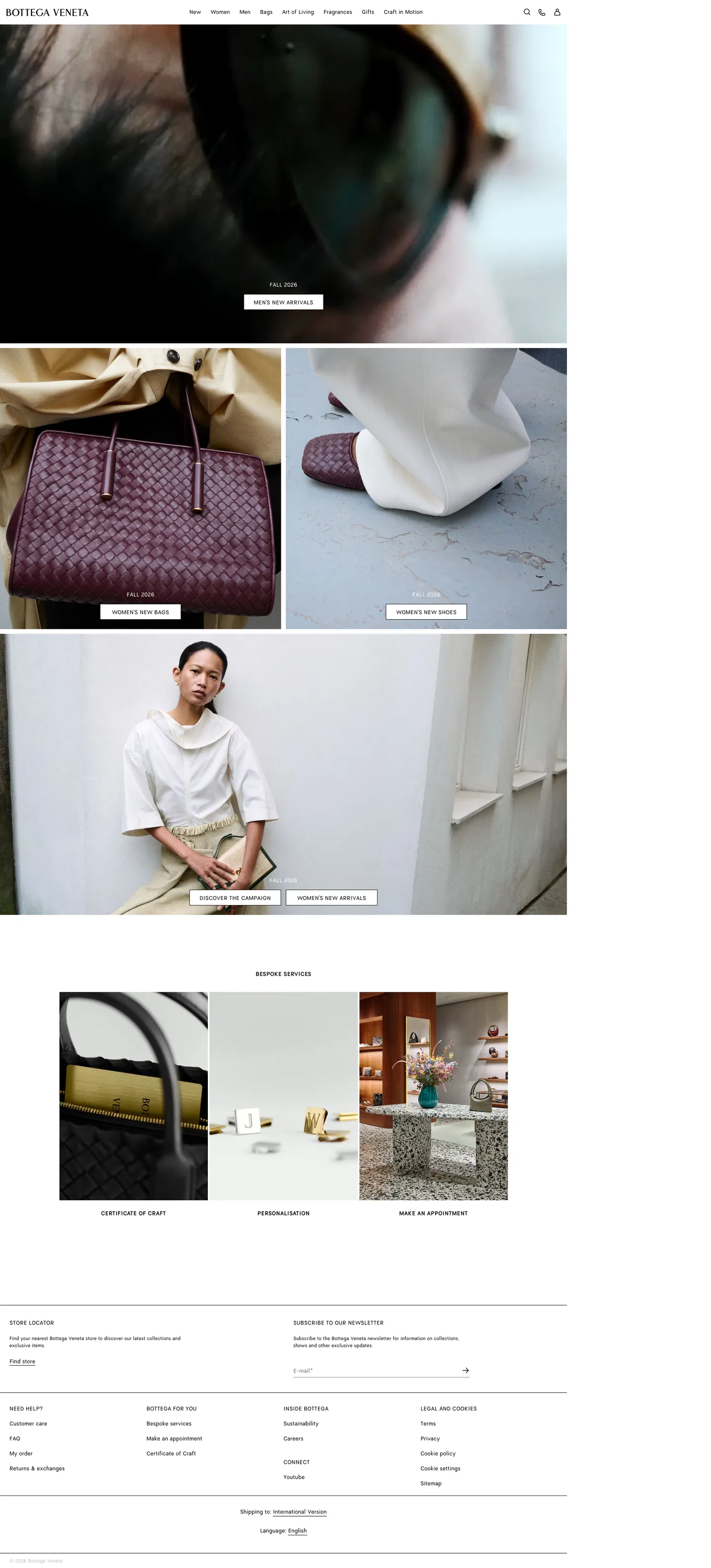
Bottega Veneta's marketing site is one of the most restrained luxury digital systems in operation. The homepage opens on a full-width photograph — a close crop of dark hair, the curve of a sunglasses arm — with the wordmark set small in the top-left corner in the brand's proprietary webfont. No hero text, no gradient overlay, no CTA floated over the image. The photograph fills the browser edge-to-edge and the only type on it is the navigation bar, rendered in the same 14px / weight 400 that the footer uses. The digital shell makes no bid for attention; it steps aside for the object.
This DESIGN.md packages the system as machine-readable tokens for React tooling. Inside: 6 colors tokens covering an achromatic range from ink black through mid graphite to pure white, with no hue anywhere in the palette; 10 typography tokens running the proprietary bottegaveneta-regular-webfont (and its bold companion) at a single 14px base size across every role — hero heading, nav link, body paragraph, and label are typographically identical except for weight and case transformation; 5 spacing tokens on a loose 12–24px base; and 14 components definitions covering the flat-edged primary button, the zero-radius text input, the full-bleed hero section, the editorial photo grid, and the newsletter form.
Feed this file to Claude or Cursor and it reproduces Bottega Veneta's specific restraint: no radius, no shadow, no accent color, a single type size that refuses to hierarchize, and a white canvas that functions as a light table. The one move worth studying — and the one hardest to execute without flinching — is the decision to treat typography as a structural substrate rather than a communication tool. Every headline on the site is the same weight and size as the footer copyright. Authority comes from image scale, not typographic muscle.
What makes it distinct
5
- Photography-as-brand-voltagezero chromatic UI elements; the image grid carries every emotional signal while the shell stays resolutely neutral
- Flat 14px typographya single font size across nav, h2, body, and label, differentiated only by weight (400 vs 700) and case (none vs uppercase)
- Achromatic disciplineonly three neutrals captured: ink black, mid graphite, and white; no tints, no tones, no brand color in the UI
- Zero border-radiusevery container, input, and button is hard-edged; rounding appears once at 7px on a single utility element and nowhere else
- Light-table shellthe page functions as a frameless white surface on which product photography is mounted; no chrome competes with the object being sold
bottegaveneta.com
Live at bottegaveneta.com
A snapshot of the brand in production. Scroll the frame to see the whole page.
Colors
6 colors
Bottega Veneta's system runs on #333333 as its primary voltage, used in 1 of 14 components. Type is set in bottegaveneta-regular-webfont across 10 tokens from 12px to 14px, weights 400–700. Shape language is sharp — components average 0px corner radius, favoring crisp rectangles.
Surface
Page and card backgrounds · 2
Text
Headlines, body, captions · 3
Borders & Hairlines
Dividers, outlines, rules · 1
Typography
10 type tokens
Set in bottegaveneta-regular-webfont across 10 tokens, from 12px to 14px, weights 400–700. Shown in its own stack: where the font isn't installed, the fallback the file names stands in.
- display-xl14px · weight 400 · lh 22px · tracking normalThe quick brown fox jumps over the lazy dog
- heading-md14px · weight 400 · lh 22px · tracking normalThe quick brown fox jumps over the lazy dog
- heading-label14px · weight 700 · lh 22px · tracking normalThe quick brown fox jumps over the lazy dog
- body-md14px · weight 400 · lh 22px · tracking normalThe quick brown fox jumps over the lazy dog
- body-sm12px · weight 400 · lh 18px · tracking normalThe quick brown fox jumps over the lazy dog
- label-md14px · weight 700 · lh 22px · tracking normalThe quick brown fox jumps over the lazy dog
- nav-link14px · weight 400 · lh 22px · tracking normalThe quick brown fox jumps over the lazy dog
- button-md14px · weight 400 · lh 22px · tracking normalThe quick brown fox jumps over the lazy dog
- caption12px · weight 400 · lh 18px · tracking normalThe quick brown fox jumps over the lazy dog
- form-label14px · weight 400 · lh 22px · tracking normalThe quick brown fox jumps over the lazy dog
Layout
Radii and spacing
3 corner radii and 5 spacing values. Shape language: sharp.
Radii
- none0px
- sm7px
- full9999px
Spacing
- xs8px
- sm12px
- base16px
- lg24px
- xl30px
Components
14 components
Each rendered from its tokens (color, type, radius, padding) on Bottega Veneta's own canvas.
- Button Primarybutton-primaryButton Primary
- Button Secondarybutton-secondaryButton Secondary
- Top Navtop-navTop Nav
- Nav Linknav-linkNav Link
- Hero Headinghero-headingHero Heading
- Hero Sectionhero-sectionHero Section
- Body Paragraphbody-paragraphBody Paragraph
- Body Paragraph Mutedbody-paragraph-mutedBody Paragraph Muted
- Section Labelsection-labelSection Label
- CardcardCard
- Photo Tilephoto-tilePhoto Tile
- Type here…text-inputText Input
- Newsletter Formnewsletter-formNewsletter Form
- FooterfooterFooter
In use
The system, in use
Bottega Veneta's tokens on the kind of product it builds.
Build something people actually use.
A short paragraph of marketing copy that previews how the brand's display tier and body tier read together. Two sentences is usually enough.
FAQ
Bottega Veneta design system FAQ
Common questions about Bottega Veneta's tokens, components, and how to use this DESIGN.md in your project.
Read next
Related reading
Specs, directories, and component libraries that pair with this design system.
- Browse all design systemsThe full directory of DESIGN.md files on shadcn.io, with live mockups for each.shadcn.io
- Bottega Veneta — official siteBottega Veneta's public marketing site — the source of truth for the live tokens captured in this file.bottegaveneta.com (opens in a new tab)
- The DESIGN.md specificationGoogle Labs' open spec for machine-readable design system files — the format this page is built on.github.com (opens in a new tab)
Use it
Use Bottega Veneta in your project
One machine-readable file. Drop it into Claude, Cursor, or any AI tool that reads DESIGN.md.
Download the DESIGN.md
One machine-readable file: every color, type, radius, spacing, and component token of Bottega Veneta.
Feed it to your AI tool
Drop it into Claude, Cursor, or GitHub Copilot. The agent writes React components and Tailwind classes that match Bottega Veneta's visual language.
Reference the tokens directly
Or paste the values into your Tailwind config, CSS variables, or component library: every color, size and radius is a quoted, ready-to-copy value.
Read the full DESIGN.md: overview, rationale, do’s and don’ts
Overview
Bottega Veneta's digital presence is an exercise in typographic withdrawal. Light-table restraint: the design system removes every element that might compete with the object being sold — no accent color, no display hierarchy, no radius, no decorative chrome — and leaves a white surface on which photography is mounted at full bleed. Where Burberry uses a beige heritage canvas and type-led editorial panels, and where Gucci employs gold wordmarks and chromatic category headers, Bottega Veneta treats the shell as neutral ground and gives the intrecciato grain and the product surface all chromatic authority.
The type system reinforces this withdrawal. Every text element on the page — the navigation link, the h2, the body paragraph, the newsletter label — renders in the proprietary bottegaveneta-webfont at 14px / weight 400 / 22px line-height. Section headings do not grow larger; they grow louder through uppercase text-transform and the bold companion font. There is no 24px or 32px display tier. The 14px h2 is the same height as the 14px footer. Authority on this page comes from composition and image scale, not from typographic hierarchy.
Key Characteristics:
- Achromatic palette — three neutrals: ink black, mid graphite, white. No hue. No brand color in the UI chrome; color belongs to the product photography.
- Flat 14px type across every role — nav, heading, body, label share one size; differentiation comes from weight (400 vs 700) and uppercase transformation only.
- Zero border-radius — every container is hard-edged. The single 7px radius captured appears on a utility widget (swiper control), not a primary UI component.
- No shadow tier — depth comes from image-to-white contrast, not elevation.
- Full-bleed editorial photo grid at multiple sizes — 2-up asymmetric splits, 1-up portrait fills, 3-up thumbnail rows — as the primary navigation surface.
- Newsletter input and footer share the same zero-radius, zero-background white field with a bottom-only 1px ink border separating input from label.
- Proprietary webfont served in two weights only — no intermediate 500 or 600 step.
Colors
Structural
- Ink (
{colors.ink}— #000000): frequency 426. Used as text (190), border (190), gradient (46). The dominant system ink — appears as text, hairline border, and gradient mask over photography. There is no warm or cool tint; pure black carries every structural role. - Ink Mid (
{colors.ink-mid}— #333333): frequency 122. Used as text (61), border (61). The secondary text and border tone — sub-navigation labels, category anchor text, mid-weight column dividers. Neither black nor gray; the mid-gray that sits at 32% lightness. - Ink Muted (
{colors.ink-muted}— #767676): frequency 2. Used as text (1), border (1). Sparse — reserved for accessibility-threshold secondary labels where pure black would over-weight the hierarchy. - Hairline Mid (
{colors.hairline-mid}— #bfbfbf): frequency 2. Used as text (1), border (1). A light mid-gray for the lowest-contrast hairlines — input placeholders or utility widget tracks. - Canvas (
{colors.canvas}— #ffffff): frequency 25. Used as text (8), bg (9), border (8). The page floor — the light table on which photography is mounted. Pure white, no cream warmth shift. - Surface Dark (
{colors.surface-dark}— #151b17): frequency 1, bg only. A near-black with a faint green undertone — captures Bottega Veneta's signature deep green at its most muted digital expression. Appears on a single overlay panel; not a primary UI color but the only hint of the brand's material signature in the digital system.
Typography
Font Family
The system runs two proprietary webfonts: bottegaveneta-regular-webfont (weight 400) and bottegaveneta-bold-webfont (weight 700), both falling back to Arial and then the generic sans-serif stack. No variable-weight axis is declared. No secondary typeface — no serif, no monospace.
The most distinctive choice is the rejection of a display scale. Every extracted typography signature sits at 14px for heading, nav, and body roles. The single smaller tier is 12px for captions and footer footnotes. A 24px or 32px hero headline does not exist in the extracted surface.
Hierarchy
| Token | Size | Weight | Line Height | Use |
|---|---|---|---|---|
{typography.display-xl} | 14px | 400 | 22px | Hero caption overlay (same size as body) |
{typography.heading-md} | 14px | 400 | 22px | Section headings — same as body; no size promotion |
{typography.heading-label} | 14px | 700 | 22px | Uppercase category anchors ("New", "Women", "Men") |
{typography.body-md} | 14px | 400 | 22px | Default running text |
{typography.body-sm} | 12px | 400 | 18px | Footer footnotes, legal copy, small metadata |
{typography.label-md} | 14px | 700 | 22px | Section labels, form field labels |
{typography.nav-link} | 14px | 400 | 22px | Top-nav primary links |
{typography.button-md} | 14px | 400 | 22px | CTA button label |
{typography.caption} | 12px | 400 | 18px | Product metadata, price fields |
{typography.form-label} | 14px | 400 | 22px | Newsletter form label |
Substitutes
The bottegaveneta webfonts are proprietary and not publicly licensed. Helvetica Neue at 400 and 700 is the closest available substitute — the proportions, x-height, and cap height align closely at 14px. If Helvetica is not available, Inter at the same two weights transfers cleanly at 14px body size.
Layout
Spacing System
- Base unit: 12px — the dominant spacing quantum, appearing 5 times in the extracted padding values.
- Tokens:
{spacing.xs}8px ·{spacing.sm}12px ·{spacing.base}16px ·{spacing.lg}24px ·{spacing.xl}30px. - Hero: zero padding — the full-bleed photograph extends to the browser edge.
- Card and tile padding:
{spacing.sm}12px internally;{spacing.lg}24px between grid cells. - Footer column padding:
{spacing.lg}24px top and bottom; columns separated by implicit whitespace rather than explicit gutters.
Grid and Container
- Hero section: full-bleed, no max-width constraint.
- Editorial photo grid: a mix of full-width single images, 2-up asymmetric splits (one portrait, one landscape), and 3-up thumbnail rows — the grid composition varies per campaign.
- Content sections: centered at approximately 1440px, with 16px horizontal margin on each side.
- Footer: multi-column grid (approximately 5 columns) with
{spacing.base}(16px) horizontal gutters.
Rhythm
The page alternates between full-bleed image and contained text band in a near-one-to-one ratio. Editorial image fills beat text panels two-to-one — a rhythm that signals fashion-house practice (less copy, more image) rather than the copy-heavy SaaS pattern of alternating hero / feature-row / social-proof.
Elevation
The system has no shadow tier. Zero shadow values were captured in the extraction. Depth on this page comes entirely from two sources: the image-to-white contrast (photography lifted against the white canvas), and the single {colors.surface-dark} overlay panel for modal or drawer contexts. There is no box-shadow elevation vocabulary — cards and inputs sit flat against the canvas with no floating affordance.
Shapes
The radius philosophy is hard-edged: {rounded.none} 0px applies to every component in the system. Buttons are rectangular. Input fields are rectangular. The editorial photo tiles are rectangular. The 7px {rounded.sm} captured in the extraction belongs to the swiper carousel control — a utility widget, not a brand-layer component. The philosophy matches luxury fashion industry convention: the hard right angle reads as precision and craft. Rounding is associated with consumer-app approachability, which conflicts with the positioning.
Components
button-primary — Ink-black fill, white text, hard-edged {rounded.none}, 8×25px padding, 38px height. Appears as "Shop now" / "Add to bag" style CTAs overlaid on editorial photography or adjacent to product tiles.
button-secondary — White fill, ink-black text, 1px ink border, same geometry as primary. Used for secondary navigational actions.
top-nav — White canvas, ink text in {typography.nav-link}, 1px ink bottom border, 44px height. Houses the wordmark (flush left), the primary category links centered, and icons (search, account, bag) flush right. No background change on hover captured.
nav-link — Transparent background, ink text at {typography.nav-link} (14px / 400), 12px horizontal padding. The seven primary categories ("New", "Women", "Men", "Shoes", "Bags", "Jewellery", "Home") use the same font as body text — no weight or size promotion.
hero-section — Full-bleed white-canvas container, zero padding, zero radius. Holds the full-bleed hero photograph with the wordmark overlaid at top-left.
hero-heading — Ink text at {typography.heading-md} (14px / 400) — the same size as the body paragraph. Hero overlay captions do not use a larger type size.
body-paragraph — Ink text at {typography.body-md} (14px / 400 / 22px). The default running-text style.
body-paragraph-muted — Muted ink {colors.ink-muted} at {typography.body-sm} (12px). Footer legal footnotes and sub-caption text.
section-label — Bold uppercase label at {typography.label-md} (14px / 700). The only visual promotion in the typographic system — uppercase replaces size hierarchy.
card — White canvas, ink text, hard-edged, 12px internal padding, 1px ink border. Product cards in grid layout.
photo-tile — White canvas container, zero padding, zero radius. The editorial photo tile in the 2-up or 3-up grid — holds one image at 100% of the tile width.
text-input — White canvas, ink text, zero border-radius, 4px vertical / 0px horizontal padding, 30px height, ink border. The newsletter email input renders without a box border — a bottom-only ink underline marks the field boundary.
newsletter-form — White canvas, 20px vertical padding. Holds the newsletter label and input side-by-side.
footer — White canvas, mid-graphite {colors.ink-mid} text, {typography.body-sm} (12px), 24px padding. Five columns: Store locator, Newsletter, brand links, international, and legal. No background color shift from the page canvas.
Do's and Don'ts
Do treat photography as the sole carrier of chromatic identity. The design system provides a neutral achromatic shell; every emotional and brand signal comes from the campaign imagery. If the photography changes, the brand expression changes — the UI does not compensate.
Do use {typography.heading-label} (14px / 700 / uppercase) as the only hierarchy promotion available. Size increase is not part of this system; the only typographic distinction is weight and case. Resist the impulse to add a 24px or 32px display tier.
Do respect the zero-radius convention. Every container, input, and button uses {rounded.none}. The single 7px radius in the extraction is a utility widget anomaly; it does not represent the brand's geometric intent.
Do keep the footer on the same white {colors.canvas} as the page body. The footer does not use a gray or dark background; it continues the light-table surface and separates from body content by a {colors.ink} top-border hairline only.
Don't introduce a brand-color accent into the UI chrome. Bottega Veneta's deep green, which defines the physical brand, does not appear as a UI color — only as {colors.surface-dark} (#151b17) in a single modal overlay. Adding a green CTA button or a green link-state would conflict with the system's deliberate color withdrawal.
Don't add shadows to cards or buttons. The system has zero captured shadow values. Elevating components with box-shadow introduces a consumer-SaaS depth convention that conflicts with the flat-surface philosophy. Use a 1px {colors.ink} border to delineate surfaces instead.
Don't set nav links at a different size than body text. In this system the nav link ({typography.nav-link}, 14px) is identical in size to the body paragraph. Promoting nav links to 16px or 18px would import a hierarchy convention the brand explicitly rejects.
Don't use {colors.ink-muted} (#767676) for anything other than accessibility-mandated secondary text. It appears only twice in the captured surface. Using it for headers, decorative rules, or card backgrounds would dilute the binary ink/canvas contrast that defines the system.
Known Gaps
- Brand green as a material color: Bottega Veneta's signature deep green appears in physical products and brand identity materials but is absent from the digital UI token set. The single
{colors.surface-dark}(#151b17) hint is the closest digital expression and appears on one overlay panel only. - Hover and active states: no hover capture was available in the extraction; button and link hover treatments are not represented in the components.
- Mobile layout: the extraction captures the desktop viewport (1440px). The mobile responsive layout, which collapses the multi-column photo grid to a single-column stack, is not represented.
- Product page: this DESIGN.md captures the marketing homepage only. The product detail page (PDP), the size-selector, the bag drawer, and the checkout flow carry their own surface tokens not represented here.
- Dark-mode or campaign overrides: seasonal campaigns (runway shows, lookbooks) may inject overlay panels that deviate from the achromatic baseline — these are not represented.
- Motion: the site uses scroll-triggered fade-ins and carousel transitions; easing curves and durations are not captured.
- Accessibility states: focus rings, keyboard-navigation indicators, and error-state styling on the newsletter form are not captured from the marketing surface.
E-commerce & Retail
More systems like this
More DESIGN.md files in E-commerce & Retail.
Pricing
Build it with Pro
The DESIGN.md files are free. Pro adds 6,000+ blocks, premium templates and the MCP server, so your AI editor builds in your system for you.
4.9/5 out of 5 · 150+ reviewsfrom 150+ founders and developers.
Billing
Billed once a year in USD. Cancel anytime.
- How many people can use the license.
- Client work, SaaS products and anything you charge for.
- Production-ready React sections: hero, pricing, features, dashboards and more.
- Complete multi-page sites you can ship as they are.
- React icons from every major library, installable with one command.
- Presets that restyle every block, in light and dark.
- Lets your AI editor search, preview and install blocks for you.
- Priority requests are answered first.
Individual
For personal projects & open source
$32instead of $49/mo
$389 billed yearly
- Seats: 1 seat
- Commercial use: Personal & open source only
- Pro blocks: 6,000+ blocks
- Templates: All 14 templates
- React icons: 294k+ icons
- Themes: All 59 themes
- MCP server: Basic usage
- Support: Standard
Team
Most popularFor freelancers, agencies & startups
$66instead of $99/mo
$789 billed yearly · ≈ $13/dev/mo
- Seats: Up to 5 seats
- Commercial use: Included
- Pro blocks: 6,000+ blocks
- Templates: All 14 templates
- React icons: 294k+ icons
- Themes: All 59 themes
- MCP server: High usage
- Support: Priority
Organization
For companies with larger teams
$132instead of $199/mo
$1,589 billed yearly
- Seats: Unlimited seats
- Commercial use: Included
- Pro blocks: 6,000+ blocks
- Templates: All 14 templates
- React icons: 294k+ icons
- Themes: All 59 themes
- MCP server: Unlimited usage
- Support: Priority
Billed once a year in USD. Cancel anytime.
Individual
For personal projects & open source
$32instead of $49/mo
$389 billed yearly
- How many people can use the license.Seats: 1 seat
- Client work, SaaS products and anything you charge for.Commercial use: Personal & open source only
- Production-ready React sections: hero, pricing, features, dashboards and more.Pro blocks: 6,000+ blocks
- Complete multi-page sites you can ship as they are.Templates: All 14 templates
- React icons from every major library, installable with one command.React icons: 294k+ icons
- Presets that restyle every block, in light and dark.Themes: All 59 themes
- Lets your AI editor search, preview and install blocks for you.MCP server: Basic usage
- Priority requests are answered first.Support: Standard
Team
Most popularFor freelancers, agencies & startups
$66instead of $99/mo
$789 billed yearly · ≈ $13/dev/mo
Everything in Individual, plus
- How many people can use the license.Seats: Up to 5 seats
- Client work, SaaS products and anything you charge for.Commercial use: Included
- Lets your AI editor search, preview and install blocks for you.MCP server: High usage
- Priority requests are answered first.Support: Priority
Organization
For companies with larger teams
$132instead of $199/mo
$1,589 billed yearly
Everything in Team, plus
- How many people can use the license.Seats: Unlimited seats
- Lets your AI editor search, preview and install blocks for you.MCP server: Unlimited usage
- Secure checkout via Stripe
- Code lives in your repo
- Keep what you've shipped if you cancel
- License terms
Your system, built for you
Every block, template and icon, installed by your AI agent in your design system. The DESIGN.md files stay free.