Balenciaga Design System
Balenciaga's design system as a DESIGN.md file. BB-Regular and BB-CondBold on a pure-black canvas, tracked uppercase navigation, 8 colors, 17 components. For React, Next.js, and AI tools.
Add shadcn.io to your AI agent. · Pro It installs blocks, icons and templates in your design system from a prompt, with Pro.
Set up MCP- Primary
- #f6f5f3
- Typeface
- BB-Regular
- Shape
- Sharp
- Base radius
- 4px
- Colors
- 8
- Type tokens
- 11
- Components
- 17
- Spacing values
- 8
About
About Balenciaga DESIGN.md
Curated by Dov Azencot · Updated May 19, 2026 · Source balenciaga.com (opens in a new tab)
Balenciaga's digital system is the one luxury fashion site that looks like it was designed to discomfort before it was designed to sell. The navigation bar runs "FALL 26" in 12px tracked uppercase with zero visual hierarchy between product categories and seasonal identifiers — everything sits at the same compressed weight and size. The product grid densifies to the edge of the viewport. The canvas is pure black. There is no warm ivory, no gentle blush, no brand gold: the system runs three tones (black, white, and a mid-grey shadow) and trusts the house typefaces — BB-Regular and BB-CondBold, both named after Cristóbal Balenciaga — to carry the full identity load.
The DESIGN.md file captures 8 colors tokens from the extraction's three-tone palette, 11 typography tokens spanning BB-Regular at 12–14px for UI chrome and BB-CondBold at 12–22px for product headings and category labels, 4 radius tokens (the system's dominant radius is 4px), 8 spacing tokens anchored to a 12px base, and 17 components definitions covering the primary button, the tracked-uppercase nav link, the product card, the shadow-elevated modal surface, and the cookie-consent banner. The extraction also captured five CSS easing custom properties — including the distinctive --ease-bounce (cubic-bezier .65,-.55,.25,1.5) — confirming that motion is a considered part of the system.
Feed this file to Claude or Cursor and it will reproduce Balenciaga's specific moves: black canvas instead of white, BB-CondBold at 22px tracked uppercase for every product label, 4px radius on interactive surfaces, and shadow-based rather than tonal elevation. The one move worth borrowing carefully: the compressed uppercase treatment works because it applies to everything — if you use it selectively on some labels but not others, the system reads as a pastiche rather than a commitment.
What makes it distinct
5
- House typefaces as brand identityBB-Regular and BB-CondBold are proprietary fonts named after the house, carrying the visual authority that other brands assign to a brand accent color
- Compression as aestheticBB-CondBold at 22px with 1.1px tracking and uppercase transforms every product name into a structural typographic block
- Three-color systempure black, pure white, and a single mid-grey shadow form the entire visual vocabulary; the system achieves distinction without any chromatic element
- Shadow as the only elevationgrey shadow tones (not raised surfaces) create the depth hierarchy across 1082 total color occurrences for black alone
- Bounce easing as signature motionthe CSS custom property --ease-bounce: cubic-bezier(.65,-.55,.25,1.5) appears alongside standard easing curves, signaling that Balenciaga's UI has a deliberate snap-back character
balenciaga.com
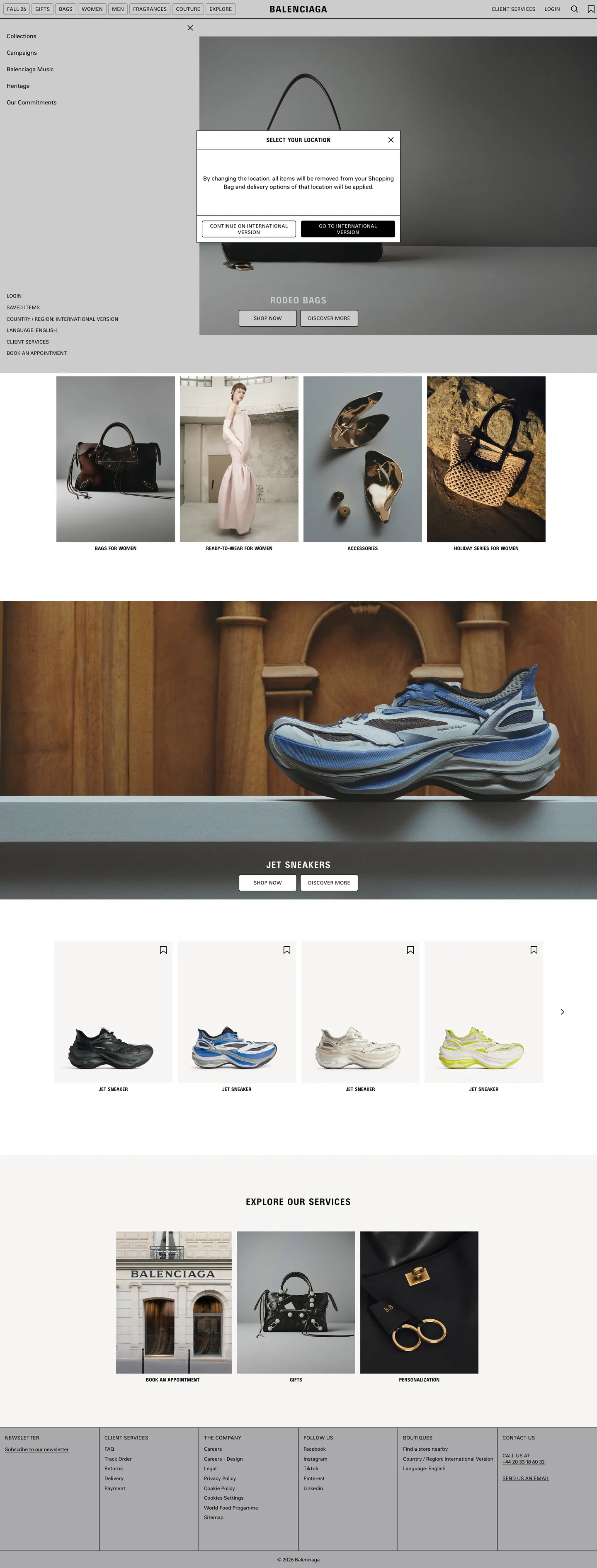
Live at balenciaga.com
A snapshot of the brand in production. Scroll the frame to see the whole page.
Colors
8 colors
Balenciaga's system anchors on #f6f5f3 (canvas-warm) as its primary color. Type is set in BB-Regular across 11 tokens from 12px to 22px, weights 400–700. Shape language is sharp — components average 3px corner radius, favoring crisp rectangles.
Surface
Page and card backgrounds · 3
Text
Headlines, body, captions · 2
Borders & Hairlines
Dividers, outlines, rules · 2
Other
Specialty colors · 1
Typography
11 type tokens
Set in BB-Regular across 11 tokens, from 12px to 22px, weights 400–700. Shown in its own stack: where the font isn't installed, the fallback the file names stands in.
- display-xl22px · weight 700 · lh 24px · tracking 1.1pxThe quick brown fox jumps over the lazy dog
- display-lg22px · weight 400 · lh 24px · tracking 1.1pxThe quick brown fox jumps over the lazy dog
- heading-md14px · weight 400 · lh 16px · tracking 0.42pxThe quick brown fox jumps over the lazy dog
- heading-sm12px · weight 700 · lh 14pxThe quick brown fox jumps over the lazy dog
- body-md14px · weight 400 · lh 20pxThe quick brown fox jumps over the lazy dog
- body-sm12px · weight 400 · lh 16px · tracking 0.12pxThe quick brown fox jumps over the lazy dog
- label-tracked12px · weight 400 · lh 16px · tracking 0.36pxThe quick brown fox jumps over the lazy dog
- caption12px · weight 400 · lh 16pxThe quick brown fox jumps over the lazy dog
- button-md12px · weight 400 · lh 16px · tracking 0.36pxThe quick brown fox jumps over the lazy dog
- nav-link12px · weight 400 · lh 16px · tracking 0.36pxThe quick brown fox jumps over the lazy dog
- nav-link-category12px · weight 400 · lh 16px · tracking 0.12pxThe quick brown fox jumps over the lazy dog
Layout
Radii and spacing
4 corner radii and 8 spacing values. Shape language: sharp.
Radii
- none0px
- xs2px
- sm4px
- full9999px
Spacing
- xs4px
- sm8px
- md12px
- base16px
- lg20px
- xl40px
- 2xl64px
- 3xl100px
Components
17 components
Each rendered from its tokens (color, type, radius, padding) on Balenciaga's own canvas.
- Button Primarybutton-primaryButton Primary
- Button Primary Hoverbutton-primary-hoverButton Primary Hover
- Button Secondarybutton-secondaryButton Secondary
- Top Navtop-navTop Nav
- Nav Linknav-linkNav Link
- Hero Headinghero-headingHero Heading
- Product Labelproduct-labelProduct Label
- Section Headingsection-headingSection Heading
- Body Paragraphbody-paragraphBody Paragraph
- CardcardCard
- Product Cardproduct-cardProduct Card
- ModalmodalModal
- Cookie Bannercookie-bannerCookie Banner
- Type here…text-inputText Input
- Price Labelprice-labelPrice Label
- Category Headercategory-headerCategory Header
- FooterfooterFooter
In use
The system, in use
Balenciaga's tokens on the kind of product it builds.
Build something people actually use.
A short paragraph of marketing copy that previews how the brand's display tier and body tier read together. Two sentences is usually enough.
FAQ
Balenciaga design system FAQ
Common questions about Balenciaga's tokens, components, and how to use this DESIGN.md in your project.
Read next
Related reading
Specs, directories, and component libraries that pair with this design system.
- Browse all design systemsThe full directory of DESIGN.md files on shadcn.io, with live mockups for each.shadcn.io
- Balenciaga — official siteBalenciaga's public marketing site — the source of truth for the live tokens captured in this file.balenciaga.com (opens in a new tab)
- The DESIGN.md specificationGoogle Labs' open spec for machine-readable design system files — the format this page is built on.github.com (opens in a new tab)
Use it
Use Balenciaga in your project
One machine-readable file. Drop it into Claude, Cursor, or any AI tool that reads DESIGN.md.
Download the DESIGN.md
One machine-readable file: every color, type, radius, spacing, and component token of Balenciaga.
Feed it to your AI tool
Drop it into Claude, Cursor, or GitHub Copilot. The agent writes React components and Tailwind classes that match Balenciaga's visual language.
Reference the tokens directly
Or paste the values into your Tailwind config, CSS variables, or component library: every color, size and radius is a quoted, ready-to-copy value.
Read the full DESIGN.md: overview, rationale, do’s and don’ts
Overview
Balenciaga's digital system is the counterargument to luxury-brand convention. Compressed authority. Where Chanel uses white canvas, generous spacing, and proprietary italic script for emotional warmth, and where Dior trusts Futura's geometry against white to signal history, Balenciaga densifies everything: pure black canvas, proprietary condensed bold type, uniform 12px uppercase across every navigation element, and a product grid that packs tight to the viewport edge. The system's authority doesn't come from space — it comes from compression.
The two house typefaces — BB-Regular and BB-CondBold — are named after Cristóbal Balenciaga himself. The choice to name the fonts after the house is a claim that type is the brand: not a logo lock-up, not a palette, not a photographic style. BB-CondBold at 22px with 1.1px tracking and forced uppercase takes every product name ("RODEO BAGS," "JET SNEAKER") and turns it into structural typography rather than descriptive commerce. This is the inverse of how direct-to-consumer brands use type — those brands keep labels small and neutral so photography takes center stage. Balenciaga makes the label as visually heavy as the photograph.
The extraction confirms the commitment to monochrome: 1984 elements scanned, three tones found. Black at 1082 total occurrences. White at 33. A mid-grey shadow tone at 107, used almost exclusively for shadow rather than text or fill.
Key Characteristics:
- Pure black canvas (
{colors.ink}— #000000): 1082 total occurrences including 532 as text and 523 as border. The overwhelming dominant tone. - BB-CondBold at 22px, 1.1px tracking, uppercase — applied to product names, campaign headers, and section labels. Compressed authority as the brand's typographic voice.
- Three-tone palette: ink, white, grey shadow. No accent, no warm tone, no structural color.
- 4px radius (
{rounded.sm}) as the system's default rounding for buttons, nav chips, and modal surfaces. Modest, not zero, not pill. - Shadow-based elevation: the
{colors.shadow}mid-grey (#aaaaac) appears 106 times as shadow and once as a background fill — the entire elevation system runs through shadow opacity rather than tonal surface lift. - Five CSS easing custom properties captured, including the bounce curve
cubic-bezier(.65,-.55,.25,1.5)— a physical snap quality on UI interactions. - Product grid with 12px internal card padding and a dense pack density.
Colors
Structural
- Ink (
{colors.ink}— #000000): frequency 1082. Used as text (532), border (523), background (2), shadow (25). The canvas itself, the text, the borders, and the primary button fill — black is every layer simultaneously. This is not black as accent or as contrast; it is black as the entire system. - Canvas (
{colors.canvas}— #ffffff): frequency 33. Used as background (18), border (12), text (3). The inversion surface — appears where product photography needs a light ground, on modal backgrounds, on button-secondary fills, and as the nav link border signal. - Canvas Warm (
{colors.canvas-warm}— #f6f5f3): merged into the canvas cluster at extraction. A fractionally off-white that appears on some surface fills where absolute white would feel clinical.
Shadow
- Shadow (
{colors.shadow}— #aaaaac): frequency 107. Used as shadow (106), background (1). The elevation medium. Not used for text, not used for borders — exclusively for casting depth on modal surfaces, card hover states, and the cookie-consent panel. The blue-grey cast is barely perceptible; it reads almost as a neutral mid-grey.
Typography
Font Families
The system runs BB-Regular for interface chrome, body, and navigation, and BB-CondBold for product names, category identifiers, and campaign headlines. Both share the same fallback stack: Helvetica Neue, Helvetica, Arial, sans-serif. The two-weight split is the system's entire typographic range — there is no intermediate weight, no serif accent, no monospace. The compression in BB-CondBold is the system's one expressive variable.
Hierarchy
| Token | Size | Weight | Line Height | Letter Spacing | Use |
|---|---|---|---|---|---|
{typography.display-xl} | 22px | 700 | 24px | 1.1px | Product names, campaign labels, section headers (BB-CondBold) |
{typography.display-lg} | 22px | 400 | 24px | 1.1px | Body-weight condensed spans — section dek (BB-CondBold) |
{typography.heading-md} | 14px | 400 | 16px | 0.42px | Sub-section labels and category headers (BB-CondBold uppercase) |
{typography.heading-sm} | 12px | 700 | 14px | 0 | h2 product names in condensed bold (BB-CondBold) |
{typography.body-md} | 14px | 400 | 20px | 0 | Body paragraphs, product descriptions (BB-Regular) |
{typography.body-sm} | 12px | 400 | 16px | 0.12px | Navigation labels, price labels, inline spans (BB-Regular) |
{typography.label-tracked} | 12px | 400 | 16px | 0.36px | Tracked navigation items and form labels (BB-Regular) |
{typography.button-md} | 12px | 400 | 16px | 0.36px | Button text (BB-Regular tracked) |
{typography.nav-link} | 12px | 400 | 16px | 0.36px | Primary nav links (BB-Regular) |
{typography.nav-link-category} | 12px | 400 | 16px | 0.12px | Secondary nav links (BB-Regular lighter track) |
{typography.caption} | 12px | 400 | 16px | 0 | Captions and metadata |
Principles
The weight range is minimal: 400 and 700, both at 12px, with size and condensation doing the work that most type systems assign to the weight axis. BB-CondBold at 22px is the loudest moment; everything else sits at 12–14px in either regular or condensed variants. The absence of a mid-weight (500, 600) is unusual — Balenciaga forces a binary between regular and compressed-bold rather than offering a gradient of emphasis.
Note on Font Substitutes
BB-Regular and BB-CondBold are proprietary house fonts. For open-source substitutes: Barlow Condensed Bold approximates BB-CondBold's character at display sizes; Barlow Regular covers the BB-Regular register. For a tighter match, Helvetica Neue Condensed is the intended fallback's condensed variant. Avoid anything that isn't geometrically neutral — the Balenciaga type identity is specifically not warm, not humanist, not friendly.
Layout
Spacing System
- Base unit: 12px (the dominant padding value at 33 occurrences).
- Tokens:
{spacing.xs}4px ·{spacing.sm}8px ·{spacing.md}12px ·{spacing.base}16px ·{spacing.lg}20px ·{spacing.xl}40px ·{spacing.2xl}64px ·{spacing.3xl}100px. - Nav height: 44px (--topsearchheight captured as a CSS custom property).
- Product card padding: 8x12 at the top, zero horizontal padding for image tiles.
- Section padding: 40px horizontal and 100px vertical separating major campaign sections.
Grid & Container
- Product grid: tight n-column layout. 12px gutters, images bleeding to card edge.
- Campaign sections: full-bleed photography with centered text overlay at constrained max-width.
- Navigation: edge-to-edge horizontal strip, 44px tall, labels at 12px tracked uppercase.
Rhythm
The page is dense by design. Campaign hero images bleed edge-to-edge and are immediately followed by the product grid with minimal vertical separation. There is no generous whitespace section between them — the transition from editorial to commercial is abrupt and intentional.
Elevation
Balenciaga's elevation system runs exclusively through shadow. The {colors.shadow} mid-grey (#aaaaac) appears 106 times as shadow. The modal panel (cookie consent, the service-exploration overlay) uses this shadow to lift above the canvas without changing its background color.
- Flat (no shadow): product grid cards, editorial photography sections, footer.
- Shadow-elevated: modal surfaces, notification panels, cookie-consent banners.
- No tonal surface lift — the system never uses a lighter or darker background fill to indicate elevation, only
rgba({colors.shadow}, *)shadows.
Shapes
The radius philosophy is minimal-practical. The dominant radius is {rounded.sm} (4px), which appears 30 times in the extraction. A 2px radius appears 24 times for smaller surfaces. Buttons, nav chips, modals, and interactive containers all round to 4px. This is the minimum that contemporary web-UI convention requires — below 4px, interactive surfaces begin to read as sharp-cornered structural elements rather than pressable targets.
The system never approaches a pill (50%+ radius) or the generous 8–16px rounding that direct-to-consumer brands use. The edge is meant to be perceived as slightly sharp — consistent with the brand's anti-softness stance.
Components
button-primary — Ink {colors.ink} fill, white text, BB-Regular tracked at {typography.button-md}, {rounded.sm} 4px radius, 0x16 padding, 40px height. The canonical instance captured is "Go to international version."
button-secondary — White fill, ink text, 1px ink border, 4px radius. Used for locale selectors and service navigation.
top-nav — White canvas, 44px height (matching the --topsearchheight CSS variable). Navigation links in 12px tracked uppercase. The nav sits on white rather than black — an inversion of the page canvas.
nav-link — Transparent background, ink text, {typography.nav-link} 12px tracked, 4px radius, 0x8 padding, 28px height, white border. The active-state nav item (e.g. "FALL 26") renders with a white outline rather than a filled state.
product-label — The BB-CondBold uppercase product name treatment. Transparent background, ink text, 22px/700/1.1px tracking. Applied to every product heading across the grid.
card — White canvas, zero radius, 8x12 top padding, zero horizontal. Product photography fills the card edge-to-edge; the label appears beneath.
product-card — The full product tile. White canvas, zero radius, 16px top padding. Holds the product image, BB-CondBold product name, and price label in tracked regular.
modal — White canvas, {colors.shadow} box-shadow elevation, {rounded.sm} 4px radius, 20px padding. Used for the country/region selector and service overlay.
cookie-banner — White fill, {rounded.xs} 2px radius, 12px padding. An ink-text body in BB-Regular with two ink-fill buttons.
text-input — White canvas, ink text, 1px ink border, {rounded.sm} 4px radius, 1x6 padding, 28px height. Compact — the input height is 28px, not the 40px most web-UI systems use.
price-label — Transparent, ink text, {typography.label-tracked} 12px with 0.36px tracking. Price always appears as tracked regular, never bold.
footer — White canvas, ink text, 48px top padding, 40px horizontal, compact tracked regular.
Do's and Don'ts
Do set every product name in BB-CondBold uppercase with 1.1px letter-spacing at 22px. The product label is the system's primary expressive element — it is the brand mark at the item level. Using sentence-case, mixed case, or a different weight collapses the compressed authority the system is built around.
Do use {spacing.md} (12px) as the base card padding. The product grid density is intentional — 12px internal card padding, not 16px or 24px. The tighter gap reinforces the system's anti-generous spatial philosophy.
Do apply the --ease-bounce curve (cubic-bezier .65,-.55,.25,1.5) to UI interactions like drawer open/close, menu expansion, and hover-state reveals. It is a CSS custom property captured from the live site — the snap-back quality is a deliberate part of the system's interaction personality.
Do invert nav-link state signals using white borders rather than filled backgrounds. The captured nav link uses a white 1px border as its active-state indicator on a white background — the border IS the signal. Switching to a filled state or an underline loses the system's specific interaction language.
Don't apply the 22px BB-CondBold tracked uppercase to body paragraphs or editorial descriptions. The {typography.display-xl} treatment is product-name-only. Using it on body text — even one sentence — destroys the contrast between product identity and descriptive content. Use {typography.body-md} (BB-Regular 14px / 400) instead.
Don't round any element above {rounded.sm} (4px). The system has no 8px, 12px, or pill radius. Adding a pill button or a rounded card creates a consumer-softness that directly contradicts the brand's anti-softness stance.
Don't use {colors.shadow} (#aaaaac) as a text color or background fill. In the extraction it appears 106 times as shadow and once as a background — it is an elevation medium, not a palette tone. For secondary text, use {colors.ink} at reduced opacity in CSS.
Don't increase the button height above 40px. The compact 40px button height is part of the dense pack philosophy — the brand does not prioritize large tap targets or accessibility-friendly button sizing at the expense of information density.
Known Gaps
- Full hover and focus state matrix: only the nav-link active state and a button opacity-fade hover were captured. Focus rings, keyboard navigation indicators, and disabled states are not documented.
- Dark-canvas sections: the product grid and navigation run on a white surface despite the marketing canvas being ink black. Dark-canvas component variants (white-fill cards on black, white-text forms) for campaign sections are not captured.
- Product interaction states: size selectors, add-to-cart confirmation states, wishlist toggles, and checkout form validation are not represented.
- Animation timing: the CSS easing curves are captured but duration values for transitions are not. The bounce and fade easing curves require duration context to implement correctly.
- Sub-brand and collaboration typography: limited-edition and collaboration pages use display type treatments that may differ from the core system.
- Accessibility states: the system's high-contrast approach (black on white) provides WCAG AA compliance at most sizes, but focus-ring design and screen-reader semantics are not captured.
E-commerce & Retail
More systems like this
More DESIGN.md files in E-commerce & Retail.
Pricing
Build it with Pro
The DESIGN.md files are free. Pro adds 6,000+ blocks, premium templates and the MCP server, so your AI editor builds in your system for you.
4.9/5 out of 5 · 150+ reviewsfrom 150+ founders and developers.
Billing
Billed once a year in USD. Cancel anytime.
- How many people can use the license.
- Client work, SaaS products and anything you charge for.
- Production-ready React sections: hero, pricing, features, dashboards and more.
- Complete multi-page sites you can ship as they are.
- React icons from every major library, installable with one command.
- Presets that restyle every block, in light and dark.
- Lets your AI editor search, preview and install blocks for you.
- Priority requests are answered first.
Individual
For personal projects & open source
$32instead of $49/mo
$389 billed yearly
- Seats: 1 seat
- Commercial use: Personal & open source only
- Pro blocks: 6,000+ blocks
- Templates: All 14 templates
- React icons: 294k+ icons
- Themes: All 59 themes
- MCP server: Basic usage
- Support: Standard
Team
Most popularFor freelancers, agencies & startups
$66instead of $99/mo
$789 billed yearly · ≈ $13/dev/mo
- Seats: Up to 5 seats
- Commercial use: Included
- Pro blocks: 6,000+ blocks
- Templates: All 14 templates
- React icons: 294k+ icons
- Themes: All 59 themes
- MCP server: High usage
- Support: Priority
Organization
For companies with larger teams
$132instead of $199/mo
$1,589 billed yearly
- Seats: Unlimited seats
- Commercial use: Included
- Pro blocks: 6,000+ blocks
- Templates: All 14 templates
- React icons: 294k+ icons
- Themes: All 59 themes
- MCP server: Unlimited usage
- Support: Priority
Billed once a year in USD. Cancel anytime.
Individual
For personal projects & open source
$32instead of $49/mo
$389 billed yearly
- How many people can use the license.Seats: 1 seat
- Client work, SaaS products and anything you charge for.Commercial use: Personal & open source only
- Production-ready React sections: hero, pricing, features, dashboards and more.Pro blocks: 6,000+ blocks
- Complete multi-page sites you can ship as they are.Templates: All 14 templates
- React icons from every major library, installable with one command.React icons: 294k+ icons
- Presets that restyle every block, in light and dark.Themes: All 59 themes
- Lets your AI editor search, preview and install blocks for you.MCP server: Basic usage
- Priority requests are answered first.Support: Standard
Team
Most popularFor freelancers, agencies & startups
$66instead of $99/mo
$789 billed yearly · ≈ $13/dev/mo
Everything in Individual, plus
- How many people can use the license.Seats: Up to 5 seats
- Client work, SaaS products and anything you charge for.Commercial use: Included
- Lets your AI editor search, preview and install blocks for you.MCP server: High usage
- Priority requests are answered first.Support: Priority
Organization
For companies with larger teams
$132instead of $199/mo
$1,589 billed yearly
Everything in Team, plus
- How many people can use the license.Seats: Unlimited seats
- Lets your AI editor search, preview and install blocks for you.MCP server: Unlimited usage
- Secure checkout via Stripe
- Code lives in your repo
- Keep what you've shipped if you cancel
- License terms
Your system, built for you
Every block, template and icon, installed by your AI agent in your design system. The DESIGN.md files stay free.