Audemars Piguet Design System
Audemars Piguet's design system as a DESIGN.md file. Helvetica Neue Web weight 100 paired with Times Now italic weight 250, near-white canvas, 17 colors tokens, 14 components. For React, Next.js, and AI tools.
Add shadcn.io to your AI agent. · Pro It installs blocks, icons and templates in your design system from a prompt, with Pro.
Set up MCP- Primary
- #757575
- Typeface
- Helvetica Neue Web
- Shape
- Sharp
- Base radius
- 12px
- Colors
- 17
- Type tokens
- 14
- Components
- 14
- Spacing values
- 8
About
About Audemars Piguet DESIGN.md
Curated by Dov Azencot · Updated May 19, 2026 · Source audemarspiguet.com (opens in a new tab)
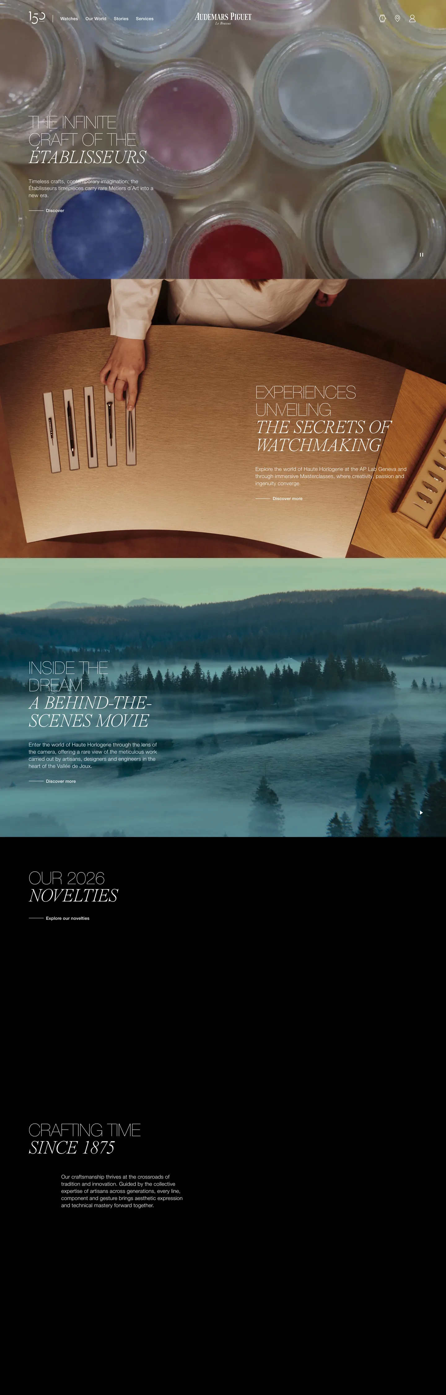
Audemars Piguet's marketing site runs a dual-typeface system that is nearly unique in the luxury-goods sector: Helvetica Neue Web in ultra-thin weight 100 handles every headline and interface label, while Times Now italic in weight 250 holds every editorial subheading and pull-quote. The two voices do not compete — the sans is uppercase, tracked, mechanical; the serif is lowercase, italic, unhurried. The hero h1 reads "The Infinite Craft of the Établisseurs" in white Helvetica Neue Web at 56px / 100 / uppercase; on the next editorial beat the same text might appear in Times Now at 60px / 250 / italic over a photograph of a workshop scene. The tension between those two surfaces is the brand's typographic signature. Where Cartier commits to all-caps sans throughout and Ferrari commits to a single FerrariSans, AP splits the page between machine and manuscript.
This DESIGN.md file packages the system into 17 colors tokens — primarily white, off-white, pure black, and mid-grays, plus a declared-but-invisible brand green wired as --color-brand-color; 14 typography tokens covering Helvetica Neue Web at weights 100 through 500 and Times Now italic at 250; 5 corner-radius values from the extracted CSS variables (none to 56px pill); 8 spacing tokens on an approximate 8px base; and 14 components definitions covering the hero heading, section headings, navigation, body copy, CTA buttons, and card surfaces. The absence of a rendered brand accent color is documented and intentional.
Feed this file to Claude or Cursor and it will reproduce AP's counterpoint system: ultra-thin sans uppercase display, lightweight italic serif editorial, off-white warm canvas, zero decorative chrome. The most consequential discipline to preserve is the typeface split — when in doubt, use the sans for anything interface-level and the serif for anything editorial. Breaking that rule collapses the tension the system depends on.
What makes it distinct
5
- Dual-typeface counterpointHelvetica Neue Web in ultra-thin weight 100 for sans display, Times Now in weight 250 italic for serif editorial; no other weights above 500
- Near-white warm canvasthe page floor merges pure white and light beige into a single off-white floor; the system never uses a blue-white or neutral gray canvas
- Declared brand green absent from marketing render--color-brand-color (deep forest) and --color-brand-green are in CSS but produce zero rendered occurrences; photography carries all color
- Uppercase all-caps sans at 56px weight 100the system's loudest typographic moment uses negative letter-spacing (-0.56px) at ultra-thin weight, not heavyweight
- Full-bleed photography between typographic bandsevery editorial section transitions through a cinematic photograph before the next text zone
audemarspiguet.com
Live at audemarspiguet.com
A snapshot of the brand in production. Scroll the frame to see the whole page.
Colors
17 colors
Audemars Piguet's system anchors on #757575 (ink-faint) as its primary color. Type is set in Helvetica Neue Web across 14 tokens from 12px to 93px, weights 100–500. Shape language is sharp — components average 0px corner radius, favoring crisp rectangles.
Brand & Accent
Sparing, CTA-only voltage · 4
Surface
Page and card backgrounds · 3
Text
Headlines, body, captions · 4
Borders & Hairlines
Dividers, outlines, rules · 2
Semantic
Status, errors, success, links · 1
Other
Specialty colors · 3
Typography
14 type tokens
Set in Helvetica Neue Web across 14 tokens, from 12px to 93px, weights 100–500. Shown in its own stack: where the font isn't installed, the fallback the file names stands in.
- display-xl93px · weight 100 · lh 77.19pxThe quick brown fox jumps over the lazy dog
- display-lg56px · weight 100 · lh 56px · tracking -0.56pxThe quick brown fox jumps over the lazy dog
- display-serif-xl60px · weight 250 · lh 49.8px · tracking -1.2pxThe quick brown fox jumps over the lazy dog
- display-serif-lg36px · weight 250 · lh 48pxThe quick brown fox jumps over the lazy dog
- heading-lg56px · weight 100 · lh 64pxThe quick brown fox jumps over the lazy dog
- heading-md40px · weight 200 · lh 48pxThe quick brown fox jumps over the lazy dog
- heading-sm30px · weight 100 · lh 40pxThe quick brown fox jumps over the lazy dog
- body-lg17px · weight 300 · lh 22.95px · tracking 0.26pxThe quick brown fox jumps over the lazy dog
- body-md16px · weight 300 · lh 24px · tracking 0.21pxThe quick brown fox jumps over the lazy dog
- body-sm14px · weight 300 · lh 20px · tracking 0.21pxThe quick brown fox jumps over the lazy dog
- label-md14px · weight 500 · lh 24px · tracking 0.21pxThe quick brown fox jumps over the lazy dog
- label-sm12px · weight 500 · lh 16px · tracking 1.8pxThe quick brown fox jumps over the lazy dog
- button-md14px · weight 500 · lh 18px · tracking 0.21pxThe quick brown fox jumps over the lazy dog
- nav-link14px · weight 500 · lh 20.86px · tracking 0.21pxThe quick brown fox jumps over the lazy dog
Layout
Radii and spacing
7 corner radii and 8 spacing values. Shape language: sharp.
Radii
- none0px
- xs4px
- sm8px
- md12px
- lg16px
- xl24px
- pill56px
Spacing
- xxs4px
- xs8px
- sm16px
- md24px
- base32px
- lg64px
- xl80px
- 2xl120px
Components
14 components
Each rendered from its tokens (color, type, radius, padding) on Audemars Piguet's own canvas.
- Button Primarybutton-primaryButton Primary
- Button Primary Hoverbutton-primary-hoverButton Primary Hover
- Button Secondarybutton-secondaryButton Secondary
- Top Navtop-navTop Nav
- Nav Linknav-linkNav Link
- Hero Headinghero-headingHero Heading
- Hero Serifhero-serifHero Serif
- Section Headingsection-headingSection Heading
- Editorial Headingeditorial-headingEditorial Heading
- Body Paragraphbody-paragraphBody Paragraph
- Body Paragraph On Lightbody-paragraph-on-lightBody Paragraph On Light
- Label Overlinelabel-overlineLabel Overline
- CardcardCard
- Type here…text-inputText Input
In use
The system, in use
Audemars Piguet's tokens on the kind of product it builds.
Build something people actually use.
A short paragraph of marketing copy that previews how the brand's display tier and body tier read together. Two sentences is usually enough.
FAQ
Audemars Piguet design system FAQ
Common questions about Audemars Piguet's tokens, components, and how to use this DESIGN.md in your project.
Read next
Related reading
Specs, directories, and component libraries that pair with this design system.
- Browse all design systemsThe full directory of DESIGN.md files on shadcn.io, with live mockups for each.shadcn.io
- Audemars Piguet — official siteAudemars Piguet's public marketing site — the source of truth for the live tokens captured in this file.audemarspiguet.com (opens in a new tab)
- The DESIGN.md specificationGoogle Labs' open spec for machine-readable design system files — the format this page is built on.github.com (opens in a new tab)
Use it
Use Audemars Piguet in your project
One machine-readable file. Drop it into Claude, Cursor, or any AI tool that reads DESIGN.md.
Download the DESIGN.md
One machine-readable file: every color, type, radius, spacing, and component token of Audemars Piguet.
Feed it to your AI tool
Drop it into Claude, Cursor, or GitHub Copilot. The agent writes React components and Tailwind classes that match Audemars Piguet's visual language.
Reference the tokens directly
Or paste the values into your Tailwind config, CSS variables, or component library: every color, size and radius is a quoted, ready-to-copy value.
Read the full DESIGN.md: overview, rationale, do’s and don’ts
Overview
Audemars Piguet's marketing site refuses the conventions of luxury-goods typography. Counterpoint system: where Cartier commits to all-caps proprietary sans at a single weight and Ferrari commits to FerrariSans, AP divides the page between two voices — Helvetica Neue Web in ultra-thin weight 100 for every interface headline, and Times Now in weight 250 italic for every editorial subhead and pull-quote. The sans is uppercase, tracked slightly negative at -0.56px, mechanically precise; the serif is lowercase, oblique, unhurried. The counterpoint reads as the two faces of Swiss watchmaking: the movement's technical geometry on one side, the horological tradition on the other. Unlike Rolex, which leans entirely on a gold-and-green brand palette to signal status, AP holds all color in reserve and trusts the tension between typefaces and photography to carry the weight.
The system is architecturally monochrome. The brand's declared green tokens (deep forest {colors.brand-forest} at --color-brand-color, muted sage {colors.brand-green} at --color-brand-green) produce zero rendered occurrences in the captured marketing surface. The page reads as white-on-black and black-on-white — near-white warm canvas {colors.canvas} / {colors.surface-1} alternating with full-bleed cinematic photography. The brand color exists but the marketing surface never uses it.
Key Characteristics:
- Dual-typeface counterpoint: Helvetica Neue Web (mechanical, sans, uppercase) vs. Times Now (editorial, serif, italic) — the contrast is the system's identity.
- Ultra-thin display: weight 100 at 56px for the sans headline tier is the loudest typographic moment; maximum weight across the page is 500.
- Near-white warm canvas:
{colors.surface-1}(#f6f5f3) and{colors.canvas}(#ffffff) merge into a single warm off-white floor; the beige undertone softens photography edges. - Declared brand green absent from marketing surface — all chromatic expression deferred entirely to photography.
- Negative letter-spacing at display sizes (-0.56px at 56px) gives the thin uppercase sans a precision-machined feel rather than a fashionable-thin feel.
- Full-bleed photography alternates with tight editorial text zones; no decorative elements, no ornamental chrome.
- Uppercase letter-spacing labels in weight 500 at 1.8px spacing mark section categories and product families.
Colors
Canvas
- Canvas (
{colors.canvas}— #ffffff): frequency 1425 merged — the dominant surface across the page. Used as text color (714), border/hairline (710), and occasionally as background fill (1). The white-on-dark photography sections invert this to text-on-canvas. Also merged with a warm beige variant (#f6f5f3) into the same perceptual token. - Surface-1 (
{colors.surface-1}— #f6f5f3): the warm light beige, wired as --color-light-beige and --color-palette-beige96. The off-white floor tone that runs beneath editorial text zones and product cards. Not pure white; the warmth absorbs the transition from photography to text bands. - Surface-2 (
{colors.surface-2}— #e7e4df): a slightly deeper warm tone wired as --color-palette-beige89 and --color-reference-contrast-neutral6. Used sparingly for divider bands and subtle surface lifts.
Ink
- Ink (
{colors.ink}— #000000): frequency 39. Pure black — used as text (15), border (15), and background fill (9). The dominant text on white bands and the fill for primary CTA buttons. - Ink-Soft (
{colors.ink-soft}— #1b1b1b): wired as --color-palette-grey11. Very near-black structural tone. - Ink-Muted (
{colors.ink-muted}— #8b8c8c): frequency 4 — used as text (2) and border (2). Mid-gray for captions and secondary navigation labels. Wired as --color-gunsmoke and --color-reference-normal-neutral3. - Ink-Faint (
{colors.ink-faint}— #757575): wired as --color-boulder / --color-grey-3-ui. A slightly lighter caption gray.
Hairlines
- Hairline (
{colors.hairline}— #bfbfbf): wired as --color-palette-grey75. The light gray divider tone between sections. - Mid-Gray (
{colors.mid-gray}— #656565): wired as --color-grey-5-ui. - Mid-Gray-2 (
{colors.mid-gray-2}— #818181): wired as --color-grey-2-ui.
Brand (declared, absent from marketing surface)
- Brand-Forest (
{colors.brand-forest}— #02291f): wired as --color-brand-color. A very dark, almost black forest green. Total rendered occurrences on the captured page: 0. Reserved for product or campaign contexts not exposed on the marketing homepage. - Brand-Green (
{colors.brand-green}— #456148): wired as --color-brand-green. A muted sage green. Total rendered occurrences: 0. The same absence-of-brand-color discipline documented in Patagonia's system. - Brand-Teal (
{colors.brand-teal}— #2b4f4f): wired as --color-reference-normal-accent and --color-palette-green24. A dark teal, also invisible on the marketing surface. Declared as the accent token in the CSS custom-property schema. - Accent-Mint (
{colors.accent-mint}— #45de93): wired as --color-palette-green57. A bright mint declared in the palette but not visible on marketing surfaces. - Gold-Warm (
{colors.gold-warm}— #c9b586): wired as --color-white-gold. A warm champagne gold, likely used on product pages for gold-case watch references. - Error (
{colors.error}— #b02828): wired as --color-palette-red42 / --color-reference-normal-error. Reserved for form validation states.
Typography
Font Families
The system runs two voices. Helvetica Neue Web handles every interface surface — display, heading, body, button, label, and navigation. It runs at weights 100 (ultra-thin display), 300 (body and labels), and 500 (button labels and strong captions); there is no 400 weight used on the captured page and no 700. Times Now is the serif editorial voice — appearing at weight 250 italic at 60–93px for the largest editorial moments and at intermediate italic instances for pull-quotes and section titles. The two families do not share a register.
Hierarchy
| Token | Family | Size | Weight | Line Height | Letter Spacing | Use |
|---|---|---|---|---|---|---|
{typography.display-xl} | Helvetica Neue Web | 93px | 100 | 77.19px | 0 | Maximum editorial moment |
{typography.display-lg} | Helvetica Neue Web | 56px | 100 | 56px | -0.56px | Hero h1, section h2 |
{typography.display-serif-xl} | Times Now | 60px | 250 | 49.8px | -1.2px | Italic editorial headline, photo caption |
{typography.display-serif-lg} | Times Now | 36px | 250 | 48px | 0 | Section editorial sub-heading |
{typography.heading-lg} | Helvetica Neue Web | 56px | 100 | 64px | 0 | Alternate section heading |
{typography.heading-md} | Helvetica Neue Web | 40px | 200 | 48px | 0 | Mid-tier heading |
{typography.heading-sm} | Helvetica Neue Web | 30px | 100 | 40px | 0 | Smaller section head |
{typography.body-lg} | Helvetica Neue Web | 17px | 300 | 22.95px | 0.26px | Hero body paragraph |
{typography.body-md} | Helvetica Neue Web | 16px | 300 | 24px | 0.21px | Default running text |
{typography.body-sm} | Helvetica Neue Web | 14px | 300 | 20px | 0.21px | Secondary body, links |
{typography.label-md} | Helvetica Neue Web | 14px | 500 | 24px | 0.21px | h4 / strong labels |
{typography.label-sm} | Helvetica Neue Web | 12px | 500 | 16px | 1.8px | Uppercase overline categories |
{typography.button-md} | Helvetica Neue Web | 14px | 500 | 18px | 0.21px | Button label |
{typography.nav-link} | Helvetica Neue Web | 14px | 500 | 20.86px | 0.21px | Top-nav links |
Principles
Display weight tops out at 100 for the sans family — the opposite of conventional luxury-goods hierarchy where weight = authority. The system trusts typeface contrast and photography over typographic force. The Times Now tier tops out at weight 250 italic, maintaining the same restraint. Uppercase letter-spacing labels ({typography.label-sm}) at 12px / 500 / 1.8px spacing are the only instance where tracking is used for emphasis rather than for display-size compensation.
Font Substitutes
Helvetica Neue Web is licensed. At weight 100–300, Neue Haas Grotesk Display (Google Fonts: Neue Haas Grotesk) or Inter at weights 200–300 with reduced letter-spacing is the closest open-source match. Times Now at weight 250 italic is best approximated by Playfair Display italic (weight 300) or DM Serif Display italic. Neither substitute is exact at large display sizes, but both preserve the voice split.
Layout
Spacing System
- Base unit: 8px with 16px as the dominant padding module (47 occurrences).
- Tokens:
{spacing.xxs}4px ·{spacing.xs}8px ·{spacing.sm}16px ·{spacing.md}24px ·{spacing.base}32px ·{spacing.lg}64px ·{spacing.xl}80px ·{spacing.2xl}120px. - Section padding (vertical): the CSS exposes explicit spacing tokens up to 256px (
--spacing-4xl); the marketing surface uses approximately 100px vertical on major section transitions. - Photography containers: full-bleed with 0px padding; text zones beneath sit at ~92.5px horizontal padding.
Grid & Container
- Max content width: text zones sit inside an approximately 412px column in the captured desktop render, centered on the 1440px viewport — a deliberately narrow single-column editorial layout for the text portions.
- Photography: full-bleed with no container constraint.
- Two-column split panels: appear below the fold where a product photograph sits beside an editorial text block, typically in a 60/40 or 50/50 split.
Rhythm
The page alternates between full-bleed photography and tight typographic editorial zones — there is no mid-density state. Text zones are narrow and generous with vertical spacing; photography containers are edge-to-edge. The rhythm is magazine-paced: a long breath of image, then a short focused text beat.
Elevation
The system has essentially no shadow tier. The CSS declares --shadow-primary (0 5px 15px 0 rgba(0,0,0,0.06)) and --shadow-secondary (0 2px 4px 0 rgba(0,0,0,0.19)) as tokens, but neither appears on the captured marketing surface. Depth comes entirely from surface-color layering — {colors.surface-1} cards against the {colors.canvas} floor — and from the physical depth of full-bleed photography above text zones. There is no elevation hierarchy in the component set.
Shapes
The radius scale is sharp-dominant plus pill:
{rounded.none}0px — the dominant treatment for CTAs, section dividers, and all editorial surfaces. The CSS declares--radius-none: 0px.{rounded.xs}4px —--radius-2xs; the smallest soft option, used for micro-chips.{rounded.sm}8px —--radius-xs; form inputs and small UI surfaces.{rounded.md}12px —--radius-sm; the step just below card rounding.{rounded.lg}16px —--radius-md; the default card radius.{rounded.xl}24px —--radius-lg; larger surface tiles.{rounded.pill}56px —--radius-2xl; pill-style promotional containers.
The dominant treatment on CTAs and typography containers is 0px — sharp and without ornament. The soft radius tiers exist primarily for product surface cards and photography wrappers. Unlike Ferrari, which uses 0px exclusively on CTAs, AP offers a full ladder but defaults to sharp on the interface layer.
Components
button-primary — Pure black {colors.ink} fill, white {colors.canvas} text, {rounded.none} 0px radius, 16×32px padding, 48px height. The CTA reads as a precise mechanical stamp — no radius, no shadow, no decoration.
button-primary-hover — Near-black {colors.ink-soft} fill on hover, same dimensions. The press-state is a lightness shift, not a color shift.
button-secondary — Transparent fill with a 1px ink border, ink text. Same sharp 0px radius. Used for secondary actions alongside hero CTAs.
top-nav — Transparent background over the hero photograph, white {colors.canvas} text, 64px height. Houses the AP logo (center or flush left), category navigation links, and right-aligned actions.
nav-link — Transparent, white text at {typography.nav-link} (14px / 500), 8px padding. The nav links at 14px / 500 are the same size as the button label — the system makes no visual distinction between navigation and action at the label level.
hero-heading — White text, Helvetica Neue Web at {typography.display-lg} (56px / 100 / uppercase / -0.56px), transparent background. The mechanical voice at its loudest.
hero-serif — White text, Times Now italic at {typography.display-serif-xl} (60px / 250), transparent background. The editorial voice at its loudest — these two headings alternate across section transitions.
section-heading — Ink text, same {typography.display-lg} token, for white-canvas sections below the fold.
editorial-heading — Ink serif italic at {typography.display-serif-lg} (36px / 250). The smaller editorial serif moment.
body-paragraph — White Helvetica Neue Web at {typography.body-lg} (17px / 300 / 0.26px tracking), for photography overlay text zones.
body-paragraph-on-light — Ink text, {typography.body-md} (16px / 300), for white-canvas editorial sections.
label-overline — White uppercase {typography.label-sm} (12px / 500 / 1.8px tracking). Used to mark product categories ("ROYAL OAK CONCEPT", "CODE 11.59") above section headings.
card — Off-white {colors.surface-1} fill, ink text, {rounded.none} 0px radius, 24px internal padding. Holds product specification breakdowns and editorial summaries.
text-input — Transparent background, ink text, 0px radius, 1px bottom ink border only (no surrounding border). The underline-only input form on the newsletter section.
Do's and Don'ts
Do use Helvetica Neue Web weight 100 (ultra-thin) for all headline text, not weight 300 or 400. The ultra-thin is the brand's typographic identity marker — switching to a medium-weight sans turns the display into a generic SaaS headline.
Do use Times Now italic (weight 250) exclusively for editorial subheadings and pull-quotes — never for interface labels. The voice split is the system. Mixing the italic serif into navigation or button labels collapses the counterpoint.
Do let full-bleed photography provide all chromatic expression. The declared brand green ({colors.brand-forest}) is invisible on the marketing surface by design; adding a green UI accent on an AP-inspired interface would read as a misuse of the system's discipline.
Do use {rounded.none} 0px on all CTAs and section containers. The sharp edge is the mechanical identity of the system.
Don't use {colors.gold-warm} (#c9b586, --color-white-gold) as a general accent or hover fill. It is reserved for gold-case product page contexts where the watch case material is being referenced. Using it in nav or body chrome reads as gilding — the opposite of AP's discipline.
Don't render display headlines at weight 300 or above in Helvetica Neue Web. The system's authority resides in the ultra-thin weight 100 — a move that inverts the category default where luxury brands reach for weight 700 to command attention. Weight 300 at 56px is merely thin; weight 100 at 56px reads as a precision instrument. The difference is audible.
Don't use {colors.accent-mint} (#45de93) or {colors.brand-teal} (#2b4f4f) in marketing chrome. These are declared in the CSS custom-property schema but are absent from the rendered surface; they belong to product or sub-brand contexts.
Don't use {typography.label-sm} (12px / 500 / 1.8px uppercase spacing) for body text or button labels — it is a category overline only. Using it at paragraph size produces the over-tracked "luxury fashion" parody look the system carefully avoids at large text sizes.
Known Gaps
- Brand green in context: the declared
{colors.brand-forest}(#02291f, --color-brand-color) and{colors.brand-green}(#456148, --color-brand-green) do not appear on the captured homepage; they likely appear on collection pages, About pages, or campaign microsites not captured here. - Dark mode: the page shows only a light-canvas system with white-text overlays on photography. No explicit dark-mode tokens are declared.
- Hover and focus states: captured only for
{component.button-primary-hover}; the full matrix (focus rings, input active, hover backgrounds) was not visible on the captured surface. - Product configurator surfaces: the watch configurator (strap / case / dial selection) carries a richer token set that is not represented here.
- Animation and parallax: the hero photography sections animate on scroll (parallax depth), but this spec captures end-state values only. Easing curves and parallax depth are not documented.
- Localization typefaces: the CSS declares fallback families for Chinese (Noto Sans SC), Japanese (Noto Sans JP), Korean (Noto Sans KR), Russian (MyriadPro / Cormorant Garamond), and Arabic (Tajawal) — none are represented in these tokens.
- Times Now usage at 93px: the CSS token
--font-secondary-display-xlspecifies 9.3rem/0.83 at weight 250 italic — this is the maximum display-serif moment but was not verified as rendered in the captured page.
E-commerce & Retail
More systems like this
More DESIGN.md files in E-commerce & Retail.
Pricing
Build it with Pro
The DESIGN.md files are free. Pro adds 6,000+ blocks, premium templates and the MCP server, so your AI editor builds in your system for you.
4.9/5 out of 5 · 150+ reviewsfrom 150+ founders and developers.
Billing
Billed once a year in USD. Cancel anytime.
- How many people can use the license.
- Client work, SaaS products and anything you charge for.
- Production-ready React sections: hero, pricing, features, dashboards and more.
- Complete multi-page sites you can ship as they are.
- React icons from every major library, installable with one command.
- Presets that restyle every block, in light and dark.
- Lets your AI editor search, preview and install blocks for you.
- Priority requests are answered first.
Individual
For personal projects & open source
$32instead of $49/mo
$389 billed yearly
- Seats: 1 seat
- Commercial use: Personal & open source only
- Pro blocks: 6,000+ blocks
- Templates: All 14 templates
- React icons: 294k+ icons
- Themes: All 59 themes
- MCP server: Basic usage
- Support: Standard
Team
Most popularFor freelancers, agencies & startups
$66instead of $99/mo
$789 billed yearly · ≈ $13/dev/mo
- Seats: Up to 5 seats
- Commercial use: Included
- Pro blocks: 6,000+ blocks
- Templates: All 14 templates
- React icons: 294k+ icons
- Themes: All 59 themes
- MCP server: High usage
- Support: Priority
Organization
For companies with larger teams
$132instead of $199/mo
$1,589 billed yearly
- Seats: Unlimited seats
- Commercial use: Included
- Pro blocks: 6,000+ blocks
- Templates: All 14 templates
- React icons: 294k+ icons
- Themes: All 59 themes
- MCP server: Unlimited usage
- Support: Priority
Billed once a year in USD. Cancel anytime.
Individual
For personal projects & open source
$32instead of $49/mo
$389 billed yearly
- How many people can use the license.Seats: 1 seat
- Client work, SaaS products and anything you charge for.Commercial use: Personal & open source only
- Production-ready React sections: hero, pricing, features, dashboards and more.Pro blocks: 6,000+ blocks
- Complete multi-page sites you can ship as they are.Templates: All 14 templates
- React icons from every major library, installable with one command.React icons: 294k+ icons
- Presets that restyle every block, in light and dark.Themes: All 59 themes
- Lets your AI editor search, preview and install blocks for you.MCP server: Basic usage
- Priority requests are answered first.Support: Standard
Team
Most popularFor freelancers, agencies & startups
$66instead of $99/mo
$789 billed yearly · ≈ $13/dev/mo
Everything in Individual, plus
- How many people can use the license.Seats: Up to 5 seats
- Client work, SaaS products and anything you charge for.Commercial use: Included
- Lets your AI editor search, preview and install blocks for you.MCP server: High usage
- Priority requests are answered first.Support: Priority
Organization
For companies with larger teams
$132instead of $199/mo
$1,589 billed yearly
Everything in Team, plus
- How many people can use the license.Seats: Unlimited seats
- Lets your AI editor search, preview and install blocks for you.MCP server: Unlimited usage
- Secure checkout via Stripe
- Code lives in your repo
- Keep what you've shipped if you cancel
- License terms
Your system, built for you
Every block, template and icon, installed by your AI agent in your design system. The DESIGN.md files stay free.