The Atlantic Design System
The Atlantic homepage as a DESIGN.md file. Canvas #ffffff, hazard red #e7131a, AGaramondPro serif body, Atlantic Serif UPPERCASE titles, Logic Monospace metadata.
Add shadcn.io to your AI agent. · Pro It installs blocks, icons and templates in your design system from a prompt, with Pro.
Set up MCP- Primary
- #000000
- Typeface
- AGaramondPro
- Shape
- Mixed
- Base radius
- 4px
- Colors
- 21
- Type tokens
- 15
- Components
- 18
- Spacing values
- 10
About
About The Atlantic DESIGN.md
Curated by Dov Azencot · Updated May 13, 2026 · Source theatlantic.com (opens in a new tab)
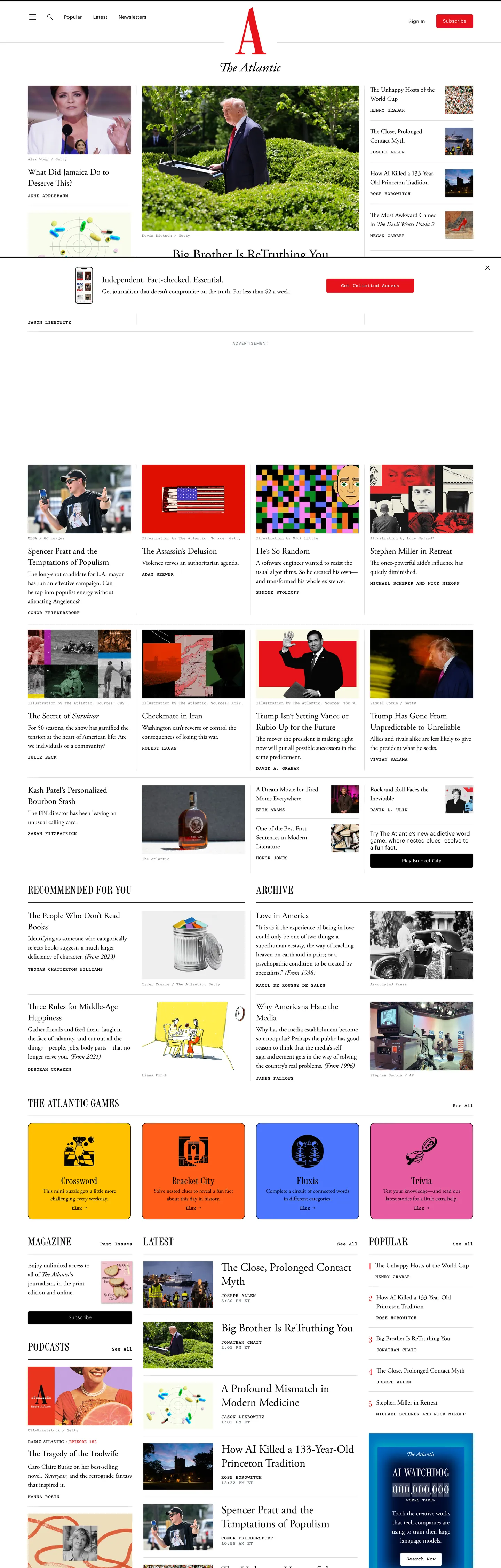
The Atlantic's homepage is a print magazine cover translated literally to the browser. The canvas is pure white, the headline serif is AGaramondPro at 38px in weight 400, and the section labels above the photography grid are set in a separate face called Atlantic Serif at 32px UPPERCASE with 1px tracking. Two serifs is the move — most publishing platforms compromise to one, but The Atlantic treats the section title (Atlantic Serif, UPPERCASE) and the article headline (AGaramondPro, sentence case) as different typographic registers, the way a print issue separates a folio rule from a feature dek. The only chromatic CTA on the page is a Subscribe button in hazard red #e7131a; everything else is black ink on white, with a Logic Monospace metadata layer carrying timestamps, bylines, kickers, and category labels.
This DESIGN.md file packages the homepage system into a structured spec. Inside: twenty color tokens covering the ink, hazard red, illustration accents, and the cssVariable greys that wrap loading placeholders; ten typography tokens spanning AGaramondPro article serif (16–38px), Atlantic Serif section labels (28–32px UPPERCASE), Logic Monospace metadata (10–14px), and a Graphik fallback used only inside CTAs and form inputs; a tight four-step radius scale anchored on "4px" with "12px" reserved for the magazine card lockup; a ten-step spacing scale built on a "4px / 20px" rhythm; and seventeen component specifications covering the masthead, photo grid, Atlantic Daily promo strip, footer rail, Subscribe pill, and the editorial moments that interrupt the article feed. The format follows the Google Labs DESIGN.md specification.
Feed the file to Claude, Cursor, or GitHub Copilot and the agent reproduces The Atlantic's print-faithful voice — white canvas, two-serif typographic discipline, hazard-red CTA scarcity, monospace metadata, and photo-driven grid. Where most digital publications dilute their print identity for SaaS-friendly chrome, The Atlantic ports the 167-year-old magazine spine almost untouched: the serif is the brand, the photography is the layout, and the red Subscribe button is the same red that runs along the printed magazine's gutter. Reference the tokens directly in Tailwind config or paste the hex values into CSS variables — the spec captures the full ladder a long-form publication needs without inheriting the SaaS landing-page reflex.
What makes it distinct
5
- Two-serif stackAGaramondPro carries article bodies and hero headlines, Atlantic Serif owns UPPERCASE section titles, never blended in the same headline
- Hazard-red Subscribe CTA#e7131a fill at 4px radius is the single chromatic CTA in the system, used in just three of nineteen components
- Logic Monospace UPPERCASE metadatakicker, timestamp, byline, and category tag all run mono at 10–14px, the fingerprint of an Atlantic page
- Photo-grid identitysquare and 16:9 thumbnails do the work of feature illustrations; the chrome around them is 4px-radius restraint and pure black hairlines
- Print-fidelity color disciplinefifteen extracted hexes, six chromatic, and only red appears in a CTA; the rest are reserved for editorial illustration
theatlantic.com
Live at theatlantic.com
A snapshot of the brand in production. Scroll the frame to see the whole page.
Colors
21 colors
The Atlantic's system anchors on #000000 (ink-rule) as its primary color. Type is set in AGaramondPro across 15 tokens from 10px to 38px, weights 300–600. Shape language is mixed across 18 components, blending pills, soft rounds, and squarer corners.
Surface
Page and card backgrounds · 3
Text
Headlines, body, captions · 13
Borders & Hairlines
Dividers, outlines, rules · 3
Other
Specialty colors · 2
Typography
15 type tokens
Set in AGaramondPro across 15 tokens, from 10px to 38px, weights 300–600. Shown in its own stack: where the font isn't installed, the fallback the file names stands in.
- display-hero38px · weight 400 · lh 44px · tracking 0The quick brown fox jumps over the lazy dog
- display-md32px · weight 400 · lh 40px · tracking 0The quick brown fox jumps over the lazy dog
- display-sm24px · weight 400 · lh 32px · tracking 0The quick brown fox jumps over the lazy dog
- section-title32px · weight 400 · lh 32px · tracking 1pxThe quick brown fox jumps over the lazy dog
- section-title-condensed28px · weight 400 · lh 32px · tracking 0.5pxThe quick brown fox jumps over the lazy dog
- body-serif20px · weight 400 · lh 28px · tracking 0The quick brown fox jumps over the lazy dog
- body-serif-md18px · weight 400 · lh 26px · tracking 0The quick brown fox jumps over the lazy dog
- body-serif-sm16px · weight 400 · lh 22px · tracking 0The quick brown fox jumps over the lazy dog
- link-emphasis16px · weight 600 · lh 18.4px · tracking 0The quick brown fox jumps over the lazy dog
- mono-kicker13px · weight 500 · lh 13px · tracking 0.5pxThe quick brown fox jumps over the lazy dog
- mono-byline14px · weight 300 · lh 17.5px · tracking 0The quick brown fox jumps over the lazy dog
- mono-caption11px · weight 300 · lh 11px · tracking 0The quick brown fox jumps over the lazy dog
- mono-meta10px · weight 300 · lh 11.25px · tracking 0.25pxThe quick brown fox jumps over the lazy dog
- mono-tag12px · weight 500 · lh 13.8px · tracking 0The quick brown fox jumps over the lazy dog
- cta-label14px · weight 400 · lh 16.1px · tracking 0.25pxThe quick brown fox jumps over the lazy dog
Layout
Radii and spacing
4 corner radii and 10 spacing values. Shape language: mixed.
Radii
- none0px
- xs2px
- base4px
- card12px
Spacing
- xxs2px
- xs4px
- sm5px
- base8px
- md12px
- lg16px
- xl20px
- section24px
- section-lg32px
- section-xl48px
Components
18 components
Each rendered from its tokens (color, type, radius, padding) on The Atlantic's own canvas.
- Button Primarybutton-primaryButton Primary
- Button Primary Hoverbutton-primary-hoverButton Primary Hover
- Button Secondarybutton-secondaryButton Secondary
- Top Navtop-navTop Nav
- Nav Linknav-linkNav Link
- KickerkickerKicker
- Section Rulesection-ruleSection Rule
- Article Cardarticle-cardArticle Card
- Feature Cardfeature-cardFeature Card
- Promo Strippromo-stripPromo Strip
- BylinebylineByline
- TimestamptimestampTimestamp
- Category Tagcategory-tagCategory Tag
- Type here…text-inputText Input
- Image Frameimage-frameImage Frame
- Image Frame Featureimage-frame-featureImage Frame Feature
- Hairline Dividerhairline-dividerHairline Divider
- Footer Railfooter-railFooter Rail
In use
The system, in use
The Atlantic's tokens on the kind of product it builds.
Build something people actually use.
A short paragraph of marketing copy that previews how the brand's display tier and body tier read together. Two sentences is usually enough.
FAQ
The Atlantic design system FAQ
Common questions about The Atlantic's tokens, components, and how to use this DESIGN.md in your project.
Read next
Related reading
Specs, directories, and component libraries that pair with this design system.
- Browse all design systemsThe full directory of DESIGN.md files on shadcn.io, with live mockups for each.shadcn.io
- The Atlantic — official siteThe publication itself — read the homepage to see AGaramondPro at 38px and the red Subscribe pill in context.theatlantic.com (opens in a new tab)
- The DESIGN.md specificationGoogle Labs' open spec for machine-readable design system files — the format this page is built on.github.com (opens in a new tab)
Use it
Use The Atlantic in your project
One machine-readable file. Drop it into Claude, Cursor, or any AI tool that reads DESIGN.md.
Download the DESIGN.md
One machine-readable file: every color, type, radius, spacing, and component token of The Atlantic.
Feed it to your AI tool
Drop it into Claude, Cursor, or GitHub Copilot. The agent writes React components and Tailwind classes that match The Atlantic's visual language.
Reference the tokens directly
Or paste the values into your Tailwind config, CSS variables, or component library: every color, size and radius is a quoted, ready-to-copy value.
Read the full DESIGN.md: overview, rationale, do’s and don’ts
Overview
The Atlantic's homepage is a 167-year-old print magazine ported to the browser with the typographic spine almost untouched. The canvas is pure white ({colors.canvas} — #ffffff), the ink is pure black ({colors.ink} — #000000), and the only chromatic CTA on the page is a Subscribe pill in hazard red ({colors.cta-fill} — #e7131a). The grid is photography — square and 16:9 thumbnails do the work that abstract product illustration does on a SaaS landing, and the chrome around the photos is "4px"-radius restraint with a "1px" black hairline rule between sections.
Two-serif discipline: where most publishing brands compromise to a single serif face for both section labels and article headlines, The Atlantic treats them as different typographic registers. AGaramondPro carries the article hero at 38px in weight 400, sentence case, the way a magazine feature dek is set. Atlantic Serif owns the section titles at 32px UPPERCASE with 1px tracking — a folio rule, not a body face. The two serifs never share a headline. Below the serifs, Logic Monospace at 13px / 500 UPPERCASE with 0.5px tracking is the typographic fingerprint of an Atlantic page; it shows up seventy-eight times in the extracted sweep, more than any other single signature. Mono carries every kicker, timestamp, byline credit, and category tag.
Editorial monospace as metadata: this inverts the convention where monospace signals technical content (code blocks, terminal output, developer documentation). On The Atlantic, monospace signals editorial metadata — bylines under a portrait, timestamps next to a category tag, the Politics / Culture / Technology kicker above a hero headline. The choice quotes mid-century newsroom teletype rather than VS Code, and the contrast against the AGaramondPro serif body is the page's quiet structural rhythm.
Key Characteristics:
- Two-serif typographic stack: AGaramondPro for article bodies and hero headlines (16–38px / 400), Atlantic Serif for UPPERCASE section titles (28–32px / 400 with 1px tracking), never blended in the same headline cluster.
- Single hazard-red CTA:
{colors.cta-fill}(#e7131a — "Atlantic Red") appears five times in the extracted token sweep, all five as either button fill, button border, or kicker text. The red is the print magazine's spine red ported as one pill. - Logic Monospace metadata layer: 13px / 500 UPPERCASE with 0.5px tracking is the dominant typographic signature (78 occurrences) — the choice that separates this site from every other long-form publication.
- Three-step radius scale: 2px, 4px, 12px. "4px" does 80% of the work; "12px" is reserved for the magazine cover card lockup; "2px" appears once on a metadata badge. Pill geometry does not exist in the system.
- Photo-driven grid: every story tile leads with a square or 16:9 photograph, with the headline below in AGaramondPro and the kicker above in Logic Monospace. Abstract illustration is reserved for the Atlantic Daily promo strip.
- Color discipline: fifteen extracted hexes, six of them chromatic (#ffc200, #ff5e19, #4d76ff, #e65ca1, #0076bf, #0066be), and only red appears as a CTA. The other five chromatic hexes live inside editorial illustration, never as chrome.
- 1px hairline rules: black "1px" lines separate sections, replacing the "20–48px" whitespace that SaaS sites use as section dividers. The page reads like a printed broadsheet because the rules are drawn, not implied.
- Zero gradients, zero shadows: depth is carried by 1px hairline rules and the photo-to-canvas contrast. The white canvas stays perfectly flat.
Colors
Ink & Canvas
- Pure White Canvas (
{colors.canvas}— #ffffff) — frequency 237. Used as bg (16), border (109), text (112). The default surface for the entire homepage. Cluster includes#f8f7f4, a faint cream variant that appears on the Atlantic Daily promo strip. - Cream Promo Surface (
{colors.surface-elevated}— #f8f7f4) — clustered with white in the extraction. The single non-white surface on the page, applied to the Atlantic Daily strip to lift it off the main canvas without breaking print fidelity. - CSS Variable Surface (
{colors.surface-muted}— #f7f7f7) — declared on--article-sharekit-background,--nav-expanded-background,--article-injector-ad-background. The light-gray utility surface that wraps share kits and ad placements. - Pure Black Ink (
{colors.ink}— #000000) — frequency 1642. Used as text (818), border (817), bg (6), shadow (1). The dominant token in the system — text and rule lines carry the page. The 1:1 split between text and border counts is unusual; it reflects The Atlantic's reliance on hairline rules as section dividers, where most sites use whitespace.
Hazard Red (CTA)
- Atlantic Red (
{colors.cta-fill}— #e7131a) — frequency 11. Used as bg (1), border (5), text (5). The single chromatic CTA voltage in the system. Quoted from the print magazine's spine red. Applied to the Subscribe pill fill, the kicker label above hero articles, and the CTA border on secondary newsletter prompts. Never used as a background wash. - Atlantic Red Deep (
{colors.cta-border}— #d0021b) — frequency 1. Used as border (1). A darker red variant declared once on the Subscribe button's outer border to add weight against the brighter fill. Functions as a one-step hover/press color.
Text & Metadata
- Slate Gray Text (
{colors.text-secondary}— #5e6a74) — frequency 40. Used as text (20), border (20). The metadata text color — bylines, timestamps, photo credits. Sits between pure black and pure gray; the slight blue cast (oklch hue 243°) keeps it from reading as printer-toner gray.
Hairlines & Borders
- Light Hairline (
{colors.hairline-light}— #c1c1c1) — declared on--nav-border-color-light. The pale rule applied to nav expansion dividers and quiet card outlines. - Dark Hairline (
{colors.hairline-dark}— #9b9b9b) — declared on--nav-border-color-dark. The mid-gray rule used on footer rails and dense list dividers. - Image Placeholder Wash (
{colors.image-loading}— #c0ccda) — declared on--article-image-loading-placeholder-color. The blue-gray skeleton that fills photo containers before the JPEG paints in.
Editorial Illustration Palette
The six chromatic hexes below appear in editorial illustration (the Atlantic Daily promo strip, the magazine cover thumbnail, the section icons). None of them are used as chrome — no buttons, no nav highlights, no link colors are drawn from this palette.
- Magazine Yellow (
{colors.illustration-yellow}— #ffc200) — frequency 1. Used as bg (1). Editorial illustration only. - Hazard Orange (
{colors.illustration-orange}— #ff5e19) — frequency 1. Section thumbnail accent. - Electric Blue (
{colors.illustration-blue-bright}— #4d76ff) — frequency 1. Magazine cover spot color. - Magazine Pink (
{colors.illustration-pink}— #e65ca1) — frequency 1. Illustration field, never chrome. - Editorial Blue (
{colors.illustration-blue}— #0076bf) — frequency 1. - Editorial Blue Deep (
{colors.illustration-blue-deep}— #0066be) — frequency 1.
Link
- Default Link Blue (
{colors.link-default}— #0000ee) — frequency 4. Used as border (2), text (2). The user-agent default link blue, preserved rather than overwritten. Appears on inline citations and fallback hyperlinks where the editorial AGaramondPro link style hasn't been applied.
Gradient System
The Atlantic uses zero decorative gradients. The illustration palette appears as flat fills inside drawn artwork, never as background washes. Print-fidelity color discipline is the rule — a gradient on a CTA would dissolve the magazine spine reference.
Typography
Font Family
Four families do the work. AGaramondPro (Adobe Garamond Pro, fallback Garamond / Times / serif) carries article bodies and hero headlines at 16–38px in weight 400, with a single weight 600 variant reserved for emphasis links. Atlantic Serif (the proprietary in-house face, fallback Atlantic / Bodoni / Times) owns UPPERCASE section titles at 28–32px with 1px tracking. Logic Monospace (proprietary, fallback monospace) handles every UPPERCASE kicker, timestamp, byline, and category tag at 10–14px in weights 300/400/500. Graphik (Commercial Type, fallback system-ui / Roboto) appears only inside the Subscribe CTA and a single text input at 14px / 400 — the lone sans-serif intrusion in an otherwise all-serif system.
Hierarchy
| Token | Size | Weight | Line Height | Letter Spacing | Use |
|---|---|---|---|---|---|
{typography.display-hero} | 38px | 400 | 44px | 0 | Hero article headline (AGaramondPro, sentence case) |
{typography.display-md} | 32px | 400 | 40px | 0 | Section feature headline |
{typography.display-sm} | 24px | 400 | 32px | 0 | Standard article tile headline |
{typography.section-title} | 32px | 400 | 32px | 1px | UPPERCASE section folio (Atlantic Serif) |
{typography.section-title-condensed} | 28px | 400 | 32px | 0.5px | Atlantic Condensed sub-section folio |
{typography.body-serif} | 20px | 400 | 28px | 0 | Article dek and lead paragraph |
{typography.body-serif-md} | 18px | 400 | 26px | 0 | Standard reading body |
{typography.body-serif-sm} | 16px | 400 | 22px | 0 | Caption body and standfirst |
{typography.link-emphasis} | 16px | 600 | 18.4px | 0 | Inline emphasis links inside body copy |
{typography.mono-kicker} | 13px | 500 | 13px | 0.5px | UPPERCASE kicker above hero headline |
{typography.mono-byline} | 14px | 300 | 17.5px | 0 | Byline credit beneath headline |
{typography.mono-caption} | 11px | 300 | 11px | 0 | Photo caption microtext |
{typography.mono-meta} | 10px | 300 | 11.25px | 0.25px | Nano-scale metadata |
{typography.mono-tag} | 12px | 500 | 13.8px | 0 | UPPERCASE category tag |
{typography.cta-label} | 14px | 400 | 16.1px | 0.25px | Subscribe CTA and form input |
Principles
AGaramondPro is the page voice; Atlantic Serif is the folio rule. The two serifs never share a headline. AGaramondPro is set sentence-case in the article hero (38px / 400). Atlantic Serif is set UPPERCASE with 1px tracking in the section title (32px / 400). Mixing them would dissolve the print-magazine cue that separates a feature dek from a section masthead. Logic Monospace is always UPPERCASE for metadata — kicker, timestamp, byline, category tag. The single 300-weight mono used for bylines is the quiet half of the monospace voice; the 500-weight mono for kickers is the loud half. Lowercase mono is reserved for inline meta where it appears at 10–11px and reads as a whisper. Graphik is the CTA-only sans — it intrudes exactly twice in the system, on the Subscribe button and the inline text input, and the intrusion is deliberate: a serif Subscribe button would read as a magazine ad rather than a click target.
Letter-spacing runs in three registers. Tight zero for AGaramondPro article body. Open 0.5–1px for Atlantic Serif and Logic Monospace UPPERCASE labels. Slight 0.25px on Graphik CTA labels to soften the sans intrusion. Line heights are tight (13–17.5px) for every mono label and 22–44px for the serif ladder — the leading jump gives the page a print-broadsheet rhythm.
Note on Font Substitutes
The 1px tracking on Atlantic Serif at 32px assumes the proprietary in-house face. If you substitute with GT Sectra, Tiempos Headline UPPERCASE, or Söhne Breit in a serif weight, hold the 1px tracking — it carries the folio identity. For AGaramondPro, EB Garamond, Cormorant Garamond, or Adobe Caslon Pro work at the published sizes without metric adjustment. For Logic Monospace, JetBrains Mono, IBM Plex Mono, or Söhne Mono substitute cleanly — match the weight-300 byline carefully, since most mono families ship 400 as the lightest. For Graphik, Inter, Hanken Grotesk, or GT America work at 14px / 400 without adjustment.
Layout
Spacing System
- Base unit: 4px with a "20px" feature step and "8px" inter-card rhythm.
- Tokens:
{spacing.xxs}2px ·{spacing.xs}4px ·{spacing.sm}5px ·{spacing.base}8px ·{spacing.md}12px ·{spacing.lg}16px ·{spacing.xl}20px ·{spacing.section}24px ·{spacing.section-lg}32px ·{spacing.section-xl}48px. - Section padding (vertical): 24–48px between major editorial sections. The promo strip uses 40×32px interior padding, the densest packing on the page.
- Card internal padding: photo cards have 0px interior padding — the image is the card, and headlines sit beneath in 20px outer rhythm. The promo strip is the only card with internal padding (40×32px).
- Inline spacing: kickers sit ~6–8px above headlines; headlines sit ~10–12px above bylines; timestamps sit ~6px below bylines on the metadata rail.
Grid & Container
- Max content width: ~1280px centered, with article columns at 624px (visible in the extracted bodyText and h2 widthPx values).
- Column patterns: a 12-column underlying grid that resolves into 4-column hero + 4-column photo grid + 2-column footer rail. The Atlantic Daily promo strip spans the full width.
- Container padding: 20px mobile / 32px desktop on the outer edges. Gutters of 20px between columns dominate (39 occurrences in the extracted spacing array — the most frequent spacing value).
Whitespace Philosophy
The Atlantic treats whitespace the way a broadsheet treats column gutters — measured, not generous. Where most digital publications use 64–128px of vertical air between sections, The Atlantic uses 24–48px and replaces the rest with 1px black hairline rules that draw the section boundary explicitly. The page reads like a printed magazine because the rules are drawn, not implied; deleting the hairlines would collapse the visual hierarchy entirely.
Border Radius Scale
{rounded.none}0px: hairline rules, text columns, and the magazine cover spine{rounded.xs}2px: a single metadata badge — the tightest curve in the system{rounded.base}4px: Subscribe CTA, text input, every photo thumbnail, every nested image — the workhorse radius (8 occurrences){rounded.card}12px: magazine cover card lockup — reserved for editorial-feature elevation (4 occurrences)
Three radius values is deliberately spare. The absence of pill geometry (20–40px radii common on SaaS pages) is the silent move — The Atlantic treats every CTA as a print-rule rectangle with a softened corner, not a button with a chip shape.
Elevation
The Atlantic's depth philosophy is hairline-as-elevation. Zero traditional drop shadows appear in the extracted token sweep — the single shadow entry on #000000 is a hairline border, not a drop shadow.
| Level | Treatment | Use |
|---|---|---|
| 0 | No border, no shadow | Default #ffffff canvas text |
| 1 | 1px #c1c1c1 hairline | Nav expansion dividers |
| 2 | 1px #9b9b9b hairline | Footer rail and dense list dividers |
| 3 | 1px #000000 hairline | Section boundary rules — the drawn folio |
| 4 | 1px #d0021b border | Subscribe CTA outline |
| 5 | Cream #f8f7f4 fill | Atlantic Daily promo strip lift |
When something needs to stand out, it does not get a shadow — it gets a 1px black hairline rule or a cream surface fill. The white canvas stays perfectly flat throughout, and hierarchy is carried by drawn rules and the photo-to-canvas contrast. No gradients, no glows, no atmospheric blurs anywhere.
Shapes
The Atlantic operates a binary shape language: 4px rounded photos and CTAs, or 0px rectangles for text columns and rule lines. The "12px" radius is the single exception, reserved for the magazine cover card lockup where a slightly larger curve signals editorial elevation. Pill geometry (20–40px radii) does not exist in the system — and the absence is the design move. Where most digital publications adopt SaaS-style pill buttons to feel contemporary, The Atlantic keeps the print-rule corner softened just enough to suggest a screen rather than a printed page, but never enough to feel like a chip. Square corners on text columns honor the print magazine's box-rule grid; "4px" softening on photos and CTAs is the single concession to the medium.
Components
Buttons
button-primary — Atlantic Red (#e7131a) fill with white text, Graphik 14px / 400 with 0.25px tracking, {rounded.base} 4px radius, 1px #d0021b border, 10×18×11px asymmetric padding (the bottom pad is one pixel taller to compensate for Graphik's cap-height). The single CTA in the system. Used for "Subscribe", "Sign In", and newsletter signup. Hover state shifts background to #d0021b — a one-step darken without changing the border.
button-secondary — Transparent fill with black text and a 1px #000000 border, {rounded.base} 4px radius, same Graphik 14px / 400 label. Used for "Manage Subscription" and secondary nav actions where the red would over-fire.
Navigation
top-nav — White canvas bar with the Atlantic wordmark left-aligned, UPPERCASE Logic Monospace category links centered (Politics, Culture, Technology, Health, Science), and a hazard-red Subscribe pill pinned right. A 1px #c1c1c1 hairline runs along the bottom edge.
nav-link — Black text in Graphik 14px / 400 with 0.25px tracking. Hover transitions to underlined without color change — a print-magazine link style, not a SaaS hover lift.
kicker — Atlantic Red (#e7131a) UPPERCASE eyebrow in Logic Monospace 13px / 500 with 0.5px tracking. Sits 6–8px above the hero article headline. The signature "Politics" / "Culture" label above an Atlantic story.
Editorial
section-rule — Atlantic Serif 32px / 400 UPPERCASE section title (Recommended For You, From The Magazine, Latest, Popular) wrapped above and below by a 1px #000000 hairline rule. The folio of the page — every major section is bracketed this way.
article-card — Standard photo card. White canvas fill with a 16:9 or square photo at 4px radius, AGaramondPro 24px / 400 headline beneath, and a Logic Monospace byline below in #5e6a74. No background, no border, no padding — the photo is the card. Hover is static.
feature-card — Top-of-feed magazine cover lockup. 12px radius on the cover photograph (the larger curve signals editorial-feature elevation), AGaramondPro 38px / 400 headline beneath, and a red kicker above.
promo-strip — The Atlantic Daily promo. Cream #f8f7f4 fill, black AGaramondPro 18px / 400 body, 4px radius, 40×32px interior padding. The single non-white surface on the page.
byline — Logic Monospace 14px / 300 in Slate Gray (#5e6a74). Sentence-case (not UPPERCASE) — the byline is the quiet half of the monospace voice.
timestamp — Logic Monospace 11px / 300 in Slate Gray. Sits beside the category tag on the metadata rail.
category-tag — Logic Monospace 12px / 500 UPPERCASE in black. The tag below a photo (POLITICS, CULTURE, TECHNOLOGY).
Forms
text-input — White fill with a 1px #c0ccda border (the blue-gray photo placeholder color, reused), 4px radius, Graphik 14px / 400 label inside, 10×16px padding, 38px height. Used for newsletter signup and search. The border color choice is unusual — most form inputs use a true neutral gray, but The Atlantic recycles the image-loading wash to keep the chrome inside the print-magazine palette.
Surfaces
image-frame — Standard 4px radius photo container with a #c0ccda placeholder fill that paints in before the JPEG loads.
image-frame-feature — 12px radius variant reserved for the magazine cover lockup. The two-step radius scale (4px standard / 12px feature) is the only image-level hierarchy in the system.
hairline-divider — 1px #000000 rule. The drawn folio that separates every major section. Appears more often than any whitespace gap — the page is structured by rules, not by air.
footer-rail — Bottom-of-page link rail. White fill, 1px #9b9b9b top border, Logic Monospace 14px / 300 link labels in black, 32×0px vertical padding.
Do's and Don'ts
Do
- Use #e7131a only for the Subscribe CTA and the kicker eyebrow. The hazard red is the print magazine's spine red, and its scarcity is the discipline — five occurrences in the extracted sweep, never as a background fill.
- Set article headlines in AGaramondPro and section titles in Atlantic Serif. Two-serif discipline is the print-magazine cue. A single serif across both registers reads as a blog template.
- Set every kicker, timestamp, byline, and category tag in Logic Monospace UPPERCASE. The monospace is the editorial fingerprint — substitute a sans and the page reads as a SaaS landing.
- Use 1px black hairlines (
#000000) to separate sections. The drawn folio replaces the 64–128px whitespace gaps that SaaS pages use. Hairlines are structural, not decorative. - Hold radii at 2/4/12px. No pill geometry. Pill buttons would dissolve the print-rule corner reference.
Don't
- Don't use #c0ccda as a text color. It is the photo-loading placeholder wash declared on
--article-image-loading-placeholder-color. The blue-gray paints in before the JPEG loads; using it as text would render the same as the skeleton state. For muted text, use Slate Gray (#5e6a74) instead. - Don't render the Subscribe CTA without the 1px #d0021b border. The brighter #e7131a fill needs the darker border to add weight; without it the button reads as a washed-out red rather than a magazine-spine red. The asymmetric 10×18×11px padding (bottom +1px) is also load-bearing — Graphik's cap-height requires the extra pixel to feel optically centered.
- Don't blend AGaramondPro and Atlantic Serif in the same headline. AGaramondPro is sentence-case at 38px / 400 for article heroes; Atlantic Serif is UPPERCASE at 32px / 400 with 1px tracking for section folios. Mixing them in a single cluster collapses the print-magazine register split into a generic editorial mush.
- Don't use Logic Monospace at lowercase for kickers or category tags. The mono is UPPERCASE for metadata labels (kicker, tag) and sentence-case only for byline and caption microtext. Lowercase mono on a category tag breaks the broadsheet voice.
- Don't drop a gradient or box-shadow into chrome. The Atlantic is gradient-free and shadow-free by design — the page is print-fidelity flat. A 0.12-alpha shadow on a card would dissolve the broadsheet identity in a single component.
- Don't introduce a fifth font family. AGaramondPro / Atlantic Serif / Logic Monospace / Graphik is the entire stack. Adding a display sans for marketing modules would multiply the typographic registers and break the print-magazine voice.
Known Gaps
- Article-detail reading view: the long-form reading template (drop caps, pull quotes, footnote rail, audio narration chrome) uses a different type ladder and tighter spacing tokens — not in scope here.
- Paywall and membership modals: the subscription gate and the Masthead member dashboard are out of scope.
- Audio player chrome: Atlantic narration episodes ship a custom audio player with timeline scrubber and chapter markers — not extracted.
- Section sub-brands: The Daily, Books, Idea Files, and Editor's Picks have minor type-ladder variants that are not captured in this homepage sweep.
- Dark mode: the marketing homepage is light-only. A dark variant would require warm canvas (#14110d) and warm ink (#f5f1e8) to preserve the printed-paper continuity, but the precise inversion has not been extracted.
- Hover state ramps: primary CTA hover (#e7131a → #d0021b) is documented; subtle nav-link hover, photo-card hover, and image-placeholder fade-in transitions were not captured.
News & Publishing
More systems like this
More DESIGN.md files in News & Publishing.
Pricing
Build it with Pro
The DESIGN.md files are free. Pro adds 6,000+ blocks, premium templates and the MCP server, so your AI editor builds in your system for you.
4.9/5 out of 5 · 150+ reviewsfrom 150+ founders and developers.
Billing
Billed once a year in USD. Cancel anytime.
- How many people can use the license.
- Client work, SaaS products and anything you charge for.
- Production-ready React sections: hero, pricing, features, dashboards and more.
- Complete multi-page sites you can ship as they are.
- React icons from every major library, installable with one command.
- Presets that restyle every block, in light and dark.
- Lets your AI editor search, preview and install blocks for you.
- Priority requests are answered first.
Individual
For personal projects & open source
$32instead of $49/mo
$389 billed yearly
- Seats: 1 seat
- Commercial use: Personal & open source only
- Pro blocks: 6,000+ blocks
- Templates: All 14 templates
- React icons: 294k+ icons
- Themes: All 59 themes
- MCP server: Basic usage
- Support: Standard
Team
Most popularFor freelancers, agencies & startups
$66instead of $99/mo
$789 billed yearly · ≈ $13/dev/mo
- Seats: Up to 5 seats
- Commercial use: Included
- Pro blocks: 6,000+ blocks
- Templates: All 14 templates
- React icons: 294k+ icons
- Themes: All 59 themes
- MCP server: High usage
- Support: Priority
Organization
For companies with larger teams
$132instead of $199/mo
$1,589 billed yearly
- Seats: Unlimited seats
- Commercial use: Included
- Pro blocks: 6,000+ blocks
- Templates: All 14 templates
- React icons: 294k+ icons
- Themes: All 59 themes
- MCP server: Unlimited usage
- Support: Priority
Billed once a year in USD. Cancel anytime.
Individual
For personal projects & open source
$32instead of $49/mo
$389 billed yearly
- How many people can use the license.Seats: 1 seat
- Client work, SaaS products and anything you charge for.Commercial use: Personal & open source only
- Production-ready React sections: hero, pricing, features, dashboards and more.Pro blocks: 6,000+ blocks
- Complete multi-page sites you can ship as they are.Templates: All 14 templates
- React icons from every major library, installable with one command.React icons: 294k+ icons
- Presets that restyle every block, in light and dark.Themes: All 59 themes
- Lets your AI editor search, preview and install blocks for you.MCP server: Basic usage
- Priority requests are answered first.Support: Standard
Team
Most popularFor freelancers, agencies & startups
$66instead of $99/mo
$789 billed yearly · ≈ $13/dev/mo
Everything in Individual, plus
- How many people can use the license.Seats: Up to 5 seats
- Client work, SaaS products and anything you charge for.Commercial use: Included
- Lets your AI editor search, preview and install blocks for you.MCP server: High usage
- Priority requests are answered first.Support: Priority
Organization
For companies with larger teams
$132instead of $199/mo
$1,589 billed yearly
Everything in Team, plus
- How many people can use the license.Seats: Unlimited seats
- Lets your AI editor search, preview and install blocks for you.MCP server: Unlimited usage
- Secure checkout via Stripe
- Code lives in your repo
- Keep what you've shipped if you cancel
- License terms
Your system, built for you
Every block, template and icon, installed by your AI agent in your design system. The DESIGN.md files stay free.