shadcn.io is not affiliated with official shadcn/ui
Drops land on a still surface at changing spots: each impact makes a small splash and sends out a few rings that spread and fade, overlapping the last ones. The spots take turns at an even, unhurried rate, so several sets of rings are always spreading across the box, crisp and bright just after the impact and wide and soft as they fade, over a faint tint of the colour like water. The spots and their timing come from a fixed seed and CSS keyframes play them, so the page renders the same on the server and in the browser, and no JavaScript runs unless you let clicks and taps drop ripples too.
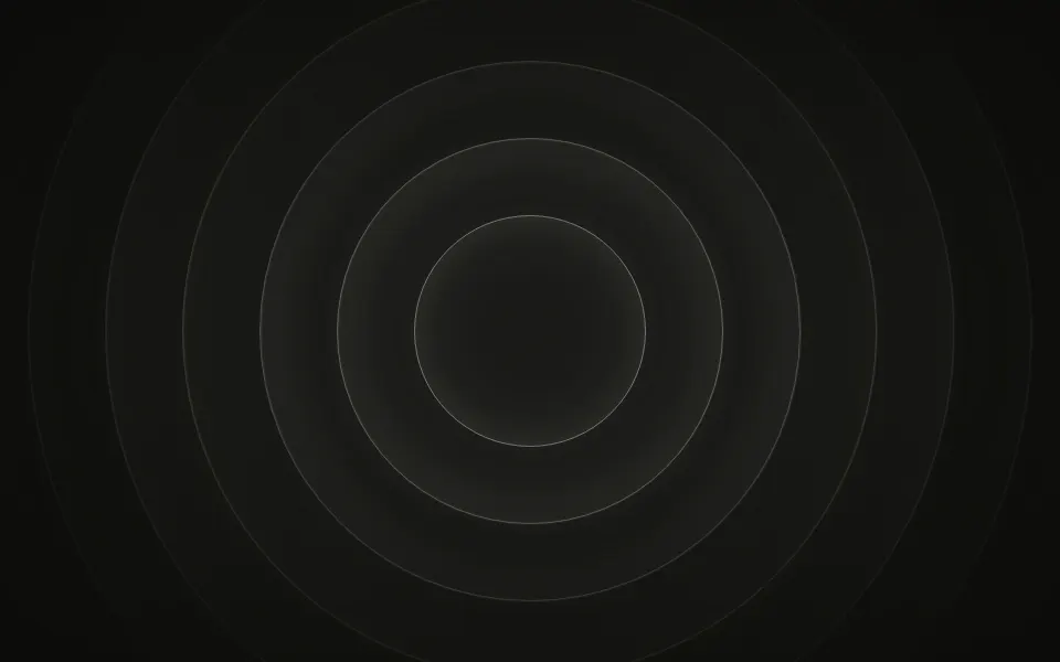
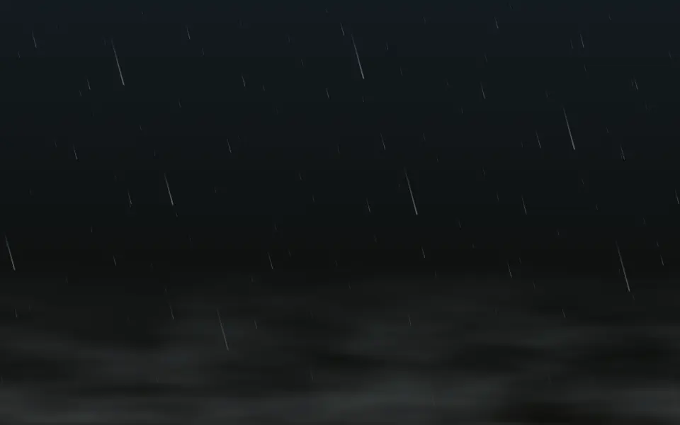
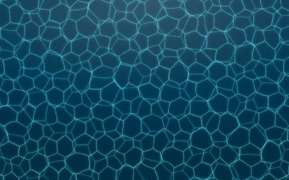
Use it for wellness, meditation and reading pages, or any hero that should feel calm. For one centred source that breathes, use Ripple; for the drops themselves falling, Rain; for light dancing under the surface, Caustics.
Installation
Usage
import { Drops } from "@/components/ui/drops";The surface sits behind whatever you put inside. Give the container a height; for the whole page, className="fixed inset-0 -z-10" with no children.
<Drops className="flex min-h-[420px] items-center justify-center">
  <h1 className="text-4xl font-semibold">Slow down</h1>
</Drops>
Demos
Color
The original's pond at dusk: color="#93c5fd" in a deep navy container, which the tint deepens toward the bottom. By default the rings take your theme's primary colour.
Interactive
With interactive, a click or tap drops a ripple where it lands, on top of the seeded ones; here with count={3}, rings={3} and tint={false} for a sparse, plain card. It's off by default.
Accessibility
The surface is decorative: it's hidden from screen readers and never takes the pointer, and your content stays on top in normal flow. With interactive, taps land on the container itself, so links and buttons inside keep working. With reduced motion the rings stop where they are, leaving a few still ripples on the surface, and taps do nothing. No more than three drops land a second: count is capped at 10 ÷ speed, and the timing slows down if a stylesheet asks for more. The rings are thin and fade as they spread, and the tint is at most 7% of the colour, so a large headline in your foreground colour reads well over them; for dense copy, use count={3}.
FAQ
How do I get more or fewer drops?
count sets the spots drops land on, each struck every 3.4 seconds in turn: 8 (the default) is about 2.4 drops a second, 3 is sparse, and 10 (about 3 a second, the cap) is a shower.
How many rings does a drop send out?
rings sets them, from 1 to 6 (4 by default). Each ring is a little smaller and thinner than the one outside it, and all of them spread and fade together after a small splash, out to about half the box's size.
Do drops land at random?
Each spot cycles through six seeded places in its own strip of the box, and the spots take turns a share of a strike apart, so drops land evenly and the pattern doesn't visibly repeat, yet it renders the same every time, on the server too.
Can I change the colour?
color takes any CSS colour or theme variable (your primary colour by default); the soft glow around each ring and the surface's tint are mixes of it. tint={false} leaves the surface clear.
Can visitors make their own ripples?
Pass interactive: a click or tap drops a ripple at that point. Up to three tapped ripples play at once; under reduced motion taps do nothing.
API Reference
Drops
<div> data-slot="drops"
color?string
The rings' colour, any CSS colour; their soft glow, and the surface's tint, are mixes of it. By default your theme's primary colour.
count?number
How many spots drops land on, each struck every 3.4 seconds in turn:
8 is about 2.4 drops a second. At most 10 ÷ speed, so no more than
three land a second.
- Default
8
interactive?boolean
Whether a click or tap drops a ripple where it lands. @default false.
- Default
false
rings?number
How many rings each drop sends out, from 1 to 6. @default 4.
- Default
4
speed?number
How fast the rings spread, and so how often drops land: 2 is twice as fast, 0.5 half as fast.
- Default
1
tint?boolean
Whether a faint wash of the colour tints the surface, like water. @default true.
- Default
true
render?ReactElement | ((props: object, state: object) => ReactElement)
Replace the host element or compose it with another component.
- Type
ReactElement | ((props: object, state: object) => ReactElement)
className?string
Merged with the part's classes.
--drops-colorstring
The rings' colour (--primary).
--drops-speedstring
How fast the rings spread, a multiplier (1).
--drops-tap-xstring--drops-tap-ystring--drops-tintstring
How strong the surface's tint is, a multiplier (1; 0 with tint={false}).
Related
- Pro
Ripple Background
LightOne centred source, breathing
- Pro
Rain Background
WeatherThe drops falling, from the side
- Pro
Interference Background
GenerativeTwo sources whose ripples cross
- Pro
Underwater Background
WeatherCaustic light below the surface
- Pro
Caustics Background
WavesA bright net of water light
- Pro

Ink Background
GradientsInk blooming in water instead of rippling