shadcn.io is not affiliated with official shadcn/ui
Headings stacked in one column. Each heading opens its own section.
Use it for an FAQ or a settings list where most sections should stay closed. For one section on its own, use a Collapsible. In Svelte, Ark UI may unmount a closed panel, so a form field in it might not submit.
Installation
Anatomy
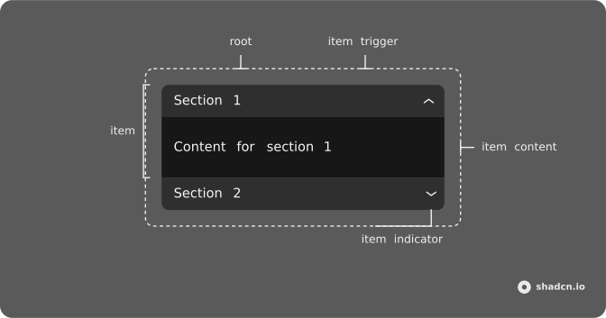
Usage
<script lang="ts">
import {
  Accordion, AccordionContent, AccordionItem, AccordionTrigger,
} from "@/components/ui/accordion";
</script>
<Accordion class="w-full max-w-sm" defaultValue={["shipping"]}>
  <AccordionItem value="shipping">
    <AccordionTrigger>What are your shipping options?</AccordionTrigger>
    <AccordionContent>
      We offer standard (5-7 days), express (2-3 days), and overnight
      shipping. Free shipping on international orders.
    </AccordionContent>
  </AccordionItem>
  <AccordionItem value="returns">
    <AccordionTrigger>What is your return policy?</AccordionTrigger>
    <AccordionContent>
      Returns accepted within 30 days. Items must be unused and in original
      packaging. Refunds processed within 5-7 business days.
    </AccordionContent>
  </AccordionItem>
  <AccordionItem value="support">
    <AccordionTrigger>How can I contact customer support?</AccordionTrigger>
    <AccordionContent>
      Reach us via email, live chat, or phone. We respond within 24 hours
      during business days.
    </AccordionContent>
  </AccordionItem>
</Accordion>
Accessibility
- Space
- When focus is on a trigger of a collapsed item, the item is expanded.
- Enter
- When focus is on a trigger of a collapsed section, expands the section.
- Tab
- Moves focus to the next focusable element.
- Shift+Tab
- Moves focus to the previous focusable element.
- Arrow Down
- Moves focus to the next trigger.
- Arrow Up
- Moves focus to the previous trigger.
- Home
- When focus is on a trigger, moves focus to the first trigger.
- End
- When focus is on a trigger, moves focus to the last trigger.
- Arrow Right
- Move to the next item.
- Arrow Left
- Move to the previous item.
Demos
Basic
Account questions, one open at a time, with the password item starting open. The rows come from a list, so another question is another entry rather than a fresh block of markup. Use this for a short FAQ where two answers on screen at once would be noise. If people compare sections, let more than one stay open.
Multiple
Notifications start open, and privacy or billing can open beside them. The copy is settings, not a three-line FAQ. Allow several sections at once when people compare answers or fill related groups without losing the one they just read. A single-open list makes them hunt for the heading they closed by accident.
Disabled
History and email still toggle. The middle item, premium feature information, sets disabled on AccordionItem, so its trigger does nothing. Leave a disabled row when the heading should stay visible as a locked feature and the upgrade path lives elsewhere on the page. If the plan will never include it, omit the row.
Borders
The root gets a border and a radius. Each item gets a bottom border and horizontal padding, and the last item drops its border so it does not double up with the outline. Use the bordered list when the accordion is the surface, sitting on a plain page. Skip the extra edges when a card already supplies them.
Card
The questions sit in CardContent, under a title and a short description about subscription and billing. Plans starts open. Use the card when this FAQ is one block among others, on a pricing or billing screen, and it needs a heading that is not itself a trigger. A bare accordion is enough when the page heading already names the topic.
RTL
The same account questions, in Arabic, with dir set to rtl and the first item open. Triggers, text, and the chevron follow the inline direction, so the icon is not stuck on the physical right. Use this when the page language is Arabic or Hebrew. The open behavior does not change, only the direction of the row.
FAQ
How do I let only one Accordion item open at a time in Svelte?
One open item is the default: opening an item closes the one that was open. Add multiple to let several items stay open together.
An open item can also be closed again, because collapsible is on by default.
How do I make an Accordion item open by default?
Pass that item's value in defaultValue, as an array: ["item-1"] opens the item whose value is item-1. The Basic demo starts with its first item open.
How do I control which Accordion items are open?
Pass value and update it in onValueChange. The value is an array of the open items' values, so you can open or close items from anywhere, such as a hash in the URL.
Do form fields inside a closed Accordion item still submit?
Not by default: a closed item's content is unmounted, because lazyMount and unmountOnExit are on in the vertical orientation. Pass unmountOnExit={false} to keep it in the DOM, hidden, so its fields submit with the form.
Is the Ark UI Accordion accessible with the keyboard?
Yes. Each trigger is a button with aria-expanded and aria-controls, Enter and Space toggle it, and the Accessibility section lists every key. Keep a real heading level around each trigger in long pages, and don't put interactive controls inside the trigger itself.
Can I nest an Accordion inside another Accordion?
You can, but a Collapsible inside the panel is usually better: two nested accordions mean two sets of arrow-key handling in one place. If people jump between every section, Tabs may fit better than an accordion.
API Reference
Accordion
<div> data-slot="accordion"
value?string[]
The controlled value of the expanded accordion items.
defaultValue?string[]
The initial value of the expanded accordion items. Use when you don't need to control the value of the accordion.
onValueChange?(details: ValueChangeDetails) → void
The callback fired when the state of expanded/collapsed accordion items changes.
- Type
(details: ValueChangeDetails) → void- Parameters
details– { value: string[] }- Returns
void
collapsible?boolean
Whether an accordion item can be closed after it has been expanded. Ark default: false.
- Default
true
dir?"ltr" | "rtl"
The document's text/writing direction.
- Type
"ltr" | "rtl"- Default
"ltr"
disabled?boolean
Whether the accordion items are disabled.
hideMode?"display-none" | "activity"
How to hide content when mounted but not present.
- display-none: HTML hidden attribute. Effects stay alive.
- activity: React 19 <Activity mode="hidden">. Effects pause. Requires React 19+.
- Type
"display-none" | "activity"- Default
"display-none"
id?string
The unique identifier of the machine.
ids?object
The ids of the elements in the accordion. Useful for composition.
- Type
{ root?: string; item?: (value: string) → string; itemContent?: (value: string) → string; itemTrigger?: (value: string) → string }
lazyMount?boolean
Whether to enable lazy mounting. Ark default: false.
- Default
true when `orientation` is not `"horizontal"`
multiple?boolean
Whether multiple accordion items can be expanded at the same time.
- Default
false
onFocusChange?(details: FocusChangeDetails) → void
The callback fired when the focused accordion item changes.
- Type
(details: FocusChangeDetails) → void- Parameters
details– { value: string | null }- Returns
void
orientation?"horizontal" | "vertical"
The orientation of the accordion items.
- Type
"horizontal" | "vertical"- Default
"vertical"
unmountOnExit?boolean
Whether to unmount on exit. Ark default: false.
- Default
true when `orientation` is not `"horizontal"`
asChild?Snippet<[PropsFn]>
Render your own element: a snippet that gets the part's props to spread on it.
- Type
Snippet<[PropsFn]>
class?string
Merged with the part's classes.
data-motion?string
Present after onValueChange.
data-orientation"horizontal" | "vertical"
The orientation of the accordion.
- Type
"horizontal" | "vertical"
AccordionItem
<div> data-slot="accordion-item"
valuestring
The value of the accordion item.
disabled?boolean
Whether the accordion item is disabled.
asChild?Snippet<[PropsFn]>
Render your own element: a snippet that gets the part's props to spread on it.
- Type
Snippet<[PropsFn]>
class?string
Merged with the part's classes.
data-disabled?string
Present when disabled.
data-focus?string
Present when focused.
data-orientation"horizontal" | "vertical"
The orientation of the item.
- Type
"horizontal" | "vertical"
data-state"open" | "closed"
"open" or "closed".
- Type
"open" | "closed"
AccordionTrigger
<button> data-slot="accordion-trigger"
asChild?Snippet<[PropsFn]>
Render your own element: a snippet that gets the part's props to spread on it.
- Type
Snippet<[PropsFn]>
class?string
Merged with the part's classes.
data-controlsstring
Id of the itemContent part.
data-focus?string
Present when focused.
data-orientation"horizontal" | "vertical"
The orientation of the item.
- Type
"horizontal" | "vertical"
data-ownedbystring
Id of the root part.
data-state"open" | "closed"
"open" or "closed".
- Type
"open" | "closed"
AccordionContent
<div> data-slot="accordion-content"
asChild?Snippet<[PropsFn]>
Render your own element: a snippet that gets the part's props to spread on it.
- Type
Snippet<[PropsFn]>
class?string
Merged with the part's classes.
data-disabled?string
Present when disabled.
data-focus?string
Present when focused.
data-orientation"horizontal" | "vertical"
The orientation of the item.
- Type
"horizontal" | "vertical"
data-state"open" | "closed"
"open" or "closed".
- Type
"open" | "closed"
--heightstring
The measured height, for animating open and closed.
--widthstring
The measured width, for animating open and closed.
AccordionRootProvider
<div> data-slot="accordion"
valueUseAccordionReturn
What useAccordion() returns: the state and API, made outside the component to control it.
hideMode?"display-none" | "activity"
How to hide content when mounted but not present.
- display-none: HTML hidden attribute. Effects stay alive.
- activity: React 19 <Activity mode="hidden">. Effects pause. Requires React 19+.
- Type
"display-none" | "activity"- Default
"display-none"
lazyMount?boolean
Whether to enable lazy mounting.
- Default
false
unmountOnExit?boolean
Whether to unmount on exit.
- Default
false
asChild?Snippet<[PropsFn]>
Render your own element: a snippet that gets the part's props to spread on it.
- Type
Snippet<[PropsFn]>
class?string
Merged with the part's classes.
data-orientation"horizontal" | "vertical"
Mirrors the orientation prop.
- Type
"horizontal" | "vertical"
useAccordion
value?string[]
The controlled value of the expanded accordion items.
defaultValue?string[]
The initial value of the expanded accordion items. Use when you don't need to control the value of the accordion.
onValueChange?(details: ValueChangeDetails) → void
The callback fired when the state of expanded/collapsed accordion items changes.
- Type
(details: ValueChangeDetails) → void- Parameters
details– { value: string[] }- Returns
void
collapsible?boolean
Whether an accordion item can be closed after it has been expanded.
- Default
false
disabled?boolean
Whether the accordion items are disabled.
id?string
The unique identifier of the machine.
ids?object
The ids of the elements in the accordion. Useful for composition.
- Type
{ root?: string; item?: (value: string) → string; itemContent?: (value: string) → string; itemTrigger?: (value: string) → string }
multiple?boolean
Whether multiple accordion items can be expanded at the same time.
- Default
false
onFocusChange?(details: FocusChangeDetails) → void
The callback fired when the focused accordion item changes.
- Type
(details: FocusChangeDetails) → void- Parameters
details– { value: string | null }- Returns
void
orientation?"horizontal" | "vertical"
The orientation of the accordion items.
- Type
"horizontal" | "vertical"- Default
"vertical"
AccordionContext
focusedValuestring | null
The value of the focused accordion item.
- Type
string | null
getItemState(props: ItemProps) → ItemState
Returns the state of an accordion item.
- Parameters
props– { value: string; disabled?: boolean }- Returns
ItemState
setValue(value: string[]) → void
Sets the value of the accordion.
- Parameters
value– string[]- Returns
void
valuestring[]
The value of the accordion.
AccordionItemContext
disabledboolean
Whether the accordion item is disabled.
expandedboolean
Whether the accordion item is expanded.
focusedboolean
Whether the accordion item is focused.