shadcn.io is not affiliated with official shadcn/ui
Drag a thumb between a min and a max when a rough value is enough.
Use it for volume, a price range, or temperature. When the number has to be exact, use a Number Input. In Solid, Ark UI can report when the drag ends, so save then instead of on every step.
Installation
Anatomy
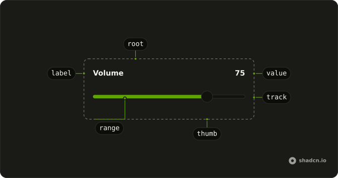
Slider
├── SliderLabel
├── SliderThumb
├── SliderValue
├── SliderTrack
├── SliderRange
├── SliderControl
├── SliderMarkerGroup
├── SliderMarker
└── SliderDraggingIndicator
Usage
import { Slider } from "@/components/ui/slider";<Slider
class="mx-auto w-full max-w-xs"
defaultValue={[75]}
max={100}
step={1}
/>Accessibility
- Arrow Right
- Increments the slider based on defined step.
- Arrow Left
- Decrements the slider based on defined step.
- Arrow Up
- Increases the value by the step amount.
- Arrow Down
- Decreases the value by the step amount.
- Page Up
- Increases the value by the
largeStepamount. - Page Down
- Decreases the value by the
largeStepamount. - Shift+Arrow Up
- Increases the value by the
largeStepamount. - Shift+Arrow Down
- Decreases the value by the
largeStepamount. - Home
- Sets the value to its minimum.
- End
- Sets the value to its maximum.
Demos
Range
Two thumbs, starting at 25 and 50, stepping by 5. The filled stretch between them is the selection, a price band or a time window. Use two thumbs when both ends are the user's choice, since a single thumb plus a fixed minimum draws the wrong picture when one end is not actually fixed. The thumbs stay in order as they move.
Multiple
Three thumbs, at 10, 20, and 70, stepping by 10, and they cannot pass through each other. Use more than two when the track is cut into bands, such as low, medium, and high thresholds, rather than a single from-to span. Two thumbs already cover a minimum and a maximum. A third thumb is a third decision.
Vertical
Two tracks with orientation set to vertical, each given a height, one starting at 50 and the other at 25. Up and down move the thumb. Use a vertical slider beside a tall preview, or anywhere a horizontal track would stretch the row for a single number. Without a height, the track has no distance to travel.
Controlled
Temperature runs from 0 to 1 in steps of a tenth, with two thumbs and the value kept in state. The readout beside the label prints both numbers as they move. Control the slider when that number is shown elsewhere, plotted, or saved while the thumb is still down. If the form can read it on submit, uncontrolled is the smaller choice.
Disabled
disabled parks the thumb at 50, and dragging and the arrow keys do nothing. Use a disabled slider when a parent switch or a plan has turned the setting off and the last value is still useful to see. Remove the slider when the setting does not apply. A track that cannot move is only worth the space as an explanation.
Rtl
One thumb at 75, with dir set to rtl. The track follows the page direction, and the value is still a number from the minimum to the maximum, so a volume of 75 does not become 25 because the page is mirrored. Use this on a page that is already right-to-left. Do not set dir on a single slider in an otherwise left-to-right layout.
FAQ
How do I make a range Slider with two thumbs in Solid?
Give it two values instead of one, for example defaultValue set to [25, 50]: the Slider renders one thumb per value, as in the Range demo. The thumbs stay in order as they move.
minStepsBetweenThumbs sets the smallest gap between them.
How do I control the Slider value in Solid?
Keep the value in state and pass it back with value. The value is always an array, even with a single thumb.
onValueChange receives details.value, the new array.
How do I run code only when the user releases the Slider?
Use the end-of-change callback: it fires once when dragging stops, while the change callback fires on every step. That is the place to save or fetch.
On Ark UI it is onValueChangeEnd.
How do I set the min, max and step of a Slider?
The range defaults to 0 through 100 in steps of 1. Set step for coarser or finer increments, for example 0.1 for decimals.
Change the range with min and max.
How do I make a vertical Slider?
Set orientation="vertical" and give the Slider a height, such as h-40, as the Vertical demo does: a vertical track fills the height it is given. Arrow keys follow the orientation, so Up and Down move the thumb.
Is the Slider accessible with the keyboard?
Yes. Each thumb is focusable with Tab; the arrow keys move it by one step, Page Up and Page Down by a larger step, and Home and End jump to the ends. Label it with SliderLabel or an aria-label so screen readers announce what it sets.
API Reference
Slider
<div> data-slot="slider"
value?number[]
The controlled value of the slider.
defaultValue?number[]
The initial value of the slider when rendered. Use when you don't need to control the value of the slider.
onValueChange?(details: ValueChangeDetails) → void
Function invoked when the value of the slider changes.
- Type
(details: ValueChangeDetails) → void- Parameters
details– { value: number[] }- Returns
void
dir?"ltr" | "rtl"
The document's text/writing direction.
- Type
"ltr" | "rtl"- Default
"ltr"
disabled?boolean
Whether the slider is disabled.
form?string
The associate form of the underlying input element.
getAriaValueText?(details: ValueTextDetails) → string
Function that returns a human readable value for the slider thumb.
- Type
(details: ValueTextDetails) → string- Parameters
details– { value: number; index: number }- Returns
string
id?string
The unique identifier of the machine.
ids?object
The ids of the elements in the slider. Useful for composition.
- Type
{ root?: string; thumb?: (index: number) → string; hiddenInput?: (index: number) → string; control?: string; track?: string; range?: string; label?: string; valueText?: string; marker?: (index: number) → string }
invalid?boolean
Whether the slider is invalid.
largeStep?number
The step value of the slider when the Shift key is held, or the
PageUp/PageDown keys are used.
- Default
10 * step
markerInterval?number
The interval between markers.
- Default
1
markerLabels?string[]
The labels to show on the markers.
- Default
[]
max?number
The maximum value of the slider.
- Default
100
min?number
The minimum value of the slider.
- Default
0
minStepsBetweenThumbs?number
The minimum permitted steps between multiple thumbs.
minStepsBetweenThumbs * step should reflect the gap between the thumbs.
- step: 1 and minStepsBetweenThumbs: 10 => gap is 10
- step: 10 and minStepsBetweenThumbs: 2 => gap is 20
- Default
0
name?string
The name associated with each slider thumb (when used in a form).
onFocusChange?(details: FocusChangeDetails) → void
Function invoked when the slider's focused index changes.
- Type
(details: FocusChangeDetails) → void- Parameters
details– { focusedIndex: number; value: number[] }- Returns
void
onValueChangeEnd?(details: ValueChangeDetails) → void
Function invoked when the slider value change is done.
- Type
(details: ValueChangeDetails) → void- Parameters
details– { value: number[] }- Returns
void
orientation?"vertical" | "horizontal"
The orientation of the slider.
- Type
"vertical" | "horizontal"- Default
"horizontal"
origin?"start" | "center" | "end"
The origin of the slider range. The track is filled from the origin to the thumb for single values. - "start": Useful when the value represents an absolute value - "center": Useful when the value represents an offset (relative) - "end": Useful when the value represents an offset from the end
- Type
"start" | "center" | "end"- Default
"start"
readOnly?boolean
Whether the slider is read-only.
showMarkers?boolean
Whether to show markers.
- Default
false
step?number
The step value of the slider.
- Default
1
thumbAlignment?"contain" | "center"
The alignment of the slider thumb relative to the track
- center: the thumb will extend beyond the bounds of the slider track.
- contain: the thumb will be contained within the bounds of the track.
- Type
"contain" | "center"- Default
"contain"
thumbCollisionBehavior?"none" | "push" | "swap"
Controls how thumbs behave when they collide during pointer interactions.
- none (default): Thumbs cannot move past each other; excess movement is ignored.
- push: Thumbs push each other without restoring their previous positions when dragged back.
- swap: Thumbs swap places when dragged past each other.
- Type
"none" | "push" | "swap"- Default
"none"
thumbSize?{ width: number; height: number; }
The slider thumbs dimensions.
- Type
{ width: number; height: number; }
asChild?(props: ParentProps) => JSX.Element
Render your own element: a function that gets the part's props to spread on it.
- Type
(props: ParentProps) => JSX.Element
class?string
Merged with the part's classes.
data-disabled?string
Present when disabled.
data-dragging?string
Present when in the dragging state.
data-focus?string
Present when focused.
data-invalid?string
Present when invalid.
data-orientation"vertical" | "horizontal"
The orientation of the slider.
- Type
"vertical" | "horizontal"
--slider-range-endstring
The range end of the slider.
--slider-range-startstring
The range start of the slider.
--slider-thumb-heightstring
The thumb height of the slider.
--slider-thumb-transformstring
The thumb transform of the slider.
--slider-thumb-widthstring
The thumb width of the slider.
--translate-xstring
The horizontal translation value.
--translate-ystring
The vertical translation value.
SliderLabel
<label> data-slot="slider-label"
asChild?(props: ParentProps) => JSX.Element
Render your own element: a function that gets the part's props to spread on it.
- Type
(props: ParentProps) => JSX.Element
class?string
Merged with the part's classes.
data-disabled?string
Present when disabled.
data-dragging?string
Present when in the dragging state.
data-focus?string
Present when focused.
data-invalid?string
Present when invalid.
data-orientation"vertical" | "horizontal"
The orientation of the label.
- Type
"vertical" | "horizontal"
SliderThumb
<div> data-slot="slider-thumb"
indexnumber
The thumb's position in its list.
name?string
The name it submits with its form.
asChild?(props: ParentProps) => JSX.Element
Render your own element: a function that gets the part's props to spread on it.
- Type
(props: ParentProps) => JSX.Element
data-disabled?string
Present when disabled.
data-dragging?string
Present when in the dragging state.
data-focus?string
Present when focused.
data-indexstring
The index of the item.
data-namestring
Mirrors name.
data-orientation"vertical" | "horizontal"
The orientation of the thumb.
- Type
"vertical" | "horizontal"
SliderValue
<span> data-slot="progress-value"
asChild?(props: ParentProps) => JSX.Element
Render your own element: a function that gets the part's props to spread on it.
- Type
(props: ParentProps) => JSX.Element
class?string
Merged with the part's classes.
data-disabled?string
Present when disabled.
data-focus?string
Present when focused.
data-invalid?string
Present when invalid.
data-orientation"vertical" | "horizontal"
The orientation of the valuetext.
- Type
"vertical" | "horizontal"
SliderTrack
<div> data-slot="slider-track"
asChild?(props: ParentProps) => JSX.Element
Render your own element: a function that gets the part's props to spread on it.
- Type
(props: ParentProps) => JSX.Element
data-disabled?string
Present when disabled.
data-dragging?string
Present when in the dragging state.
data-focus?string
Present when focused.
data-invalid?string
Present when invalid.
data-orientation"vertical" | "horizontal"
The orientation of the track.
- Type
"vertical" | "horizontal"
SliderRange
<div> data-slot="slider-range"
asChild?(props: ParentProps) => JSX.Element
Render your own element: a function that gets the part's props to spread on it.
- Type
(props: ParentProps) => JSX.Element
data-disabled?string
Present when disabled.
data-dragging?string
Present when in the dragging state.
data-focus?string
Present when focused.
data-invalid?string
Present when invalid.
data-orientation"vertical" | "horizontal"
The orientation of the range.
- Type
"vertical" | "horizontal"
SliderControl
<div> data-slot="slider-control"
asChild?(props: ParentProps) => JSX.Element
Render your own element: a function that gets the part's props to spread on it.
- Type
(props: ParentProps) => JSX.Element
data-disabled?string
Present when disabled.
data-dragging?string
Present when in the dragging state.
data-focus?string
Present when focused.
data-invalid?string
Present when invalid.
data-orientation"vertical" | "horizontal"
The orientation of the control.
- Type
"vertical" | "horizontal"
SliderMarkerGroup
<div>
asChild?(props: ParentProps) => JSX.Element
Render your own element: a function that gets the part's props to spread on it.
- Type
(props: ParentProps) => JSX.Element
data-orientation"vertical" | "horizontal"
The orientation of the markergroup.
- Type
"vertical" | "horizontal"
SliderMarker
<span> data-slot="slider-marker"
valuenumber
The marker's value.
asChild?(props: ParentProps) => JSX.Element
Render your own element: a function that gets the part's props to spread on it.
- Type
(props: ParentProps) => JSX.Element
data-disabled?string
Present when disabled.
data-interval?stringdata-orientation"vertical" | "horizontal"
The orientation of the marker.
- Type
"vertical" | "horizontal"
data-state"under-value" | "over-value" | "at-value"
"under-value", "over-value" or "at-value".
- Type
"under-value" | "over-value" | "at-value"
data-valuestring
The value of the item.
useSlider
value?number[]
The controlled value of the slider.
defaultValue?number[]
The initial value of the slider when rendered. Use when you don't need to control the value of the slider.
onValueChange?(details: ValueChangeDetails) → void
Function invoked when the value of the slider changes.
- Type
(details: ValueChangeDetails) → void- Parameters
details– { value: number[] }- Returns
void
disabled?boolean
Whether the slider is disabled.
form?string
The associate form of the underlying input element.
getAriaValueText?(details: ValueTextDetails) → string
Function that returns a human readable value for the slider thumb.
- Type
(details: ValueTextDetails) → string- Parameters
details– { value: number; index: number }- Returns
string
id?string
The unique identifier of the machine.
ids?object
The ids of the elements in the slider. Useful for composition.
- Type
{ root?: string; thumb?: (index: number) → string; hiddenInput?: (index: number) → string; control?: string; track?: string; range?: string; label?: string; valueText?: string; marker?: (index: number) → string }
invalid?boolean
Whether the slider is invalid.
largeStep?number
The step value of the slider when the Shift key is held, or the
PageUp/PageDown keys are used.
- Default
10 * step
max?number
The maximum value of the slider.
- Default
100
min?number
The minimum value of the slider.
- Default
0
minStepsBetweenThumbs?number
The minimum permitted steps between multiple thumbs.
minStepsBetweenThumbs * step should reflect the gap between the thumbs.
- step: 1 and minStepsBetweenThumbs: 10 => gap is 10
- step: 10 and minStepsBetweenThumbs: 2 => gap is 20
- Default
0
name?string
The name associated with each slider thumb (when used in a form).
onFocusChange?(details: FocusChangeDetails) → void
Function invoked when the slider's focused index changes.
- Type
(details: FocusChangeDetails) → void- Parameters
details– { focusedIndex: number; value: number[] }- Returns
void
onValueChangeEnd?(details: ValueChangeDetails) → void
Function invoked when the slider value change is done.
- Type
(details: ValueChangeDetails) → void- Parameters
details– { value: number[] }- Returns
void
orientation?"vertical" | "horizontal"
The orientation of the slider.
- Type
"vertical" | "horizontal"- Default
"horizontal"
origin?"start" | "center" | "end"
The origin of the slider range. The track is filled from the origin to the thumb for single values. - "start": Useful when the value represents an absolute value - "center": Useful when the value represents an offset (relative) - "end": Useful when the value represents an offset from the end
- Type
"start" | "center" | "end"- Default
"start"
readOnly?boolean
Whether the slider is read-only.
step?number
The step value of the slider.
- Default
1
thumbAlignment?"contain" | "center"
The alignment of the slider thumb relative to the track
- center: the thumb will extend beyond the bounds of the slider track.
- contain: the thumb will be contained within the bounds of the track.
- Type
"contain" | "center"- Default
"contain"
thumbCollisionBehavior?"none" | "push" | "swap"
Controls how thumbs behave when they collide during pointer interactions.
- none (default): Thumbs cannot move past each other; excess movement is ignored.
- push: Thumbs push each other without restoring their previous positions when dragged back.
- swap: Thumbs swap places when dragged past each other.
- Type
"none" | "push" | "swap"- Default
"none"
thumbSize?{ width: number; height: number; }
The slider thumbs dimensions.
- Type
{ width: number; height: number; }
With other components
Field
InputsName and live value
Label
InputsCaption the control
Input
InputsType the exact number
Card
LayoutFrame a settings group
Tooltip
OverlaysShow the current value
Number Input
InputsType the same value
Related
Progress
FeedbackPaint, don't drag
Switch
SelectionOn or off only
Radio Group
SelectionA few discrete choices
Select
SelectionPick from a list
Checkbox
SelectionInclude or exclude
Angle Slider
ControlsA circular range