shadcn.io is not affiliated with official shadcn/ui
Turn a thumb around a dial to set an angle in degrees. Dragging past the top wraps around.
Use it for rotation, a heading, or the direction of a gradient. Volume, price, or a percentage belongs on a Slider. In Solid, Ark UI turns the pointer position into degrees.
Installation
Anatomy
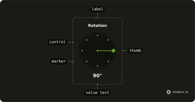
AngleSlider
├── AngleSliderLabel
├── AngleSliderThumb
├── AngleSliderValueText
├── AngleSliderControl
├── AngleSliderTrack
└── AngleSliderMarker
    └── AngleSliderMarkerGroup
Usage
import {
  AngleSlider, AngleSliderControl, AngleSliderHiddenInput,
  AngleSliderLabel, AngleSliderMarker, AngleSliderMarkerGroup,
  AngleSliderThumb, AngleSliderValueText,
} from "@/components/ui/angle-slider";
const MARKERS = [0, 45, 90, 135, 180, 225, 270, 315];
const Example = () => (
<AngleSlider>
<AngleSliderLabel>Rotation</AngleSliderLabel>
<AngleSliderControl>
<AngleSliderMarkerGroup>
{MARKERS.map((value) => (
<AngleSliderMarker key={value} value={value} />
))}
</AngleSliderMarkerGroup>
<AngleSliderThumb />
</AngleSliderControl>
<AngleSliderValueText />
<AngleSliderHiddenInput />
</AngleSlider>
);Accessibility
- Arrow Right
- Increments the angle slider based on defined step.
- Arrow Left
- Decrements the angle slider based on defined step.
- Arrow Up
- Decreases the value by the step amount.
- Arrow Down
- Increases the value by the step amount.
- Shift+Arrow Up
- Decreases the value by a larger step.
- Shift+Arrow Down
- Increases the value by a larger step.
- Home
- Sets the value to 0 degrees.
- End
- Sets the value to 360 degrees.
Demos
Context
AngleSliderContext feeds the degrees into the label, so it tracks the thumb without a second copy in state. Use it when a sibling inside the slider, usually the label, should show the angle. A button outside this tree should hold value or use the root provider. The readout under the dial still prints the angle, so keep both only if one of them is the text people read.
Controlled
value starts at 45, and onValueChange writes the next angle back. Control the dial when a canvas or another field must show the same degrees, or when you might ignore a change. Leave it uncontrolled when the dial is the only place the angle lives and a hidden input can submit it. If you persist it, the end of the drag is the quieter moment.
Disabled
disabled holds the dial at 45 degrees. The thumb stays put, and the keyboard will not move it. Use that when rotation is locked by another setting, such as following a layer default, but people should still see the angle. Hiding the control makes the lock invisible, so the label, or a line beside it, should say why it cannot be dragged.
Root Provider
useAngleSlider creates the store, AngleSliderRootProvider passes it down, and a button outside the dial sets the angle to 90. Use the provider when a control outside the slider must read or write the angle without props threaded through both. They share one store. If you only need the angle on submit, the hidden input is enough.
Step
step is 15, and the label says so. The thumb snaps to those increments instead of every degree, while the ticks stay on the 45 degree marks. Use a coarse step for a compass or a rotation people think of in chunks, and leave the default of 1 when a gradient needs a precise angle. Ticks show landmarks, and step decides where the thumb may rest.
FAQ
When should I use an Angle Slider instead of a Slider?
Use the Angle Slider for values that go around a circle, such as a direction, a rotation or a gradient angle. For a value on a line, such as volume, use a Slider, and for a circular track with a start and an end, a Circular Slider.
How do I read the Angle Slider value in Solid?
The value is a number of degrees.
Pass value and read the new one in onValueChange, which receives { value }, as the Controlled demo does.
AngleSliderValueText shows the current angle next to the dial.
How do I snap the Angle Slider to fixed angles?
Set step, which is 1 by default: step of 15 or 45 snaps to those increments, as in the Step demo. Add an AngleSliderMarkerGroup with an AngleSliderMarker per value to draw ticks at the angles that matter.
How do I save the Angle Slider value only when dragging stops?
Use onValueChangeEnd: it fires once, when the pointer is released, while onValueChange fires on every move. Save there to avoid a request per pixel.
Can I submit the Angle Slider value with a form?
Yes. Give the slider a name and render AngleSliderHiddenInput inside it: the hidden input carries the angle with the form. disabled, readOnly and invalid set the matching states, as in the Disabled demo.
API Reference
AngleSlider
<div> data-slot="angle-slider"
value?number
The value of the slider.
defaultValue?number
The initial value of the slider. Use when you don't need to control the value of the slider.
- Default
0
onValueChange?(details: ValueChangeDetails) → void
The callback function for when the value changes.
- Type
(details: ValueChangeDetails) → void- Parameters
details– { value: number; valueAsDegree: string }- Returns
void
dir?"ltr" | "rtl"
The document's text/writing direction.
- Type
"ltr" | "rtl"- Default
"ltr"
disabled?boolean
Whether the slider is disabled.
id?string
The unique identifier of the machine.
ids?object
The ids of the elements in the machine. Useful for composition.
- Type
{ root?: string; thumb?: string; hiddenInput?: string; control?: string; valueText?: string; label?: string }
invalid?boolean
Whether the slider is invalid.
name?string
The name of the slider. Useful for form submission.
onValueChangeEnd?(details: ValueChangeDetails) → void
The callback function for when the value changes ends.
- Type
(details: ValueChangeDetails) → void- Parameters
details– { value: number; valueAsDegree: string }- Returns
void
readOnly?boolean
Whether the slider is read-only.
step?number
The step value for the slider.
- Default
1
asChild?(props: ParentProps) => JSX.Element
Render your own element: a function that gets the part's props to spread on it.
- Type
(props: ParentProps) => JSX.Element
class?string
Merged with the part's classes.
data-disabled?string
Present when disabled.
data-invalid?string
Present when invalid.
data-readonly?string
Present when read-only.
--anglestring
The angle in degrees.
--valuestring
The current value.
AngleSliderLabel
<label> data-slot="angle-slider-label"
asChild?(props: ParentProps) => JSX.Element
Render your own element: a function that gets the part's props to spread on it.
- Type
(props: ParentProps) => JSX.Element
class?string
Merged with the part's classes.
data-disabled?string
Present when disabled.
data-invalid?string
Present when invalid.
data-readonly?string
Present when read-only.
AngleSliderThumb
<div> data-slot="angle-slider-thumb"
asChild?(props: ParentProps) => JSX.Element
Render your own element: a function that gets the part's props to spread on it.
- Type
(props: ParentProps) => JSX.Element
class?string
Merged with the part's classes.
data-disabled?string
Present when disabled.
data-invalid?string
Present when invalid.
data-readonly?string
Present when read-only.
--sizestring--thumb-widthstringAngleSliderValueText
<span> data-slot="angle-slider-value-text"
asChild?(props: ParentProps) => JSX.Element
Render your own element: a function that gets the part's props to spread on it.
- Type
(props: ParentProps) => JSX.Element
class?string
Merged with the part's classes.
AngleSliderControl
<div> data-slot="angle-slider-control"
asChild?(props: ParentProps) => JSX.Element
Render your own element: a function that gets the part's props to spread on it.
- Type
(props: ParentProps) => JSX.Element
class?string
Merged with the part's classes.
data-disabled?string
Present when disabled.
data-invalid?string
Present when invalid.
data-readonly?string
Present when read-only.
--sizestring--track-widthstringAngleSliderMarkerGroup
<div> data-slot="angle-slider-marker-group"
asChild?(props: ParentProps) => JSX.Element
Render your own element: a function that gets the part's props to spread on it.
- Type
(props: ParentProps) => JSX.Element
class?string
Merged with the part's classes.
AngleSliderMarker
<span> data-slot="angle-slider-marker"
valuenumber
The value of the marker.
asChild?(props: ParentProps) => JSX.Element
Render your own element: a function that gets the part's props to spread on it.
- Type
(props: ParentProps) => JSX.Element
class?string
Merged with the part's classes.
data-disabled?string
Present when disabled.
data-state"under-value" | "over-value" | "at-value"
"under-value", "over-value" or "at-value".
- Type
"under-value" | "over-value" | "at-value"
data-valuestring
The value of the item.
--marker-display-valuestring
The rotation angle for display (mirrored in RTL).
--marker-valuestring
The logical marker value (e.g. 0, 45, 90).
AngleSliderHiddenInput
<input> data-slot="angle-slider-hidden-input"
asChild?(props: ParentProps) => JSX.Element
Render your own element: a function that gets the part's props to spread on it.
- Type
(props: ParentProps) => JSX.Element
AngleSliderRootProvider
<div> data-slot="angle-slider"
valueUseAngleSliderReturn
What useAngleSlider() returns: the state and API, made outside the component to control it.
asChild?(props: ParentProps) => JSX.Element
Render your own element: a function that gets the part's props to spread on it.
- Type
(props: ParentProps) => JSX.Element
class?string
Merged with the part's classes.
data-disabled?string
Present when disabled is true.
data-invalid?string
Present when invalid is true.
data-readonly?string
Present when readOnly is true.
--anglestring--valuestringuseAngleSlider
value?number
The value of the slider.
defaultValue?number
The initial value of the slider. Use when you don't need to control the value of the slider.
- Default
0
onValueChange?(details: ValueChangeDetails) → void
The callback function for when the value changes.
- Type
(details: ValueChangeDetails) → void- Parameters
details– { value: number; valueAsDegree: string }- Returns
void
disabled?boolean
Whether the slider is disabled.
id?string
The unique identifier of the machine.
ids?object
The ids of the elements in the machine. Useful for composition.
- Type
{ root?: string; thumb?: string; hiddenInput?: string; control?: string; valueText?: string; label?: string }
invalid?boolean
Whether the slider is invalid.
name?string
The name of the slider. Useful for form submission.
onValueChangeEnd?(details: ValueChangeDetails) → void
The callback function for when the value changes ends.
- Type
(details: ValueChangeDetails) → void- Parameters
details– { value: number; valueAsDegree: string }- Returns
void
readOnly?boolean
Whether the slider is read-only.
step?number
The step value for the slider.
- Default
1
AngleSliderContext
draggingboolean
Whether the slider is being dragged.
setValue(value: number) → void
Sets the value of the angle slider.
- Parameters
value– number- Returns
void
valuenumber
The current value of the angle slider.
valueAsDegreestring
The current value as a degree string.
With other components
Number Input
InputsType the degrees
Field
InputsLabel and the dial
Label
InputsName the angle
Tooltip
OverlaysShow the degrees
Card
LayoutA dial in a panel
Button
ButtonsReset to zero
Related
Circular Slider
ControlsA progress-ring dial
Slider
ControlsA straight range
Circular Progress
FeedbackShow an angle, do not pick it
Rating
SelectionA small stepped score
Color Picker
InputsAnother two-axis control
Timer
ControlsA value that runs