shadcn.io is not affiliated with official shadcn/ui
Days, hours, minutes, and seconds, as a countdown or a stopwatch. It keeps going while the tab is open.
Use it for a launch, a focus session, or a deadline. A Progress bar is clearer when you only care how far a task has gotten. In Solid, Ark UI keeps the countdown, and start, pause, and reset are parts you place yourself.
Installation
Anatomy
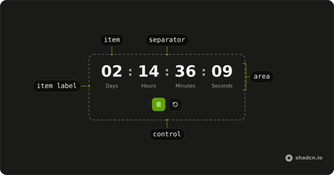
Timer
├── TimerArea
├── TimerControl
├── TimerItem
│   ├── TimerItemValue
│   └── TimerItemLabel
├── TimerRestart
└── TimerSeparator
Usage
import {
  Timer, TimerArea, TimerItem, TimerItemGroup, TimerItemLabel,
  TimerSeparator,
} from "@/components/ui/timer";<Timer autoStart>
<TimerArea>
<TimerItemGroup>
<TimerItem type="days" />
<TimerItemLabel>Days</TimerItemLabel>
</TimerItemGroup>
<TimerSeparator />
<TimerItemGroup>
<TimerItem type="hours" />
<TimerItemLabel>Hours</TimerItemLabel>
</TimerItemGroup>
<TimerSeparator />
<TimerItemGroup>
<TimerItem type="minutes" />
<TimerItemLabel>Minutes</TimerItemLabel>
</TimerItemGroup>
<TimerSeparator />
<TimerItemGroup>
<TimerItem type="seconds" />
<TimerItemLabel>Seconds</TimerItemLabel>
</TimerItemGroup>
</TimerArea>
</Timer>Accessibility
- Enter
- Activate the focused control.
- Space
- Activate the focused control.
Demos
Controlled
It counts up from zero and stops at targetMs, here five seconds. onTick bumps a counter on each update, and onComplete flips a flag once the target is hit, with play and reset in TimerControl. Use the callbacks when a parent has to react, such as enabling a button at the end. If you only need the digits, skip the extra state.
Countdown
countdown and autoStart, with startMs set to five minutes, showing minutes and seconds. It runs as soon as it renders, and there is no pause button, which fits a hold, a resend delay, or anything that should just expire. Add TimerPause when a person has to be able to stop it. Leave countdown off and the same parts count up.
Countdown Date
The target is a date seven days out. remainingMsUntilDate turns that into startMs when the clock renders, with countdown and autoStart, and the date is printed above the units. Use this for a launch or a registration close, and recompute on mount. A millisecond constant baked earlier is already stale by the time someone opens the page.
Custom Separator
TimerSeparator shows two slashes instead of the default colon, between minutes and seconds, with no unit labels. Use a custom separator when the clock has to match a mark or a compact style. Keep the stand-in short. A word in that slot stops reading as a clock and starts reading as a sentence between two numbers.
Interval
interval is 100 milliseconds, the units are seconds and milliseconds, and the clock counts up toward one minute, waiting for play with pause beside it. Use a short interval for a stopwatch where fractions matter. A minutes-and-seconds countdown can keep the default of one second, since updating faster only to show whole seconds makes the digits flicker.
Orientation Horizontal
TimerItemGroup set to horizontal puts the unit label beside the number, in a row. The countdown is still five minutes, auto-started. Use this when the clock sits in a toolbar or a short strip, where a stacked caption would make the row too tall. The separator stays between the groups, not between the digit and its label.
Orientation Vertical
The label sits under the number. That is also the default for TimerItemGroup, and this preview sets vertical so you can compare it with the row beside it. Use it for a poster-style clock, where the unit is a caption under the digits. Switch to horizontal when the strip is short on height and the caption has to sit inline.
Pomodoro
A 25 minute countdown that does not start on its own, with large digits, a focus label under them, and play, pause, and reset in TimerControl. Reset stays visible because hidden is set to false, including before the first start. Use this for a session a person starts on purpose. A launch date should compute itself and start alone.
FAQ
How do I make a countdown Timer in Solid?
Set countdown and the starting time in milliseconds with startMs, for example 5 minutes as 5 * 60 * 1000, as the Countdown demo does. Add autoStart to start counting as soon as it renders.
How do I count down to a date with the Timer?
Compute the milliseconds left until the date and pass them as startMs with countdown, as the Countdown Date demo does. Recompute it when the component mounts, so the time left is right after a reload.
How do I use the Timer as a stopwatch?
Leave out countdown: the Timer then counts up from startMs, which defaults to 0. Set targetMs to stop it at a given time, and show milliseconds with a TimerItem of type milliseconds and a shorter interval.
How do I run code when the Timer finishes?
Pass onComplete: it fires once when a countdown reaches zero, or when counting up reaches targetMs, as the Controlled demo does. onTick fires on every update, at the rate set by interval (1000 milliseconds by default).
How do I add start, pause and reset buttons to the Timer?
Put TimerStart, TimerPause, TimerResume, TimerReset and TimerRestart inside a TimerControl, or use a TimerActionTrigger with an action. Each button shows only when its action applies, so Pause replaces Start while the Timer runs.
API Reference
Timer
<div> data-slot="timer"
autoStart?boolean
Whether the timer should start automatically.
countdown?boolean
Whether the timer should countdown, decrementing the timer on each tick.
id?string
The unique identifier of the machine.
ids?object
The ids of the timer parts.
- Type
{ root?: string; area?: string }
interval?number
The interval in milliseconds to update the timer count.
- Default
1000
onComplete?() → void
Function invoked when the timer is completed.
- Returns
void
onTick?(details: TickDetails) → void
Function invoked when the timer ticks.
- Parameters
details– { value: number; time: Time; formattedTime: Time<string> }- Returns
void
startMs?number
The total duration of the timer in milliseconds.
targetMs?number
The minimum count of the timer in milliseconds.
translations?object
Specifies the localized strings that identifies the accessibility elements and their states.
- Type
{ areaLabel?: (time: Time, formattedTime: Time<string>) → string }
asChild?(props: ParentProps) => JSX.Element
Render your own element: a function that gets the part's props to spread on it.
- Type
(props: ParentProps) => JSX.Element
class?string
Merged with the part's classes.
TimerArea
<div> data-slot="timer-area"
asChild?(props: ParentProps) => JSX.Element
Render your own element: a function that gets the part's props to spread on it.
- Type
(props: ParentProps) => JSX.Element
class?string
Merged with the part's classes.
TimerControl
<div> data-slot="timer-control"
asChild?(props: ParentProps) => JSX.Element
Render your own element: a function that gets the part's props to spread on it.
- Type
(props: ParentProps) => JSX.Element
class?string
Merged with the part's classes.
TimerItem
<div> data-slot="timer-item"
typekeyof Time
The unit it shows: days, hours, minutes, seconds or milliseconds.
asChild?(props: ParentProps) => JSX.Element
Render your own element: a function that gets the part's props to spread on it.
- Type
(props: ParentProps) => JSX.Element
class?string
Merged with the part's classes.
data-typestring
The type of the item.
--valuestring
The current value.
TimerPlay
<button>
asChild?(props: ParentProps) => JSX.Element
Render your own element: a function that gets the part's props to spread on it.
- Type
(props: ParentProps) => JSX.Element
TimerSeparator
<div> data-slot="timer-separator"
asChild?(props: ParentProps) => JSX.Element
Render your own element: a function that gets the part's props to spread on it.
- Type
(props: ParentProps) => JSX.Element
class?string
Merged with the part's classes.
TimerItemGroup
<div> data-slot="timer-item-group"
orientation?"horizontal" | "vertical"
The orientation of the timer item group.
- Type
"horizontal" | "vertical"- Default
"vertical"
asChild?(props: ParentProps) => JSX.Element
Render your own element: a function that gets the part's props to spread on it.
- Type
(props: ParentProps) => JSX.Element
class?string
Merged with the part's classes.
data-orientation?string
Mirrors orientation.
TimerItemLabel
<div> data-slot="timer-item-label"
asChild?(props: ParentProps) => JSX.Element
Render your own element: a function that gets the part's props to spread on it.
- Type
(props: ParentProps) => JSX.Element
class?string
Merged with the part's classes.
TimerActionTrigger
<button> data-slot="timer-action"
action"start" | "pause" | "resume" | "reset" | "restart"
The action it runs: start, pause, resume, reset or restart.
- Type
"start" | "pause" | "resume" | "reset" | "restart"
asChild?(props: ParentProps) => JSX.Element
Render your own element: a function that gets the part's props to spread on it.
- Type
(props: ParentProps) => JSX.Element
TimerPause
<button> data-slot="timer-pause"
asChild?(props: ParentProps) => JSX.Element
Render your own element: a function that gets the part's props to spread on it.
- Type
(props: ParentProps) => JSX.Element
TimerResume
<button> data-slot="timer-resume"
asChild?(props: ParentProps) => JSX.Element
Render your own element: a function that gets the part's props to spread on it.
- Type
(props: ParentProps) => JSX.Element
TimerStart
<button> data-slot="timer-start"
asChild?(props: ParentProps) => JSX.Element
Render your own element: a function that gets the part's props to spread on it.
- Type
(props: ParentProps) => JSX.Element
TimerReset
<button> data-slot="timer-reset"
asChild?(props: ParentProps) => JSX.Element
Render your own element: a function that gets the part's props to spread on it.
- Type
(props: ParentProps) => JSX.Element
TimerRestart
<button> data-slot="timer-restart"
asChild?(props: ParentProps) => JSX.Element
Render your own element: a function that gets the part's props to spread on it.
- Type
(props: ParentProps) => JSX.Element
useTimer
autoStart?boolean
Whether the timer should start automatically.
countdown?boolean
Whether the timer should countdown, decrementing the timer on each tick.
id?string
The unique identifier of the machine.
ids?object
The ids of the timer parts.
- Type
{ root?: string; area?: string }
interval?number
The interval in milliseconds to update the timer count.
- Default
1000
onComplete?() → void
Function invoked when the timer is completed.
- Returns
void
onTick?(details: TickDetails) → void
Function invoked when the timer ticks.
- Parameters
details– { value: number; time: Time; formattedTime: Time<string> }- Returns
void
startMs?number
The total duration of the timer in milliseconds.
targetMs?number
The minimum count of the timer in milliseconds.
translations?object
Specifies the localized strings that identifies the accessibility elements and their states.
- Type
{ areaLabel?: (time: Time, formattedTime: Time<string>) → string }
With other components
Button
ButtonsStart, pause, reset
Badge
FeedbackThe time as a tag
Progress
FeedbackTime elapsed
Card
LayoutThe clock on a surface
Kbd
TypographySpace to start
Tooltip
OverlaysWhat the timer is for
Related
Slider
ControlsSet a duration
Number Input
InputsType the seconds
Circular Progress
FeedbackA ring that counts down
Spinner
FeedbackWaiting, no clock
Status
FeedbackRunning or stopped
Toast
FeedbackTime is up