Zoom Design System
Zoom's marketing-site system as a DESIGN.md file: cobalt #0b5cff voltage, Happy Face Semi Bold display, Almaden Sans body, 14 colors. Tokens for React, Next.js, and AI coding tools.
Add shadcn.io to your AI agent. · Pro It installs blocks, icons and templates in your design system from a prompt, with Pro.
Set up MCP- Primary
- #0b5cff
- Typeface
- Almaden Sans
- Shape
- Mixed
- Base radius
- 8px
- Colors
- 14
- Type tokens
- 11
- Components
- 17
- Spacing values
- 9
About
About Zoom DESIGN.md
Curated by Dov Azencot · Updated May 19, 2026 · Source zoom.us (opens in a new tab)
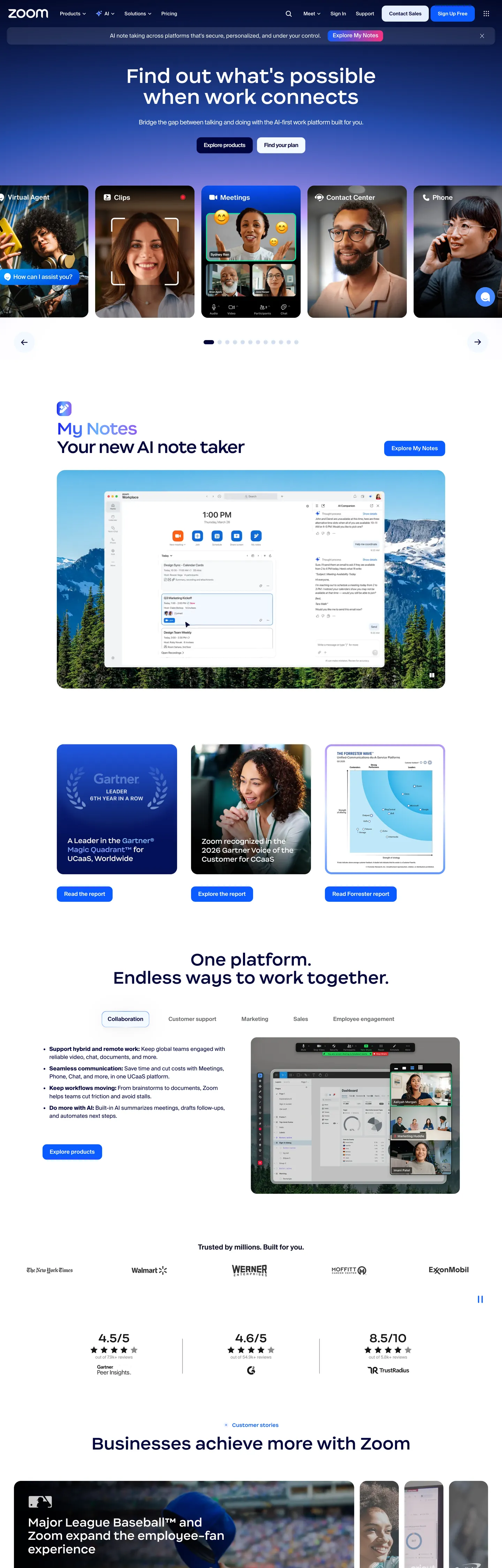
Zoom's marketing site does something the video-meetings category convention pushes against: it treats the actual product visual — live human faces in a 5-up camera-tile grid — as the hero's anchor element rather than as a sample screenshot below the fold. The hero canvas is a full-bleed cobalt-blue gradient block at #0b5cff with the 54px Happy Face Semi Bold headline "Find out what's possible when work connects" rendered in white above it, and immediately beneath sits a row of five rounded-card video tiles showing actual smiling humans on real camera feeds. Where Microsoft Teams renders flat purple shapes and Google Meet runs flat color blocks, Zoom commits to the human-face-as-product moment.
Below the fold the page inverts to a white canvas with navy ink #00053d carrying every heading, and the cobalt voltage recedes to small button highlights, the AI-notes app badge, and the link color. The typographic move that distinguishes the brand from the developer-tools category is the Happy Face Semi Bold display family — a friendly proprietary sans with rounded humanist letterforms that read warm rather than precise. Headlines sit at 32-54px in weight 500 (never 700+), and the body voice is Almaden Sans at 14-16px / 400-600. The pairing reads as consumer-friendly business software rather than as developer infrastructure — closer to Notion or Asana than to Linear or Vercel.
The DESIGN.md file packages the system into a machine-readable spec. Inside: 14 colors tokens drawn from the white canvas, the navy ink ladder, the cobalt voltage, and a handful of gradient end-stops; 11 typography tokens running Happy Face Semi Bold for display and Almaden Sans for everything else; a 5-step radius scale centered on 20px and 12px (the softer-than-dev-tools move); and 17 components definitions covering the cobalt-floor hero, the rounded video tile, the cobalt-text primary button, the navy section heading, and the customer-quote card. Feed this file to Claude or Cursor and it will reproduce the specific moves: human-face-as-product hero, Happy Face display family, white canvas with navy ink, and the consumer-friendly 20px / 12px radius pair.
What makes it distinct
5
- Happy Face Semi Bold displayZoom's proprietary friendly sans carries every 32-54px headline; the rounded humanist letterforms are the typographic move that distinguishes the brand from the harder dev-tool grotesks
- Cobalt-as-camera-floorthe hero embeds live video tiles inside a full-bleed cobalt gradient block rather than placing a CTA accent on a white field; the human faces become the visual anchor
- White canvas with navy inkbelow the fold the page sits on pure white with #00053d navy headings, the inverse of Twilio or Linear's dark-canvas convention
- 20px cards plus 12px buttonsthe softer-than-dev-tools radius scale signals consumer-friendly rather than enterprise-precision
- Text-gradient marquee tokenstwo named gradients (cobalt-to-sky for dark contexts, silver-to-pale-blue for light) appear only inside specific feature headlines
zoom.us
Live at zoom.us
A snapshot of the brand in production. Scroll the frame to see the whole page.
Colors
14 colors
Zoom's system runs on #0b5cff as its primary voltage, used in 2 of 17 components. Type is set in Almaden Sans across 11 tokens from 10px to 54px, weights 400–600. Shape language is mixed across 17 components, blending pills, soft rounds, and squarer corners.
Brand & Accent
Sparing, CTA-only voltage · 5
Surface
Page and card backgrounds · 3
Text
Headlines, body, captions · 4
Borders & Hairlines
Dividers, outlines, rules · 1
Other
Specialty colors · 1
Typography
11 type tokens
Set in Almaden Sans across 11 tokens, from 10px to 54px, weights 400–600. Shown in its own stack: where the font isn't installed, the fallback the file names stands in.
- display-xl54px · weight 500 · lh 60.48pxThe quick brown fox jumps over the lazy dog
- display-lg46px · weight 500 · lh 52.44px · tracking -1.4pxThe quick brown fox jumps over the lazy dog
- display-md32px · weight 500 · lh 38.4pxThe quick brown fox jumps over the lazy dog
- heading-md20px · weight 500 · lh 23px · tracking -0.4pxThe quick brown fox jumps over the lazy dog
- body-lg16px · weight 400 · lh 23.2pxThe quick brown fox jumps over the lazy dog
- body-md16px · weight 400 · lh 20.8pxThe quick brown fox jumps over the lazy dog
- body-sm14px · weight 400 · lh 18.9pxThe quick brown fox jumps over the lazy dog
- label-md14px · weight 500 · lh 14pxThe quick brown fox jumps over the lazy dog
- button-md16px · weight 600 · lh 21.6pxThe quick brown fox jumps over the lazy dog
- nav-link15px · weight 600 · lh 18pxThe quick brown fox jumps over the lazy dog
- caption10px · weight 400 · lh 10pxThe quick brown fox jumps over the lazy dog
Layout
Radii and spacing
7 corner radii and 9 spacing values. Shape language: mixed.
Radii
- none0px
- sm4px
- md8px
- base12px
- lg16px
- xl20px
- full9999px
Spacing
- xs4px
- sm6px
- base8px
- md10px
- lg16px
- xl20px
- 2xl24px
- 3xl40px
- 4xl60px
Components
17 components
Each rendered from its tokens (color, type, radius, padding) on Zoom's own canvas.
- Button Primarybutton-primaryButton Primary
- Button Secondarybutton-secondaryButton Secondary
- Top Navtop-navTop Nav
- Nav Linknav-linkNav Link
- Hero Blockhero-blockHero Block
- Hero Headinghero-headingHero Heading
- Section Headingsection-headingSection Heading
- Feature Headingfeature-headingFeature Heading
- Body Paragraphbody-paragraphBody Paragraph
- Body Paragraph Mutedbody-paragraph-mutedBody Paragraph Muted
- Video Tilevideo-tileVideo Tile
- Feature Cardfeature-cardFeature Card
- Ai App Badgeai-app-badgeAi App Badge
- Quote Cardquote-cardQuote Card
- AvataravatarAvatar
- Type here…text-inputText Input
- FooterfooterFooter
In use
The system, in use
Zoom's tokens on the kind of product it builds.
Build something people actually use.
A short paragraph of marketing copy that previews how the brand's display tier and body tier read together. Two sentences is usually enough.
FAQ
Zoom design system FAQ
Common questions about Zoom's tokens, components, and how to use this DESIGN.md in your project.
Read next
Related reading
Specs, directories, and component libraries that pair with this design system.
- Browse all design systemsThe full directory of DESIGN.md files on shadcn.io, with live mockups for each.shadcn.io
- Zoom — official siteZoom's public marketing site — the source of truth for the live tokens captured in this file.zoom.us (opens in a new tab)
- The DESIGN.md specificationGoogle Labs' open spec for machine-readable design system files — the format this page is built on.github.com (opens in a new tab)
Use it
Use Zoom in your project
One machine-readable file. Drop it into Claude, Cursor, or any AI tool that reads DESIGN.md.
Download the DESIGN.md
One machine-readable file: every color, type, radius, spacing, and component token of Zoom.
Feed it to your AI tool
Drop it into Claude, Cursor, or GitHub Copilot. The agent writes React components and Tailwind classes that match Zoom's visual language.
Reference the tokens directly
Or paste the values into your Tailwind config, CSS variables, or component library: every color, size and radius is a quoted, ready-to-copy value.
Read the full DESIGN.md: overview, rationale, do’s and don’ts
Overview
Zoom's marketing site does something the video-meetings category usually avoids: it treats actual human faces as the hero's anchor element. Human-face-as-product. The hero block is a full-bleed cobalt-blue gradient at {colors.primary} (#0b5cff) carrying a 5-up grid of rounded video tiles showing live camera feeds of real smiling humans, with the 54px Happy Face Semi Bold headline "Find out what's possible when work connects" rendered in white above the grid. Microsoft Teams runs flat purple shapes and Google Meet uses flat color blocks; Zoom commits to the actual face-on-camera moment as the brand identity. The video tiles are not sample screenshots — they are the brand statement.
Below the fold the page inverts to a {colors.canvas} pure-white surface with {colors.ink} navy headings at #00053d, and the cobalt voltage recedes to small accent roles — the AI-notes app badge, button text color, link color, the chat-emoji floating indicator on the AI-notes app card. The dark-cobalt-hero / white-canvas-body split is the page's structural device. Where Twilio commits to a dark canvas everywhere and Cloudflare commits to a saturated brand canvas in the hero only, Zoom takes Cloudflare's voltage-as-canvas move and applies it specifically to the human-face hero — then drops into conventional white-business-software canvas for the editorial bands.
Typography runs Happy Face Semi Bold (a proprietary friendly sans with rounded humanist letterforms) for the 32-54px display tier and Almaden Sans (a proprietary neutral grotesque with broad Asian-script fallbacks baked in) for body, label, button, and nav. Display weight stays at 500, not 700 — the headline confidence comes from the rounded letterforms rather than from weight. The pairing reads as consumer-friendly business software, closer to Notion or Asana than to Linear or Vercel.
Key Characteristics:
- Pure white canvas (
{colors.canvas}— #ffffff) dominates with 590 captured occurrences — the editorial-band surface below the cobalt hero block. - Cobalt voltage (
{colors.primary}— #0b5cff) carries 121 captured occurrences split across text, background, border, and gradient — the only saturated brand color in the system. - Happy Face Semi Bold display family at 32-54px in weight 500 — rounded humanist letterforms that read warm, not precise.
- Almaden Sans body family with broad Asian-script fallbacks (Noto Sans JP / KR / SC / TC) baked into the family stack — an unusual amount of i18n declared at the family level.
- 20px and 12px are the dominant radii — softer than the dev-tools convention (Vercel, Linear), harder than the consumer-playful extreme (Notion).
- Two named text-gradient variables —
--text-gradient-darkwalks cobalt → sky for dark contexts;--text-gradient-lightwalks silver → pale-blue for light contexts. Both appear only inside specific feature headlines. - Navy ink (
{colors.ink}— #00053d) carries every below-fold heading; the system has no neutral charcoal text tier. - No fully-rounded pill anywhere — even the 12px nav tabs and the secondary button stop short of the pill threshold.
Colors
Brand
- Cobalt (
{colors.primary}— #0b5cff): frequency 121. Used as background (9), text (49), border (56), gradient (7). The single brand voltage — fills the hero gradient block, the AI-notes app badge, button text colors, link colors, the chat-emoji floating indicator. The dominant chromatic element after navy ink. - Cobalt Dark (
{colors.primary-dark}— #011067): frequency 4, all inside gradients. The dark end-stop on the cobalt-to-sky text gradient used for marquee headlines on dark backgrounds. - Accent Magenta (
{colors.accent-magenta}— #fb327e): frequency 1, gradient only. A magenta end-stop in a secondary background gradient — likely a "reactions" or emoji color from the product chrome, not a recurring brand color. - Accent Violet (
{colors.accent-violet}— #9a67fa): frequency 1, gradient only. The violet end-stop on the same secondary gradient; not part of the primary brand palette. - Accent Sky (
{colors.accent-sky}— #6cb0ff): frequency 1, gradient only. The light end-stop on the cobalt-to-sky text gradient.
Surface
- Canvas (
{colors.canvas}— #ffffff): frequency 590 — 285 text, 25 background, 277 border, 3 gradient. The dominant page surface below the fold. Wired in CSS as--zdcm-border-color(with 50% alpha) and--nav-background(with 50% alpha for the translucent top nav). - Surface-1 (
{colors.surface-1}— #e6f0ff): frequency 4 — 3 background, 1 border. The pale-cobalt tint used on the "Zoom Workplace" primary button background and the AI-app-badge background. Wired as--zdcm-item-background. - Surface-2 (
{colors.surface-2}— #d1def2): frequency 17 — 15 background, 2 border. The mid-pale cobalt-tinted gray used on avatar backgrounds, active nav item backgrounds, and quote-card subtle backdrops. Wired as--zdcm-li-active.
Text
- Ink (
{colors.ink}— #00053d): frequency 205 — 102 text, 3 background, 99 border, 1 gradient. The dominant navy heading and body color across every below-fold section. Wired as--hamburger-color,--zdcm-item-color,--nav-main-list-items, and--zdcm-waffle. - Ink Dark (
{colors.ink-dark}— #00031f): frequency 228 — 113 text, 113 border, 2 gradient. A slightly darker navy used on dropdown menu text, secondary navigation, and as the dominant border tone for outlined surfaces. Effectively a second navy step below{colors.ink}. - Ink Muted (
{colors.ink-muted}— #696b6e): frequency 20 — 10 text, 10 border. The neutral medium-gray for secondary captions and footer category sub-labels. The single non-blue text tone in the system. - Ink Soft (
{colors.ink-soft}— #181819): frequency 50 — 24 text, 24 border, 2 shadow. A near-black neutral used on the deepest text emphasis and the strongest border outlines.
Hairline
- Hairline (
{colors.hairline}— #d1def2): the cobalt-tinted gray shared with{colors.surface-2}. The system uses warm-tinted hairlines rather than neutral gray so the rule lines harmonize with the cobalt brand voltage.
Shadow
- Shadow (
{colors.shadow}— #000000): frequency 134 — 64 text, 64 border, 6 shadow. Pure black used in CSS shadow declarations and as a deep contrast option on the strongest text emphasis. The shadow itself usesrgba(0,0,0,.06)andrgba(0,0,0,.04)for the panel-shadow inset values per the declared--panel-shadowvariable.
Typography
Font Families
The system runs Happy Face Semi Bold for the display tier (32-54px headlines) and Almaden Sans for body, label, button, nav, and caption. Both are proprietary families introduced in Zoom's 2024 brand refresh.
The Happy Face / Almaden pairing is the most distinctive typographic move in the system. Happy Face is a friendly rounded sans with humanist letterforms — the kind of warm display family more often seen on consumer brands (Mailchimp's old Cooper Hewitt move, Asana's Aktiv Grotesk) than on business-meetings software. Almaden Sans is a workhorse neutral grotesque with broad Asian-script fallbacks (Noto Sans JP / KR / SC / TC) baked directly into the family stack — an unusual amount of i18n declared at the family level, signaling that Zoom prioritizes global rendering consistency.
Hierarchy
| Token | Size | Weight | Line Height | Use |
|---|---|---|---|---|
{typography.display-xl} | 54px | 500 | 60.48px | Hero h1 ("Find out what's possible when work connects") |
{typography.display-lg} | 46px | 500 | 52.44px | Section h2 ("Your new AI note taker") |
{typography.display-md} | 32px | 500 | 38.4px | Tertiary h3 ("One platform. Endless ways to work together.") |
{typography.heading-md} | 20px | 500 | 23px | Sub-section h3 / feature-card titles |
{typography.body-lg} | 16px | 400 | 23.2px | Lead paragraphs (note generous 23.2px line-height) |
{typography.body-md} | 16px | 400 | 20.8px | Default running text in feature cards |
{typography.body-sm} | 14px | 400 | 18.9px | Caption rows, customer-quote attribution, footer body |
{typography.label-md} | 14px | 500 | 14px | Small-caps-equivalent label treatment, badge text |
{typography.button-md} | 16px | 600 | 21.6px | Primary and secondary button labels |
{typography.nav-link} | 15px | 600 | 18px | Top-nav link labels |
{typography.caption} | 10px | 400 | 10px | Footnote text, fine-print metadata |
Principles
Display weight stays at 500. The hero h1 at 54px / 500 leans on the rounded Happy Face letterforms for warmth rather than on a heavier weight — the same restraint move Cloudflare makes with FT Kunst Grotesk at 500. The display ladder compresses size in even steps (54 / 46 / 32) without tracking adjustments at the largest sizes; only the second-tier 46px display picks up -1.4px tracking on certain headline variants.
Body weight runs 400 for paragraphs and 500-600 for labels and buttons. The 14px label tier at weight 500 with 14px line-height (a 1:1 ratio) is unusually tight — it reads as a small-caps treatment without using uppercase tracking. Almaden Sans handles the entire body voice, including the Asian-script fallbacks.
Note on Font Substitutes
Happy Face Semi Bold is proprietary. The closest open-source substitute is Nunito Sans at weight 600 — the rounded humanist letterforms transfer well at the 54px display sizes. Fraunces at weight 600 reads similarly warm if you want a slightly more editorial feel. For Almaden Sans, Inter at the same weights is the cleanest replacement; Almaden has a slightly wider cap-height so you may want to set the substitute at 95% of Almaden's declared sizes for a closer match. For the Asian-script fallbacks, the declared Noto Sans JP / KR / SC / TC family stack is itself the recommendation — keep that fallback ladder intact in any substitute deployment.
Layout
Spacing System
- Base unit: 8px / 16px share the dominant gap role — 8px appears 40 times and 16px appears 66 times.
- Tokens:
{spacing.xs}4px ·{spacing.sm}6px ·{spacing.base}8px ·{spacing.md}10px ·{spacing.lg}16px ·{spacing.xl}20px ·{spacing.2xl}24px ·{spacing.3xl}40px ·{spacing.4xl}60px. - Section padding (vertical):
{spacing.4xl}60px between major editorial sections — the captured page uses60px 0pxas the dominant section-padding pattern. - Card internal padding:
{spacing.3xl}(40px) on{component.feature-card}and{component.quote-card}— generous, signaling consumer-friendly rather than dev-tool-dense. - Top-nav padding: the captured nav uses
0px 20pxhorizontal padding at a 64px height.
Grid & Container
- Max content width: ~1440px on the hero gradient block (full-bleed at most viewport widths), ~1200px on the editorial sections below the fold.
- Hero block: full-bleed cobalt gradient carrying the 5-up rounded video tiles in a horizontal row. The video tiles are the visual anchor, not the headline.
- AI-notes feature band: centered 2-column 50/50 split — the AI note-taker product card on the left and a screenshot panel on the right.
- Feature-band cards: 3-column grid of consumer-quote cards with portrait + quote + attribution rows.
- Resource grid: 4-column logo + customer-quote grid at the page bottom — the only densely-packed section on an otherwise generous-tempo page.
Rhythm
The page alternates between dense product moments (the 5-up video grid, the AI note-taker mockup, the quote grid) and generous editorial bands (single-sentence headlines with significant vertical breathing room). The cobalt hero block is dense (5 tiles + headline); the following AI-notes section is generous (single headline, single screenshot); the quote band is dense (3 cards); the footer logo wall is dense again. The page never holds a single tempo — it cycles between editorial pause and product reveal.
Elevation
The system uses inset panel shadows on the AI-notes app card and soft drop shadows on the video tiles. The declared --panel-shadow variable carries 0px 2.709px 14.449px 0px rgba(0,0,0,.06) inset, 0px 1.127px 6.012px 0px rgba(0,0,0,.04) inset — two stacked inset shadows that create a soft inner depression effect on the AI-notes card surface.
- Flat (no shadow): the hero gradient block, the editorial bands, the footer — 95% of surfaces sit flat.
- Inset panel shadow: the AI-notes app card uses the stacked inset shadow values to create a recessed appearance — the only inset-shadow surface in the system.
- Soft drop shadow: the 5-up video tiles in the hero carry a subtle drop shadow at low opacity to lift them off the cobalt gradient.
- Border-as-elevation: feature cards on white canvas use 1px
{colors.hairline}borders rather than shadows; the warm cobalt-tinted hairline does the depth work.
Shapes
The radius scale is soft and consumer-friendly:
{rounded.none}0px — only on full-bleed surfaces like the hero gradient block.{rounded.sm}4px — 2 captured occurrences on the smallest UI surfaces.{rounded.md}8px — 26 occurrences on medium surfaces (the AI-app badge, customer-quote card outline).{rounded.base}12px — 25 occurrences on the primary "Zoom Workplace" button, secondary chips, and nav tabs.{rounded.lg}16px — 5 occurrences on mid-sized cards and dropdown surfaces.{rounded.xl}20px — 29 occurrences (the dominant card radius) on video tiles, the AI-notes app card, feature cards, quote cards.{rounded.full}9999px / 50% — 17 occurrences on avatar circles and chat-emoji indicators.
The scale skips a fully-rounded pill on buttons (the 12px stops short) and skips the 24px tier some consumer apps use. The 20px-card / 12px-button pairing is the consistent signature.
Components
button-primary — The "Zoom Workplace" CTA. Pale-cobalt {colors.surface-1} fill (not saturated cobalt), navy {colors.ink} text, {rounded.base} 12px radius, 54px height, padding 16px 30px 16px 12px (asymmetric to make room for an inline product icon on the left). The primary button is unusually large and uses a subtle pale-blue fill rather than a saturated brand color — the cobalt voltage stays in the hero gradient block.
button-secondary — Transparent fill, navy text, 1px {colors.hairline} border, same 12px radius, 44px height. Used for "Sign in" and tertiary CTAs.
top-nav — White canvas surface with 50% alpha (translucent over the hero), navy text in {typography.nav-link} (15px / 600), 64px height. Zoom wordmark flush left, product mega-menu (Products / Solutions / Industries / Pricing / Contact Sales / Support / Sign In) center, "Request a Demo" + "Sign Up" cluster flush right.
nav-link — Transparent background, navy text in {typography.nav-link}, 10px padding, 34px height. Hover state pulls in a {rounded.base} 12px background fill at low cobalt tint.
hero-block — Full-bleed cobalt {colors.primary} gradient surface, 60×20px padding, no radius (extends to viewport edges). The single moment in the system where the brand voltage owns the canvas. Carries the 54px Happy Face hero h1 in white and the 5-up video tile grid beneath.
hero-heading — White text on the cobalt hero, Happy Face Semi Bold 54px / 500. The display tier — confidence by rounded letterforms, not by weight.
section-heading — Navy {colors.ink} text, {typography.display-lg} (46px / 500). Used for "Your new AI note taker," "One platform. Endless ways to work together.," and "Businesses achieve more with Zoom."
feature-heading — Navy text, {typography.display-md} (32px / 500). Used for tertiary feature headlines below the fold.
body-paragraph — Default navy text at {typography.body-lg} (16px / 400 with 23.2px line-height for breathing).
body-paragraph-muted — {colors.ink-muted} (#696b6e) variant for secondary captions and metadata.
video-tile — {colors.surface-1} pale-cobalt fill, navy text overlay, {rounded.xl} 20px radius, 0 padding (the live video feed fills the tile edge-to-edge). The 5 tiles in the hero use these as the visual anchor of the entire page.
feature-card — White {colors.canvas} surface, 1px {colors.hairline} border, {rounded.xl} 20px radius, 40px internal padding. The default content card on the white below-fold canvas.
ai-app-badge — {colors.surface-1} pale-cobalt fill, cobalt {colors.primary} text, {rounded.md} 8px radius, 6×10px padding. The "AI Notes" label inside the AI-notes app card — the smallest dedicated brand chrome on the page.
quote-card — White surface, 1px hairline border, {rounded.xl} 20px radius, 40px padding. The customer-quote cards in the 3-up testimonial row.
avatar — {colors.surface-2} pale-cobalt fill, navy text, full-circle {rounded.full} 50% radius, 40px diameter. Used for the customer-quote attribution portraits.
text-input — White surface, navy text, 1px hairline border, {rounded.md} 8px radius, 10×12px padding, 40px height.
footer — White {colors.canvas} floor, muted-gray text at {typography.body-sm}, 60×20px padding. The footer continues the page canvas; only a 1px hairline rule separates it from the body bands.
Do's and Don'ts
Do anchor the hero on actual human-face video tiles, not on a sample screenshot or a stylized illustration. The 5-up live-camera grid is the brand statement; replacing it with a calendar view or a chat thread loses the entire "video that connects" identity.
Do use the saturated cobalt {colors.primary} only in the hero gradient block and as small accent fills below the fold. The voltage discipline keeps the brand color from competing with the human faces in the hero or with the white-canvas editorial rhythm below.
Do keep Happy Face Semi Bold at weight 500 across the display tier. The rounded humanist letterforms carry the warmth; bumping to a 700 weight or to a sharper grotesque collapses the consumer-friendly read.
Do keep the Almaden Sans Asian-script fallback ladder (Noto Sans JP / KR / SC / TC) intact in any deployment. Zoom is a global product and the family-level fallback declaration is the i18n signal.
Don't swap the hero gradient block to a flat single-stop fill. The cobalt-to-deeper-cobalt gradient gives the hero block depth without requiring a drop shadow on the video tiles; a flat color forces the tiles to carry the entire depth job and they read as floating cutouts.
Don't use the 20px card radius ({rounded.xl}) on buttons. Buttons stay at {rounded.base} 12px throughout the system; pushing buttons to 20px softens them into card territory and breaks the 20px-card / 12px-button signature.
Don't introduce a fully-rounded pill anywhere on the page. The Zoom radius scale stops short of the pill threshold deliberately — the 12px button is the maximum rounding for action surfaces, and the full circle is reserved for avatars and chat-emoji indicators only.
Don't render below-fold headings in cobalt. The brand discipline reserves navy {colors.ink} for every editorial heading and lets cobalt do small accent work; a cobalt h2 reads as a feature flag rather than as a section anchor.
Known Gaps
- Hover and focus states: the captured surfaces show resting state only; the full state matrix (focus rings, active press, disabled tints on the cobalt-text button) is not visible.
- Form input error states:
{component.text-input}carries the resting state; error / validation styling lives in the product surfaces (the meeting client, the web portal) and is not exposed on the marketing site. - Dark mode: the captured marketing surface is white-canvas-below-the-fold only. A dark variant exists in the product surfaces (the Zoom Workplace desktop client supports dark mode) but is not represented here.
- Motion: the hero video tiles autoplay short loops of live faces and the AI-notes app card animates the "typing" indicator on load. The spec captures end-state values only; loop timing, easing, and stagger live in the live page runtime.
- Product surfaces: this DESIGN.md captures the marketing site only. The Zoom Workplace desktop client, the web meeting client, the Zoom Phone surface, and the Zoom Contact Center surface all carry their own token systems and component libraries not represented here.
- The two text gradients:
--text-gradient-dark(cobalt → sky) and--text-gradient-light(silver → pale-blue) are declared in the captured CSS but appear only on specific marquee headlines; the rule for which headlines receive gradient treatment vs. flat fills is not documented in the marketing surface. - The magenta and violet accents:
{colors.accent-magenta}and{colors.accent-violet}appear only inside a single secondary background gradient and likely belong to product chrome (reactions, emoji palette) rather than to the marketing brand palette; their role on the marketing site is decorative-only.
Communication & Messaging
More systems like this
More DESIGN.md files in Communication & Messaging.
Pricing
Build it with Pro
The DESIGN.md files are free. Pro adds 6,000+ blocks, premium templates and the MCP server, so your AI editor builds in your system for you.
4.9/5 out of 5 · 150+ reviewsfrom 150+ founders and developers.
Billing
Billed once a year in USD. Cancel anytime.
- How many people can use the license.
- Client work, SaaS products and anything you charge for.
- Production-ready React sections: hero, pricing, features, dashboards and more.
- Complete multi-page sites you can ship as they are.
- React icons from every major library, installable with one command.
- Presets that restyle every block, in light and dark.
- Lets your AI editor search, preview and install blocks for you.
- Priority requests are answered first.
Individual
For personal projects & open source
$32instead of $49/mo
$389 billed yearly
- Seats: 1 seat
- Commercial use: Personal & open source only
- Pro blocks: 6,000+ blocks
- Templates: All 14 templates
- React icons: 294k+ icons
- Themes: All 59 themes
- MCP server: Basic usage
- Support: Standard
Team
Most popularFor freelancers, agencies & startups
$66instead of $99/mo
$789 billed yearly · ≈ $13/dev/mo
- Seats: Up to 5 seats
- Commercial use: Included
- Pro blocks: 6,000+ blocks
- Templates: All 14 templates
- React icons: 294k+ icons
- Themes: All 59 themes
- MCP server: High usage
- Support: Priority
Organization
For companies with larger teams
$132instead of $199/mo
$1,589 billed yearly
- Seats: Unlimited seats
- Commercial use: Included
- Pro blocks: 6,000+ blocks
- Templates: All 14 templates
- React icons: 294k+ icons
- Themes: All 59 themes
- MCP server: Unlimited usage
- Support: Priority
Billed once a year in USD. Cancel anytime.
Individual
For personal projects & open source
$32instead of $49/mo
$389 billed yearly
- How many people can use the license.Seats: 1 seat
- Client work, SaaS products and anything you charge for.Commercial use: Personal & open source only
- Production-ready React sections: hero, pricing, features, dashboards and more.Pro blocks: 6,000+ blocks
- Complete multi-page sites you can ship as they are.Templates: All 14 templates
- React icons from every major library, installable with one command.React icons: 294k+ icons
- Presets that restyle every block, in light and dark.Themes: All 59 themes
- Lets your AI editor search, preview and install blocks for you.MCP server: Basic usage
- Priority requests are answered first.Support: Standard
Team
Most popularFor freelancers, agencies & startups
$66instead of $99/mo
$789 billed yearly · ≈ $13/dev/mo
Everything in Individual, plus
- How many people can use the license.Seats: Up to 5 seats
- Client work, SaaS products and anything you charge for.Commercial use: Included
- Lets your AI editor search, preview and install blocks for you.MCP server: High usage
- Priority requests are answered first.Support: Priority
Organization
For companies with larger teams
$132instead of $199/mo
$1,589 billed yearly
Everything in Team, plus
- How many people can use the license.Seats: Unlimited seats
- Lets your AI editor search, preview and install blocks for you.MCP server: Unlimited usage
- Secure checkout via Stripe
- Code lives in your repo
- Keep what you've shipped if you cancel
- License terms
Your system, built for you
Every block, template and icon, installed by your AI agent in your design system. The DESIGN.md files stay free.