WhatsApp Design System
WhatsApp's marketing system pairs near-black ink, a warm-cream canvas, and a single voltage-green pill CTA. Tokens for React, Next.js, and AI coding tools.
Add shadcn.io to your AI agent. · Pro It installs blocks, icons and templates in your design system from a prompt, with Pro.
Set up MCP- Primary
- #25d366
- Typeface
- WhatsApp Sans Var
- Shape
- Soft
- Base radius
- 0px
- Colors
- 10
- Type tokens
- 9
- Components
- 14
- Spacing values
- 9
About
About WhatsApp DESIGN.md
Curated by Dov Azencot · Updated May 18, 2026 · Source whatsapp.com (opens in a new tab)
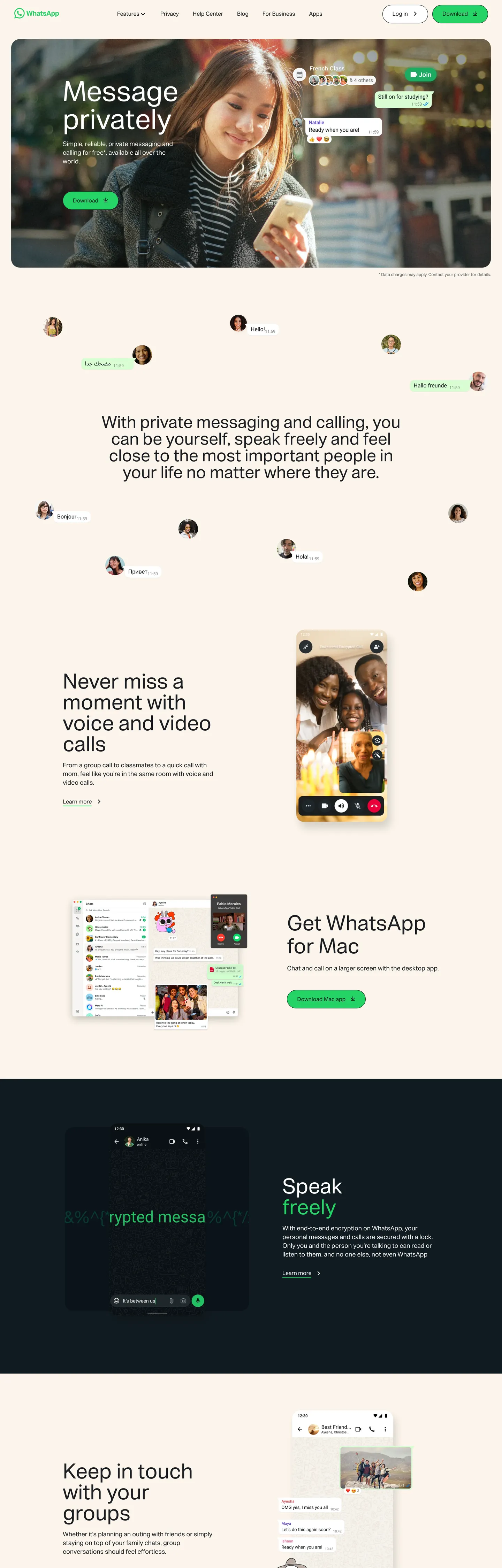
WhatsApp.com is one of the strangest marketing sites a billion-user product has ever shipped. The hero is a photograph of a woman holding a phone, framed inside a 25px-rounded peachy-cream container, with the headline "Message privately" set in white at 80px / weight 400 floating over the image. Around the photograph, small circular profile chips drift across the cream canvas as if torn from a contact picker. A single bright voltage-green pill — the Download CTA — sits beneath the headline at 50px radius, and that pill is the only chromatic brand moment above the fold. Where Telegram leans into glossy gradient screenshots and where Signal goes austere monochrome, WhatsApp picks a third lane: warm-cream editorial photography with a single high-voltage green button.
The system runs on a custom proprietary variable sans — WhatsApp Sans Var — across every tier, never deviating from weight 400. The 80px hero h1, the 60px section h2, the 18px body paragraph, and the 12px caption all share that single weight. Display feels like a 19th-century billboard rather than a SaaS shout. The chromatic palette is just as restrained: near-black ink (#1c1e21) reading on a peachy cream canvas (#fcf5eb), with WhatsApp's signature voltage green (#25d366) reserved for primary calls to action and a deep near-black band underneath the fold to dramatize the end-to-end-encryption story. Every container that rounds rounds to 50px or 50% — there is no 4px or 8px tier anywhere on the page.
Feed this DESIGN.md to an AI coding tool and it reproduces WhatsApp's specific moves: warm cream as page floor instead of stark white, single voltage-green pill reserved for the Download action, WhatsApp Sans Var (or a system-sans substitute) at uniform weight 400, and pill-everything radius. The one move that requires nerve to copy: trusting a 400-weight 80px display headline to carry a billion-user product. Most teams reach for 600 or 700 here. WhatsApp doesn't.
What makes it distinct
5
- Single voltage-green CTAthe bright green pill appears exactly four times on the page, reserved for Download actions; every other interactive element is text-only or transparent
- Warm-cream canvasthe page floor is a peachy off-white, not stark white, and it carries every hero band; bright voltage-green reads warmer against cream than against pure white
- Pill chrome everywhereevery container that rounds rounds to 50px (buttons, cards) or 50% (avatars, badges); no 4px, 8px, or 12px tiers exist on the page
- WhatsApp Sans Var at weight 400the entire hierarchy from 80px display down to 12px caption runs at a single 400 weight; no semibold or bold tier ever appears
- Mixed-band canvasesthe page alternates cream and a deep near-black section (the encryption story) to dramatize the green CTA's only chromatic neighbor
whatsapp.com
Live at whatsapp.com
A snapshot of the brand in production. Scroll the frame to see the whole page.
Colors
10 colors
WhatsApp's system runs on #25d366 as its primary voltage, used in 1 of 14 components. Type is set in WhatsApp Sans Var across 9 tokens from 12px to 80px, weights 400–400. Shape language is soft — components average 40px corner radius, with no sharp interactive edges.
Brand & Accent
Sparing, CTA-only voltage · 1
Surface
Page and card backgrounds · 3
Text
Headlines, body, captions · 4
Borders & Hairlines
Dividers, outlines, rules · 1
Other
Specialty colors · 1
Typography
9 type tokens
Set in WhatsApp Sans Var across 9 tokens, from 12px to 80px, weights 400–400. Shown in its own stack: where the font isn't installed, the fallback the file names stands in.
- display-xl80px · weight 400 · lh 80pxThe quick brown fox jumps over the lazy dog
- display-lg60px · weight 400 · lh 60pxThe quick brown fox jumps over the lazy dog
- display-md48px · weight 400 · lh 48pxThe quick brown fox jumps over the lazy dog
- body-lg18px · weight 400 · lh 25pxThe quick brown fox jumps over the lazy dog
- body-md16px · weight 400 · lh 22pxThe quick brown fox jumps over the lazy dog
- button-md16px · weight 400 · lh 16pxThe quick brown fox jumps over the lazy dog
- nav-link16px · weight 400 · lh 22pxThe quick brown fox jumps over the lazy dog
- caption12px · weight 400 · lh 15.6pxThe quick brown fox jumps over the lazy dog
- caption-tight12px · weight 400 · lh 14.4pxThe quick brown fox jumps over the lazy dog
Layout
Radii and spacing
4 corner radii and 9 spacing values. Shape language: soft.
Radii
- none0px
- tile25px
- pill50px
- full9999px
Spacing
- xs8px
- sm12px
- md16px
- lg18px
- xl20px
- 2xl24px
- 3xl32px
- 4xl40px
- 5xl80px
Components
14 components
Each rendered from its tokens (color, type, radius, padding) on WhatsApp's own canvas.
- Button Primarybutton-primaryButton Primary
- Button Secondarybutton-secondaryButton Secondary
- Top Navtop-navTop Nav
- Nav Linknav-linkNav Link
- Hero Headinghero-headingHero Heading
- Section Headingsection-headingSection Heading
- Body Paragraphbody-paragraphBody Paragraph
- Body Paragraph Darkbody-paragraph-darkBody Paragraph Dark
- Hero Cardhero-cardHero Card
- Contact Chipcontact-chipContact Chip
- Message Bubble Outmessage-bubble-outMessage Bubble Out
- Type here…text-inputText Input
- Encryption Bandencryption-bandEncryption Band
- FooterfooterFooter
In use
The system, in use
WhatsApp's tokens on the kind of product it builds.
Build something people actually use.
A short paragraph of marketing copy that previews how the brand's display tier and body tier read together. Two sentences is usually enough.
FAQ
WhatsApp design system FAQ
Common questions about WhatsApp's tokens, components, and how to use this DESIGN.md in your project.
Read next
Related reading
Specs, directories, and component libraries that pair with this design system.
- Browse all design systemsThe full directory of DESIGN.md files on shadcn.io, with live mockups for each.shadcn.io
- WhatsApp — official siteWhatsApp's public marketing site — the source of truth for the live tokens captured in this file.whatsapp.com (opens in a new tab)
- The DESIGN.md specificationGoogle Labs' open spec for machine-readable design system files — the format this page is built on.github.com (opens in a new tab)
Use it
Use WhatsApp in your project
One machine-readable file. Drop it into Claude, Cursor, or any AI tool that reads DESIGN.md.
Download the DESIGN.md
One machine-readable file: every color, type, radius, spacing, and component token of WhatsApp.
Feed it to your AI tool
Drop it into Claude, Cursor, or GitHub Copilot. The agent writes React components and Tailwind classes that match WhatsApp's visual language.
Reference the tokens directly
Or paste the values into your Tailwind config, CSS variables, or component library: every color, size and radius is a quoted, ready-to-copy value.
Read the full DESIGN.md: overview, rationale, do’s and don’ts
Overview
WhatsApp's marketing site is one of the strangest landing pages a billion-user product has ever shipped. Utility-first voltage. Where Telegram leans into glossy gradient screenshots and where Signal goes austere monochrome, WhatsApp picks a third lane — a warm peachy-cream canvas that carries editorial photography of real conversations, with a single bright voltage-green pill CTA as the only chromatic brand moment. The page reads more like a public-service announcement about end-to-end encryption than a SaaS landing page, and that's the point: the product is so universal that the marketing surface refuses to perform.
The chromatic restraint is the system's signature. There is exactly one brand voltage — the WhatsApp green at {colors.primary} (#25d366) — and it appears four times on the page, all on Download CTAs. Near-black ink at {colors.ink} (#1c1e21) does every reading job, against a warm cream canvas at {colors.canvas} (#fcf5eb). Below the fold the page drops into a deep near-black band that dramatizes the encryption story — the green pill reads loudest against that black. The remaining structural tones (white card surfaces, a soft mint message bubble at {colors.secondary}, a single link blue) appear in supporting roles only.
Typography is WhatsApp Sans Var across every tier, uniformly at weight 400. The 80px hero h1, the 60px section h2, the 48px sub-heading, the 18px body paragraph, and the 12px caption all share that single weight. There is no semibold or bold variant anywhere on the captured marketing page — display feels like 19th-century billboard typography rather than a SaaS shout.
Key Characteristics:
- Warm cream canvas (
{colors.canvas}— #fcf5eb), not stark white — voltage green reads warmer and friendlier against peach than against true white. - Single voltage-green pill (
{colors.primary}) reserved exclusively for Download actions. Four occurrences on the captured page. - WhatsApp Sans Var across every typographic tier at uniform weight 400 — no semibold or bold variant exists on the page.
- Pill-everywhere radius: 50px on buttons (
{rounded.pill}), 25px on hero photography containers ({rounded.tile}), 50% on avatars and badges ({rounded.full}). No 4px, 8px, or 12px tier. - Mixed-band layout — cream sections alternate with a deep near-black band carrying the end-to-end-encryption story.
- Hero photography (real people holding phones) sits inside generously rounded containers rather than full-bleed — the cream margin around each photo is part of the composition.
- Floating contact-chip avatars drift around the hero photograph as if torn from a phone's contact picker.
Colors
Brand
- Voltage Green (
{colors.primary}— #25d366): frequency 6. Used as bg (4), border (1), text (1). The single chromatic brand moment on the page — every Download CTA pill, every primary action. The fill carries near-black{colors.ink}text rather than white, because green-on-white-text reads less legible at the small button sizes than green-on-near-black. - Mint Bubble (
{colors.secondary}— #e6ffda): frequency 1. Used as bg only — the outgoing message bubble color borrowed from the in-product chat interface. Appears once below the fold in the encryption-story illustration.
Surface
- Canvas (
{colors.canvas}— #fcf5eb): frequency 12 — used as bg (10), text (1), border (1). The peachy off-white that carries the hero band and most editorial sections. Warmer than #ffffff so voltage green reads approachable rather than electric. - White (
{colors.surface-1}— #ffffff): frequency 102. Used as text (50), bg (2), border (50). The dominant text color when inverted on the dark encryption band, and the fill for the hero-photo container card and contact chips. - Dark Surface (
{colors.surface-dark}— #000000): frequency 2 as text/border. Reserved for the encryption-story band — the only deep-black section on the page, used to dramatize the green CTA's contrast.
Text
- Ink (
{colors.ink}— #1c1e21): frequency 690 — the dominant text/border tone. Used as text (342), bg (8), border (340). Near-black, slightly cooler than pure black, for body and headline copy on the cream canvas. - Ink Muted (
{colors.ink-muted}— #5e5e5e): frequency 6 — text (3), border (3). Reserved for tertiary metadata and disabled-state captions. - Ink Inverse (
{colors.ink-inverse}— #ffffff): the white text color used on hero photography and on the dark encryption band.
Link & Hairline
- Link (
{colors.link}— #0373e9): frequency 4. Used as text (2), border (2). The standard sky blue for inline anchor links inside footer disclaimers. Not a brand color — purely functional. - Hairline (
{colors.hairline}— #1c1e21): the near-black ink doubles as the 1px button border on secondary pills against the cream canvas.
Typography
Font Family
The system runs WhatsApp Sans Var for every tier — a custom proprietary variable sans Meta ships specifically for WhatsApp's surfaces. The fallback stack is -apple-system, BlinkMacSystemFont, "Segoe UI", Roboto, sans-serif. There is no separate display family, no serif tier, and no monospace anywhere on the marketing page. One variable-weight sans does every job — display, heading, body, button, caption — and it does every job at weight 400.
Hierarchy
| Token | Size | Weight | Line Height | Use |
|---|---|---|---|---|
{typography.display-xl} | 80px | 400 | 80px | Hero h1 ("Message privately") |
{typography.display-lg} | 60px | 400 | 60px | Section h2 ("Speak freely," "Stay close to family and friends") |
{typography.display-md} | 48px | 400 | 48px | Sub-section heading ("With private messaging and calling…") |
{typography.body-lg} | 18px | 400 | 25px | Default running body copy |
{typography.body-md} | 16px | 400 | 22px | Secondary body and navigation labels |
{typography.button-md} | 16px | 400 | 16px | Download CTA pill label |
{typography.nav-link} | 16px | 400 | 22px | Top-nav link labels (Privacy, About, Support, Business) |
{typography.caption} | 12px | 400 | 15.6px | Footer disclaimers, metadata |
{typography.caption-tight} | 12px | 400 | 14.4px | In-product caption rows |
Principles
Every tier sits at weight 400. There is no semibold, no bold, no heavy. The system's "emphasis" mechanism is size, not weight — an 80px h1 commands attention because it is enormous, not because it is heavy. This is deeply unusual at this product scale and is the single move that most directly defines WhatsApp's editorial voice. Display sizes step in roughly 1.5x increments (48 → 60 → 80) so the hierarchy stays legible without weight differentiation.
Note on Font Substitutes
WhatsApp Sans Var is proprietary to Meta. The closest open-source substitutes:
- Inter at weight 400 with -0.5% letter-spacing on the display tier transfers cleanly; the proportions are close.
- Söhne Buch if you have a Klim Type license — closer in counter width to WhatsApp Sans.
- system-ui as a fallback is acceptable because the stack already includes Apple system and Segoe UI; on macOS and Windows the page degrades to native sans without visible damage to the rhythm.
Layout
Spacing System
- Base unit: 4px (with 8px and 12px as the dominant modules).
- Tokens:
{spacing.xs}8px ·{spacing.sm}12px ·{spacing.md}16px ·{spacing.lg}18px ·{spacing.xl}20px ·{spacing.2xl}24px ·{spacing.3xl}32px ·{spacing.4xl}40px ·{spacing.5xl}80px. - Section padding (vertical): 80px between major bands.
- Card internal padding: 0px on the hero photography card — the image fills the rounded container edge-to-edge, with no internal margin.
- Hero padding: 16px 28px on the primary CTA pill — wider on the horizontal axis to keep the pill feeling pill-like rather than capsule-like.
Grid & Container
- Max content width: ~1080px on the hero band, ~900px on the editorial sections below.
- Hero: cream canvas with a 25px-rounded photography card sitting inside the safe area, headline overlaid in white at the top-left of the photo, contact chips drifting around the perimeter.
- Mixed-band stack: cream → cream → near-black encryption band → cream → cream. The deep band is the only chromatic break in the page.
- Footer: 6-column link grid with disclaimer microcopy below.
Rhythm
The page alternates between cream editorial bands (with hero photography and headline copy) and a single deep near-black band (the encryption story). There is no atmospheric gradient between sections — every band terminates on a flat fill color, and the green CTA pill is the only element that crosses bands unchanged.
Elevation
The system has essentially no shadow tier. The hero photography card sits against the cream canvas with no shadow, no border — only a 25px corner radius defines the container. The encryption band carries no shadow either. Hierarchy comes from corner radius and color contrast, never from depth.
- Flat (no shadow): every band on the page — 100% of surfaces.
- Tonal lift: the dark encryption band lifts off the cream surface by sheer luminance contrast, not by drop shadow.
- Pill outlines: secondary CTA pills carry a 1px
{colors.hairline}(near-black) border against the cream canvas. The border is the only "edge" treatment in the system.
Shapes
The radius scale is pill-or-tile, never tight:
{rounded.none}0px — only on full-bleed page bands.{rounded.tile}25px — hero photography containers and outgoing message bubbles. The "generous" tile radius.{rounded.pill}50px — every button, every pill chip. The dominant radius on the page (6 occurrences).{rounded.full}9999px (50% on square elements) — avatars, notification badges, contact chips, profile circles.
There is no 4px, 8px, 12px, or 16px tier anywhere on the page. The scale skips the entire "tight-corners" aesthetic that dev-tools brands lean on. Everything is either a pill, a generous tile, or a full circle — no in-between.
Components
button-primary — The signature Download CTA. Voltage-green {colors.primary} fill, near-black {colors.ink} text (not white — the green/black contrast reads more legible at this size), {rounded.pill} 50px radius, 16x28 padding, 53px height. A 1px {colors.ink} border wraps the pill. "Download" is the canonical instance, sitting beneath the hero headline.
button-secondary — Transparent fill with near-black text and a 1px {colors.ink} hairline border. {rounded.pill} 50px radius, 12x24 padding, 44px height. Used for tertiary links in the top nav.
top-nav — Cream {colors.canvas} background flush with the page floor. 72px height, 16x24 padding. Houses the WhatsApp wordmark, the four product-nav links (Privacy, About, Support, Business), and the right-aligned Download pill.
nav-link — Transparent background, near-black text in {typography.nav-link} (16px / 400), 0x20 padding. The most generic interactive treatment on the page.
hero-heading — White text on the hero photography card, {typography.display-xl} (80px / 400). 0 padding because the headline sits inside the rounded photo container's safe area.
section-heading — Near-black text, {typography.display-md} (48px / 400). Used for "With private messaging and calling…" and the encryption-section headers.
body-paragraph — White text on the hero card at {typography.body-lg} (18px / 400). The hero sub-paragraph and dark-band lead copy.
body-paragraph-dark — Same typography as above, but in {colors.ink} for cream-canvas sections.
hero-card — White {colors.surface-1} fill, {rounded.tile} 25px radius, 0 padding. The container that holds the hero photograph edge-to-edge.
contact-chip — White circular avatar chips with the contact's photo, fully rounded {rounded.full}. The chips drift around the hero photo perimeter as decorative composition elements.
message-bubble-out — {colors.secondary} (mint) fill, near-black text, {rounded.tile} 25px radius. The outgoing message bubble borrowed from the in-product chat interface.
text-input — White fill, near-black text, {rounded.pill} 50px radius, 12x24 padding, 44px height. Inputs are pills rather than tiles.
encryption-band — Deep near-black {colors.surface-dark} fill, white text, 80x24 padding. The single dramatic break in the page's cream rhythm — the band that holds the end-to-end-encryption story.
footer — Cream canvas, near-black text, 32x24 padding. No surface contrast against the page floor — the footer just continues the cream.
Do's and Don'ts
Do reserve the voltage green for Download actions only. The page has exactly four green pills, all on Download CTAs. Multiplying the green into navigation links, badges, or decorative pills would destroy the single-signal discipline that makes the brand voltage land.
Do use the warm cream {colors.canvas} (#fcf5eb) as the page floor rather than #ffffff. The voltage green reads electric-harsh against pure white and friendly-approachable against cream — the cream is doing more brand work than it appears to.
Do keep typography at weight 400 across every tier. The 80px hero h1 at weight 400 is the brand's editorial signature; jumping to weight 600 or 700 turns the page into a generic SaaS shout and undercuts the utility-first restraint.
Do round every container to either 25px, 50px, or 50%. Mixing in a 4px or 8px radius would import a dev-tools aesthetic that doesn't belong on a billion-user messaging product.
Don't use voltage green text on a white background. The captured page sets green pills with near-black text (#1c1e21) on green, not white-on-green. White-on-green at 16px button size reads less legible than black-on-green at WhatsApp's specific saturation point.
Don't swap the dark encryption band's fill from pure #000000 to a softer charcoal. The whole point of the band is dramatic contrast — softening it removes the visual hierarchy that makes the encryption story feel important against the rest of the cream page.
Don't introduce a semibold or bold weight to typography. The system's "emphasis" mechanism is size, not weight. Adding weight 600 to section headings will visually fight the 80px hero h1 and flatten the size-driven hierarchy.
Don't drop shadows on the hero photography card. The captured page sits the card on cream with no shadow and no border, defining the container by corner radius alone. Adding even a subtle drop shadow imports a SaaS-card aesthetic that breaks the editorial-photography reading.
Known Gaps
- Hover and focus states: the captured marketing surface shows resting states only. Pill button hover, focus ring, and disabled tints are not exposed on the marketing page — they live inside the product app.
- Form input error states: the marketing page carries no real form inputs (no signup, no contact form). Error styling for
{component.text-input}is captured from product context only. - Dark mode: the marketing page is light-only. WhatsApp's in-product chat surfaces have a dark mode but it is not represented on the public site.
- Motion: the contact chips drifting around the hero photograph likely carry a subtle parallax or float animation, but the spec captures end-state geometry only.
- Product surfaces: this DESIGN.md captures the marketing site at whatsapp.com. The in-product chat UI (web.whatsapp.com, mobile apps) carries a much richer token system — message bubble variants, typing indicators, status colors, voice-call gradients — that is not represented here.
- Localized typography: WhatsApp Sans Var ships variants for Arabic, Devanagari, and CJK scripts that don't appear on the en-US marketing surface captured here.
- The mint message bubble color appears once on the page in an in-product illustration; the full chat-bubble color matrix (incoming bubble fill, system message tint, link color) is not captured.
Communication & Messaging
More systems like this
More DESIGN.md files in Communication & Messaging.
Pricing
Build it with Pro
The DESIGN.md files are free. Pro adds 6,000+ blocks, premium templates and the MCP server, so your AI editor builds in your system for you.
4.9/5 out of 5 · 150+ reviewsfrom 150+ founders and developers.
Billing
Billed once a year in USD. Cancel anytime.
- How many people can use the license.
- Client work, SaaS products and anything you charge for.
- Production-ready React sections: hero, pricing, features, dashboards and more.
- Complete multi-page sites you can ship as they are.
- React icons from every major library, installable with one command.
- Presets that restyle every block, in light and dark.
- Lets your AI editor search, preview and install blocks for you.
- Priority requests are answered first.
Individual
For personal projects & open source
$32instead of $49/mo
$389 billed yearly
- Seats: 1 seat
- Commercial use: Personal & open source only
- Pro blocks: 6,000+ blocks
- Templates: All 14 templates
- React icons: 294k+ icons
- Themes: All 59 themes
- MCP server: Basic usage
- Support: Standard
Team
Most popularFor freelancers, agencies & startups
$66instead of $99/mo
$789 billed yearly · ≈ $13/dev/mo
- Seats: Up to 5 seats
- Commercial use: Included
- Pro blocks: 6,000+ blocks
- Templates: All 14 templates
- React icons: 294k+ icons
- Themes: All 59 themes
- MCP server: High usage
- Support: Priority
Organization
For companies with larger teams
$132instead of $199/mo
$1,589 billed yearly
- Seats: Unlimited seats
- Commercial use: Included
- Pro blocks: 6,000+ blocks
- Templates: All 14 templates
- React icons: 294k+ icons
- Themes: All 59 themes
- MCP server: Unlimited usage
- Support: Priority
Billed once a year in USD. Cancel anytime.
Individual
For personal projects & open source
$32instead of $49/mo
$389 billed yearly
- How many people can use the license.Seats: 1 seat
- Client work, SaaS products and anything you charge for.Commercial use: Personal & open source only
- Production-ready React sections: hero, pricing, features, dashboards and more.Pro blocks: 6,000+ blocks
- Complete multi-page sites you can ship as they are.Templates: All 14 templates
- React icons from every major library, installable with one command.React icons: 294k+ icons
- Presets that restyle every block, in light and dark.Themes: All 59 themes
- Lets your AI editor search, preview and install blocks for you.MCP server: Basic usage
- Priority requests are answered first.Support: Standard
Team
Most popularFor freelancers, agencies & startups
$66instead of $99/mo
$789 billed yearly · ≈ $13/dev/mo
Everything in Individual, plus
- How many people can use the license.Seats: Up to 5 seats
- Client work, SaaS products and anything you charge for.Commercial use: Included
- Lets your AI editor search, preview and install blocks for you.MCP server: High usage
- Priority requests are answered first.Support: Priority
Organization
For companies with larger teams
$132instead of $199/mo
$1,589 billed yearly
Everything in Team, plus
- How many people can use the license.Seats: Unlimited seats
- Lets your AI editor search, preview and install blocks for you.MCP server: Unlimited usage
- Secure checkout via Stripe
- Code lives in your repo
- Keep what you've shipped if you cancel
- License terms
Your system, built for you
Every block, template and icon, installed by your AI agent in your design system. The DESIGN.md files stay free.