Telegram Design System
Telegram's marketing system as a DESIGN.md file. One cyan voltage, the Lucida Grande system stack, no rounded chrome, no shadow tier. Tokens for React, Next.js, and AI coding tools.
Add shadcn.io to your AI agent. · Pro It installs blocks, icons and templates in your design system from a prompt, with Pro.
Set up MCP- Primary
- #0088cc
- Typeface
- Lucida Grande
- Shape
- Sharp
- Base radius
- 6px
- Colors
- 7
- Type tokens
- 10
- Components
- 14
- Spacing values
- 8
About
About Telegram DESIGN.md
Curated by Dov Azencot · Updated May 18, 2026 · Source telegram.org (opens in a new tab)
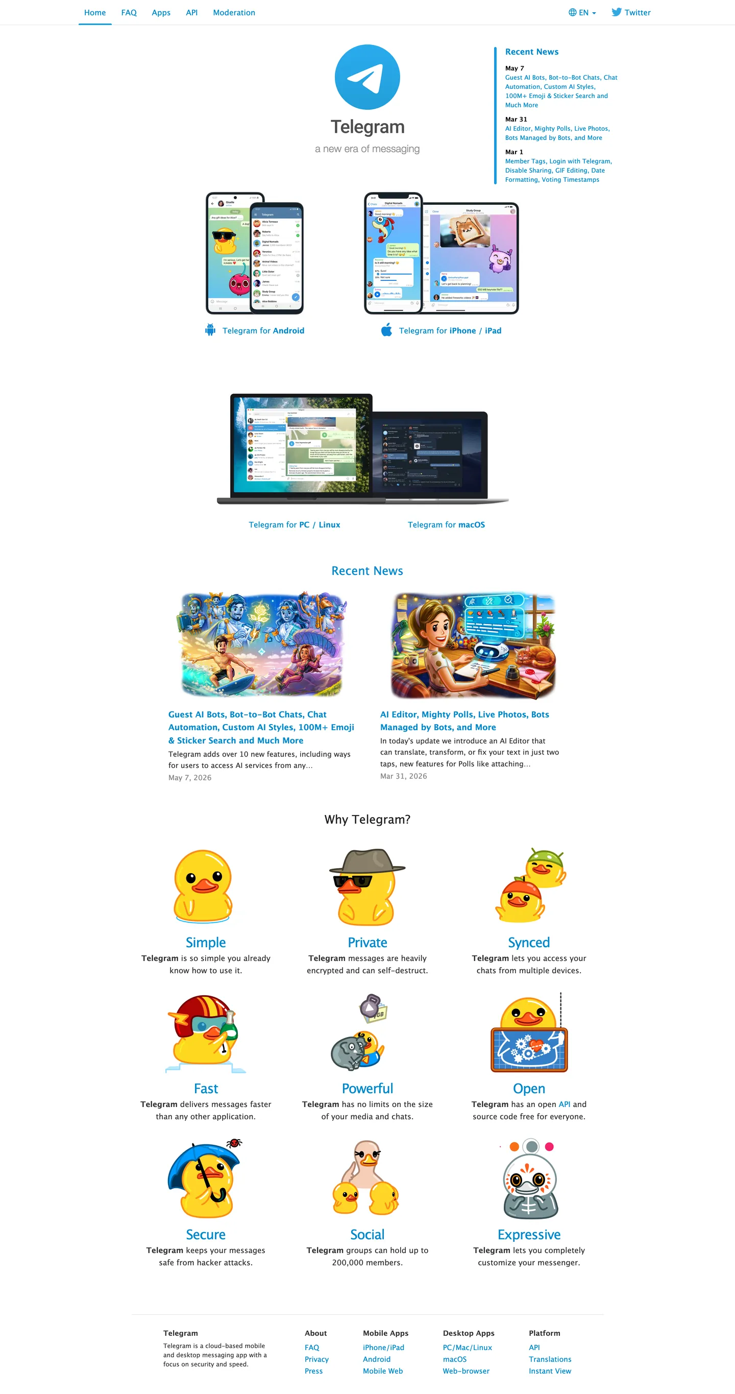
Telegram's marketing site is the loudest argument against the past decade of brand-system inflation. The page is pure white. The paper-airplane mark sits at the top in cyan. The wordmark "Telegram" sits in cyan at 26px, the dek "a new era of messaging" in graphite below at 20px Helvetica Neue Light, and that is the entire above-fold composition — no hero illustration, no gradient, no shadow, no rounded CTA pill. Below the fold the page lists nine product principles in a 3-by-3 grid of cartoon ducks, each label rendered in the same single cyan, each sentence in the same single graphite. Where WhatsApp paints its hero in jade green and pushes a download-app CTA, where Signal leans on an indigo gradient and animated illustrations, Telegram refuses every convention of the category — there is no CTA above the fold, no app-store badge in the hero, no scroll-driven motion, no captured email field. The restraint is the position: a Dubai-based messenger that has shed Western design tropes alongside Western advertising tracking.
The DESIGN.md file packages the system into a machine-readable spec for React tooling. Inside: 7 colors tokens — a single cyan voltage, four neutral inks — drawn from the seven colors the page renders at all; 7 typography tokens running the platform Lucida Grande stack (with one Helvetica Neue Light moment for the dek); zero declared border-radius tokens because the captured surface has no rounded chrome (the input field on the search overlay rounds to 0px, the news cards have no radius, the icons are circular only because they are SVGs); 8 spacing values on a 4px base; and 14 components definitions covering the cyan link, the cyan heading, the graphite body, the cartoon-duck principle tile, the news card, and the footer columns.
Feed this file to an AI coding tool and it reproduces Telegram's specific moves: a single saturated cyan instead of a hero-friendly indigo, the system Lucida Grande stack instead of Inter or Geist, zero corner-radius tokens, zero shadow tier, and a 3-by-3 product-principle grid where the labels share the same color and weight rather than tiering visually. Borrow the move only if your positioning is willing to read as anti-design — Telegram gets away with it because the brand's central promise is the absence of the chrome (no algorithmic feed, no ad inventory, no engagement-metric pressure). Most teams need at least one rounded surface to look "real" in 2026.
What makes it distinct
5
- Single cyan voltage#0088cc covers every link, heading, brand mark, and product-principle label, never reserved for one CTA the way most SaaS systems hold accents
- Lucida Grande system stackno web font, no Inter, no Helvetica Neue Display; the page renders in whatever the OS ships, which keeps page-weight near-zero
- Anti-design as positioningno rounded chrome, no shadow tier, no hover states declared; the visual restraint is a privacy posture against the Meta family
- 26px / weight 400 / -1px tracking displayevery principle label uses the same tight setting, making the 3-by-3 mascot grid scan as one editorial unit
- Cartoon-duck mascots as iconographyTelegram's signature illustration style replaces the gradient-icon convention every messaging peer leans on
telegram.org
Live at telegram.org
A snapshot of the brand in production. Scroll the frame to see the whole page.
Colors
7 colors
Telegram's system runs on #0088cc as its primary voltage, used in 8 of 14 components. Type is set in Lucida Grande across 10 tokens from 12px to 26px, weights 300–700. Shape language is sharp — components average 0px corner radius, favoring crisp rectangles.
Brand & Accent
Sparing, CTA-only voltage · 1
Surface
Page and card backgrounds · 1
Text
Headlines, body, captions · 4
Other
Specialty colors · 1
Typography
10 type tokens
Set in Lucida Grande across 10 tokens, from 12px to 26px, weights 300–700. Shown in its own stack: where the font isn't installed, the fallback the file names stands in.
- display-md26px · weight 400 · lh 28.6px · tracking -1pxThe quick brown fox jumps over the lazy dog
- display-sm23px · weight 500 · lh 25.3pxThe quick brown fox jumps over the lazy dog
- hero-dek20px · weight 300 · lh 29.6pxThe quick brown fox jumps over the lazy dog
- heading-md16px · weight 700 · lh 25.6pxThe quick brown fox jumps over the lazy dog
- body-md15px · weight 400 · lh 23.7pxThe quick brown fox jumps over the lazy dog
- body-md-bold15px · weight 700 · lh 23.7pxThe quick brown fox jumps over the lazy dog
- body-sm14px · weight 400 · lh 23pxThe quick brown fox jumps over the lazy dog
- label-sm14px · weight 700 · lh 15.4pxThe quick brown fox jumps over the lazy dog
- caption12px · weight 400 · lh 18pxThe quick brown fox jumps over the lazy dog
- caption-bold12px · weight 700 · lh 18pxThe quick brown fox jumps over the lazy dog
Layout
Radii and spacing
4 corner radii and 8 spacing values. Shape language: sharp.
Radii
- none0px
- sm2px
- md6px
- lg9px
Spacing
- xs2px
- sm6px
- md9px
- base10px
- lg15px
- xl17px
- 2xl20px
- 3xl40px
Components
14 components
Each rendered from its tokens (color, type, radius, padding) on Telegram's own canvas.
- Button Primarybutton-primaryButton Primary
- Button Secondarybutton-secondaryButton Secondary
- Top Navtop-navTop Nav
- Nav Linknav-linkNav Link
- Hero Headinghero-headingHero Heading
- Hero Dekhero-dekHero Dek
- Section Headingsection-headingSection Heading
- Principle Labelprinciple-labelPrinciple Label
- Body Paragraphbody-paragraphBody Paragraph
- Body Paragraph Mutedbody-paragraph-mutedBody Paragraph Muted
- Link Cyanlink-cyanLink Cyan
- News Cardnews-cardNews Card
- Type here…text-inputText Input
- FooterfooterFooter
In use
The system, in use
Telegram's tokens on the kind of product it builds.
Build something people actually use.
A short paragraph of marketing copy that previews how the brand's display tier and body tier read together. Two sentences is usually enough.
@curated.creator
Designer · Photographer · Writer
FAQ
Telegram design system FAQ
Common questions about Telegram's tokens, components, and how to use this DESIGN.md in your project.
Read next
Related reading
Specs, directories, and component libraries that pair with this design system.
- Browse all design systemsThe full directory of DESIGN.md files on shadcn.io, with live mockups for each.shadcn.io
- Telegram — official siteTelegram's public marketing site — the source of truth for the live tokens captured in this file.telegram.org (opens in a new tab)
- The DESIGN.md specificationGoogle Labs' open spec for machine-readable design system files — the format this page is built on.github.com (opens in a new tab)
Use it
Use Telegram in your project
One machine-readable file. Drop it into Claude, Cursor, or any AI tool that reads DESIGN.md.
Download the DESIGN.md
One machine-readable file: every color, type, radius, spacing, and component token of Telegram.
Feed it to your AI tool
Drop it into Claude, Cursor, or GitHub Copilot. The agent writes React components and Tailwind classes that match Telegram's visual language.
Reference the tokens directly
Or paste the values into your Tailwind config, CSS variables, or component library: every color, size and radius is a quoted, ready-to-copy value.
Read the full DESIGN.md: overview, rationale, do’s and don’ts
Overview
Telegram's marketing site is the loudest argument against the past decade of brand-system inflation. Anti-design as posture. The page is pure white. The paper-airplane mark sits at the top in cyan. The wordmark "Telegram" sits in cyan at 26px, the dek "a new era of messaging" in graphite below at 20px Helvetica Neue Light, and that is the entire above-fold composition — no hero illustration, no gradient, no shadow, no rounded CTA pill. Where WhatsApp paints its hero in jade green and pushes a download-app CTA above the fold, and where Signal leans on an indigo gradient with animated illustrations, Telegram refuses every convention of the messaging-app category. There is no captured email field, no scroll-driven motion, no app-store badge in the hero band.
The system's chromatic restraint is the central move. There is exactly one brand color — cyan ({colors.primary} — #0088cc) — and it does the work of every chromatic element on the page. It carries the paper-airplane logomark, the Telegram wordmark, every heading from h3 down to small caps, every link in the body, the download-platform labels under the device mockups, and the nine product-principle labels under the cartoon ducks. The page captures 128 total uses of this single hex versus zero declared brand secondary. This is the inverse of the held-in-reserve discipline at Airbnb (Rausch red used only on CTAs) or Cloudflare (Kumo orange used only as the hero canvas) — Telegram uses cyan as the universal voice of every interactive surface, including text links inside body copy. The neutral tier is a four-step graphite ladder ({colors.ink} graphite, {colors.ink-soft} near-black, {colors.ink-muted} mid-gray, {colors.ink-faint} light-gray) on a pure-white {colors.canvas} floor.
Typography is the platform Lucida Grande system stack for everything — no web font, no fonts.googleapis.com call, no fallback gymnastics. The one second-family moment on the page is the hero dek "a new era of messaging" in Helvetica Neue Light at 20px / weight 300; every other text element on the page resolves to Lucida Grande on macOS, Lucida Sans Unicode on Windows, or Arial as the universal fallback. Display headings sit at 26px / weight 400 with -1px tracking; body at 15px / weight 400; small captions at 12px / 400. There is no display tier above 26px on the captured page — even the "Why Telegram?" section heading sits at 23px.
Key Characteristics:
- Pure white canvas (
{colors.canvas}— #ffffff), no off-white, no cream variant. - Single cyan voltage (
{colors.primary}— #0088cc) carrying every chromatic surface: logo, headings, links, principle labels, platform tags. - Lucida Grande system stack for every text element — zero web font requests.
- Display headings at 26px / weight 400 with -1px tracking — the system's loudest typographic moment.
- Zero declared corner-radius tokens — buttons, inputs, news cards, and platform tags all sit at 0px rounding.
- Zero shadow tier — no drop shadow, no inner shadow, no soft-blur elevation anywhere on the page.
- 3-by-3 "Why Telegram?" principle grid (
Simple/Private/Synced/Fast/Powerful/Open/Secure/Social/Expressive) with cartoon-duck mascots replacing gradient icons. - News-card pair below the hero — two horizontal cards with full-bleed photos, cyan headlines, and graphite dek text; no border, no shadow, no hover state.
Colors
Brand
- Telegram Cyan (
{colors.primary}— #0088cc): frequency 128. Used as text (64) and border (64), never as background fill. The single chromatic voice of the system — logo, wordmark, every heading, every link, every principle label, every platform tag. The frequency split tells the story: Telegram does not use the cyan to fill buttons, it uses it to letterform-tint every interactive surface.
Text
- Ink (
{colors.ink}— #333333): frequency 238. Used as text (120) and border (118). The default body color and the dominant border tone for hairline rules. Pure black would feel harsh against the white canvas; this mid-graphite softens without sliding toward the warmer charcoal grays peers use. - Ink Soft (
{colors.ink-soft}— #222222): frequency 4. Used as text (2) and border (2). Reserved for slightly emphasized labels. - Ink Muted (
{colors.ink-muted}— #888888): frequency 6 — used on the hero dek "a new era of messaging" and on secondary labels under news cards. The extraction merges two near-identical grays into this single token. - Ink Faint (
{colors.ink-faint}— #a2a2a2): frequency 18. Used on the timestamp captions in the Recent News rail and on metadata labels.
Surface
- Canvas (
{colors.canvas}— #ffffff): frequency 2 as background. The entire page floor. No cream variant, no off-white surface tier, no charcoal-near-white dark mode declared.
Hairline / Shadow
- Shadow (
{colors.shadow}— #000000): frequency 8 — used as text (4) and border (4). Reserved for the absolute-black footer labels and a small set of hairline borders where the graphite would be too soft.
Typography
Font Family
The system runs the platform Lucida Grande system stack for every text element — fallback order "Lucida Grande", "Lucida Sans Unicode", Arial, Helvetica, Verdana, sans-serif. On macOS the resolved face is Lucida Grande; on Windows it is Lucida Sans Unicode; on Linux it falls through to Arial. There is no web-font request — no fonts.googleapis.com, no self-hosted .woff2 — which keeps the page-weight near-zero and avoids the third-party-tracking surface that Google Fonts introduces.
One second-family moment exists on the captured page: the hero dek "a new era of messaging" renders in Helvetica Neue Light at 20px / weight 300. It is the only HelveticaNeue-Light declaration in the entire system; every other surface resolves to Lucida Grande.
Hierarchy
| Token | Size | Weight | Line Height | Use |
|---|---|---|---|---|
{typography.display-md} | 26px | 400 | 28.6px | "Telegram" wordmark, every section heading, all nine principle labels |
{typography.display-sm} | 23px | 500 | 25.3px | "Why Telegram?" section h3 |
{typography.hero-dek} | 20px | 300 | 29.6px | "a new era of messaging" (Helvetica Neue Light) |
{typography.heading-md} | 16px | 700 | 25.6px | "Recent News" sidebar h4 |
{typography.body-md} | 15px | 400 | 23.7px | Default running text, principle descriptions |
{typography.body-md-bold} | 15px | 700 | 23.7px | Inline emphasis, news-card headlines |
{typography.body-sm} | 14px | 400 | 23px | Nav-link labels |
{typography.label-sm} | 14px | 700 | 15.4px | "Telegram for Android", "Telegram for iPhone / iPad" download labels |
{typography.caption} | 12px | 400 | 18px | Date stamps in the Recent News rail |
{typography.caption-bold} | 12px | 700 | 18px | Recent News date headers ("May 7", "May 4", "May 1") |
Principles
Display weight tops out at 500, used only on the "Why Telegram?" section heading. The dominant display token sits at weight 400 — the same weight as body text — and gets its prominence from size (26px) and tracking (-1px), not from boldness. There is no 700-tier moment for a hero h1 because there is no hero h1; the wordmark "Telegram" is the loudest typographic moment in the system at 26px / 400. Bold weight 700 is reserved for download platform labels, date stamps, and news-card headlines — small-format emphasis only.
Note on Font Substitutes
Lucida Grande is a system font on macOS; Lucida Sans Unicode is its Windows equivalent. There is no open-source substitute that matches exactly, but the system stack already handles the fallback gracefully — Arial at the same weights reads close at body sizes. If you want a single web font for cross-platform parity, Verdana ships everywhere and matches the Lucida proportions at the 12-15px tier; Tahoma is the closest Windows-native equivalent. Avoid Inter or Helvetica Neue as substitutes — both feel too clearly "designed" against the deliberately-undesigned Lucida vibe.
Layout
Spacing System
- Base unit: 1px (with 3px as a common module).
- Tokens:
{spacing.xs}2px ·{spacing.sm}6px ·{spacing.md}9px ·{spacing.base}10px ·{spacing.lg}15px ·{spacing.xl}17px ·{spacing.2xl}20px ·{spacing.3xl}40px. - Section padding (vertical): 20px above and 9px below most section headings — a tight rhythm that keeps the page scannable as a single editorial column.
- Hero padding: 160px above the wordmark on desktop — the only generous vertical breathing room in the system, used to push the centered Telegram mark into a visual safe zone.
- Footer padding: 40px outer, 15px gutter between the four column groups.
Grid & Container
- Max content width: ~620px on the main editorial column — narrower than nearly every peer marketing site, which keeps the single-column reading rhythm intact.
- Hero: centered single-column with the paper-airplane mark, wordmark, dek, and download links stacked vertically.
- Device-mockup band: two-up grid showing iOS and Android device screenshots, with the "Telegram for Android" and "Telegram for iPhone / iPad" labels rendered in the platform-tag bold treatment.
- Recent News rail: two-card horizontal grid with full-bleed photos above cyan headlines and graphite dek.
- "Why Telegram?" grid: 3-by-3 desktop, collapsing to 2-up on tablet, with cartoon-duck mascots above each cyan principle label.
- Footer: four-column grid (About / Mobile Apps / Desktop Apps / Platform) of plain-text link lists, no visual separation between columns.
Rhythm
The page reads as a vertical scroll of editorial bands separated by the same {spacing.3xl} (40px) gap. There is no atmospheric color shift between bands, no background variation, no parallax — every section terminates on the same pure-white canvas. Section transitions are marked only by a heading change from cyan body-tier to cyan display-tier.
Elevation
The system has no shadow tier. Zero. The captured page declares no drop-shadow, no inner-shadow, no soft-blur elevation on any surface. News cards, principle tiles, and device mockups all sit flush on the white canvas; the only thing distinguishing one band from another is the heading color shift.
- Flat (no shadow): every surface on the page — 100% of the captured chrome.
- Hairline rules: thin 1px
{colors.ink}rules separate the footer columns and the Recent News date headers from their content. No drop-shadow ever stands in for the rule. - Device mockups: the iOS and Android phone screenshots include their own rendered drop-shadow as part of the image asset, not as a CSS shadow declaration. The shadow is photography, not chrome.
Shapes
The system has essentially no corner-radius tier. The captured page renders almost every surface at 0px rounding:
{rounded.none}0px — buttons (which are inline text links, not pill chrome), news cards, principle tiles, footer columns, the hero device mockup container.{rounded.sm}2px — declared as a fallback for any input that needs the slightest softening; rarely rendered.{rounded.md}6px — declared as a fallback for download-link buttons on certain breakpoints; not present in the captured hero.{rounded.lg}9px — declared as a fallback for the platform-tag pill on the device-mockup band; not present in the captured hero.
There is no pill tier, no full-circle radius, no large-card 16-24px rounding. The icons in the principle grid are circular because they are SVG illustrations of round-bodied cartoon ducks, not because any corner-radius is applied. The absence of a rounding scale is the position — the system reads as plain document chrome by design.
Components
button-primary — There is no signature CTA pill. The closest analog is the cyan-on-white inline link, rendered in {typography.body-md} at {colors.primary} with a 1px {colors.primary} bottom border on hover (the border is not captured at rest). No padding, no rounded radius, no fill.
button-secondary — Identical to the primary in the captured surface: cyan text link with no fill and no rounded chrome. The system does not distinguish primary and secondary action by visual weight; the distinction is positional (download links sit in the hero, navigation links sit in the top bar).
top-nav — Plain white surface with cyan inline-text links (Home, FAQ, Apps, API, Wallpapers) and a right-aligned cyan EN-language toggle. No background fill, no border, no shadow. 15.5px vertical padding, 15px horizontal padding.
nav-link — Cyan text on transparent, {typography.body-sm} (14px / 400), 0px 15px padding. No hover background visible in the captured surface; the link likely picks up an underline on hover but it is not declared in the resting state.
hero-heading — The "Telegram" wordmark, cyan {colors.primary} text at {typography.display-md} (26px / 400 / -1px tracking). 20px top / 9px bottom padding. The 26px size is identical to every other display heading on the page — there is no separate hero-h1 tier.
hero-dek — "a new era of messaging" in {colors.ink-muted} graphite at {typography.hero-dek} (20px / 300 Helvetica Neue Light). The only Helvetica Neue Light moment on the page; every other text element resolves to Lucida Grande.
section-heading — Cyan {colors.primary} text at {typography.display-sm} (23px / 500) for "Why Telegram?", "Recent News". 20px top / 9px bottom padding.
principle-label — The nine cyan labels under the cartoon ducks: Simple / Private / Synced / Fast / Powerful / Open / Secure / Social / Expressive. Each renders in {typography.display-md} (26px / 400 / -1px tracking) — identical to the wordmark treatment. The repetition is the editorial move: every principle gets the same typographic weight, so the reader is not pre-sorted toward any single virtue.
body-paragraph — Default ink-graphite text at {typography.body-md} (15px / 400). The principle descriptions ("Telegram lets you access your chats from multiple devices.") and the news-card dek.
body-paragraph-muted — {colors.ink-muted} text at {typography.body-md} for the news-card date stamp and the secondary labels under download links.
link-cyan — Inline cyan link inside body copy, {typography.body-md} color {colors.primary}. The dominant interactive element on the page — every clickable text element inherits this treatment.
news-card — White canvas, no border, no shadow, no rounded radius. Full-bleed photo at the top, cyan headline at {typography.body-md-bold} (15px / 700) below, graphite dek at {typography.body-md}, gray date stamp at the bottom in {typography.caption}. The lack of visual containment is the point — news cards sit in the editorial flow like wiki entries.
text-input — White fill, ink-graphite text, {rounded.none} 0px radius, 6px padding, 1px {colors.ink-faint} border. Appears on the FAQ search overlay; not visible in the captured marketing surface.
footer — Pure white canvas, ink-graphite labels at {typography.caption} (12px / 400), with 12px / 700 column headers. Four columns (About / Mobile Apps / Desktop Apps / Platform). 40px outer padding, 15px gutter. No surface contrast against the page floor.
Do's and Don'ts
Do treat the brand voltage as the universal voice of every interactive surface. The system uses one cyan for the logo, every heading, every link, and every principle label — there is no "primary" / "secondary" / "tertiary" hierarchy split by color. Multiplying the palette into a second brand accent would destroy the single-voice discipline.
Do ship the system Lucida Grande stack and skip the web font entirely. The page-weight benefit is real, but the bigger move is what it signals — no Google Fonts request means no third-party tracking surface, which aligns with the privacy posture.
Do keep display weight at 500 max, and use the 26px / weight 400 / -1px tracking treatment as the dominant display moment. Bumping the wordmark to 700 would turn it into a generic SaaS shout and undercut the deliberately-undesigned vibe.
Do render the nine "Why Telegram?" principle labels at identical typographic weight. The visual flatness across Simple / Private / Synced / Fast / Powerful / Open / Secure / Social / Expressive is the editorial move — no principle is pre-ranked above the others.
Don't introduce a rounded-pill CTA in the hero. The hero has no CTA at all in the captured surface — adding a fully-rounded download button (the WhatsApp move) would import the engagement-design language Telegram defines itself against.
Don't apply a drop-shadow to the news cards or principle tiles. The system has zero shadow tier — softening the cards with even a 2-4px shadow would push the page toward Material-style elevation and away from the wiki-document aesthetic.
Don't swap Lucida Grande for Inter or Helvetica Neue as a "type-update" pass. Both fonts read as clearly-designed type choices; Lucida reads as a system default. The "didn't choose a font" affect is part of the position.
Don't rework the principle grid into a card stack with backgrounds and rounded corners (the post-2018 SaaS feature-grid convention). The flat 3-by-3 mascot grid with no card containment is Telegram's signature marketing composition — adding containment would make it look like every other startup feature section.
Known Gaps
- Hover and focus states: the captured page declares no hover background, no focus ring, no underline-on-hover state for the cyan links. The product app uses an underline; the marketing site does not.
- Mobile breakpoint behavior: captured at desktop only. The 3-by-3 principle grid collapses to 2-up on tablet and 1-up on phone, but the breakpoint values are not exposed in the marketing CSS.
- Dark mode: no dark variant on the captured marketing surface. The product app ships dark, but the website is light-only.
- Motion: the page has zero captured animation — no scroll-driven motion, no entrance fade, no hover transition. The product app uses Lottie animations for the duck mascots, but the marketing site renders them as static SVGs.
- Search overlay: the FAQ search lives behind a click and is not exposed in the captured first-paint surface.
- Product surfaces: this DESIGN.md captures the telegram.org marketing site only. The Telegram Web app (web.telegram.org) and the desktop / mobile clients carry a much richer token system — chat bubbles, sticker-pack chrome, in-app sidebar, voice-call surface — that is not represented here.
- Cyan brand variants: the system declares no hover-cyan or pressed-cyan token. The single #0088cc is used at all states; any state variation lives in opacity or underline rather than a separate color value.
Communication & Messaging
More systems like this
More DESIGN.md files in Communication & Messaging.
Pricing
Build it with Pro
The DESIGN.md files are free. Pro adds 6,000+ blocks, premium templates and the MCP server, so your AI editor builds in your system for you.
4.9/5 out of 5 · 150+ reviewsfrom 150+ founders and developers.
Billing
Billed once a year in USD. Cancel anytime.
- How many people can use the license.
- Client work, SaaS products and anything you charge for.
- Production-ready React sections: hero, pricing, features, dashboards and more.
- Complete multi-page sites you can ship as they are.
- React icons from every major library, installable with one command.
- Presets that restyle every block, in light and dark.
- Lets your AI editor search, preview and install blocks for you.
- Priority requests are answered first.
Individual
For personal projects & open source
$32instead of $49/mo
$389 billed yearly
- Seats: 1 seat
- Commercial use: Personal & open source only
- Pro blocks: 6,000+ blocks
- Templates: All 14 templates
- React icons: 294k+ icons
- Themes: All 59 themes
- MCP server: Basic usage
- Support: Standard
Team
Most popularFor freelancers, agencies & startups
$66instead of $99/mo
$789 billed yearly · ≈ $13/dev/mo
- Seats: Up to 5 seats
- Commercial use: Included
- Pro blocks: 6,000+ blocks
- Templates: All 14 templates
- React icons: 294k+ icons
- Themes: All 59 themes
- MCP server: High usage
- Support: Priority
Organization
For companies with larger teams
$132instead of $199/mo
$1,589 billed yearly
- Seats: Unlimited seats
- Commercial use: Included
- Pro blocks: 6,000+ blocks
- Templates: All 14 templates
- React icons: 294k+ icons
- Themes: All 59 themes
- MCP server: Unlimited usage
- Support: Priority
Billed once a year in USD. Cancel anytime.
Individual
For personal projects & open source
$32instead of $49/mo
$389 billed yearly
- How many people can use the license.Seats: 1 seat
- Client work, SaaS products and anything you charge for.Commercial use: Personal & open source only
- Production-ready React sections: hero, pricing, features, dashboards and more.Pro blocks: 6,000+ blocks
- Complete multi-page sites you can ship as they are.Templates: All 14 templates
- React icons from every major library, installable with one command.React icons: 294k+ icons
- Presets that restyle every block, in light and dark.Themes: All 59 themes
- Lets your AI editor search, preview and install blocks for you.MCP server: Basic usage
- Priority requests are answered first.Support: Standard
Team
Most popularFor freelancers, agencies & startups
$66instead of $99/mo
$789 billed yearly · ≈ $13/dev/mo
Everything in Individual, plus
- How many people can use the license.Seats: Up to 5 seats
- Client work, SaaS products and anything you charge for.Commercial use: Included
- Lets your AI editor search, preview and install blocks for you.MCP server: High usage
- Priority requests are answered first.Support: Priority
Organization
For companies with larger teams
$132instead of $199/mo
$1,589 billed yearly
Everything in Team, plus
- How many people can use the license.Seats: Unlimited seats
- Lets your AI editor search, preview and install blocks for you.MCP server: Unlimited usage
- Secure checkout via Stripe
- Code lives in your repo
- Keep what you've shipped if you cancel
- License terms
Your system, built for you
Every block, template and icon, installed by your AI agent in your design system. The DESIGN.md files stay free.