Superhumon Inspired Design System
Superhuman's design system as a DESIGN.md file. Indigo #1b1938, teal #0e3030, Super Sans VF, 16 components. For React, Next.js, and AI tools.
Add shadcn.io to your AI agent. · Pro It installs blocks, icons and templates in your design system from a prompt, with Pro.
Set up MCP- Primary
- #1b1938
- Typeface
- Super Sans VF
- Shape
- Mixed
- Base radius
- 8px
- Colors
- 15
- Type tokens
- 12
- Components
- 16
- Spacing values
- 8
About
About Superhumon Inspired DESIGN.md
Curated by Dov Azencot · Updated May 12, 2026 · Source superhuman.com (opens in a new tab)
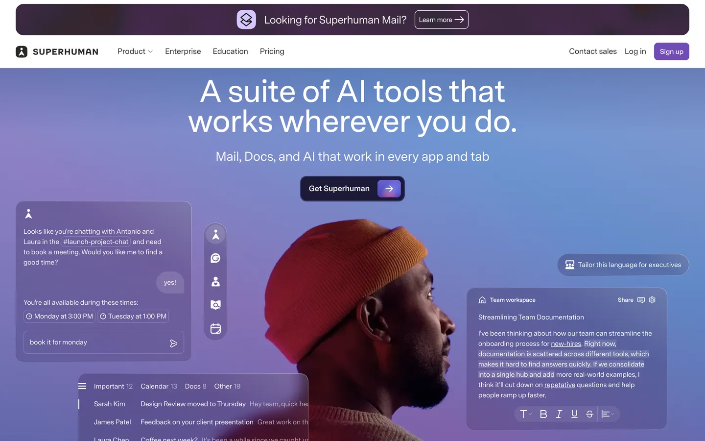
Superhuman built its reputation on speed — the fastest email client in the world — and its marketing surfaces translate that ethos into a design language that reads more like an editorial broadsheet than a SaaS dashboard. Every page opens on a deep indigo navy hero at #1b1938, overlaid with a soft violet-sky atmospheric backdrop and a half-bleed portrait subject photographed at twilight. Headlines sit at 64px in a proprietary variable sans, tight-tracked into editorial density, paired with a single pale-violet pill CTA. The body of every page flips to pure white #ffffff with warm dark grey ink at #292827, and every page closes on a deep-teal #0e3030 CTA band — the brand's resolving chord.
This DESIGN.md file packages all of that into a machine-readable spec built on the Google Labs DESIGN.md format. Inside: 15 colors tokens spanning indigo, violet, teal, and warm off-greys; 12 typography styles using Super Sans VF at unusual sub-default weights of 460, 540, and 600; 6 corner-radius tokens from 4px hairline tags to 9999px hero pills; 8 spacing units on an 8px base with 2/4/12px sub-tokens; and 16 components covering rounded-rectangle buttons, pricing cards, the signature teal closing band, half-bleed portrait hero, and pill-tab feature selectors.
Drop this file into Claude, Cursor, or GitHub Copilot and the agent will reproduce Superhuman's restraint — the three-canvas rhythm of indigo/white/teal, the single-CTA-per-band rule, the sub-default 460/540 weights, the 0.96 display leading. The tokens are also directly quotable: paste #1b1938 into your Tailwind config, pull `font-variation-settings: "wght" 540` from the typography section, or use the spec as a design audit when reviewing a peer's email-client marketing page. The system is worth studying for one reason — it proves you can build a fast-email brand that reads as warm and considered rather than another minimalist productivity clone.
What makes it distinct
5
- Three-canvas rhythmindigo navy #1b1938 hero, pure white #ffffff body, deep teal #0e3030 closing CTA band on every page
- Sub-default variable weightsSuper Sans VF at 460/540/600 instead of the usual 400/500/700, the typographic warmth signature
- Tight 0.96 line-height on 48–64px display sizeseditorial compression rather than airy SaaS leading
- Single CTA per band rulepill-shaped violet #c9b4fa over the hero, 8px rounded rectangles everywhere else
- Warm dark grey #292827 body ink, never pure blackthe quiet warmth that distinguishes the system from default SaaS
superhuman.com
Live at superhuman.com
A snapshot of the brand in production. Scroll the frame to see the whole page.
Colors
15 colors
Superhumon Inspired's system runs on #1b1938 as its primary voltage, used in 4 of 16 components. Type is set in Super Sans VF across 12 tokens from 12px to 64px, weights 460–700. Shape language is mixed across 16 components, blending pills, soft rounds, and squarer corners.
Brand & Accent
Sparing, CTA-only voltage · 2
Surface
Page and card backgrounds · 5
Text
Headlines, body, captions · 6
Borders & Hairlines
Dividers, outlines, rules · 2
Typography
12 type tokens
Set in Super Sans VF across 12 tokens, from 12px to 64px, weights 460–700. Shown in its own stack: where the font isn't installed, the fallback the file names stands in.
- display-xxl64px · weight 540 · lh 0.96The quick brown fox jumps over the lazy dog
- display-xl48px · weight 460 · lh 0.96 · tracking -1.32pxThe quick brown fox jumps over the lazy dog
- display-lg28px · weight 540 · lh 1.14 · tracking -0.63pxThe quick brown fox jumps over the lazy dog
- display-md22px · weight 460 · lh 1.1 · tracking -0.315pxThe quick brown fox jumps over the lazy dog
- heading-lg20px · weight 460 · lh 1.2 · tracking -0.4pxThe quick brown fox jumps over the lazy dog
- body-lg18px · weight 540 · lh 1.5 · tracking -0.135pxThe quick brown fox jumps over the lazy dog
- body-md16px · weight 460 · lh 1.5The quick brown fox jumps over the lazy dog
- body-strong18.72px · weight 700 · lh 1.5The quick brown fox jumps over the lazy dog
- button-md16px · weight 700 · lh 1The quick brown fox jumps over the lazy dog
- button-cap14px · weight 600 · lh 1The quick brown fox jumps over the lazy dog
- caption14px · weight 460 · lh 1.4The quick brown fox jumps over the lazy dog
- micro12px · weight 540 · lh 1.4The quick brown fox jumps over the lazy dog
Layout
Radii and spacing
6 corner radii and 8 spacing values. Shape language: mixed.
Radii
- xs4px
- sm6px
- md8px
- lg12px
- xl16px
- full9999px
Spacing
- xxs2px
- xs4px
- sm8px
- md12px
- lg16px
- xl24px
- xxl32px
- huge64px
Components
16 components
Each rendered from its tokens (color, type, radius, padding) on Superhumon's own canvas.
- Button Primary Darkbutton-primary-darkButton Primary Dark
- Button Primary Dark Pressedbutton-primary-dark-pressedButton Primary Dark Pressed
- Button On Dark Pillbutton-on-dark-pillButton On Dark Pill
- Button Secondary Outlinebutton-secondary-outlineButton Secondary Outline
- Button On Tealbutton-on-tealButton On Teal
- Type here…text-inputText Input
- Card Feature Lightcard-feature-lightCard Feature Light
- Card Pricingcard-pricingCard Pricing
- Card Pricing Featuredcard-pricing-featuredCard Pricing Featured
- Card Teal Bandcard-teal-bandCard Teal Band
- Card Feature Rowcard-feature-rowCard Feature Row
- Pill Tab Lightpill-tab-lightPill Tab Light
- Nav Bar Darknav-bar-darkNav Bar Dark
- Nav Bar Lightnav-bar-lightNav Bar Light
- Link On Lightlink-on-lightLink On Light
- Footer Lightfooter-lightFooter Light
In use
The system, in use
Superhumon's tokens on the kind of product it builds.
Build something people actually use.
A short paragraph of marketing copy that previews how the brand's display tier and body tier read together. Two sentences is usually enough.
FAQ
Superhumon Inspired design system FAQ
Common questions about Superhumon's tokens, components, and how to use this DESIGN.md in your project.
Read next
Related reading
Specs, directories, and component libraries that pair with this design system.
Use it
Use Superhumon Inspired in your project
One machine-readable file. Drop it into Claude, Cursor, or any AI tool that reads DESIGN.md.
Download the DESIGN.md
One machine-readable file: every color, type, radius, spacing, and component token of Superhumon Inspired.
Feed it to your AI tool
Drop it into Claude, Cursor, or GitHub Copilot. The agent writes React components and Tailwind classes that match Superhumon Inspired's visual language.
Reference the tokens directly
Or paste the values into your Tailwind config, CSS variables, or component library: every color, size and radius is a quoted, ready-to-copy value.
Read the full DESIGN.md: overview, rationale, do’s and don’ts
Overview
Superhuman's marketing pages open in an editorial dark register: a deep indigo navy {colors.primary} (#1b1938) canvas overlaid with a soft violet-and-sky atmospheric backdrop and a half-bleed portrait subject (often a person looking off-frame, photographed at twilight). Headlines render in {typography.display-xxl} (Super Sans VF at 64px / weight 540) with negative tracking, set in white over the indigo. A single rounded-rectangle CTA button anchors each band — never two, never three.
The body of every page flips to white. {colors.canvas} (#ffffff) takes over below the hero, with body type in {colors.ink} (#292827 — a slightly warm dark grey, never pure black) and feature rows alternating between white and {colors.canvas-soft} (#fafaf8, a barely-tinted off-white). Pricing tiers sit on this white surface; the featured tier inverts to the indigo navy #1b1938, completing the brand's binary polarity.
Every page closes with a deep-teal CTA band ({colors.surface-teal-deep} — #0e3030). The teal is a single chromatic interlude: rich, almost-black green-blue, that breaks up what would otherwise be an indigo/white-only page. The teal band always contains the closing CTA in {typography.display-lg} paired with a single white-pill button.
Typography runs Super Sans VF — a proprietary variable display sans — at unusual mid-weights (460, 540, 600). The variable axes let the brand pick precise sub-default weights that read as warmer and more human than typical 400/500/700 SaaS scales. Display sizes use negative letter-spacing of -1.32px to -0.315px depending on size; line-heights are unusually tight (0.96 on 48px display).
Key Characteristics:
- Three-canvas system: indigo navy #1b1938 for hero, white #ffffff for body, deep teal #0e3030 for closing CTA.
- Half-bleed portrait subject in the hero with violet-sky atmospheric backdrop — the brand uses a person looking off-frame as a recurring visual.
- Single CTA per band; the marketing pages never crowd actions.
- Super Sans VF at sub-default weights (460, 540, 600) — the brand's typographic warmth signature.
- Tight line-heights (0.96) on display sizes — vertical compression as editorial density.
- Off-warm-grey body ink #292827 — never pure black; the brand's quiet warmth.
- Pill-shaped on-hero CTA in pale violet #c9b4fa; rounded-rectangle CTAs everywhere else at 8px radius.
Known Gaps
- Motion vocabulary: the brand uses subtle scroll-triggered fades and a hero portrait parallax that aren't captured in static design tokens; the timing curves and durations would need separate documentation.
- Product-app UI: this spec covers the marketing site only — the in-app email client surfaces (inbox list, message thread, command palette, keyboard shortcut chips) live in a separate design language not captured here.
- Hover state colors: inline link hover treatment and rounded-rectangle button hover lift colors are not documented per the global no-hover policy.
- Iconography: the system uses a custom icon set across feature rows and pricing cards; only the icon container chrome is captured, not the full glyph library.
- Loading states: skeleton screens and progressive loading patterns aren't visible on the extracted marketing surfaces.
- Dark-mode body: the system inverts only via the hero and closing teal band — there is no separate dark-mode rendering of body content or pricing tiers documented here.
Communication & Messaging
More systems like this
More DESIGN.md files in Communication & Messaging.
Pricing
Build it with Pro
The DESIGN.md files are free. Pro adds 6,000+ blocks, premium templates and the MCP server, so your AI editor builds in your system for you.
4.9/5 out of 5 · 150+ reviewsfrom 150+ founders and developers.
Billing
Billed once a year in USD. Cancel anytime.
- How many people can use the license.
- Client work, SaaS products and anything you charge for.
- Production-ready React sections: hero, pricing, features, dashboards and more.
- Complete multi-page sites you can ship as they are.
- React icons from every major library, installable with one command.
- Presets that restyle every block, in light and dark.
- Lets your AI editor search, preview and install blocks for you.
- Priority requests are answered first.
Individual
For personal projects & open source
$32instead of $49/mo
$389 billed yearly
- Seats: 1 seat
- Commercial use: Personal & open source only
- Pro blocks: 6,000+ blocks
- Templates: All 14 templates
- React icons: 294k+ icons
- Themes: All 59 themes
- MCP server: Basic usage
- Support: Standard
Team
Most popularFor freelancers, agencies & startups
$66instead of $99/mo
$789 billed yearly · ≈ $13/dev/mo
- Seats: Up to 5 seats
- Commercial use: Included
- Pro blocks: 6,000+ blocks
- Templates: All 14 templates
- React icons: 294k+ icons
- Themes: All 59 themes
- MCP server: High usage
- Support: Priority
Organization
For companies with larger teams
$132instead of $199/mo
$1,589 billed yearly
- Seats: Unlimited seats
- Commercial use: Included
- Pro blocks: 6,000+ blocks
- Templates: All 14 templates
- React icons: 294k+ icons
- Themes: All 59 themes
- MCP server: Unlimited usage
- Support: Priority
Billed once a year in USD. Cancel anytime.
Individual
For personal projects & open source
$32instead of $49/mo
$389 billed yearly
- How many people can use the license.Seats: 1 seat
- Client work, SaaS products and anything you charge for.Commercial use: Personal & open source only
- Production-ready React sections: hero, pricing, features, dashboards and more.Pro blocks: 6,000+ blocks
- Complete multi-page sites you can ship as they are.Templates: All 14 templates
- React icons from every major library, installable with one command.React icons: 294k+ icons
- Presets that restyle every block, in light and dark.Themes: All 59 themes
- Lets your AI editor search, preview and install blocks for you.MCP server: Basic usage
- Priority requests are answered first.Support: Standard
Team
Most popularFor freelancers, agencies & startups
$66instead of $99/mo
$789 billed yearly · ≈ $13/dev/mo
Everything in Individual, plus
- How many people can use the license.Seats: Up to 5 seats
- Client work, SaaS products and anything you charge for.Commercial use: Included
- Lets your AI editor search, preview and install blocks for you.MCP server: High usage
- Priority requests are answered first.Support: Priority
Organization
For companies with larger teams
$132instead of $199/mo
$1,589 billed yearly
Everything in Team, plus
- How many people can use the license.Seats: Unlimited seats
- Lets your AI editor search, preview and install blocks for you.MCP server: Unlimited usage
- Secure checkout via Stripe
- Code lives in your repo
- Keep what you've shipped if you cancel
- License terms
Your system, built for you
Every block, template and icon, installed by your AI agent in your design system. The DESIGN.md files stay free.