Sketch Design System
Sketch's marketing system pairs a 76px Reckless serif with a pastel sunrise gradient hero and a 24-px-rounded charcoal CTA. Tokens for React, Next.js, and AI coding tools.
Add shadcn.io to your AI agent. · Pro It installs blocks, icons and templates in your design system from a prompt, with Pro.
Set up MCP- Primary
- #151515
- Typeface
- InterVariable
- Shape
- Soft
- Base radius
- 12px
- Colors
- 16
- Type tokens
- 12
- Components
- 14
- Spacing values
- 8
About
About Sketch DESIGN.md
Curated by Dov Azencot · Updated May 19, 2026 · Source sketch.com (opens in a new tab)
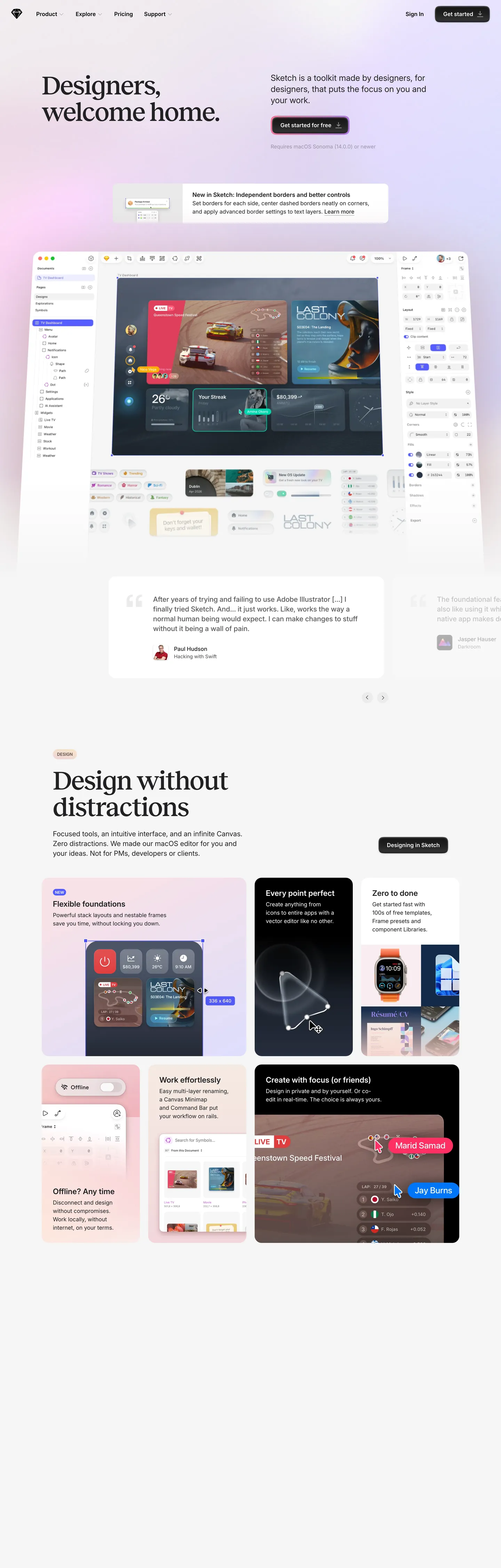
Sketch's marketing site does what almost no other Mac-native design tool attempts: it opens on a pastel sunrise gradient instead of a solid hero canvas. Lavender fades through cream-peach to coral as the hero band scrolls; the headline "Designers, welcome home." renders in a 76px Reckless serif in near-black weight 500, with a 24-px-rounded charcoal CTA pill beneath. Where Figma keeps its hero on warm orange and Adobe XD pushed dark indigo, Sketch returns to a softer palette closer to a 1990s Mac OS sunrise wallpaper than to a 2026 SaaS landing page. The gradient is the brand argument: a deliberate counter-move to the dev-tool category's drift toward black canvases and saturated voltages.
The DESIGN.md file packages the system into a machine-readable spec for React tooling. Inside: 16 colors tokens drawn from the page CSS — near-black ink (the primary text and CTA color), the coral peach voltage, the legacy hyperlink blue, plus a handful of gradient end-stops and product-mockup accent tints; 12 typography tokens splitting Reckless across two display sizes (76px h1, 44px sub-display) in weight 500 and InterVariable across every body / label / nav tier at 11-22px in weights 400-600; 6 radius tokens covering the 20px card / 24px CTA / pill scale; 8 spacing tokens on an 8px base; and 14 components covering the charcoal CTA pill, the gradient hero, the Reckless display heading, the product card with tactile shadow, and the dark text input.
Feed this file to an AI coding tool and it reproduces Sketch's specific moves: Reckless serif at weight 500 across display, pastel sunrise gradient hero, charcoal CTA pill at 24px radius, InterVariable workhorse body, and coral accent reserved for in-product chip decoration. The token references resolve cleanly without invention. One move worth borrowing only if your brand can sustain it: the pastel sunrise gradient depends on the brand having a clear visual heritage to call back to — for SaaS without that history it reads as decoration rather than as positioning.
What makes it distinct
5
- Pastel sunrise gradient herolavender, cream-peach, and coral instead of a solid hero canvas, the move that distinguishes Sketch from every other Mac-native dev tool
- Reckless serif at weight 50076px hero h1 and 76px section h2 share a single display step, a serif-display moment most design tools have abandoned for sans
- Charcoal CTA pillprimary buttons render at #151515 with 24px radius, not the brand-color voltage most SaaS pages reach for
- Coral accent reserved for in-product chipsthe gradient-yellow Sketch diamond and coral peach #ff7843 appear inside product card mockups, never as page-level surface fills
- InterVariable as workhorseevery body, label, button, and nav surface runs InterVariable at 14-22px in weights 400-600
sketch.com
Live at sketch.com
A snapshot of the brand in production. Scroll the frame to see the whole page.
Colors
16 colors
Sketch's system runs on #151515 as its primary voltage, used in 1 of 14 components. Type is set in InterVariable across 12 tokens from 11px to 76px, weights 400–600. Shape language is soft — components average 21px corner radius, with no sharp interactive edges.
Surface
Page and card backgrounds · 1
Text
Headlines, body, captions · 5
Borders & Hairlines
Dividers, outlines, rules · 1
Other
Specialty colors · 9
Typography
12 type tokens
Set in InterVariable across 12 tokens, from 11px to 76px, weights 400–600. Shown in its own stack: where the font isn't installed, the fallback the file names stands in.
- display-xl76px · weight 500 · lh 76px · tracking -1.5pxThe quick brown fox jumps over the lazy dog
- display-md44px · weight 500 · lh 48px · tracking -1pxThe quick brown fox jumps over the lazy dog
- heading-md22px · weight 600 · lh 24pxThe quick brown fox jumps over the lazy dog
- body-xl24px · weight 400 · lh 32pxThe quick brown fox jumps over the lazy dog
- body-lg20px · weight 500 · lh 28pxThe quick brown fox jumps over the lazy dog
- body-md16px · weight 400 · lh 24pxThe quick brown fox jumps over the lazy dog
- body-sm15px · weight 400 · lh 24pxThe quick brown fox jumps over the lazy dog
- body-xs14px · weight 400 · lh 20pxThe quick brown fox jumps over the lazy dog
- label-md16px · weight 500 · lh 24pxThe quick brown fox jumps over the lazy dog
- button-md16px · weight 600 · lh 24pxThe quick brown fox jumps over the lazy dog
- nav-link16px · weight 400 · lh 16pxThe quick brown fox jumps over the lazy dog
- uppercase-eyebrow11px · weight 600 · lh 12pxThe quick brown fox jumps over the lazy dog
Layout
Radii and spacing
6 corner radii and 8 spacing values. Shape language: soft.
Radii
- none0px
- sm8px
- md12px
- lg20px
- xl24px
- pill9999px
Spacing
- xs4px
- sm8px
- md12px
- base14px
- lg24px
- xl32px
- 2xl52px
- 3xl100px
Components
14 components
Each rendered from its tokens (color, type, radius, padding) on Sketch's own canvas.
- Hero Sectionhero-sectionHero Section
- Hero Headinghero-headingHero Heading
- Section Headingsection-headingSection Heading
- Body Paragraphbody-paragraphBody Paragraph
- Button Primarybutton-primaryButton Primary
- Button Secondarybutton-secondaryButton Secondary
- Top Navtop-navTop Nav
- Nav Linknav-linkNav Link
- Card Lightcard-lightCard Light
- Card Coralcard-coralCard Coral
- Card Blushcard-blushCard Blush
- Uppercase Eyebrowuppercase-eyebrowUppercase Eyebrow
- Type here…text-inputText Input
- HyperlinkhyperlinkHyperlink
In use
The system, in use
Sketch's tokens on the kind of product it builds.
Build something people actually use.
A short paragraph of marketing copy that previews how the brand's display tier and body tier read together. Two sentences is usually enough.
FAQ
Sketch design system FAQ
Common questions about Sketch's tokens, components, and how to use this DESIGN.md in your project.
Read next
Related reading
Specs, directories, and component libraries that pair with this design system.
- Browse all design systemsThe full directory of DESIGN.md files on shadcn.io, with live mockups for each.shadcn.io
- Sketch — official siteSketch's public marketing site — the source of truth for the live tokens captured in this file.sketch.com (opens in a new tab)
- The DESIGN.md specificationGoogle Labs' open spec for machine-readable design system files — the format this page is built on.github.com (opens in a new tab)
Use it
Use Sketch in your project
One machine-readable file. Drop it into Claude, Cursor, or any AI tool that reads DESIGN.md.
Download the DESIGN.md
One machine-readable file: every color, type, radius, spacing, and component token of Sketch.
Feed it to your AI tool
Drop it into Claude, Cursor, or GitHub Copilot. The agent writes React components and Tailwind classes that match Sketch's visual language.
Reference the tokens directly
Or paste the values into your Tailwind config, CSS variables, or component library: every color, size and radius is a quoted, ready-to-copy value.
Read the full DESIGN.md: overview, rationale, do’s and don’ts
Overview
Sketch's marketing site opens on a move almost no other Mac-native design tool attempts. Sunrise gradient hero. The above-fold band stacks {colors.lavender} at the top, fading through cream-peach ({colors.cream} and {colors.peach}) to {colors.coral} at the bottom — a pastel sunrise that runs the entire opening section. The headline "Designers, welcome home." renders in Reckless serif at 76px in weight 500 with -1.5px tracking, anchored in near-black {colors.ink} (#212123). The primary CTA pill sits in charcoal {colors.ink-cta} (#151515) at a 24px radius — not the brand-color voltage most SaaS pages reach for. Where Figma keeps its hero on warm orange and Adobe XD pushed dark indigo, Sketch returns to a softer palette closer to a 1990s-2000s Mac OS sunrise wallpaper than to a 2026 SaaS landing.
The voltage discipline is unusual. The system doesn't have a single chromatic brand color in the conventional sense — the primary CTA is charcoal, the hero canvas is the gradient, and the closest thing to an accent is {colors.coral} (#ff7843, frequency 12), used exclusively inside product-mockup card backgrounds and the Sketch diamond mark. Coral never appears as a page-level surface fill or CTA. This inverts single-voltage discipline at Cloudflare or Stripe: instead of holding one accent in reserve for CTAs, Sketch holds NO accent for CTAs and lets the pastel gradient carry the entire chromatic argument above the fold.
Typography is Reckless display, InterVariable body. Reckless (a contemporary serif from Displaay Type Foundry) carries the display tier at weight 500 — 76px hero h1 and 44px sub-display share a single weight step. InterVariable handles every body, label, button, and nav surface at 11-24px in weights 400-600. The serif-plus-sans split is the distinguishing typographic move; most design-tool brands (Figma, Framer, Linear) commit to sans-only marketing copy, and the Reckless serif at 76px / 500 reads closer to a magazine masthead than to a SaaS hero.
Key Characteristics:
- Pastel sunrise gradient hero — lavender, cream-peach, and coral fade through the entire above-fold band, the brand argument against the dev-tool category's drift to dark canvases.
- Reckless serif at weight 500 across the display tier — 76px hero h1 ("Designers, welcome home.") and 76px section h2 ("Design without distractions") share a single display step.
- Charcoal CTA pill at
{colors.ink-cta}(#151515) with 24px radius — primary buttons render in near-black, not in a brand-color voltage. Frequency 5 background occurrences total. - Coral peach (
{colors.coral}— #ff7843, frequency 12) reserved for in-product chip decoration and the Sketch diamond mark, never as a page-level surface fill or CTA. - InterVariable workhorse — 29 captured samples in the 15px / 400 nav-link style, 20 in 16px / 400 body, 18 in 22px / 600 sub-heading.
- Hyperlink-blue
{colors.hyperlink}(#0000ee) — frequency 36, used as the default a-tag text color in nav and inline links. The browser-default link blue, a deliberately old-school choice. - 20px default card radius (frequency 25), 24px CTA pill radius (frequency 5), full pill at 9999px (frequency 9) for chips and badges — the system tops out at 24px on rectangular surfaces.
- 8px base spacing unit (frequency 56), with 32px module dominance on card padding and section gutters.
Colors
Brand
- Coral (
{colors.coral}— #ff7843): frequency 12. Used as text (0), background (12), border (0). The closest thing to a brand accent — appears exclusively inside product-mockup card backgrounds, the Sketch diamond mark, and decorative product-chip strips. Never used as a page-level CTA or surface fill. The peach end-stop of the hero sunrise gradient at the bottom of the above-fold band. - Coral Soft (
{colors.coral-soft}— #e97f42): frequency 3 (gradient). The slightly cooler coral — appears as gradient end-stop inside product-mockup card decorations. - Peach (
{colors.peach}— #f8a57e): frequency 1 (gradient). The lighter peach end-stop — appears inside the gradient stack of the hero sunrise. - Cream (
{colors.cream}— #f7e5c6): frequency 1 (gradient). The pale cream end-stop in the mid-section of the hero sunrise gradient. - Lavender (
{colors.lavender}— #b47eee): frequency 1 (gradient). The lavender end-stop at the top of the hero sunrise gradient. - Blush (
{colors.blush}— #efd3d7): frequency 1 (gradient). The pale pink mid-tone in the gradient stack, also used as background fill on a single decorative product card. - Azure (
{colors.azure}— #32adf7): frequency 6 (gradient). The cyan-blue product-mockup chip accent inside the editor screenshot. - Indigo (
{colors.indigo}— #555dff): frequency 1, background. A deep brand-indigo used inside a single product-card chip illustration. - Midnight (
{colors.midnight}— #141d33): frequency 1 (gradient). The deep navy end-stop in the dark product-mockup card gradient.
Text
- Ink (
{colors.ink}— #212123): frequency 454 — 227 text, 227 border. The dominant text color across the system. Hero headline, section headings, body paragraphs, and primary nav labels all render in dark slate. Never pure black — the slate undertone (oklch lightness 0.25) softens the contrast against the gradient hero without disappearing. - Ink CTA (
{colors.ink-cta}— #151515): frequency 5, background. The charcoal CTA pill fill — one step darker than the body ink, used exclusively as the primary button background. The system intentionally splits the CTA charcoal from the body slate. - Ink Pure (
{colors.ink-pure}— #000000): frequency 306 — 134 text, 7 background, 135 border, 30 shadow. Pure black — used inside hairline borders and shadow ink. The body text never renders in pure black; the system splits text-ink (slate) from border-ink (pure black) by one luminance step. - Ink Muted (
{colors.ink-muted}— #5c5c5c): frequency 12 — 6 text, 6 border. The body-paragraph secondary tone — used inside long-form testimonial copy and section lead paragraphs ("After years of trying and failing to use Adobe Illustrator…"). - Hyperlink (
{colors.hyperlink}— #0000ee): frequency 36 — 19 text, 17 border. The browser-default link blue — used as the default a-tag color in inline links and footer nav. A deliberately old-school choice that signals the brand's Mac-native heritage.
Surface
- Canvas (
{colors.canvas}— #ffffff): frequency 93 — 28 text, 22 background, 28 border, 5 shadow, 10 gradient. Pure white — the floor of the editorial sections below the gradient hero. The extractor merges three near-white off-tones into this canonical token — the system uses interchangeable near-white surface tones for product-mockup backgrounds and inset fields.
Hairlines
- Hairline (
{colors.hairline}— #e6e6e6): frequency 1, shadow. The primary border tone — card outlines, input field rules, secondary-button outlines. Wired as the default light-grey hairline across the editorial sections.
Typography
Font Families
The system runs two voices: Reckless (a contemporary serif from Displaay Type Foundry) for the display tier at weight 500, and InterVariable (Rasmus Andersson's variable-axis Inter) for every body, label, button, and nav surface at weights 400-600. Both faces declare full fallback stacks — Reckless walks to generic serif; InterVariable to system-ui, -apple-system, "system-ui", "Helvetica Neue", Helvetica, Arial, sans-serif. The system-ui fallback chain is the Mac-native gesture: on macOS, the InterVariable fallback resolves to San Francisco, keeping the brand's Mac-tool heritage even when the variable font fails to load.
The serif-plus-sans pairing is the distinguishing typographic move. Most design-tool brands commit to a single sans across every tier; Sketch divides labor with Reckless carrying weight-500 display moments and InterVariable carrying weights 400-600 across body and chrome.
Hierarchy
| Token | Size | Weight | Line Height | Letter Spacing | Use |
|---|---|---|---|---|---|
{typography.display-xl} | 76px | 500 | 76px | -1.5px | Hero h1 ("Designers, welcome home."), section h2 ("Design without distractions") |
{typography.display-md} | 44px | 500 | 48px | -1px | Sub-display headings, h3 / mid-page editorial titles |
{typography.heading-md} | 22px | 600 | 24px | 0 | h3 / sub-section card titles |
{typography.body-xl} | 24px | 400 | 32px | 0 | Large lead paragraphs inside testimonial cards |
{typography.body-lg} | 20px | 500 | 28px | 0 | Section lead paragraphs |
{typography.body-md} | 16px | 400 | 24px | 0 | Default running text — body paragraphs, captions |
{typography.body-sm} | 15px | 400 | 24px | 0 | Small labels, breadcrumbs, footnote rows |
{typography.body-xs} | 14px | 400 | 20px | 0 | Tiny metadata, fine-print copy, cite text |
{typography.label-md} | 16px | 500 | 24px | 0 | Bold inline labels — chip labels, emphasis text |
{typography.button-md} | 16px | 600 | 24px | 0 | Primary CTA pill labels |
{typography.nav-link} | 16px | 400 | 16px | 0 | Top-nav link labels |
{typography.uppercase-eyebrow} | 11px | 600 | 12px | 0 | All-caps eyebrows above section headings |
Principles
Display sits at weight 500 — neither the heavier 700 weight that fintech uses, nor the lighter 300 weight that Mural or Stripe reach for. The Reckless serif at 76px / 500 with -1.5px tracking is a confident editorial gesture; the system maintains a single display step (76px h1 == 76px h2) rather than running a tiered ladder. The same size and weight on h1 and h2 collapses the typographic hierarchy and makes the page feel like a single editorial argument rather than a marketing funnel.
Body and labels stay at weights 400-600. Weight 600 in InterVariable handles button labels, h3 sub-headings, and bold emphasis runs; weight 500 handles inline labels and section lead paragraphs. The eyebrow text uses weight 600 at 11px uppercase — the smallest typographic moment in the system.
Note on Font Substitutes
Reckless is proprietary. Lora at weight 500 is the closest open-source substitute — similar transitional-serif proportions and the same modest tracking transfer cleanly at 70-76px display sizes. DM Serif Display is a slightly heavier alternative if Lora reads too light. InterVariable ships open from Rasmus Andersson — no substitution needed; the same variable-Inter is what Vercel and Linear ship.
Layout
Spacing System
- Base unit: 8px (the dominant gap value at frequency 56; 14px appears as a secondary value inside chip padding).
- Tokens:
{spacing.xs}4px ·{spacing.sm}8px ·{spacing.md}12px ·{spacing.base}14px ·{spacing.lg}24px ·{spacing.xl}32px ·{spacing.2xl}52px ·{spacing.3xl}100px. - Section padding (vertical): 100px between editorial bands (frequency 4), 56px tighter rhythm between sub-section blocks.
- Card internal padding: 32px on large product cards (frequency 16 on the 32px-32px-0 padding pattern, frequency 5 on 0-32px-32px), 24px on testimonial cards, 14px on small chips.
- Top-nav padding: 16x32px — flush with the 32px page gutter to keep the nav links aligned with the editorial column below.
Grid & Container
- Max content width: ~1080px on display headlines and editorial bands, ~1280px on the full-bleed product-mockup card grid.
- Hero block: full-bleed gradient canvas, content centered at ~640px max-width with the Reckless h1 and charcoal CTA pinned dead-center.
- Editorial bands: centered displays at ~1080px, with 2-up and 3-up product-mockup rows splitting into 50/50 or 33/33/33 columns.
- Product mockup grid: 2x3 grid of pastel product cards (coral, blush, dark, cream) below the editorial heading "Design without distractions."
Rhythm
The page alternates between gradient hero and white editorial rather than holding a single tempo. The hero is gradient (lavender-cream-coral sunrise, slate Reckless headline, charcoal CTA). The first editorial band is white (white floor, slate Reckless h2, 2x3 pastel card grid). The mid-page testimonial band returns to a softer pastel-blush surface. The final CTA band returns to white. The rhythm itself is the design move: bands either go to gradient or to white — there is no half-tinted in-between.
Elevation
The system has a tactile shadow approach — depth comes from a soft, neutral drop shadow under product mockup cards rather than from hairline elevation. The captured page has 30 occurrences of {colors.ink-pure} (#000000) used as shadow ink, almost all of them on the large product-mockup screenshot in the hero ("Mac editor screenshot floating dead-center") and on the 2x3 pastel card grid below the fold.
- Flat (no shadow): hero text, editorial paragraphs, footer — every type-led surface.
- Soft drop: the central product-mockup screenshot in the hero carries a deep, soft drop shadow that lifts it off the gradient canvas — the page's loudest elevation moment.
- Card lift: the 2x3 pastel product card grid below the fold carries the same tactile drop shadow at a smaller offset — each card reads as a physical sticker on the white canvas.
Shapes
The radius scale is generous-soft, concentrated on three values:
{rounded.none}0px — only on full-bleed band fills and the page floor.{rounded.sm}8px (frequency 6) — small chips and dropdown items inside product-mockup illustrations.{rounded.md}12px (frequency 2) — rare; intermediate input surfaces.{rounded.lg}20px (frequency 25) — the dominant radius. Cards, product mockups, testimonial frames.{rounded.xl}24px (frequency 5) — primary CTA pills.{rounded.pill}9999px (frequency 9) — fully-rounded secondary chips and badges.
The system tops out at 24px on rectangular surfaces; the 28px and 26px outliers appear once each on specific decorative chips and don't form a tier. The pill-versus-rounded-pill distinction (24px CTA, 9999px chip) is the brand's structural shape language. Most SaaS sites either go fully-pill on CTAs or stay at 8-12px tight — the 24px CTA is unusual and reads as warmth without going as soft as a full pill.
Components
hero-section — Full-bleed pastel sunrise gradient canvas (lavender at top, cream-peach in middle, coral at bottom), 100x32px padding, no border-radius. Holds the hero h1 in slate {colors.ink} at {typography.display-xl}, a single-paragraph lead in {colors.ink-muted}, the charcoal CTA pill, and the central Mac-editor product mockup floating beneath.
hero-heading — Slate {colors.ink} text on the gradient canvas, Reckless 76px / 500, -1.5px tracking. The system's loudest display moment — and the section h2 below the fold shares the same 76px display step.
section-heading — Same {typography.display-xl} token rendered on the white editorial bands ("Design without distractions").
body-paragraph — Default ink-muted running text at {typography.body-lg} (20px / 500 / 28px line-height) inside testimonial cards and section leads.
button-primary — The signature CTA. Charcoal {colors.ink-cta} (#151515) fill, white text, {rounded.xl} 24px radius, 11x24x12 padding, 47px height, weight 600 label. "Get started for free" is the canonical instance, sitting beneath the hero headline and in the top-nav.
button-secondary — White {colors.canvas} fill, slate text, 1px {colors.hairline} border, {rounded.xl} 24px radius, 11x24x12 padding, 47px height. Used for "Learn more" / "View pricing" style tertiary CTAs.
top-nav — White surface, 80px height, 16x32px padding. Sketch wordmark flush left, product links (Product / Pricing / Resources / Support) center, "Sign in" + "Get started for free" CTAs flush right.
nav-link — Slate text on the white nav surface in {typography.nav-link} (16px / 400), 8x16px padding. The footer nav uses hyperlink blue {colors.hyperlink} (#0000ee) for the same component, signaling the legacy-Mac heritage gesture.
card-light — White {colors.canvas} surface, 1px {colors.hairline} border, {rounded.lg} 20px radius, 32px internal padding. The default content card on the editorial bands — holds testimonials, feature blocks, and product cells.
card-coral — Coral {colors.coral} (#ff7843) fill, white text, {rounded.lg} 20px radius, 32px padding. One of the four pastel product cards in the 2x3 grid below "Design without distractions" — coral carries the "Easy any device" tile.
card-blush — Blush {colors.blush} fill, slate text, {rounded.lg} 20px radius, 32px padding. Another pastel product card variant — blush carries the testimonial highlight card mid-page.
uppercase-eyebrow — Ink-muted {colors.ink-muted} text in {typography.uppercase-eyebrow} (11px / 600 uppercase), used as the small section eyebrow above the editorial h2 — "What's new" or section-category labels.
text-input — White {colors.canvas} surface, pure-black text, 1px hairline border, {rounded.lg} 20px radius, 12x14px padding, 48px height. The email input at the footer newsletter signup.
hyperlink — Default browser-blue {colors.hyperlink} (#0000ee) text on transparent background. The legacy-Mac heritage gesture — using the unstyled a-tag color rather than overriding to a brand voltage.
Do's and Don'ts
Do keep the hero gradient stacking lavender at the top, cream-peach in the middle, and coral at the bottom. The order matters — the gradient is the brand argument; swapping the stops (e.g., coral at top) loses the sunrise direction and turns the brand gesture into generic decoration.
Do render the primary CTA in charcoal {colors.ink-cta} (#151515), not in {colors.coral} or any brand color. The CTA's color discipline — charcoal pill on the pastel gradient — is the inverse of typical SaaS voltage discipline and what differentiates Sketch's hero from Figma or Framer.
Do keep display weight at 500 on the Reckless serif. The hero h1 at 76px / 500 with -1.5px tracking is the editorial gesture; heavier weights collapse the serif into a banking-luxe gesture, lighter weights collapse it into editorial-thin fragility.
Do reserve {colors.coral} (#ff7843) for product-mockup card backgrounds and the Sketch diamond mark. The system has no page-level coral surface; using coral as a section background floods the page with the only secondary accent and undoes the gradient-as-voltage move.
Don't use {colors.hyperlink} (#0000ee) outside footer inline links. The browser-default link blue is a deliberate Mac-heritage gesture — pulling it into inline emphasis text inside body paragraphs reads as missing CSS rather than as intentional positioning.
Don't swap the slate ink {colors.ink} (#212123) for pure black on display headings. The slate undertone is the intentional softening against the pastel gradient — pure black headlines read too harsh and break the warmth gradient of the hero.
Don't add a tiered ladder of display sizes (e.g., 76 / 64 / 56 / 44). The system runs a single 76px display step that h1 and h2 both share — adding a middle tier collapses the editorial argument into a marketing funnel hierarchy.
Don't swap the 24px CTA radius for a full pill at 9999px. The 24px CTA at {rounded.xl} is the brand's structural shape signature; switching to a full pill makes the CTA read as a Stripe / Cloudflare gesture rather than Sketch's softer-but-not-fully-soft warmth.
Known Gaps
- Dark mode: the captured marketing surface is light-only — gradient hero followed by white editorial bands. A dark variant of the Sketch Mac editor surface exists but is not represented here.
- Hover and focus states: documented for the resting state only; the full state matrix (button hover, focus rings, active press, disabled tints) is not captured from the marketing surface.
- Form input states:
{component.text-input}carries the resting state in the footer newsletter signup; error / validation / focus styling lives inside the Sketch product editor and is not exposed on the marketing site. - Motion: the central product-mockup screenshot in the hero has a faint floating animation, but the spec captures end-state values only. Easing curves and animation rate live in the live page runtime.
- Product surfaces: this DESIGN.md captures the marketing site only. The Sketch Mac app and the Sketch Web Workspace carry richer token systems — canvas grid layouts, inspector chrome, color-picker matrices — that are not represented here.
- Gradient stops: the hero gradient stacks lavender, cream-peach, and coral but the exact stop positions and easing function are not captured by the extractor. The hex values are present (
{colors.lavender},{colors.cream},{colors.peach},{colors.coral}) but the stop math lives inside the live CSS gradient declaration. - The Sketch diamond mark: the brand mark renders in a gradient combining
{colors.coral},{colors.azure}, and{colors.lavender}but the exact mark geometry and gradient angles are not extractable from the page CSS.
Design & Creative Tools
More systems like this
More DESIGN.md files in Design & Creative Tools.
Pricing
Build it with Pro
The DESIGN.md files are free. Pro adds 6,000+ blocks, premium templates and the MCP server, so your AI editor builds in your system for you.
4.9/5 out of 5 · 150+ reviewsfrom 150+ founders and developers.
Billing
Billed once a year in USD. Cancel anytime.
- How many people can use the license.
- Client work, SaaS products and anything you charge for.
- Production-ready React sections: hero, pricing, features, dashboards and more.
- Complete multi-page sites you can ship as they are.
- React icons from every major library, installable with one command.
- Presets that restyle every block, in light and dark.
- Lets your AI editor search, preview and install blocks for you.
- Priority requests are answered first.
Individual
For personal projects & open source
$32instead of $49/mo
$389 billed yearly
- Seats: 1 seat
- Commercial use: Personal & open source only
- Pro blocks: 6,000+ blocks
- Templates: All 14 templates
- React icons: 294k+ icons
- Themes: All 59 themes
- MCP server: Basic usage
- Support: Standard
Team
Most popularFor freelancers, agencies & startups
$66instead of $99/mo
$789 billed yearly · ≈ $13/dev/mo
- Seats: Up to 5 seats
- Commercial use: Included
- Pro blocks: 6,000+ blocks
- Templates: All 14 templates
- React icons: 294k+ icons
- Themes: All 59 themes
- MCP server: High usage
- Support: Priority
Organization
For companies with larger teams
$132instead of $199/mo
$1,589 billed yearly
- Seats: Unlimited seats
- Commercial use: Included
- Pro blocks: 6,000+ blocks
- Templates: All 14 templates
- React icons: 294k+ icons
- Themes: All 59 themes
- MCP server: Unlimited usage
- Support: Priority
Billed once a year in USD. Cancel anytime.
Individual
For personal projects & open source
$32instead of $49/mo
$389 billed yearly
- How many people can use the license.Seats: 1 seat
- Client work, SaaS products and anything you charge for.Commercial use: Personal & open source only
- Production-ready React sections: hero, pricing, features, dashboards and more.Pro blocks: 6,000+ blocks
- Complete multi-page sites you can ship as they are.Templates: All 14 templates
- React icons from every major library, installable with one command.React icons: 294k+ icons
- Presets that restyle every block, in light and dark.Themes: All 59 themes
- Lets your AI editor search, preview and install blocks for you.MCP server: Basic usage
- Priority requests are answered first.Support: Standard
Team
Most popularFor freelancers, agencies & startups
$66instead of $99/mo
$789 billed yearly · ≈ $13/dev/mo
Everything in Individual, plus
- How many people can use the license.Seats: Up to 5 seats
- Client work, SaaS products and anything you charge for.Commercial use: Included
- Lets your AI editor search, preview and install blocks for you.MCP server: High usage
- Priority requests are answered first.Support: Priority
Organization
For companies with larger teams
$132instead of $199/mo
$1,589 billed yearly
Everything in Team, plus
- How many people can use the license.Seats: Unlimited seats
- Lets your AI editor search, preview and install blocks for you.MCP server: Unlimited usage
- Secure checkout via Stripe
- Code lives in your repo
- Keep what you've shipped if you cancel
- License terms
Your system, built for you
Every block, template and icon, installed by your AI agent in your design system. The DESIGN.md files stay free.