Adobe Design System
Adobe's marketing system is a grid of charcoal cards hosting full-color product creatives — proprietary display sans across every tier, cobalt CTA pill, 20px corner radius. Tokens for React, Next.js, and AI tools.
Add shadcn.io to your AI agent. · Pro It installs blocks, icons and templates in your design system from a prompt, with Pro.
Set up MCP- Primary
- #3b63fb
- Typeface
- Adobe Clean
- Shape
- Soft
- Base radius
- 16px
- Colors
- 11
- Type tokens
- 11
- Components
- 15
- Spacing values
- 8
About
About Adobe DESIGN.md
Curated by Dov Azencot · Updated May 18, 2026 · Source adobe.com (opens in a new tab)
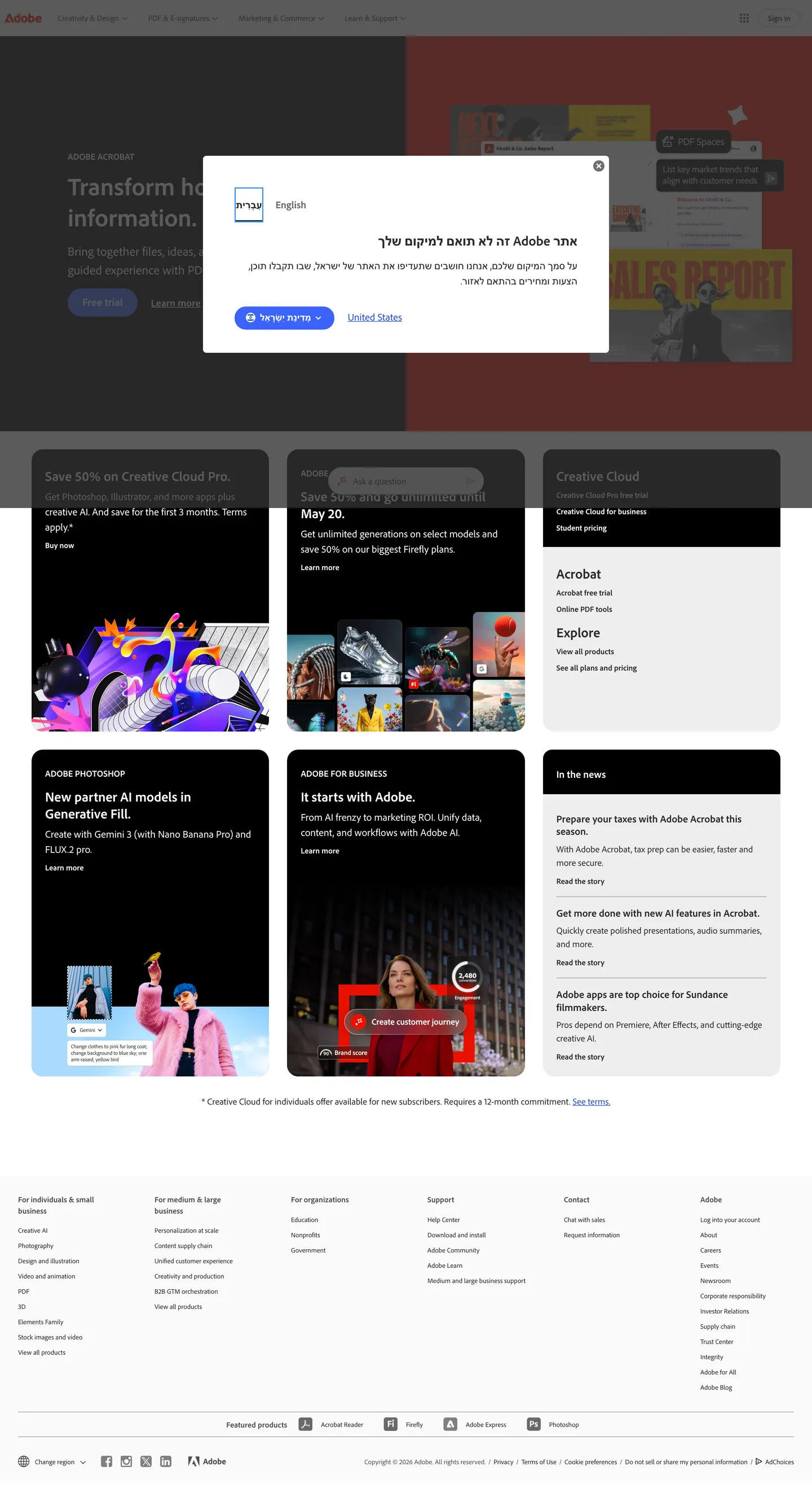
Adobe's marketing site rejects the single-voltage convention almost every dev-tool brand follows. Where Cloudflare paints the page in orange and Linear leans on a violet-graphite ladder, the above-fold on adobe.com is a 4-up grid of charcoal cards: a Creative Cloud Pro promo tile, a generative-AI tile, an Acrobat link rail, and a Photoshop "New AI models in Generative Fill" card with the actual app artwork bleeding to the edges. The brand voltage — Adobe's famous red — appears only as the wordmark glyph at the top-left and as the brand variable wired into the Acrobat tile. The colored work belongs to the products themselves: Photoshop's magenta-and-cyan, Illustrator's saffron, Premiere's deep violet.
The DESIGN.md file packages the corporate marketing system into a machine-readable spec for React tooling. Inside: 11 colors tokens drawn from the structural tier of Adobe's CSS variable system — a charcoal carrying 333 occurrences, a soft gray carrying 193, white-on-cream surface tones, and the two brand cobalts (one for inline link, one for the CTA) used 22 times combined. Eleven typography tokens running `Adobe Clean` — a custom proprietary sans the brand ships from its own foundry — at 12, 14, 16, 18, 22, 24, and 44px in weights 400 (body), 600 (emphasis), and 700 (display and uppercase labels). Eight corner-radius tokens centered on a generous 20px default. 15 components definitions covering the cobalt CTA pill, the charcoal tile, the cream nav, the dark dropdown surface, and the Acrobat brand red.
Feed this file to Claude or Cursor and it reproduces Adobe's specific moves: a tile-grid hero instead of a voltage hero, charcoal cards over a near-white floor, the proprietary display sans across every tier, 20px rounding everywhere, and the cobalt CTA reserved for the single most-important conversion action. The one move worth borrowing is the discipline of letting product artwork carry chromatic work — Adobe never sits the brand red against a competing colored canvas because the page is built to host Photoshop's spectrum, not to compete with it. This is the inverse of single-voltage discipline: a system that gets its color from what it sells.
What makes it distinct
5
- Tile grid as marketing herothe above-fold is a 4-up grid of charcoal cards rather than a single voltage canvas, each card hosting product artwork
- Cobalt CTA voltagethe cobalt blue pair is the only saturated chromatic moment in the marketing chrome; the Adobe red is reserved for the wordmark and the Acrobat brand variable
- One proprietary sans across every tierdisplay, heading, body, button, label at weights 400 / 600 / 700, no second display family or serif moment
- 20px default radiusthe dominant rounding (26 of 36 captured radii), giving every dark tile a soft-pillow silhouette
- Charcoal-on-cream pairingsurfaces alternate between dark card fills and a near-white floor, with full-color product artwork doing the chromatic work
adobe.com
Live at adobe.com
A snapshot of the brand in production. Scroll the frame to see the whole page.
Colors
11 colors
Adobe's system runs on #3b63fb as its primary voltage, used in 1 of 15 components. Type is set in Adobe Clean across 11 tokens from 14px to 44px, weights 400–700. Shape language is soft — components average 23px corner radius, with no sharp interactive edges.
Brand & Accent
Sparing, CTA-only voltage · 3
Surface
Page and card backgrounds · 3
Text
Headlines, body, captions · 3
Borders & Hairlines
Dividers, outlines, rules · 1
Other
Specialty colors · 1
Typography
11 type tokens
Set in Adobe Clean across 11 tokens, from 14px to 44px, weights 400–700. Shown in its own stack: where the font isn't installed, the fallback the file names stands in.
- display-xl44px · weight 700 · lh 55pxThe quick brown fox jumps over the lazy dog
- display-md24px · weight 700 · lh 30pxThe quick brown fox jumps over the lazy dog
- heading-md22px · weight 400 · lh 33pxThe quick brown fox jumps over the lazy dog
- heading-sm18px · weight 700 · lh 22.5pxThe quick brown fox jumps over the lazy dog
- body-lg18px · weight 400 · lh 27pxThe quick brown fox jumps over the lazy dog
- body-md16px · weight 400 · lh 24pxThe quick brown fox jumps over the lazy dog
- body-sm14px · weight 400 · lh 19.6pxThe quick brown fox jumps over the lazy dog
- label-md14px · weight 600 · lh 19.6pxThe quick brown fox jumps over the lazy dog
- label-caps16px · weight 700 · lh 20pxThe quick brown fox jumps over the lazy dog
- button-md17px · weight 700 · lh 20pxThe quick brown fox jumps over the lazy dog
- nav-link14px · weight 400 · lh 27pxThe quick brown fox jumps over the lazy dog
Layout
Radii and spacing
7 corner radii and 8 spacing values. Shape language: soft.
Radii
- none0px
- sm6px
- md16px
- lg20px
- xl24px
- pill25px
- full9999px
Spacing
- xs4px
- sm8px
- md12px
- base16px
- lg24px
- xl32px
- 2xl56px
- 3xl80px
Components
15 components
Each rendered from its tokens (color, type, radius, padding) on Adobe's own canvas.
- Button Primarybutton-primaryButton Primary
- Button Primary Hoverbutton-primary-hoverButton Primary Hover
- Button Secondarybutton-secondaryButton Secondary
- Top Navtop-navTop Nav
- Nav Linknav-linkNav Link
- Hero Headinghero-headingHero Heading
- Section Headingsection-headingSection Heading
- Body Paragraphbody-paragraphBody Paragraph
- Body Paragraph Mutedbody-paragraph-mutedBody Paragraph Muted
- Card Darkcard-darkCard Dark
- Card Promocard-promoCard Promo
- Acrobat Tileacrobat-tileAcrobat Tile
- App Chipapp-chipApp Chip
- Category Pillcategory-pillCategory Pill
- FooterfooterFooter
In use
The system, in use
Adobe's tokens on the kind of product it builds.
Build something people actually use.
A short paragraph of marketing copy that previews how the brand's display tier and body tier read together. Two sentences is usually enough.
FAQ
Adobe design system FAQ
Common questions about Adobe's tokens, components, and how to use this DESIGN.md in your project.
Read next
Related reading
Specs, directories, and component libraries that pair with this design system.
- Browse all design systemsThe full directory of DESIGN.md files on shadcn.io, with live mockups for each.shadcn.io
- Adobe — official siteAdobe's public marketing site — the source of truth for the live tokens captured in this file.adobe.com (opens in a new tab)
- The DESIGN.md specificationGoogle Labs' open spec for machine-readable design system files — the format this page is built on.github.com (opens in a new tab)
Use it
Use Adobe in your project
One machine-readable file. Drop it into Claude, Cursor, or any AI tool that reads DESIGN.md.
Download the DESIGN.md
One machine-readable file: every color, type, radius, spacing, and component token of Adobe.
Feed it to your AI tool
Drop it into Claude, Cursor, or GitHub Copilot. The agent writes React components and Tailwind classes that match Adobe's visual language.
Reference the tokens directly
Or paste the values into your Tailwind config, CSS variables, or component library: every color, size and radius is a quoted, ready-to-copy value.
Read the full DESIGN.md: overview, rationale, do’s and don’ts
Overview
Adobe's marketing site rejects the single-voltage convention almost every dev-tool brand follows. Tile grid as hero. Where Cloudflare paints the page in saturated orange, Linear holds a violet-graphite ladder, and Stripe leans on an indigo gradient mesh, the above-fold on adobe.com is a 4-up grid of charcoal cards: a Creative Cloud Pro promo tile, a generative-AI tile, an Acrobat link rail, and a Photoshop "New AI models in Generative Fill" card with the actual app artwork bleeding edge-to-edge inside each. The brand voltage — Adobe's iconic red {colors.adobe-red} — appears only as the wordmark glyph at the top-left and as a CSS brand variable; it carries 0 background occurrences in the captured chrome. The colored work belongs to the products themselves: Photoshop's magenta-and-cyan, Illustrator's saffron, Premiere's deep violet, sitting inside the dark tiles as full-bleed compositions.
The working voltage of the marketing chrome is a cobalt blue pair — {colors.primary} (#3b63fb) as the CTA pill background and {colors.primary-hover} (#274dea) as the hover state and inline link color. Combined frequency: 22 occurrences across the captured surface, almost all on the rounded {component.button-primary} and on the nav-link tier. This is the inverse of the cloudflare/spline single-voltage move: where those brands hold one saturated color in reserve for emphasis, Adobe quietly delegates the emphasis job to cobalt and reserves the legacy brand red for product-line semantics only (the Acrobat tile inherits --feds-color-adobeBrand, and the wordmark glyph is the only above-fold rendering).
Adobe Clean is the proprietary typeface family running every tier — display at 44px / 700, section headings at 24px / 700, body at 18px / 400, labels at 14px / 600, and uppercase labels at 16px / 700. There is no second display family, no serif moment, no monospace surface above the fold. The dominant typographic rhythm is weight contrast rather than family contrast: 400 for running text, 600 for emphasis, 700 for everything that needs to read as a heading or a CTA.
Key Characteristics:
- Tile grid hero — 4-up charcoal cards (
{colors.ink}) replace a single voltage block; each card hosts a full-bleed product creative. - Cobalt CTA voltage (
{colors.primary}) is the only saturated chromatic element in the marketing chrome; 22 total combined-pair occurrences. - Adobe brand red (
{colors.adobe-red}) is wired as--feds-color-adobeBrandbut never rendered as a background fill above the fold — wordmark glyph and Acrobat tile only. - The proprietary display sans runs across every tier — display, heading, body, button, label — in weights 400 / 600 / 700; no second family or serif.
- 20px default radius (
{rounded.lg}) — the dominant rounding (26 of 36 captured radii), giving every dark tile a soft-pillow silhouette. - Charcoal-on-cream surface pairing —
{colors.ink}card fills sit over a near-white{colors.canvas}page floor. - Top-nav (
{component.top-nav}) and footer share the white canvas; the dark tiles are the only "dark" moments on the page. - Pill CTA at 25px radius (
{rounded.pill}) — the only non-tile pill-shaped surface on the page; the cobalt fill makes it the most-tappable element.
Colors
Brand
- Cobalt Primary (
{colors.primary}— #3b63fb): frequency 4. Used as background (2) and border (2). The CTA pill fill —{component.button-primary}— and the inline accent link color. Wired in CSS as--color-accent,--feds-cta-primary-bg, and--link-color-dark. The single saturated chromatic element in the marketing chrome. - Cobalt Hover (
{colors.primary-hover}— #274dea): frequency 18. Used as text (9) and border (9). The hover variant and the default nav-link color —{component.nav-link}carries this tone. Wired as--feds-cta-primary-bg--hover,--feds-color-blue-link,--link-color, and--color-accent-hover. - Cobalt Down (
{colors.primary-down}— #095aba): declared as--color-accent-down. Reserved for the press/active state on{component.button-primary}; absent from the rendered captured chrome. - Adobe Red (
{colors.adobe-red}— #eb1000): the iconic Adobe brand voltage. Wired as--feds-color-adobeBrand. Above-fold rendering is limited to the wordmark glyph and the Acrobat product tile's brand variable; carries 0 background, 0 border, 0 text frequency on the captured page despite being the most famous color in the system. The product-line semantic, not the marketing voltage.
Surface
- Canvas (
{colors.canvas}— #ffffff): frequency 178 — pure white, the dominant page floor. Wired as--background-color,--feds-background-nav,--feds-background-footer, and--color-white. Top-nav, footer, and the gaps between dark tiles all sit on the canvas. - Surface-1 (
{colors.surface-1}— #ededed): frequency 3 as background. Used inside dropdown popups and the secondary tab-background tier. Wired as--feds-background-popup. - Surface-2 (
{colors.surface-2}— #f3f3f3): the slightly-warmer tab-content background, wired as--feds-backgroundColor-tabContent-v2. Used on the Acrobat link-rail tile background.
Text
- Ink (
{colors.ink}— #2c2c2c): frequency 333 — the dominant text tone AND the dominant card-fill surface (167 text, 165 border, 1 bg). Carries every body paragraph and section heading on the white canvas, and supplies the charcoal fill on every dark tile. Wired as--text-color,--feds-color-link,--feds-color-breadcrumbs--current, and--tabs-active-text-color. Never pure black. - Ink Soft (
{colors.ink-soft}— #505050): frequency 193 (97 text, 96 border). The secondary running-text and inactive-pill tone. Wired as--feds-color-headline,--feds-color-navLink-description,--tabs-pill-text-color, and--tabs-pill-bg-color-active. - Ink Muted (
{colors.ink-muted}— #686868): frequency 1 as text. Used sparingly for sub-labels and metadata. Wired as--tabs-text-color,--feds-color-link-breadcrumbs, and--color-gray-600.
Hairlines
- Hairline (
{colors.hairline}— #dadada): frequency 1 as border. The subtle outline tone used on the menu-border and tab-border tiers. Wired as--feds-borderColor-menu,--color-gray-300, and--tabs-pill-bg-color-hover. There is essentially no other hairline tone on the captured page.
Typography
Font Family
The system runs Adobe Clean for every tier — display, heading, body, button, label, nav. The face is a proprietary sans-serif from the Adobe Fonts library (formerly Typekit), declared as 'Adobe Clean', adobe-clean, 'Trebuchet MS', sans-serif. There is no separate display family, no serif tier, no monospace surface above the fold. Roboto Mono is declared as the --fixed-font-family fallback but never rendered in the captured chrome.
Hierarchy
| Token | Size | Weight | Line Height | Use |
|---|---|---|---|---|
{typography.display-xl} | 44px | 700 | 55px | Hero h1 ("Transform how you share information") |
{typography.display-md} | 24px | 700 | 30px | Section h2 ("Save 50% on Creative Cloud Pro", "New AI models in Generative Fill") |
{typography.heading-md} | 22px | 400 | 33px | Lead paragraph / large quote tier |
{typography.heading-sm} | 18px | 700 | 22.5px | h3 / card titles |
{typography.body-lg} | 18px | 400 | 27px | Default running-text body |
{typography.body-md} | 16px | 400 | 24px | Secondary body and link tier |
{typography.body-sm} | 14px | 400 | 19.6px | Caption rows, footer category sub-labels |
{typography.label-md} | 14px | 600 | 19.6px | Emphasis label, button caption |
{typography.label-caps} | 16px | 700 | 20px | Uppercase brand-rail label ("Featured products") |
{typography.button-md} | 17px | 700 | 20px | Primary CTA pill label |
{typography.nav-link} | 14px | 400 | 27px | Top-nav link labels |
Principles
Display weight tops out at 700 — Adobe is one of the few brands in the directory that leans into heavy display rather than the editorial 500 weight that Cloudflare and Spline run. The 44px / 700 hero heading with 55px line-height is the loudest typographic moment in the system, sized to compete with the saturated app artwork sitting beside it inside the dark tiles. Body and labels share weight 400; weight 600 is the system's emphasis treatment, distinct from the 700 heading tier.
The label-caps tier at 16px / 700 with uppercase transform is the only all-caps treatment in the system — used exclusively for the brand-rail label at the bottom of the page ("Featured products" with the Acrobat, Firefly, Adobe Express, Photoshop chips beneath).
Note on Font Substitutes
Adobe Clean is proprietary to Adobe Fonts. Source Sans 3 (also designed at Adobe and released as open-source) is the closest substitute and transfers proportions well at every weight. Inter works at body sizes (14-18px) but reads narrower than the proprietary face at the 44px display tier — adjust to weight 800 to compensate. The system stack fallback (Trebuchet MS, sans-serif) is what Adobe ships as the no-font-load fallback.
Layout
Spacing System
- Base unit: 8px — the dominant gap value (31 occurrences in the captured page).
- Tokens:
{spacing.xs}4px ·{spacing.sm}8px ·{spacing.md}12px ·{spacing.base}16px ·{spacing.lg}24px ·{spacing.xl}32px ·{spacing.2xl}56px ·{spacing.3xl}80px. - Section padding (vertical): ~80px between major bands on the white canvas; the wired
--spacing-xxxlis 104px for the tallest break. - Card internal padding:
{spacing.lg}(24px) on{component.card-dark}and{component.acrobat-tile}; the Creative Cloud promo runs slightly larger at 32px. - Hero padding: 0 horizontal inside the dark tile — the product artwork fills the card edge-to-edge while text sits at 24px inset.
Grid & Container
- Max content width: 1200px (wired as
--grid-container-width). The 1440px outer (--feds-maxWidth-nav) constrains the top-nav only. - Hero block: 4-up tile grid. Two columns at desktop split equally (each tile ~580px wide), with the Acrobat link-rail spanning two rows on the right.
- Brand rail (bottom): single-row chip strip ("Featured products" left-label + Acrobat / Adobe Firefly / Adobe Express / Photoshop chips).
- Footer: 6-column grid of footnote categories ("For individuals & small business", "For medium & large business", "For organizations", "Support", "Contact", "Adobe").
Rhythm
The page is dense above the fold, generous below. The 4-up tile grid is tightly packed — minimal gutters between cards (8px), each tile carrying full-bleed artwork and overlay text. Below the tile-grid hero, the page opens to a single-column white-canvas band, then settles into a wide footer with substantial vertical breathing. The dark tiles are the visual mass; the rest of the page is the white frame around them.
Elevation
The system has essentially no shadow tier. The captured page has 1 shadow occurrence on the entire surface, used as the tab-paddle drop-shadow with black at 10% opacity. Depth is delivered entirely by surface-color contrast — the charcoal {colors.ink} tiles sit on the {colors.canvas} white floor with no border, no shadow, no hairline outline. The 25-point lightness gap reads as elevation by itself.
- Flat (no shadow): body, hero tiles, brand rail, footer — 99% of surfaces.
- Tonal lift:
{colors.ink}cards on{colors.canvas}— the charcoal-on-white pairing does the elevation work. - Modal scrim: the country-selector popover uses white at 12% opacity.
Shapes
The radius scale is generous-soft, single-default: 20px carries 26 of the 36 captured rendered radii, more than 70% of the system.
- Sharp:
{rounded.none}0px — used inside chart blocks and full-bleed artwork. - Small:
{rounded.sm}6px — the only small-radius surface (1 occurrence on a chip). - Card-default:
{rounded.md}16px (3) and{rounded.lg}20px (26) — the dominant rounding for every dark tile and Acrobat link-rail. - Promo:
{rounded.xl}24px — the Creative Cloud Pro promo tile sits slightly more rounded. - Pill:
{rounded.pill}25px — the CTA button. Adobe's pill is a rounded rectangle (25px radius on a 41px-tall button) rather than a fully-circular pill — the curve reads as warm without disappearing into a perfect ellipse. - Full:
{rounded.full}9999px (rendered as50%) — three icon-button instances.
The scale skips the 4px / 8px tight tier almost every dev-tools system relies on. Adobe's 20px default reads as approachable and product-friendly — it belongs to the same family of decisions as the 44px / 700 display: warmth through scale rather than restraint through tightness.
Components
button-primary — The signature CTA. Cobalt {colors.primary} fill, white text, {typography.button-md} (17px / 700), {rounded.pill} 25px radius, 7×18×8 asymmetric padding, 41px height. The single most-tappable element on the page; the only saturated chromatic moment in the marketing chrome.
button-primary-hover — Background flips to the slightly-darker {colors.primary-hover} (#274dea). White text remains.
button-secondary — Transparent fill with ink text and a 1px ink-toned border. Same {rounded.pill} 25px radius and 41px height. Used for tertiary CTAs in the footer and inside dropdown menus.
top-nav — White {colors.canvas} surface, 63px height, 0×16 padding. Houses the Adobe wordmark (the only above-fold rendering of {colors.adobe-red}), the product mega-menu links (Creativity & Design / PDF & e-signatures / Marketing & Commerce / Help & Support), and the right-aligned Sign In cluster.
nav-link — Transparent background, cobalt {colors.primary-hover} text at {typography.nav-link} (14px / 400), 0×8 padding. The link tone is the same cobalt as the inline accent — Adobe deliberately keeps nav-link and inline-link at the same color.
hero-heading — White text on the dark card surface, {typography.display-xl} (44px / 700). Renders inside {component.card-promo} rather than free-floating on the canvas; the hero is always wrapped in a tile.
section-heading — {typography.display-md} (24px / 700) — used for the in-tile titles ("Save 50% on Creative Cloud Pro", "New AI models in Generative Fill", "May 20"). The 24px size is the most-common heading on the page; the 44px display is reserved for the lead promo only.
body-paragraph — White text on dark tiles at {typography.body-lg} (18px / 400). Ink text on the canvas for the cream-band moments.
body-paragraph-muted — Soft ink {colors.ink-soft} at {typography.body-md} for secondary copy and inactive labels.
card-dark — Dark {colors.ink} fill, white text, {rounded.lg} 20px radius, 24px internal padding. The default tile on the page; hosts the in-the-news rail and the bottom of the Acrobat link-rail.
card-promo — Dark {colors.ink} fill, {rounded.lg} 20px radius, 24px padding, but with full-bleed product artwork extending edge-to-edge inside. The Creative Cloud Pro tile and the Photoshop AI tile both use this pattern — text in the upper-third, artwork in the lower-two-thirds, no padding between text-block and artwork.
acrobat-tile — {colors.surface-2} (#f3f3f3) fill with ink text — the single light-surface tile in the otherwise-charcoal grid. Wraps the Acrobat Free PDF Reader, Online PDF tools, View all products link rail on the right side of the hero grid. The Acrobat tile inherits --feds-color-adobeBrand for its accent moments.
app-chip — Transparent fill with the app icon (Acrobat, Firefly, Adobe Express, Photoshop) at uniform 40px height, ink text label beneath. Renders in the "Featured products" brand rail at the bottom of the page; chips are arranged horizontally with the uppercase {typography.label-caps} label on the left.
category-pill — Soft-ink {colors.ink-soft} fill with white text, {typography.label-md} at 14px / 600, {rounded.pill} 25px radius. Used inside the tab-pill set for product-line switching.
footer — White canvas, soft-ink text, 32×16 padding. No surface contrast against the page floor; the footer just continues the canvas, with category headers in {typography.body-sm} and link rails beneath in the same size.
Do's and Don'ts
Do treat {colors.adobe-red} (#eb1000) as product-line semantic, not as the marketing voltage. The iconic Adobe red lives in the wordmark and the Acrobat brand variable only. For working CTAs and inline emphasis, reach for the cobalt pair {colors.primary} / {colors.primary-hover}.
Do let the dark tiles host full-bleed product artwork. The {component.card-promo} pattern — text in the upper third, product creative extending edge-to-edge in the lower two-thirds — is the defining move of the page. Hosting a stock illustration inside the tile would undercut it.
Do default to 20px corner radius ({rounded.lg}) on every card surface. The 20px default carries 70% of the system's rendered rounding and gives every tile its signature soft-pillow silhouette.
Do keep the top-nav and footer on the white {colors.canvas} — the dark tiles are the only dark moments on the page, and inverting the nav or footer would lose the figure-ground inversion the tile-grid hero depends on.
Don't render the {colors.adobe-red} as a background fill in marketing chrome. Adobe deliberately holds the brand red back; it carries 0 background occurrences on the captured page. Painting a section in Adobe red would read as a sub-brand product page, not as adobe.com.
Don't introduce a 4px or 8px small-step radius tier. The system is generous-soft starting at 16px; adding a tight tier would borrow the dev-tools-aesthetic vocabulary (Vercel, Linear) and clash with the 20px-default pillow shape.
Don't use a second display typeface. Adobe Clean carries every tier; introducing a serif or a display sans-serif (Druk, Migra, Saans) breaks the family-discipline that lets the dark tiles unify visually.
Don't render the CTA pill as a perfect ellipse. The pill {rounded.pill} is 25px radius on a 41px-tall button — a rounded rectangle, not a fully-circular capsule. Going to {rounded.full} would lose the warm geometry Adobe wants.
Known Gaps
- Hover and focus states: documented for
{component.button-primary-hover}only; the full state matrix (focus rings, disabled tints, active press) is not captured from the marketing surface. - Dark mode: the captured marketing surface is light-only on the white canvas with dark tile cards. A dark variant exists in the Creative Cloud desktop apps and the Photoshop / Premiere editor surfaces but is not represented here.
- Form input states: the corporate marketing surface does not expose a primary text-input field above the fold; sign-in form styling lives on the auth subdomain.
- Motion: the dark-tile thumbnails carry subtle hover-scale transitions and the Creative Cloud Pro promo carries an animated artwork loop. End-state values only are captured; timing and easing live in the live runtime.
- Product surfaces: this DESIGN.md captures the corporate marketing site only. The Creative Cloud product pages (
adobe.com/creativecloud/business.html), the Photoshop / Illustrator product surfaces, and the dashboard / account surfaces (account.adobe.com) carry their own token systems. - Adobe red rendering:
{colors.adobe-red}(#eb1000) is declared as--feds-color-adobeBrandbut never appears as a background fill on the captured page. Acrobat product surfaces use it more aggressively and would expand this token's usage map. - Mega-menu chrome: the product-mega-menu is collapsed on the captured page; expanded-state colors, dividers, and column rules are not represented in the token set.
Design & Creative Tools
More systems like this
More DESIGN.md files in Design & Creative Tools.
Pricing
Build it with Pro
The DESIGN.md files are free. Pro adds 6,000+ blocks, premium templates and the MCP server, so your AI editor builds in your system for you.
4.9/5 out of 5 · 150+ reviewsfrom 150+ founders and developers.
Billing
Billed once a year in USD. Cancel anytime.
- How many people can use the license.
- Client work, SaaS products and anything you charge for.
- Production-ready React sections: hero, pricing, features, dashboards and more.
- Complete multi-page sites you can ship as they are.
- React icons from every major library, installable with one command.
- Presets that restyle every block, in light and dark.
- Lets your AI editor search, preview and install blocks for you.
- Priority requests are answered first.
Individual
For personal projects & open source
$32instead of $49/mo
$389 billed yearly
- Seats: 1 seat
- Commercial use: Personal & open source only
- Pro blocks: 6,000+ blocks
- Templates: All 14 templates
- React icons: 294k+ icons
- Themes: All 59 themes
- MCP server: Basic usage
- Support: Standard
Team
Most popularFor freelancers, agencies & startups
$66instead of $99/mo
$789 billed yearly · ≈ $13/dev/mo
- Seats: Up to 5 seats
- Commercial use: Included
- Pro blocks: 6,000+ blocks
- Templates: All 14 templates
- React icons: 294k+ icons
- Themes: All 59 themes
- MCP server: High usage
- Support: Priority
Organization
For companies with larger teams
$132instead of $199/mo
$1,589 billed yearly
- Seats: Unlimited seats
- Commercial use: Included
- Pro blocks: 6,000+ blocks
- Templates: All 14 templates
- React icons: 294k+ icons
- Themes: All 59 themes
- MCP server: Unlimited usage
- Support: Priority
Billed once a year in USD. Cancel anytime.
Individual
For personal projects & open source
$32instead of $49/mo
$389 billed yearly
- How many people can use the license.Seats: 1 seat
- Client work, SaaS products and anything you charge for.Commercial use: Personal & open source only
- Production-ready React sections: hero, pricing, features, dashboards and more.Pro blocks: 6,000+ blocks
- Complete multi-page sites you can ship as they are.Templates: All 14 templates
- React icons from every major library, installable with one command.React icons: 294k+ icons
- Presets that restyle every block, in light and dark.Themes: All 59 themes
- Lets your AI editor search, preview and install blocks for you.MCP server: Basic usage
- Priority requests are answered first.Support: Standard
Team
Most popularFor freelancers, agencies & startups
$66instead of $99/mo
$789 billed yearly · ≈ $13/dev/mo
Everything in Individual, plus
- How many people can use the license.Seats: Up to 5 seats
- Client work, SaaS products and anything you charge for.Commercial use: Included
- Lets your AI editor search, preview and install blocks for you.MCP server: High usage
- Priority requests are answered first.Support: Priority
Organization
For companies with larger teams
$132instead of $199/mo
$1,589 billed yearly
Everything in Team, plus
- How many people can use the license.Seats: Unlimited seats
- Lets your AI editor search, preview and install blocks for you.MCP server: Unlimited usage
- Secure checkout via Stripe
- Code lives in your repo
- Keep what you've shipped if you cancel
- License terms
Your system, built for you
Every block, template and icon, installed by your AI agent in your design system. The DESIGN.md files stay free.