Boursorama Design System
The Boursorama design system uses brand blue #009de0, navy ink #1a2e45, and Proxima Nova typeface across a palette of 19 colors, delivering a focused UI for React components.
Add shadcn.io to your AI agent. · Pro It installs blocks, icons and templates in your design system from a prompt, with Pro.
Set up MCP- Primary
- #009de0
- Typeface
- ProximaNova
- Shape
- Sharp
- Base radius
- 3px
- Colors
- 19
- Type tokens
- 12
- Components
- 18
- Spacing values
- 8
About
About Boursorama DESIGN.md
Curated by Dov Azencot · Updated May 14, 2026 · Source boursorama.com (opens in a new tab)
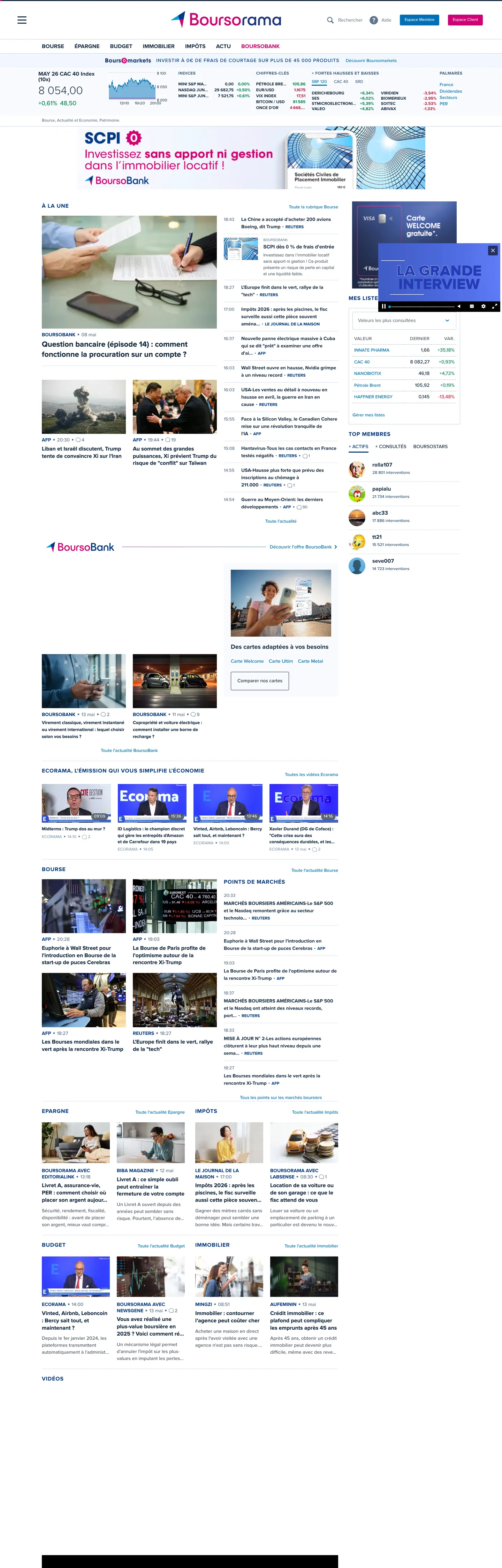
Boursorama’s homepage reads like a terminal: a black canvas (#000000) drenched in navy ink #1a2e45, with a single flash of brand blue #009de0 that punctuates navigation and primary actions. The layout shuns decorative illustrations, instead letting dense tables, ticker‑style headlines, and crisp typographic hierarchy speak for the brand. This stark, data‑first visual language makes the site instantly recognizable to traders and investors who expect information over ornament.
The palette follows a single‑accent philosophy: the deep navy provides legibility, the black canvas reinforces focus, and the brand blue offers the only chromatic cue. Where peers like Bloomberg splash gradients of teal and orange, or where Yahoo Finance leans on a bright orange spectrum, Boursorama isolates its color to a single brand hue, reinforcing a sense of seriousness and trust. The hairline #d8e1ee border adds a subtle layer cue without breaking the monochrome mood, and muted greys such as #869db8 give depth to secondary text.
For a designer feeding this spec into an AI‑assisted tool, the payoff is a UI that feels like a professional trading desk rather than a generic SaaS dashboard. The most reusable idea is the hairline‑as‑elevation pattern: a barely‑visible border that signals interactivity and hierarchy without adding bulk. Replicating this approach yields interfaces that stay dense yet readable, perfect for data‑heavy applications where every pixel must earn its place.
What makes it distinct
5
- Primary blue #009de0anchors call‑to‑action buttons, navigation highlights, and key icons, providing a single splash of brand energy across the UI.
- Ink navy #1a2e45dominates body copy and headings, establishing a dense information hierarchy suited to financial content.
- Hairline border #d8e1eeapplied to input fields and card outlines, it creates a lightweight elevation effect without adding visual weight.
- Muted text #869db8reserved for secondary labels, captions, and disabled states, offering contrast while preserving the dark aesthetic.
- Surface‑1 #f0f6ffused sparingly for modal backgrounds, it introduces a brief visual relief from the dominant black canvas.
boursorama.com
Live at boursorama.com
A snapshot of the brand in production. Scroll the frame to see the whole page.
Colors
19 colors
Boursorama's system runs on #009de0 as its primary voltage, used in 2 of 18 components. Type is set in ProximaNova across 12 tokens from 12px to 16px, weights 500–700. Shape language is sharp — components average 0px corner radius, favoring crisp rectangles.
Brand & Accent
Sparing, CTA-only voltage · 1
Surface
Page and card backgrounds · 2
Text
Headlines, body, captions · 13
Borders & Hairlines
Dividers, outlines, rules · 3
Typography
12 type tokens
Set in ProximaNova across 12 tokens, from 12px to 16px, weights 500–700. Shown in its own stack: where the font isn't installed, the fallback the file names stands in.
- body-1212px · weight 500 · lh 15pxThe quick brown fox jumps over the lazy dog
- body-1414px · weight 500 · lh 17.5pxThe quick brown fox jumps over the lazy dog
- body-1313px · weight 500 · lh 16.25pxThe quick brown fox jumps over the lazy dog
- heading-14-bold14px · weight 700 · lh 17.5pxThe quick brown fox jumps over the lazy dog
- heading-16-bold16px · weight 700 · lh 20.8pxThe quick brown fox jumps over the lazy dog
- heading-12-bold12px · weight 700 · lh 15pxThe quick brown fox jumps over the lazy dog
- heading-16-bold-compact16px · weight 700 · lh 16px · tracking 0.8pxThe quick brown fox jumps over the lazy dog
- body-12-2012px · weight 500 · lh 20pxThe quick brown fox jumps over the lazy dog
- body-12-60012px · weight 600 · lh 15pxThe quick brown fox jumps over the lazy dog
- body-13-500-2313px · weight 500 · lh 23.4pxThe quick brown fox jumps over the lazy dog
- body-12-0.312px · weight 500 · lh 15px · tracking 0.3pxThe quick brown fox jumps over the lazy dog
- heading-16-700-2016px · weight 700 · lh 20pxThe quick brown fox jumps over the lazy dog
Layout
Radii and spacing
2 corner radii and 8 spacing values. Shape language: sharp.
Radii
- small3px
- medium10px
Spacing
- spacing-xxs8px
- spacing-xs10px
- spacing-sm20px
- spacing-md20px
- spacing-lg10px
- spacing-xl8px
- spacing-xxl20px
- spacing-38px
Components
18 components
Each rendered from its tokens (color, type, radius, padding) on Boursorama's own canvas.
- Primary Buttonprimary-buttonPrimary Button
- Secondary Buttonsecondary-buttonSecondary Button
- Hero Headinghero-headingHero Heading
- Section Titlesection-titleSection Title
- Body Textbody-textBody Text
- Nav Linknav-linkNav Link
- Input Fieldinput-fieldInput Field
- CardcardCard
- ModalmodalModal
- BadgebadgeBadge
- TooltiptooltipTooltip
- Table Headertable-headerTable Header
- Table Rowtable-rowTable Row
- DropdowndropdownDropdown
- PaginationpaginationPagination
- Alert Successalert-successAlert Success
- Alert Erroralert-errorAlert Error
- Footer Linkfooter-linkFooter Link
In use
The system, in use
Boursorama's tokens on the kind of product it builds.
Build something people actually use.
A short paragraph of marketing copy that previews how the brand's display tier and body tier read together. Two sentences is usually enough.
FAQ
Boursorama design system FAQ
Common questions about Boursorama's tokens, components, and how to use this DESIGN.md in your project.
Read next
Related reading
Specs, directories, and component libraries that pair with this design system.
- Browse all design systemsThe full directory of DESIGN.md files on shadcn.io, with live mockups for each.shadcn.io
- Boursorama — official siteBoursorama's public marketing site — the source of truth for the live tokens captured in this file.boursorama.com (opens in a new tab)
- The DESIGN.md specificationGoogle Labs' open spec for machine-readable design system files — the format this page is built on.github.com (opens in a new tab)
Use it
Use Boursorama in your project
One machine-readable file. Drop it into Claude, Cursor, or any AI tool that reads DESIGN.md.
Download the DESIGN.md
One machine-readable file: every color, type, radius, spacing, and component token of Boursorama.
Feed it to your AI tool
Drop it into Claude, Cursor, or GitHub Copilot. The agent writes React components and Tailwind classes that match Boursorama's visual language.
Reference the tokens directly
Or paste the values into your Tailwind config, CSS variables, or component library: every color, size and radius is a quoted, ready-to-copy value.
Read the full DESIGN.md: overview, rationale, do’s and don’ts
Overview
Boursorama’s visual language is built around a single, high‑contrast premise: dark canvas, bright ink, and a flash of brand blue. Hairline-as-elevation.
Unlike many fintech sites that layer multiple accent colors, Boursorama confines chromatic interest to a thin #d8e1ee border that signals depth without breaking the monochrome mood. The black background (#000000) forces every piece of data to stand out, while the navy ink (#1a2e45) provides a dense typographic field that reads like a professional terminal. The brand blue #009de0 appears only on primary actions, making those moments unmistakable.
Key Characteristics:
- Black canvas (#000000) as the default surface, creating a terminal‑like environment.
- Navy ink (#1a2e45) dominates body copy, headings, and navigation text.
- Single accent blue (#009de0) reserved for primary buttons and active navigation items.
- Hairline #d8e1ee border used on inputs, cards, and modals as a subtle elevation cue.
- Muted text #869db8 for secondary labels, captions, and disabled states.
- Surface‑1 #f0f6ff applied sparingly for modal backgrounds, offering brief visual relief.
- Proxima Nova across all typographic scales, ranging from 12 px body to 16 px bold headings.
- Spacing system limited to 8 px, 10 px, and 20 px tokens, ensuring tight, predictable layout.
- Rounded tokens include a 50 % circle for avatars and small 3 px radius for UI elements.
- Component library of 16 React primitives, each referencing the token set for color, typography, radius, and spacing.
The result is a UI that feels like a data‑centric workstation, where every pixel is justified by information density rather than decorative flourish.
Known Gaps
- The token set lacks a dedicated success color; designers must repurpose existing surface or muted tones, which can blur semantic meaning in feedback messages.
- No explicit shadow tokens are defined, so any depth beyond the hairline border must be handcrafted, potentially breaking visual consistency across components.
- The spacing palette is confined to three pure values, limiting nuanced layout adjustments for complex grid systems or responsive breakpoints.
- Rounded tokens do not include an intermediate radius (e.g., 5px), forcing designers to choose between a sharp 0px or a relatively large 10px curve, which may feel jarring in mixed‑type UI elements.
- Typography does not provide a dedicated small‑caps or caption style, leaving developers to approximate these with existing body tokens, which can affect hierarchy clarity.
Design & Creative Tools
More systems like this
More DESIGN.md files in Design & Creative Tools.
Pricing
Build it with Pro
The DESIGN.md files are free. Pro adds 6,000+ blocks, premium templates and the MCP server, so your AI editor builds in your system for you.
4.9/5 out of 5 · 150+ reviewsfrom 150+ founders and developers.
Billing
Billed once a year in USD. Cancel anytime.
- How many people can use the license.
- Client work, SaaS products and anything you charge for.
- Production-ready React sections: hero, pricing, features, dashboards and more.
- Complete multi-page sites you can ship as they are.
- React icons from every major library, installable with one command.
- Presets that restyle every block, in light and dark.
- Lets your AI editor search, preview and install blocks for you.
- Priority requests are answered first.
Individual
For personal projects & open source
$32instead of $49/mo
$389 billed yearly
- Seats: 1 seat
- Commercial use: Personal & open source only
- Pro blocks: 6,000+ blocks
- Templates: All 14 templates
- React icons: 294k+ icons
- Themes: All 59 themes
- MCP server: Basic usage
- Support: Standard
Team
Most popularFor freelancers, agencies & startups
$66instead of $99/mo
$789 billed yearly · ≈ $13/dev/mo
- Seats: Up to 5 seats
- Commercial use: Included
- Pro blocks: 6,000+ blocks
- Templates: All 14 templates
- React icons: 294k+ icons
- Themes: All 59 themes
- MCP server: High usage
- Support: Priority
Organization
For companies with larger teams
$132instead of $199/mo
$1,589 billed yearly
- Seats: Unlimited seats
- Commercial use: Included
- Pro blocks: 6,000+ blocks
- Templates: All 14 templates
- React icons: 294k+ icons
- Themes: All 59 themes
- MCP server: Unlimited usage
- Support: Priority
Billed once a year in USD. Cancel anytime.
Individual
For personal projects & open source
$32instead of $49/mo
$389 billed yearly
- How many people can use the license.Seats: 1 seat
- Client work, SaaS products and anything you charge for.Commercial use: Personal & open source only
- Production-ready React sections: hero, pricing, features, dashboards and more.Pro blocks: 6,000+ blocks
- Complete multi-page sites you can ship as they are.Templates: All 14 templates
- React icons from every major library, installable with one command.React icons: 294k+ icons
- Presets that restyle every block, in light and dark.Themes: All 59 themes
- Lets your AI editor search, preview and install blocks for you.MCP server: Basic usage
- Priority requests are answered first.Support: Standard
Team
Most popularFor freelancers, agencies & startups
$66instead of $99/mo
$789 billed yearly · ≈ $13/dev/mo
Everything in Individual, plus
- How many people can use the license.Seats: Up to 5 seats
- Client work, SaaS products and anything you charge for.Commercial use: Included
- Lets your AI editor search, preview and install blocks for you.MCP server: High usage
- Priority requests are answered first.Support: Priority
Organization
For companies with larger teams
$132instead of $199/mo
$1,589 billed yearly
Everything in Team, plus
- How many people can use the license.Seats: Unlimited seats
- Lets your AI editor search, preview and install blocks for you.MCP server: Unlimited usage
- Secure checkout via Stripe
- Code lives in your repo
- Keep what you've shipped if you cancel
- License terms
Your system, built for you
Every block, template and icon, installed by your AI agent in your design system. The DESIGN.md files stay free.