Figma Design System
Figma's design system as a DESIGN.md file. Black #000000, figmaSans variable, 20 colors, 23 components, 7 pastel blocks. For React and AI tools.
Add shadcn.io to your AI agent. · Pro It installs blocks, icons and templates in your design system from a prompt, with Pro.
Set up MCP- Primary
- #000000
- Typeface
- figmaSans
- Shape
- Soft
- Base radius
- 8px
- Colors
- 20
- Type tokens
- 12
- Components
- 23
- Spacing values
- 9
About
About Figma DESIGN.md
Curated by Dov Azencot · Updated May 12, 2026 · Source figma.com (opens in a new tab)
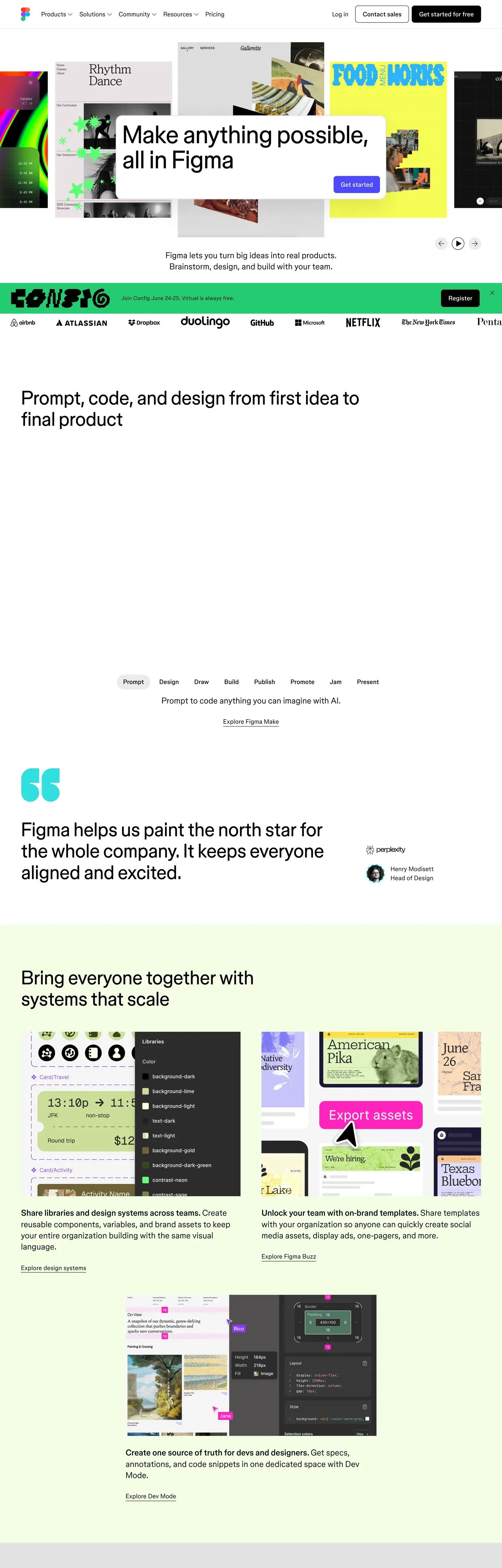
Figma's marketing site is the rare case where a design tool actually demonstrates its own design discipline. The frame is monochrome — black ink, white canvas, figmaSans variable type, pill-shaped CTAs — but every long-form page interrupts itself with oversized pastel panels that span the full content width. Lime for systems and FAQ, lilac for the /design route and FigJam highlights, cream for templates, mint and pink for FigJam pastel stories, coral for "ship products" on the home page, and a deep navy for the only inverse story block above the footer. The chrome stays editorial; the blocks do the storytelling. There is no gradient, no shadow stack, no second accent color outside a single magenta promo pill reserved for one CTA per page.
This page packages all of that into a single DESIGN.md file. Inside: 20 colors tokens grouped into brand, surface, text, and semantic roles; 13 type styles across figmaSans and figmaMono; 7 corner radius steps from 2px hairline to a 50px pill; 9 spacing tokens on an 8px base; and 23 components covering buttons, pricing tabs, color-block sections, navigation, comparison glyphs, and the dense footer link grid. The file follows Google Labs' DESIGN.md spec, so every token resolves to a concrete hex, px, or weight a build tool can read.
Feed the file to Claude, Cursor, or GitHub Copilot and the agent reproduces Figma's contrast — monochrome chrome interrupted by deliberate color-block sections — rather than a generic SaaS theme. Reference the tokens directly to wire them into Tailwind config, CSS variables, or your own component library. The system is worth studying because it solves a problem most marketing sites get wrong: how to feel both technical and joyful without leaning on bling.
What makes it distinct
5
- Monochrome chromeevery CTA is black #000000 or white #ffffff; the system never reaches for a brand color outside the pastel blocks
- Seven oversized pastel surfaceslime, lilac, cream, mint, pink, coral, navy — span full content width with 24px corners and 48px padding
- Pill is the only button shape50px radius for text CTAs, 9999px for icon buttons, no square button anywhere
- figmaSans at unusual weight increments320, 330, 340, 480, 540, 700 — the type reads as one voice modulating, not a stepped family
- Display headlines pull -1.72px tracking at 86pxeditorial cadence without sacrificing body readability at 18px
figma.com
Live at figma.com
A snapshot of the brand in production. Scroll the frame to see the whole page.
Colors
20 colors
Figma's system runs on #000000 as its primary voltage, used in 3 of 23 components. Type is set in figmaSans across 12 tokens from 12px to 86px, weights 320–700. Shape language is soft — components average 23px corner radius, with no sharp interactive edges.
Brand & Accent
Sparing, CTA-only voltage · 2
Surface
Page and card backgrounds · 2
Text
Headlines, body, captions · 5
Borders & Hairlines
Dividers, outlines, rules · 2
Semantic
Status, errors, success, links · 1
Other
Specialty colors · 8
Typography
12 type tokens
Set in figmaSans across 12 tokens, from 12px to 86px, weights 320–700. Shown in its own stack: where the font isn't installed, the fallback the file names stands in.
- display-xl86px · weight 340 · lh 1 · tracking -1.72pxThe quick brown fox jumps over the lazy dog
- display-lg64px · weight 340 · lh 1.1 · tracking -0.96pxThe quick brown fox jumps over the lazy dog
- headline26px · weight 540 · lh 1.35 · tracking -0.26pxThe quick brown fox jumps over the lazy dog
- subhead26px · weight 340 · lh 1.35 · tracking -0.26pxThe quick brown fox jumps over the lazy dog
- card-title24px · weight 700 · lh 1.45The quick brown fox jumps over the lazy dog
- body-lg20px · weight 330 · lh 1.4 · tracking -0.14pxThe quick brown fox jumps over the lazy dog
- body18px · weight 320 · lh 1.45 · tracking -0.26pxThe quick brown fox jumps over the lazy dog
- body-sm16px · weight 330 · lh 1.45 · tracking -0.14pxThe quick brown fox jumps over the lazy dog
- link20px · weight 480 · lh 1.4 · tracking -0.10pxThe quick brown fox jumps over the lazy dog
- button20px · weight 480 · lh 1.4 · tracking -0.10pxThe quick brown fox jumps over the lazy dog
- eyebrow18px · weight 400 · lh 1.3 · tracking 0.54pxThe quick brown fox jumps over the lazy dog
- caption12px · weight 400 · lh 1 · tracking 0.60pxThe quick brown fox jumps over the lazy dog
Layout
Radii and spacing
7 corner radii and 9 spacing values. Shape language: soft.
Radii
- xs2px
- sm6px
- md8px
- lg24px
- xl32px
- pill50px
- full9999px
Spacing
- hair1px
- xxs4px
- xs8px
- sm12px
- md16px
- lg24px
- xl32px
- xxl48px
- section96px
Components
23 components
Each rendered from its tokens (color, type, radius, padding) on Figma's own canvas.
- Button Primarybutton-primaryButton Primary
- Button Primary Pressedbutton-primary-pressedButton Primary Pressed
- Button Secondarybutton-secondaryButton Secondary
- Button Tertiary Textbutton-tertiary-textButton Tertiary Text
- button-icon-circularButton Icon Circular
- button-icon-circular-inverseButton Icon Circular Inverse
- Button Magenta Promobutton-magenta-promoButton Magenta Promo
- Pricing Tab Defaultpricing-tab-defaultPricing Tab Default
- Pricing Tab Selectedpricing-tab-selectedPricing Tab Selected
- Type here…text-inputText Input
- Type here…text-input-focusedText Input Focused
- Pricing Cardpricing-cardPricing Card
- Pricing Card Feature Rowpricing-card-feature-rowPricing Card Feature Row
- Color Block Sectioncolor-block-sectionColor Block Section
- Color Block Section Lilaccolor-block-section-lilacColor Block Section Lilac
- Color Block Section Navycolor-block-section-navyColor Block Section Navy
- Promo Banner Lilacpromo-banner-lilacPromo Banner Lilac
- Template Cardtemplate-cardTemplate Card
- Feature Illustration Tilefeature-illustration-tileFeature Illustration Tile
- Top Navtop-navTop Nav
- Marquee Stripmarquee-stripMarquee Strip
- Comparison Checkmarkcomparison-checkmarkComparison Checkmark
- FooterfooterFooter
In use
The system, in use
Figma's tokens on the kind of product it builds.
Build something people actually use.
A short paragraph of marketing copy that previews how the brand's display tier and body tier read together. Two sentences is usually enough.
FAQ
Figma design system FAQ
Common questions about Figma's tokens, components, and how to use this DESIGN.md in your project.
Read next
Related reading
Specs, directories, and component libraries that pair with this design system.
- Browse all design systemsThe full directory of DESIGN.md files on shadcn.io, with live mockups for each.shadcn.io
- Figma Design product pageThe live /design/ route Figma uses to market the editor — the lilac hero is the canonical color-block reference.figma.com (opens in a new tab)
- The DESIGN.md specificationGoogle Labs' open spec for machine-readable design system files — the format this page is built on.github.com (opens in a new tab)
Use it
Use Figma in your project
One machine-readable file. Drop it into Claude, Cursor, or any AI tool that reads DESIGN.md.
Download the DESIGN.md
One machine-readable file: every color, type, radius, spacing, and component token of Figma.
Feed it to your AI tool
Drop it into Claude, Cursor, or GitHub Copilot. The agent writes React components and Tailwind classes that match Figma's visual language.
Reference the tokens directly
Or paste the values into your Tailwind config, CSS variables, or component library: every color, size and radius is a quoted, ready-to-copy value.
Read the full DESIGN.md: overview, rationale, do’s and don’ts
Overview
Figma's marketing canvas is, at the system level, an editor-clean black-and-white frame. The chrome — top nav, body type, footer, primary CTA — is monochrome. Headlines are oversized {typography.display-xl} set in figmaSans with aggressive negative tracking, body copy hovers around weight 320–340 of the same variable family, and small mono {typography.eyebrow} and {typography.caption} labels (figmaMono, all-caps, positive tracking) act as section markers. Every CTA is a pill — {rounded.pill} — and the primary action across the entire site is the same black {components.button-primary} paired with the same white {components.button-secondary}.
What makes the design unique is what happens between those monochrome bookends: the page repeatedly drops into oversized pastel color-block sections — lime, lavender, cream, mint, pink, coral, and a deep navy — that span the full content width with {rounded.lg} corners and {spacing.xxl} interior padding. These blocks are where the storytelling lives. They aren't accents tucked into a card; they take over a whole viewport's worth of vertical space, like a designer arranging giant sticky notes on a clean wall. FigJam is the most pastel-saturated, the home page rotates through the full set, and the pricing page ends with a lime FAQ panel — same vocabulary, different rhythm per route.
This is a system built on contrast: the monochrome chrome makes the color blocks feel intentional rather than decorative, and the color blocks make the monochrome chrome feel like editorial paper rather than enterprise SaaS. Density is generous, line-heights are tight on display sizes, and the interface never reaches for shadows or gradients to do the work that color blocks and confident typography already do.
Key Characteristics:
- Monochrome system core:
{colors.primary}(black) and{colors.canvas}(white) carry every CTA, every body line, every footer link. - Oversized pastel color-block sections (
{colors.block-lime},{colors.block-lilac},{colors.block-cream},{colors.block-mint},{colors.block-pink},{colors.block-coral},{colors.block-navy}) define the narrative rhythm of every long-form page. - Pill is the only button shape —
{rounded.pill}for text CTAs,{rounded.full}for icon buttons. No square buttons anywhere. figmaSansvariable typeface used at unusually fine weight increments (320, 330, 340, 450, 480, 540) — the type system reads as a single voice that flexes rather than a multi-weight family.- Tight negative letter-spacing on display sizes (-1.72px at 86px, -0.96px at 64px) creates a confident editorial cadence.
figmaMonoreserved for category labels, eyebrows, and captions — always uppercase, positive tracking — to flag taxonomy without competing with display type.- Color-block page rhythm (home): white hero → marquee strip → white feature → lime systems block → navy ship-products block → coral developer block → white template grid → white footer.
Known Gaps
- The exact pastel hex values of
{colors.block-*}are derived from screenshot pixels; the production source likely uses named tokens that aren't exposed via CSS variables. Treat the documented hex values as faithful approximations rather than exact brand specs. - Dark mode is not documented because the marketing site does not ship a dark theme — the closest analog is the navy color-block (
color-block-section-navy) and the inverse-canvas footer. - Form-field error and validation styling is not visible on
/contact/because no error states render in the static screenshot. Inputs have hairline borders and rounded{rounded.md}corners; error treatment is not documented. - The animated marquee-strip and color-block reveal animations are not documented (per the no-interaction policy).
Design & Creative Tools
More systems like this
More DESIGN.md files in Design & Creative Tools.
Pricing
Build it with Pro
The DESIGN.md files are free. Pro adds 6,000+ blocks, premium templates and the MCP server, so your AI editor builds in your system for you.
4.9/5 out of 5 · 150+ reviewsfrom 150+ founders and developers.
Billing
Billed once a year in USD. Cancel anytime.
- How many people can use the license.
- Client work, SaaS products and anything you charge for.
- Production-ready React sections: hero, pricing, features, dashboards and more.
- Complete multi-page sites you can ship as they are.
- React icons from every major library, installable with one command.
- Presets that restyle every block, in light and dark.
- Lets your AI editor search, preview and install blocks for you.
- Priority requests are answered first.
Individual
For personal projects & open source
$32instead of $49/mo
$389 billed yearly
- Seats: 1 seat
- Commercial use: Personal & open source only
- Pro blocks: 6,000+ blocks
- Templates: All 14 templates
- React icons: 294k+ icons
- Themes: All 59 themes
- MCP server: Basic usage
- Support: Standard
Team
Most popularFor freelancers, agencies & startups
$66instead of $99/mo
$789 billed yearly · ≈ $13/dev/mo
- Seats: Up to 5 seats
- Commercial use: Included
- Pro blocks: 6,000+ blocks
- Templates: All 14 templates
- React icons: 294k+ icons
- Themes: All 59 themes
- MCP server: High usage
- Support: Priority
Organization
For companies with larger teams
$132instead of $199/mo
$1,589 billed yearly
- Seats: Unlimited seats
- Commercial use: Included
- Pro blocks: 6,000+ blocks
- Templates: All 14 templates
- React icons: 294k+ icons
- Themes: All 59 themes
- MCP server: Unlimited usage
- Support: Priority
Billed once a year in USD. Cancel anytime.
Individual
For personal projects & open source
$32instead of $49/mo
$389 billed yearly
- How many people can use the license.Seats: 1 seat
- Client work, SaaS products and anything you charge for.Commercial use: Personal & open source only
- Production-ready React sections: hero, pricing, features, dashboards and more.Pro blocks: 6,000+ blocks
- Complete multi-page sites you can ship as they are.Templates: All 14 templates
- React icons from every major library, installable with one command.React icons: 294k+ icons
- Presets that restyle every block, in light and dark.Themes: All 59 themes
- Lets your AI editor search, preview and install blocks for you.MCP server: Basic usage
- Priority requests are answered first.Support: Standard
Team
Most popularFor freelancers, agencies & startups
$66instead of $99/mo
$789 billed yearly · ≈ $13/dev/mo
Everything in Individual, plus
- How many people can use the license.Seats: Up to 5 seats
- Client work, SaaS products and anything you charge for.Commercial use: Included
- Lets your AI editor search, preview and install blocks for you.MCP server: High usage
- Priority requests are answered first.Support: Priority
Organization
For companies with larger teams
$132instead of $199/mo
$1,589 billed yearly
Everything in Team, plus
- How many people can use the license.Seats: Unlimited seats
- Lets your AI editor search, preview and install blocks for you.MCP server: Unlimited usage
- Secure checkout via Stripe
- Code lives in your repo
- Keep what you've shipped if you cancel
- License terms
Your system, built for you
Every block, template and icon, installed by your AI agent in your design system. The DESIGN.md files stay free.