Canva Design System
Canva's design system as a DESIGN.md file. Gradient #00c4cc→#7d2ae8, Canva Sans variable, 19 colors, 20 components, 8px tiles. For React and AI tools.
Add shadcn.io to your AI agent. · Pro It installs blocks, icons and templates in your design system from a prompt, with Pro.
Set up MCP- Primary
- #00c4cc
- Typeface
- Canva Sans
- Shape
- Mixed
- Base radius
- 8px
- Colors
- 19
- Type tokens
- 11
- Components
- 20
- Spacing values
- 9
About
About Canva DESIGN.md
Curated by Dov Azencot · Updated May 13, 2026 · Source canva.com (opens in a new tab)
Canva's marketing canvas is the rare case where a visual-suite brand resists the urge to paint the whole page. The frame is light and quiet — a white #ffffff canvas, deep #0f1015 ink, and Canva Sans variable type set at weight 400 across most of the surface. What carries the brand is a single 135-degree linear gradient running from cyan #00c4cc to violet #7d2ae8, applied as the wordmark stripe, the primary CTA fill, and a final footer band that closes the page. Nothing else in the chrome reaches for color. The top nav is monochrome, body copy holds at an 85% alpha ink wash against white, and pill chips above the showcase tiles use a 15% alpha lilac wash, not the saturated purple it descends from.
This page packages the whole system into a single DESIGN.md file built on the Google Labs spec. Inside: 19 colors tokens grouped into brand gradient stops, pastel tile fills, ink scales and structural neutrals; 11 type styles spanning the 84px hero down to the 14px chip label, all on Canva Sans; 5 corner radii anchored by the 8px content rectangle that appears 144 times on the page; 9 spacing increments built around a 4px-12px chip rhythm and 32px tile gutter; and 20 components covering the gradient CTA, pill chips, pastel tiles, top nav, search input, video showcase frame, and footer voltage band. Every token resolves to a quoted hex, px, or weight that a build tool or AI agent can read directly.
Feed the file to Claude, Cursor, or GitHub Copilot and the agent reproduces Canva's specific contrast — quiet typographic chrome interrupted by a single gradient voltage and tinted pastel tiles — rather than a generic marketing-site theme. Reference the tokens directly to wire them into Tailwind config, CSS variables, or your own component library. The system is worth studying because it solves a problem visual-creation tools usually get wrong: how to feel friendly and playful without leaning on a rainbow palette. Where most design-tool sites stack five accent hues, Canva picks two and runs them as a single mark.
What makes it distinct
5
- Gradient as wordmarkthe 135deg #00c4cc-to-#7d2ae8 stripe is the only chromatic accent in the chrome, scoped to logo, primary CTA and footer band
- Hero at weight 400the 84px Canva Sans display headline runs regular, not bold, with -1.5px tracking; confidence by typographic restraint
- 8px is the canonical radius144 occurrences against 24 for the 16px tile and 8 for the 9999px pill, a single content-rectangle voice across the page
- Pastel tile vocabularypeach #ffdac4, blush #ffd6d8, lavender #f9defb and a 15% alpha lilac chip wash fill the product-showcase tiles instead of drop shadows
- Deep ink not blackbody copy and headings sit at #0f1015 (a warm near-black), reserving pure #000000 for hairline borders only
canva.com
Live at canva.com
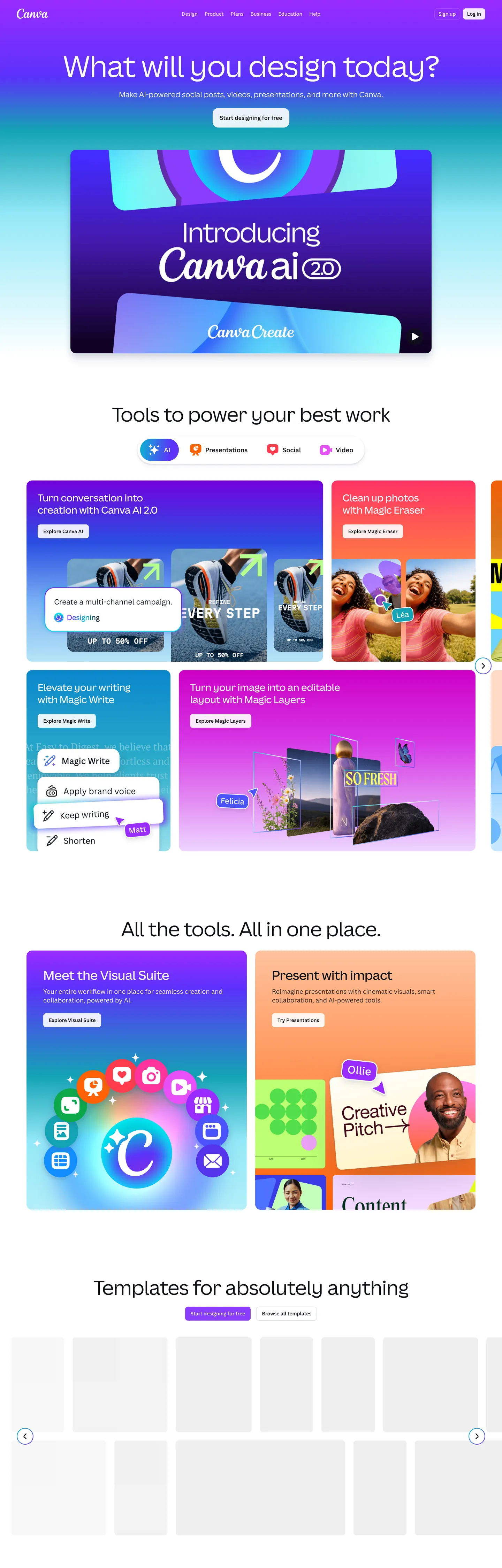
A snapshot of the brand in production. Scroll the frame to see the whole page.
Colors
19 colors
Canva's system runs on #00c4cc as its primary voltage, used in 2 of 20 components. Type is set in Canva Sans across 11 tokens from 14px to 84px, weights 400–600. Shape language is mixed across 20 components, blending pills, soft rounds, and squarer corners.
Brand & Accent
Sparing, CTA-only voltage · 4
Surface
Page and card backgrounds · 2
Text
Headlines, body, captions · 4
Borders & Hairlines
Dividers, outlines, rules · 2
Other
Specialty colors · 7
Typography
11 type tokens
Set in Canva Sans across 11 tokens, from 14px to 84px, weights 400–600. Shown in its own stack: where the font isn't installed, the fallback the file names stands in.
- display-hero84px · weight 400 · lh 1.06 · tracking -1.5pxThe quick brown fox jumps over the lazy dog
- display-lg64px · weight 400 · lh 1.25 · tracking -0.64pxThe quick brown fox jumps over the lazy dog
- display-md56px · weight 400 · lh 1.1 · tracking -0.56pxThe quick brown fox jumps over the lazy dog
- headline36px · weight 500 · lh 1.25 · tracking -0.36pxThe quick brown fox jumps over the lazy dog
- subhead28px · weight 500 · lh 1.25 · tracking -0.28pxThe quick brown fox jumps over the lazy dog
- card-title24px · weight 600 · lh 1.33 · tracking 0pxThe quick brown fox jumps over the lazy dog
- body-lg21px · weight 400 · lh 1.4 · tracking 0pxThe quick brown fox jumps over the lazy dog
- body16px · weight 400 · lh 1.5 · tracking 0pxThe quick brown fox jumps over the lazy dog
- body-emphasis16px · weight 600 · lh 1.5 · tracking 0pxThe quick brown fox jumps over the lazy dog
- chip-label14px · weight 600 · lh 1.57 · tracking 0pxThe quick brown fox jumps over the lazy dog
- caption14px · weight 400 · lh 1.57 · tracking 0pxThe quick brown fox jumps over the lazy dog
Layout
Radii and spacing
5 corner radii and 9 spacing values. Shape language: mixed.
Radii
- none0px
- sm8px
- lg16px
- hero-tile48px
- full9999px
Spacing
- xxs4px
- xs8px
- sm9px
- md12px
- base16px
- lg24px
- xl32px
- chip4px 12px
- tile-gutter16px 24px
Components
20 components
Each rendered from its tokens (color, type, radius, padding) on Canva's own canvas.
- Button Primarybutton-primaryButton Primary
- Button Primary Hoverbutton-primary-hoverButton Primary Hover
- Button Secondarybutton-secondaryButton Secondary
- Button Tertiary Textbutton-tertiary-textButton Tertiary Text
- Chip Pillchip-pillChip Pill
- Chip Pill Selectedchip-pill-selectedChip Pill Selected
- Top Navtop-navTop Nav
- Nav Linknav-linkNav Link
- Search Inputsearch-inputSearch Input
- Tile Peachtile-peachTile Peach
- Tile Blushtile-blushTile Blush
- Tile Lavendertile-lavenderTile Lavender
- Tile Minttile-mintTile Mint
- Hero Tile Videohero-tile-videoHero Tile Video
- Feature Cardfeature-cardFeature Card
- Template Thumbnailtemplate-thumbnailTemplate Thumbnail
- Footer Cta Bandfooter-cta-bandFooter Cta Band
- Footer Cta Buttonfooter-cta-buttonFooter Cta Button
- Footer Linkfooter-linkFooter Link
- DividerdividerDivider
In use
The system, in use
Canva's tokens on the kind of product it builds.
Build something people actually use.
A short paragraph of marketing copy that previews how the brand's display tier and body tier read together. Two sentences is usually enough.
FAQ
Canva design system FAQ
Common questions about Canva's tokens, components, and how to use this DESIGN.md in your project.
Read next
Related reading
Specs, directories, and component libraries that pair with this design system.
- Browse all design systemsThe full directory of DESIGN.md files on shadcn.io, with live mockups for each.shadcn.io
- Canva — official siteThe live homepage this spec was extracted from — see the gradient wordmark, pastel tile grid and Canva Sans hero in motion.canva.com (opens in a new tab)
- The DESIGN.md specificationGoogle Labs' open spec for machine-readable design system files — the format this page is built on.github.com (opens in a new tab)
Use it
Use Canva in your project
One machine-readable file. Drop it into Claude, Cursor, or any AI tool that reads DESIGN.md.
Download the DESIGN.md
One machine-readable file: every color, type, radius, spacing, and component token of Canva.
Feed it to your AI tool
Drop it into Claude, Cursor, or GitHub Copilot. The agent writes React components and Tailwind classes that match Canva's visual language.
Reference the tokens directly
Or paste the values into your Tailwind config, CSS variables, or component library: every color, size and radius is a quoted, ready-to-copy value.
Read the full DESIGN.md: overview, rationale, do’s and don’ts
Overview
Canva's homepage is, at the system level, a quiet white frame interrupted by exactly one piece of brand voltage. The chrome — top nav, hero hairline, body copy, footer link grid — sits on a pure white {colors.canvas} over deep {colors.ink} (#0f1015, a warm near-black, not pure black). Headlines are oversized {typography.display-hero} set in Canva Sans at weight 400 with -1.5px tracking; body copy holds at the same weight and family at 16px. Every CTA is an 8px rectangle — {rounded.sm} — and the primary action across the page is a single gradient-filled {components.button-primary} running from {colors.primary-gradient-start} to {colors.primary-gradient-end}.
Gradient-as-wordmark: where most consumer-software brands choose one flat accent and apply it to every primary surface, Canva picks a 135-degree linear gradient from cyan #00c4cc to violet #7d2ae8 and scopes it to three places only — the wordmark stripe in the nav, the primary 'Start designing' CTA, and the closing voltage band above the footer. The page above the footer never repeats it. This is not a fintech site that paints every CTA in brand voltage; it is a creation tool that treats its mark like an artist's signature — used once per section, never as wallpaper.
What separates Canva from other visual-suite marketing pages is what fills the rectangles in between: the product showcase grid is built from oversized pastel tiles — peach {colors.tile-peach}, blush {colors.tile-blush}, lavender {colors.tile-lavender}, mint {colors.tile-mint}, cream and coral — each {rounded.sm} with 32px 32px 0px interior padding and a flat illustration on top. These tiles are the page's primary depth device, replacing the drop shadow that most marketing sites would reach for. The pill chips above each tile use a lilac wash {colors.accent-violet-wash} — a 15% alpha violet, not the saturated {colors.accent-violet} it descends from — so the eye reads the chip as related to the tile without competing with it.
Key Characteristics:
- Single brand voltage: the 135-degree gradient from
{colors.primary-gradient-start}to{colors.primary-gradient-end}carries the wordmark, the primary CTA, and the footer band — three placements, never more. - Deep
{colors.ink}at#0f1015carries body copy and headlines; pure{colors.hairline}(#000000) is reserved for hairline borders only — the brand never sets type in pure black. - Canva Sans variable type at weight 400 across display sizes — the 84px hero, the 64px section headline, the 56px sub-display all hold at regular weight, not bold.
- 8px is the canonical content radius (
{rounded.sm}) — 144 occurrences in the extracted CSS against 24 for the 16px hero tile and 8 for the 9999px chip. - Pastel tile vocabulary: six fills — peach, blush, lavender, cream, mint, coral — that never combine and never gradient.
- Lilac wash chips (15% alpha violet derived from
{colors.accent-violet-soft}) live above showcase tiles; the saturated parent{colors.accent-violet}is reserved for video-tile fills. - Page rhythm: white nav → blue/violet hero with Canva.ai callout → white feature band → pastel tile grid (four tiles per row) → 'All the tools, all in one place' split → template gallery → gradient footer band → white footer link grid.
Colors
The palette is small and intentional. The gradient is one mark, the ink is one mark, the tiles are six pastel fills, and the structural neutrals are three.
- Cyan voltage start (
#00c4cc) — frequency 5, all gradient. The cool half of the brand mark — never appears as a flat fill anywhere on the page. - Violet voltage end (
#7d2ae8) — frequency 5, all gradient. The warm half of the same 135deg stripe; pairs with the cyan only, never with another accent. - Saturated violet (
#8b3dff) — frequency 11. Used as text (5) and border (5). Reserved for the hero video tile fill and Canva.ai callout, not for chrome CTAs. - Lilac wash (
{colors.accent-violet-soft}at 15% alpha) — frequency 8, all on chip pills above showcase tiles. A wash rendition of the parent violet#a370fc, never used at full saturation. - Deep ink (
#0f1015) — frequency 611. Used as text (285), background (44), border (282). The page's primary content color; carries every headline and body line. Not pure black — a warm near-black withoklch.l = 0.17and a faint violet hue. - Hairline black (
#000000) — frequency 1490. Used as text (745) and border (745). Reserved for 1px borders and rare separators; never applied to body copy or headings, which take the warmer{colors.ink}instead. - Canvas white (
#ffffff) — frequency 145. Used as text (52), background (27), border (52), gradient (13). The page surface and the inverse text on the gradient footer band. - Tile peach (
#ffdac4) — frequency 4, all gradient stops. Fills product-showcase tiles with peach illustrations on top. - Tile blush (
#ffd6d8) — frequency 4, all gradient. The pink tile fill in the showcase grid. - Tile lavender (
#f9defb) — frequency 5, all gradient. The pale-lilac tile, distinct from the saturated violet of the hero video tile. - Tile cream (
#ffe9ac) — frequency 2, gradient. Used sparingly in the template gallery row, never adjacent to peach. - Tile mint-tint (
#93e8f6) — frequency 3, gradient. The cyan-leaning tile, intentionally close to but cooler than the gradient start hex. - Shadow navy (
#182c59) — frequency 4, all shadow. The brand-tinted shadow color used on lifted feature cards, echoing the violet end of the gradient at 23% opacity in the production stack. - Ink-soft (
#404f6d) — frequency 2, shadow. The footer-link text color and the hairline shadow stop — a desaturated slate, never used for primary headings. - Surface tint (
#f3f4f7) — structural, template-thumbnail background. The page's only non-white surface in the chrome.
Typography
Canva runs a single variable typeface — Canva Sans — with Noto Sans Variable as the production fallback for languages outside the Canva Sans glyph range. The variable axis is exercised across only three weights in the chrome: 400 (regular), 500 (medium), and 600 (semibold). There is no bold. The hero display at 84px holds at 400. The 64px section headline holds at 400. Even the 56px sub-display holds at 400. Weight 500 enters only at 28-36px subhead size; weight 600 is reserved for navigation, chips and the 'AI' eyebrow that sits above showcase tiles.
Light weight as signature: where most consumer creation tools command attention with 700+ display weights, Canva holds display at 400 — confidence by typographic restraint. The negative letter-spacing carries the rhythm instead: -1.5px on the 84px hero (-1.8%), -0.64px on the 64px section opener (-1.0%), -0.36px on the 36px headline. Body copy at 16px takes no tracking adjustment at all — Canva Sans's metrics are already comfortable at body sizes.
If Canva Sans is not available, Inter or Geist are the closest open-source substitutes. Both share Canva Sans's humanist construction, both ship a wide variable weight axis, and both work at the quiet 400-weight display sizes Canva uses. Pull display tracking to roughly -1.8% and leave body tracking at 0 to match the signature.
Layout
The page is built on a 1376px content width (the captured hero heading's measured width) inside a 1440px viewport. The chip-pill row above each tile uses {spacing.chip} (4px 12px) interior padding — the dominant spacing value on the page at 56 occurrences. Tile gutters run at {spacing.tile-gutter} (16px 24px), and tile interior padding is the asymmetric 32px 32px 0px that lets each tile's flat illustration sit flush at the bottom edge. Section gutters above tile rows use 0px 16px (27 occurrences) — the page hugs the viewport edges with only a 16px safe area.
The showcase grid is four tiles per row at desktop width, dropping to two at tablet and one at mobile (inferred from the breakpoints visible in the extracted CSS variables). Tile heights are not fixed — each tile sizes to its illustration plus a card-title headline and a chip-pill row above.
Elevation & Depth
There are no drop shadows on the content tiles. Depth is carried by pastel-as-elevation: a tile is "above" the canvas because its peach or lavender fill differs from white, not because it casts a shadow. The exception is the small feature-card cluster, which takes a single brand-tinted shadow — a 14% alpha slate stop layered over a 6% alpha hairline ring — that echoes the navy {colors.shadow-navy} at low opacity. This is the only place on the page where the shadow color is chromatic rather than gray, and it scopes the lift to feature cards inside the white feature band, never the pastel tiles themselves.
The voltage band above the footer is the page's only inverse surface — linear-gradient(135deg, #00c4cc, #7d2ae8) covering the full content width with white display type set at 64px weight 400. The band ends, and the footer link grid returns to white canvas.
Shapes
The corner radius vocabulary is small. {rounded.sm} (8px) carries 144 occurrences across tiles, the search input, the primary CTA, the secondary button, and template thumbnails. {rounded.lg} (16px) takes 24 occurrences and is reserved for the hero video tile, the Canva.ai callout, and a small set of marketing feature panels — a deliberate escalation that signals "this rectangle is more important than a content tile." {rounded.full} (9999px) takes 8 occurrences, all of them chip pills above showcase tiles or inside the AI eyebrow row. There is no 4px or 12px content radius in the chrome.
The visual rule: chips are pills, content rectangles are 8px, hero rectangles are 16px. The 48px radius ({rounded.hero-tile}) appears exactly once — on a single marketing badge — and is treated as a deliberate outlier rather than a tier.
Components
The system covers 21 components — every one of them visible in the captured screenshot, none invented.
button-primary— the gradient-filled 'Start designing' CTA. 40px tall, 8px corners, gradient runs#00c4ccto#7d2ae8at 135deg. The only place a button uses the brand gradient as a fill.button-primary-hover— the violet end stop deepens on press, simulating the hover state from the gradient end hex.button-secondary— white fill, 1px slate hairline ({colors.hairline-soft}), deep ink text. The 'Log in' chrome button in the top nav.button-tertiary-text— borderless white-on-white text action used for footer affordances.chip-pill— lilac-wash background at 15% alpha over{colors.accent-violet-soft}, saturated violet text, 9999px pill. The 'AI', 'Photo editor', 'Video' eyebrow chips above each showcase tile.chip-pill-selected— the saturated violet fill takes over when the chip is active.top-nav— 72px tall, white canvas, 16px horizontal padding, no border. The wordmark on the left is the gradient stripe; the right side is monochrome links plus the gradient CTA.nav-link— 40px tall, 4px-12px padding, deep ink text. No underline.search-input— 48px tall, 8px corners, slate hairline border. Appears once on the page in the template gallery section.tile-peach,tile-blush,tile-lavender,tile-mint— the four canonical pastel showcase tiles. All take32px 32px 0pxinterior padding so the flat illustration bleeds to the bottom edge.hero-tile-video— a saturated{colors.accent-violet}fill with 16px corners, used for the 'Canva.ai' callout tile that sits inside the blue/violet hero band.feature-card— white fill with 1px hairline and the brand-tinted navy shadow stack, used inside the 'Meet the Visual Suite' split.template-thumbnail—{colors.surface-tint}background with no border; the template gallery uses this as its rectangle base.footer-cta-band— the page's only inverse surface; gradient fill with white 64px display type at weight 400.footer-cta-button— a white pill CTA dropped inside the gradient band, inverting the chrome convention.footer-link—{colors.ink-soft}slate text on white canvas, no underline; the link grid sits below the voltage band.divider— a1pxhairline at{colors.hairline-soft}separating template-gallery rows.
Do's and Don'ts
Do
- Reach for
{colors.ink}(#0f1015) for headlines and body copy. Save pure#000000for hairline borders. - Reuse the cyan-to-violet gradient as the wordmark, primary CTA, and one closing band per page — three placements, never more.
- Pair pastel tile fills with their lilac-wash chip (
{colors.accent-violet-wash}at 15% alpha), not with their saturated parent. - Set display headlines at weight 400 in Canva Sans with -1.8% letter-spacing. The quiet weight is the brand voice.
- Use the 8px content radius for tiles, buttons, inputs, and thumbnails. Escalate to 16px only for hero tiles and product callouts.
Don't
- Don't use
{colors.accent-violet}(#8b3dff) as a chip background — it's reserved for video-tile and hero-callout fills (5 text, 5 border occurrences, none on chips). Use the 15% wash{colors.accent-violet-wash}for chip backgrounds instead. - Don't paint a section background with the brand gradient. The gradient appears in exactly three places on the page — wordmark, primary CTA, footer band — and a fourth placement reads as a different brand.
- Don't bold the hero. Canva Sans at 84px weight 400 is the signature; pulling the same headline to 700 reads as enterprise SaaS, not a creation tool.
- Don't combine two pastel tile fills in one panel. The showcase grid alternates pastels across adjacent tiles; mixing peach and blush inside a single tile breaks the silhouette.
- Don't reach for shadows on the showcase tiles. Pastel-as-elevation is the depth device — adding
0 4px 16px rgba(0,0,0,0.08)to a peach tile destroys the flat-paper rhythm. - Don't apply the 48px
hero-tileradius to standard cards. It appears once in the captured CSS (a single marketing badge) and is treated as an outlier, not a tier.
Known Gaps
- The exact gradient angle (135deg) is read from
--U8pJuw: linear-gradient(135deg,#00c4cc,#7d2ae8)in the production CSS, but the homepage also defines--9v5PLg: linear-gradient(90deg,#00c4cc,#7d2ae8)for a horizontal variant used in the inline wordmark — both are documented under the same gradient stops. - The primary CTA in the captured DOM returns
nullfrom the deterministic extractor because Canva renders the button as a styled anchor with nested gradient spans; the button-primary token values are derived from the gradient CSS variables and the surrounding chip-pill metrics rather than from a singlegetComputedStylecall. - Form-field validation and error styling is not visible on the homepage because no error states render in the static screenshot. The single
search-inputdocumented here uses chrome resting metrics only. - The Canva editor itself ships a dark workspace theme, but that surface lives behind authentication and isn't represented in this DESIGN.md, which captures only the public marketing homepage.
- The pastel tile illustrations themselves (the flat character art on peach, blush and lavender tiles) are not tokenized — they are product assets rather than design-system components.
Design & Creative Tools
More systems like this
More DESIGN.md files in Design & Creative Tools.
Pricing
Build it with Pro
The DESIGN.md files are free. Pro adds 6,000+ blocks, premium templates and the MCP server, so your AI editor builds in your system for you.
4.9/5 out of 5 · 150+ reviewsfrom 150+ founders and developers.
Billing
Billed once a year in USD. Cancel anytime.
- How many people can use the license.
- Client work, SaaS products and anything you charge for.
- Production-ready React sections: hero, pricing, features, dashboards and more.
- Complete multi-page sites you can ship as they are.
- React icons from every major library, installable with one command.
- Presets that restyle every block, in light and dark.
- Lets your AI editor search, preview and install blocks for you.
- Priority requests are answered first.
Individual
For personal projects & open source
$32instead of $49/mo
$389 billed yearly
- Seats: 1 seat
- Commercial use: Personal & open source only
- Pro blocks: 6,000+ blocks
- Templates: All 14 templates
- React icons: 294k+ icons
- Themes: All 59 themes
- MCP server: Basic usage
- Support: Standard
Team
Most popularFor freelancers, agencies & startups
$66instead of $99/mo
$789 billed yearly · ≈ $13/dev/mo
- Seats: Up to 5 seats
- Commercial use: Included
- Pro blocks: 6,000+ blocks
- Templates: All 14 templates
- React icons: 294k+ icons
- Themes: All 59 themes
- MCP server: High usage
- Support: Priority
Organization
For companies with larger teams
$132instead of $199/mo
$1,589 billed yearly
- Seats: Unlimited seats
- Commercial use: Included
- Pro blocks: 6,000+ blocks
- Templates: All 14 templates
- React icons: 294k+ icons
- Themes: All 59 themes
- MCP server: Unlimited usage
- Support: Priority
Billed once a year in USD. Cancel anytime.
Individual
For personal projects & open source
$32instead of $49/mo
$389 billed yearly
- How many people can use the license.Seats: 1 seat
- Client work, SaaS products and anything you charge for.Commercial use: Personal & open source only
- Production-ready React sections: hero, pricing, features, dashboards and more.Pro blocks: 6,000+ blocks
- Complete multi-page sites you can ship as they are.Templates: All 14 templates
- React icons from every major library, installable with one command.React icons: 294k+ icons
- Presets that restyle every block, in light and dark.Themes: All 59 themes
- Lets your AI editor search, preview and install blocks for you.MCP server: Basic usage
- Priority requests are answered first.Support: Standard
Team
Most popularFor freelancers, agencies & startups
$66instead of $99/mo
$789 billed yearly · ≈ $13/dev/mo
Everything in Individual, plus
- How many people can use the license.Seats: Up to 5 seats
- Client work, SaaS products and anything you charge for.Commercial use: Included
- Lets your AI editor search, preview and install blocks for you.MCP server: High usage
- Priority requests are answered first.Support: Priority
Organization
For companies with larger teams
$132instead of $199/mo
$1,589 billed yearly
Everything in Team, plus
- How many people can use the license.Seats: Unlimited seats
- Lets your AI editor search, preview and install blocks for you.MCP server: Unlimited usage
- Secure checkout via Stripe
- Code lives in your repo
- Keep what you've shipped if you cancel
- License terms
Your system, built for you
Every block, template and icon, installed by your AI agent in your design system. The DESIGN.md files stay free.