Bun Design System
The Bun design system uses a charcoal #282a36 canvas, a punchy #f472b6 pink accent, system‑ui for interface typography and JetBrains Mono for code, delivering a focused UI built from 18 ready‑made components.
Add shadcn.io to your AI agent. · Pro It installs blocks, icons and templates in your design system from a prompt, with Pro.
Set up MCP- Primary
- #f472b6
- Typeface
- system-ui
- Shape
- Sharp
- Base radius
- 4px
- Colors
- 20
- Type tokens
- 10
- Components
- 20
- Spacing values
- 7
About
About Bun DESIGN.md
Curated by Dov Azencot · Updated May 14, 2026 · Source bun.sh (opens in a new tab)
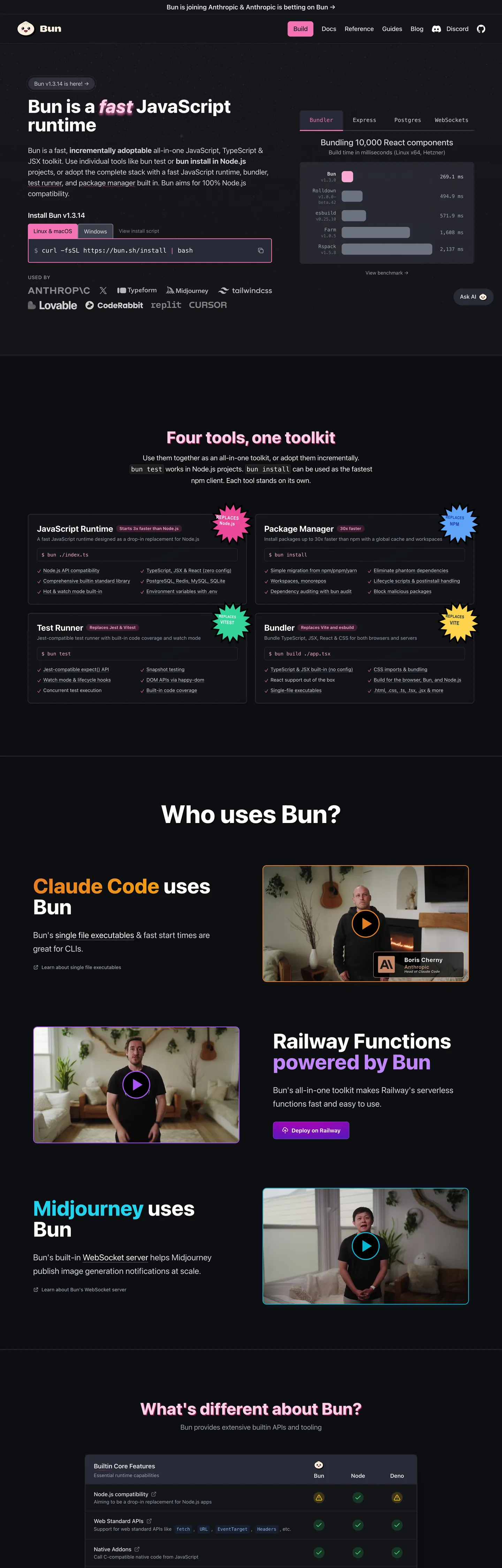
Bun’s site refuses the usual runtime aesthetic of a dark terminal lit by neon green. The fold opens on a charcoal #282a36 canvas, a flat, almost matte surface that feels more like a night‑sky than a console. A single 44‑pixel tall pill‑shaped button in hot pink #f472b6 dominates the hero, its 8px rounding and white border turning the call‑to‑action into a visual anchor that instantly tells you where to click. No gradient meshes, no illustrative hero graphics – just type, color, and a bold accent that says "this is the tool you run code with."
The palette is deliberately limited: a single saturated pink for emphasis, a deep charcoal for the main background, and a muted gray scale for supporting text. Where Stripe leans on an indigo gradient and Vercel opts for a matte black with subtle teal highlights, Bun chooses a binary contrast – dark canvas versus bright pink – to signal performance and speed. The brand’s own language talks about “fast all‑in‑one” and the visual restraint mirrors that promise, keeping the user’s eye on the code rather than decorative fluff.
For a designer or developer feeding this spec into a component library generator, the payoff is immediate. The system tells you exactly which token to use for every UI element – pink only lives on primary actions, white borders never change, and the code font is locked to JetBrains Mono. The one thing worth stealing is the disciplined use of a single accent color as a hierarchy marker; it lets you build a UI that feels fast, focused, and unmistakably Bun without drowning the page in unnecessary hues.
What makes it distinct
5
- Primary pink #f472b6appears only on the main call‑to‑action button, the hero wordmark, and the navigation pill, never elsewhere.
- Ink #9ca3afserves as the default text color across headings, paragraphs and UI labels, providing high contrast on the dark canvas.
- Hairline #ffffffdefines every border, from input outlines to card dividers, keeping the visual language crisp without adding visual weight.
- Muted #e5e7ebused for secondary copy, code comments and subtle UI hints, ensuring a gentle hierarchy beneath the primary ink.
- Surface‑1 #14151athe deepest background layer for modals and footers, creating a sense of depth without breaking the dark theme.
bun.sh
Live at bun.sh
A snapshot of the brand in production. Scroll the frame to see the whole page.
Colors
20 colors
Bun's system runs on #f472b6 as its primary voltage, used in 4 of 20 components. Type is set in system-ui across 10 tokens from 12px to 18px, weights 400–600. Shape language is sharp — components average 0px corner radius, favoring crisp rectangles.
Brand & Accent
Sparing, CTA-only voltage · 8
Surface
Page and card backgrounds · 5
Text
Headlines, body, captions · 2
Borders & Hairlines
Dividers, outlines, rules · 1
Other
Specialty colors · 4
Typography
10 type tokens
Set in system-ui across 10 tokens, from 12px to 18px, weights 400–600. Shown in its own stack: where the font isn't installed, the fallback the file names stands in.
- body-sm14px · weight 400 · lh 20pxThe quick brown fox jumps over the lazy dog
- body-md16px · weight 600 · lh 24pxThe quick brown fox jumps over the lazy dog
- code-sm14px · weight 400 · lh 22.4pxThe quick brown fox jumps over the lazy dog
- code-md16px · weight 400 · lh 24pxThe quick brown fox jumps over the lazy dog
- heading-lg18px · weight 600 · lh 28pxThe quick brown fox jumps over the lazy dog
- heading-xl18px · weight 400 · lh 32pxThe quick brown fox jumps over the lazy dog
- caption14px · weight 500 · lh 20pxThe quick brown fox jumps over the lazy dog
- subheading16px · weight 500 · lh 24pxThe quick brown fox jumps over the lazy dog
- code-xs12px · weight 400 · lh 16pxThe quick brown fox jumps over the lazy dog
- code-sm213px · weight 400 · lh 20pxThe quick brown fox jumps over the lazy dog
Layout
Radii and spacing
4 corner radii and 7 spacing values. Shape language: sharp.
Radii
- full9999px
- lg8px
- md4px
- sm6px
Spacing
- 00px
- xs4px
- sm8px
- md12px
- lg16px
- xl24px
- xxl32px
Components
20 components
Each rendered from its tokens (color, type, radius, padding) on Bun's own canvas.
- Primary Buttonprimary-buttonPrimary Button
- Nav Linknav-linkNav Link
- Hero Headinghero-headingHero Heading
- Section Titlesection-titleSection Title
- Body Textbody-textBody Text
- BadgebadgeBadge
- PillpillPill
- Code Blockcode-blockCode Block
- InputinputInput
- CardcardCard
- ModalmodalModal
- TooltiptooltipTooltip
- FooterfooterFooter
- HeaderheaderHeader
- SidebarsidebarSidebar
- Alert Successalert-successAlert Success
- Alert Erroralert-errorAlert Error
- Alert Infoalert-infoAlert Info
- Badge Pinkbadge-pinkBadge Pink
- Badge Purplebadge-purpleBadge Purple
In use
The system, in use
Bun's tokens on the kind of product it builds.
Build something people actually use.
A short paragraph of marketing copy that previews how the brand's display tier and body tier read together. Two sentences is usually enough.
FAQ
Bun design system FAQ
Common questions about Bun's tokens, components, and how to use this DESIGN.md in your project.
Read next
Related reading
Specs, directories, and component libraries that pair with this design system.
- Browse all design systemsThe full directory of DESIGN.md files on shadcn.io, with live mockups for each.shadcn.io
- Bun — official siteBun's public marketing site — the source of truth for the live tokens captured in this file.bun.sh (opens in a new tab)
- The DESIGN.md specificationGoogle Labs' open spec for machine-readable design system files — the format this page is built on.github.com (opens in a new tab)
Use it
Use Bun in your project
One machine-readable file. Drop it into Claude, Cursor, or any AI tool that reads DESIGN.md.
Download the DESIGN.md
One machine-readable file: every color, type, radius, spacing, and component token of Bun.
Feed it to your AI tool
Drop it into Claude, Cursor, or GitHub Copilot. The agent writes React components and Tailwind classes that match Bun's visual language.
Reference the tokens directly
Or paste the values into your Tailwind config, CSS variables, or component library: every color, size and radius is a quoted, ready-to-copy value.
Read the full DESIGN.md: overview, rationale, do’s and don’ts
Overview
Bun’s visual language hinges on a single accent that drives hierarchy. Pink‑pill hierarchy.
Where most JavaScript runtimes scatter brand colors across headers, footers, and icons, Bun concentrates its pink #f472b6 into a few high‑impact elements, letting the dark canvas dominate the rest of the experience. This restraint creates a clear signal path for users: pink means act now, gray means read, white means separate.
Key Characteristics:
- Dark charcoal canvas (#282a36) provides a high‑contrast stage for all content.
- Hot pink accent (#f472b6) appears only on primary actions and the hero wordmark.
- Ink gray (#9ca3af) serves as the default text color, balancing readability and mood.
- Pure white borders (#ffffff) define edges without adding visual weight.
- Muted gray (#e5e7eb) tones down secondary copy and code comments.
- Rounded corners follow a 4‑8‑9999px scale, giving pills a friendly feel.
- Spacing increments of 4px, 8px, 12px, 16px, 24px, 32px keep layout tight.
- System‑ui for UI text, JetBrains Mono for code, preserving developer focus.
- Surface layers (#14151a, #3b3f4b, #0d0e11) create depth for modals and footers.
- Accent reds and greens are reserved for alerts, never for decorative backgrounds.
Known Gaps
- No explicit dark‑mode toggle; the system assumes a single dark theme, limiting flexibility for light‑mode preferring users.
- Token documentation lacks visual swatches, requiring developers to manually map hex values to UI elements.
- The spacing token list includes composite values in the source data, but the spec only exposes pure values, leaving some original intent undocumented.
- Accessibility contrast for pink on dark background meets WCAG AA but falls short of AAA, which could be a concern for high‑visibility contexts.
- The design system does not expose a dedicated icon set, forcing teams to import external SVGs or font icons.
- No variant definitions for disabled states on buttons; designers must infer styling from existing tokens.
Design & Creative Tools
More systems like this
More DESIGN.md files in Design & Creative Tools.
Pricing
Build it with Pro
The DESIGN.md files are free. Pro adds 6,000+ blocks, premium templates and the MCP server, so your AI editor builds in your system for you.
4.9/5 out of 5 · 150+ reviewsfrom 150+ founders and developers.
Billing
Billed once a year in USD. Cancel anytime.
- How many people can use the license.
- Client work, SaaS products and anything you charge for.
- Production-ready React sections: hero, pricing, features, dashboards and more.
- Complete multi-page sites you can ship as they are.
- React icons from every major library, installable with one command.
- Presets that restyle every block, in light and dark.
- Lets your AI editor search, preview and install blocks for you.
- Priority requests are answered first.
Individual
For personal projects & open source
$32instead of $49/mo
$389 billed yearly
- Seats: 1 seat
- Commercial use: Personal & open source only
- Pro blocks: 6,000+ blocks
- Templates: All 14 templates
- React icons: 294k+ icons
- Themes: All 59 themes
- MCP server: Basic usage
- Support: Standard
Team
Most popularFor freelancers, agencies & startups
$66instead of $99/mo
$789 billed yearly · ≈ $13/dev/mo
- Seats: Up to 5 seats
- Commercial use: Included
- Pro blocks: 6,000+ blocks
- Templates: All 14 templates
- React icons: 294k+ icons
- Themes: All 59 themes
- MCP server: High usage
- Support: Priority
Organization
For companies with larger teams
$132instead of $199/mo
$1,589 billed yearly
- Seats: Unlimited seats
- Commercial use: Included
- Pro blocks: 6,000+ blocks
- Templates: All 14 templates
- React icons: 294k+ icons
- Themes: All 59 themes
- MCP server: Unlimited usage
- Support: Priority
Billed once a year in USD. Cancel anytime.
Individual
For personal projects & open source
$32instead of $49/mo
$389 billed yearly
- How many people can use the license.Seats: 1 seat
- Client work, SaaS products and anything you charge for.Commercial use: Personal & open source only
- Production-ready React sections: hero, pricing, features, dashboards and more.Pro blocks: 6,000+ blocks
- Complete multi-page sites you can ship as they are.Templates: All 14 templates
- React icons from every major library, installable with one command.React icons: 294k+ icons
- Presets that restyle every block, in light and dark.Themes: All 59 themes
- Lets your AI editor search, preview and install blocks for you.MCP server: Basic usage
- Priority requests are answered first.Support: Standard
Team
Most popularFor freelancers, agencies & startups
$66instead of $99/mo
$789 billed yearly · ≈ $13/dev/mo
Everything in Individual, plus
- How many people can use the license.Seats: Up to 5 seats
- Client work, SaaS products and anything you charge for.Commercial use: Included
- Lets your AI editor search, preview and install blocks for you.MCP server: High usage
- Priority requests are answered first.Support: Priority
Organization
For companies with larger teams
$132instead of $199/mo
$1,589 billed yearly
Everything in Team, plus
- How many people can use the license.Seats: Unlimited seats
- Lets your AI editor search, preview and install blocks for you.MCP server: Unlimited usage
- Secure checkout via Stripe
- Code lives in your repo
- Keep what you've shipped if you cancel
- License terms
Your system, built for you
Every block, template and icon, installed by your AI agent in your design system. The DESIGN.md files stay free.