Excalidraw Design System
Excalidraw's marketing surface is the editor itself — Excalifont sketchy annotations on pure white, a single indigo wordmark, an 8px-radius toolbar. Tokens for React, Next.js, and AI coding tools.
Add shadcn.io to your AI agent. · Pro It installs blocks, icons and templates in your design system from a prompt, with Pro.
Set up MCP- Primary
- #6965db
- Typeface
- Assistant
- Shape
- Mixed
- Base radius
- 8px
- Colors
- 10
- Type tokens
- 10
- Components
- 14
- Spacing values
- 8
About
About Excalidraw DESIGN.md
Curated by Dov Azencot · Updated May 19, 2026 · Source excalidraw.com (opens in a new tab)
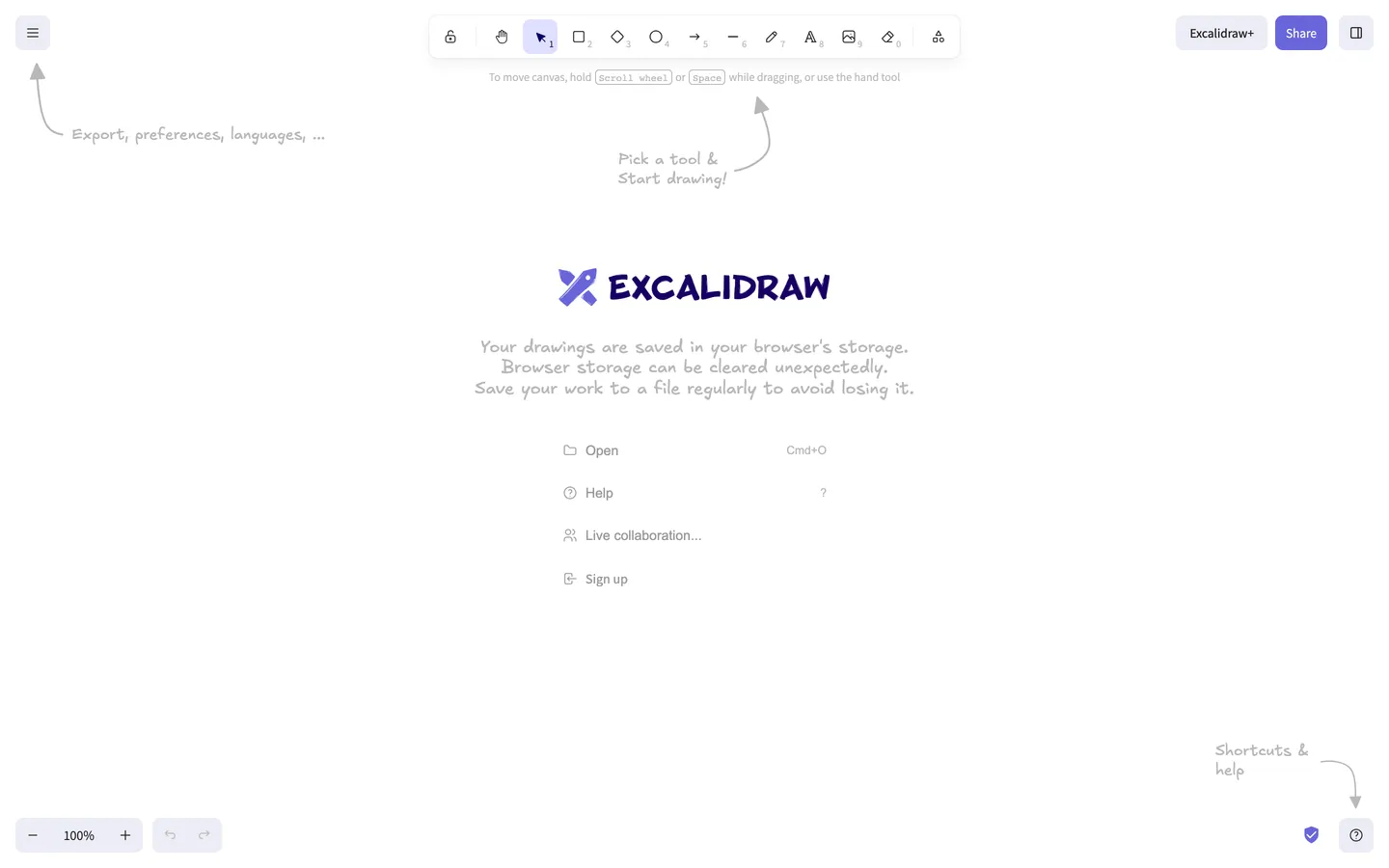
Excalidraw's marketing site is the application itself. There is no separate landing page, no hero photograph, no testimonial wall — visiting excalidraw.com renders the live editor on a white canvas, with a horizontal toolbar floating at the top, a burger menu top-left, zoom controls bottom-left, a question-mark help button bottom-right, and a centered welcome card carrying the indigo wordmark, a sketch-style storage warning, and four flat command rows. Hand-drawn pencil arrows in the Excalifont face point at every chrome element with sketchy captions ("Pick a tool & Start drawing!", "Export, preferences, languages...", "Shortcuts & help"). The page communicates the entire product surface in one viewport without ever leaving the tool.
The DESIGN.md file packages the system into a machine-readable spec for React tooling. Inside: 10 colors tokens organized around a near-black ink #1b1b1f, a gray hairline tier, a single brand indigo #6965db wired into the rocket-logo wordmark and tool-selection states, and a soft lavender pill #ececf4 carrying the primary CTA. 11 typography tokens cover Excalifont sketch in two sizes (16px and 18px), Assistant sans in four sizes (12–16px) at weights 400 and 500, and a small Arial fallback tier. A radius scale of 4 / 6 / 8 px with 8px dominant. A spacing scale on 4px increments through 32px. 14 components covering the toolbar tile, Share pill, Excalidraw+ button, welcome card, hand-drawn-arrow annotation, and the four bottom-corner utility buttons.
Feed this file to Claude or Cursor and it reproduces Excalidraw's specific moves: pure white canvas instead of a tinted near-white, sketchy Excalifont face for any annotation-style copy paired with Assistant sans for chrome labels, indigo held in reserve as a single brand voltage, and 8px rounding everywhere. One caveat: the editor-as-marketing move only works if the product itself is visually self-evident in one viewport — most SaaS surfaces need a separate marketing skin because the in-product canvas does not communicate what the tool does on its own.
What makes it distinct
5
- Editor-as-marketinglanding on excalidraw.com drops you straight into the drawing tool with hand-drawn arrows annotating the UI, no marketing chrome
- Excalifont sketchy facethe hand-drawn typeface used for every on-canvas annotation, sitting beside Assistant sans for the toolbar chrome
- Indigo voltage at #6965dbappears six times total as wordmark fill, Share-button background, and tool selection ring; no other chromatic accent on the page
- Lavender Excalidraw+ pilla soft #ececf4 fill carries the only call-to-action, kept quiet so it does not compete with the canvas
- 8px radius dominates37 of 44 captured radii sit at 8px; the toolbar slots, Share pill, and Excalidraw+ button all share the same single rounding step
excalidraw.com
Live at excalidraw.com
A snapshot of the brand in production. Scroll the frame to see the whole page.
Colors
10 colors
Excalidraw's system runs on #6965db as its primary voltage, used in 3 of 14 components. Type is set in Assistant across 10 tokens from 10px to 18px, weights 400–500. Shape language is mixed across 14 components, blending pills, soft rounds, and squarer corners.
Brand & Accent
Sparing, CTA-only voltage · 3
Surface
Page and card backgrounds · 1
Text
Headlines, body, captions · 4
Borders & Hairlines
Dividers, outlines, rules · 1
Other
Specialty colors · 1
Typography
10 type tokens
Set in Assistant across 10 tokens, from 10px to 18px, weights 400–500. Shown in its own stack: where the font isn't installed, the fallback the file names stands in.
- display-md18px · weight 400 · lh 21.6pxThe quick brown fox jumps over the lazy dog
- display-sm16px · weight 400 · lh 19.2pxThe quick brown fox jumps over the lazy dog
- body-md16px · weight 400 · lh 22.4pxThe quick brown fox jumps over the lazy dog
- body-sm14px · weight 400 · lh 20pxThe quick brown fox jumps over the lazy dog
- label-md14px · weight 500 · lh 20pxThe quick brown fox jumps over the lazy dog
- button-md13.33px · weight 500 · lh 16pxThe quick brown fox jumps over the lazy dog
- caption12px · weight 400 · lh 16pxThe quick brown fox jumps over the lazy dog
- kbd-mono10px · weight 400 · lh 14pxThe quick brown fox jumps over the lazy dog
- fallback-sm14px · weight 400 · lh 16.1pxThe quick brown fox jumps over the lazy dog
- fallback-xs12px · weight 400 · lh 14pxThe quick brown fox jumps over the lazy dog
Layout
Radii and spacing
5 corner radii and 8 spacing values. Shape language: mixed.
Radii
- none0px
- xs4px
- sm6px
- md8px
- full9999px
Spacing
- xs2px
- sm4px
- base8px
- md10px
- lg12px
- xl16px
- 2xl24px
- 3xl32px
Components
14 components
Each rendered from its tokens (color, type, radius, padding) on Excalidraw's own canvas.
- ToolbartoolbarToolbar
- Toolbar Tiletoolbar-tileToolbar Tile
- Toolbar Tile Activetoolbar-tile-activeToolbar Tile Active
- Button Primarybutton-primaryButton Primary
- Button Sharebutton-shareButton Share
- Button Secondarybutton-secondaryButton Secondary
- Welcome Cardwelcome-cardWelcome Card
- Command Rowcommand-rowCommand Row
- Hand Arrow Captionhand-arrow-captionHand Arrow Caption
- WordmarkwordmarkWordmark
- Zoom Controlzoom-controlZoom Control
- Kbd Chipkbd-chipKbd Chip
- Hint Texthint-textHint Text
- Help Buttonhelp-buttonHelp Button
In use
The system, in use
Excalidraw's tokens on the kind of product it builds.
Build something people actually use.
A short paragraph of marketing copy that previews how the brand's display tier and body tier read together. Two sentences is usually enough.
FAQ
Excalidraw design system FAQ
Common questions about Excalidraw's tokens, components, and how to use this DESIGN.md in your project.
Read next
Related reading
Specs, directories, and component libraries that pair with this design system.
- Browse all design systemsThe full directory of DESIGN.md files on shadcn.io, with live mockups for each.shadcn.io
- Excalidraw — official siteExcalidraw's public marketing site — the source of truth for the live tokens captured in this file.excalidraw.com (opens in a new tab)
- The DESIGN.md specificationGoogle Labs' open spec for machine-readable design system files — the format this page is built on.github.com (opens in a new tab)
Use it
Use Excalidraw in your project
One machine-readable file. Drop it into Claude, Cursor, or any AI tool that reads DESIGN.md.
Download the DESIGN.md
One machine-readable file: every color, type, radius, spacing, and component token of Excalidraw.
Feed it to your AI tool
Drop it into Claude, Cursor, or GitHub Copilot. The agent writes React components and Tailwind classes that match Excalidraw's visual language.
Reference the tokens directly
Or paste the values into your Tailwind config, CSS variables, or component library: every color, size and radius is a quoted, ready-to-copy value.
Read the full DESIGN.md: overview, rationale, do’s and don’ts
Overview
Excalidraw's marketing surface is unlike any other entry in this directory. Editor-as-marketing. Loading excalidraw.com renders the live drawing application directly — toolbar floating at the top of a pure white canvas, burger menu top-left, zoom controls bottom-left, help button bottom-right, and a centered welcome card holding the indigo wordmark. There is no hero block, no testimonial wall, no pricing-page redirect. Hand-drawn pencil arrows in the Excalifont face annotate every chrome element with sketchy captions ("Pick a tool & Start drawing!", "Export, preferences, languages...", "Shortcuts & help"). Where Figma keeps marketing on a flat hero page and reserves the canvas for an interstitial click, and where Miro paints a SaaS marketing surface in front of the product, Excalidraw skips the marketing layer entirely.
The system's chromatic restraint is extreme. One indigo voltage — {colors.primary} (#6965db) — appears exactly six times across the captured page: twice as wordmark fill, three times as the active-tool selection border, and once on the rocket icon. The Share pill in the top-right is a slightly more saturated violet in the same hue family. Apart from indigo, every other rendered color is structural: a near-black ink {colors.ink} (#1b1b1f) for toolbar glyphs and command-row text, two gray hairlines ({colors.hairline} #b8b8b8 and {colors.muted} #999999) for the sketchy arrow strokes and divider rules, plus one lavender pill {colors.primary-soft} (#ececf4) that carries the Excalidraw+ CTA. Unlike the convention of holding a single accent against a white surface for SaaS marketing pages, Excalidraw holds its indigo against the live editor canvas, where the only competing color is whatever the user has drawn — usually nothing, on first load.
Typography is the pairing that defines the brand. Excalifont — Excalidraw's custom hand-drawn sketchy sans, which writes itself into the canvas with the same stroke quality the drawing tool uses for its shape labels — handles every annotation-style text (the wordmark, the storage warning, the arrow captions). Assistant, a humanist sans, carries the chrome labels: command rows, tooltips, zoom counter, button labels. There is no display tier in the conventional SaaS sense. The largest type on the page is the 18px Excalifont wordmark; the next largest is 16px Excalifont sketch in the storage-warning paragraph. The deliberate absence of any 32px+ display moment is the brand's confidence signal — the product communicates itself, so the type does not need to shout.
Key Characteristics:
- Pure white canvas (
{colors.canvas}— #ffffff), not the tinted near-white that Figma and Miro use — the sketchy Excalifont annotations need maximum contrast to read as ink-on-paper. - Single indigo voltage (
{colors.primary}— #6965db) held in the wordmark, active-tool ring, and rocket icon. Six total occurrences on the captured page. - Two-face typography: Excalifont for any sketch-style annotation, Assistant for every chrome label. No serif tier, no display tier larger than 18px.
- 8px radius dominates — 37 of 44 captured radii sit at 8px; the toolbar tile, Share pill, Excalidraw+ button, welcome-card command rows, and zoom controls all share the same single rounding step.
- Hand-drawn arrow callouts in
{colors.hairline}(#b8b8b8) pencil-gray annotate every UI region on first load — the only entry in this directory whose chrome is itself annotated. - Toolbar runs flush at the top center, floating on the white canvas with a 1px hairline border and a soft outer halo — the only meaningfully elevated element on the page.
- Zero photography, zero illustrations beyond product UI, zero customer-logo wall — the only logos on the page are the rocket glyph and the wordmark itself.
Colors
Brand
- Indigo (
{colors.primary}— #6965db): frequency 6. Used as text (2), border (3), background (1). The single brand voltage — the wordmark fill, the active-tool selection ring, and the rocket icon. Wired without a CSS custom-property name; it is hardcoded in the component styles rather than themed. - Lavender Soft (
{colors.primary-soft}— #ececf4): frequency 9. Used exclusively as background — the Excalidraw+ pill in the top-right, the zoom-control housing, and the help-button bubble. The system's softest interactive fill; reads as a one-step-cooler off-white. - Lavender Pale (
{colors.primary-pale}— #e0dfff): frequency 1 as a background fill, the onlylayer: "brand"color in the extraction without a CSS variable name. Reserved for the selected-tool slot ring.
Surface
- Canvas (
{colors.canvas}— #ffffff): the page floor. Pure white, deliberately — the sketchy Excalifont annotations and the pencil-gray arrows need maximum contrast to read as ink-on-paper rather than as UI strokes.
Text
- Ink (
{colors.ink}— #1b1b1f): frequency 142 (71 text, 71 border) — the dominant text and stroke color across every tier. Toolbar glyphs, command-row labels, the welcome-card storage warning, the Excalidraw+ pill label. - Ink Deep (
{colors.ink-deep}— #101010): frequency 4 (2 text, 2 border). A slightly cooler near-black used for the burger-menu icon and the help-button glyph. Reads as the same color as{colors.ink}at body sizes. - Ink Black (
{colors.ink-black}— #000000): frequency 15 (6 text, 6 border, 3 shadow). The only pure black on the page; carries the keyboard-shortcut kbd chips and the dropdown shadow rgba layer. - Muted (
{colors.muted}— #999999): frequency 20 (12 text, 8 border). Tertiary text — the dimmed shortcut-chip captions, divider rules between command rows, and the inactive-tool slot hairlines. - Hairline (
{colors.hairline}— #b8b8b8): frequency 28 (14 text, 14 border). The pencil-gray that draws the hand-drawn arrows across the page. Wired as both text color and stroke color so the arrows render as SVG strokes plus their Excalifont captions in the same tone.
Accent (rare)
- Navy (
{colors.navy}— #030064): frequency 2. Appears once as a sub-pixel text accent and once as a border on a focus state; effectively absent from the visible page and reserved for deep-mode contexts the marketing page does not currently render.
Typography
Font Families
The system runs Excalifont for every sketch-style annotation (the wordmark, the storage-warning paragraph, the hand-drawn-arrow captions) and Assistant for every chrome label (toolbar tooltips, command-row rows, zoom counter, button labels). Excalifont falls back to Xiaolai then to sans-serif; Assistant falls back to system-ui, -apple-system, "Segoe UI", Roboto, Helvetica, Arial, sans-serif. A small Arial fallback tier renders one or two body strings before Assistant loads. Monospace appears only inside the keyboard-shortcut kbd chips at 10px.
The pairing is the signature: hand-drawn-sketchy display + humanist sans chrome. No serif tier exists. No display moment above 18px exists. The largest text on the entire page is the 18px Excalifont wordmark.
Hierarchy
| Token | Family | Size | Weight | Line Height | Use |
|---|---|---|---|---|---|
{typography.display-md} | Excalifont | 18px | 400 | 21.6px | The wordmark and the largest sketch-style annotation |
{typography.display-sm} | Excalifont | 16px | 400 | 19.2px | The storage-warning paragraph and the hand-drawn-arrow captions |
{typography.body-md} | Assistant | 16px | 400 | 22.4px | Command-row labels in the welcome card |
{typography.body-sm} | Assistant | 14px | 400 | 20px | Toolbar tooltips and secondary running text |
{typography.label-md} | Assistant | 14px | 500 | 20px | Mid-emphasis command-row labels |
{typography.button-md} | Assistant | 13.33px | 500 | 16px | The Excalidraw+ pill label and the Share button label |
{typography.caption} | Assistant | 12px | 400 | 16px | The zoom percentage and the shortcut-chip captions |
{typography.kbd-mono} | Mono stack | 10px | 400 | 14px | The keyboard-shortcut chips ("Cmd+O", "Scroll wheel") |
{typography.fallback-sm} | Arial | 14px | 400 | 16.1px | The pre-load fallback for any Assistant string |
{typography.fallback-xs} | Arial | 12px | 400 | 14px | The pre-load fallback for any Assistant caption |
Principles
Display weight is always 400. There is no semibold or bold tier on Excalifont — the sketchy face only ships at one weight, so emphasis comes from size alone. Assistant runs at 400 and 500, with 500 reserved for command-row labels and button text. The deliberate absence of any heading-size step above 18px is the brand's typographic restraint — the product communicates itself, so the type does not need to shout.
Note on Font Substitutes
Excalifont is a free-but-bespoke face shipped with the Excalidraw app. The closest open-source substitute is Virgil (the original hand-drawn font Excalidraw used before Excalifont) or Caveat at line-height 1.1; both transfer the sketchy stroke quality cleanly. For Assistant, Open Sans or Inter at the same weights work without re-tuning the metrics.
Layout
Spacing System
- Base unit: 4px (with 8px as the dominant module).
- Tokens:
{spacing.xs}2px ·{spacing.sm}4px ·{spacing.base}8px ·{spacing.md}10px ·{spacing.lg}12px ·{spacing.xl}16px ·{spacing.2xl}24px ·{spacing.3xl}32px. - Toolbar tile padding:
{spacing.base}(8px) per slot. - Excalidraw+ button padding: 8x14px (the only off-grid value on the page).
- Command-row internal padding:
{spacing.lg}(12px) horizontal.
Grid & Container
- Max content width: the toolbar runs centered at ~600px; the welcome card sits centered at ~400px wide.
- Toolbar: floats horizontally centered at the top of the viewport with a 1px hairline border and a soft outer halo.
- Welcome card: centered vertically and horizontally on the canvas, with the wordmark on top, a three-line storage warning beneath in Excalifont sketch, and four command rows ("Open / Help / Live collaboration... / Sign up") below.
- Corner controls: burger menu top-left, Excalidraw+ pill and Share button top-right, zoom controls bottom-left, undo/redo + help button bottom-right.
Rhythm
There is no editorial rhythm because there is no editorial content. The page is one viewport with the toolbar at the top, the welcome card centered, and four corner-anchored UI controls. Every region is annotated by a hand-drawn arrow in Excalifont sketch — a unique structural device that doubles as both decoration and onboarding.
Elevation
The system has essentially no shadow tier beyond a single soft halo on the toolbar. The page has three captured rgba(0,0,0,*) shadow occurrences, all of them on the floating toolbar at the top center — a 4-pixel outer halo at low opacity that lifts the toolbar off the white canvas.
- Flat (no shadow): the welcome card, the corner-anchored controls, the Excalidraw+ pill, the Share button — every interactive surface except the toolbar.
- Single elevation: the toolbar with its 1px hairline border and soft halo is the only meaningfully elevated surface on the page.
- Hairline outlines:
{colors.hairline}and{colors.muted}carry the divider rules inside the welcome card and the inactive-tool slot strokes inside the toolbar.
Shapes
The radius scale is tight three-step, with 8px dominant:
{rounded.none}0px — only on body running text containers.{rounded.xs}4px — the keyboard-shortcut kbd chips (3 occurrences).{rounded.sm}6px — the help-button frame and a few dropdown items (4 occurrences).{rounded.md}8px — toolbar slots, the Share pill, the Excalidraw+ button, the zoom-control housing, the welcome-card command rows (37 occurrences — 84% of all radii).{rounded.full}9999px — declared for completeness; not rendered on the marketing surface.
There is no 12 / 16 / 20px tier and no pill. The 8px default keeps every interactive surface feeling like a Post-it — soft enough to be tappable, square enough to read as toolbar slots rather than capsule pills.
Components
toolbar — The horizontally-centered floating tool selector at the top of the canvas. White {colors.canvas} fill, 1px {colors.hairline} border, {rounded.md} 8px outer rounding, 44px height, 4px internal padding. Houses 11 tool slots (lock, hand, select, rectangle, diamond, ellipse, arrow, line, pencil, text, image), each {component.toolbar-tile}.
toolbar-tile — Inactive tool slot. Transparent fill, 36px height, 8px padding, {rounded.md} 8px radius. The icon glyph rendered in {colors.ink}. A small numeric shortcut chip in {typography.caption} sits in the bottom-right corner.
toolbar-tile-active — The selected tool slot. Lavender {colors.primary-pale} fill, indigo {colors.primary} icon and 1px border. The single indigo moment in the toolbar.
button-primary — The Excalidraw+ pill in the top-right corner. Lavender {colors.primary-soft} fill, ink text, {typography.button-md} (13.33px / 500), {rounded.md} 8px radius, 8x14px padding, 36px height.
button-share — The Share button next to Excalidraw+. Indigo {colors.primary} fill, white text, same dimensions as {component.button-primary}. The system's primary call-to-action.
button-secondary — Transparent fill with hairline border. Used for utility buttons (burger menu, help button) when not active.
welcome-card — The centered onboarding panel. Transparent fill (canvas shows through), no border, no radius. Holds the wordmark on top, a three-line Excalifont storage-warning paragraph beneath, and four command rows below.
command-row — A single welcome-card row ("Open", "Help", "Live collaboration...", "Sign up"). 12px horizontal padding, 44px height. The label sits flush left after a small icon glyph; a keyboard shortcut chip floats flush right.
hand-arrow-caption — The sketchy text labels in {colors.hairline} pencil-gray Excalifont that annotate every chrome region on first load ("Pick a tool & Start drawing!", "Export, preferences, languages...", "Shortcuts & help"). The unique structural device of the page.
wordmark — The "EXCALIDRAW" sketchy wordmark in {colors.primary} indigo, set in 18px Excalifont, with a small rocket-glyph icon to its left.
zoom-control — Bottom-left zoom percentage + plus/minus buttons. Lavender {colors.primary-soft} fill, ink text, {rounded.md} 8px radius, 32px height.
kbd-chip — The small monospace keyboard-shortcut chips ("Cmd+O", "Scroll wheel", "Space"). White fill, 1px hairline border, {rounded.xs} 4px radius, 1x3px padding, 10px monospace.
hint-text — The single-line hint above the welcome card ("To move canvas, hold [Scroll wheel] or [Space] while dragging, or use the hand tool"). Rendered in {colors.muted} at {typography.body-sm}.
help-button — The bottom-right question-mark button. Lavender {colors.primary-soft} fill, ink glyph, {rounded.md} 8px radius, 32px height.
Do's and Don'ts
Do treat indigo {colors.primary} as a scarce voltage held in the wordmark and tool-selection states. The system has six total occurrences on the captured page; multiplying it across hover states, link colors, and accents would dilute the only chromatic brand signal on a system that is otherwise three structural inks.
Do keep the canvas at pure white. The sketchy Excalifont annotations and the pencil-gray hand-drawn arrows need maximum contrast against the canvas to read as ink-on-paper. Tinting one step toward warm-gray or cool-gray compresses the contrast and makes the annotations feel like UI rather than drawings.
Do pair Excalifont with Assistant — never substitute Excalifont for body chrome or Assistant for sketchy annotations. The two faces divide labor: hand-drawn for any pen-feel string, humanist sans for any chrome label. Crossing the line breaks the "this page IS the canvas" illusion.
Do use {rounded.md} 8px as the default for every interactive surface. 84% of captured radii sit at this single value; adding a 12px or 16px tier would break the visual consistency between the toolbar slots, the Share pill, and the welcome-card rows.
Don't use {colors.hairline} (#b8b8b8) for body text or button labels — it is the pencil-gray tone reserved for the hand-drawn-arrow annotations and the inactive-tool divider rules. Using it for running text reads as the canvas-arrow voice rather than as chrome.
Don't introduce a heading tier larger than 18px Excalifont. The deliberate absence of any 24px+ display moment is the brand's confidence signal — the largest text on the page is the wordmark itself. A 32px or 48px hero headline would turn the editor-as-marketing surface into a generic SaaS hero.
Don't add a pill radius ({rounded.full}) on the Excalidraw+ button or the Share button. The system has no pill tier; both buttons sit at {rounded.md} 8px, the same step as the toolbar tiles. A pill button would over-emphasize the CTA against a canvas that intentionally keeps every surface at the same rounding.
Don't render the hand-drawn arrows in {colors.primary} indigo. The annotations are intentionally pencil-gray {colors.hairline} — making them indigo would conflict with the wordmark and the active-tool ring, and would shout the onboarding rather than letting it read as hand-drawn marginalia.
Known Gaps
- Hover and focus states: the captured marketing surface is a single first-load viewport; hover styles for the toolbar tiles, the Excalidraw+ pill, and the Share button are not exposed.
- Form input states: the canvas does not expose a
text-inputon first load; form chrome lives inside dialogs (Save, Export, Share) that are not represented here. - Dark mode: the captured surface is light-only. The Excalidraw editor exposes a dark-canvas variant in its preferences panel but is not rendered on the public marketing page.
- Motion: the toolbar slot animates on hover and the hand-drawn arrows fade in on first load, but the spec captures end-state values only.
- Dialog and modal surfaces: the burger-menu dropdown, the keyboard-shortcut overlay, and the share-link modal are not captured in the marketing screenshot.
- Excalidraw+ paid surface: clicking the Excalidraw+ pill leads to a separate marketing site (
plus.excalidraw.com) with its own surface tokens that are not represented in this file. - Live-collaboration cursors: the multiplayer cursor and presence-avatar surfaces are not exposed on the first-load canvas.
Design & Creative Tools
More systems like this
More DESIGN.md files in Design & Creative Tools.
Pricing
Build it with Pro
The DESIGN.md files are free. Pro adds 6,000+ blocks, premium templates and the MCP server, so your AI editor builds in your system for you.
4.9/5 out of 5 · 150+ reviewsfrom 150+ founders and developers.
Billing
Billed once a year in USD. Cancel anytime.
- How many people can use the license.
- Client work, SaaS products and anything you charge for.
- Production-ready React sections: hero, pricing, features, dashboards and more.
- Complete multi-page sites you can ship as they are.
- React icons from every major library, installable with one command.
- Presets that restyle every block, in light and dark.
- Lets your AI editor search, preview and install blocks for you.
- Priority requests are answered first.
Individual
For personal projects & open source
$32instead of $49/mo
$389 billed yearly
- Seats: 1 seat
- Commercial use: Personal & open source only
- Pro blocks: 6,000+ blocks
- Templates: All 14 templates
- React icons: 294k+ icons
- Themes: All 59 themes
- MCP server: Basic usage
- Support: Standard
Team
Most popularFor freelancers, agencies & startups
$66instead of $99/mo
$789 billed yearly · ≈ $13/dev/mo
- Seats: Up to 5 seats
- Commercial use: Included
- Pro blocks: 6,000+ blocks
- Templates: All 14 templates
- React icons: 294k+ icons
- Themes: All 59 themes
- MCP server: High usage
- Support: Priority
Organization
For companies with larger teams
$132instead of $199/mo
$1,589 billed yearly
- Seats: Unlimited seats
- Commercial use: Included
- Pro blocks: 6,000+ blocks
- Templates: All 14 templates
- React icons: 294k+ icons
- Themes: All 59 themes
- MCP server: Unlimited usage
- Support: Priority
Billed once a year in USD. Cancel anytime.
Individual
For personal projects & open source
$32instead of $49/mo
$389 billed yearly
- How many people can use the license.Seats: 1 seat
- Client work, SaaS products and anything you charge for.Commercial use: Personal & open source only
- Production-ready React sections: hero, pricing, features, dashboards and more.Pro blocks: 6,000+ blocks
- Complete multi-page sites you can ship as they are.Templates: All 14 templates
- React icons from every major library, installable with one command.React icons: 294k+ icons
- Presets that restyle every block, in light and dark.Themes: All 59 themes
- Lets your AI editor search, preview and install blocks for you.MCP server: Basic usage
- Priority requests are answered first.Support: Standard
Team
Most popularFor freelancers, agencies & startups
$66instead of $99/mo
$789 billed yearly · ≈ $13/dev/mo
Everything in Individual, plus
- How many people can use the license.Seats: Up to 5 seats
- Client work, SaaS products and anything you charge for.Commercial use: Included
- Lets your AI editor search, preview and install blocks for you.MCP server: High usage
- Priority requests are answered first.Support: Priority
Organization
For companies with larger teams
$132instead of $199/mo
$1,589 billed yearly
Everything in Team, plus
- How many people can use the license.Seats: Unlimited seats
- Lets your AI editor search, preview and install blocks for you.MCP server: Unlimited usage
- Secure checkout via Stripe
- Code lives in your repo
- Keep what you've shipped if you cancel
- License terms
Your system, built for you
Every block, template and icon, installed by your AI agent in your design system. The DESIGN.md files stay free.