Retool Design System
Retool’s design system uses a deep #151515 canvas, the saansFont family for headings, and a brand‑blue #518dd2 accent. It ships with a curated set of components for internal‑tool UIs.
Add shadcn.io to your AI agent. · Pro It installs blocks, icons and templates in your design system from a prompt, with Pro.
Set up MCP- Primary
- #518dd2
- Typeface
- saansFont
- Shape
- Sharp
- Base radius
- 6px
- Colors
- 13
- Type tokens
- 10
- Components
- 18
- Spacing values
- 7
About
About Retool DESIGN.md
Curated by Dov Azencot · Updated May 14, 2026 · Source retool.com (opens in a new tab)
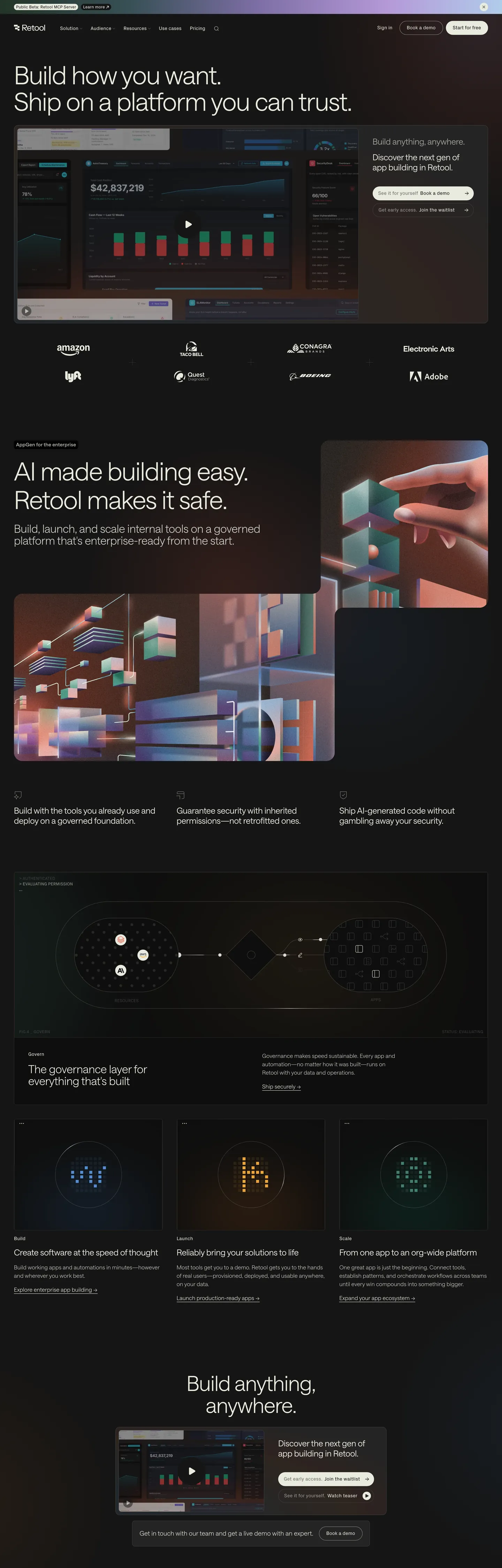
Retool’s homepage opens on a near‑black canvas (#151515) that stretches across the full viewport. The hero headline uses a 72px saansFont weight‑300 typeface in #e9ebdf, while the primary call‑to‑action button features the brand‑blue #518dd2 background, white text, and a full‑pill border radius. Below the fold the dark canvas persists, punctuated by light‑gray UI elements, a subtle border tone of #cbccc4, and a consistent use of the saansFont family for headings and body copy. The design system’s signature move is the use of hairline borders as a visual elevation cue, turning a 1px #cbccc4 stroke into a depth indicator for cards and inputs.
Inside this DESIGN.md file you will find 13 colors tokens grouped into primary, ink, body, muted, canvas, hairline, and six surface categories (base, muted, accent, success, warning, error, info). There are 10 typography tokens ranging from a 72px display style to a 12px footnote, 6 rounded values from 0px to 9999px, a spacing scale of seven single‑dimension steps (4px‑40px), and 18 components definitions covering buttons, cards, inputs, alerts, modals, tables, navigation links, and more. The token set follows the Google Labs specification for CSS custom properties, making it ready for import into Tailwind or CSS‑in‑JS workflows.
To use the file, import the JSON into a design‑token processor such as Claude, Cursor, or Copilot, then reference tokens directly in Tailwind config (e.g., theme.extend.colors.primary = '{colors.primary}') or as CSS variables (var(--primary)). Because the system balances a dark canvas with high‑contrast text and a disciplined spacing rhythm, it offers a reproducible visual language that other internal‑tool platforms rarely achieve, making Retool a compelling case study for token‑first design.
What makes it distinct
5
- Primary accentthe brand‑blue #518dd2 anchors CTA buttons, nav highlights, and focus rings, delivering a consistent signal across the UI.
- Ink contrastthe near‑white #e9ebdf supplies the dominant text color, ensuring legibility against the dark canvas without additional overrides.
- Rounded languagea full‑pill radius (9999px) on primary buttons creates a distinctive, approachable silhouette that differentiates action elements.
- Spacing hierarchya modular scale from 4px to 40px structures padding and margins, allowing designers to compose layouts with predictable rhythm.
- Surface layeringa palette of muted grays (#242424, #0e0e0e, #433e38) defines background bands, while success, warning, and error surfaces (#233427, #4a2b11, #491f16) convey status clearly.
retool.com
Live at retool.com
A snapshot of the brand in production. Scroll the frame to see the whole page.
Colors
13 colors
Retool's system runs on #518dd2 as its primary voltage, used in 3 of 18 components. Type is set in saansFont across 10 tokens from 12px to 72px, weights 300–400. Shape language is sharp — components average 0px corner radius, favoring crisp rectangles.
Brand & Accent
Sparing, CTA-only voltage · 1
Surface
Page and card backgrounds · 8
Text
Headlines, body, captions · 3
Borders & Hairlines
Dividers, outlines, rules · 1
Typography
10 type tokens
Set in saansFont across 10 tokens, from 12px to 72px, weights 300–400. Shown in its own stack: where the font isn't installed, the fallback the file names stands in.
- display-xl72px · weight 300 · lh 1.05 · tracking -1.584pxThe quick brown fox jumps over the lazy dog
- display-lg60px · weight 300 · lh 1.05 · tracking -1.2pxThe quick brown fox jumps over the lazy dog
- display-md48px · weight 300 · lh 1.05 · tracking -0.48pxThe quick brown fox jumps over the lazy dog
- headline-lg36px · weight 300 · lh 1.05 · tracking -0.36pxThe quick brown fox jumps over the lazy dog
- headline-md32px · weight 300 · lh 1.05 · tracking -0.32pxThe quick brown fox jumps over the lazy dog
- body-lg24px · weight 380 · lh 1.2 · tracking -0.24pxThe quick brown fox jumps over the lazy dog
- body-md18px · weight 300 · lh 1.5 · tracking 0.18pxThe quick brown fox jumps over the lazy dog
- body-sm16px · weight 300 · lh 1.5 · tracking 0.16pxThe quick brown fox jumps over the lazy dog
- caption14px · weight 400 · lh 1.14 · tracking 0.14pxThe quick brown fox jumps over the lazy dog
- footnote12px · weight 400 · lh 1.2 · tracking 0.12pxThe quick brown fox jumps over the lazy dog
Layout
Radii and spacing
6 corner radii and 7 spacing values. Shape language: sharp.
Radii
- none0px
- sm4px
- md6px
- lg8px
- xl12px
- full9999px
Spacing
- xxs4px
- xs8px
- sm12px
- md16px
- base24px
- lg40px
- xl0px
Components
18 components
Each rendered from its tokens (color, type, radius, padding) on Retool's own canvas.
- Button Primarybutton-primaryButton Primary
- Button Secondarybutton-secondaryButton Secondary
- CardcardCard
- InputinputInput
- Nav Linknav-linkNav Link
- Hero Headinghero-headingHero Heading
- Body Textbody-textBody Text
- BadgebadgeBadge
- Alert Successalert-successAlert Success
- Alert Warningalert-warningAlert Warning
- Alert Erroralert-errorAlert Error
- ModalmodalModal
- SidebarsidebarSidebar
- FooterfooterFooter
- TabletableTable
- DropdowndropdownDropdown
- TooltiptooltipTooltip
- PaginationpaginationPagination
In use
The system, in use
Retool's tokens on the kind of product it builds.
Build something people actually use.
A short paragraph of marketing copy that previews how the brand's display tier and body tier read together. Two sentences is usually enough.
FAQ
Retool design system FAQ
Common questions about Retool's tokens, components, and how to use this DESIGN.md in your project.
Read next
Related reading
Specs, directories, and component libraries that pair with this design system.
- Browse all design systemsThe full directory of DESIGN.md files on shadcn.io, with live mockups for each.shadcn.io
- Retool — official siteRetool's public marketing site — the source of truth for the live tokens captured in this file.retool.com (opens in a new tab)
- The DESIGN.md specificationGoogle Labs' open spec for machine-readable design system files — the format this page is built on.github.com (opens in a new tab)
Use it
Use Retool in your project
One machine-readable file. Drop it into Claude, Cursor, or any AI tool that reads DESIGN.md.
Download the DESIGN.md
One machine-readable file: every color, type, radius, spacing, and component token of Retool.
Feed it to your AI tool
Drop it into Claude, Cursor, or GitHub Copilot. The agent writes React components and Tailwind classes that match Retool's visual language.
Reference the tokens directly
Or paste the values into your Tailwind config, CSS variables, or component library: every color, size and radius is a quoted, ready-to-copy value.
Read the full DESIGN.md: overview, rationale, do’s and don’ts
Overview
Retool’s visual language revolves around a single disciplined move: Hairline-as-elevation. The system treats a 1 px #cbccc4 stroke as a depth cue, applying it to cards, inputs, and modal outlines to signal hierarchy without adding heavy shadows. Where most SaaS dashboards rely on layered gradients or drop‑shadows, Retool instead flips the conventional elevation model on its head, using subtle border tones to create a sense of stacking on a flat dark canvas. This approach reduces visual noise and keeps the interface crisp on high‑density screens.
Key Characteristics:
- Dark canvas (#151515) provides a high‑contrast backdrop for white and light‑gray UI elements.
- Primary accent (#518dd2) appears on interactive controls, navigation highlights, and focus rings.
- Ink color (#e9ebdf) dominates all textual content, ensuring legibility against the dark background.
- A modular spacing scale (4 px – 40 px) creates predictable padding and margin relationships.
- Rounded language ranges from 0 px to a full‑pill radius, giving designers granular control over corner treatment.
- Surface tokens (#242424, #0e0e0e, #433e38) define background bands for panels, cards, and sidebars.
- Status surfaces (success #233427, warning #4a2b11, error #491f16) convey feedback with color alone.
- Typography spans a 72 px display style down to a 12 px footnote, all anchored in the saansFont family for consistency.
The combination of these choices yields a UI that feels cohesive yet lightweight, allowing developers to assemble internal tools quickly while preserving a strong brand identity.
Known Gaps
- The token set does not include a dedicated elevation token for shadows, which limits designers who prefer subtle drop‑shadows on top of the hairline‑as‑elevation approach.
- No explicit dark‑mode toggle is provided; the system assumes a single dark canvas, making it harder to adapt the same tokens for a light‑theme variant.
- The spacing scale lacks a true “auto” or fluid value, which can cause layout rigidity on very wide or narrow viewports.
- Typography tokens do not expose a separate line‑height token for headings, requiring manual calculation when adjusting vertical rhythm.
- Component definitions omit ARIA attributes and focus‑visible styles, leaving accessibility implementation to downstream developers.
Design & Creative Tools
More systems like this
More DESIGN.md files in Design & Creative Tools.
Pricing
Build it with Pro
The DESIGN.md files are free. Pro adds 6,000+ blocks, premium templates and the MCP server, so your AI editor builds in your system for you.
4.9/5 out of 5 · 150+ reviewsfrom 150+ founders and developers.
Billing
Billed once a year in USD. Cancel anytime.
- How many people can use the license.
- Client work, SaaS products and anything you charge for.
- Production-ready React sections: hero, pricing, features, dashboards and more.
- Complete multi-page sites you can ship as they are.
- React icons from every major library, installable with one command.
- Presets that restyle every block, in light and dark.
- Lets your AI editor search, preview and install blocks for you.
- Priority requests are answered first.
Individual
For personal projects & open source
$32instead of $49/mo
$389 billed yearly
- Seats: 1 seat
- Commercial use: Personal & open source only
- Pro blocks: 6,000+ blocks
- Templates: All 14 templates
- React icons: 294k+ icons
- Themes: All 59 themes
- MCP server: Basic usage
- Support: Standard
Team
Most popularFor freelancers, agencies & startups
$66instead of $99/mo
$789 billed yearly · ≈ $13/dev/mo
- Seats: Up to 5 seats
- Commercial use: Included
- Pro blocks: 6,000+ blocks
- Templates: All 14 templates
- React icons: 294k+ icons
- Themes: All 59 themes
- MCP server: High usage
- Support: Priority
Organization
For companies with larger teams
$132instead of $199/mo
$1,589 billed yearly
- Seats: Unlimited seats
- Commercial use: Included
- Pro blocks: 6,000+ blocks
- Templates: All 14 templates
- React icons: 294k+ icons
- Themes: All 59 themes
- MCP server: Unlimited usage
- Support: Priority
Billed once a year in USD. Cancel anytime.
Individual
For personal projects & open source
$32instead of $49/mo
$389 billed yearly
- How many people can use the license.Seats: 1 seat
- Client work, SaaS products and anything you charge for.Commercial use: Personal & open source only
- Production-ready React sections: hero, pricing, features, dashboards and more.Pro blocks: 6,000+ blocks
- Complete multi-page sites you can ship as they are.Templates: All 14 templates
- React icons from every major library, installable with one command.React icons: 294k+ icons
- Presets that restyle every block, in light and dark.Themes: All 59 themes
- Lets your AI editor search, preview and install blocks for you.MCP server: Basic usage
- Priority requests are answered first.Support: Standard
Team
Most popularFor freelancers, agencies & startups
$66instead of $99/mo
$789 billed yearly · ≈ $13/dev/mo
Everything in Individual, plus
- How many people can use the license.Seats: Up to 5 seats
- Client work, SaaS products and anything you charge for.Commercial use: Included
- Lets your AI editor search, preview and install blocks for you.MCP server: High usage
- Priority requests are answered first.Support: Priority
Organization
For companies with larger teams
$132instead of $199/mo
$1,589 billed yearly
Everything in Team, plus
- How many people can use the license.Seats: Unlimited seats
- Lets your AI editor search, preview and install blocks for you.MCP server: Unlimited usage
- Secure checkout via Stripe
- Code lives in your repo
- Keep what you've shipped if you cancel
- License terms
Your system, built for you
Every block, template and icon, installed by your AI agent in your design system. The DESIGN.md files stay free.