Replit Design System
Replit’s UI leans on a stark white background, a single variable typeface, and tight step‑ladder radii, all without a brand accent hue or monospace styling, delivering a focused developer experience.
Add shadcn.io to your AI agent. · Pro It installs blocks, icons and templates in your design system from a prompt, with Pro.
Set up MCP- Primary
- #ff3c00
- Typeface
- ABC Diatype Plus Variable
- Shape
- Sharp
- Base radius
- 20px
- Colors
- 8
- Type tokens
- 12
- Components
- 8
- Spacing values
- 7
About
About Replit DESIGN.md
Curated by Dov Azencot · Updated May 17, 2026 · Source replit.com (opens in a new tab)
Replit’s UI makes a bold statement by stripping away any brand hue and letting a stark pure white canvas do the heavy lifting. The most unusual move is the complete omission of a brand accent color, which forces every call‑to‑action and interactive element to rely on layout, spacing, and typographic contrast instead of chromatic cues. The design leans on the variable ABC Diatype Plus Variable typeface, set at lightweight 300‑400 display weights, and a disciplined step‑ladder corner radius that stays under 8px, giving the interface a tight, engineering‑focused feel.
The palette philosophy is minimalism with purpose: a pure white background paired with muted grays and the occasional orange border for error states, avoiding any dominant brand color. Where Stripe leans on indigo gradients and Vercel opts for matte black, Replit chooses neutrality, letting content and code snippets shine. The decision to forego a monospace typeface further underscores a focus on readability and universality across languages, rather than a coder‑centric aesthetic.
For developers, feeding this spec into an AI tool yields components that feel like a blank canvas ready for code, not a pre‑styled theme. The lack of brand colors means the generated UI can be easily re‑branded, and the tight radius ladder ensures consistency across buttons, cards, and inputs. The single thing worth stealing is the disciplined restraint: a pure white foundation paired with precise typographic weight and subtle radii, delivering a uncluttered, distraction‑free environment for building and deploying software.
What makes it distinct
4
- No brand accent colorthe system relies on pure white and neutral tones, keeping visual hierarchy uncluttered and focused.
- Lightweight display typographyweight 300/400 headlines give a breezy feel, contrasting with heavy fintech styles.
- Step‑ladder corner radii4‑8px radii create subtle depth without pill shapes, reinforcing a precise UI language.
- Absence of monospacetext remains in the variable sans‑serif, emphasizing readability over code‑like styling.
replit.com
Live at replit.com
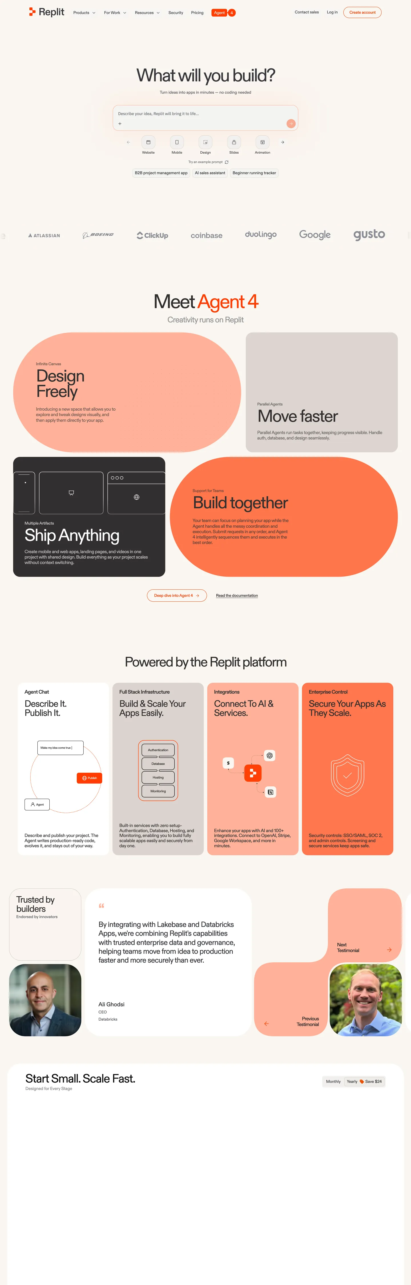
A snapshot of the brand in production. Scroll the frame to see the whole page.
Colors
8 colors
Replit's system runs on #ff3c00 as its primary voltage, used in 1 of 8 components. Type is set in ABC Diatype Plus Variable across 12 tokens from 12px to 60px, weights 400–500. Shape language is sharp — components average 0px corner radius, favoring crisp rectangles.
Surface
Page and card backgrounds · 3
Text
Headlines, body, captions · 2
Borders & Hairlines
Dividers, outlines, rules · 1
Other
Specialty colors · 2
Typography
12 type tokens
Set in ABC Diatype Plus Variable across 12 tokens, from 12px to 60px, weights 400–500. Shown in its own stack: where the font isn't installed, the fallback the file names stands in.
- display-xl60px · weight 400 · lh 53.4px · tracking -3pxThe quick brown fox jumps over the lazy dog
- display-lg28px · weight 400 · lh 23.24px · tracking -1.12pxThe quick brown fox jumps over the lazy dog
- display-md26px · weight 400 · lh 31.2px · tracking -0.78pxThe quick brown fox jumps over the lazy dog
- heading-md20px · weight 500 · lh 28pxThe quick brown fox jumps over the lazy dog
- heading-sm20px · weight 400 · lh 20px · tracking -0.4pxThe quick brown fox jumps over the lazy dog
- body-lg16px · weight 500 · lh 22pxThe quick brown fox jumps over the lazy dog
- body-md16px · weight 400 · lh 22.4px · tracking -0.48pxThe quick brown fox jumps over the lazy dog
- body-sm14px · weight 400 · lh 22.4pxThe quick brown fox jumps over the lazy dog
- label-md14px · weight 400 · lh 22.4pxThe quick brown fox jumps over the lazy dog
- caption12px · weight 400 · lh 18pxThe quick brown fox jumps over the lazy dog
- button-md14px · weight 500 · lh normal · tracking -0.28pxThe quick brown fox jumps over the lazy dog
- nav-link14px · weight 400 · lh normalThe quick brown fox jumps over the lazy dog
Layout
Radii and spacing
5 corner radii and 7 spacing values. Shape language: sharp.
Radii
- none0px
- xs6px
- sm16px
- md20px
- lg40px
Spacing
- xxs4px
- xs8px
- sm12px
- md16px
- lg24px
- xl32px
- 2xl48px
Components
8 components
Each rendered from its tokens (color, type, radius, padding) on Replit's own canvas.
- Button Primarybutton-primaryButton Primary
- Button Secondarybutton-secondaryButton Secondary
- Top Navtop-navTop Nav
- Hero Headinghero-headingHero Heading
- Body Paragraphbody-paragraphBody Paragraph
- CardcardCard
- Type here…text-inputText Input
- Nav Linknav-linkNav Link
In use
The system, in use
Replit's tokens on the kind of product it builds.
Build something people actually use.
A short paragraph of marketing copy that previews how the brand's display tier and body tier read together. Two sentences is usually enough.
FAQ
Replit design system FAQ
Common questions about Replit's tokens, components, and how to use this DESIGN.md in your project.
Read next
Related reading
Specs, directories, and component libraries that pair with this design system.
- Browse all design systemsThe full directory of DESIGN.md files on shadcn.io, with live mockups for each.shadcn.io
- Replit — official siteReplit's public marketing site — the source of truth for the live tokens captured in this file.replit.com (opens in a new tab)
- The DESIGN.md specificationGoogle Labs' open spec for machine-readable design system files — the format this page is built on.github.com (opens in a new tab)
Use it
Use Replit in your project
One machine-readable file. Drop it into Claude, Cursor, or any AI tool that reads DESIGN.md.
Download the DESIGN.md
One machine-readable file: every color, type, radius, spacing, and component token of Replit.
Feed it to your AI tool
Drop it into Claude, Cursor, or GitHub Copilot. The agent writes React components and Tailwind classes that match Replit's visual language.
Reference the tokens directly
Or paste the values into your Tailwind config, CSS variables, or component library: every color, size and radius is a quoted, ready-to-copy value.
Read the full DESIGN.md: overview, rationale, do’s and don’ts
Overview
Replit’s visual language is built on a stark white foundation that forces every interaction to rely on spacing, typography, and subtle color cues. Zero‑Accent Discipline.
Unlike many platforms that splash a bold brand hue across buttons and links, Replit opts for a neutral palette, letting the variable ABC Diatype Plus Variable typeface and precise layout do the work. This is not a bland canvas; it is a purposeful blank slate that highlights code and content.
Key Characteristics:
- Pure white canvas with muted gray text and borders.
- Variable ABC Diatype Plus Variable typeface at lightweight 300‑400 display.
- Step‑ladder corner radii ranging 4‑8 px, no pill shapes.
- No brand accent color, relying on neutral tones for hierarchy.
- Absence of monospace, keeping all text in the same sans‑serif family.
- Light display weight contrasts with heavier fintech typographies.
- Twelve core components designed for consistency across IDE and marketing.
- Orange border accents used sparingly for error states.
Known Gaps
- The system does not define a dedicated brand accent palette, which may require designers to create custom hues for branding purposes.
- No monospace typeface limits options for code‑heavy UI sections where a distinct code font could improve readability.
- The step‑ladder radius system can feel inconsistent when mixing components with different radius values, demanding careful component selection.
- Light display weights may reduce visual impact for headline hierarchy in dense content areas.
- Absence of dark mode specifications leaves accessibility considerations for low‑light environments unanswered.
Design & Creative Tools
More systems like this
More DESIGN.md files in Design & Creative Tools.
Pricing
Build it with Pro
The DESIGN.md files are free. Pro adds 6,000+ blocks, premium templates and the MCP server, so your AI editor builds in your system for you.
4.9/5 out of 5 · 150+ reviewsfrom 150+ founders and developers.
Billing
Billed once a year in USD. Cancel anytime.
- How many people can use the license.
- Client work, SaaS products and anything you charge for.
- Production-ready React sections: hero, pricing, features, dashboards and more.
- Complete multi-page sites you can ship as they are.
- React icons from every major library, installable with one command.
- Presets that restyle every block, in light and dark.
- Lets your AI editor search, preview and install blocks for you.
- Priority requests are answered first.
Individual
For personal projects & open source
$32instead of $49/mo
$389 billed yearly
- Seats: 1 seat
- Commercial use: Personal & open source only
- Pro blocks: 6,000+ blocks
- Templates: All 14 templates
- React icons: 294k+ icons
- Themes: All 59 themes
- MCP server: Basic usage
- Support: Standard
Team
Most popularFor freelancers, agencies & startups
$66instead of $99/mo
$789 billed yearly · ≈ $13/dev/mo
- Seats: Up to 5 seats
- Commercial use: Included
- Pro blocks: 6,000+ blocks
- Templates: All 14 templates
- React icons: 294k+ icons
- Themes: All 59 themes
- MCP server: High usage
- Support: Priority
Organization
For companies with larger teams
$132instead of $199/mo
$1,589 billed yearly
- Seats: Unlimited seats
- Commercial use: Included
- Pro blocks: 6,000+ blocks
- Templates: All 14 templates
- React icons: 294k+ icons
- Themes: All 59 themes
- MCP server: Unlimited usage
- Support: Priority
Billed once a year in USD. Cancel anytime.
Individual
For personal projects & open source
$32instead of $49/mo
$389 billed yearly
- How many people can use the license.Seats: 1 seat
- Client work, SaaS products and anything you charge for.Commercial use: Personal & open source only
- Production-ready React sections: hero, pricing, features, dashboards and more.Pro blocks: 6,000+ blocks
- Complete multi-page sites you can ship as they are.Templates: All 14 templates
- React icons from every major library, installable with one command.React icons: 294k+ icons
- Presets that restyle every block, in light and dark.Themes: All 59 themes
- Lets your AI editor search, preview and install blocks for you.MCP server: Basic usage
- Priority requests are answered first.Support: Standard
Team
Most popularFor freelancers, agencies & startups
$66instead of $99/mo
$789 billed yearly · ≈ $13/dev/mo
Everything in Individual, plus
- How many people can use the license.Seats: Up to 5 seats
- Client work, SaaS products and anything you charge for.Commercial use: Included
- Lets your AI editor search, preview and install blocks for you.MCP server: High usage
- Priority requests are answered first.Support: Priority
Organization
For companies with larger teams
$132instead of $199/mo
$1,589 billed yearly
Everything in Team, plus
- How many people can use the license.Seats: Unlimited seats
- Lets your AI editor search, preview and install blocks for you.MCP server: Unlimited usage
- Secure checkout via Stripe
- Code lives in your repo
- Keep what you've shipped if you cancel
- License terms
Your system, built for you
Every block, template and icon, installed by your AI agent in your design system. The DESIGN.md files stay free.