shadcn.io is not affiliated with official shadcn/ui
Backgrounds
ProPrism Background for React
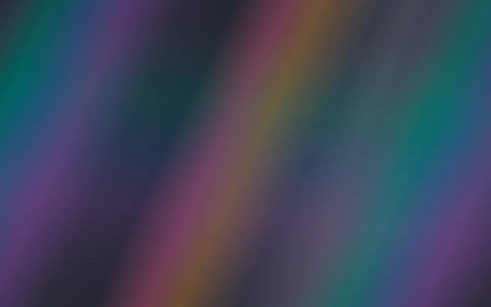
White light catches the edge of the frame and breaks into a soft spectrum that fans across the whole section, like sunlight through a crystal onto a wall. For React with Base UI, when a hero about splitting, converting or analysing something needs colour and slow motion.
White light catches the edge of the frame and breaks into a spectrum that fans across the whole section, like sunlight through a crystal onto a wall. A wide, faint fan of soft colour bands sweeps slowly under a brighter, narrower band laced with thin caustic streaks, which swings further at its own pace, so the colours keep drifting through each other; a soft glow marks where the light enters and faint chromatic leaks warm the far corners. The fans are conic gradients turned about the entry point, so the browser composites them without repainting, and there's no script.
Use it where the story is one thing becoming many: a converter, an analytics product, an API that splits data. For curtains of one colour family, use Aurora; for parallel streaks of light, Beams; for an iridescent foil over a surface, Hologram; for coloured light from a turning ball, Disco.
Installation
Usage
import { Prism } from "@/components/ui/prism";<Prism className="flex min-h-[32rem] items-center justify-center">
<h1 className="text-5xl font-semibold">One input, every color</h1>
</Prism>Prism is a container: whatever you put inside sits on top of the light, in normal flow. The light enters at the left edge, near the top, and the spectrum fans out to the right and down, fading with distance, so it fills a card, a banner or a whole page. On a right-to-left page it enters from the right. The surface is the root's own background, so className="bg-…" sets it. For a backdrop behind the whole page, render it empty with className="fixed inset-0 -z-10".
Demos
Sweep
angleRange={34} nearly doubles how far the bright band swings and speed={0.5} halves its pace, on a scene that stays dark, where the bands add up like light.
In a card
colors takes up to seven CSS colours, from the top band to the bottom one, repeated when there are fewer; here cyan, blue and violet at intensity="subtle".
Accessibility
The light is decoration: it's hidden from assistive tech and lets every click through to your content. With reduced motion both fans hold the middle of their swing, which is the full picture. Nothing flashes.
Put copy over it in your foreground colour (text-foreground). The bands are brightest near where the light enters and fade across the box; at the default intensity text in the content area keeps above 4.5:1 in both colour schemes, so keep small text away from the entry corner on a dark surface with intensity="strong".
FAQ
How is it built?
Two conic gradients of the spectrum share a pivot at the left edge, each in a box sized to cover the section at every angle it turns to, and each fades with distance through a radial mask. They swing with rotate on keyframes of different lengths, so their bands drift through each other. A still layer holds the entry glow and the corner leaks.
Is the order of the colours right?
Yes: red bends least, so it's the top band, and violet bends most, so it's the bottom one. The angles are artistic, wide and soft, so the light fills the box.
Can I change the colours?
Pass up to seven colors, top band first, as any CSS colours; fewer are repeated. Each is also a CSS variable, --prism-color-1 to --prism-color-7. On a light surface they're deepened a little so the pastels read on white.
What does angleRange do?
It's how far the bright band swings, in degrees, there and back: 18 by default. The wide fan under it swings 40% as far.
API Reference
Prism
<div> data-slot="prism"
angleRange?number
How far the bright band of colours swings, in degrees, there and back; the wide fan under it swings 40% as far.
- Default
18
colors?string[]
Up to seven CSS colours for the spectrum, from the top band (red) to the bottom one (violet), repeated when there are fewer. By default a soft spectrum.
intensity?"subtle" | "medium" | "strong"
How strongly the light shows. @default "medium".
- Type
"subtle" | "medium" | "strong"- Default
"medium"
speed?number
How fast the light sweeps, as a multiplier: the bright band swings once every 17 seconds at 1, half as fast at 0.5.
- Default
1
render?ReactElement | ((props: object, state: object) => ReactElement)
Replace the host element or compose it with another component.
- Type
ReactElement | ((props: object, state: object) => ReactElement)
className?string
Merged with the part's classes.
--prism-color-1string
The top band's colour (red); --prism-color-2 to -7 the others.
--prism-rangestring
How far the bright band swings (18deg).
--prism-speedstring
How fast the light sweeps, a multiplier (1).
Related
Beams Background
LightParallel light beams instead of a fan
- Pro

Hologram Background
GradientsThin-film colours sliding over foil
- Pro

Corona Background
LightSunlight pouring in from an edge, without the spectrum
- Pro
Disco Background
LightColoured light from a mirror ball
- Pro
Neon lines on a grid
- Pro

Facets Background
GenerativeA faceted surface catching a drifting light