shadcn.io is not affiliated with official shadcn/ui
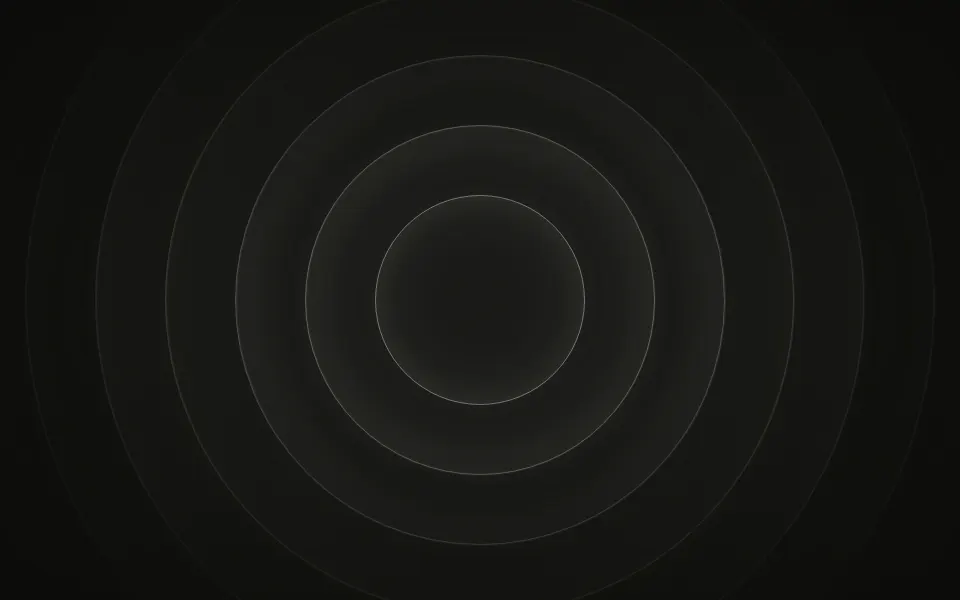
Seven glowing rings turn around the centre, each at its own pace and every other one the other way. Each ring is a thin line of light the whole way round, with one to three bright arcs riding it, a sharp head and a long fading tail, over a soft glow in the middle. The smallest ring sits well inside the box and the largest passes its corners, so the rings fill a card, a banner or a whole page. CSS keyframes turn masked conic gradients; no JavaScript runs.
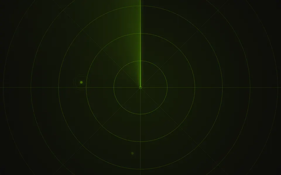
Use it behind a launch headline, a loading or idle state, or anything that should look precise without much movement. For rings that breathe instead of turn, use Ripple; for a beam sweeping over range rings, Sonar; for rings flying toward you, Portal.
Installation
Usage
import { Circles } from "@/components/ui/circles";The rings sit behind whatever you put inside, centred and sized to the container. Give the container a height; for the whole page, className="fixed inset-0 -z-10" with no children.
<Circles className="flex min-h-[420px] items-center justify-center">
  <h1 className="text-4xl font-semibold">Launch day</h1>
</Circles>
Demos
Color
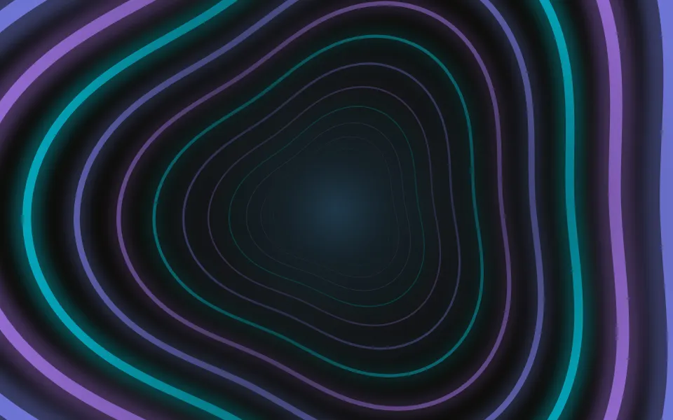
colors takes any number of CSS colours, cycled from the innermost ring out: here cyan, sky and indigo on near-black, with intensity="strong". The glow in the middle takes the first colour.
Speed
speed={0.4} slows every ring to well under half its pace, for an idle or waiting state in a small card. The rings are sized to the box, so the smallest stays inside the card and the largest still reaches its corners.
Accessibility
The rings are decorative: they're hidden from screen readers and never take the pointer, and your content stays on top in normal flow. With reduced motion the rings stop where they are, so the arcs stay as a still picture. Nothing flashes. The rings are thin lines and the glow behind a centred headline is at most 15% of the colour, so text in your foreground colour keeps its contrast in light and dark themes; only an arc's head is the full colour, and it passes behind any one word for a moment.
FAQ
How do the rings move?
Each ring is a conic gradient masked to a soft band and turned by CSS keyframes. One turn takes 22 seconds for the innermost ring and up to two minutes for the outermost, every other ring turning back, so the arcs rarely line up the same way twice.
Can I change the colours?
Pass colors, any CSS colours or theme variables, cycled from the innermost ring out; one colour gives a single-colour set. By default every ring is your theme's --primary, a little deeper at the arcs' heads on a light page and a little whiter on a dark one, so it follows light and dark mode.
How do I change the pace?
speed multiplies every ring's rate: 2 is twice as fast, 0.5 half as fast. The rings keep their relative speeds.
Why does it fill my card, not the window?
The rings are sized in container units of the background layer: the smallest is a third of the box's shorter side and the largest just passes its corners, so the set stays round and fills a small card, a wide banner or the whole page.
API Reference
Circles
<div> data-slot="circles"
colors?string[]
The rings' colours, any CSS colours or theme variables, cycled from the innermost ring out. By default your theme's primary colour.
fade?"none" | "radial" | "top" | "bottom"
Where the rings fade out: toward the edges, the top, the bottom, or nowhere.
- Type
"none" | "radial" | "top" | "bottom"- Default
"radial"
intensity?"subtle" | "medium" | "strong"
How strongly the rings show over the surface.
- Type
"subtle" | "medium" | "strong"- Default
"medium"
speed?number
How fast the rings turn: 2 is twice as fast, 0.5 half as fast.
- Default
1
render?ReactElement | ((props: object, state: object) => ReactElement)
Replace the host element or compose it with another component.
- Type
ReactElement | ((props: object, state: object) => ReactElement)
className?string
Merged with the part's classes.
--circles-color-1string
The first ring colour (the theme's --primary); --circles-color-2… for more.
--circles-speedstring
How fast the rings turn, a multiplier (1).
Related
- Pro
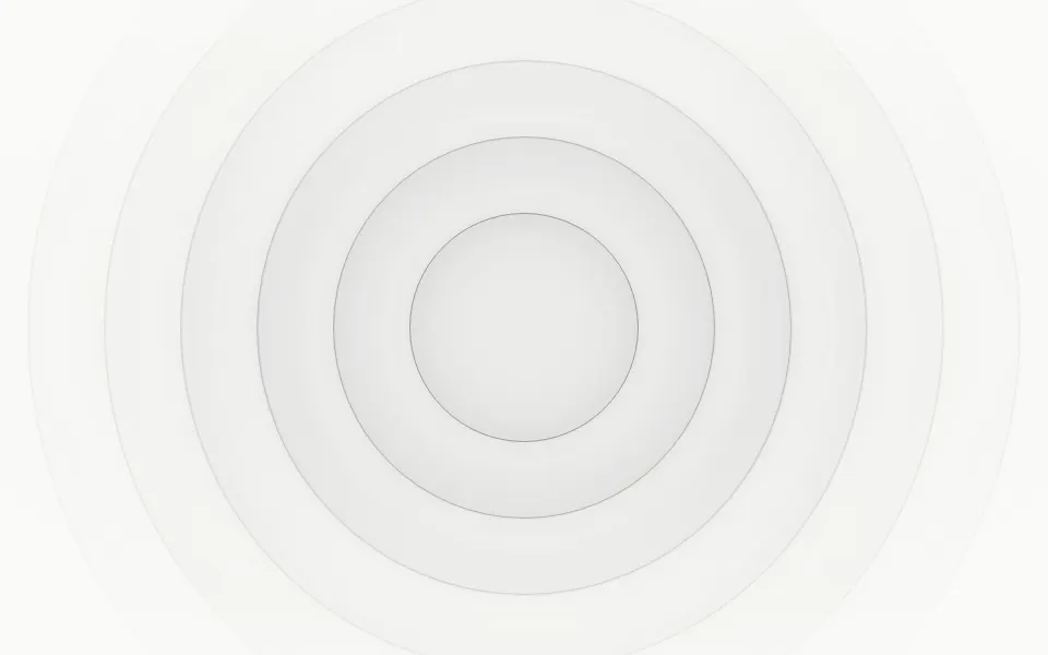
Ripple Background
LightRings that breathe instead of turn
- Pro
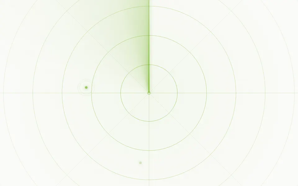
Sonar Background
TechA beam turning over range rings
- Pro
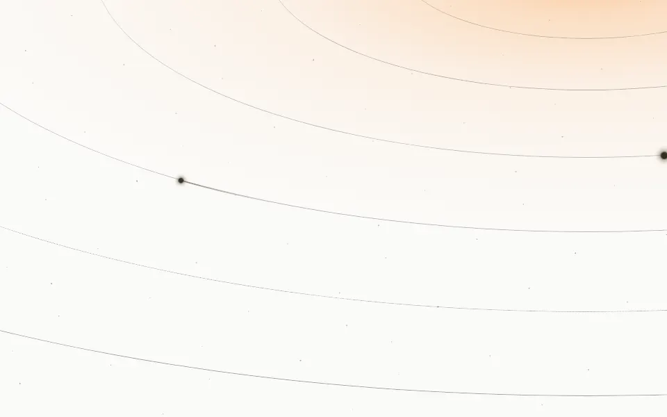
Orbits Background
SpaceElliptical orbits with bodies travelling along them
- Pro
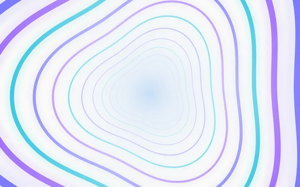
Portal Background
LightRings flying toward you
- Pro

Corona Background
LightA sun at the top edge, pouring rays down
- Pro
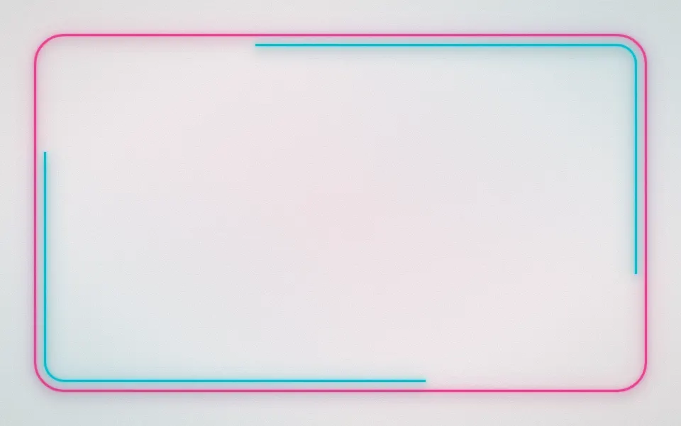
Neon Background
TechNeon tubes framing a lit wall