shadcn.io is not affiliated with official shadcn/ui
Soap bubbles float up through the section, swaying as they rise. Near bubbles are bigger, clearer and quicker; far ones are small and faint, and behind them two layers of tiny bubbles drift up, so the scene has depth. Each bubble is clear glass with a thin film of colour that's strongest at its rim and slowly turns, magenta into gold into cyan, plus a soft highlight and the faint reflection of a window. On a light page the rims read as pastel colour on paper; on a dark one they glow. Bubbles are placed when the page renders and moved by keyframes the install adds to your stylesheet, so no script runs while they rise. With interactive, one more bubble follows the pointer.
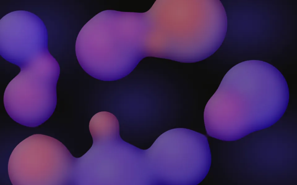
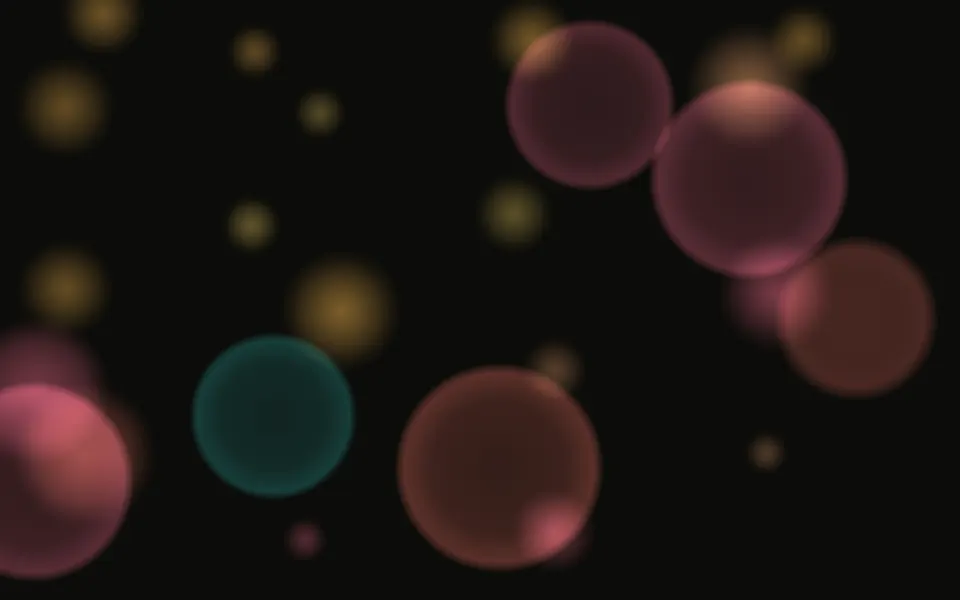
Use it behind a hero, a portfolio intro or a launch section that should feel light and a little playful. For soft out-of-focus discs of light use Bokeh; for one large, slow liquid mass, Metaballs; for tiny motes in a shaft of light, Pollen.
Installation
Usage
import { Bubbles } from "@/components/ui/bubbles";<Bubbles className="flex min-h-[32rem] items-center justify-center">
<h1 className="text-5xl font-semibold">Ideas that rise</h1>
</Bubbles>Bubbles is a container: whatever you put inside sits on top of the bubbles, in normal flow. It fills its own box, so give it a height or content. For a backdrop behind the whole page, render it empty with className="fixed inset-0 -z-10".
Demos
Colors
colors takes up to four CSS colours for the film, repeated when there are fewer; your theme's variables work too. Here an icy cyan, blue and violet, with intensity="subtle" for fainter bubbles and speed={0.6} for a slower rise.
Interactive
interactive adds a bubble that follows the pointer: it grows in where the pointer enters, glides after it with a small overshoot, and shrinks away where it was when the pointer leaves. count sets how many rise at once; in a card this narrow about half of them show.
Accessibility
The bubbles are decoration: they're hidden from assistive tech and let every click through to your content. With reduced motion every bubble stops where it is, so the box shows a still picture of floating bubbles; the pointer bubble still follows a mouse, without gliding. Touch doesn't move it, so scrolling stays smooth. Nothing flashes: the film turns once every half minute or so.
Put copy over it in your foreground colour (text-foreground). The bubbles are mostly clear: their faces carry under a tenth of the film's colour, so text over a face keeps its contrast in both themes. Only a bubble's thin rim is bright, and on a dark page a rim passing behind small text dims it for a moment; behind body text use intensity="subtle", which keeps the rims faint.
FAQ
How is a soap bubble drawn?
Each bubble is one element with a faint body and a fine rim, a soft highlight and a window reflection drawn once as a mask, and a child that holds the film: a conic gradient of colours, masked to be strong at the rim and faint across the face, that slowly turns. Nothing is a bitmap and there's no blur filter.
How does the depth work?
Bubbles come in three tiers, far, middle and near, each rising at its own pace: the nearer, the bigger, clearer and quicker. Behind them two faint layers of tiny bubbles are repeating tiles that drift up as a whole. Within a tier the bubbles share a pace, so they stay evenly spread and never bunch up.
How do I change the colours?
Pass colors, up to four CSS colours for the film; with fewer they repeat. ["var(--primary)"] tints every bubble your brand colour. You can also set --bubbles-color-1 to --bubbles-color-4 in your CSS.
Does it crowd a phone?
No. count is for a wide box; under 900 px wide about 80% of the bubbles show, and under 480 px about 55%, the rest still evenly spread. The bubbles are sized against the box too, so they stay in proportion.
What does interactive do?
One more bubble follows the pointer with a little spring. It grows in where the pointer enters and shrinks away where it was when the pointer leaves. Touch is ignored so scrolling stays smooth.
API Reference
Bubbles
<div> data-slot="bubbles"
colors?string[]
Up to four CSS colours for the soap film's sheen, repeated when there
are fewer. By default magenta, gold, cyan and violet, like real
thin-film colour; ["var(--primary)"] tints every bubble your brand
colour.
count?number
How many bubbles float up at once in a wide box, from 0 to 40. A narrower box shows fewer (about 80% under 900 px wide, 55% under 480), and two faint far layers of tiny bubbles rise behind them, so the box never looks empty or crowded.
- Default
22
intensity?"subtle" | "medium" | "strong"
How strongly the bubbles show: subtle behind body text, strong on a
dark scene.
- Type
"subtle" | "medium" | "strong"- Default
"medium"
interactive?boolean
Whether one more bubble follows the pointer with a little spring. It grows in where the pointer enters and shrinks away where it leaves. Touch is ignored.
- Default
false
speed?number
How fast the bubbles rise and their film turns: 2 is twice as fast, 0.5 half as fast.
- Default
1
render?ReactElement | ((props: object, state: object) => ReactElement)
Replace the host element or compose it with another component.
- Type
ReactElement | ((props: object, state: object) => ReactElement)
className?string
Merged with the part's classes.
data-intensity?string
Mirrors intensity.
--bubbles-color-1string
The first film colour (magenta); -2 to -4 are gold, cyan and violet.
--bubbles-speedstring
How fast they rise and turn, a multiplier (1).
Related
- Pro
Metaballs Background
GradientsOne large, slow liquid mass instead of bubbles
- Pro
Gradient Animation Background
GradientsVery large soft colour fields, no edges at all
- Pro
Bokeh Background
ParticlesSoft out-of-focus circles drifting
- Pro
Underwater Background
WeatherAn aquatic scene with light and drifting particles
- Pro

Pollen Background
ParticlesTiny golden motes in a shaft of light
- Pro
Ink Background
GradientsInk blooming in water, sinking instead of rising