shadcn.io is not affiliated with official shadcn/ui
Month view for one day, several days, or a range. It stays on the page.
Use it when choosing the date is the task. When the date is one field among many, a Date Picker opens this grid in a popover. In Vue, Ark UI moves between days with the arrow keys, and Enter selects.
Installation
Anatomy
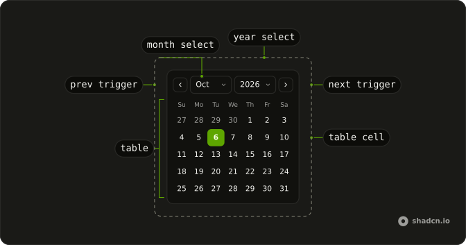
Calendar
├── CalendarClearTrigger
├── CalendarContent
├── CalendarControl
├── CalendarInput
├── CalendarLabel
├── CalendarMonthSelect
├── CalendarNextTrigger
├── CalendarPositioner
├── CalendarPresetTrigger
├── CalendarPrevTrigger
├── CalendarViewDate
├── CalendarTable
│   ├── CalendarTableBody
│   ├── CalendarTableCell
│   │   └── CalendarTableCellTrigger
│   ├── CalendarTableHead
│   ├── CalendarTableHeader
│   └── CalendarTableRow
├── CalendarTrigger
├── CalendarView
│   ├── CalendarViewControl
│   └── CalendarViewTrigger
└── CalendarYearSelect
Usage
import { type DateValue, parseDate } from "@ark-ui/react/date-picker";
import { useState } from "react";
import {
  Calendar, CalendarMonthSelect, CalendarNextTrigger,
  CalendarPrevTrigger, CalendarTable, CalendarTableDays,
  CalendarViewControl, CalendarWeekDays, CalendarYearSelect,
} from "@/components/ui/calendar";
const CalendarDemo = () => {
const [value, setValue] = useState<DateValue[]>([parseDate(new Date())]);
const handleValueChange = (details: { value: DateValue[] }) => {
setValue(details.value);
};
return (
<Calendar
className="w-72 rounded-xl border shadow-xs/5"
fixedWeeks
onValueChange={handleValueChange}
value={value}
>
<CalendarViewControl>
<CalendarPrevTrigger />
<CalendarMonthSelect />
<CalendarYearSelect />
<CalendarNextTrigger />
</CalendarViewControl>
<CalendarTable>
<CalendarWeekDays />
<CalendarTableDays />
</CalendarTable>
</Calendar>
);
};Accessibility
- Arrow Left
- Moves focus to the previous day within the current week.
- Arrow Right
- Moves focus to the next day within the current week.
- Arrow Up
- Moves focus to the same day of the week in the previous week.
- Arrow Down
- Moves focus to the same day of the week in the next week.
- Home
- Moves focus to the first day of the current month.
- End
- Moves focus to the last day of the current month.
- Page Up
- Moves focus to the same day of the month in the previous month.
- Page Down
- Moves focus to the same day of the month in the next month.
- Enter
- Selects the focused date.
- Space
- Activate the focused control.
Demos
Hijri
This month follows a Persian calendar, not a Gregorian grid with translated labels. The selected day starts at 12 June 2025 so there is a stable date to look at. Reach for it when the product's dates are Jalali or Hijri. A locale on an ordinary calendar only renames months and weekdays, so the calendar system has to change as well.
Basic
Previous and next sit around the month title, with no year menu. fixedWeeks keeps every month six rows tall so the block does not jump. Use the plain title when dates are near today and paging by month is fine. A birthday decades back needs year menus, not that walk.
Range
Two months sit side by side, and the selection runs eighteen days from the 20th. Use a range for a stay, a report window, or a filter with a from and a to. A single day is the wrong mode, because a second click should extend the first, not replace it.
Caption
The control row replaces the plain month title with month and year menus. That is the layout for a birthday, a document date, or any value far from the current month. People should not hammer next through twenty years. Keep the plain title when the range is the next few weeks and the menus would only add chrome.
Presets
Today, Tomorrow, and Next week sit under the grid and write the selection themselves. Add shortcuts when most people want a relative date and the grid is the fallback. The button should also move the visible month, or Next week looks like it did nothing while last month stays on screen. Skip shortcuts when the dates have nothing in common.
Time
From and To sit under the days, defaulting to 10:30 and 12:30. The grid still only picks a date, and the clocks are separate inputs, so a meeting can have hours without the calendar storing them. Keep the month visible this way when a popover would hide it. Label both fields, because an unlabeled time is easy to misread as part of the date.
Booked Dates
A run of days is unavailable and drawn with a line through the number. Those days stay visible so the month looks full, but they cannot be selected. Use that for reservations, blackout dates, or a cutoff in the past. Hiding the days makes the grid look broken, so if the strike is unclear, say nearby why those dates are blocked.
Custom Days
Each in-month day shows its number and a price, 100 on weekdays and 120 on weekends. The selection is a range that starts on the 8th. Render the cell when a day carries a fare, a capacity, or a marker, and keep the extra to a few characters. The price sits under the number and should not replace it.
Week Numbers
A column of week numbers sits beside the days. Turn that on for scheduling or payroll, where people already name weeks, and leave it off a birthday picker, where it is noise. Those numbers follow the locale's week rules, so do not label a Monday start and let the column count from Sunday. fixedWeeks still keeps the month a constant height.
Multiple
Several days can be selected at once, starting here with the 4th, the 12th, and the 18th. Use that for shifts or exceptions, dates that are not one continuous stay. A range fits better when the value is a start and an end. Selecting a day toggles it, so the set can change without a separate clear control.
Rtl
dir is rtl and the locale is Arabic, so the week runs from the inline start and the month controls follow the text. Set direction on the calendar when the page is Arabic or Hebrew, not only on a wrapper the grid never sees. The previous and next controls already follow the inline direction. Mirroring the icons yourself can aim them backward.
FAQ
When should I use a Calendar instead of a Date Picker?
Use the Calendar when the month should stay visible on the page, such as a booking screen or a dashboard filter. When the date belongs in a form field, use the Date Picker: an input that opens this calendar in a popover.
How do I select a date range with the Calendar in Vue?
Set selectionMode to range, and numOfMonths to 2 to show two months side by side. The value then holds the start and end dates, as in the Range demo.
How do I let users pick several dates in the Calendar?
Set selectionMode to multiple: the value becomes a list of dates, as in the Multiple demo.
maxSelectedDates caps how many can be picked.
How do I disable booked or past dates in the Calendar?
Pass isDateUnavailable, a function that returns true for days that can't be picked, and min or max to limit the range.
The Booked Dates demo keeps booked days visible with a line through them.
How do I let users jump to a year, such as a birth year, in the Ark UI Calendar?
Add CalendarMonthSelect and CalendarYearSelect to the control row, as the Caption demo does, so nobody clicks back month by month.
Why does the Calendar select the day before the date I set?
Its values are calendar dates without a time, so they don't shift with time zones. Create them with parseDate from a string such as 2025-06-01, rather than converting a Date that carries a time.
Can the Calendar show a Persian or Hijri calendar?
Yes. The Hijri demo shows a Persian calendar. A locale on its own only translates the month and weekday names; the calendar system has to change too, as that demo does.
API Reference
Calendar
<div> data-slot="calendar"
open?boolean
The controlled open state of the date picker. Two-way with v-model:open.
defaultOpen?boolean
The initial open state of the date picker when rendered. Use when you don't need to control the open state of the date picker.
value?DateValue[]
The controlled selected date(s). Two-way with v-model.
defaultValue?DateValue[]
The initial selected date(s) when rendered. Use when you don't need to control the selected date(s) of the date picker.
view?"day" | "month" | "year"
The view of the calendar. Two-way with v-model:view.
- Type
"day" | "month" | "year"
defaultView?"day" | "month" | "year"
The default view of the calendar.
- Type
"day" | "month" | "year"- Default
"day"
closeOnSelect?boolean
Whether the calendar should close after the date selection is complete.
This is ignored when the selection mode is multiple.
- Default
true
createCalendar?(identifier: CalendarIdentifier) → Calendar
A function that creates a Calendar object for a given calendar identifier. Enables non-Gregorian calendar support (Persian, Buddhist, Islamic, etc.) without bundling all calendars by default. import { createCalendar } from "@internationalized/date" { locale: "fa-IR", createCalendar }
- Type
(identifier: CalendarIdentifier) → Calendar- Parameters
identifier– CalendarIdentifier- Returns
Calendar
defaultFocusedValue?CalendarDate | CalendarDateTime | ZonedDateTime
The initial focused date when rendered. Use when you don't need to control the focused date of the date picker.
- Type
CalendarDate | CalendarDateTime | ZonedDateTime
dir?"ltr" | "rtl"
The document's text/writing direction.
- Type
"ltr" | "rtl"- Default
"ltr"
disabled?boolean
Whether the calendar is disabled.
fixedWeeks?boolean
Whether the calendar should have a fixed number of weeks. This renders the calendar with 6 weeks instead of 5 or 6.
focusedValue?CalendarDate | CalendarDateTime | ZonedDateTime
The controlled focused date.
- Type
CalendarDate | CalendarDateTime | ZonedDateTime
format?(date: DateValue, details: LocaleDetails) → string
The format of the date to display in the input.
- Type
(date: DateValue, details: LocaleDetails) → string- Parameters
date– DateValuedetails– { locale: string; timeZone: string }- Returns
string
hideMode?"display-none" | "activity"
How to hide content when mounted but not present.
- display-none: HTML hidden attribute. Effects stay alive.
- activity: React 19 <Activity mode="hidden">. Effects pause. Requires React 19+.
- Type
"display-none" | "activity"- Default
"display-none"
id?string
The unique identifier of the machine.
ids?object
The ids of the elements in the date picker. Useful for composition.
- Type
{ root?: string; label?: (index: number) → string; table?: (id: string) → string; tableHeader?: (id: string) → string; tableBody?: (id: string) → string; tableRow?: (id: string) → string; content?: string; cellTrigger?: (id: string) → string; prevTrigger?: (view: DateView) → string; nextTrigger?: (view: DateView) → string; viewTrigger?: (view: DateView) → string; clearTrigger?: string; control?: string; input?: (index: number) → string; trigger?: string; monthSelect?: string; yearSelect?: string; positioner?: string }
inline?boolean
Whether to render the date picker inline.
invalid?boolean
Whether the date picker is invalid.
isDateUnavailable?(date: DateValue, locale: string) → boolean
Returns whether a date of the calendar is available.
- Type
(date: DateValue, locale: string) → boolean- Parameters
date– DateValuelocale– string- Returns
boolean
lazyMount?boolean
Whether to enable lazy mounting. Ark default: false.
- Default
true
locale?string
The locale (BCP 47 language tag) to use when formatting the date.
- Default
"en-US"
max?CalendarDate | CalendarDateTime | ZonedDateTime
The maximum date that can be selected.
- Type
CalendarDate | CalendarDateTime | ZonedDateTime
maxSelectedDates?number
The maximum number of dates that can be selected.
This is only applicable when selectionMode is multiple.
maxView?"day" | "month" | "year"
The maximum view of the calendar.
- Type
"day" | "month" | "year"- Default
"year"
min?CalendarDate | CalendarDateTime | ZonedDateTime
The minimum date that can be selected.
- Type
CalendarDate | CalendarDateTime | ZonedDateTime
minView?"day" | "month" | "year"
The minimum view of the calendar.
- Type
"day" | "month" | "year"- Default
"day"
name?string
The name attribute of the input element.
numOfMonths?number
The number of months to display.
openOnClick?boolean
Whether to open the calendar when the input is clicked.
- Default
false
outsideDaySelectable?boolean
Whether day outside the visible range can be selected.
- Default
false
parse?(value: string, details: LocaleDetails) → DateValue
Function to parse the date from the input back to a DateValue.
- Type
(value: string, details: LocaleDetails) → DateValue- Parameters
value– stringdetails– { locale: string; timeZone: string }- Returns
DateValue
placeholder?string
The placeholder text to display in the input.
positioning?object
The user provided options used to position the date picker content.
- Type
{ restoreStyles?: boolean; applyStyles?: boolean; hideWhenDetached?: boolean; strategy?: "absolute" | "fixed"; placement?: Placement; offset?: { mainAxis?: number; crossAxis?: number; }; gutter?: number; shift?: number; overflowPadding?: number; arrowPadding?: number; flip?: boolean | Placement[]; slide?: boolean; overlap?: boolean; sameWidth?: boolean; fitViewport?: boolean; sizeMiddleware?: boolean; boundary?: (() → Boundary) | Boundary | "clipping-ancestors"; listeners?: boolean | AutoUpdateOptions; onComplete?: (data: ComputePositionReturn) → void; onPositioned?: ((data: { placed: boolean; }) → void); getAnchorElement?: () → HTMLElement | VirtualElement | null; getAnchorRect?: (element: HTMLElement | VirtualElement | null) → AnchorRect | null; updatePosition?: ((data: { updatePosition: () → Promise<void>; floatingElement: HTMLElement | null; }) → void | Promise<void>) }
readOnly?boolean
Whether the calendar is read-only.
required?boolean
Whether the date picker is required.
selectionMode?"single" | "multiple" | "range"
The selection mode of the calendar.
- single - only one date can be selected
- multiple - multiple dates can be selected
- range - a range of dates can be selected
- Type
"single" | "multiple" | "range"- Default
"single"
showWeekNumbers?boolean
Whether to show the week number column in the day view.
skipAnimationOnMount?boolean
Whether to allow the initial presence animation.
- Default
false
startOfWeek?number
The first day of the week.
0 - Sunday
1 - Monday
2 - Tuesday
3 - Wednesday
4 - Thursday
5 - Friday
6 - Saturday
timeZone?string
The time zone to use.
- Default
"UTC"
translations?object
The localized messages to use.
- Type
{ dayCell?: (state: DayTableCellState) → string; nextTrigger?: (view: DateView) → string; monthSelect?: string; yearSelect?: string; viewTrigger?: (view: DateView, nextView: DateView) → string; prevTrigger?: (view: DateView) → string; presetTrigger?: (value: string[]) → string; clearTrigger?: string; trigger?: (open: boolean) → string; content?: string; placeholder?: ((locale: string) → { year: string; month: string; day: string; }); weekColumnHeader?: string; weekNumberCell?: (weekNumber: number) → string }
unmountOnExit?boolean
Whether to unmount on exit. Ark default: false.
- Default
true
asChild?boolean
Use the provided child element as the default rendered element, combining their props and behavior.
class?string
Merged with the part's classes.
@open-change(details: OpenChangeDetails) → void
Function called when the calendar opens or closes.
- Type
(details: OpenChangeDetails) → void- Parameters
details– { open: boolean; value: DateValue[] }- Returns
void
@value-change(details: ValueChangeDetails) → void
Function called when the value changes.
- Type
(details: ValueChangeDetails) → void- Parameters
details– { value: DateValue[]; valueAsString: string[]; view: DateView }- Returns
void
@view-change(details: ViewChangeDetails) → void
Function called when the view changes.
- Type
(details: ViewChangeDetails) → void- Parameters
details– { view: DateView }- Returns
void
@focus-change(details: FocusChangeDetails) → void
Function called when the focused date changes.
- Type
(details: FocusChangeDetails) → void- Parameters
details– { focusedValue: DateValue; view: DateView }- Returns
void
@visible-range-change(details: VisibleRangeChangeDetails) → void
Function called when the visible range changes.
- Type
(details: VisibleRangeChangeDetails) → void- Parameters
details– { view: DateView; visibleRange: { start: DateValue; end: DateValue; } }- Returns
void
data-disabled?string
Present when disabled.
data-empty?string
Present when the content is empty.
data-readonly?string
Present when read-only.
data-state"open" | "closed"
"open" or "closed".
- Type
"open" | "closed"
CalendarClearTrigger
<button> data-slot="calendar-clear-trigger"
asChild?boolean
Use the provided child element as the default rendered element, combining their props and behavior.
CalendarControl
<div> data-slot="calendar-control"
asChild?boolean
Use the provided child element as the default rendered element, combining their props and behavior.
class?string
Merged with the part's classes.
data-disabled?string
Present when disabled.
data-invalid?string
Present when invalid.
data-placeholder-shown?string
Present when placeholder is shown.
CalendarLabel
<label> data-slot="calendar-label"
asChild?boolean
Use the provided child element as the default rendered element, combining their props and behavior.
class?string
Merged with the part's classes.
data-disabled?string
Present when disabled.
data-index?string
The index of the item.
data-invalid?string
Present when invalid.
data-readonly?string
Present when read-only.
data-state"open" | "closed"
"open" or "closed".
- Type
"open" | "closed"
CalendarMonthSelect
<div> data-slot="calendar-month-select-wrapper"
asChild?boolean
Use the provided child element as the default rendered element, combining their props and behavior.
class?string
Merged with the part's classes.
--cell-radiusstringCalendarNextTrigger
<button> data-slot="calendar-next-trigger"
asChild?boolean
Use the provided child element as the default rendered element, combining their props and behavior.
class?string
Merged with the part's classes.
data-disabled?string
Present when disabled.
CalendarPresetTrigger
<button> data-slot="calendar-preset-trigger"
valueDateValue[] | DateRangePreset
The preset trigger's value.
- Type
DateValue[] | DateRangePreset
asChild?boolean
Use the provided child element as the default rendered element, combining their props and behavior.
CalendarPrevTrigger
<button> data-slot="calendar-prev-trigger"
asChild?boolean
Use the provided child element as the default rendered element, combining their props and behavior.
class?string
Merged with the part's classes.
data-disabled?string
Present when disabled.
CalendarViewDate
<div> data-slot="calendar-range-text"
asChild?boolean
Use the provided child element as the default rendered element, combining their props and behavior.
class?string
Merged with the part's classes.
CalendarTable
<table> data-slot="calendar-table"
columns?number
How many cells each row holds, for months and years.
asChild?boolean
Use the provided child element as the default rendered element, combining their props and behavior.
class?string
Merged with the part's classes.
data-columns?stringdata-view?string
The view of the table.
CalendarTableBody
<tbody> data-slot="calendar-table-body"
asChild?boolean
Use the provided child element as the default rendered element, combining their props and behavior.
data-disabled?string
Present when disabled.
data-view?string
The view of the tablebody.
CalendarTableCell
<td> data-slot="calendar-table-cell"
asChild?boolean
Use the provided child element as the default rendered element, combining their props and behavior.
class?string
Merged with the part's classes.
--cell-radiusstring--cell-sizestringCalendarTableCellTrigger
<div> data-slot="calendar-table-cell-trigger"
asChild?boolean
Use the provided child element as the default rendered element, combining their props and behavior.
--cell-radiusstring--cell-sizestringCalendarTableHead
<thead> data-slot="calendar-table-head"
asChild?boolean
Use the provided child element as the default rendered element, combining their props and behavior.
data-disabled?string
Present when disabled.
data-view?string
The view of the tablehead.
CalendarTableHeader
<th> data-slot="calendar-table-header"
asChild?boolean
Use the provided child element as the default rendered element, combining their props and behavior.
class?string
Merged with the part's classes.
data-disabled?string
Present when disabled.
data-view?string
The view of the tableheader.
--cell-radiusstring--cell-sizestringCalendarTableRow
<tr> data-slot="calendar-table-row"
asChild?boolean
Use the provided child element as the default rendered element, combining their props and behavior.
class?string
Merged with the part's classes.
data-disabled?string
Present when disabled.
data-view?string
The view of the tablerow.
CalendarTrigger
<button> data-slot="calendar-trigger"
asChild?boolean
Use the provided child element as the default rendered element, combining their props and behavior.
data-placeholder-shown?string
Present when placeholder is shown.
data-placementstring
The placement of the trigger.
data-side"top" | "right" | "bottom" | "left"
The side of the trigger that the trigger is positioned on.
- Type
"top" | "right" | "bottom" | "left"
data-state"open" | "closed"
"open" or "closed".
- Type
"open" | "closed"
CalendarView
<div> data-slot="calendar-view"
asChild?boolean
Use the provided child element as the default rendered element, combining their props and behavior.
class?string
Merged with the part's classes.
data-view?string
The view of the view.
CalendarViewControl
<div> data-slot="calendar-view-control"
asChild?boolean
Use the provided child element as the default rendered element, combining their props and behavior.
class?string
Merged with the part's classes.
data-view?string
The view of the viewcontrol.
CalendarViewTrigger
<button> data-slot="calendar-view-trigger"
asChild?boolean
Use the provided child element as the default rendered element, combining their props and behavior.
class?string
Merged with the part's classes.
data-disabled?string
Present when disabled.
data-view?string
The view of the viewtrigger.
--cell-radiusstringCalendarYearSelect
<div> data-slot="calendar-year-select-wrapper"
asChild?boolean
Use the provided child element as the default rendered element, combining their props and behavior.
class?string
Merged with the part's classes.
--cell-radiusstring--cell-sizestringCalendarTodayTrigger
data-slot="calendar-today-trigger"
clickEffect?boolean
Apply a click effect to the button.
- Default
true
isLoading?boolean
Show a loading indicator.
- Default
false
pill?boolean
Fully rounded corners.
- Default
false
size?"icon-lg" | "icon-md" | "icon-sm" | "icon-xl" | "icon-xs" | "lg" | "md" | "sm" | "xl" | "xs"
Ark default: md.
- Type
"icon-lg" | "icon-md" | "icon-sm" | "icon-xl" | "icon-xs" | "lg" | "md" | "sm" | "xl" | "xs"- Default
"lg"
variant?"default" | "destructive" | "ghost" | "link" | "outline" | "secondary"
Ark default: default.
- Type
"default" | "destructive" | "ghost" | "link" | "outline" | "secondary"- Default
"outline"
asChild?boolean
Use the provided child element as the default rendered element, combining their props and behavior.
data-disabled?string
Present when disabled is true.
data-empty?string
Present when empty is true.
data-readonly?string
Present when readOnly is true.
data-state"open" | "closed"
"open" or "closed".
- Type
"open" | "closed"
CalendarWeekDays
<thead> data-slot="calendar-table-head"
format?"narrow" | "short" | "long"
Weekday label width. short is two letters (Su), matching the other
calendar bases.
- Type
"narrow" | "short" | "long"- Default
"short"
asChild?boolean
Use the provided child element as the default rendered element, combining their props and behavior.
data-disabled?string
Present when disabled.
data-view?string
The view of the tablehead.
CalendarTableDays
asChild?boolean
Use the provided child element as the default rendered element, combining their props and behavior.
data-disabled?string
Present when disabled is true.
data-empty?string
Present when empty is true.
data-readonly?string
Present when readOnly is true.
data-state"open" | "closed"
"open" or "closed".
- Type
"open" | "closed"
CalendarTableNextMonth
months?number
The number of months to offset.
- Default
1
asChild?boolean
Use the provided child element as the default rendered element, combining their props and behavior.
data-disabled?string
Present when disabled is true.
data-empty?string
Present when empty is true.
data-readonly?string
Present when readOnly is true.
data-state"open" | "closed"
"open" or "closed".
- Type
"open" | "closed"
CalendarWeekNumberHeaderCell
<th> data-slot="calendar-week-number-header-cell"
asChild?boolean
Use the provided child element as the default rendered element, combining their props and behavior.
class?string
Merged with the part's classes.
data-disabled?string
Present when disabled.
data-type?string
The type of the item.
data-view?string
The view of the weeknumberheadercell.
--cell-sizestringCalendarWeekNumberCell
<td> data-slot="calendar-week-number-cell"
weekDateValue[]
The week's days, the row it numbers.
weekIndexnumber
The week's row in the month, from 0.
asChild?boolean
Use the provided child element as the default rendered element, combining their props and behavior.
class?string
Merged with the part's classes.
data-disabled?string
Present when disabled.
data-type"week-number"
The type of the item.
- Default
"week-number"
data-view"day"
The view of the weeknumbercell.
- Default
"day"
data-week-indexstring
Mirrors weekIndex.
--cell-sizestringCalendarTableMonths
columns?number
How many months each row holds.
- Default
4
format?"short" | "long"
How month names are written: short (Jan) or long (January).
- Type
"short" | "long"- Default
"short"
asChild?boolean
Use the provided child element as the default rendered element, combining their props and behavior.
data-disabled?string
Present when disabled is true.
data-empty?string
Present when empty is true.
data-readonly?string
Present when readOnly is true.
data-state"open" | "closed"
"open" or "closed".
- Type
"open" | "closed"
CalendarTableYears
columns?number
How many years each row holds.
- Default
4
asChild?boolean
Use the provided child element as the default rendered element, combining their props and behavior.
data-disabled?string
Present when disabled is true.
data-empty?string
Present when empty is true.
data-readonly?string
Present when readOnly is true.
data-state"open" | "closed"
"open" or "closed".
- Type
"open" | "closed"
CalendarRootProvider
<div> data-slot="calendar"
valueUseDatePickerReturn
What useCalendar() returns: the state and API, made outside the component to control it.
hideMode?"display-none" | "activity"
How to hide content when mounted but not present.
- display-none: HTML hidden attribute. Effects stay alive.
- activity: React 19 <Activity mode="hidden">. Effects pause. Requires React 19+.
- Type
"display-none" | "activity"- Default
"display-none"
lazyMount?boolean
Whether to enable lazy mounting. Ark default: false.
- Default
true
skipAnimationOnMount?boolean
Whether to allow the initial presence animation.
- Default
false
unmountOnExit?boolean
Whether to unmount on exit. Ark default: false.
- Default
true
asChild?boolean
Use the provided child element as the default rendered element, combining their props and behavior.
class?string
Merged with the part's classes.
data-disabled?string
Present when disabled is true.
data-empty?string
Present when empty is true.
data-readonly?string
Present when readOnly is true.
data-state"open" | "closed"
"open" or "closed".
- Type
"open" | "closed"
useCalendar
CalendarContext
With other components
Popover
OverlaysFloat next to a trigger
Button
ButtonsDay cells and nav
Card
LayoutFrame around the month
Field
InputsLabel on the picker
Input
InputsNative time next to day
Input Group
InputsClock on the time field
Related
Date Picker
DatesPopover plus the grid
Direction
LayoutRTL reading direction
Dialog
OverlaysCalendar inside a modal
Sheet
OverlaysPicker on a phone
Date Input
DatesType the date
Number Input
InputsA single segment