Volkswagen Design System
Volkswagen USA's marketing-site design system as a DESIGN.md file. Deep navy brand surface, ultra-light 47px vw-head display at weight 200, 100px pill buttons, yellow roundel accent, 11 colors tokens. For React, Next.js, and AI coding tools.
Add shadcn.io to your AI agent. · Pro It installs blocks, icons and templates in your design system from a prompt, with Pro.
Set up MCP- Primary
- #001e50
- Typeface
- vw-text
- Shape
- Soft
- Base radius
- 8px
- Colors
- 11
- Type tokens
- 12
- Components
- 16
- Spacing values
- 8
About
About Volkswagen DESIGN.md
Curated by Dov Azencot · Updated May 19, 2026 · Source vw.com (opens in a new tab)
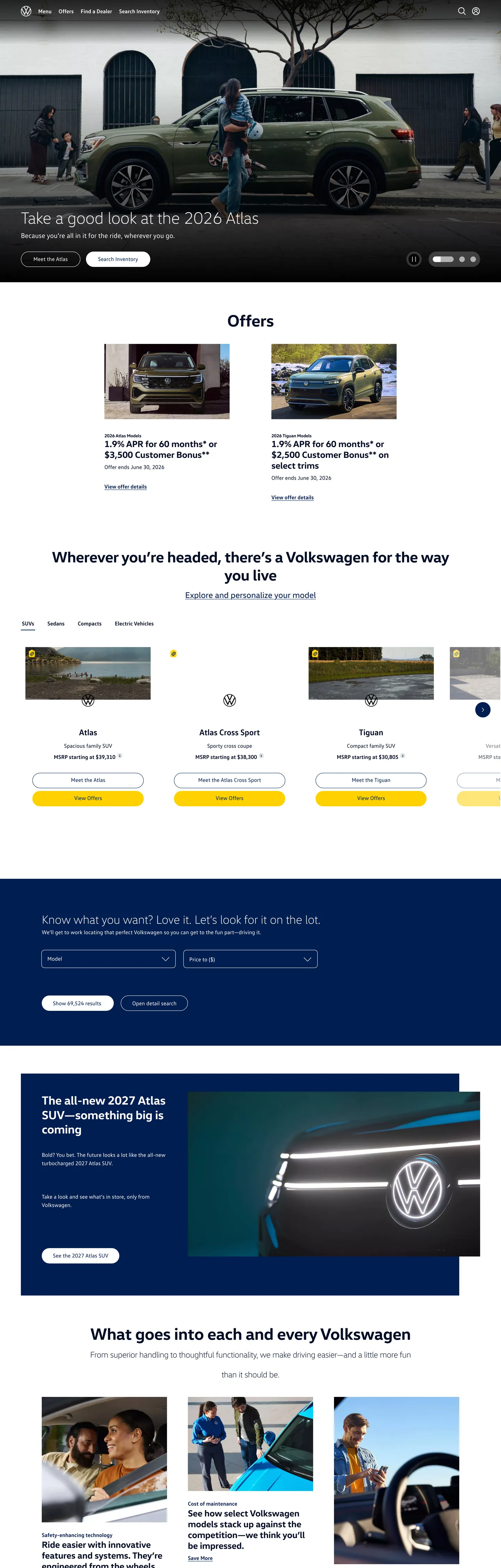
Volkswagen's US site opens with a full-width Atlas photograph and a headline that sets the system's typographic signature immediately: "Take a good look at the 2026 Atlas" in ultra-light vw-head at weight 200. This is not a default — it is a choice that distinguishes VW from every other automotive brand in the US market. GMC's display runs at weight 900. Ford's at 700. Nissan's at 400. Volkswagen's at 200, with -0.63px tracking pulling the already-thin letterforms even closer together into a precise, European-engineered density.
The navy blue identity sits structurally below the fold and in the footer. The dominant above-fold tone is the VW ink-navy — a near-black charcoal with a measurable blue cast (#000e26) that appears 1727 times in the page and carries every text and border occurrence. This is the brand's quietest move: pure black would be more conventional; the blue-tinted near-black ties the entire UI's text register to the VW brand palette without ever declaring a color accent above the fold. The VW roundel at the bottom of the home section sits on a navy blue band, and the yellow (#ffd100) — declared as a brand-layer color in the extraction — appears precisely where the roundel's gold ring runs, 5 occurrences total.
The pill button at 100px border-radius (27 occurrences in the extraction) is the system's warmest element. At a standard 60px button height, a 100px radius forces a full stadium pill with circular ends. This is the same move Nissan makes at 40px, but VW overshoots into the 100px+ territory shared more with luxury-tech brands (Apple's pill buttons) than with truck-and-SUV competitors. Feed this file to an AI coding tool and it will reproduce the VW-specific combination: ink-navy text as the only pervasive color, ultra-light display at weight 200, navy fill for brand identity sections, and mega-radius pill as the dominant interactive shape.
What makes it distinct
5
- Ultra-light display tiervw-head at weight 200 and 47px with -0.63px tracking is the lightest automotive display treatment among major US brands
- Navy as brand surfaceVW Dark Navy fills the footer brand band and key identity sections; unlike GMC or Nissan this navy is a fill-level presence, not just a text color
- 100px pill dominance27 occurrences of the 100px border-radius (and 500px for certain mega-radius elements) make the rounded pill the unchallenged shape language
- Ink-navy vs true navy#000e26 (the dominant text tone) is not black but a near-black with a measurable blue cast that ties all text to the brand palette
- Weight-200-to-700 typographic splitthe same vw-head family swings from 200 (display headlines) to 700 (subheads and body-bold moments) within the same composition
vw.com
Live at vw.com
A snapshot of the brand in production. Scroll the frame to see the whole page.
Colors
11 colors
Volkswagen's system runs on #001e50 as its primary voltage, used in 2 of 16 components. Type is set in vw-text across 12 tokens from 14.08px to 47.712px, weights 200–700. Shape language is soft — components average 62px corner radius, with no sharp interactive edges.
Brand & Accent
Sparing, CTA-only voltage · 2
Surface
Page and card backgrounds · 3
Text
Headlines, body, captions · 3
Borders & Hairlines
Dividers, outlines, rules · 1
Other
Specialty colors · 2
Typography
12 type tokens
Set in vw-text across 12 tokens, from 14.08px to 47.712px, weights 200–700. Shown in its own stack: where the font isn't installed, the fallback the file names stands in.
- display-xl47.712px · weight 200 · lh 57.2544px · tracking -0.63424pxThe quick brown fox jumps over the lazy dog
- display-xl-bold47.712px · weight 700 · lh 57.2544px · tracking -0.63424pxThe quick brown fox jumps over the lazy dog
- display-md34.496px · weight 700 · lh 41.3952px · tracking -0.36992pxThe quick brown fox jumps over the lazy dog
- display-sm25.856px · weight 700 · lh 31.0272px · tracking -0.19712pxThe quick brown fox jumps over the lazy dog
- heading-sm14.08px · weight 700 · lh 16.896px · tracking 0.5pxThe quick brown fox jumps over the lazy dog
- body-lg20px · weight 400 · lh 30px · tracking -0.08pxThe quick brown fox jumps over the lazy dog
- body-md16px · weight 400 · lh 24pxThe quick brown fox jumps over the lazy dog
- body-md-bold16px · weight 700 · lh 24pxThe quick brown fox jumps over the lazy dog
- body-sm14.08px · weight 400 · lh 21.12px · tracking 0.0384pxThe quick brown fox jumps over the lazy dog
- nav-link16px · weight 400 · lh 18.4pxThe quick brown fox jumps over the lazy dog
- card-title24px · weight 700 · lh 36px · tracking -0.17pxThe quick brown fox jumps over the lazy dog
- button-md18.72px · weight 700 · lh 24pxThe quick brown fox jumps over the lazy dog
Layout
Radii and spacing
5 corner radii and 8 spacing values. Shape language: soft.
Radii
- none0px
- sm8px
- pill100px
- mega500px
- full50%
Spacing
- xs4px
- sm8px
- md12px
- base16px
- lg24px
- xl32px
- 2xl40px
- 3xl80px
Components
16 components
Each rendered from its tokens (color, type, radius, padding) on Volkswagen's own canvas.
- Button Primarybutton-primaryButton Primary
- Button Secondarybutton-secondaryButton Secondary
- Button Outline Whitebutton-outline-whiteButton Outline White
- Top Navtop-navTop Nav
- Nav Linknav-linkNav Link
- Hero Headinghero-headingHero Heading
- Section Headingsection-headingSection Heading
- Section Heading Boldsection-heading-boldSection Heading Bold
- Body Paragraphbody-paragraphBody Paragraph
- Body Paragraph Inkbody-paragraph-inkBody Paragraph Ink
- CardcardCard
- Brand Bandbrand-bandBrand Band
- Type here…text-inputText Input
- Offer Cardoffer-cardOffer Card
- Model Tabmodel-tabModel Tab
- FooterfooterFooter
In use
The system, in use
Volkswagen's tokens on the kind of product it builds.
Build something people actually use.
A short paragraph of marketing copy that previews how the brand's display tier and body tier read together. Two sentences is usually enough.
- · 1 project
- · Community support
- · 10k req/mo
- · 10 projects
- · Priority support
- · 1M req/mo
- · Custom domains
- · Unlimited
- · SLA
- · Audit log
- · SSO
FAQ
Volkswagen design system FAQ
Common questions about Volkswagen's tokens, components, and how to use this DESIGN.md in your project.
Read next
Related reading
Specs, directories, and component libraries that pair with this design system.
- Browse all design systemsThe full directory of DESIGN.md files on shadcn.io, with live mockups for each.shadcn.io
- Volkswagen — official siteVolkswagen's public US marketing site — the source of truth for the live tokens captured in this file.vw.com (opens in a new tab)
- The DESIGN.md specificationGoogle Labs' open spec for machine-readable design system files — the format this page is built on.github.com (opens in a new tab)
Use it
Use Volkswagen in your project
One machine-readable file. Drop it into Claude, Cursor, or any AI tool that reads DESIGN.md.
Download the DESIGN.md
One machine-readable file: every color, type, radius, spacing, and component token of Volkswagen.
Feed it to your AI tool
Drop it into Claude, Cursor, or GitHub Copilot. The agent writes React components and Tailwind classes that match Volkswagen's visual language.
Reference the tokens directly
Or paste the values into your Tailwind config, CSS variables, or component library: every color, size and radius is a quoted, ready-to-copy value.
Read the full DESIGN.md: overview, rationale, do’s and don’ts
Overview
Volkswagen's US marketing site runs a typographic experiment that no other major automotive brand in the United States attempts. Ultra-light European restraint. The hero headline — vw-head at weight 200 — sits at the opposite end of the display-weight spectrum from GMC's weight-900 Stratum, Toyota's weight-700 sans, and Ford's weight-800 condensed. Where those brands declare authority through typographic mass, VW declares it through precision: 47px ultra-light letterforms with -0.63px tracking that pull the narrow strokes into a controlled density. The vw-head family then swings to weight 700 for subheadings and card titles within the same page, creating a visual contrast between the engineering restraint of the display tier and the grounded confidence of the supporting text.
The blue identity runs as two distinct tones. The ink-navy (#000e26 — 1727 occurrences) carries every text and border occurrence on the page; it is not pure black but a near-black with a perceptible blue cast that ties the entire UI's text register to the brand palette. The VW Dark Navy (#001e50 — 377 occurrences) is the brand identity surface — it fills the footer brand band, the VW roundel section, and key structural moments below the fold. Where Nissan holds its identity layer entirely monochrome, VW surfaces the navy at section-level fills.
Key Characteristics:
- Ink-navy (
{colors.ink}— #000e26): 1727 total occurrences as text and border — the dominant UI color; a near-black with measurable blue chroma tying every text occurrence to the brand. - VW Dark Navy (
{colors.primary}— #001e50): 377 occurrences across text, border, and background — the brand identity fill color for footer bands and roundel sections. - vw-head at weight 200 for all display headlines (47px); weight 700 for subheads (34px, 25px); vw-text at weight 400 for body.
- 100px border-radius pill as the dominant button and input shape — 27 occurrences in the extraction, far more than any other radius.
- Yellow accent (
{colors.accent-yellow}— #ffd100) as a brand-layer roundel element only — 5 background occurrences, zero text or border occurrences. - 8px card radius (
{rounded.sm}) as the only non-pill non-zero radius in the system. - vw-text runs at weight 400 and 700 for all body, nav, and UI text; Helvetica and Arial as fallbacks.
- Deep black (
{colors.canvas-black}— #000000) for the footer surface; this is the darkest zone, distinct from the ink-navy text color.
Colors
Brand
- VW Dark Navy (
{colors.primary}— #001e50): frequency 377. Used as text (186), border (186), background (4), gradient (1). The brand identity surface — footer band, roundel section, strong brand accent. A readable midnight blue at 25% lightness. - Accent Yellow (
{colors.accent-yellow}— #ffd100): frequency 5, all as backgrounds. Declared as a brand-layer color in the extraction. Appears in the VW roundel badge element only; does not enter the marketing UI chrome. - Gradient Navy (
{colors.gradient-navy}— #00437a): frequency 1, in gradient only. The mid-blue gradient stop on the hero-to-navy overlay gradient.
Text & Border
- Ink (
{colors.ink}— #000e26): frequency 1727. Used as text (865), border (862). The dominant near-black with blue cast — carries the full text and border register across the marketing surface. OKLCH chroma 0.056 at hue 255 confirms a genuine blue-navy tint. - Mid-Gray (
{colors.mid-gray}— #6a767d): frequency 46. Used as text (23), border (23). Secondary text — card meta labels, caption rows, sub-label text below offer cards. - Ink Dark (
{colors.ink-dark}— #3c484d): frequency 2. A cool dark-gray that appears in specific muted-text contexts. - Ink Near (
{colors.ink-near}— #101010): frequency 2. Near-pure black appearing on specific high-contrast text elements.
Surface
- Canvas (
{colors.canvas}— #ffffff): frequency 261. Used as text (122), border (122), background (15), shadow (2). The page floor, card surfaces, and the text/border tone used on dark sections. - Canvas Black (
{colors.canvas-black}— #000000): frequency 57. Used as background (13), text (21), gradient (2). Footer surface and deep gradient stop in photography overlays. - Surface-1 (
{colors.surface-1}— #dfe4e8): frequency 5, all as backgrounds. A cool blue-gray used for alternate section backgrounds and card background variants.
Hairline
- Hairline (
{colors.hairline}— #c2cacf): frequency 1, as background. A light blue-gray surface — the lightest tinted surface in the palette.
Typography
Font Families
The system runs two proprietary typefaces: vw-head for display and heading moments (weight 200 through 700) and vw-text (and vw-text, Helvetica, Arial, sans-serif for component-level UI) for body, nav, and label text (weight 400 and 700). There is no mono tier.
The distinguishing move is the 200–700 weight split within vw-head. Display at weight 200 reads as architectural precision; the same family at weight 700 reads as functional confidence. The two weights do the work that two completely different typefaces would do in a less disciplined system.
Hierarchy
| Token | Size | Weight | Line Height | Letter Spacing | Use |
|---|---|---|---|---|---|
{typography.display-xl} | 47.712px | 200 | 57.2544px | -0.63424px | Hero h1 ("The 2026 Jetta"), section h2 ("Offers") |
{typography.display-xl-bold} | 47.712px | 700 | 57.2544px | -0.63424px | Display-size bold callouts in content panels |
{typography.display-md} | 34.496px | 700 | 41.3952px | -0.36992px | Sub-section headers, model name labels |
{typography.display-sm} | 25.856px | 700 | 31.0272px | -0.19712px | Card titles, feature section headers |
{typography.heading-sm} | 14.08px | 700 | 16.896px | 0.5px | Small uppercase-weight section labels |
{typography.body-lg} | 20px | 400 | 30px | -0.08px | Lead paragraph copy |
{typography.body-md} | 16px | 400 | 24px | 0 | Default body text, nav links, button labels |
{typography.body-md-bold} | 16px | 700 | 24px | 0 | Bold inline text, CTA link labels |
{typography.body-sm} | 14.08px | 400 | 21.12px | 0.0384px | Caption rows, fine print, card meta |
{typography.nav-link} | 16px | 400 | 18.4px | 0 | Top-nav link labels |
{typography.card-title} | 24px | 700 | 36px | -0.17px | Offer card titles, feature cell headings |
{typography.button-md} | 18.72px | 700 | 24px | 0 | Pill button labels |
Principles
Weight 200 at 47px is the defining typographic move. The -0.63px tracking tightens the already-narrow ultra-light strokes into precision-cut letterforms — readable at scale, otherworldly thin in proximity to the weight-700 subheads one section below. The same family alternating 200-to-700 within a single page layout is rare in automotive marketing, closer to a design system from Zara or Acne Studios than from Ford or GMC.
Note on Font Substitutes
vw-head and vw-text are Volkswagen proprietary typefaces not available publicly. For vw-head at weight 200 display: DM Sans at weight 200–300 is the closest open-source match for the proportions and light-weight feel. Inter at weight 200 at larger sizes is another candidate. For vw-text at body sizes, Inter at weight 400–700 transfers cleanly. Preserve the weight-200 treatment at the display tier — any heavier substitute changes the brand's typographic identity fundamentally.
Layout
Spacing System
- Base unit: 4px — the most frequent individual padding value in the extraction (24 occurrences at 4px, 37 at "4px 0px").
- Tokens:
{spacing.xs}4px ·{spacing.sm}8px ·{spacing.md}12px ·{spacing.base}16px ·{spacing.lg}24px ·{spacing.xl}32px ·{spacing.2xl}40px ·{spacing.3xl}80px. - Section-level padding: hero and brand-band sections pad to 80px vertically; offer card sections pad to 32px.
- Button horizontal padding:
{spacing.xl}(32px) left and right on pill CTAs; height is fixed at 60px. - Nav horizontal padding:
{spacing.xl}(32px) — the widest common horizontal padding in the system.
Grid & Container
- Max content width: approximately 1440px on hero and brand-band sections; ~1280px on offers grid and model selector.
- Hero: full-bleed vehicle photography, white display headline left-aligned, pill CTA below.
- Offers section: 2-up card grid on white canvas — each card holds a model photograph, offer terms, and a pill CTA.
- Model selector: horizontal tab strip with model names, links to individual model overview pages.
- "What goes into each and every Volkswagen" section: 3-column editorial feature grid with photography and body paragraphs.
- Brand-band: full-width VW Dark Navy
{colors.primary}section centered on the VW roundel.
Rhythm
The page alternates between white editorial bands (offers, model selector, brand copy) and full-bleed photography moments (hero, lifestyle section, 2026 Atlas feature). Within the white bands, content is set in the ink-navy text register at generous spacing. The navy brand-band near the footer provides a structural anchor: the first non-white non-photography surface on the page, it reintroduces the brand identity color after a long editorial stretch.
Elevation
The VW marketing surface shows minimal shadow usage — {colors.canvas} (#ffffff) appears 2 times as a shadow value, suggesting very faint white-highlight shadows on specific dark-surface elements. The system otherwise relies on surface-color contrast (white card on canvas-black footer, photography panels against white editorial bands) for depth hierarchy.
- Flat: the dominant mode — hero, white editorial bands, nav, footer.
- Card separation:
{colors.surface-1}(#dfe4e8) as light blue-gray card backgrounds in the offers section, lifted against the white canvas floor. - Shadow: minimal — 2 white-channel shadow occurrences only.
Shapes
The radius scale is pill-dominant with an 8px card variant.
{rounded.none}0px — hero sections, full-bleed photography panels, the nav bar.{rounded.sm}8px — offer cards and content cards. 10 occurrences.{rounded.pill}100px — all buttons and text inputs. 27 occurrences — the dominant radius by count.{rounded.mega}500px — 3 occurrences on certain large container elements; renders as a mega-pill for oversized interactive containers.{rounded.full}50% — the VW roundel badge mark and circular icon buttons.
At 100px radius on a 60px-tall button, the pill is geometrically forced: the 30px cap height is smaller than the 100px radius, so the button ends are perfect semicircles. This is intentional — the pill is not aspirational softness but geometric completeness. VW makes the pill harder than Nissan's 40px pill because the math is unambiguous: the ends are exactly circular, not "almost" circular.
Components
button-primary — Ink-navy {colors.ink} fill, white text, {rounded.pill} 100px radius, 0x32px padding, 60px height. The dominant CTA across offers, model pages, and the brand band.
button-secondary — Transparent fill, ink-navy text and border, {rounded.pill} 100px radius, same dimensions. Used for secondary "Learn More" and "Build & Price" CTAs.
button-outline-white — Transparent fill, white text and border, {rounded.pill} 100px radius. Applied over dark photography sections.
top-nav — White {colors.canvas} surface, ink-navy text, 64px height, 32px horizontal padding. VW roundel logo mark flush left, model/offers/shopping links center, account cluster right.
nav-link — VW Dark Navy {colors.primary} border and text on a pill shape, {rounded.pill} 100px radius, 32px horizontal padding, 60px height. The captured nav-link style renders as a pill outline — the same pill treatment as the CTA buttons.
hero-heading — White text, {typography.display-xl} (47.712px / weight 200 / -0.63424px tracking). The ultra-light display headline on photography sections.
section-heading — Ink-navy text, same {typography.display-xl} token, on white canvas editorial sections. "Offers," "Wherever you're headed."
section-heading-bold — Ink-navy text at {typography.display-md} (34.496px / weight 700). The bolder sub-section header tier — model names, feature section headings.
body-paragraph — White text at {typography.body-md} (16px / 400) on photography overlays.
body-paragraph-ink — Ink-navy text at {typography.body-md} on white editorial canvas.
card — White {colors.canvas} fill, ink-navy text, {rounded.sm} 8px radius, 16px padding, {colors.surface-1} border. The default editorial card — holds article teasers, press items, model callouts.
offer-card — White fill, ink-navy text, {rounded.sm} 8px radius, 24px padding. Used in the 2-up offers grid — holds financing terms (APR, months), model photo, and pill CTA.
brand-band — VW Dark Navy {colors.primary} fill, white text, no radius, 80x32px padding. The full-width brand identity section centered on the VW roundel; the single brand-color fill moment above the footer.
model-tab — Transparent fill, ink-navy text, {rounded.pill} radius, minimal padding. The horizontal model-selector tab strip.
text-input — White canvas fill, ink-navy text and border, {rounded.pill} 100px radius, 0x32px padding, 60px height. The search field — same pill geometry as the buttons, creating unified interactive affordance.
footer — Pure black {colors.canvas-black} surface, white text at {typography.body-sm}, 40x32px padding. Houses VW wordmark, site-map column links (Models, Offers, Dealer tools, About), and social icon cluster.
Do's and Don'ts
Do use weight 200 for all display headlines. The ultra-light vw-head at 47px is the defining typographic identity of the brand — substituting weight 400 or 700 at display sizes makes the page read like any other automotive site.
Do apply {rounded.pill} (100px) to every button and text input. The fully-geometric pill — where the radius exceeds half the element height, forcing perfect semicircular ends — is the system's signature interactive shape; inconsistent radius choices (mixing 100px pills with 8px cards) are intentional, not an error.
Do use {colors.ink} (#000e26) rather than pure black for all text. The blue-tinted near-black is a design choice that ties the entire text register to the brand palette — replacing it with #000000 removes a subtle but cumulative brand signal.
Do reserve {colors.primary} (VW Dark Navy) for brand-identity band fills and structural accent moments. The navy fills the footer brand band and the roundel section; it should not enter card or button fills where it would compete with the ink-navy text color.
Don't use {colors.accent-yellow} (#ffd100) in the marketing UI chrome. The yellow appears only as a roundel badge element — 5 total background occurrences, zero text or border occurrences. Injecting yellow into a button fill or section header would read as borrowed from a different brand system entirely.
Don't use the {rounded.sm} (8px) radius on buttons. Cards use 8px; buttons use 100px. Mixing these within the same component family destroys the shape hierarchy that distinguishes interactive affordances (pill) from content containers (card).
Don't render vw-head at weight 200 for text below 32px. Ultra-light weight at small sizes loses legibility quickly — below 32px, the system switches to weight 700 subheadings. Applying weight 200 to body or label text breaks the typographic legibility contract.
Don't use {colors.canvas-black} (#000000) for above-the-fold sections. Pure black belongs only to the footer. Above-fold dark surfaces should use full-bleed vehicle photography rather than flat black fills — a black section above the fold reads as an unfinished hero rather than a brand moment.
Known Gaps
- EV-specific tokens: the ID.4 and ID.Buzz EV models may carry additional accent colors (the ID.4's distinct light-blue EV badge treatment is not captured from the main marketing surface).
- Hover and active states: button hover behavior and active nav states are not captured; it is unknown whether VW injects a color change or changes the border weight on pill-button hover.
- Dark-mode surface: the site does not expose a dark-mode toggle; the near-black surfaces on the page are structural photography and footer elements, not a full dark theme.
- Form validation states: text-input error, success, and disabled states are not represented — the captured marketing surface shows resting state only.
- Configurator surface: the Build & Price configurator carries a richer token system (color-swatch selectors, option comparison grids, 3D exterior viewer) that is not accessible from the main marketing surface capture.
- VW Golf / GTI sub-brand: the performance GTI and Golf R sub-brands historically use a distinct red-accent identity that may override the standard VW navy tokens on their respective model pages.
Automotive
More systems like this
More DESIGN.md files in Automotive.
Pricing
Build it with Pro
The DESIGN.md files are free. Pro adds 6,000+ blocks, premium templates and the MCP server, so your AI editor builds in your system for you.
4.9/5 out of 5 · 150+ reviewsfrom 150+ founders and developers.
Billing
Billed once a year in USD. Cancel anytime.
- How many people can use the license.
- Client work, SaaS products and anything you charge for.
- Production-ready React sections: hero, pricing, features, dashboards and more.
- Complete multi-page sites you can ship as they are.
- React icons from every major library, installable with one command.
- Presets that restyle every block, in light and dark.
- Lets your AI editor search, preview and install blocks for you.
- Priority requests are answered first.
Individual
For personal projects & open source
$32instead of $49/mo
$389 billed yearly
- Seats: 1 seat
- Commercial use: Personal & open source only
- Pro blocks: 6,000+ blocks
- Templates: All 14 templates
- React icons: 294k+ icons
- Themes: All 59 themes
- MCP server: Basic usage
- Support: Standard
Team
Most popularFor freelancers, agencies & startups
$66instead of $99/mo
$789 billed yearly · ≈ $13/dev/mo
- Seats: Up to 5 seats
- Commercial use: Included
- Pro blocks: 6,000+ blocks
- Templates: All 14 templates
- React icons: 294k+ icons
- Themes: All 59 themes
- MCP server: High usage
- Support: Priority
Organization
For companies with larger teams
$132instead of $199/mo
$1,589 billed yearly
- Seats: Unlimited seats
- Commercial use: Included
- Pro blocks: 6,000+ blocks
- Templates: All 14 templates
- React icons: 294k+ icons
- Themes: All 59 themes
- MCP server: Unlimited usage
- Support: Priority
Billed once a year in USD. Cancel anytime.
Individual
For personal projects & open source
$32instead of $49/mo
$389 billed yearly
- How many people can use the license.Seats: 1 seat
- Client work, SaaS products and anything you charge for.Commercial use: Personal & open source only
- Production-ready React sections: hero, pricing, features, dashboards and more.Pro blocks: 6,000+ blocks
- Complete multi-page sites you can ship as they are.Templates: All 14 templates
- React icons from every major library, installable with one command.React icons: 294k+ icons
- Presets that restyle every block, in light and dark.Themes: All 59 themes
- Lets your AI editor search, preview and install blocks for you.MCP server: Basic usage
- Priority requests are answered first.Support: Standard
Team
Most popularFor freelancers, agencies & startups
$66instead of $99/mo
$789 billed yearly · ≈ $13/dev/mo
Everything in Individual, plus
- How many people can use the license.Seats: Up to 5 seats
- Client work, SaaS products and anything you charge for.Commercial use: Included
- Lets your AI editor search, preview and install blocks for you.MCP server: High usage
- Priority requests are answered first.Support: Priority
Organization
For companies with larger teams
$132instead of $199/mo
$1,589 billed yearly
Everything in Team, plus
- How many people can use the license.Seats: Unlimited seats
- Lets your AI editor search, preview and install blocks for you.MCP server: Unlimited usage
- Secure checkout via Stripe
- Code lives in your repo
- Keep what you've shipped if you cancel
- License terms
Your system, built for you
Every block, template and icon, installed by your AI agent in your design system. The DESIGN.md files stay free.