Vrbo Design System
Vrbo's marketing site runs deep navy-indigo as its structural ink with cobalt-blue as the brand CTA voltage, on a white canvas with vacation photography. Tokens for React and AI coding tools.
Add shadcn.io to your AI agent. · Pro It installs blocks, icons and templates in your design system from a prompt, with Pro.
Set up MCP- Primary
- #0f51ec
- Typeface
- Source Sans Pro
- Shape
- Mixed
- Base radius
- 8px
- Colors
- 13
- Type tokens
- 12
- Components
- 18
- Spacing values
- 8
About
About Vrbo DESIGN.md
Curated by Dov Azencot · Updated May 19, 2026 · Source vrbo.com (opens in a new tab)
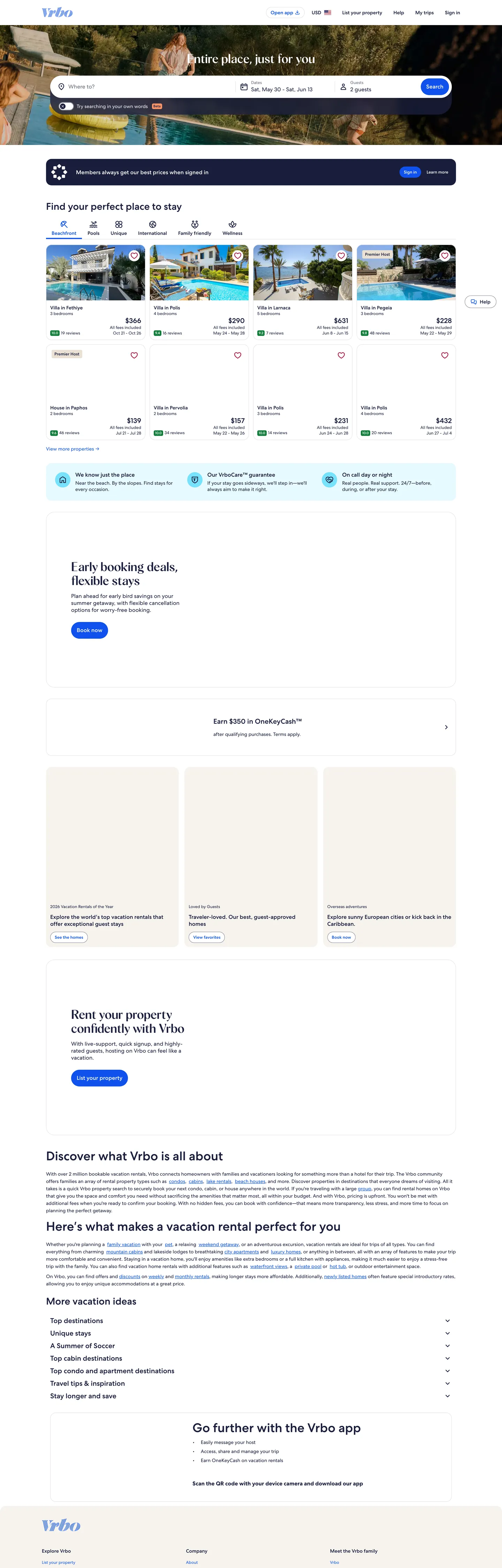
Vrbo's marketing page is the operational face of a two-million-listing vacation rental platform, and its design system reflects that scale. The header carries a full search form — destination, check-in, check-out, guests — above the fold in a white bar anchored to the deep navy-indigo brand tone. Below it, a category navigation with icons (Tropical, Beachfront, Cabin, Mountain, Lake...) and destination photography cards carry the visual weight. The page is white-canvas and photography-led in the same way as Airbnb, but where Airbnb's coral-red (#ff385c) is a warm emotional choice, Vrbo's cobalt-blue (#0f51ec) reads as a transactional trust signal — the color of a booking button, a focus ring, a selected date.
The DESIGN.md file captures the system's ground truth: 13 colors tokens covering a deep navy-indigo structural ink used 2,547 times, a single cobalt-blue brand voltage (519 occurrences, all as text or border), a pure-white canvas, a warm-cream card surface, three grey steps, a green confirmation color, and a light-blue interaction tint. Twelve typography tokens run Source Sans Pro — a utility-grade humanist sans used at sizes from 12px caption to 24px display — with no weight above 700. Eighteen component definitions cover the full booking search form, property cards, the navigation, and badge variants. The system underneath the marketing surface is an enterprise design system: the CSS exports 200+ variables covering loyalty tiers (low/mid/high/extra_high), marketing themes (marketing_1 through marketing_3), and every badge and dialog state.
Feed this file to an AI coding tool and it reproduces Vrbo's specific moves: deep navy-indigo for all structural text and borders rather than the neutral grey most marketplaces use, cobalt blue reserved exclusively for interactive and brand surfaces, warm-cream cards lifted off the white canvas, and a search-form-first above-the-fold composition. The one implementation note worth flagging: Vrbo's token system is an enterprise design system with hundreds of role-specific variables — the 18 tokens in this spec are the marketing-surface subset, not the complete Vrbo Harmony token vocabulary.
What makes it distinct
5
- Deep navy-indigo dominance#191e3b appears 2,547 times as text and borders, making it the most-used color by a factor of 5x over any other token
- Single cobalt CTA voltage#0f51ec wired as --color__brand__1 drives every interactive surface: primary buttons, focus rings, links, selected tabs, and loading spinners
- White canvas with warm photographythe page surface is pure white, with vacation-rental property photos supplying all warmth and aspirational tone
- Enterprise-grade token depththe design system exports 200+ CSS variables covering loyalty tiers, marketing themes, date-picker states, and badge variants
- Green confirmation color#127d3b handles deal badges, positive indicators, and toggle-on states at a distinct hue separate from the cobalt CTA
vrbo.com
Live at vrbo.com
A snapshot of the brand in production. Scroll the frame to see the whole page.
Colors
13 colors
Vrbo's system runs on #0f51ec as its primary voltage, used in 5 of 18 components. Type is set in Source Sans Pro across 12 tokens from 12px to 24px, weights 400–700. Shape language is mixed across 18 components, blending pills, soft rounds, and squarer corners.
Brand & Accent
Sparing, CTA-only voltage · 3
Surface
Page and card backgrounds · 2
Text
Headlines, body, captions · 3
Borders & Hairlines
Dividers, outlines, rules · 2
Other
Specialty colors · 3
Typography
12 type tokens
Set in Source Sans Pro across 12 tokens, from 12px to 24px, weights 400–700. Shown in its own stack: where the font isn't installed, the fallback the file names stands in.
- display-md24px · weight 700 · lh 32pxThe quick brown fox jumps over the lazy dog
- heading-lg20px · weight 700 · lh 28pxThe quick brown fox jumps over the lazy dog
- heading-md18px · weight 700 · lh 24pxThe quick brown fox jumps over the lazy dog
- heading-sm16px · weight 600 · lh 22pxThe quick brown fox jumps over the lazy dog
- body-lg16px · weight 400 · lh 24pxThe quick brown fox jumps over the lazy dog
- body-md14px · weight 400 · lh 20pxThe quick brown fox jumps over the lazy dog
- body-sm12px · weight 400 · lh 18pxThe quick brown fox jumps over the lazy dog
- label-md14px · weight 600 · lh 20pxThe quick brown fox jumps over the lazy dog
- caption12px · weight 400 · lh 16pxThe quick brown fox jumps over the lazy dog
- button-md16px · weight 700 · lh 24pxThe quick brown fox jumps over the lazy dog
- nav-link14px · weight 400 · lh 20pxThe quick brown fox jumps over the lazy dog
- price-display18px · weight 700 · lh 24pxThe quick brown fox jumps over the lazy dog
Layout
Radii and spacing
6 corner radii and 8 spacing values. Shape language: mixed.
Radii
- none0px
- sm4px
- md8px
- lg16px
- xl24px
- pill9999px
Spacing
- xs4px
- sm8px
- md12px
- base16px
- lg24px
- xl32px
- 2xl48px
- 3xl64px
Components
18 components
Each rendered from its tokens (color, type, radius, padding) on Vrbo's own canvas.
- Button Primarybutton-primaryButton Primary
- Button Primary Hoverbutton-primary-hoverButton Primary Hover
- Button Secondarybutton-secondaryButton Secondary
- Button Tertiarybutton-tertiaryButton Tertiary
- Top Navtop-navTop Nav
- Nav Linknav-linkNav Link
- Hero Headinghero-headingHero Heading
- Body Paragraphbody-paragraphBody Paragraph
- Body Paragraph Mutedbody-paragraph-mutedBody Paragraph Muted
- CardcardCard
- Card Warmcard-warmCard Warm
- Type here…text-inputText Input
- Type here…text-input-focusText Input Focus
- Search Formsearch-formSearch Form
- Badge Brandbadge-brandBadge Brand
- Badge Dealbadge-dealBadge Deal
- Price Lockupprice-lockupPrice Lockup
- FooterfooterFooter
In use
The system, in use
Vrbo's tokens on the kind of product it builds.
Build something people actually use.
A short paragraph of marketing copy that previews how the brand's display tier and body tier read together. Two sentences is usually enough.
FAQ
Vrbo design system FAQ
Common questions about Vrbo's tokens, components, and how to use this DESIGN.md in your project.
Read next
Related reading
Specs, directories, and component libraries that pair with this design system.
- Browse all design systemsThe full directory of DESIGN.md files on shadcn.io, with live mockups for each.shadcn.io
- Vrbo — official siteVrbo's public marketing and search site — the source of truth for the live tokens captured in this file.vrbo.com (opens in a new tab)
- The DESIGN.md specificationGoogle Labs' open spec for machine-readable design system files — the format this page is built on.github.com (opens in a new tab)
Use it
Use Vrbo in your project
One machine-readable file. Drop it into Claude, Cursor, or any AI tool that reads DESIGN.md.
Download the DESIGN.md
One machine-readable file: every color, type, radius, spacing, and component token of Vrbo.
Feed it to your AI tool
Drop it into Claude, Cursor, or GitHub Copilot. The agent writes React components and Tailwind classes that match Vrbo's visual language.
Reference the tokens directly
Or paste the values into your Tailwind config, CSS variables, or component library: every color, size and radius is a quoted, ready-to-copy value.
Read the full DESIGN.md: overview, rationale, do’s and don’ts
Overview
Vrbo's marketing site is a utility-first travel marketplace that uses a near-navy structural ink so consistently it redefines what "dark text" means. Saturated structural authority. Where Airbnb deploys a warm neutral grey for body text and lets its coral-red carry the brand identity, Vrbo saturates every text element and border with a deep navy-indigo that reads as a brand tone even in running body copy. The color appears 2,547 times — 1,277 as text, 1,268 as borders — making it the most-used single hex in the system by a factor of five. The effect is a page that feels authoritative and transactional rather than aspirational, which is appropriate for a platform competing on trust and selection rather than lifestyle aspiration.
The brand voltage sits in contrast: cobalt blue handles every interactive surface — the "Search" button, focus rings on the date picker and guest count, selected tab underlines, loading spinners, and all link text. It appears 519 times, split almost evenly between text (262) and border (257) — evidence of a mature component system where focus states are as carefully engineered as the CTA fills. The pairing of deep navy ink with cobalt-blue interactions creates a blue-on-blue hierarchy that reads as unified rather than redundant because the values are separated by roughly 30 lightness points in OKLCH.
The surface is pure white, the photography is warm and aspirational, and the search form above the fold is the primary UI gesture. The category navigation below the hero (Tropical, Beachfront, Cabin, Mountain, Lake) uses icon chips and scrollable labels that function as the browseable taxonomy. Property cards below show photography, price, and review scores in a familiar 3-column grid.
Key Characteristics:
- Deep navy-indigo as the universal structural ink — text, borders, subheadings, labels — not neutral grey.
- Single cobalt-blue brand voltage for every interactive surface, appearing roughly 50/50 as text and border.
- White canvas with warm-cream card surfaces (
{colors.surface-1}— ) for secondary content areas. - Green as the confirmation color — deal badges, toggle switches, positive pricing — distinct from the blue CTA system.
- Source Sans Pro — a free, openly licensed humanist sans used as the utility workhorse at 12px through 24px.
- Enterprise-depth token system: 200+ CSS variables covering 8 loyalty tiers, 3 marketing themes, and every badge and dialog state.
- 8px default card radius; pill geometry (9999px) for tag chips and search pills.
Colors
Brand
- Primary (
{colors.primary}— ): frequency 519 total (262 text, 257 border). Layer: brand, wired as --color__brand__1. The single interactive voltage. CTA button fill, focus ring color, active tab underline, link text color, loading spinner. Not used as a section background — Vrbo reserves cobalt for interaction, not decoration. - Primary Active (
{colors.primary-active}— ): frequency 0 rendered (declared as active-state). Darker navy-blue for button active/pressed states — a deeper cobalt rather than a separate brand signal. - Primary Tint (
{colors.primary-tint}— ): frequency 0 rendered (declared as hover surface). The light blue hover-background for tertiary buttons, action list items, and selected range fills in the date picker. - Positive (
{colors.positive}— ): frequency 8 bg. The confirmation green for deal badges, toggle-selected states, and positive pricing indicators. Used exclusively for outcomes, not for actions.
Surface
- Canvas (
{colors.canvas}— ): frequency 95 total (26 text, 38 bg, 31 border). The page floor — pure white. Wired as --color__background__1 and --background_color__base. - Surface-1 (
{colors.surface-1}— ): frequency 6 bg. A warm cream for secondary card surfaces and highlighted content zones — the "Rent your property confidently" CTA section and highlighted deal cards use this tone.
Text
- Ink (
{colors.ink}— ): frequency 2,547 total (1,277 text, 1,268 border). The dominant structural color. Not a neutral grey — a deep navy-indigo that carries perceptible hue even in body text, giving the page a proprietary visual tone. - Ink Muted (
{colors.ink-muted}— ): frequency 4 total. Placeholder text, muted subtext, and secondary icon fills. A mid-grey with a slight blue-purple tint that echoes the navy ink. - Ink Faint (
{colors.ink-faint}— ): frequency 5 border. The lightest visible grey in the hierarchy — used for navigation active states, card placeholder backgrounds, and loyalty display text.
Structure
- Hairline (
{colors.hairline}— ): frequency 4 total. The standard divider and card border — a barely-warm light grey, wired as --border_color__muted and --light_1__outline_variant. - Hairline Mid (
{colors.hairline-mid}— ): frequency 5 border. The stronger border color for form inputs in their resting state — visible against the white canvas without being as dark as the ink. - Shadow (
{colors.shadow}— ): frequency 3 shadow. Used exclusively as a shadow base — a near-black with blue tint that echoes the navy palette even in drop shadows. - Teal (
{colors.teal}— ): teal for specific informational UI states (not rendered in the marketing surface capture; declared as a system token).
Typography
Font Family
The system runs Source Sans Pro — Adobe's open-source humanist sans-serif released in 2012, now maintained as Source Sans 3. Available on Google Fonts at no cost, it is one of the rare cases where a major marketplace has committed to an open typeface rather than a custom or licensed family.
Hierarchy
| Token | Size | Weight | Use |
|---|---|---|---|
{typography.display-md} | 24px | 700 | Page section headers, marketing headlines |
{typography.heading-lg} | 20px | 700 | Sub-section titles |
{typography.heading-md} | 18px | 700 | Card headings, property names |
{typography.heading-sm} | 16px | 600 | Category labels, tab text |
{typography.body-lg} | 16px | 400 | Primary running text, form labels |
{typography.body-md} | 14px | 400 | Secondary body, card metadata |
{typography.body-sm} | 12px | 400 | Tertiary labels, fine print |
{typography.label-md} | 14px | 600 | Strong labels, badge text |
{typography.caption} | 12px | 400 | Metadata, dates |
{typography.button-md} | 16px | 700 | All button labels |
{typography.nav-link} | 14px | 400 | Navigation items |
{typography.price-display} | 18px | 700 | Property price lockups |
Principles
Source Sans Pro is a utilitarian choice — it lacks the editorial distinction of custom typefaces but has excellent legibility across screen sizes and renders well at 12px caption sizes that are common in data-dense travel UIs. The weight scale tops out at 700 (bold) which appears in headings and button labels; body text sits at 400. No ultralight or thin weights appear, consistent with a platform where density and legibility matter more than typographic mood.
Note on Font Substitutes
Source Sans Pro (now Source Sans 3) is freely available at fonts.google.com — it is the substitute. If you need a comparable fallback: Inter has similar proportions at the 14-16px body range and is available as a variable font. Noto Sans is another open alternative with strong multilingual coverage appropriate for a global travel platform.
Layout
Spacing System
- Base unit: 4px (8px as the dominant module).
- Tokens:
{spacing.xs}4px ·{spacing.sm}8px ·{spacing.md}12px ·{spacing.base}16px ·{spacing.lg}24px ·{spacing.xl}32px ·{spacing.2xl}48px ·{spacing.3xl}64px. - Card internal padding:
{spacing.base}(16px) on property cards;{spacing.lg}(24px) on feature cards. - Header height: 64px with 24px horizontal padding.
- Footer padding: 48px vertical, 24px horizontal.
Grid & Container
- Above-fold search: The hero is a full-bleed photography background with the Vrbo wordmark and a white search-form card centered at the viewport. The search form carries destination typeahead, date range picker, and guest count selector in a single horizontal row at desktop.
- Category navigation: A horizontally scrollable icon-and-label chip rail (Tropical, Beachfront, Cabin, Mountain, Lake, All-inclusive, Ranch...) below the search bar.
- Property grid: A 3-column responsive grid of property cards at desktop, each showing a photography carousel, price, rating, and review count.
- Max content width: approximately 1280px, with padding to the viewport edge at desktop.
Rhythm
The page alternates between photography-led sections (hero, property grid) and text-led feature sections ("Early booking deals," "Discover what Vrbo is all about," "Go further with the Vrbo app"). Feature sections use the warm-cream surface to differentiate them from the white-canvas property grid. There is no dark-canvas section — Vrbo is a light-mode-only surface.
Elevation
The system uses a shadow-plus-border strategy. Property cards have a visible 1px border in {colors.hairline} and no shadow in the resting state — elevation is expressed by surface contrast (card white against page white, bordered). The {colors.shadow} token is a near-black with blue tint used for overlay shadows (modals, dropdowns). The date picker and guest-count dropdown appear with a soft card shadow using this token as the shadow color — consistent with the brand's navy palette even in shadow form.
Shapes
The radius scale runs from 4px (badges) through 8px (buttons, inputs) to 16px (property cards) and 24px (feature cards), with 9999px (pill) for search input pills and tag chips. The 8px default on buttons and inputs is a moderate-soft tier — not as rounded as consumer apps like Airbnb (12px+ buttons) nor as sharp as utility tools. The category icon chips appear as pills (9999px) which creates visual variety against the rectangular cards.
Components
button-primary — Cobalt-blue fill, white text, weight-700 button label, 8px radius, 12x24 padding, 48px height. The "Search" button in the hero form and the "Rent your property" CTA.
button-primary-hover — Darker cobalt fill for hover/active states — a deeper navy-blue rather than a lightened version.
button-secondary — White fill, cobalt border and text — the ghost variant used for secondary CTAs like "Explore more deals."
button-tertiary — Transparent fill, cobalt text, no border. Used for low-emphasis CTAs ("Learn more," "Show all").
top-nav — White surface, 64px height, navy-indigo text, 1px hairline bottom border. Houses the Vrbo wordmark (left), primary nav links (center-left), and sign-in / list-your-property actions (right).
search-form — White surface, 24px radius, hairline border, 8x16 padding. The above-fold booking form carrying the destination input, date range pickers, and guest count stepper in a single horizontal container.
card — White surface, 16px radius, 1px hairline border, 16px padding. The default property card — photography carousel on top, metadata (price, rating, location) below.
card-warm — Warm-cream surface, 16px radius, 24px padding. Feature content cards on the "Rent your property" and "Go further with the Vrbo app" sections.
text-input — White surface, navy text, 8px radius, 1px grey border, 12x16 padding, 48px height. Standard form inputs in the booking search.
text-input-focus — Same geometry but with cobalt border on focus. Wired to --input__focus__border_color in the system.
price-lockup — Transparent surface, navy text at 18px/700. Property pricing displayed below card photography.
badge-brand — Cobalt fill, white text, caption size, 4px radius. Brand promotion labels.
badge-deal — Green fill, white text, caption size, 4px radius. Deal and discount labels — the only green element in the marketing chrome.
footer — White canvas, muted-grey text, body-small, 48x24 padding. The standard marketing page footer with links and legal.
Do's and Don'ts
Do use {colors.ink} for all body text and structural borders, not a neutral grey. The navy-indigo is Vrbo's most distinctive system decision — replacing it with or removes the brand's single most pervasive visual signature.
Do reserve {colors.primary} exclusively for interactive surfaces: CTAs, links, focus rings, selected states. Vrbo uses cobalt as an action signal, not as a decorative accent — decorative use would dilute the affordance signal.
Do use {colors.positive} for confirmation and deal states, and keep it separate from the cobalt CTA. The two-color interactive system (cobalt for actions, green for outcomes) is a usability choice as much as a design one.
Do trust photography to provide warmth. The page canvas is pure white and the ink is cold navy — the warmth comes entirely from vacation-rental photography. Without property photography, this color system reads as a banking interface, not a travel marketplace.
Don't use {colors.primary-tint} as a card background. It is a hover-state and selection-range fill for interactive elements (button hover, date-range mid-selection). Using it as a static card surface would make static elements look hover-active.
Don't use {colors.surface-1} as a background for the main property grid. It is the warm-cream reserved for feature sections that need to stand out from the standard white canvas — overusing it collapses the visual hierarchy between primary content and feature callouts.
Don't set the primary button radius above 8px. Vrbo's 8px button radius sits in a deliberate middle ground between the tighter 4px of fintech interfaces and the softer 12-16px of consumer social apps. Going to 12px would shift the register toward Airbnb's consumer warmth; going to 4px would read as enterprise software.
Don't introduce a third chromatic role (orange, purple, red) for marketing decorations. The system is dual-voltage: cobalt for interactive, green for positive. Adding a decorative accent would break the semantic clarity of the two-color interactive system — any new color would be interpreted as either an action or a confirmation signal.
Known Gaps
- Loyalty tier components: the CSS declares 8 loyalty tier themes (low, mid, high, extra_high, each with a bright variant) with distinct surface, border, and text tokens — none of these render in the static marketing-surface capture.
- Dark-mode overlay states: photo-overlay text uses dark scrims for legibility; the full overlay system is not captured here.
- Date picker internals: the booking calendar (selected dates, range fills, disabled states, today indicator) is one of the most complex components in the system; only the resting and focus states are captured.
- Map view: the property search can switch to a map view with pin markers and card overlays — a distinct component surface not represented here.
- Mobile navigation: the collapsed mobile header (hamburger menu, bottom-nav bar) behaves differently from the desktop nav captured here.
- Marketing themes 1–3: the CSS declares three distinct marketing theme contexts (marketing_1 through marketing_3) which appear to drive promotional landing-page variants; only the default light theme is captured.
- Animation: the search results carousel and the destination photography hero have entrance animations not captured in the static token extraction.
Travel & Hospitality
More systems like this
More DESIGN.md files in Travel & Hospitality.
Pricing
Build it with Pro
The DESIGN.md files are free. Pro adds 6,000+ blocks, premium templates and the MCP server, so your AI editor builds in your system for you.
4.9/5 out of 5 · 150+ reviewsfrom 150+ founders and developers.
Billing
Billed once a year in USD. Cancel anytime.
- How many people can use the license.
- Client work, SaaS products and anything you charge for.
- Production-ready React sections: hero, pricing, features, dashboards and more.
- Complete multi-page sites you can ship as they are.
- React icons from every major library, installable with one command.
- Presets that restyle every block, in light and dark.
- Lets your AI editor search, preview and install blocks for you.
- Priority requests are answered first.
Individual
For personal projects & open source
$32instead of $49/mo
$389 billed yearly
- Seats: 1 seat
- Commercial use: Personal & open source only
- Pro blocks: 6,000+ blocks
- Templates: All 14 templates
- React icons: 294k+ icons
- Themes: All 59 themes
- MCP server: Basic usage
- Support: Standard
Team
Most popularFor freelancers, agencies & startups
$66instead of $99/mo
$789 billed yearly · ≈ $13/dev/mo
- Seats: Up to 5 seats
- Commercial use: Included
- Pro blocks: 6,000+ blocks
- Templates: All 14 templates
- React icons: 294k+ icons
- Themes: All 59 themes
- MCP server: High usage
- Support: Priority
Organization
For companies with larger teams
$132instead of $199/mo
$1,589 billed yearly
- Seats: Unlimited seats
- Commercial use: Included
- Pro blocks: 6,000+ blocks
- Templates: All 14 templates
- React icons: 294k+ icons
- Themes: All 59 themes
- MCP server: Unlimited usage
- Support: Priority
Billed once a year in USD. Cancel anytime.
Individual
For personal projects & open source
$32instead of $49/mo
$389 billed yearly
- How many people can use the license.Seats: 1 seat
- Client work, SaaS products and anything you charge for.Commercial use: Personal & open source only
- Production-ready React sections: hero, pricing, features, dashboards and more.Pro blocks: 6,000+ blocks
- Complete multi-page sites you can ship as they are.Templates: All 14 templates
- React icons from every major library, installable with one command.React icons: 294k+ icons
- Presets that restyle every block, in light and dark.Themes: All 59 themes
- Lets your AI editor search, preview and install blocks for you.MCP server: Basic usage
- Priority requests are answered first.Support: Standard
Team
Most popularFor freelancers, agencies & startups
$66instead of $99/mo
$789 billed yearly · ≈ $13/dev/mo
Everything in Individual, plus
- How many people can use the license.Seats: Up to 5 seats
- Client work, SaaS products and anything you charge for.Commercial use: Included
- Lets your AI editor search, preview and install blocks for you.MCP server: High usage
- Priority requests are answered first.Support: Priority
Organization
For companies with larger teams
$132instead of $199/mo
$1,589 billed yearly
Everything in Team, plus
- How many people can use the license.Seats: Unlimited seats
- Lets your AI editor search, preview and install blocks for you.MCP server: Unlimited usage
- Secure checkout via Stripe
- Code lives in your repo
- Keep what you've shipped if you cancel
- License terms
Your system, built for you
Every block, template and icon, installed by your AI agent in your design system. The DESIGN.md files stay free.