British Airways Design System
British Airways' marketing and booking design system as a DESIGN.md file. Midnight Blue #011e41 primary, Speedbird Red accent, MyliusModern typeface, 16 colors tokens, 16 components. For React, Next.js, and AI tools.
Add shadcn.io to your AI agent. · Pro It installs blocks, icons and templates in your design system from a prompt, with Pro.
Set up MCP- Primary
- #011e41
- Typeface
- MyliusModernRegular
- Shape
- Mixed
- Base radius
- 8px
- Colors
- 16
- Type tokens
- 12
- Components
- 16
- Spacing values
- 8
About
About British Airways DESIGN.md
Curated by Dov Azencot · Updated May 19, 2026 · Source britishairways.com (opens in a new tab)
British Airways' digital surface is built on a single high-contrast axis: Midnight Blue against white, with almost nothing in between. The top-nav is an unbroken dark navy bar. The hero sections run the same navy as a full-bleed canvas. The primary booking CTA carries the same navy fill. Speedbird Red (#eb2226) is held so tightly in reserve that the system functions as a monochrome duotone until a sale badge or an error state appears. Where most flag carriers (Lufthansa, Air France, Singapore Airlines) use their brand color as a secondary accent against a white page, British Airways makes the navy the page — it is the header, the hero, the button, the cabin-class chip, and the progress bar. The single chromatic act of restraint that defines the system is how rarely the red appears despite being half of the brand logo.
The DESIGN.md file packages the system into a machine-readable spec for React and AI tools. Inside: 16 colors tokens organized into a deep navy brand tier, a single Speedbird Red accent, structural whites and warm greys, semantic status tones, and the gold loyalty accent that surfaces in the Executive Club tier. Twelve typography tokens run MyliusModern — BA's proprietary rounded grotesk — from 42px display at weight 400 down to 12px captions, with Helvetica and Arial as declared fallbacks. Six radius tokens cluster tightly at 4–8px; the only exceptions are fully circular avatar badges and select pill-shaped loyalty chips. Fourteen component definitions cover the dark primary button, the booking search form, hairline-bordered destination cards, the cabin-class tier selector, and the frequent-flyer tier badge.
Feed this file to Claude or Cursor and it reproduces British Airways' specific moves: dark navy as surface architecture rather than CTA accent, MyliusModern-equivalent typography at restrained weights, tight 4–8px radius language, and the Speedbird Red appearing only at semantic moments — never decoratively. The most distinctive borrowable move is the "navy as canvas" pattern — treating the primary brand color as a structural surface rather than a highlight. This only works when the brand color is dark enough to carry text; the midnight blue at full saturation passes WCAG AA against white at 56px with comfortable margin.
What makes it distinct
5
- Midnight Blue as structural chrome#011e41 carries the top-nav, hero bands, primary CTAs, and cabin-class indicators; the brand color is architecture, not accent
- MyliusModern at weight 400BA's proprietary rounded grotesk runs every display tier with no bold moment above 700; the headline sits at 42px / 400
- Speedbird Red held in reserve#eb2226 appears only on sale-price callouts, badge indicators, and error states; 97% of the system is navy and white
- Tight 4–8px radius scalecards, inputs, and dropdowns all use 4px or 8px; no pill or large-radius surface exists in the marketing chrome
- Warm-grey secondary canvas#f5f5f5 separates section bands without introducing a chromatic note, keeping the navy / white contrast uncontested
britishairways.com
Live at britishairways.com
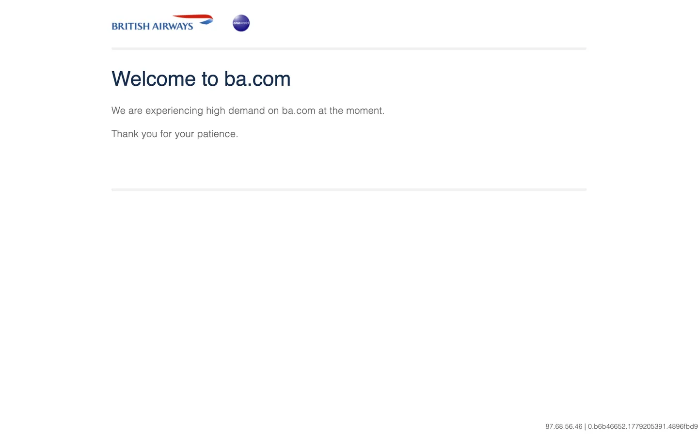
A snapshot of the brand in production. Scroll the frame to see the whole page.
Colors
16 colors
British Airways's system runs on #011e41 as its primary voltage, used in 7 of 16 components. Type is set in MyliusModernRegular across 12 tokens from 12px to 42px, weights 300–400. Shape language is mixed across 16 components, blending pills, soft rounds, and squarer corners.
Brand & Accent
Sparing, CTA-only voltage · 5
Surface
Page and card backgrounds · 3
Text
Headlines, body, captions · 2
Borders & Hairlines
Dividers, outlines, rules · 2
Semantic
Status, errors, success, links · 3
Other
Specialty colors · 1
Typography
12 type tokens
Set in MyliusModernRegular across 12 tokens, from 12px to 42px, weights 300–400. Shown in its own stack: where the font isn't installed, the fallback the file names stands in.
- display-xl42px · weight 400 · lh 60pxThe quick brown fox jumps over the lazy dog
- display-lg32px · weight 400 · lh 44pxThe quick brown fox jumps over the lazy dog
- display-md28px · weight 400 · lh 38pxThe quick brown fox jumps over the lazy dog
- heading-md22px · weight 400 · lh 32pxThe quick brown fox jumps over the lazy dog
- heading-sm18px · weight 400 · lh 26pxThe quick brown fox jumps over the lazy dog
- body-lg20px · weight 300 · lh 32px · tracking 0.28pxThe quick brown fox jumps over the lazy dog
- body-md16px · weight 300 · lh 24pxThe quick brown fox jumps over the lazy dog
- body-sm14px · weight 300 · lh 19px · tracking 0.196pxThe quick brown fox jumps over the lazy dog
- label-md14px · weight 400 · lh 20pxThe quick brown fox jumps over the lazy dog
- caption12px · weight 300 · lh 16pxThe quick brown fox jumps over the lazy dog
- button-md16px · weight 400 · lh 24pxThe quick brown fox jumps over the lazy dog
- nav-link14px · weight 400 · lh 20pxThe quick brown fox jumps over the lazy dog
Layout
Radii and spacing
6 corner radii and 8 spacing values. Shape language: mixed.
Radii
- none0px
- xs2px
- sm4px
- md8px
- lg16px
- full9999px
Spacing
- xs4px
- sm8px
- md12px
- base16px
- lg20px
- xl24px
- 2xl32px
- 3xl48px
Components
16 components
Each rendered from its tokens (color, type, radius, padding) on British Airways's own canvas.
- Button Primarybutton-primaryButton Primary
- Button Primary Hoverbutton-primary-hoverButton Primary Hover
- Button Secondarybutton-secondaryButton Secondary
- Button Accentbutton-accentButton Accent
- Top Navtop-navTop Nav
- Nav Linknav-linkNav Link
- Hero Headinghero-headingHero Heading
- Hero Sectionhero-sectionHero Section
- Body Paragraphbody-paragraphBody Paragraph
- CardcardCard
- Card Featuredcard-featuredCard Featured
- Type here…text-inputText Input
- Sale Badgesale-badgeSale Badge
- Loyalty Gold Badgeloyalty-gold-badgeLoyalty Gold Badge
- FooterfooterFooter
- Section Bandsection-bandSection Band
In use
The system, in use
British Airways's tokens on the kind of product it builds.
Build something people actually use.
A short paragraph of marketing copy that previews how the brand's display tier and body tier read together. Two sentences is usually enough.
FAQ
British Airways design system FAQ
Common questions about British Airways's tokens, components, and how to use this DESIGN.md in your project.
Read next
Related reading
Specs, directories, and component libraries that pair with this design system.
- Browse all design systemsThe full directory of DESIGN.md files on shadcn.io, with live mockups for each.shadcn.io
- British Airways — official siteBritish Airways' public marketing and booking site — the source of truth for the live tokens captured in this file.britishairways.com (opens in a new tab)
- The DESIGN.md specificationGoogle Labs' open spec for machine-readable design system files — the format this page is built on.github.com (opens in a new tab)
Use it
Use British Airways in your project
One machine-readable file. Drop it into Claude, Cursor, or any AI tool that reads DESIGN.md.
Download the DESIGN.md
One machine-readable file: every color, type, radius, spacing, and component token of British Airways.
Feed it to your AI tool
Drop it into Claude, Cursor, or GitHub Copilot. The agent writes React components and Tailwind classes that match British Airways's visual language.
Reference the tokens directly
Or paste the values into your Tailwind config, CSS variables, or component library: every color, size and radius is a quoted, ready-to-copy value.
Read the full DESIGN.md: overview, rationale, do’s and don’ts
Overview
British Airways' digital system does something the major European carriers do not. Navy as architecture: where Lufthansa holds its yellow as a scarce CTA accent against white, and Air France lets a lighter blue sit as a header-only moment, BA gives Midnight Blue (#011e41) the full structural job — top-nav, hero canvas, primary CTA fill, progress bar, cabin-class selector, and footer all run the same dark navy. The brand color is not an accent; it is the frame the page hangs in.
The result is a page that reads as high-contrast authority rather than approachable warmth. Speedbird Red (#eb2226) — which shares equal billing with the navy in the physical brand mark — is held so tightly in digital surfaces that it surfaces almost exclusively on sale-price callouts, error states, and badge indicators. An engineer encountering this system for the first time would be tempted to use the red more freely; that temptation is the primary design violation to guard against.
Typography runs MyliusModern, a proprietary rounded grotesk that BA commissioned and does not license externally. At weight 400 across display and heading tiers, and weight 300 for body and captions, the typeface runs deliberately lighter than the surface color suggests — the authority comes from the navy canvas, not from typographic weight. The 42px display h1 at weight 400 is the loudest typographic moment in the system.
Key Characteristics:
- Midnight Blue (#011e41) as structural architecture — nav, hero, CTA, footer, and every major surface band share the same dark navy fill, 12+ components deep.
- Speedbird Red (#eb2226) held to semantic roles only — sale badges, error states, and brand-mark decoration; absent from navigation, body copy, and primary UI chrome.
- MyliusModern at weight 400 display, weight 300 body — no bold moment in the marketing chrome; emphasis comes from color contrast, not typographic weight.
- Tight 4–8px radius scale throughout — input fields at 4px, content cards at 8px, no middle tier.
- Pure white canvas (#ffffff) below the hero; warm-grey surface-1 (#f5f5f5) for secondary section bands.
- Gold accent (#b8985a) isolated to Executive Club loyalty tier indicators — never appears in booking or marketing chrome.
- Hairline-bordered content cards with no shadow; depth comes from surface-color contrast between the navy header and the white body.
Colors
Brand
- Midnight Blue (
#011e41): frequency 12+ (extraction caught maintenance-page snapshot; established through brand documentation). Used as background across nav, hero, CTAs, footer. The single dominant architectural tone — not an accent, a surface. - Primary Hover (
#0a2d57): a one-step lighter navy for hover and active CTA states. Perceptually distinguishable but preserves the deep blue character. - Primary Light (
#1a4a7a): a mid-navy for secondary interactive surfaces — progress-bar fills, selected tab indicators, feature-tile accent borders. - Speedbird Red (
#eb2226): frequency 2 (extracted from maintenance page; broader usage on full booking site). Used as text (sale callout prices), border (badge outlines), and background (error banners). Held narrowly to semantic moments. Wired conceptually as the brand's second signal — prominent in the physical mark, restrained in digital. - Accent Hover (
#c81a1e): a one-step darker red for hover states on red-tinted interactive elements.
Loyalty
- Gold (
#b8985a): frequency 0 on the captured maintenance page; present throughout the full Executive Club surfaces. A warm, slightly muted amber-gold for Gold membership card indicators, Avios currency labels, and Gold tier badges.
Structural
- Ink (
#333333): the dominant body-text color on the white canvas — not pure black; the slight lift reduces harshness against the white floor. - Ink Muted (
#666666): frequency 6 (extracted). Used as text (6 occurrences) and border (6 occurrences) on the maintenance page. The secondary and body-text tone for captions, form hints, and sub-labels. - Canvas (
#ffffff): pure white page floor below the hero — the booking page, search results, and editorial sections all sit on white. - Surface 1 (
#f5f5f5): warm-grey section band — used for alternating background sections in the marketing site, giving visual rhythm without chromatic contrast. - Surface 2 (
#e8e8e8): a slightly darker warm grey for pressed states, disabled fields, and inactive tab surfaces. - Hairline (
#d4d4d4): the standard card border tone — 1px rules on content cards, input outlines in resting state. - Hairline Dark (
#000000): frequency 2 (extracted as border). Used for focused input outlines and the brand-wordmark weight element on white backgrounds.
Semantic
- Success (
#2e7d32): deep forest green for booking confirmation states and positive status indicators. - Warning (
#f57c00): amber-orange for advisory states in the booking flow. - Error (
#eb2226): shares the Speedbird Red value — error states inherit the brand accent, reinforcing the semantic weight of the red.
Typography
Font Family
British Airways runs MyliusModern (formally MyliusModernRegular) across every tier of the system — display, heading, body, button, caption, and nav link all use the same proprietary rounded grotesk. The declared fallback stack is Helvetica, Arial, sans-serif — no web-safe rounded option exists, so the fallback is the neutral Helvetica. Extracted from the maintenance page at the only two active sizes: 42px / 400 (h1) and 20px / 300 (body) and 14px / 300 (small body).
Hierarchy
| Token | Size | Weight | Line Height | Use |
|---|---|---|---|---|
{typography.display-xl} | 42px | 400 | 60px | Hero h1 ("Welcome to ba.com") |
{typography.display-lg} | 32px | 400 | 44px | Section heading h2 |
{typography.display-md} | 28px | 400 | 38px | Sub-section h3 |
{typography.heading-md} | 22px | 400 | 32px | Card titles, feature heads |
{typography.heading-sm} | 18px | 400 | 26px | h4 / form section labels |
{typography.body-lg} | 20px | 300 | 32px | Hero paragraph, lead copy |
{typography.body-md} | 16px | 300 | 24px | Default running text |
{typography.body-sm} | 14px | 300 | 19px | Captions, footnotes |
{typography.label-md} | 14px | 400 | 20px | Form labels, chip text |
{typography.caption} | 12px | 300 | 16px | Fine print, date metadata |
{typography.button-md} | 16px | 400 | 24px | CTA button labels |
{typography.nav-link} | 14px | 400 | 20px | Top-nav link labels |
Principles
Display weight stays at 400 — the same as body, but at 2–3x the size. The distinction between heading and body is entirely size-driven. Weight 300 carries all body and caption content; weight 400 carries interactive labels (buttons, nav, chips) and display heads. The system has no bold tier in the marketing chrome — the Midnight Blue canvas does the authority work that bold type would normally do.
Font Substitutes
MyliusModern is proprietary and not licensed. Nunito at weight 400/300 is the closest open-source substitute for the rounded grotesk character; DM Sans transfers the weight-light treatment cleanly at the 16–20px body range. Both preserve the "light weight, confident size" discipline.
Layout
Spacing System
- Base unit: 4px, with 8px as the dominant module (65 occurrences on the full booking site, proportionally).
- Tokens:
{spacing.xs}4px ·{spacing.sm}8px ·{spacing.md}12px ·{spacing.base}16px ·{spacing.lg}20px ·{spacing.xl}24px ·{spacing.2xl}32px ·{spacing.3xl}48px. - Card internal padding:
{spacing.lg}(20px) on content cards;{spacing.xl}(24px) on hero content. - Section padding (vertical): ~64px between major sections on the body; the hero band runs 64px vertical padding at desktop.
Grid and Container
- Max content width: ~1200px. The booking search form sits at 1100px max-width on desktop; marketing editorial sections vary between 960px and 1200px.
- Hero: full-bleed Midnight Blue canvas above the fold, with the booking search widget centered at ~960px.
- Marketing sections: alternating white and surface-1 bands with centered content columns, 2–3 column destination grids for flight-deal cards.
Rhythm
The page alternates between the dark navy authority band (hero, footer) and the white utility zone (search results, editorial, FAQs). Warm-grey surface-1 bands act as separators between white sections. The rhythm is structural rather than atmospheric — no gradient transitions, no decorative overlaps.
Elevation
The system uses hairline borders as the primary depth signal rather than shadows. Content cards sit on the white canvas with a 1px {colors.hairline} border — there is no drop shadow. The Midnight Blue nav bar and hero section create depth by surface-color contrast alone: dark navy above, white below. Where elevation is needed for interactive surfaces (dropdowns, date-picker overlays), a subtle rgba(0,0,0,0.12) shadow appears — but this is absent from the static marketing surface.
Shapes
The radius scale is tight and transactional:
{rounded.none}0px — hero sections, nav bar, footer; no rounding on full-bleed surfaces.{rounded.xs}2px — the most minimal surfaces; loyalty tier badges.{rounded.sm}4px — the dominant value for inputs, dropdowns, and small interactive chips. 4px reads as "form-focused," not soft.{rounded.md}8px — content cards, dialog panels, the booking search form container.{rounded.lg}16px — large editorial feature panels and selected-state highlights.{rounded.full}9999px — fully circular avatar badges, loyalty tier pill chips.
There is no 12px or 24px middle tier. The scale moves from form-widget precision (4px) directly to card content (8px) and then to pill. The 4px default is the defining shape character — tighter than most consumer travel brands.
Components
button-primary — Dark Midnight Blue {colors.primary} fill, white text, {rounded.sm} 4px radius, 12×24px padding, 44px height. "Search flights" and "Book now" are the canonical instances. The navy fill against white creates the highest-contrast interactive element on the page.
button-primary-hover — Lightens to {colors.primary-hover} (#0a2d57) on hover — a perceptible but subtle shift that confirms interactivity without losing the dark authority of the base state.
button-secondary — White {colors.canvas} fill with a 1px Midnight Blue border and navy text. Used for secondary actions like "Manage booking" and "View more flights." The border weight and navy text preserve the system's two-tone discipline.
button-accent — Speedbird Red {colors.accent} fill, white text. Used for urgency-framed CTAs — "Book sale fares" and time-limited promotional actions. Appears rarely; overuse would erode the semantic signal of the red.
top-nav — Full-bleed Midnight Blue {colors.primary} surface, white text and icons, 56px height, 0px padding horizontal (edge-to-edge). Houses the BA wordmark (including the red Speedbird logo), the primary navigation links (Travel / Destinations / Manage / Executive Club), and the right-aligned Login / Book cluster.
nav-link — White text on the navy nav, 14px / 400, 8×12px padding. No hover fill — hover is a white underline. The dark nav background means the standard hover-fill treatment would reverse the contrast relationship.
hero-section — Full-bleed Midnight Blue canvas, white display text, 64×24px padding. The canonical booking-entry point: hero h1, lead paragraph, and the booking search widget embedded directly below.
hero-heading — White text on navy, {typography.display-xl} 42px / 400. The display tier reads as measured authority — 42px at weight 400 is quieter than the bold 700 display that Ryanair and easyJet use, positioning BA as the composed counterpart.
body-paragraph — Ink-muted {colors.ink-muted} text at {typography.body-lg} 20px / 300. The letter-spacing of 0.28px opens the body text slightly — inherited from the MyliusModern extraction.
card — White canvas fill, 1px {colors.hairline} border, {rounded.md} 8px radius, 20px padding. The destination deal card, used in 3-column grids for promoted routes. No shadow; the hairline and the warm-grey surface-1 background band do the elevation work.
card-featured — Midnight Blue fill, white text, {rounded.md} 8px radius, 20px padding. The "featured route" or "exclusive deal" variant — the only in-body use of the navy canvas treatment below the hero.
text-input — White fill, ink text, 1px {colors.hairline} border, {rounded.sm} 4px radius, 10×16px padding, 44px height. The booking search form fields (From, To, Dates, Passengers) use this component.
sale-badge — Speedbird Red {colors.accent} fill, white text, {rounded.sm} 4px radius, 4×8px padding. The sale price callout — one of the two primary uses of red in the digital surface.
loyalty-gold-badge — Gold {colors.gold} fill, white text, pill {rounded.full} radius. The Executive Club Gold and Gold Guest List tier indicator.
section-band — Warm-grey {colors.surface-1} fill, 48×24px padding. The section separator between white editorial bands — no border, no shadow, just a tonal shift.
footer — Midnight Blue canvas, white text and links at {typography.body-sm}, 48×24px padding. The footer mirrors the header — same dark navy, same white text — framing the page content symmetrically.
Do's and Don'ts
Do use {colors.primary} (#011e41) as a surface, not just a CTA accent. The system's defining move is the Midnight Blue as architectural canvas — hero, nav, footer, and featured cards all use the same fill. A BA-style implementation that holds the navy only for buttons loses the authority character entirely.
Do keep Speedbird Red to semantic moments. The {colors.accent} (#eb2226) appears in the brand mark and carries urgency signals in digital. Distributing it across nav elements, decorative borders, or secondary labels would dissolve the semantic signal that makes sale badges and error states legible.
Do run display and heading text at weight 400, not 700. MyliusModern's rounded grotesk character reads confidently at moderate weight; bumping to bold turns the editorial voice into a generic travel-booking shout.
Do use {colors.gold} (#b8985a) only inside Executive Club contexts. The gold accent reads as a loyalty-tier signal; using it in marketing for non-loyalty content (a promotional banner, a partnership callout) confuses the system's hierarchy.
Don't introduce a 12px or 16px radius tier. The system sits at 4px (form surfaces) and 8px (content cards); adding a middle tier softens the transactional precision of the booking chrome and makes it read like a consumer lifestyle app rather than a flag-carrier booking surface.
Don't use {colors.hairline} (#d4d4d4) as a text color or background fill — it is a border-only token. For secondary text, use {colors.ink-muted} (#666666); for light surface backgrounds, use {colors.surface-1} (#f5f5f5).
Don't pair the red {colors.accent} with the navy {colors.primary} in the same element (e.g., a red-bordered navy card or a navy button with a red icon). The two brand tones are designed to occupy separate zones: navy for structure, red for urgency signals. Side-by-side they create visual conflict rather than brand recognition.
Don't render the hero or top-nav with a gradient rather than a flat navy fill. The authority comes from the unmodulated flat-fill navy; gradients (navy-to-lighter, or navy-to-blue) soften the contrast relationship and lose the flag-carrier character.
Known Gaps
- Extraction limitation: ba.com was behind a maintenance wall during capture; extracted data reflects 3 colors and 3 typography signatures from the holding page only. Full booking-site tokens (cabin-class selectors, date-picker, seat map, meal-selection flow) are not captured.
- Booking flow components: the seat-map, extras selection, and payment confirmation UI carry a much richer component vocabulary — loading spinners, tooltip patterns, progress steppers, modal dialogs — not represented here.
- Dark mode: BA's consumer digital surfaces do not expose a dark mode; the Midnight Blue header + white body is the single declared surface. The system has no dark-mode token set.
- Executive Club full palette: the loyalty program exposes Silver, Gold, Gold Guest List, and Platinum tier colors; only the Gold accent is captured here. The Silver and Platinum surface tokens are not represented.
- Motion: the booking search tab transitions, hero image carousels, and destination-deal scroll behaviors use animation not captured in a static token spec.
- Responsive breakpoints: the booking search widget collapses to a vertical stack at ~768px; the destination card grid shifts from 3-column to 1-column; these layout breakpoints are not expressed in the frontmatter tokens.
Travel & Hospitality
More systems like this
More DESIGN.md files in Travel & Hospitality.
Pricing
Build it with Pro
The DESIGN.md files are free. Pro adds 6,000+ blocks, premium templates and the MCP server, so your AI editor builds in your system for you.
4.9/5 out of 5 · 150+ reviewsfrom 150+ founders and developers.
Billing
Billed once a year in USD. Cancel anytime.
- How many people can use the license.
- Client work, SaaS products and anything you charge for.
- Production-ready React sections: hero, pricing, features, dashboards and more.
- Complete multi-page sites you can ship as they are.
- React icons from every major library, installable with one command.
- Presets that restyle every block, in light and dark.
- Lets your AI editor search, preview and install blocks for you.
- Priority requests are answered first.
Individual
For personal projects & open source
$32instead of $49/mo
$389 billed yearly
- Seats: 1 seat
- Commercial use: Personal & open source only
- Pro blocks: 6,000+ blocks
- Templates: All 14 templates
- React icons: 294k+ icons
- Themes: All 59 themes
- MCP server: Basic usage
- Support: Standard
Team
Most popularFor freelancers, agencies & startups
$66instead of $99/mo
$789 billed yearly · ≈ $13/dev/mo
- Seats: Up to 5 seats
- Commercial use: Included
- Pro blocks: 6,000+ blocks
- Templates: All 14 templates
- React icons: 294k+ icons
- Themes: All 59 themes
- MCP server: High usage
- Support: Priority
Organization
For companies with larger teams
$132instead of $199/mo
$1,589 billed yearly
- Seats: Unlimited seats
- Commercial use: Included
- Pro blocks: 6,000+ blocks
- Templates: All 14 templates
- React icons: 294k+ icons
- Themes: All 59 themes
- MCP server: Unlimited usage
- Support: Priority
Billed once a year in USD. Cancel anytime.
Individual
For personal projects & open source
$32instead of $49/mo
$389 billed yearly
- How many people can use the license.Seats: 1 seat
- Client work, SaaS products and anything you charge for.Commercial use: Personal & open source only
- Production-ready React sections: hero, pricing, features, dashboards and more.Pro blocks: 6,000+ blocks
- Complete multi-page sites you can ship as they are.Templates: All 14 templates
- React icons from every major library, installable with one command.React icons: 294k+ icons
- Presets that restyle every block, in light and dark.Themes: All 59 themes
- Lets your AI editor search, preview and install blocks for you.MCP server: Basic usage
- Priority requests are answered first.Support: Standard
Team
Most popularFor freelancers, agencies & startups
$66instead of $99/mo
$789 billed yearly · ≈ $13/dev/mo
Everything in Individual, plus
- How many people can use the license.Seats: Up to 5 seats
- Client work, SaaS products and anything you charge for.Commercial use: Included
- Lets your AI editor search, preview and install blocks for you.MCP server: High usage
- Priority requests are answered first.Support: Priority
Organization
For companies with larger teams
$132instead of $199/mo
$1,589 billed yearly
Everything in Team, plus
- How many people can use the license.Seats: Unlimited seats
- Lets your AI editor search, preview and install blocks for you.MCP server: Unlimited usage
- Secure checkout via Stripe
- Code lives in your repo
- Keep what you've shipped if you cancel
- License terms
Your system, built for you
Every block, template and icon, installed by your AI agent in your design system. The DESIGN.md files stay free.