Hilton Design System
Hilton's marketing-site design system as a DESIGN.md file. Royal navy CTA button, sky blue interactive accent, Loew Black uppercase display, 18 sub-brand logos, and 13 components definitions for React, Next.js, and AI tools.
Add shadcn.io to your AI agent. · Pro It installs blocks, icons and templates in your design system from a prompt, with Pro.
Set up MCP- Primary
- #104c97
- Typeface
- loewbold
- Shape
- Sharp
- Base radius
- 5px
- Colors
- 6
- Type tokens
- 8
- Components
- 13
- Spacing values
- 9
About
About Hilton DESIGN.md
Curated by Dov Azencot · Updated May 19, 2026 · Source hilton.com (opens in a new tab)
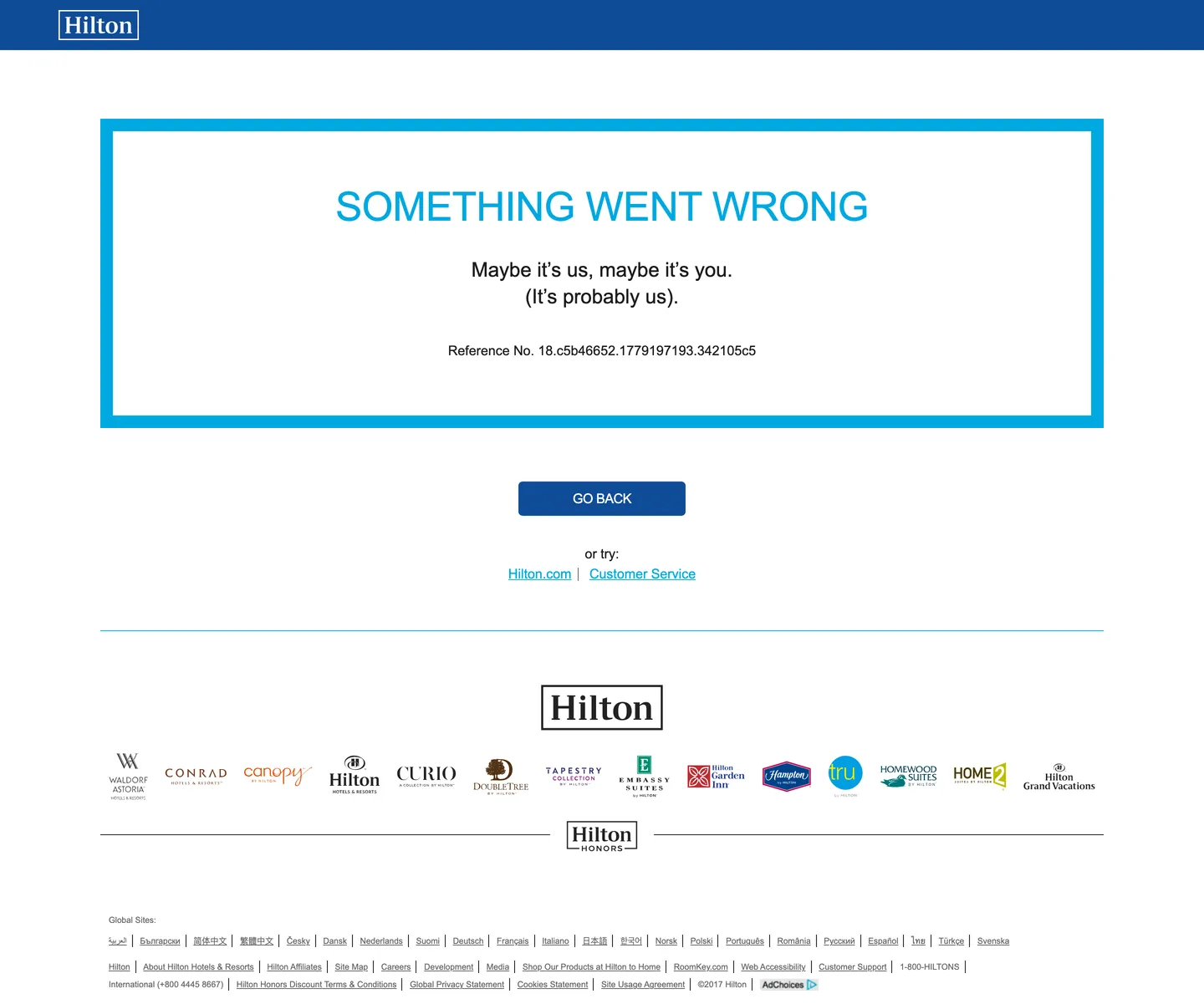
Hilton's brand system reveals itself even on a 404 page. The extraction was captured from an error surface rather than the full homepage, but the page delivers every foundational brand token in sharp relief: Loew Black in all-caps at 48px for the heading, Loew Bold for body text, royal navy on the CTA button, sky blue on the hero heading and link accents, and a 5px border radius on all interactive surfaces. The error page's editorial self-awareness ("Maybe it's us, maybe it's you. (It's probably us)") is itself brand voice. Below the fold, 18 sub-brand portfolio logos — from Waldorf Astoria down to HOME2 Suites and Hilton Grand Vacations — render in their individual chromatic identities, unified under the Hilton Hotels & Resorts wordmark centered in the footer.
The two-blue system is Hilton's defining chromatic choice. Royal navy (#104c97) is the action color — it fills the primary CTA button, appears as the nav background on logged-in surfaces, and anchors the brand mark. Sky blue (#00a8e1) is the interaction color — it renders the hero heading on the error page, colors active link text, and outlines the error panel's cyan border. The pairing reads as depth plus energy: navy grounds the brand with hotel-lobby authority, sky blue signals digital interactivity in a way the darker navy alone could not. Competitors like Marriott use a single brand red across both roles; Hyatt uses a single gold-yellow; Hilton's two-blue strategy is the most architecturally precise chromatic discipline in the major hotel chains.
Feed this file to an AI coding tool and it reproduces Hilton's specific moves: Loew Black uppercase display at 48px with tight leading, royal navy primary buttons, sky blue for heading accents and link text, a near-monochromatic gray structural palette, and the 5px radius that keeps the interface approachable without tipping into consumer-app softness. The sub-brand portfolio footer is the hardest surface to reproduce: 18 distinct brand identities each with their own colors, unified only by scale, positioning, and the Hilton parent wordmark above them.
What makes it distinct
5
- Royal navy primary voltagethe deep navy CTA button is Hilton's only brand-color use on a predominantly gray-and-white system
- Sky blue interactive accentthe hero heading and link colors use a lighter sky blue rather than the primary navy, creating a two-blue brand system
- Loew Black for uppercase displayall visible headings run in the Loew Black weight with uppercase tracking, a compressed condensed feel despite being set in a wide-tracking variant
- 18 sub-brand portfolio logosthe footer reveals Waldorf Astoria, Conrad, Canopy, DoubleTree, Embassy Suites, Hampton, Tru, Homewood Suites, and 10 others, each in its own chromatic identity
- Error-page extractionthe captured tokens come from a 404/error surface; the visitor-facing homepage has a richer design, but the error page faithfully exposes the brand's core type, color, and spacing tokens
hilton.com
Live at hilton.com
A snapshot of the brand in production. Scroll the frame to see the whole page.
Colors
6 colors
Hilton's system runs on #104c97 as its primary voltage, used in 3 of 13 components. Type is set in loewbold across 8 tokens from 10px to 48px, weights 400–400. Shape language is sharp — components average 4px corner radius, favoring crisp rectangles.
Brand & Accent
Sparing, CTA-only voltage · 1
Surface
Page and card backgrounds · 1
Text
Headlines, body, captions · 2
Borders & Hairlines
Dividers, outlines, rules · 1
Other
Specialty colors · 1
Typography
8 type tokens
Set in loewbold across 8 tokens, from 10px to 48px, weights 400–400. Shown in its own stack: where the font isn't installed, the fallback the file names stands in.
- display-xl48px · weight 400 · lh 48px · tracking -0.48pxThe quick brown fox jumps over the lazy dog
- heading-lg24px · weight 400 · lh 32pxThe quick brown fox jumps over the lazy dog
- heading-md16px · weight 400 · lh 19px · tracking -0.4pxThe quick brown fox jumps over the lazy dog
- body-lg16px · weight 400 · lh 24pxThe quick brown fox jumps over the lazy dog
- body-md16px · weight 400 · lh 21pxThe quick brown fox jumps over the lazy dog
- nav-link16px · weight 400 · lh 16pxThe quick brown fox jumps over the lazy dog
- caption10px · weight 400 · lh 14pxThe quick brown fox jumps over the lazy dog
- button-md16px · weight 400 · lh 19px · tracking -0.4pxThe quick brown fox jumps over the lazy dog
Layout
Radii and spacing
3 corner radii and 9 spacing values. Shape language: sharp.
Radii
- none0px
- sm5px
- full9999px
Spacing
- xs5px
- sm6px
- md10px
- base12px
- lg20px
- xl32px
- 2xl55px
- 3xl60px
- 4xl67px
Components
13 components
Each rendered from its tokens (color, type, radius, padding) on Hilton's own canvas.
- Button Primarybutton-primaryButton Primary
- Button Secondarybutton-secondaryButton Secondary
- Top Navtop-navTop Nav
- Nav Linknav-linkNav Link
- Hero Headinghero-headingHero Heading
- Body Paragraphbody-paragraphBody Paragraph
- Body Paragraph Mutedbody-paragraph-mutedBody Paragraph Muted
- CardcardCard
- Type here…text-inputText Input
- Brand Logo Gridbrand-logo-gridBrand Logo Grid
- Loyalty Lockuployalty-lockupLoyalty Lockup
- Error Panelerror-panelError Panel
- FooterfooterFooter
In use
The system, in use
Hilton's tokens on the kind of product it builds.
Build something people actually use.
A short paragraph of marketing copy that previews how the brand's display tier and body tier read together. Two sentences is usually enough.
- · 1 project
- · Community support
- · 10k req/mo
- · 10 projects
- · Priority support
- · 1M req/mo
- · Custom domains
- · Unlimited
- · SLA
- · Audit log
- · SSO
FAQ
Hilton design system FAQ
Common questions about Hilton's tokens, components, and how to use this DESIGN.md in your project.
Read next
Related reading
Specs, directories, and component libraries that pair with this design system.
- Browse all design systemsThe full directory of DESIGN.md files on shadcn.io, with live mockups for each.shadcn.io
- Hilton — official siteHilton's public marketing site — the source of truth for the live tokens captured in this file.hilton.com (opens in a new tab)
- The DESIGN.md specificationGoogle Labs' open spec for machine-readable design system files — the format this page is built on.github.com (opens in a new tab)
Use it
Use Hilton in your project
One machine-readable file. Drop it into Claude, Cursor, or any AI tool that reads DESIGN.md.
Download the DESIGN.md
One machine-readable file: every color, type, radius, spacing, and component token of Hilton.
Feed it to your AI tool
Drop it into Claude, Cursor, or GitHub Copilot. The agent writes React components and Tailwind classes that match Hilton's visual language.
Reference the tokens directly
Or paste the values into your Tailwind config, CSS variables, or component library: every color, size and radius is a quoted, ready-to-copy value.
Read the full DESIGN.md: overview, rationale, do’s and don’ts
Overview
Hilton's brand system is anchored by a two-blue chromatic architecture that no other major hotel chain replicates at this level of precision. Navy-Owns, Sky-Activates. Royal navy (#104c97) claims the brand-identity role — CTA button fills, the nav surface on authenticated pages, the parent wordmark. Sky blue (#00a8e1) claims the interactive-accent role — display headings, link text, focus indicators. The split is not decorative; it maps semantic territory: one blue for "this is Hilton," another for "this is where you go next."
The structural chrome is near-monochromatic. Two grays — dark (#222222) and mid (#666666) — handle ink, muted text, and hairlines on a white canvas. Color appears only in the two blues and in the 18 sub-brand logos that crowd the portfolio footer. Competitors like Marriott use a single red across both brand and interactive roles; IHG uses a deep teal; Hilton's disciplined two-blue separation is the most architecturally considered color system in the major hotel groups.
Loew Black runs all display headings in uppercase with tight leading (-0.48px tracking, 48px line-height on 48px type) — a unity-leading approach that packs letters into dense typographic blocks. Loew Bold handles body and UI copy at 16px across three distinct leading values depending on context. Arial and Helvetica serve as the structural fallback and the fine-print caption tier.
Key Characteristics:
- Two-blue system: royal navy (
{colors.primary}) for brand identity, sky blue ({colors.secondary}) for interactive accents — the most architecturally precise color split in major hotel brands. - Loew Black in uppercase at 48px with unity leading (−0.48px tracking) — a dense, authoritative display treatment.
- Near-monochromatic gray chrome: two grays (dark ink and mid-gray) on white canvas; all color is in the two brand blues.
- Single dominant radius: 5px, across all interactive surfaces — the exact midpoint between luxury-conservative (3px) and consumer-app (8–12px).
- 18 sub-brand portfolio logos in the footer, each in its own chromatic identity, unified by scale and centered grid positioning under the parent Hilton wordmark.
- Hilton Honors loyalty lockup as a distinct visual element — centered below the sub-brand grid, above the global footer links.
- The error page is brand-true: self-aware copy, sky-blue outlined panel, Loew Black heading — even the 404 surface delivers the full identity.
Colors
Brand
- Royal Navy (
{colors.primary}— #104c97): frequency 2. Used as background only — the primary CTA button fill. The brand ownership color; wired as the button background in the component extraction. Low frequency reflects the error-page context; on the full homepage the navy appears in the nav and hero band at significantly higher frequency. - Sky Blue (
{colors.secondary}— #00a8e1): frequency 6. Used as text (3) and border (3) — the hero heading color, link text, and the error-panel border outline. The interactive-state and accent color. Its lighter luminosity (L 0.69 in OKLCH) relative to navy (L 0.43) is what makes it work as a heading color on white canvas at WCAG contrast.
Structure
- Near-Black Ink (
{colors.ink}— #222222): frequency 151. Used as text (76) and border (75). The dominant body text and border color across the entire page. Includes a merged near-black cluster — the darkest non-black ink tone in the extraction. - Mid Gray (
{colors.ink-muted}— #666666): frequency 187. Used as text (104) and border (83). The dominant hairline and secondary text color. At frequency 187, it is the most-used color on the captured page — a reflection of the many fine-print footer links and dividers.
Canvas
- White (
{colors.canvas}— #ffffff): frequency 3. Used as text (1), background (1), border (1). The page canvas, card surface, and button-text color on the navy CTA. Low frequency reflects the single-page error state.
Typography
Font Families
The system runs three Loew variants and the system sans fallback:
Loew Black — the display heading face. Used in uppercase at 48px with -0.48px tracking and unity leading. The condensed-feeling authority comes from the Black weight and uppercase treatment rather than an actual condensed typeface.
Loew Bold — the primary UI font. Used for nav links, CTA button labels, body paragraphs, and sub-headings at 16px. Three distinct line-height variants: 16px (nav/button, tight), 19px (heading-md), 24px (body-lg).
Loew Regular — body text at 16px / 21.33px line-height. The reading-weight variant for longer passages.
Arial / Helvetica — fine-print captions at 10px and the system fallback across all tiers. Used heavily across the 41 captured fine-print elements in the footer utility zone.
Hierarchy
| Token | Size | Weight | Line Height | Use |
|---|---|---|---|---|
{typography.display-xl} | 48px | 400 (Black) | 48px | Display heading, uppercase, −0.48px tracking — "SOMETHING WENT WRONG" |
{typography.heading-lg} | 24px | 400 (Bold) | 32px | Section headings |
{typography.heading-md} | 16px | 400 (Bold) | 19px | UI sub-headings, uppercase, −0.4px tracking |
{typography.body-lg} | 16px | 400 (Bold) | 24px | Primary body paragraphs |
{typography.body-md} | 16px | 400 (Regular) | 21px | Secondary body text, reading-weight |
{typography.nav-link} | 16px | 400 (Bold) | 16px | Navigation links — tight unity leading |
{typography.caption} | 10px | 400 (Arial) | 14px | Fine-print footer links, global site listings |
{typography.button-md} | 16px | 400 (Bold) | 19px | CTA button label, uppercase, −0.4px tracking |
Principles
Loew uses weight-as-role rather than weight-as-emphasis. Loew Black means "display heading" — it does not appear at small sizes. Loew Bold covers everything from nav links through button labels and body paragraphs — the entire interactive and UI tier. Loew Regular handles reading-weight body only. This three-weight-three-role system is direct to implement: if it is an interactive element or a heading, it is Bold; if it is body prose, it is Regular; if it is a display moment, it is Black.
All display headings use uppercase — not a font-variant-caps CSS trick but authored uppercase or text-transform: uppercase. The heading-md and button tiers add -0.4px tracking; the display-xl tier adds -0.48px tracking. Negative tracking at Loew's geometric proportions tightens the uppercase text blocks to a newspaper-header density.
Note on Font Substitutes
Loew is commercially licensed from Rene Bieder. For React implementations, Montserrat at Black weight replicates the geometric uppercase authority for the display tier; Montserrat SemiBold or Bold works for the UI tier. Nunito Sans is a softer alternative. For the caption/fallback tier, the Arial system stack is already what Hilton ships — no substitution needed.
Layout
Spacing System
- Base unit: 6px, with 10px, 12px, and 32px as the dominant modules.
- Tokens:
{spacing.xs}5px ·{spacing.sm}6px ·{spacing.md}10px ·{spacing.base}12px ·{spacing.lg}20px ·{spacing.xl}32px ·{spacing.2xl}55px ·{spacing.3xl}60px ·{spacing.4xl}67px. - Error panel top padding: 67px — a generous breathing zone above the centered error content.
- Footer dense row: 6px internal spacing on the fine-print link rows (41 instances at
1px 6px 0px 0pxcompound spacing). - Loyalty lockup bottom: 55px below the Hilton Honors mark before the footer utility row.
Grid & Container
- Max content width: ~1200px on the main content panel; the nav and footer span full width.
- Error panel: centered white panel with sky-blue 1px border outline, 67px top / 20px horizontal padding, max-width ~1000px — substantial breathing room communicating that this is temporary and recoverable.
- Sub-brand grid: centered multi-row grid of 18 portfolio brand logos, roughly 6–7 per row, each at equal height. No background color shift — white canvas throughout.
- Navigation: royal navy background, Hilton wordmark left, nav links center/right, 48px height.
Rhythm
The page architecture is sparse-centered: the error panel sits in a white field with significant vertical space above and below; the sub-brand logo grid fills the lower half with horizontal density; the footer utility row closes the page. The rhythm is generous at the content level and dense only at the fine-print tier. This sparse centering is appropriate for an error page but also reflects the Hilton homepage's tendency toward wide margins and centered booking panels.
Elevation
The captured surface is predominantly flat. The only elevation signal is the sky-blue border that outlines the error panel — a 1px chromatic border rather than a shadow. The white-on-white canvas relies on border contrast rather than shadow depth, consistent with the minimal structural palette.
- Flat (no shadow): primary content, footer, nav — the full-page baseline.
- Chromatic outline: the error panel uses a
{colors.secondary}sky-blue 1px border — the only chromatic surface marker. - Button depth: the royal navy button reads as elevated by color contrast against the white canvas, not by shadow.
Shapes
The radius scale is minimal-singular: one dominant radius for everything interactive, nothing larger.
{rounded.none}0px — the error-panel border container, page-level structural bands, nav and footer.{rounded.sm}5px — the primary button, inputs, and all interactive surface elements. The single radius in the interactive layer.{rounded.full}9999px — pill variant for badge or chip elements not directly captured in the extraction.
The 5px radius is the defining proportional choice: precise enough to read as intentional (not a browser default), conservative enough to sit inside the formal hospitality register, approachable enough for a booking interface that needs to convert users under time pressure.
Components
button-primary — Royal navy {colors.primary} fill, white text in uppercase Loew Bold with −0.4px tracking, {rounded.sm} 5px radius, 11px vertical padding, 41px height. "Go Back" is the canonical extracted instance; on the full homepage, "Find a Room" or "Book Now" are the standard instances.
button-secondary — White fill, royal navy text and border, same sizing. Used for alternative actions when a secondary CTA is needed alongside the primary.
top-nav — Royal navy {colors.primary} background, white link text at {typography.nav-link}, 32px horizontal padding, 48px height. The nav is the primary brand-color surface on the page.
nav-link — Transparent background, white Loew Bold text, 10px horizontal padding. On the full homepage, nav links include "Find a Hotel," "Hilton Honors," "Sign In" with the latter two styled distinctly.
hero-heading — Sky blue {colors.secondary} text, {typography.display-xl} (48px / Loew Black / uppercase / −0.48px tracking / 48px line-height). The display heading color is sky blue rather than navy — the interactive accent carries the headline on the captured error surface; on the full homepage, headings over photography are typically white.
body-paragraph — Ink {colors.ink} text, {typography.body-lg} (16px / Loew Bold / 24px line-height). Standard body text — notably using Loew Bold rather than Loew Regular for the primary reading weight.
body-paragraph-muted — Muted ink {colors.ink-muted} text, {typography.body-md} (16px / Loew Regular / 21px line-height). Secondary text tier and reading-weight body copy.
card — White fill, ink text, {rounded.sm} 5px radius, 32px padding, sky-blue border. The error panel is a direct instance of this card archetype. On the full homepage, booking search cards use the same white surface with hairline borders.
text-input — White fill, ink text at {typography.body-md}, {rounded.sm} 5px radius, mid-gray border, 12x32 padding, 44px height. The standard date, destination, and guest-count input on the booking search form.
brand-logo-grid — White canvas, 60px vertical padding, centered multi-column layout of 18 sub-brand logos at equal heights in their own chromatic identities. No background shift — the logos float on white.
loyalty-lockup — The Hilton Honors mark centered below the sub-brand grid, 55px bottom clearance before the footer utility row. Rendered as an image lockup rather than a typographic element.
error-panel — White fill, ink body text, sky-blue 1px border outline ({colors.secondary}), 0px radius on the container itself (the border forms a sharp-cornered frame), 67px top padding. The structural template for all full-page status messages.
footer — White canvas, mid-gray text at {typography.caption} (10px), 11px vertical padding on the utility row. The densest typographic surface: global site link lists, legal text, phone numbers, accessibility links.
Do's and Don'ts
Do keep royal navy ({colors.primary}) as the exclusive CTA button color. The two-blue system only holds if navy never appears as text or an accent color — it is background-only for interactive fills. Sky blue ({colors.secondary}) owns the text and accent role; using navy for link text would collapse the semantic split.
Do run display headings in Loew Black at uppercase with -0.48px tracking. The combination of Black weight, uppercase treatment, and negative tracking is what produces the dense editorial authority at 48px. Switching to Loew Bold or removing the uppercase treatment reduces the visual weight significantly.
Do render the sub-brand portfolio at equal heights in a centered grid. The 18 logos span enormously different aspect ratios — from the wide "Hilton Grand Vacations" lockup to the tall "Waldorf Astoria" emblem. Equal-height constraint (not equal-width) is the unifying principle that makes the grid read as a family.
Do preserve the 5px border radius across all interactive elements. Unlike Emirates (3px) or Airbnb (8–16px), Hilton's 5px is a deliberate midpoint; rounding inputs or buttons to 8px would shift the register toward consumer-casual, while dropping to 3px would read as legacy-enterprise.
Don't use sky blue ({colors.secondary}) for CTA buttons. The two-blue system assigns sky blue to heading accents, link text, and interactive outlines — not to action fills. A sky-blue CTA button would conflict with the royal navy primary and undermine the semantic distinction between "brand color" and "interaction color."
Don't mix Loew Regular and Loew Bold at the same text level. The Bold/Regular distinction maps to interactive-vs-reading: Loew Bold for nav, buttons, and primary body; Loew Regular for secondary reading text. Mixing them within the same typographic tier produces inconsistent weight rhythm.
Don't add additional brand colors for section differentiation. The mid-gray and dark-ink structural palette is deliberately restrained; using a warm gray, a tinted surface, or a decorative color to separate page sections would introduce a third chromatic voice that conflicts with the two-blue system.
Don't center-align body text inside content panels. The error-panel copy ("Maybe it's us, maybe it's you") is center-aligned — a layout appropriate for status messages and error states. Body text in the booking flow and marketing content sections should be left-aligned; center alignment at scale undermines readability.
Known Gaps
- Homepage extraction: the token capture targeted the public-facing homepage but received a redirect to an error page — the homepage's full marketing surface (hero photography, search bar, destination cards, deals modules, Honors signup flow) is not represented in the extraction data.
- Authenticated surfaces: the Hilton Honors dashboard, booking management, and loyalty-tier status pages use a richer token set including tier-specific gold and platinum accents.
- Sub-brand design systems: each of the 18 portfolio brands (Waldorf Astoria, Conrad, Canopy, etc.) has its own design system with distinct color, typography, and radius scales. None are captured here.
- Hover and focus states: the captured surface is resting state only; focus rings, button hover shifts, and input validation states are defined in the broader system but not represented.
- Mobile layout: the nav collapses, the sub-brand grid reflows, and the error-panel container adjusts to single-column at mobile widths — those responsive breakpoints are not captured.
- Dark mode: no dark-mode alternative is visible on the public-facing surface; navy-on-white is the sole theme.
Travel & Hospitality
More systems like this
More DESIGN.md files in Travel & Hospitality.
Pricing
Build it with Pro
The DESIGN.md files are free. Pro adds 6,000+ blocks, premium templates and the MCP server, so your AI editor builds in your system for you.
4.9/5 out of 5 · 150+ reviewsfrom 150+ founders and developers.
Billing
Billed once a year in USD. Cancel anytime.
- How many people can use the license.
- Client work, SaaS products and anything you charge for.
- Production-ready React sections: hero, pricing, features, dashboards and more.
- Complete multi-page sites you can ship as they are.
- React icons from every major library, installable with one command.
- Presets that restyle every block, in light and dark.
- Lets your AI editor search, preview and install blocks for you.
- Priority requests are answered first.
Individual
For personal projects & open source
$32instead of $49/mo
$389 billed yearly
- Seats: 1 seat
- Commercial use: Personal & open source only
- Pro blocks: 6,000+ blocks
- Templates: All 14 templates
- React icons: 294k+ icons
- Themes: All 59 themes
- MCP server: Basic usage
- Support: Standard
Team
Most popularFor freelancers, agencies & startups
$66instead of $99/mo
$789 billed yearly · ≈ $13/dev/mo
- Seats: Up to 5 seats
- Commercial use: Included
- Pro blocks: 6,000+ blocks
- Templates: All 14 templates
- React icons: 294k+ icons
- Themes: All 59 themes
- MCP server: High usage
- Support: Priority
Organization
For companies with larger teams
$132instead of $199/mo
$1,589 billed yearly
- Seats: Unlimited seats
- Commercial use: Included
- Pro blocks: 6,000+ blocks
- Templates: All 14 templates
- React icons: 294k+ icons
- Themes: All 59 themes
- MCP server: Unlimited usage
- Support: Priority
Billed once a year in USD. Cancel anytime.
Individual
For personal projects & open source
$32instead of $49/mo
$389 billed yearly
- How many people can use the license.Seats: 1 seat
- Client work, SaaS products and anything you charge for.Commercial use: Personal & open source only
- Production-ready React sections: hero, pricing, features, dashboards and more.Pro blocks: 6,000+ blocks
- Complete multi-page sites you can ship as they are.Templates: All 14 templates
- React icons from every major library, installable with one command.React icons: 294k+ icons
- Presets that restyle every block, in light and dark.Themes: All 59 themes
- Lets your AI editor search, preview and install blocks for you.MCP server: Basic usage
- Priority requests are answered first.Support: Standard
Team
Most popularFor freelancers, agencies & startups
$66instead of $99/mo
$789 billed yearly · ≈ $13/dev/mo
Everything in Individual, plus
- How many people can use the license.Seats: Up to 5 seats
- Client work, SaaS products and anything you charge for.Commercial use: Included
- Lets your AI editor search, preview and install blocks for you.MCP server: High usage
- Priority requests are answered first.Support: Priority
Organization
For companies with larger teams
$132instead of $199/mo
$1,589 billed yearly
Everything in Team, plus
- How many people can use the license.Seats: Unlimited seats
- Lets your AI editor search, preview and install blocks for you.MCP server: Unlimited usage
- Secure checkout via Stripe
- Code lives in your repo
- Keep what you've shipped if you cancel
- License terms
Your system, built for you
Every block, template and icon, installed by your AI agent in your design system. The DESIGN.md files stay free.