Emirates Design System
Emirates airline's marketing-site design system as a DESIGN.md file. Two-font editorial hierarchy, crimson-red CTA voltage, warm cream accent, and 15 components definitions for React, Next.js, and AI tools.
Add shadcn.io to your AI agent. · Pro It installs blocks, icons and templates in your design system from a prompt, with Pro.
Set up MCP- Primary
- #d71921
- Typeface
- Emirates-Bold
- Shape
- Mixed
- Base radius
- 5px
- Colors
- 11
- Type tokens
- 11
- Components
- 15
- Spacing values
- 9
About
About Emirates DESIGN.md
Curated by Dov Azencot · Updated May 19, 2026 · Source emirates.com (opens in a new tab)
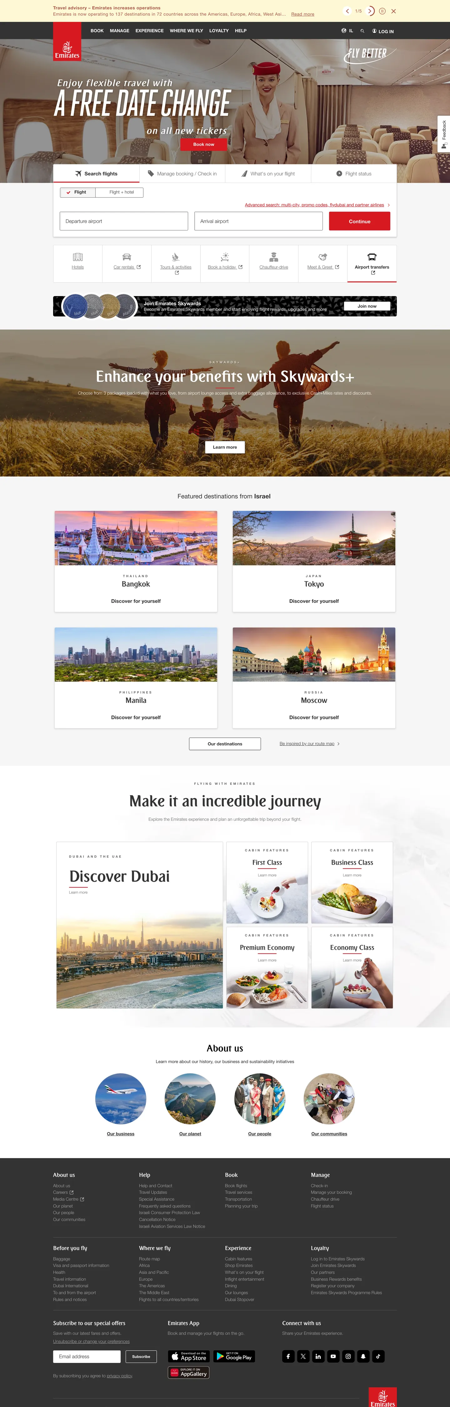
The Emirates homepage opens with an editorial impact that most airlines reserve for print campaigns. The hero is a full-bleed cabin photograph overlaid with white display type running at 120px and -5px letter-spacing — a condensed, magazine-style lock-up more common on luxury fashion sites than on booking engines. Below that single heroic typographic moment the page resolves into an orderly white canvas with Emirates-Bold headings at 24–50px, Helvetica Neue Light body copy at 14px, and a sparse palette of grays that lets the destination photography carry all the color. The contrast with a brand like Expedia (white utility grid) or Airbnb (warm photography-first) is deliberate: Emirates is performing a luxury editorial register above the booking mechanics.
The DESIGN.md file captures a two-font system anchored by Emirates-Bold — a proprietary typeface used exclusively for display headings and section titles — and Helvetica Neue across four weights (200, 300, 400, 700) for all UI copy. The brand-color system is almost monochromatic: five gray tones from near-black (#333333) to silver-gray (#a9a9a9) handle text and borders, with a terracotta red-brown (#af5541) appearing in the mid-frequency structural slots and the standard Emirates crimson (#d71921) used sparingly for the primary CTA button and brand marks. One warm cream panel (#fef8d5) appears as a single background accent per layout section — a quiet warmth move against the gray-dominant system. The radius scale is minimal: 3px dominates, with 8px on secondary surfaces.
Feed this file to an AI coding tool and it reproduces Emirates' specific moves: full-bleed hero photography with extreme display type overlay, white editorial canvas below the fold, two-font hierarchy with Emirates-Bold for headings and Helvetica Neue Light for body, crimson reserved as a single CTA voltage, and the minimal three-radius scale (3px, 8px, pill). The tension worth understanding before borrowing: the 120px/−5px hero heading at weight 400 reads as editorial restraint rather than typographic aggression. Heavy display weight would have looked mass-market; the combination of large size and light weight is the move.
What makes it distinct
5
- Two-font editorial hierarchyEmirates-Bold for display headings, Helvetica Neue at weights 200/300/400/700 for all body, button, and UI copy
- Crimson CTA voltagethe primary button fills a single deep red on a predominantly gray-and-white system, making booking actions immediately scannable
- Negative-tracked display at 120pxthe hero heading compresses letterforms at -5px tracking for a condensed editorial impact rarely seen in airline marketing
- Warm cream accenta single pale yellow-cream background panel appears once per section to break the white-gray monotony without introducing a second brand color
- Monochrome structural palettefive gray tones from near-black to light-gray carry every text and border role; color appears only in CTAs and brand marks
emirates.com
Live at emirates.com
A snapshot of the brand in production. Scroll the frame to see the whole page.
Colors
11 colors
Emirates's system runs on #d71921 as its primary voltage, used in 1 of 15 components. Type is set in Emirates-Bold across 11 tokens from 10px to 120px, weights 200–700. Shape language is mixed across 15 components, blending pills, soft rounds, and squarer corners.
Brand & Accent
Sparing, CTA-only voltage · 2
Surface
Page and card backgrounds · 2
Text
Headlines, body, captions · 4
Borders & Hairlines
Dividers, outlines, rules · 3
Typography
11 type tokens
Set in Emirates-Bold across 11 tokens, from 10px to 120px, weights 200–700. Shown in its own stack: where the font isn't installed, the fallback the file names stands in.
- display-xl120px · weight 400 · lh 110px · tracking -5pxThe quick brown fox jumps over the lazy dog
- display-lg50px · weight 700 · lh 57pxThe quick brown fox jumps over the lazy dog
- display-md30px · weight 400 · lh 36px · tracking 2pxThe quick brown fox jumps over the lazy dog
- heading-lg24px · weight 700 · lh 28pxThe quick brown fox jumps over the lazy dog
- heading-md22px · weight 700 · lh 25pxThe quick brown fox jumps over the lazy dog
- heading-sm18px · weight 400 · lh 27pxThe quick brown fox jumps over the lazy dog
- body-md16px · weight 200 · lh 18pxThe quick brown fox jumps over the lazy dog
- body-sm14px · weight 200 · lh 22pxThe quick brown fox jumps over the lazy dog
- body-link14px · weight 400 · lh 22pxThe quick brown fox jumps over the lazy dog
- label-caps10px · weight 700 · lh 12px · tracking 4pxThe quick brown fox jumps over the lazy dog
- button-md16px · weight 700 · lh 60pxThe quick brown fox jumps over the lazy dog
Layout
Radii and spacing
5 corner radii and 9 spacing values. Shape language: mixed.
Radii
- none0px
- sm3px
- md5px
- lg8px
- full100px
Spacing
- xs3px
- sm6px
- md10px
- base12px
- lg15px
- xl20px
- 2xl24px
- 3xl25px
- 4xl29px
Components
15 components
Each rendered from its tokens (color, type, radius, padding) on Emirates's own canvas.
- Button Primarybutton-primaryButton Primary
- Button Secondarybutton-secondaryButton Secondary
- Top Navtop-navTop Nav
- Nav Linknav-linkNav Link
- Hero Headinghero-headingHero Heading
- Section Headingsection-headingSection Heading
- SubheadingsubheadingSubheading
- Body Paragraphbody-paragraphBody Paragraph
- Body Paragraph Lightbody-paragraph-lightBody Paragraph Light
- Label Overlinelabel-overlineLabel Overline
- CardcardCard
- Card Creamcard-creamCard Cream
- Type here…text-inputText Input
- Destination Carddestination-cardDestination Card
- FooterfooterFooter
In use
The system, in use
Emirates's tokens on the kind of product it builds.
Build something people actually use.
A short paragraph of marketing copy that previews how the brand's display tier and body tier read together. Two sentences is usually enough.
FAQ
Emirates design system FAQ
Common questions about Emirates's tokens, components, and how to use this DESIGN.md in your project.
Read next
Related reading
Specs, directories, and component libraries that pair with this design system.
- Browse all design systemsThe full directory of DESIGN.md files on shadcn.io, with live mockups for each.shadcn.io
- Emirates — official siteEmirates' public marketing site — the source of truth for the live tokens captured in this file.emirates.com (opens in a new tab)
- The DESIGN.md specificationGoogle Labs' open spec for machine-readable design system files — the format this page is built on.github.com (opens in a new tab)
Use it
Use Emirates in your project
One machine-readable file. Drop it into Claude, Cursor, or any AI tool that reads DESIGN.md.
Download the DESIGN.md
One machine-readable file: every color, type, radius, spacing, and component token of Emirates.
Feed it to your AI tool
Drop it into Claude, Cursor, or GitHub Copilot. The agent writes React components and Tailwind classes that match Emirates's visual language.
Reference the tokens directly
Or paste the values into your Tailwind config, CSS variables, or component library: every color, size and radius is a quoted, ready-to-copy value.
Read the full DESIGN.md: overview, rationale, do’s and don’ts
Overview
Emirates' homepage performs a split identity that almost no other airline attempts at this scale. Editorial Chrome, Utility Engine. The top third of the page is a luxury editorial production — 120px condensed display type, full-bleed cabin photography, and a near-absence of brand chrome. The bottom two-thirds resolves into a spare white booking utility: search tabs, destination card grids, loyalty program upsell panels. Where British Airways and Qatar Airways both use branded masthead colors, Emirates runs a black navigation bar with white links and reserves its crimson exclusively for the CTA button and brand marks.
The palette is almost completely monochromatic at the structural level. Five grays from near-black to silver handle every text, border, and surface role. The crimson CTA ({colors.primary} — #d71921) appears just 9 times across the captured page — the single most restrained primary-button color system in the travel sector. A terracotta red-brown ({colors.ink-muted} — #af5541) appears 100 times in text and border roles, carrying the warm red-family tone through the navigation marks and section dividers without using the full brand crimson. One warm cream panel ({colors.accent-cream} — #fef8d5) appears as a single accent surface per content section.
Typography is a deliberate two-family editorial hierarchy. Emirates-Bold — a proprietary typeface with a calligraphic weight — handles all display headings (18–50px). Helvetica Neue at four weights (200, 300, 400, 700) handles all body and UI copy. The hero uses a third face, Heroic-Medium (a condensed sans), for the above-fold 120px lock-up. The result is three voices at three scales that never overlap: condensed-sans hero, serif-adjacent display subheads, utilitarian Helvetica body.
Key Characteristics:
- Full-bleed hero photography with 120px / −5px-tracked condensed display type in white — an editorial impact scale closer to magazine than airline.
- Black (
{colors.ink}) top navigation bar with white links — the only airline at this scale that runs a pure-black masthead. - Crimson primary CTA (
{colors.primary}) appearing only 9 times on the captured page — the lowest CTA-color frequency in the travel sector. - Terracotta red-brown (
{colors.ink-muted}— #af5541) as the warm-red structural accent, appearing in navigation marks, section dividers, and icon fills rather than using full crimson everywhere. - Emirates-Bold for headings at 18–50px, Helvetica Neue Light (weight 200) for body — a maximum-contrast typographic contrast between display and body.
- Single warm cream accent panel (
{colors.accent-cream}) per layout section — a quiet warmth signal against the gray-dominant system. - 3px as the dominant radius — the tightest-radius system in the travel category, consistent with a conservative luxury register.
- All-caps utility labels at 10px / weight 700 / 4px letter-spacing — a small-caps convention that reinforces the editorial register.
Colors
Brand
- Emirates Crimson (
{colors.primary}— #d71921): frequency 9. Used as background (4), text (2), border (2), shadow (1). The primary CTA button fill and brand-mark color. Wired as--red-colorin CSS variables (the CSS variable resolves to a slightly darker crimson variant; the rendered button fill is the extraction value #d71921). The scarcest primary-button color in the travel sector by occurrence count. - Terracotta Red-Brown (
{colors.ink-muted}— #af5541): frequency 100. Used as text (50) and border (50). The warm red-family structural tone — appears in navigation marks, section link accents, divider borders, and icon fills. Carries the red-family brand identity without using the full crimson voltage.
Structure
- Near-Black (
{colors.ink}— #000000): frequency 344. Used as text (165), border (150), background (16), shadow (13). The primary navigation background and the dominant border color across the page. - Warm Dark (
{colors.ink-dark}— #333333): frequency 153. Used as text (79), border (72), background (2). The primary body text color on white canvas. Wired as--text-color. - Mid Gray (
{colors.ink-mid}— #666666): frequency 120. Used as text (61) and border (58). Secondary text, metadata labels, and section dividers. Wired as--gray-color. - Silver (
{colors.hairline}— #a9a9a9): frequency 230. Used as text (115) and border (115). The dominant hairline tone — section borders, input borders, card dividers. The most-used non-black color in the system. - Dark Silver (
{colors.hairline-light}— #d8d8d8): frequency 6. Used as border — lighter divider between sections. - Light Silver (
{colors.hairline-faint}— #cccccc): frequency 5. Used as border — faintest hairline for secondary dividers.
Canvas
- White (
{colors.canvas}— #ffffff): frequency 128. Used as text (50), background (25), border (50). Page canvas, card surfaces, button label text on dark fills. Wired as--white-color. - Off-White Surface (
{colors.surface-1}— #f6f6f6): merged into white cluster. Background for light card and input surfaces.
Accent
- Warm Cream (
{colors.accent-cream}— #fef8d5): frequency 1. Used as background only — a single warm-yellow cream panel per page section. The only non-gray, non-red chromatic tone in the system.
Typography
Font Families
The system runs three font families across three distinct contexts:
Emirates-Bold — proprietary display typeface used for section headings (18–50px). Has a calligraphic warmth that distinguishes it from geometric sans or pure neutral sans. Used at weights 400 and 700.
Heroic-Medium — condensed sans-serif used exclusively for the above-fold hero lock-up at 120px. Not used anywhere else in the captured surface.
Helvetica Neue — in four weights: 200 (body copy, label text), 300 (secondary body), 400 (links, standard UI), 700 (buttons, overline caps). The system workhorse for all UI and supporting copy.
Hierarchy
| Token | Size | Weight | Line Height | Use |
|---|---|---|---|---|
{typography.display-xl} | 120px | 400 | 110px | Hero above-fold headline (condensed, −5px tracked) |
{typography.display-lg} | 50px | 700 | 57px | Section lead headings (Emirates-Bold) |
{typography.display-md} | 30px | 400 | 36px | Featured span callouts (Emirates-Bold, +2px tracked) |
{typography.heading-lg} | 24px | 700 | 28px | Card section headings (Emirates-Bold) |
{typography.heading-md} | 22px | 700 | 25px | Secondary card headings (Emirates-Bold) |
{typography.heading-sm} | 18px | 400 | 27px | Feature panel titles (Emirates-Bold) |
{typography.body-md} | 16px | 200 | 18px | Standard body paragraphs (Helvetica Neue Light) |
{typography.body-sm} | 14px | 200 | 22px | Body copy, captions (Helvetica Neue Light) |
{typography.body-link} | 14px | 400 | 22px | Link text, nav labels (Helvetica Neue) |
{typography.label-caps} | 10px | 700 | 12px | All-caps overline labels, +4px tracking (Helvetica Neue Bold) |
{typography.button-md} | 16px | 700 | 60px | Button label text (Helvetica Neue Bold, uppercase) |
Principles
The system uses body weight 200 (ultra-light) for running copy — the lightest weight in the Helvetica Neue family. This is unusual in travel interfaces, which typically use weight 400 for readability at 14px. Emirates makes the choice deliberately: ultra-light body copy alongside Emirates-Bold headings maximizes the weight contrast between the two families and signals that prose text is secondary to the visual content.
All-caps button labels are enforced via text-transform on weight-700 Helvetica Neue — not a separate caps variant. The same uppercase treatment applies to utility navigation labels.
Note on Font Substitutes
Emirates-Bold is proprietary. For React implementations, Playfair Display Bold or Freight Display Pro are the nearest substitutes that carry a similar calligraphic editorial warmth. For the Heroic-Medium hero slot, Barlow Condensed SemiBold or Bebas Neue replicate the condensed geometric structure. For Helvetica Neue Light (weight 200), the system Helvetica stack is already very close; web-font alternatives include HelveticaNeue-Light from Adobe Fonts or the system sans-serif stack with font-weight: 200.
Layout
Spacing System
- Base unit: 10px, with 12px, 20px, and 24px as the dominant modules.
- Tokens:
{spacing.xs}3px ·{spacing.sm}6px ·{spacing.md}10px ·{spacing.base}12px ·{spacing.lg}15px ·{spacing.xl}20px ·{spacing.2xl}24px ·{spacing.3xl}25px ·{spacing.4xl}29px. - Hero padding: 0px 22px on the left, 13px bottom — the display heading is nearly edge-aligned with a breathing inset only on the left and at baseline.
- Section padding: typically 29px top / 22px bottom, 20px horizontal — the full-page section rhythm.
Grid & Container
- Max content width: ~1400px at desktop — wider than most travel sites, consistent with a photographic-editorial layout that benefits from horizontal spread.
- Hero: full-bleed photography with centered or left-aligned display type stack; the search bar appears below the hero fold as a distinct white band.
- Destination cards: 4-column grid of photographic cards with heading, sub-label, and link; caption below each card in italic Helvetica Neue Light.
- Loyalty panel: full-width Emirates Skywards+ upsell section using a dark background with white Emirates-Bold heading and Helvetica Neue Light body at weight 200.
- "Discover Dubai" row: mixed editorial grid — one large-format photographic tile left, smaller card grid right.
Rhythm
The page alternates between photography-dominant editorial bands (hero, destination grids, full-width Skywards panel) and white utility bands (search bar, destination sub-nav). Section transitions are marked by the shift from dark or photographic backgrounds to the white canvas — not by decorative dividers.
Elevation
The system uses minimal elevation. The dominant surface is flat white canvas with silver hairline borders ({colors.hairline}). Destination cards have a light border and may carry a subtle box-shadow on hover, but the marketing surface in resting state is predominantly flat.
- Flat (hairline border): destination cards, input fields, content panels — the standard surface treatment.
- Full-bleed photography: the hero and full-width section panels use imagery rather than color or shadow for depth.
- Dark surface panels: the Skywards+ section uses a dark photographic overlay, not a flat dark color surface.
Shapes
The radius scale is minimal-conservative, appropriate for a luxury airline booking interface:
{rounded.none}0px — full-bleed photography panels, hero, footer sections.{rounded.sm}3px — the dominant radius: the primary button, input fields, and most card surfaces. 26 occurrences — the most-used radius in the system.{rounded.md}5px — secondary input and UI surfaces. 1 occurrence.{rounded.lg}8px — slightly larger card surfaces and modals. 14 occurrences.{rounded.full}100px — pill variant for toggle or badge elements. 2 occurrences.
No generous 16–24px rounding anywhere. The 3px dominant radius is the tightest in the travel-hospitality category and signals the conservative luxury register.
Components
button-primary — Emirates crimson {colors.primary} fill, white text in uppercase Helvetica Neue Bold, {rounded.sm} 3px radius, 60px height. "Continue" is the canonical captured instance; the oversized height (60px) relative to typical 44–48px buttons is distinctive.
button-secondary — White fill, ink-dark text, silver hairline border, same 60px height. Used for secondary booking actions and "learn more" style CTAs.
top-nav — Pure black {colors.ink} background, white link text at {typography.body-link}, 48px height. The black navigation bar is the most distinctive macro-level design choice relative to peer airlines (British Airways uses dark navy, Qatar uses maroon).
nav-link — Transparent, white text, 10px horizontal padding. Navigation links render at 14px / weight 400; no hover background visible in the resting capture.
hero-heading — White text, {typography.display-xl} (120px / −5px tracking / 110px line-height), 22px left padding and 13px bottom padding. The only instance of this size in the system.
section-heading — White text on dark or photographic backgrounds, {typography.display-lg} (50px / weight 700), 10px top padding. Used for section lead headings like "Enhance your benefits with Skywards+".
subheading — Ink-dark text on white canvas, {typography.heading-lg} (24px / weight 700). Used for white-canvas section headings.
body-paragraph — White text on dark backgrounds, {typography.body-sm} (14px / weight 200), 30px bottom padding. The ultra-light body weight is the most distinctive typographic move in the system.
body-paragraph-light — Ink-dark text on white canvas, same size/weight. The white-canvas body equivalent.
label-overline — Ink-dark text, {typography.label-caps} (10px / weight 700 / +4px tracking / uppercase). Section category labels and navigation-tier labels.
card — White fill, ink-dark text, Emirates-Bold heading at {typography.heading-md}, {rounded.lg} 8px radius, hairline-light border. The standard destination or promotion card.
card-cream — Warm cream {colors.accent-cream} background, ink-dark text. Used once per layout section as the warm accent surface.
text-input — White fill, ink-dark text at {typography.body-md}, {rounded.sm} 3px radius, {colors.hairline} border, 40px height, 17px top padding for a floating-label layout.
destination-card — Photography-first card, Emirates-Bold heading at {typography.heading-md}, light hairline border, {rounded.lg} 8px radius. Used in the destination grid below the fold.
footer — Black {colors.ink} background, white text at {typography.body-sm}, 29px top / 22px bottom padding, 20px horizontal. Mirrors the black top navigation.
Do's and Don'ts
Do use Emirates-Bold (or the closest substitute) exclusively for headings. Mixing Helvetica Neue Bold into heading slots would collapse the two-family hierarchy and read as generic rather than editorial.
Do preserve the 60px button height for primary CTAs. The oversized height relative to the 14–16px label creates the luxury tension — the button is not compact, it is substantial. Shrinking it to 44px strips the proportional signal.
Do use the terracotta red-brown ({colors.ink-muted} — #af5541) for structural red-family accents: icon fills, section dividers, navigation marks. Reserve full crimson ({colors.primary}) only for the primary booking CTA and brand marks.
Do run body copy at Helvetica Neue weight 200 (ultra-light). The high contrast between Emirates-Bold headings and ultra-light body is the signature typographic move; using weight 400 body collapses that contrast.
Don't add a second background color beyond the warm cream accent. The single warm cream panel ({colors.accent-cream}) appears once per section as a quiet break; adding a second accent color (even a pale blue or light gold) introduces a palette conflict the monochromatic system is designed to avoid.
Don't use 16px or larger radii on booking form elements. The 3px dominant radius — confirmed by 26 extracted occurrences — is the conservative luxury signal. Rounding buttons or inputs to 8px or above shifts the register toward consumer-app rather than a luxury airline.
Don't increase body-copy letter-spacing. The 14px / weight 200 body runs at normal (0) tracking. Adding positive letter-spacing on ultra-light type at small sizes reduces legibility; the generous line-height (22px on 14px type) already provides the airy, high-end reading feel without tracking.
Don't use the hero 120px display size for any sub-hero heading. {typography.display-xl} at 120px / −5px tracking is reserved for a single above-fold moment. Using it at section level reduces its impact to decoration.
Known Gaps
- Search widget internals: the date-picker, traveler-count stepper, and destination typeahead are present on the page but not captured in component detail — only the text input resting state is extracted.
- Hover and focus states: the extraction captures resting states; hover color shifts on navigation links and destination cards, and focus-ring styles on inputs, are not represented.
- Mobile layout: the captured surface is desktop width; the hero heading at 120px scales down significantly on mobile, and the navigation collapses to a hamburger — those responsive states are not captured.
- Skywards loyalty tiers: the multi-tier frequent-flyer program (Blue, Silver, Gold, Platinum) has distinct visual treatments in the logged-in surface that are not accessible from the public marketing page.
- Animation and parallax: the hero photography transitions and possible parallax scroll effects are captured in end-state only; easing and timing values are not represented.
- Dark-mode or alternate themes: no dark canvas alternative is visible on the public marketing surface; the brand uses dark photography but does not switch the chrome to a dark system.
Travel & Hospitality
More systems like this
More DESIGN.md files in Travel & Hospitality.
Pricing
Build it with Pro
The DESIGN.md files are free. Pro adds 6,000+ blocks, premium templates and the MCP server, so your AI editor builds in your system for you.
4.9/5 out of 5 · 150+ reviewsfrom 150+ founders and developers.
Billing
Billed once a year in USD. Cancel anytime.
- How many people can use the license.
- Client work, SaaS products and anything you charge for.
- Production-ready React sections: hero, pricing, features, dashboards and more.
- Complete multi-page sites you can ship as they are.
- React icons from every major library, installable with one command.
- Presets that restyle every block, in light and dark.
- Lets your AI editor search, preview and install blocks for you.
- Priority requests are answered first.
Individual
For personal projects & open source
$32instead of $49/mo
$389 billed yearly
- Seats: 1 seat
- Commercial use: Personal & open source only
- Pro blocks: 6,000+ blocks
- Templates: All 14 templates
- React icons: 294k+ icons
- Themes: All 59 themes
- MCP server: Basic usage
- Support: Standard
Team
Most popularFor freelancers, agencies & startups
$66instead of $99/mo
$789 billed yearly · ≈ $13/dev/mo
- Seats: Up to 5 seats
- Commercial use: Included
- Pro blocks: 6,000+ blocks
- Templates: All 14 templates
- React icons: 294k+ icons
- Themes: All 59 themes
- MCP server: High usage
- Support: Priority
Organization
For companies with larger teams
$132instead of $199/mo
$1,589 billed yearly
- Seats: Unlimited seats
- Commercial use: Included
- Pro blocks: 6,000+ blocks
- Templates: All 14 templates
- React icons: 294k+ icons
- Themes: All 59 themes
- MCP server: Unlimited usage
- Support: Priority
Billed once a year in USD. Cancel anytime.
Individual
For personal projects & open source
$32instead of $49/mo
$389 billed yearly
- How many people can use the license.Seats: 1 seat
- Client work, SaaS products and anything you charge for.Commercial use: Personal & open source only
- Production-ready React sections: hero, pricing, features, dashboards and more.Pro blocks: 6,000+ blocks
- Complete multi-page sites you can ship as they are.Templates: All 14 templates
- React icons from every major library, installable with one command.React icons: 294k+ icons
- Presets that restyle every block, in light and dark.Themes: All 59 themes
- Lets your AI editor search, preview and install blocks for you.MCP server: Basic usage
- Priority requests are answered first.Support: Standard
Team
Most popularFor freelancers, agencies & startups
$66instead of $99/mo
$789 billed yearly · ≈ $13/dev/mo
Everything in Individual, plus
- How many people can use the license.Seats: Up to 5 seats
- Client work, SaaS products and anything you charge for.Commercial use: Included
- Lets your AI editor search, preview and install blocks for you.MCP server: High usage
- Priority requests are answered first.Support: Priority
Organization
For companies with larger teams
$132instead of $199/mo
$1,589 billed yearly
Everything in Team, plus
- How many people can use the license.Seats: Unlimited seats
- Lets your AI editor search, preview and install blocks for you.MCP server: Unlimited usage
- Secure checkout via Stripe
- Code lives in your repo
- Keep what you've shipped if you cancel
- License terms
Your system, built for you
Every block, template and icon, installed by your AI agent in your design system. The DESIGN.md files stay free.