Expedia Design System
Expedia's marketing-site design system as a DESIGN.md file. Sunshine yellow brand voltage on a white canvas, midnight navy ink, a 400+ CSS variable token system, and 17 components definitions for React, Next.js, and AI tools.
Add shadcn.io to your AI agent. · Pro It installs blocks, icons and templates in your design system from a prompt, with Pro.
Set up MCP- Primary
- #1668e3
- Typeface
- system-ui
- Shape
- Sharp
- Base radius
- 8px
- Colors
- 18
- Type tokens
- 10
- Components
- 17
- Spacing values
- 8
About
About Expedia DESIGN.md
Curated by Dov Azencot · Updated May 19, 2026 · Source expedia.com (opens in a new tab)
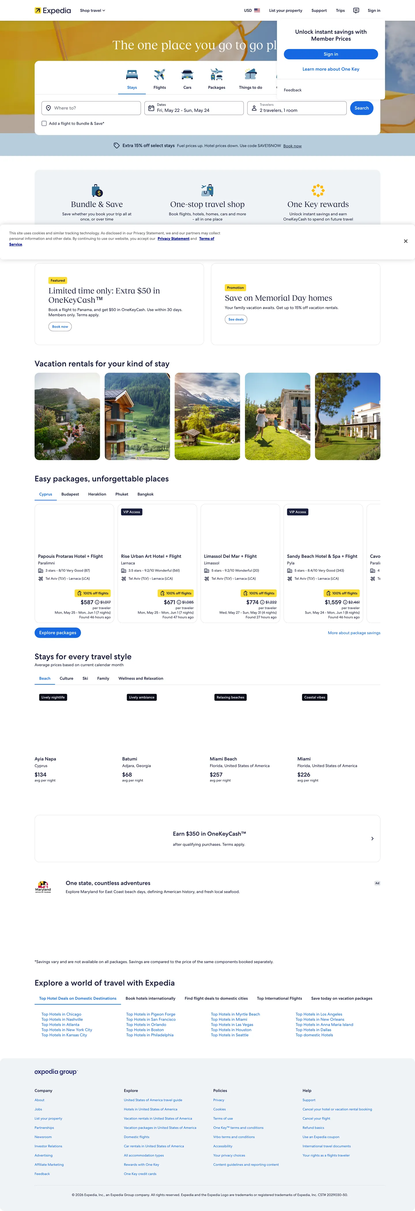
Expedia's homepage reads like a well-organized marketplace dashboard rather than a travel fantasy. The hero is a white canvas with a single horizontal search bar spanning flight, hotel, package, car, and activity tabs — the photography appears below the fold in destination and vacation-rental card grids. The brand voltage is a warm sunshine yellow that appears in the header loyalty stripe, the alternate primary button fill, and badge backgrounds; every other chromatic moment belongs to functional states (cobalt focus rings, green deal badges, red error banners). Against most consumer-travel sites that open with a full-bleed destination photograph, Expedia's restraint reads almost like a B2B product: the search engine is the hero, not the destination.
The DESIGN.md file exposes a token system of unusual depth. Expedia ships over 400 CSS custom properties organized into named families — `marketing_1`, `marketing_2`, `marketing_3`, `dark_1`, `dark_2`, `bright_1`, `romie`, and a multi-tier loyalty system (`global_loyalty_low`, `mid`, `high`, `extra_high`, each with a `_bright` variant). In practice, the marketing surface uses a small working palette: midnight navy as the primary ink and border color, cobalt blue for all interactive states, sunshine yellow for the brand-voltage moments, a pale blue selection tint for date-range fills, and standard white canvas. Typography runs a single sans family across every tier from 10px utility labels to display headings; the system picks practical sizes (10, 12, 14, 16, 18, 24px) rather than a dramatic editorial scale.
Feed this file to an AI coding tool and it reproduces Expedia's specific moves: a white marketplace canvas instead of atmospheric photography, sunshine yellow reserved for brand-alt CTAs rather than primary actions, cobalt blue as the single interactive-state color, and a tight 2–12px radius scale that keeps booking forms feeling transactional rather than decorative. The one move worth understanding before borrowing: the yellow is not the primary button — Expedia's primary action is cobalt blue, a deliberate choice that keeps the yellow scarce and readable as a loyalty or brand-highlight signal.
What makes it distinct
5
- Sunshine yellow voltagethe brand yellow appears as the primary alternate button fill and header stripe, the only warm chromatic moment against an otherwise cool neutral system
- 400+ CSS custom propertiesthe most exhaustive token system in consumer travel, covering loyalty-tier palettes, marketing themes, and dark/bright mode families
- Midnight navy as structural inkthe near-black with a blue undertone carries text, borders, and icon fills across the entire page, warmer than pure black
- Interactive cobalt for focus and linksa distinct royal blue handles all interactive states: focus rings, selected tabs, checkbox fills, link text, and loading spinners
- White-canvas marketplace layoutunlike airlines and hotels that use full-bleed photography, Expedia's homepage is a bright white grid of search, product cards, and module rows
expedia.com
Live at expedia.com
A snapshot of the brand in production. Scroll the frame to see the whole page.
Colors
18 colors
Expedia's system runs on #1668e3 as its primary voltage, used in 4 of 17 components. Type is set in system-ui across 10 tokens from 10px to 24px, weights 400–700. Shape language is sharp — components average 4px corner radius, favoring crisp rectangles.
Brand & Accent
Sparing, CTA-only voltage · 2
Surface
Page and card backgrounds · 3
Text
Headlines, body, captions · 3
Borders & Hairlines
Dividers, outlines, rules · 2
Semantic
Status, errors, success, links · 2
Other
Specialty colors · 6
Typography
10 type tokens
Set in system-ui across 10 tokens, from 10px to 24px, weights 400–700. Shown in its own stack: where the font isn't installed, the fallback the file names stands in.
- display-xl24px · weight 700 · lh 32pxThe quick brown fox jumps over the lazy dog
- heading-lg18px · weight 700 · lh 24pxThe quick brown fox jumps over the lazy dog
- heading-md16px · weight 700 · lh 20pxThe quick brown fox jumps over the lazy dog
- body-lg16px · weight 400 · lh 24pxThe quick brown fox jumps over the lazy dog
- body-md14px · weight 400 · lh 20pxThe quick brown fox jumps over the lazy dog
- body-sm12px · weight 400 · lh 16pxThe quick brown fox jumps over the lazy dog
- label-md14px · weight 700 · lh 20pxThe quick brown fox jumps over the lazy dog
- caption10px · weight 400 · lh 14pxThe quick brown fox jumps over the lazy dog
- button-md16px · weight 700 · lh 24pxThe quick brown fox jumps over the lazy dog
- nav-link14px · weight 400 · lh 20pxThe quick brown fox jumps over the lazy dog
Layout
Radii and spacing
6 corner radii and 8 spacing values. Shape language: sharp.
Radii
- none0px
- xs2px
- sm4px
- md8px
- lg12px
- full9999px
Spacing
- xs4px
- sm8px
- md12px
- base16px
- lg24px
- xl32px
- 2xl48px
- 3xl64px
Components
17 components
Each rendered from its tokens (color, type, radius, padding) on Expedia's own canvas.
- Button Primarybutton-primaryButton Primary
- Button Primary Altbutton-primary-altButton Primary Alt
- Button Secondarybutton-secondaryButton Secondary
- Top Navtop-navTop Nav
- Nav Linknav-linkNav Link
- Hero Headinghero-headingHero Heading
- Body Paragraphbody-paragraphBody Paragraph
- Body Paragraph Mutedbody-paragraph-mutedBody Paragraph Muted
- CardcardCard
- Card Hovercard-hoverCard Hover
- Type here…text-inputText Input
- Type here…text-input-focusText Input Focus
- Badge Brandbadge-brandBadge Brand
- Badge Dealbadge-dealBadge Deal
- Date Range Filldate-range-fillDate Range Fill
- Pill Selectedpill-selectedPill Selected
- FooterfooterFooter
In use
The system, in use
Expedia's tokens on the kind of product it builds.
Build something people actually use.
A short paragraph of marketing copy that previews how the brand's display tier and body tier read together. Two sentences is usually enough.
FAQ
Expedia design system FAQ
Common questions about Expedia's tokens, components, and how to use this DESIGN.md in your project.
Read next
Related reading
Specs, directories, and component libraries that pair with this design system.
- Browse all design systemsThe full directory of DESIGN.md files on shadcn.io, with live mockups for each.shadcn.io
- Expedia — official siteExpedia's public marketing site — the source of truth for the live tokens captured in this file.expedia.com (opens in a new tab)
- The DESIGN.md specificationGoogle Labs' open spec for machine-readable design system files — the format this page is built on.github.com (opens in a new tab)
Use it
Use Expedia in your project
One machine-readable file. Drop it into Claude, Cursor, or any AI tool that reads DESIGN.md.
Download the DESIGN.md
One machine-readable file: every color, type, radius, spacing, and component token of Expedia.
Feed it to your AI tool
Drop it into Claude, Cursor, or GitHub Copilot. The agent writes React components and Tailwind classes that match Expedia's visual language.
Reference the tokens directly
Or paste the values into your Tailwind config, CSS variables, or component library: every color, size and radius is a quoted, ready-to-copy value.
Read the full DESIGN.md: overview, rationale, do’s and don’ts
Overview
Expedia's homepage is the rare travel brand that leads with the product rather than the destination. Marketplace-First Canvas. The above-fold experience is a white grid with a tabbed search engine at center — no full-bleed hero photography, no overlaid gradient text, no atmospheric backdrop. The booking interface is the identity. This puts Expedia closer to Google Flights or Kayak in visual logic than to Airbnb or booking.com, which both use destination photography as their primary emotional hook.
The color discipline reinforces the transactional framing. One midnight navy structural ink ({colors.ink} — the near-black with a blue cast) carries text and borders. One cobalt blue ({colors.primary}) handles every interactive state — focus rings, selected tabs, checkbox fills, link text, loading spinners, the primary search button. One sunshine yellow ({colors.secondary}) appears as the brand-alt button fill and loyalty stripe. The remaining tokens are semantic: green for deals, red for errors, pale blue for date-range selection fills. The marketplace grid below the fold is entirely photographic — destination thumbnails carry all the visual warmth that the chrome withholds.
The token system is the deepest in consumer travel. Over 400 CSS custom properties organized into marketing, dark, bright, loyalty-tier, and "romie" (AI-assistant) families live on :root. The marketing homepage consumes a small fraction; the depth reflects a unified design system spanning search, booking flows, calendar pickers, loyalty dashboards, and multi-surface dark/light modes.
Key Characteristics:
- White canvas marketplace layout — search engine above the fold, photography in card grids below; no hero photography.
- Midnight navy ink (
{colors.ink}) as the dominant structural color — text, borders, icon fills — a blue-tinted near-black rather than pure black. - Cobalt blue (
{colors.primary}) reserved for all interactive states: focus rings, selected underlines, checkbox fills, primary search CTA. - Sunshine yellow (
{colors.secondary}) as the brand-alt voltage — alternate button fill, header loyalty stripe, brand badge backgrounds. - Tight transactional radius scale: 2px micro, 4px standard, 8px search fields, 12px promotional tiles.
- 400+ CSS custom properties organized into named theme families — marketing, dark, bright, loyalty tiers (low/mid/high/extra-high each with a bright variant), and "romie" for the AI-assistant surface.
- Pale blue (
{colors.primary-light}) reserved for date-range fill tints in the calendar picker — a functional accent that never appears in marketing chrome. - One Key loyalty rewards badge rendered in sunshine yellow — the only above-fold chromatic moment that isn't functional.
Colors
Brand
- Cobalt Blue (
{colors.primary}— #1668e3): frequency 309. Used as text (158), border (151) — focus borders, selected tab underlines, checkbox backgrounds, link text, loading spinners, the primary search button fill. The interactive-state color for the entire system. Wired across 100+ variables including--button__primary__default__background_color,--link__default__text_color,--input__focus__border_color. - Sunshine Yellow (
{colors.secondary}— #fddb32): frequency 12. Used as background only — alternate primary button fill, header loyalty stripe, brand badge backgrounds. Wired as--color__brand__1and--button__primary_alt__default__background_color. The brand-identity voltage; not used for primary actions. - Pale Blue Selection (
{colors.primary-light}— #c8dff9): frequency 14. Used as background only — date-range cell fills, active pill backgrounds, secondary button active states. Wired as--date_range_grid__cell__date__selected__background_colorand--light_1__primary_container. Functional, never decorative.
Structure
- Midnight Navy (
{colors.ink}— #191e3b): frequency 3348. Used as text (1682), border (1661) — the dominant ink and border tone across the entire system. Wired across 170+ variables; the most-used color in the extraction by a wide margin. A blue-tinted near-black that reads warmer than true black against white. - Deep Scrim (
{colors.scrim}— #0c0e1c): frequency 92. Used as background (17), gradient (24) — scrim overlays, shadow tokens, dark inverse surfaces. The true darkest tone in the system. - Pure Black (not declared as a named token — frequency 17 in extraction). Border only — sparse use in shadow and gradient definitions.
Canvas
- White Canvas (
{colors.canvas}— #ffffff): frequency 214. Used as text (66), background (83), border (65) — the primary page canvas, card backgrounds, input fills, button text on dark fills. The dominant surface across the marketplace layout. - Surface-1 (
{colors.surface-1}— #eff3f7): frequency 3. Used as background — hover states on cards, secondary tab container backgrounds, and low-elevation surfaces. A cool off-white with a slight blue tint. - Surface-2 (
{colors.surface-2}— #dfe0e4): frequency 4. Used as border — card borders, table dividers, input group separators. The standard light-gray hairline color.
Text / Muted
- Ink Muted (
{colors.ink-muted}— #676a7d): frequency 2. Used as text and border — placeholder text in inputs, secondary metadata labels, nav header link muted state. - Ink Soft (
{colors.ink-soft}— #818494): frequency 10. Used as border only — unselected pill borders, radio button resting borders, switch container borders, input default borders. - Mid Gray (
{colors.hairline-dark}— #999ca8): frequency 7. Used as border — tertiary button borders, nav dividers, placeholder card backgrounds.
Semantic
- Positive (
{colors.positive}— #227950): frequency 0 on marketing surface. Wired as deal badge fill, positive progress bar fill, switch selected state, confirmation icon color across the product. - Error (
{colors.error}— #a7183c): frequency 0 on marketing surface. Wired as error text, required field indicator, error badge background, negative price highlight. - Loyalty Amber (
{colors.loyalty-amber}— #ffb800): frequency 0. Wired as the high-tier loyalty surface, alternate primary button hover fill.
Typography
Font Family
The system resolves to a single sans-serif family across every tier — the CSS declarations use functional variable names without explicit font-family strings in the extracted samples, pointing to the system sans stack. Display and body use the same family at different weights. There is no separate serif or condensed display family anywhere in the marketing surface.
Hierarchy
| Token | Size | Weight | Line Height | Use |
|---|---|---|---|---|
{typography.display-xl} | 24px | 700 | 32px | Section headings ("Vacation rentals for your kind of stay") |
{typography.heading-lg} | 18px | 700 | 24px | Module headings, promotional card titles |
{typography.heading-md} | 16px | 700 | 20px | Card headings, tab labels |
{typography.body-lg} | 16px | 400 | 24px | Standard body text, input values |
{typography.body-md} | 14px | 400 | 20px | Default running text, nav links, filter labels |
{typography.body-sm} | 12px | 400 | 16px | Secondary metadata, price sub-labels |
{typography.label-md} | 14px | 700 | 20px | Button labels, badge text, selected tab labels |
{typography.caption} | 10px | 400 | 14px | Fine-print metadata, utility labels, loyalty-tier badges |
{typography.button-md} | 16px | 700 | 24px | Primary and alternate CTA button text |
{typography.nav-link} | 14px | 400 | 20px | Top-nav link labels and secondary navigation |
Principles
The system avoids display-scale type entirely. The largest heading on the marketing surface is 24px — closer to a B2B dashboard than a consumer brand hero. Weight 700 carries all emphasis: headings, button labels, selected state labels. Weight 400 handles body, nav, and metadata. There is no intermediate semibold (600) tier in the captured surface.
Note on Font Substitutes
The system stack resolves to the device system sans. Inter at the same size and weight scale is the closest web-font match; the proportions of 14px body and 16px button labels transfer cleanly. For the caption tier (10px), ensure the chosen typeface remains legible at that size — Inter works well; avoid condensed alternatives.
Layout
Spacing System
- Base unit: 4px, with 8px and 12px as the dominant modules in booking UI.
- Tokens:
{spacing.xs}4px ·{spacing.sm}8px ·{spacing.md}12px ·{spacing.base}16px ·{spacing.lg}24px ·{spacing.xl}32px ·{spacing.2xl}48px ·{spacing.3xl}64px. - Card internal padding:
{spacing.md}(12px) on standard search-result cards;{spacing.base}(16px) on promotional module tiles. - Section vertical padding: 24–32px between module rows below the fold.
Grid & Container
- Max content width: ~1200px with side padding collapsing gracefully to mobile.
- Hero: full-width white band, centered search bar stack (tab row + input row + submit button), no background fill beyond white.
- Vacation rentals: 4-column responsive card grid with property photography, price, and rating.
- Package deals: horizontal scroll row of 4-column cards with thumbnail + headline + price below.
- Navigation: single-row top nav with Expedia wordmark left, category links center, sign-in / One Key right; a slim yellow loyalty-stripe banner below on eligible sessions.
Rhythm
The page alternates between search/utility bands (white, high-density form fields) and browseable product bands (white card grids with photography). There is no background-color alternation — every section sits on the same white canvas; module boundaries are marked by section headings and horizontal visual rhythm, not surface-color changes.
Elevation
The system uses standard drop shadows on interactive overlays (date-picker popovers, dropdown menus, tooltips) drawn from the {colors.scrim} token. Marketing surface cards are flat with hairline borders ({colors.surface-2}) rather than shadow — elevation reads through border contrast against the white canvas.
- Flat (hairline border): search-result cards, product tiles, input fields — the vast majority of surfaces.
- Shadow elevation: date-picker calendar popover, nav dropdowns, modal dialogs — popovers above the canvas plane.
- No elevation: section headings and body text — the canvas floor is the base.
Shapes
The radius scale is transactional-tight, optimized for booking interfaces:
{rounded.none}0px — table cells, date-range mid-range fills.{rounded.xs}2px — micro badges, step-indicator dots, tight chip variants.{rounded.sm}4px — standard input fields, search-result cards, primary and alternate buttons.{rounded.md}8px — the main search-bar input group, promotional feature tiles.{rounded.lg}12px — larger promotional card surfaces.{rounded.full}9999px — date-range start/end handles (full circle), tag pills, filter chips, badge labels.
There is no 16px or 24px tier. The scale is binary-ish: tight (2–4px) for booking UI, moderate (8–12px) for featured surfaces, pill (full) for selection handles.
Components
button-primary — The main search/booking CTA. Cobalt {colors.primary} fill, white text at {typography.button-md}, {rounded.sm} 4px radius, 12x24 padding, 44px height. Used for "Search" on the main search bar and "Book now" on individual listings.
button-primary-alt — The brand-voltage button. Sunshine yellow {colors.secondary} fill, midnight navy text, same radius and sizing as button-primary. Used for "Bundle & Save" featured CTAs and One Key loyalty upsell buttons.
button-secondary — Transparent fill, cobalt text and border, {rounded.sm} radius. Used for filter actions and secondary navigation CTAs.
top-nav — White surface, midnight navy text at {typography.nav-link}, hairline bottom border, 60px height. Houses the Expedia wordmark, product tab navigation, and account/loyalty cluster. A slim sunshine-yellow stripe ({colors.secondary}) may appear below on loyalty sessions.
nav-link — Transparent background, midnight navy text, 8x12 padding. Selected state adds a cobalt underline.
hero-heading — Midnight navy text, {typography.display-xl} (24px/700). Used for module section headings on the white canvas — no photographic hero heading exists at this font size.
body-paragraph — Midnight navy text, {typography.body-lg}, transparent background. Default body text across the marketplace surface.
body-paragraph-muted — Muted ink {colors.ink-muted}, {typography.body-md}. Used for secondary metadata: price sub-labels, listing address lines, filter counts.
card — White fill, midnight navy text, {rounded.sm} 4px radius, 12px padding, hairline border {colors.surface-2}. The standard property / package / deal card.
card-hover — Shifts background to {colors.surface-1} on pointer hover. The standard hover affordance across all product grids.
text-input — White fill, midnight navy text, {rounded.sm} radius, {colors.hairline-dark} border in resting state.
text-input-focus — Border flips to {colors.primary} cobalt on focus; the only chromatic change during interaction.
badge-brand — Sunshine yellow fill, midnight navy text, full-pill radius, {typography.caption}. Used for "Sale", "One Key Cash", "Member Price" loyalty signals.
badge-deal — Positive green {colors.positive} fill, white text. Used for "Save X%", "Tonight only" deal callouts in product grids.
date-range-fill — Pale blue {colors.primary-light} background on the mid-range cells between selected start and end dates in the calendar picker. No radius on interior cells; full-circle handles on endpoints.
pill-selected — Surface-1 fill, cobalt text and border, full-pill radius, 6x16 padding. Used for selected filter chips on search-results pages.
footer — {colors.surface-1} background, muted ink text, {typography.body-sm}, 48x24 padding. Houses site links, app download CTAs, Expedia Group sub-brand logos.
Do's and Don'ts
Do use cobalt blue ({colors.primary}) as the single interactive-state color. Every focus ring, selected tab underline, checkbox fill, and link text should resolve to the same cobalt — consistency here is what makes the interface legible across dozens of interactive elements on a single search-results page.
Do keep sunshine yellow ({colors.secondary}) for brand-identity moments only: the alternate CTA, loyalty-tier highlights, and brand badge fills. The moment yellow appears on a primary form action it loses its identity signal — Expedia deliberately keeps it off the primary search button.
Do use the pale blue selection tint ({colors.primary-light}) for calendar date-range fills rather than a full cobalt fill. The tint is functional and readable across the multi-week calendar grid; a saturated primary fill would make ranges visually heavy and obscure the dates beneath.
Do keep section headings at 24px / weight 700. The marketplace layout reads dense — display-scale type above 28px would fight the card grid rather than organizing it.
Don't introduce photography or gradient fills above the fold. The search bar is the hero; adding a destination photograph behind it shifts Expedia toward a travel-magazine aesthetic and away from the transactional clarity that distinguishes it from competitors like booking.com.
Don't use {colors.secondary} sunshine yellow as a text color. At #fddb32 on white, the contrast ratio fails WCAG AA at any size. Yellow is background-only in this system; text on yellow should always be {colors.ink} midnight navy.
Don't round inputs or cards past {rounded.md} 8px. The tight radius scale is deliberate — generous rounding (16–24px) makes a booking interface feel like a consumer app rather than a transactional marketplace.
Don't use {colors.loyalty-amber} (#ffb800) outside the loyalty-tier surfaces. It is the high-tier rewards badge color and belongs to the One Key ecosystem; using it as a general accent introduces a second yellow and dilutes the brand-yellow signal of {colors.secondary}.
Known Gaps
- Dark mode: the extraction captures the light-mode marketing surface only. The
dark_1,dark_2,bright_1, andromietheme families in the CSS are populated but not rendered in the captured page state. - Loyalty tier interfaces: the
global_loyalty_low,mid,high,extra_high(and_brightvariants) palettes power the One Key rewards dashboard, which requires authentication and is not captured here. - Animation and microinteractions: the date-range picker, destination typeahead, and tab transitions all include motion but the spec captures resting-state tokens only.
- Responsive breakpoints: the marketing surface is captured at desktop width; the tab navigation collapses, the card grids reflow, and the search bar stacks differently on mobile — breakpoint tokens are not represented.
- Error and validation states:
{colors.error}(#a7183c) and related form-error tokens are fully wired in the CSS but not rendered in the marketing surface; they live in the booking and account flows. - Hover state matrix: button hover states (
button__primary_alt__hoverresolves to{colors.loyalty-amber}) are defined in the CSS but not captured from the marketing surface interaction.
Travel & Hospitality
More systems like this
More DESIGN.md files in Travel & Hospitality.
Pricing
Build it with Pro
The DESIGN.md files are free. Pro adds 6,000+ blocks, premium templates and the MCP server, so your AI editor builds in your system for you.
4.9/5 out of 5 · 150+ reviewsfrom 150+ founders and developers.
Billing
Billed once a year in USD. Cancel anytime.
- How many people can use the license.
- Client work, SaaS products and anything you charge for.
- Production-ready React sections: hero, pricing, features, dashboards and more.
- Complete multi-page sites you can ship as they are.
- React icons from every major library, installable with one command.
- Presets that restyle every block, in light and dark.
- Lets your AI editor search, preview and install blocks for you.
- Priority requests are answered first.
Individual
For personal projects & open source
$32instead of $49/mo
$389 billed yearly
- Seats: 1 seat
- Commercial use: Personal & open source only
- Pro blocks: 6,000+ blocks
- Templates: All 14 templates
- React icons: 294k+ icons
- Themes: All 59 themes
- MCP server: Basic usage
- Support: Standard
Team
Most popularFor freelancers, agencies & startups
$66instead of $99/mo
$789 billed yearly · ≈ $13/dev/mo
- Seats: Up to 5 seats
- Commercial use: Included
- Pro blocks: 6,000+ blocks
- Templates: All 14 templates
- React icons: 294k+ icons
- Themes: All 59 themes
- MCP server: High usage
- Support: Priority
Organization
For companies with larger teams
$132instead of $199/mo
$1,589 billed yearly
- Seats: Unlimited seats
- Commercial use: Included
- Pro blocks: 6,000+ blocks
- Templates: All 14 templates
- React icons: 294k+ icons
- Themes: All 59 themes
- MCP server: Unlimited usage
- Support: Priority
Billed once a year in USD. Cancel anytime.
Individual
For personal projects & open source
$32instead of $49/mo
$389 billed yearly
- How many people can use the license.Seats: 1 seat
- Client work, SaaS products and anything you charge for.Commercial use: Personal & open source only
- Production-ready React sections: hero, pricing, features, dashboards and more.Pro blocks: 6,000+ blocks
- Complete multi-page sites you can ship as they are.Templates: All 14 templates
- React icons from every major library, installable with one command.React icons: 294k+ icons
- Presets that restyle every block, in light and dark.Themes: All 59 themes
- Lets your AI editor search, preview and install blocks for you.MCP server: Basic usage
- Priority requests are answered first.Support: Standard
Team
Most popularFor freelancers, agencies & startups
$66instead of $99/mo
$789 billed yearly · ≈ $13/dev/mo
Everything in Individual, plus
- How many people can use the license.Seats: Up to 5 seats
- Client work, SaaS products and anything you charge for.Commercial use: Included
- Lets your AI editor search, preview and install blocks for you.MCP server: High usage
- Priority requests are answered first.Support: Priority
Organization
For companies with larger teams
$132instead of $199/mo
$1,589 billed yearly
Everything in Team, plus
- How many people can use the license.Seats: Unlimited seats
- Lets your AI editor search, preview and install blocks for you.MCP server: Unlimited usage
- Secure checkout via Stripe
- Code lives in your repo
- Keep what you've shipped if you cancel
- License terms
Your system, built for you
Every block, template and icon, installed by your AI agent in your design system. The DESIGN.md files stay free.