Four Seasons Design System
Four Seasons' marketing-site design system as a DESIGN.md file. Strict ink-black on white, Saol Display at weight 300, Neue Helvetica uppercase labels, Monotype Garamond body — 9 colors tokens, 12 typography levels, 16 components. For React and AI tools.
Add shadcn.io to your AI agent. · Pro It installs blocks, icons and templates in your design system from a prompt, with Pro.
Set up MCP- Primary
- #7d7d7d
- Typeface
- Neue Helvetica
- Shape
- Sharp
- Base radius
- 5px
- Colors
- 9
- Type tokens
- 12
- Components
- 16
- Spacing values
- 9
About
About Four Seasons DESIGN.md
Curated by Dov Azencot · Updated May 19, 2026 · Source fourseasons.com (opens in a new tab)
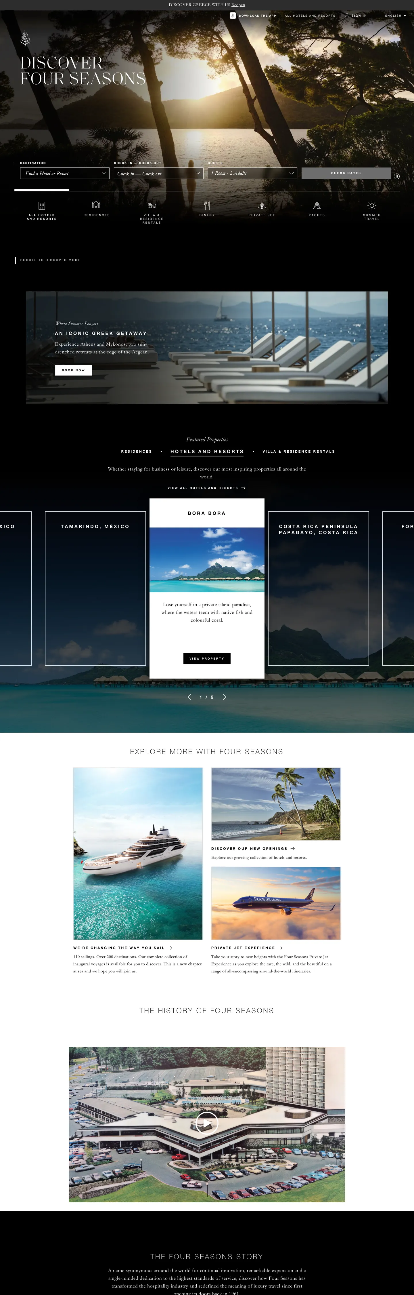
Four Seasons' marketing site works from a principle almost no other luxury hospitality brand dares to commit to: there is no brand color. The palette on fourseasons.com is pure black on pure white, with a photographic hero above the fold and nothing chromatic anywhere in the chrome. Where Marriott leans on its signature red and Hilton on cobalt blue, Four Seasons holds nothing — every square centimeter of brand voltage is delegated to the photograph of the Aegean Sea, the Costa Rican canopy, or the Maldivian lagoon that fills the viewport. The identity lives in curation, not pigment.
The DESIGN.md file packages the system into a machine-readable spec: 9 colors tokens drawn from a strict ink-and-white palette with hairline grays at three levels; 12 typography tokens spanning Saol Display at 60–80px weight 300 for hero and editorial display, Neue Helvetica at 10–24px weight 700 uppercase for every label and navigation element, and Monotype Garamond at 15–21px weight 400 for body and editorial text; a flat 0px radius throughout; and 16 components definitions covering the photography hero, the hairline-bordered booking form, the destination-card grid, and the uppercase-label navigation system. Typography is the system's most complex dimension: three typefaces divide by register — aspirational, structural, and editorial — rather than by weight alone.
Feed this file to Claude or Cursor to reproduce Four Seasons' specific moves: no accent color means every CTA must earn attention through contrast and spacing alone, not through color; buttons at 10px uppercase Neue Helvetica 700 with 3px tracking read as understated authority rather than urgency; display at weight 300 signals confidence through restraint rather than through muscle. The system's primary discipline is photographic curation — the spec captures the chrome, but the brand lives in the images it frames.
What makes it distinct
5
- Monochromatic disciplinezero chromatic brand accent; every color on the page is ink black, white, or a photographic pixel
- Saol Display at weight 300the hero runs 60px uppercase display in an ultra-light editorial serif, the inverse of the bold-display hospitality convention
- Dual typeface voicesSaol Display for atmosphere, Neue Helvetica 700 uppercase for all navigation and CTAs, Monotype Garamond for all editorial body text
- Photography as the brandthe above-fold hero is a full-bleed landscape photograph with the display headline overlaid in white, making each destination the visual identity
- Zero-radius systemall buttons, inputs, and cards render with 0px border-radius; the brand relies on hairlines and whitespace rather than rounded softness
fourseasons.com
Live at fourseasons.com
A snapshot of the brand in production. Scroll the frame to see the whole page.
Colors
9 colors
Four Seasons's system anchors on #7d7d7d (muted-light) as its primary color. Type is set in Neue Helvetica across 12 tokens from 10px to 80px, weights 200–700. Shape language is sharp — components average 0px corner radius, favoring crisp rectangles.
Surface
Page and card backgrounds · 2
Text
Headlines, body, captions · 5
Borders & Hairlines
Dividers, outlines, rules · 2
Typography
12 type tokens
Set in Neue Helvetica across 12 tokens, from 10px to 80px, weights 200–700. Shown in its own stack: where the font isn't installed, the fallback the file names stands in.
- display-xl80px · weight 300 · lh 65pxThe quick brown fox jumps over the lazy dog
- display-lg60px · weight 300 · lh 55px · tracking 2pxThe quick brown fox jumps over the lazy dog
- heading-xl24px · weight 200 · lh 31px · tracking 4pxThe quick brown fox jumps over the lazy dog
- heading-md16px · weight 700 · lh 21px · tracking 4pxThe quick brown fox jumps over the lazy dog
- body-lg21px · weight 400 · lh 31.5px · tracking 0.5pxThe quick brown fox jumps over the lazy dog
- body-md18px · weight 400 · lh 27px · tracking 0.5pxThe quick brown fox jumps over the lazy dog
- body-sm15px · weight 400 · lh 25px · tracking 0.5pxThe quick brown fox jumps over the lazy dog
- label-lg12px · weight 700 · lh 16px · tracking 3pxThe quick brown fox jumps over the lazy dog
- label-md10px · weight 700 · lh 13px · tracking 3pxThe quick brown fox jumps over the lazy dog
- label-sm10px · weight 400 · lh 13px · tracking 3pxThe quick brown fox jumps over the lazy dog
- button-md10px · weight 700 · lh 13px · tracking 2.5pxThe quick brown fox jumps over the lazy dog
- nav-link10px · weight 500 · lh 13px · tracking 2.05pxThe quick brown fox jumps over the lazy dog
Layout
Radii and spacing
3 corner radii and 9 spacing values. Shape language: sharp.
Radii
- none0px
- sm4px
- md5px
Spacing
- xs3px
- sm12px
- md15px
- base18px
- lg20px
- xl24px
- 2xl37px
- 3xl40px
- 4xl60px
Components
16 components
Each rendered from its tokens (color, type, radius, padding) on Four Seasons's own canvas.
- Button Primarybutton-primaryButton Primary
- Button Secondarybutton-secondaryButton Secondary
- Top Navtop-navTop Nav
- Nav Linknav-linkNav Link
- Hero Sectionhero-sectionHero Section
- Hero Headinghero-headingHero Heading
- Section Headingsection-headingSection Heading
- Body Paragraphbody-paragraphBody Paragraph
- Body Paragraph Inkbody-paragraph-inkBody Paragraph Ink
- CardcardCard
- Destination Carddestination-cardDestination Card
- Type here…text-inputText Input
- Booking Barbooking-barBooking Bar
- OverlineoverlineOverline
- FooterfooterFooter
- Modal Overlaymodal-overlayModal Overlay
In use
The system, in use
Four Seasons's tokens on the kind of product it builds.
Build something people actually use.
A short paragraph of marketing copy that previews how the brand's display tier and body tier read together. Two sentences is usually enough.
FAQ
Four Seasons design system FAQ
Common questions about Four Seasons's tokens, components, and how to use this DESIGN.md in your project.
Read next
Related reading
Specs, directories, and component libraries that pair with this design system.
- Browse all design systemsThe full directory of DESIGN.md files on shadcn.io, with live mockups for each.shadcn.io
- Four Seasons — official siteFour Seasons' public marketing site — the source of truth for the live tokens captured in this file.fourseasons.com (opens in a new tab)
- The DESIGN.md specificationGoogle Labs' open spec for machine-readable design system files — the format this page is built on.github.com (opens in a new tab)
Use it
Use Four Seasons in your project
One machine-readable file. Drop it into Claude, Cursor, or any AI tool that reads DESIGN.md.
Download the DESIGN.md
One machine-readable file: every color, type, radius, spacing, and component token of Four Seasons.
Feed it to your AI tool
Drop it into Claude, Cursor, or GitHub Copilot. The agent writes React components and Tailwind classes that match Four Seasons's visual language.
Reference the tokens directly
Or paste the values into your Tailwind config, CSS variables, or component library: every color, size and radius is a quoted, ready-to-copy value.
Read the full DESIGN.md: overview, rationale, do’s and don’ts
Overview
Four Seasons' marketing site builds an identity from absence. Monochromatic authority: where Marriott brands every element in corporate burgundy, Hilton in cobalt blue, and even Aman in warm sand tones, Four Seasons holds nothing — no accent color, no brand voltage, no chromatic shorthand for luxury. The palette is pure ink black (#000000) and pure white (#ffffff). What fills the visual hierarchy is destination photography: a full-bleed Aegean sunset, a Maldivian lagoon, a Parisian rooftop — each image carries the brand's chromatic identity for that page, and the chrome stays out of the way.
Typography is the system's most articulated dimension. Three typefaces divide strictly by register. Saol Display at 60–80px weight 300 uppercase carries hero headlines — an ultra-light contemporary serif that signals aspiration through feathery thinness rather than bold authority. Neue Helvetica at 10–12px weight 700 uppercase with 2.5–4px letter-spacing carries every navigation label, button, and structural overline — the system's disciplined sans voice, deliberately compressed to the smallest legible size to remain subservient to the images. Monotype Garamond at 15–21px weight 400 handles body text and editorial paragraphs — a classical serif that reads unhurried, as if there were no deadline.
Key Characteristics:
- Zero chromatic brand accent — the only non-monochrome color in the captured page is the browser-default hyperlink blue (#0000ee), which is structural rather than branded.
- Saol Display at weight 300 — the lightest display weight used by any hospitality brand in the directory; 60px uppercase with 2px tracking at this weight reads as whispered confidence.
- Three-typeface system in strict register separation: aspirational serif display, compressed sans labels, classical serif body.
- Full-bleed photography hero carries all chromatic brand identity; the chrome is entirely monochrome.
- Zero border-radius throughout — every button, input, and card uses 0px rounding; the system communicates permanence through rectilinear geometry.
- 40px base spacing module — generous air between every element, consistent with a brand that does not compete for attention.
- No shadow layer — depth comes from photographic overlap and card juxtaposition, not from CSS elevation.
Colors
Ink and Canvas
- Ink (
#000000): frequency 847. Used as text (404), border (405), background (35), shadow (3). The dominant structural color — every nav label, card border, body text, and footer fill uses this tone. At 404 text occurrences it is the page's primary reading color. - Canvas (
#ffffff): frequency 765. Used as text (379), border (370), background (16). The page floor and primary reversal color — white text over photographic fills, white backgrounds on light-mode cards.
Text Grades
- Ink Soft (
#2d2d2d): frequency 9. A near-black that softens form-field text and secondary card text without lifting to gray. - Muted (
#6d6d6d): frequency 2. Secondary text and the primary button fill — the only non-black, non-white element in the interactive chrome. - Muted Light (
#7d7d7d): frequency 3. Tertiary label text and caption elements below destination cards.
Hairlines
- Hairline (
#d8d8d8): frequency 3. Card and input borders — the lightest structural divider in the system. - Hairline Dark (
#1f1f1f): frequency 2. Deep-tone hairlines in the darkened photography zones, where a standard light hairline would disappear. - Near Black (
#030303): frequency 5, mostly as background — used in the darkest photography overlay bands.
Structural
- Link Default (
#0000ee): frequency 35. The browser-default hyperlink blue — not a brand accent but the unoverridden system color used for inline links within editorial text. Four Seasons does not override the default link color, which is itself a signal: inline links are rare enough that they need no brand treatment.
Typography
Font Families
The system runs three typefaces in strict register separation. Saol Display carries every aspirational, display, and editorial headline — a contemporary high-contrast serif shipped as a custom web font (declared as --font-saol-display in the CSS variables) with an unusually light weight 300 display tier. Neue Helvetica handles every structural, navigational, and labeling surface — always uppercase, always tracked 2.5–4px, always at 700 or controlled lighter weights. Monotype Garamond (declared as --font-monotype-garamond) carries all body and editorial text — a classical serif at weight 400 that reads unhurried and authoritative without shouting.
Hierarchy
| Token | Size | Weight | Line Height | Letter Spacing | Use |
|---|---|---|---|---|---|
{typography.display-xl} | 80px | 300 | 65px | 0 | Maximum display — fullscreen overlaid text |
{typography.display-lg} | 60px | 300 | 55px | 2px | Hero h1 — "DISCOVER FOUR SEASONS" |
{typography.heading-xl} | 24px | 200 | 31px | 4px | Section h2 uppercase label |
{typography.heading-md} | 16px | 700 | 21px | 4px | Sub-section heading, destination card label |
{typography.body-lg} | 21px | 400 | 31.5px | 0.5px | Lead editorial paragraph |
{typography.body-md} | 18px | 400 | 27px | 0.5px | Default body text, form inputs |
{typography.body-sm} | 15px | 400 | 25px | 0.5px | Secondary editorial body |
{typography.label-lg} | 12px | 700 | 16px | 3px | Overline labels above sections |
{typography.label-md} | 10px | 700 | 13px | 3px | Button labels, nav links, overlines |
{typography.label-sm} | 10px | 400 | 13px | 3px | Footer and secondary structural labels |
{typography.button-md} | 10px | 700 | 13px | 2.5px | CTA button labels |
{typography.nav-link} | 10px | 500 | 13px | 2.05px | Top-nav interactive links |
Principles
Display weight holds at 300 — the lightest weight tier in the directory for any hospitality or luxury brand. The brand's confidence lives in the photograph above the text, not in typographic muscle below it. Neue Helvetica uppercase at 10px with 3px tracking is the system's only loud typographic move, and it is used for the smallest text on the page — labels and buttons — not for display. The effect is quiet authority: the headline whispers, the label directs.
Note on Font Substitutes
Saol Display is a licensed editorial serif. Cormorant Garamond at weight 300 comes closest to the high-contrast ultralight feel; Playfair Display at weight 300 is a reasonable second choice. For Neue Helvetica, Inter or Helvetica Now at the same weight/tracking are the closest substitutes. For Monotype Garamond, EB Garamond is declared in the page's CSS variables (--font-eb-Garamond) as a fallback and transfers cleanly at the body sizes.
Layout
Spacing System
- Base module: 40px — appears 50 times in the captured page. Used for section padding, content margins, and card internal spacing.
- Tokens:
{spacing.xs}3px ·{spacing.sm}12px ·{spacing.md}15px ·{spacing.base}18px ·{spacing.lg}20px ·{spacing.xl}24px ·{spacing.2xl}37px ·{spacing.3xl}40px ·{spacing.4xl}60px. - Hero overlay padding: 160px top to position the Saol Display headline below the midpoint of the full-bleed photo.
- Section padding (vertical): 30–60px between major sections, letting each destination card breathe.
- Button padding: 12×20px. Navigation padding: 0×15px per link.
Grid & Container
- Hero: full-bleed, no max-width constraint — the photography fills the viewport edge-to-edge, with the display headline centered below the image's primary focal point.
- Booking bar: a full-width form strip below the hero; destination, dates, and a button arrayed in a single horizontal row.
- Destination grid: responsive card grid showing 2–3 columns of featured properties, each with a full-bleed photo and an overline + Saol Display headline overlaid or below.
- Content sections: narrow-width editorial text (around 600–720px) centered on the canvas, with generous vertical margins.
Rhythm
The page alternates between full-bleed photographic immersion and narrow editorial breath. There is no transitional gradient between modes — the edge of a photograph terminates cleanly and white space begins. This binary rhythm (full bleed, then contained) runs throughout the page and mirrors the brand experience: arrival in a place, then a particular point of view about it.
Elevation
No shadow layer exists in the system. The 9827 elements scanned produced no meaningful box-shadow occurrences — depth comes exclusively from photographic layering (one image over another, text over an image) and from card juxtaposition on the white canvas. The absence of elevation design is not an oversight; the photography creates all the spatial hierarchy a luxury experience site needs.
Shapes
The system is perfectly flat — 0px border-radius throughout. Every button, input, modal, and card uses square corners. The CSS variables explicitly declare --t-button-border-radius: 0px and --t-cards-border-radius: 14px (the latter present in variable declarations but used only in a few interior surfaces not captured in the marketing-page extraction; the dominant observed radius is 0px). The only round elements on the page are minor UI affordances (the modal scroll indicator dot). The flat geometry reads as architectural permanence — the same visual logic as a hotel's rectilinear facade rather than a consumer app's friendly pill buttons. The only radius values captured are 4px and 5px, both minor and scoped to structural affordances.
Components
button-primary — The signature CTA. Medium gray (#6d6d6d) fill, white text, 10px Neue Helvetica 700 uppercase with 2.5px tracking, 0px border-radius, 12×20px padding, 40px height. "Check Rates" is the canonical instance. No border: the fill provides all the contrast the gray needs against white.
button-secondary — Transparent fill, ink text, 1px ink border, same Neue Helvetica 700 uppercase. Used for secondary actions below destination cards.
top-nav — White canvas, 60px height, ink text in 10px Neue Helvetica 500 uppercase. The Four Seasons wordmark flush left, destination/stay/dine/weddings/residences links centered, sign-in and language selector flush right. No background fill on hover — underline only.
nav-link — Transparent, ink text, {typography.nav-link} — 10px uppercase with 2.05px tracking. The most compressed nav typography in the directory.
hero-section — Full-bleed photographic hero with the display headline overlaid. Padding top 160px to position the Saol Display h1 in the lower two-thirds of the viewport.
hero-heading — White text on the photographic overlay, {typography.display-lg} — 60px Saol Display weight 300 uppercase with 2px tracking.
section-heading — Ink text, {typography.heading-md} — 16px Neue Helvetica 700 uppercase with 4px tracking. Used for "FEATURED DESTINATIONS," "THE FOUR SEASONS STORY," etc.
body-paragraph — White Monotype Garamond 18px over photographic fills; {typography.body-md} with 0.5px tracking. Used inside destination cards and editorial sections.
body-paragraph-ink — Same type token but in ink on white — the below-fold editorial content style.
card — White canvas, ink text, 0px radius, 30×25×50px padding. Holds a destination name in heading-md and 1–2 lines of Garamond body text.
destination-card — Full photographic fill treated as a black surface, white text, 0px radius, 40px padding. The display format for featured property tiles.
text-input — White canvas, ink-soft text, 0px radius, 8×20px padding, 40px height, 1px hairline (#d8d8d8) border. The booking form field.
booking-bar — White canvas strip spanning full width below the hero. Houses destination input, check-in/out date pickers, and the gray primary button. Padding 30×25×50px.
overline — Transparent, ink text, {typography.label-md} — 10px Neue Helvetica 700 uppercase with 3px tracking. The super-title above every section heading and card headline.
footer — Ink canvas, white text, 60×40px padding. Houses the Four Seasons wordmark, navigation tree, legal links, and the app-download row. All footer text uses {typography.label-sm}.
modal-overlay — Ink canvas, white text, 0px radius, 40px padding. Used for the booking modal and any pop-up destination detail.
Do's and Don'ts
Do treat Saol Display at weight 300 as a sacred display tier — never apply it to body text or labels. The entire brand aspiration rests on the contrast between featherlight Saol Display above and compressed Neue Helvetica below.
Do keep navigation labels at 10px uppercase with 2.5–4px letter-spacing. Increasing label size or reducing tracking immediately collapses the authority gap between the destination headline and the structural chrome.
Do render CTAs in the 40px-height gray fill (#6d6d6d). The gray is the single concession to a non-ink, non-white color in the interactive chrome — replacing it with a brand accent (gold, green, blue) breaks the monochromatic discipline.
Do use photography fills rather than colored background fills for section variety. When a section needs visual contrast, the system reaches for a photographic image, not a colored block.
Don't add a chromatic accent color — not gold, not green, not any hospitality cliché. The moment a color accent enters the chrome, the system's entire identity collapses into the category default. The discipline is the brand.
Don't use {typography.display-lg} at weight 700 — the 60px Saol Display h1 must stay at weight 300. Bumping to bold makes the system indistinguishable from Marriott or Hilton's marketing pages; the lightness at large size is the typographic signature.
Don't use {colors.link-default} (#0000ee) as a brand accent or CTA color. It is the unoverridden browser hyperlink color for inline editorial links — using it anywhere outside that context introduces an accidental accent into a deliberately colorless system.
Don't add border-radius to buttons or cards. The system's 0px geometry is structural; rounding a button to 6px or a card to 12px immediately signals consumer-app friendliness, which is antithetical to the brand's architectural permanence.
Known Gaps
- Brand blue accent: Four Seasons' loyalty program ("Book With Four Seasons") uses a distinct cobalt blue in some sub-brand contexts, but this does not appear in the marketing-site chrome captured here.
- Hover and focus states: the nav link underline on hover is the only documented state; full focus-ring, active-press, and disabled-button states are not captured from the marketing surface.
- Dark mode: the marketing site is light-only; dark surfaces appear only in photographic overlay contexts, not in a dedicated dark-mode token system.
- Motion: the hero rotates through destination photographs with a Ken Burns effect and fade transition; easing curves and duration values are not captured in this spec.
- Responsive breakpoints: the booking bar collapses to a stacked form on mobile; the Saol Display headline scales from 60px (desktop) down to approximately 36px; these responsive tokens are not included here.
- Sub-brand surfaces: Four Seasons Magazine, Four Seasons Yachts, and the Private Residences product use modified typographic and color treatments not captured in the main marketing site extraction.
- Accessibility considerations: the 10px Neue Helvetica label tier is below recommended minimum sizes for WCAG AA body text; this is a brand trade-off, not an oversight in the spec.
Travel & Hospitality
More systems like this
More DESIGN.md files in Travel & Hospitality.
Pricing
Build it with Pro
The DESIGN.md files are free. Pro adds 6,000+ blocks, premium templates and the MCP server, so your AI editor builds in your system for you.
4.9/5 out of 5 · 150+ reviewsfrom 150+ founders and developers.
Billing
Billed once a year in USD. Cancel anytime.
- How many people can use the license.
- Client work, SaaS products and anything you charge for.
- Production-ready React sections: hero, pricing, features, dashboards and more.
- Complete multi-page sites you can ship as they are.
- React icons from every major library, installable with one command.
- Presets that restyle every block, in light and dark.
- Lets your AI editor search, preview and install blocks for you.
- Priority requests are answered first.
Individual
For personal projects & open source
$32instead of $49/mo
$389 billed yearly
- Seats: 1 seat
- Commercial use: Personal & open source only
- Pro blocks: 6,000+ blocks
- Templates: All 14 templates
- React icons: 294k+ icons
- Themes: All 59 themes
- MCP server: Basic usage
- Support: Standard
Team
Most popularFor freelancers, agencies & startups
$66instead of $99/mo
$789 billed yearly · ≈ $13/dev/mo
- Seats: Up to 5 seats
- Commercial use: Included
- Pro blocks: 6,000+ blocks
- Templates: All 14 templates
- React icons: 294k+ icons
- Themes: All 59 themes
- MCP server: High usage
- Support: Priority
Organization
For companies with larger teams
$132instead of $199/mo
$1,589 billed yearly
- Seats: Unlimited seats
- Commercial use: Included
- Pro blocks: 6,000+ blocks
- Templates: All 14 templates
- React icons: 294k+ icons
- Themes: All 59 themes
- MCP server: Unlimited usage
- Support: Priority
Billed once a year in USD. Cancel anytime.
Individual
For personal projects & open source
$32instead of $49/mo
$389 billed yearly
- How many people can use the license.Seats: 1 seat
- Client work, SaaS products and anything you charge for.Commercial use: Personal & open source only
- Production-ready React sections: hero, pricing, features, dashboards and more.Pro blocks: 6,000+ blocks
- Complete multi-page sites you can ship as they are.Templates: All 14 templates
- React icons from every major library, installable with one command.React icons: 294k+ icons
- Presets that restyle every block, in light and dark.Themes: All 59 themes
- Lets your AI editor search, preview and install blocks for you.MCP server: Basic usage
- Priority requests are answered first.Support: Standard
Team
Most popularFor freelancers, agencies & startups
$66instead of $99/mo
$789 billed yearly · ≈ $13/dev/mo
Everything in Individual, plus
- How many people can use the license.Seats: Up to 5 seats
- Client work, SaaS products and anything you charge for.Commercial use: Included
- Lets your AI editor search, preview and install blocks for you.MCP server: High usage
- Priority requests are answered first.Support: Priority
Organization
For companies with larger teams
$132instead of $199/mo
$1,589 billed yearly
Everything in Team, plus
- How many people can use the license.Seats: Unlimited seats
- Lets your AI editor search, preview and install blocks for you.MCP server: Unlimited usage
- Secure checkout via Stripe
- Code lives in your repo
- Keep what you've shipped if you cancel
- License terms
Your system, built for you
Every block, template and icon, installed by your AI agent in your design system. The DESIGN.md files stay free.