Skip to content

Volvo Cars Design System

Volvo Cars' marketing system as a DESIGN.md file. Pure white canvas, true-black ink, Volvo Centum across every tier, photography-led panels, and fully-rounded pill CTAs. Tokens for React, Next.js, and AI coding tools.

Add shadcn.io to your AI agent. · Pro It installs blocks, icons and templates in your design system from a prompt, with Pro.

Set up MCP
Primary
#0b2ded
Typeface
Volvo Centum
Shape
Sharp
Base radius
8px
Colors
13
Type tokens
9
Components
14
Spacing values
9

About

About Volvo Cars DESIGN.md

Curated by Dov Azencot · Updated May 19, 2026 · Source volvocars.com (opens in a new tab)

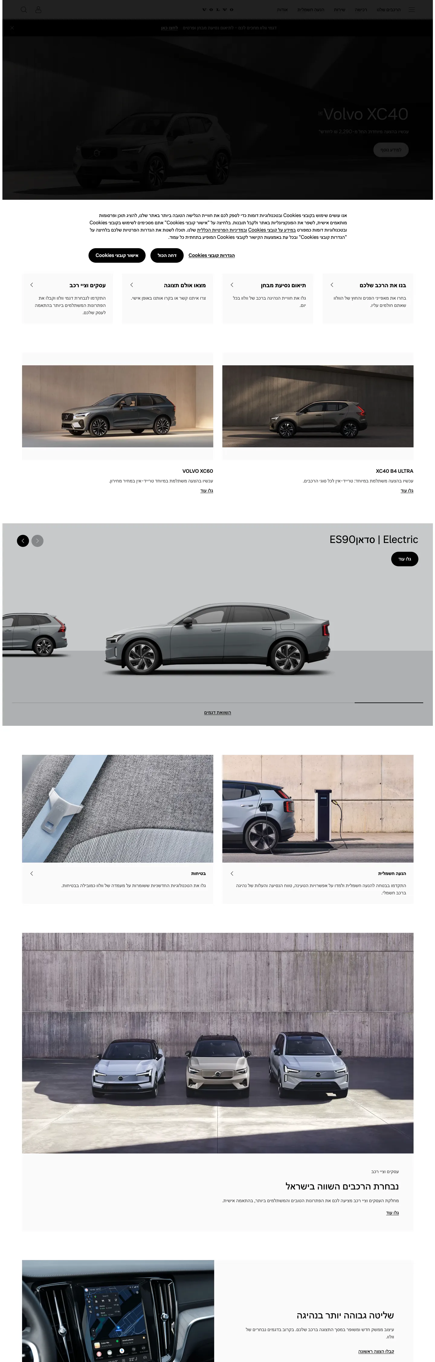
Volvo Cars treats its marketing page as a long vertical magazine rather than a configurator. The above-fold hero is a wide cinematic shot of the XC40 parked on a charcoal driveway with the 52px hero h1 set in white over the photograph at weight 400 — no shadow, no overlay gradient, no glow. Below the fold, the page stacks: a hairline-bordered text card, a second full-bleed shot of the ES90 Electric on a concrete plinth, then two side-by-side cabin and charging-port closeups, then a row of three EX models on a wet street, then more cards. Where Tesla animates a 3D configurator and Polestar leans on minimal-product photography against pure white voids, Volvo runs documentary-style photography full bleed and surrounds it with the smallest possible chrome — ink-on-white type, a few pill CTAs, hairline dividers, nothing else.

The DESIGN.md file packages the system into a machine-readable spec for React and AI tools. Inside: thirteen color tokens drawn from the 421 CSS variables Volvo exposes on the page, organized into a structural tier (true black ink, true white canvas, mid and light grey text and surface tones), a single-accent tier (a cobalt blue and a signal red that exist as feedback semantics, not brand voltage), and a small surface set. Eight typography tokens cover Volvo Centum at display, statement, heading, body, and label tiers, plus a Volvo Broad Pro display-statement tier reserved for the corporate wordmark and editorial signage. Three radii — squared zero, a small four-pixel rounding for inputs, and the full pill. Eight spacing values on a fluid clamp ladder running from 4 to 128 pixels. Fourteen component definitions covering the ink-black primary pill, the secondary ghost pill, the hairline-edged cards, the full-bleed model panel, the editorial body paragraph, and the top nav.

Feed this file to Claude or Cursor and the agent reproduces Volvo's specific moves: full-bleed model photography as the page floor rather than a hero gradient, single-family Volvo Centum across every tier, weight-400 display headlines that never tip into bold authority, binary radius scale that reserves the pill for tappable actions, and the documentary-photo-plus-text-card cadence that runs the full page. The token references resolve cleanly — `{colors.ink}` for any black, `{colors.canvas}` for any white, `{rounded.pill}` for the CTA, `{typography.statement-1}` for the corporate-signage tier — so the AI never has to invent a value. The one move worth borrowing only if your product has the photographic budget to back it: trusting cinematic photography to do the entire job of brand assertion, with no decorative chrome in between.

What makes it distinct

5

  1. Photography is the systemevery above-fold panel is a full-bleed model shot; brand chrome is just ink, white, and pill CTAs around the photography
  2. Single-family typographyVolvo Centum carries display, heading, body, button, and nav with no second sans, and a tertiary Volvo Broad Pro reserved for the wordmark only
  3. Display weight 400 across the systemthe 52px hero h1 sits at regular, not bold; the 32-34px section headings match
  4. Binary radius scaleevery surface is squared (0px) except the pill CTAs, which use a full 9999px capsule
  5. Monochrome palettetrue black ink, true white canvas, a single mid-grey for secondary text; brand-color accents (cobalt blue, signal red) exist as CSS variables but barely render on the marketing page

volvocars.com

Live at volvocars.com

A snapshot of the brand in production. Scroll the frame to see the whole page.

Volvo Cars's website at volvocars.com

Colors

13 colors

Volvo Cars's system anchors on #0b2ded (accent-blue) as its primary color. Type is set in Volvo Centum across 9 tokens from 12px to 148px, weights 400–600. Shape language is sharp — components average 1px corner radius, favoring crisp rectangles.

Brand & Accent

Sparing, CTA-only voltage · 1

Surface

Page and card backgrounds · 3

Text

Headlines, body, captions · 3

Borders & Hairlines

Dividers, outlines, rules · 1

Other

Specialty colors · 5

Typography

9 type tokens

Set in Volvo Centum across 9 tokens, from 12px to 148px, weights 400–600. Shown in its own stack: where the font isn't installed, the fallback the file names stands in.

  • statement-1148px · weight 400 · lh calc(1em + 0.5rem)The quick brown fox jumps over the lazy dog
  • display-xl52px · weight 400 · lh 60pxThe quick brown fox jumps over the lazy dog
  • heading-md34px · weight 400 · lh 42pxThe quick brown fox jumps over the lazy dog
  • heading-sm20px · weight 600 · lh 30pxThe quick brown fox jumps over the lazy dog
  • body-lg24px · weight 400 · lh 32pxThe quick brown fox jumps over the lazy dog
  • body-md16px · weight 400 · lh 24pxThe quick brown fox jumps over the lazy dog
  • button-md16px · weight 600 · lh 24pxThe quick brown fox jumps over the lazy dog
  • caption12px · weight 400 · lh 20px · tracking 0.24pxThe quick brown fox jumps over the lazy dog
  • statement-signature84px · weight 400 · lh calc(1em + 0.5rem)The quick brown fox jumps over the lazy dog

Layout

Radii and spacing

5 corner radii and 9 spacing values. Shape language: sharp.

Radii

  • none0px
  • sm4px
  • md8px
  • lg16px
  • pill9999px

Spacing

  • xs4px
  • sm8px
  • md12px
  • base16px
  • lg24px
  • xl48px
  • 2xl64px
  • 3xl96px
  • 4xl128px

Components

14 components

Each rendered from its tokens (color, type, radius, padding) on Volvo Cars's own canvas.

  • Hero Section
    hero-sectionHero Section
  • Hero Heading
    hero-headingHero Heading
  • Statement Heading
    statement-headingStatement Heading
  • Section Heading
    section-headingSection Heading
  • Body Paragraph
    body-paragraphBody Paragraph
  • Body Paragraph Emphasis
    body-paragraph-emphasisBody Paragraph Emphasis
  • Button Primary
    button-primaryButton Primary
  • Button Secondary
    button-secondaryButton Secondary
  • Top Nav
    top-navTop Nav
  • Nav Link
    nav-linkNav Link
  • Card Hairline
    card-hairlineCard Hairline
  • Model Panel
    model-panelModel Panel
  • Type here…
    text-inputText Input
  • Footer
    footerFooter

In use

The system, in use

Volvo Cars's tokens on the kind of product it builds.

Build something people actually use.

A short paragraph of marketing copy that previews how the brand's display tier and body tier read together. Two sentences is usually enough.

Get startedLearn more
Marketing heroHeadline, sub-copy, primary CTA — the universal homepage opener.
Reporting · 14 min read

The quiet collapse of an old idea

For decades the consensus held that the system would correct itself. Then it didn't. This is the inside story of what changed, told by the people who watched it unravel.

"Nobody noticed because the failure was indistinguishable from progress."

By Sam Reporter · Updated 2 hours ago

Editorial articleMagazine-style longform with display headline.

FAQ

Volvo Cars design system FAQ

Common questions about Volvo Cars's tokens, components, and how to use this DESIGN.md in your project.

Read next

Specs, directories, and component libraries that pair with this design system.

Use it

Use Volvo Cars in your project

One machine-readable file. Drop it into Claude, Cursor, or any AI tool that reads DESIGN.md.

Download DESIGN.md
  1. Download the DESIGN.md

    One machine-readable file: every color, type, radius, spacing, and component token of Volvo Cars.

  2. Feed it to your AI tool

    Drop it into Claude, Cursor, or GitHub Copilot. The agent writes React components and Tailwind classes that match Volvo Cars's visual language.

  3. Reference the tokens directly

    Or paste the values into your Tailwind config, CSS variables, or component library: every color, size and radius is a quoted, ready-to-copy value.

Read the full DESIGN.md: overview, rationale, do’s and don’ts

Overview

Volvo Cars' marketing system inverts the dev-tools convention of brand chrome carrying the visual force. Photography is the system. The above-fold hero on volvocars.com is a wide cinematic shot of the XC40 parked on a charcoal driveway with the 52px h1 set in white over the photograph at weight 400 — no overlay gradient, no glow, no shadow, no decorative panel. Below the fold the page stacks vertically: a hairline-bordered text card, a full-bleed ES90 Electric on a concrete plinth, two side-by-side cabin and charging-port closeups, a row of three EX models on a wet street, then a closing pair of cards. Where Tesla animates a 3D configurator and Polestar leans on product photography against pure white voids, Volvo runs documentary-style photography full bleed and surrounds it with the smallest possible chrome — ink-on-white type, a few pill CTAs, hairline dividers, nothing else.

The chromatic discipline reinforces the move. The captured page renders true black {colors.ink} 326 times — 146 as text, 178 as border, one as background, one inside a gradient — and true white {colors.canvas} 64 times. Mid-grey {colors.ink-soft} carries fourteen secondary text moments. That is essentially the entire palette. The CSS declares 16 additional brand-layer values (a cobalt blue {colors.accent-blue}, a signal red {colors.signal-red}, feedback-state greens and oranges) but none of them render meaningfully in the marketing chrome — they live inside the configurator's form-validation states and the dealer-locator's status flags. The brand voltage, such as it is, comes from the photography: the metallic paint colors of the models do the chromatic work a brand accent would do elsewhere.

Typography is Volvo Centum across every tier — a single proprietary sans handling display, statement, heading, body, button, and label. A second family, Volvo Broad Pro, exists only as the corporate signature tier (the heaviest typographic moment in the system at weight 400) and never appears as running text. Display weight tops out at 400; emphasis goes to weight 600 at the small heading and button tiers. There is no 700+ moment anywhere on the marketing page. The hero h1 at 52px in weight 400 is the loudest typographic moment — deliberately measured so the photography behind it remains the protagonist.

Key Characteristics:

  • Pure white canvas ({colors.canvas} — #ffffff), not the off-white cream that Cloudflare or Aesop run — the contrast against full-bleed photography needs maximum chromatic gap.
  • True black ink ({colors.ink} — #000000) used at intensity — 326 captured occurrences, 178 of them as borders, dominant across every typographic and chrome tier.
  • Single typography family Volvo Centum across display, heading, body, button, and nav, with a Volvo Broad Pro statement-signature tier reserved for the wordmark only.
  • Display weight 400 across the system, emphasis at weight 600 — no 700+ bold moment anywhere on the captured page.
  • Binary radius scale — every surface squared at zero except the pill CTAs ({rounded.pill} — 9999px). Four pill occurrences total on the page.
  • Photography stack — every other panel is a full-bleed model or lifestyle shot; the cards between them are hairline-bordered editorial blocks.
  • Fluid spacing on clamp ladders — the statement-1 tier clamps from 72px to 148px, section padding from 32px to 64px, gutters from 16px to 32px depending on viewport.
  • Sustainability messaging carries no green chrome — electrification copy reads the same as the model showcases, with no eco-iconography or tinted accents.

Colors

Structural

  • Ink ({colors.ink} — #000000): frequency 326. Used as text (146), border (178), background (1), gradient (1). The dominant chrome color across the entire page. Wired in CSS as --v-color-foreground-primary, --v-color-always-black, --v-color-surface-neutral, and --v-color-state-primary-medium. True black, not a near-black graphite.
  • Canvas ({colors.canvas} — #ffffff): frequency 64 — used as background (16), text (26), border (22). The page floor. Wired as --v-color-background-primary, --v-color-always-white, --v-color-foreground-inverted.
  • Surface-1 ({colors.surface-1} — #fafafa): the secondary background — appears once as --v-color-background-secondary. A near-imperceptible warmth shift from canvas, used inside the configurator's stepper panels and the news-card secondary surfaces.
  • Surface Gray ({colors.surface-gray} — #e3e3e3): the model-panel background tone used behind the ES90 hero card. Wired as --v-color-surface-gray. The single mid-grey surface in the system.
  • Hairline ({colors.hairline} — #f0f0f0): the border separator used inside feedback components and card outlines. Wired as --v-color-background-feedback-gray and --v-color-background-feedback-red.

Text

  • Ink Soft ({colors.ink-soft} — #5e5e5e): frequency 14 — the secondary text tone for body paragraphs and lead copy. Wired as --v-color-foreground-secondary. The single mid-grey text moment in the system.
  • Ink Muted ({colors.ink-muted} — #7b8082): the tertiary text tone, used for caption labels and metadata. Wired as --v-color-foreground-tertiary. Slightly warmer than the ink-soft grey to keep the photographic surroundings from feeling cold.

Accent (declared, rarely rendered)

  • Accent Blue ({colors.accent-blue} — #0b2ded): a saturated cobalt wired as --v-color-foreground-accent-blue and --v-color-surface-accent-blue. Declared as the brand secondary accent but barely renders in the marketing chrome — reserved for editor selection states and dealer-locator pinpoints.
  • Signal Red ({colors.signal-red} — #cb232c): the brand signal red wired as --v-color-foreground-feedback-red. One captured occurrence on the page, used as the inline-error text color inside form chrome.

Feedback (semantic, configurator-only)

  • Feedback Red Surface ({colors.feedback-red-surface} — #e52715): the validation-error surface fill wired as --v-color-surface-feedback-red and --v-color-state-feedback-red-medium. Lives inside the configurator's form-validation chrome.
  • Feedback Green Surface ({colors.feedback-green-surface} — #048220): the validation-success fill wired as --v-color-surface-feedback-green. Reserved for form-success and the dealer-stock availability badge.
  • Feedback Orange Surface ({colors.feedback-orange-surface} — #ce6700): the warning fill wired as --v-color-surface-feedback-orange. Reserved for service-recall and warranty-notification badges inside the owner portal.
  • Feedback Orange Bg ({colors.feedback-orange-bg} — #ffe8d1): the soft warning surround wired as --v-color-background-feedback-orange. The pale-orange fill behind warning text inside notification cards.

Typography

Font Families

The system runs Volvo Centum for every spoken tier — display, statement, heading, body, button, nav, and caption. The fallback stack walks Helvetica Neue, Helvetica, Noto Sans, Segoe UI, Arial, sans-serif. A second family, Volvo Broad Pro, carries the statement-signature tier reserved for the corporate wordmark and editorial signage moments; it never appears as running text or button label.

There is no third family — no monospace, no second sans, no serif tier. Volvo Centum does the labor of every typographic surface the marketing page renders, and the discipline holds across the configurator, the news index, and the financial-services subpages.

Hierarchy

TokenSizeWeightLine HeightUse
{typography.statement-1}148px fluid400calc(1em + 0.5rem)Editorial signage moments — clamps from 72px to 148px
{typography.statement-signature}84px fluid400calc(1em + 0.5rem)Volvo Broad Pro signature tier — clamps from 40px to 84px
{typography.display-xl}52px40060pxHero h1 ("Volvo XC40")
{typography.heading-md}34px40042pxSection h2
{typography.heading-sm}20px60030pxSub-section / card title
{typography.body-lg}24px40032pxLead paragraph beneath display
{typography.body-md}16px40024pxDefault running text
{typography.button-md}16px60024pxPill CTA label
{typography.caption}12px40020pxMetadata, footer chrome

Principles

Display weight tops out at 400. The hero h1 at 52px / 400 is the loudest typographic moment in the marketing chrome — deliberately measured so the photography behind it remains visually dominant. Emphasis goes to weight 600 at the small heading and button tiers, never to 700+. The statement-1 token at the wide-desktop clamp ceiling reaches 148px — that scale only renders in the corporate-signage editorial spreads, never in the model-showcase cadence. Volvo Broad Pro at the statement-signature tier is the only display tier that diverges from Centum, and it appears in vertical-signage compositions where the corporate wordmark needs the wider geometry to read at scale.

Note on Font Substitutes

Volvo Centum is a licensed proprietary family. Inter at the same weights is the closest open-source substitute; the proportions transfer cleanly at the 16-24px body sizes. For the statement-1 fluid tier, Söhne or Aktiv Grotesk at weight 400 carry the same humanist warmth. For the Volvo Broad Pro statement-signature tier, Manrope ExtraBold at weight 800 or Inter Black at weight 900 are the closest free substitutes — the geometry diverges slightly but the visual force transfers.

Layout

Spacing System

  • Base unit: fluid. The system runs CSS clamp() ladders rather than fixed scale steps — --v-space-pagemargin clamps from 16px on mobile to 64px on wide desktop, --v-space-gutter from 16px to 32px, --v-space-md from 24px to 48px.
  • Fixed-step tokens: {spacing.xs} 4px · {spacing.sm} 8px · {spacing.md} 12px · {spacing.base} 16px · {spacing.lg} 24px · {spacing.xl} 48px · {spacing.2xl} 64px · {spacing.3xl} 96px · {spacing.4xl} 128px. The 24px and 4px values are the dominant tokens — 12 captured occurrences each.
  • Section padding (vertical): 96px between major model showcases, dropping to 64px between editorial cards.
  • Card internal padding: 44px x 30px on hairline-bordered text cards, 16px x 24px on smaller index cards.

Grid & Container

  • Max content width: 81rem (1296px) on the page-content grid (--v-size-grid-maxwidth), with an absolute hard ceiling at 160rem (2560px) for ultra-wide editorial spreads.
  • Twelve-column grid with 16-32px fluid gutters (--v-grid-columns: 12).
  • Hero: full-bleed cinematic photograph, content overlaid at ~1080px max-width, left-aligned at the bottom-left third of the frame.
  • Model showcase: full-bleed image panels alternate with hairline-bordered text cards in a vertical stack — no two-column splits, no card carousels.
  • Sub-grids: sidebar widths run from 15rem narrow to 29rem wide for the configurator-step rail and the financing-options rail.

Rhythm

The page alternates between full-bleed photographic and constrained editorial card bands. There is no atmospheric gradient between bands — each photographic panel terminates at the edge of the viewport, and the next text card begins immediately below with a hairline dividing rule. The 96px section-padding tier reads as breathing room; the 44x30 card padding reads as editorial generosity; together they pace the page as a vertical magazine rather than as a scrollable hero stack.

Elevation

The system has essentially no shadow tier. The captured page renders zero shadow occurrences in the structural CSS variables — depth comes entirely from photography (the model imagery carries its own lighting) and from surface contrast ({colors.surface-gray} panels lifted against the {colors.canvas} floor by a ~6% lightness gap).

  • Flat (no shadow): hero, every model panel, every text card, every footer band — 100% of structural surfaces.
  • Tonal lift: {colors.surface-gray} (#e3e3e3) cards sit on {colors.canvas} (#ffffff). The lift reads quietly — a single tonal step rather than a layered elevation.
  • Photographic depth: the cinematic lighting inside each model shot does the depth work — the XC40 driveway shadow, the ES90 plinth highlight, the EX-trio reflection on wet asphalt — without any drawn shadow in the chrome.

Shapes

The radius scale is binary: every surface squared at zero, except the pill CTAs.

  • {rounded.none} 0px — the structural default (--v-shape-default). Every card, every image container, every text panel, every nav band, every footer block sits at zero.
  • {rounded.sm} 4px — declared as --v-radius-sm for inputs and small chips inside the configurator. Rarely renders on the marketing page.
  • {rounded.md} 8px — declared as --v-radius-md for the configurator panel corners. Not visible on the captured marketing surface.
  • {rounded.lg} 16px — declared as --v-radius-lg for the dealer-locator results and the saved-build cards. Not visible on the marketing page.
  • {rounded.pill} 9999px — wired as --v-shape-emphasis. The four occurrences on the captured page are exactly the primary and secondary CTAs in the hero (configure / book a test drive / find a retailer).

The discipline is the move. When softness happens, it happens only at the single tappable action. Every other surface reads as a squared editorial block — including the photographic panels, which terminate at the viewport edge without a rounded corner.

Components

hero-section — Full-bleed cinematic model photograph with the h1 overlaid in white. 96x24 padding on the inner content stack, no border-radius. The model name sits at the bottom-left third of the frame; the primary and secondary pill CTAs sit immediately below the headline.

hero-heading — White text on the photograph, Volvo Centum 52px / 400. The display tier — confidence by scale, not by weight.

statement-heading — Ink text at the statement-1 fluid tier — clamps from 72px on mobile to 148px on ultra-wide desktop. Used for editorial signage moments inside the design-story and sustainability spreads.

section-heading — Ink text at 34px / 400, used for "Build your car" and other section h2s.

body-paragraph — Ink-soft {colors.ink-soft} text at 16px / 400 — the workhorse paragraph style. Mid-grey, not pure black, to keep long-form reading comfortable.

body-paragraph-emphasis — Ink text at the 20px / 600 heading-sm tier — used inside cards where a single sentence needs to read as emphasis without being treated as a heading.

button-primary — The signature CTA. Ink-black {colors.ink} fill, white text, full pill {rounded.pill} 9999px radius, 12x24 padding, 44px height. The "Build your car" pill is the canonical instance, sitting beneath the hero h1.

button-secondary — Transparent fill with ink text and a 1px ink-black border. Pill radius, 12x24 padding, 44px height. Used for "Find a retailer" and other secondary actions beside the primary pill.

top-nav — White {colors.canvas} surface, 64px height, no border. The Volvo wordmark sits flush left; product-category links (Cars, Buy & Order, Owners, Support) sit center; the country selector and account icon sit flush right.

nav-link — Transparent background, ink text in {typography.body-md}, 8x12 padding. No hover background visible in the captured surface — the hover state is a faint underline.

card-hairline — White {colors.canvas} surface, 1px {colors.hairline} border, no border-radius, 44x30 internal padding. The default text card — holds feature explanations, sustainability talking points, and the financial-services blocks.

model-panel — Full-bleed photograph with no border-radius and no padding. The model name and price sit in a hairline-bordered text card immediately below the photograph, not overlaid.

text-input — White surface, ink text, 1px {colors.ink-muted} border, {rounded.sm} 4px radius, 12x16 padding, 44px height. Used inside the dealer-locator and the build-quote forms.

footer — White canvas, ink-soft text, 48x24 padding. No surface contrast against the page floor — the footer continues the canvas with a hairline top rule and the category-link grid stacked beneath.

Do's and Don'ts

Do trust the photography to carry the chromatic load. The system's single structural move is the full-bleed cinematic photograph stack — model shots, charging-port closeups, lifestyle scenes. Adding a brand-color overlay or a hero gradient would compromise the documentary tone and tip the page from magazine into showroom.

Do keep display weight at 400. The hero h1 at 52px / 400 is the loudest typographic moment in the marketing chrome; bumping to 700 turns the editorial dek into a generic auto-shout and undercuts the principle of letting the photography lead.

Do reserve the pill ({rounded.pill} — 9999px) for the primary and secondary hero CTAs only. Multiplying pills across the page dilutes the single tappable-action signal and softens the squared editorial discipline.

Do keep sustainability and electrification copy in the same chrome as the model showcases. Green tinting, leaf icons, eco-badge gradients would create a second visual register and undercut the principle that electrification is default rather than a separate marketing track.

Don't introduce a rounded-card tier at 8 or 16 pixels. The CSS declares {rounded.md} and {rounded.lg} but the marketing surface never renders them; importing those values would soften the squared editorial blocks and weaken the binary radius discipline.

Don't use {colors.accent-blue} (#0b2ded) as a CTA fill or a link color in marketing chrome. It is declared as the brand secondary accent but reserved for editor selection states and dealer-locator pinpoints — using it on a button reads as a system fault.

Don't use the feedback colors ({colors.feedback-red-surface}, {colors.feedback-green-surface}, {colors.feedback-orange-surface}) outside of configurator validation states and owner-portal notification badges. Outside those contexts they read as decorative accents and break the monochrome discipline.

Don't swap the canvas from pure white to a cream or off-white. The contrast between true white and full-bleed photography is intentional — softening it to cream would muddy the documentary lighting inside each model shot and dull the chromatic punch of the metallic-paint colors.

Known Gaps

  • Hover and focus states: the captured marketing page exposes the resting state of the pill CTAs and the secondary ghost pill; the full state matrix (focus rings, active press, disabled tints) lives inside the configurator and is not represented here.
  • Form input error states: {component.text-input} carries the resting state; error styling uses {colors.feedback-red-surface} and {colors.signal-red} inside the configurator forms but is not exposed on the marketing surface.
  • Dark mode: the captured marketing surface is light-only. The CSS exposes --v-color-state-inverted-* variants for inversion contexts but no dark-mode variant is rendered on the public marketing pages.
  • Configurator chrome: this DESIGN.md captures the marketing site only. The build-your-car configurator (shop.volvocars.com) carries a richer token system — step-rail panels, swatch chips, accessory cards, financing tables — that is not represented here.
  • Owner portal and service surfaces: the My Volvo owner portal, the service-booking flow, and the dealer-locator carry their own surface tokens and notification chrome not represented in this file.
  • Motion: the hero photograph and the model panels animate on scroll-into-view (subtle parallax, fade-in on cards) but the spec captures end-state values only. Easing curves are declared as --v-transition-easing-regular (cubic-bezier(0.45,0,0.4,1)) and --v-transition-easing-entrance (cubic-bezier(0,0,0.1,1)) but the staging is not exposed.
  • Statement-tier rendering: the {typography.statement-1} and {typography.statement-signature} tiers are declared in the CSS variables but render only on editorial design-story spreads (not on the standard model-showcase page) — the captured page does not exercise the full fluid range.

Automotive

More systems like this

More DESIGN.md files in Automotive.

Pricing

Build it with Pro

The DESIGN.md files are free. Pro adds 6,000+ blocks, premium templates and the MCP server, so your AI editor builds in your system for you.

4.9/5 out of 5 · 150+ reviewsfrom 150+ founders and developers.

Billed once a year in USD. Cancel anytime.

Individual

For personal projects & open source

$32instead of $49/mo

$389 billed yearly

  • How many people can use the license.Seats: 1 seat
  • Client work, SaaS products and anything you charge for.Commercial use: Personal & open source only
  • Production-ready React sections: hero, pricing, features, dashboards and more.Pro blocks: 6,000+ blocks
  • Complete multi-page sites you can ship as they are.Templates: All 14 templates
  • React icons from every major library, installable with one command.React icons: 294k+ icons
  • Presets that restyle every block, in light and dark.Themes: All 59 themes
  • Lets your AI editor search, preview and install blocks for you.MCP server: Basic usage
  • Priority requests are answered first.Support: Standard

Team

Most popular

For freelancers, agencies & startups

$66instead of $99/mo

$789 billed yearly · ≈ $13/dev/mo

Everything in Individual, plus

  • How many people can use the license.Seats: Up to 5 seats
  • Client work, SaaS products and anything you charge for.Commercial use: Included
  • Lets your AI editor search, preview and install blocks for you.MCP server: High usage
  • Priority requests are answered first.Support: Priority

Organization

For companies with larger teams

$132instead of $199/mo

$1,589 billed yearly

Everything in Team, plus

  • How many people can use the license.Seats: Unlimited seats
  • Lets your AI editor search, preview and install blocks for you.MCP server: Unlimited usage
  • Secure checkout via Stripe
  • Code lives in your repo
  • Keep what you've shipped if you cancel
  • License terms

Your system, built for you

Every block, template and icon, installed by your AI agent in your design system. The DESIGN.md files stay free.

Get Pro