Uber Inspired Design System
Uber's design system as a DESIGN.md file. Ink Black #000000, UberMove + UberMoveText, 13 colors, 40+ components. For React, Next.js, and AI tools.
Add shadcn.io to your AI agent. · Pro It installs blocks, icons and templates in your design system from a prompt, with Pro.
Set up MCP- Primary
- #000000
- Typeface
- UberMoveText
- Shape
- Soft
- Base radius
- 8px
- Colors
- 13
- Type tokens
- 13
- Components
- 39
- Spacing values
- 8
About
About Uber Inspired DESIGN.md
Curated by Dov Azencot · Updated May 12, 2026 · Source uber.com (opens in a new tab)
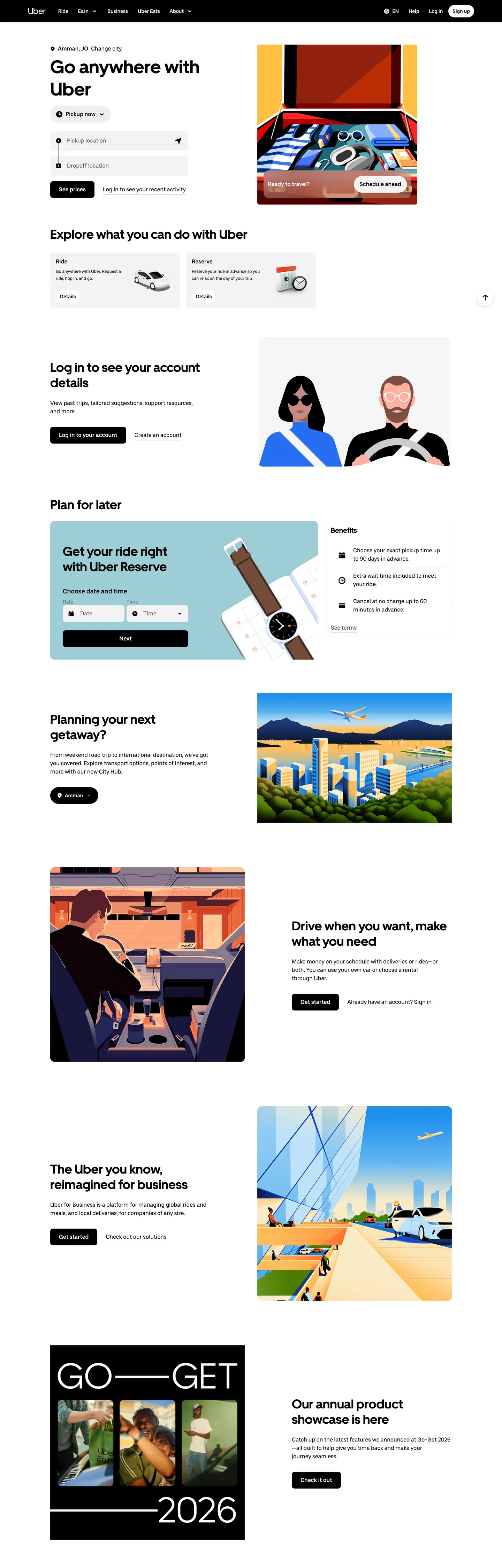
Uber's web surface is the most disciplined two-color system in consumer marketplaces. The brand strips every page down to a black-and-white duet — pure ink "#000000" anchors every primary CTA, every dark promo band, and the full-bleed footer; pure canvas "#ffffff" carries everything else. There is no secondary accent, no gradient, no atmospheric backdrop. The only chromatic element on the entire surface is the browser-default "#0000ee" link blue inside legal fine print, a deliberately mundane choice that signals the brand will not invent decoration where none is needed.
This page packages Uber's web design language into a single DESIGN.md file following the Google Labs spec. Inside: 13 colors tokens grouped into surface, text, brand, and elevated roles; 13 type styles spanning UberMove display sizes from 20px to 52px and UberMoveText body weights at 400 and 500; 8 spacing values on a 4px base; 7 corner radii anchored on the signature 999px pill; and 40+ components covering buttons, cards, navigation, the hero ride-request form, and the polarity-flipped promo bands that punctuate the page.
Feed the file to Claude, Cursor, or GitHub Copilot and the agent renders React components that match Uber's restraint — black pill CTAs on white surfaces, sentence-case display headlines at weight 700, editorial 4:3 illustration frames inside "#rounded.xl" 16px cards. Or use the tokens directly as a reference: every hex, every font stack, every padding value is a quoted string you can paste into Tailwind config or CSS variables. The system is worth studying because it proves a marketplace brand can scale to global logistics on two colors and one shape — no third voltage required.
What makes it distinct
5
- Two-color duetpure black #000000 and pure white #ffffff carry the entire system with zero secondary accent
- Pill is the signature shape999px radius on every interactive element except cards (#rounded.xl 16px) and the off-shape 36px tab toggle
- Two custom faces, two rolesUberMove 700 for 20-52px headlines, UberMoveText 400/500 for body, button, and link
- Polarity-flipped black promo bands mid-page are the depth cuethe system has no progressive shadow tiers
- Editorial 4:3 illustrations of riders and drivers are the only decorationno gradients, no atmospheric backdrops
uber.com
Live at uber.com
A snapshot of the brand in production. Scroll the frame to see the whole page.
Colors
13 colors
Uber Inspired's system runs on #000000 as its primary voltage, used in 4 of 39 components. Type is set in UberMoveText across 13 tokens from 12px to 52px, weights 400–700. Shape language is soft — components average 233px corner radius, with no sharp interactive edges.
Brand & Accent
Sparing, CTA-only voltage · 1
Surface
Page and card backgrounds · 4
Text
Headlines, body, captions · 5
Borders & Hairlines
Dividers, outlines, rules · 1
Other
Specialty colors · 2
Typography
13 type tokens
Set in UberMoveText across 13 tokens, from 12px to 52px, weights 400–700. Shown in its own stack: where the font isn't installed, the fallback the file names stands in.
- display-xxl52px · weight 700 · lh 64pxThe quick brown fox jumps over the lazy dog
- display-xl36px · weight 700 · lh 44pxThe quick brown fox jumps over the lazy dog
- display-lg32px · weight 700 · lh 40pxThe quick brown fox jumps over the lazy dog
- display-md24px · weight 700 · lh 32pxThe quick brown fox jumps over the lazy dog
- display-sm20px · weight 700 · lh 28pxThe quick brown fox jumps over the lazy dog
- body-lg18px · weight 500 · lh 24pxThe quick brown fox jumps over the lazy dog
- body-md16px · weight 400 · lh 24pxThe quick brown fox jumps over the lazy dog
- body-md-strong16px · weight 500 · lh 20pxThe quick brown fox jumps over the lazy dog
- body-sm14px · weight 400 · lh 20pxThe quick brown fox jumps over the lazy dog
- body-sm-strong14px · weight 500 · lh 16pxThe quick brown fox jumps over the lazy dog
- caption12px · weight 400 · lh 20pxThe quick brown fox jumps over the lazy dog
- button-large18px · weight 500 · lh 24pxThe quick brown fox jumps over the lazy dog
- button-md16px · weight 500 · lh 20pxThe quick brown fox jumps over the lazy dog
Layout
Radii and spacing
7 corner radii and 8 spacing values. Shape language: soft.
Radii
- none0px
- md8px
- lg12px
- xl16px
- pill999px
- pill-tab36px
- full9999px
Spacing
- xxs4px
- xs6px
- sm8px
- md12px
- lg16px
- xl20px
- 2xl24px
- 3xl32px
Components
39 components
Each rendered from its tokens (color, type, radius, padding) on Uber's own canvas.
- Nav Barnav-barNav Bar
- Nav Linknav-linkNav Link
- Button Primarybutton-primaryButton Primary
- Button Secondarybutton-secondaryButton Secondary
- Button Subtlebutton-subtleButton Subtle
- Button Floatingbutton-floatingButton Floating
- Button Large Roundedbutton-large-roundedButton Large Rounded
- Button Tab Translucentbutton-tab-translucentButton Tab Translucent
- Type here…text-inputText Input
- Type here…text-input-on-softText Input On Soft
- Card Contentcard-contentCard Content
- Card Elevatedcard-elevatedCard Elevated
- Card Soft Tintedcard-soft-tintedCard Soft Tinted
- Promo Card Illustratedpromo-card-illustratedPromo Card Illustrated
- Promo Card On Darkpromo-card-on-darkPromo Card On Dark
- Request Form Cardrequest-form-cardRequest Form Card
- Request Form Input Rowrequest-form-input-rowRequest Form Input Row
- Category Buttoncategory-buttonCategory Button
- Faq Rowfaq-rowFaq Row
- App Download Pillapp-download-pillApp Download Pill
- Hero Band Lighthero-band-lightHero Band Light
- Hero Band Darkhero-band-darkHero Band Dark
- Showcase Image Cardshowcase-image-cardShowcase Image Card
- Link Bluelink-blueLink Blue
- Link On Darklink-on-darkLink On Dark
- Link Mutelink-muteLink Mute
- Link Mute Softlink-mute-softLink Mute Soft
- icon-button-circularIcon Button Circular
- FooterfooterFooter
- Ex Pricing Tierex-pricing-tierEx Pricing Tier
- Ex Pricing Tier Featuredex-pricing-tier-featuredEx Pricing Tier Featured
- Ex Product Selectorex-product-selectorEx Product Selector
- Ex Cart Drawerex-cart-drawerEx Cart Drawer
- Ex App Shell Rowex-app-shell-rowEx App Shell Row
- Ex Data Table Cellex-data-table-cellEx Data Table Cell
- Ex Auth Form Cardex-auth-form-cardEx Auth Form Card
- Ex Modal Cardex-modal-cardEx Modal Card
- Ex Empty State Cardex-empty-state-cardEx Empty State Card
- Ex Toastex-toastEx Toast
In use
The system, in use
Uber's tokens on the kind of product it builds.
Build something people actually use.
A short paragraph of marketing copy that previews how the brand's display tier and body tier read together. Two sentences is usually enough.
FAQ
Uber Inspired design system FAQ
Common questions about Uber's tokens, components, and how to use this DESIGN.md in your project.
Read next
Related reading
Specs, directories, and component libraries that pair with this design system.
- The DESIGN.md specificationGoogle Labs' open spec for machine-readable design system files — the format this page is built on.github.com (opens in a new tab)
- Browse all design systemsThe full directory of DESIGN.md files on shadcn.io, with live mockups for each.shadcn.io
- Airbnb design systemThe other canonical travel-and-marketplace brand, built on a single Rausch accent and Cereal VF type.shadcn.io
Use it
Use Uber Inspired in your project
One machine-readable file. Drop it into Claude, Cursor, or any AI tool that reads DESIGN.md.
Download the DESIGN.md
One machine-readable file: every color, type, radius, spacing, and component token of Uber Inspired.
Feed it to your AI tool
Drop it into Claude, Cursor, or GitHub Copilot. The agent writes React components and Tailwind classes that match Uber Inspired's visual language.
Reference the tokens directly
Or paste the values into your Tailwind config, CSS variables, or component library: every color, size and radius is a quoted, ready-to-copy value.
Read the full DESIGN.md: overview, rationale, do’s and don’ts
Overview
Uber is a transportation-and-delivery super-app — ride, eats, freight, the whole urban logistics layer — and the brand's web surface signals that scale through restraint: no third colour, no accent palette, no illustration that fights the headline. The page is structurally a black-and-white duet, where black {colors.primary} (#000000) is the conversion anchor (every CTA pill, every nav login button, the footer fill) and {colors.canvas} (#ffffff) white carries everything else. The only consistent decoration is a body of editorial 4:3 illustrations — riders, drivers, parking lots, cars-on-highway — that ground the marketing without leaking accent colour into the system.
Type is the second decisive voice. Two custom faces carry every page: UberMove at weight 700 for headlines (32 – 52 px display sizes with tight 1.22 – 1.25 line-height, never letter-spaced), and UberMoveText at weights 400 / 500 for body, button, and link. The pairing reads as engineering-grade — no italic, no decorative weight, no tracking flourish. Headlines are sentence-case; eyebrows are uppercase only when used as the section eyebrow ("WHY BECOME"); buttons are sentence-case.
The single shape signature is the pill. Every interactive element rounds to {rounded.pill} 999 px — primary CTA, secondary CTA, subtle gray pill, white floating pill, category chip, app-download badge. Cards and surfaces round to {rounded.xl} 16 px; the larger "Go Get 2026" annual-showcase card uses the same 16 px shape, just at scale. The tab-toggle on the hero ride-request form uses an off-shape {rounded.pill-tab} 36 px — barely-pill, deliberately tighter than the canonical 999 px pill.
Key Characteristics:
- A two-colour CTA hierarchy: black
{colors.primary}(#000000) pill for primary conversion targets; white{colors.canvas}(#ffffff) pill (sometimes with a soft drop shadow) for secondary; subtle gray{colors.canvas-soft}(#efefef) pill for tertiary or chip variants. - The pill is the single signature shape —
{rounded.pill}999 px on every interactive element except the tab-toggle ({rounded.pill-tab}36 px) and the larger product cards ({rounded.xl}16 px). - Every headline is sentence-case in
{typography.display-xl}/{typography.display-xxl}weight 700; no all-caps display. - Editorial 4:3 illustrations of riders / drivers / cars are the only consistent decorative system; no gradients, no atmospheric backdrops, no shadows that aren't card-elevation hints.
- A signature alternating-band rhythm: white feature card → black promo card (with white text and white CTA) → white feature card → black footer. The black bands are NOT hero-only; they appear mid-page as promo callouts.
- A signature ride-request form card on the hero: pickup pin input + destination input + date/time chip + black "See prices" pill, all stacked inside a
{rounded.xl}shadowed card.
Colors
Brand & Accent
- Ink Black (
{colors.primary}—#000000): The brand's only conversion colour. Every primary CTA pill, the footer fill, every dark promo band, every nav login button. The system has no secondary accent. - Surface Pressed (
{colors.surface-pressed}—#e2e2e2): The pressed-state fill for white pills — a soft grey that's used only in active / pressed states. - Black Elevated (
{colors.black-elevated}—#282828): A near-black used on hover for the translucent white tab-toggle pill. Documented as a system colour because it appears on a recurring brand control.
Surface
- Canvas (
{colors.canvas}—#ffffff): The default page background. - Canvas Soft (
{colors.canvas-soft}—#efefef): The soft gray fill for category chips, form-input rows inside the ride-request card, and subtle pill buttons. - Canvas Softer (
{colors.canvas-softer}—#f3f3f3): A slightly lighter gray used as a nested-input fill on white surfaces.
Text
- Ink (
{colors.ink}—#000000): Every heading and body paragraph on light surfaces. - Body (
{colors.body}—#5e5e5e): Secondary text — captions, sub-headings, supporting copy. - Hairline Mid (
{colors.hairline-mid}—#4b4b4b): A mid-gray used for muted link text inside footer columns and breadcrumb-style nav. - Mute (
{colors.mute}—#afafaf): The lightest text role — placeholder text, fine print, low-priority metadata. - On Dark (
{colors.on-dark}—#ffffff): All text on{colors.ink}surfaces (footer, dark promo bands).
Semantic
The brand does not maintain a separate error / success / warning palette in its public marketing surface. Validation cues come from the primary black or from the brand's editorial illustrations. The #0000ee link colour is the system's only chromatic — it's the browser-default link blue, appearing in body-copy inline links inside legal / footer text.
Typography
Font Family
Two custom faces carry the entire system:
- A custom geometric display sans (extracted as
UberMove) for every headline. Weight 700 only; no italic; no tracking variation. Sizes range fromdisplay-sm20 px up todisplay-xxl52 px on the hero. Line-heights tighten to 1.22 – 1.25 at display sizes for a poured-on-the-page look. - A custom text sans (extracted as
UberMoveText) for body, button, link, and small headings. Weights 400 and 500 are the working pair. Used at 12 – 18 px; 24 px maximum for ride-request form labels. Tracking is always neutral.
The two faces share a family DNA but never overlap roles — the display face never carries a body paragraph; the text face never carries a hero headline.
Hierarchy
| Token | Size | Weight | Line Height | Use |
|---|---|---|---|---|
{typography.display-xxl} | 52px | 700 | 64px | Hero headline ("Go anywhere with Uber", "Drive when you want"). |
{typography.display-xl} | 36px | 700 | 44px | Page section headlines ("Plan for later", "Safety, simplified"). |
{typography.display-lg} | 32px | 700 | 40px | Promo-card headlines. |
{typography.display-md} | 24px | 700 | 32px | Card titles, illustrated-promo headlines. |
{typography.display-sm} | 20px | 700 | 28px | Sub-card headings. |
{typography.body-lg} | 18px | 500 | 24px | Lead paragraphs and larger body. |
{typography.body-md} | 16px | 400 | 24px | Default paragraph body. |
{typography.body-md-strong} | 16px | 500 | 20px | Bolded inline body and most button labels. |
{typography.body-sm} | 14px | 400 | 20px | Captions, secondary metadata. |
{typography.body-sm-strong} | 14px | 500 | 16px | Bold caption / chip labels. |
{typography.caption} | 12px | 400 | 20px | Fine print, footer secondary lines. |
{typography.button-large} | 18px | 500 | 24px | Large rounded buttons inside the ride-request form. |
{typography.button-md} | 16px | 500 | 20px | Default button label. |
Principles
- Sentence-case is the voice. No all-caps headlines. Eyebrow tags ("WHY BECOME") are the rare exception.
- Weight 700 is for headlines; weight 500 is for buttons and emphasis. Don't promote button labels to 700.
- No tracking flourish. The display face is never letter-spaced, positive or negative.
- Two faces, two roles. UberMove for display; UberMoveText for everything else. Never cross the streams.
Note on Font Substitutes
The two faces are proprietary. Open-source substitutes:
- Display sans — Inter weight 700 with
font-feature-settings: "ss01"enabled comes closest. Geist weight 700 is the second-best option. - Text sans — Inter weights 400 / 500 match the geometric width and x-height. Plus Jakarta Sans is a softer alternative if the brand wants a less neutral feel.
Layout
Spacing System
- Base unit: 4 px. Most captured values are multiples of 4 with a few 6-px sub-multiples (10, 14) inside button padding.
- Tokens:
{spacing.xxs}4 px ·{spacing.xs}6 px ·{spacing.sm}8 px ·{spacing.md}12 px ·{spacing.lg}16 px ·{spacing.xl}20 px ·{spacing.2xl}24 px ·{spacing.3xl}32 px. - Section padding: marketing bands sit at
{spacing.3xl}32 px top/bottom on tighter pages and{spacing.3xl} {spacing.3xl}for hero bands; promo cards inset at{spacing.2xl}24 px. - Card interior padding: content cards sit at
{spacing.2xl}24 px; the ride-request form uses{spacing.lg}16 px to keep the form compact. - Inline gap: button rows, category chip rows, app-store pill rows use
{spacing.md}12 px between siblings.
Grid & Container
- Max width: ~1200 px container; centred with horizontal gutters of
{spacing.3xl}32 px on desktop,{spacing.lg}16 px on mobile. - Column patterns:
- Promo-card rows: 2-up at desktop (image left + content right, alternating sides), 1-up at mobile.
- Category chips: horizontal flex with wrap.
- FAQ rows: full-width single-column.
- App-download pills: 2-up at desktop (Rider + Driver), 1-up at mobile.
Whitespace Philosophy
Card-to-card spacing carries the rhythm — between two stacked promo cards there's roughly a full {spacing.3xl} 32 px gutter; inside a card the headline / paragraph / CTA stack is tight ({spacing.sm} 8 px between siblings). The black promo bands and the footer have no internal hairlines — content sits on flat ink with white text.
Responsive Strategy
Breakpoints
| Name | Width | Key Changes |
|---|---|---|
| Mobile | < 600px | Nav collapses to hamburger; promo cards stack; ride-request form becomes full-width. |
| Mobile-Large | 600–767px | Same as Mobile; chip rows enable horizontal scroll. |
| Tablet | 768–1119px | 2-up promo grid at upper widths; nav stays horizontal until ≥ 1120 px. |
| Desktop | 1120–1135px | Full nav row visible; promo cards 2-up. |
| Desktop-Large | ≥ 1136px | Container caps at ~1200 px; bands stay edge-to-edge while content centres. |
Touch Targets
The pill button-primary renders at ~44 px tall (10 px vertical padding + 24 px label line-height); the larger button-large-rounded at ~56 px. Both meet WCAG AAA at all breakpoints. Category chips inflate to ≥ 44 px tall through extra padding on touch viewports.
Collapsing Strategy
- Nav: full link row + Help / Log in / Sign up pills at desktop. Collapses to logo + hamburger at mobile; menu overlays full-screen with the same link list stacked.
- Ride-request form card: at desktop, the form sits inside a max-490-px
{rounded.xl}card with shadow. At mobile, full-width with edge-to-edge. - Promo cards: at desktop, image-left + content-right (or alternating). At mobile, image always above content.
- Annual showcase card: scales from a 2:3 desktop frame to a 4:3 mobile frame; date text resizes proportionally.
Image Behavior
- Editorial illustrations: 4:3 or 16:9 hard-edge rectangles; never cropped to a circle, never tilted. Aspect preserved.
- Photography: same — square or landscape; framed inside
{rounded.xl}card chrome. - Maps in ride-request flow: full-bleed inside a card; rounded corners follow the parent card.
- Logo bar: SVG vector, monochrome, consistent height.
Elevation & Depth
| Level | Treatment | Use |
|---|---|---|
| Level 0 — Flat | No shadow, no border. | Default — most cards and surfaces lean on hairline-of-canvas contrast. |
| Level 1 — Subtle Drop | rgba(0, 0, 0, 0.12) 0px 4px 16px 0px | Card-elevated frames around promo cards on light bands. |
| Level 2 — Card Drop | rgba(0, 0, 0, 0.16) 0px 4px 16px 0px | The ride-request form card on the hero; large content cards with embedded forms. |
| Level 3 — Pill Float | rgba(0, 0, 0, 0.16) 0px 2px 8px 0px | The floating white pill button (the one that floats over hero photography). |
Decorative Depth
- Black bands as polarity-flip depth: the brand uses pure black
{colors.primary}(#000000) mid-page bands to break the white-on-white rhythm. The polarity shift IS the depth cue. - Editorial illustrations as in-card depth: every promo card has a single 4:3 illustration as its left or right column. The illustration's visual weight is part of the card's elevation read.
- Pill geometry as micro-depth:
{rounded.pill}999 px applied at varying button heights creates a stack of nested pills that reads as visual hierarchy.
Shapes
Border Radius Scale
| Token | Value | Use |
|---|---|---|
{rounded.none} | 0px | Full-bleed hero bands, footer fill, raw image edges. |
{rounded.md} | 8px | Form-input fields inside the ride-request card. |
{rounded.lg} | 12px | Smaller secondary card chrome. |
{rounded.xl} | 16px | Canonical card radius — promo cards, content cards, ride-request form card, annual-showcase card, large rounded buttons. |
{rounded.pill} | 999px | The brand's signature interactive shape — every pill button, category chip, app-download pill, icon button. |
{rounded.pill-tab} | 36px | The translucent-white tab-toggle pill on the hero (Ride / Drive). |
{rounded.full} | 9999px | Identical effect to {rounded.pill} for circular icon containers. |
Photography Geometry
- Editorial illustrations: 4:3 landscape inside promo cards; 16:9 for full-width showcase frames.
- Driver / rider portraits: 4:5 portrait crop; framed by
{rounded.xl}16 px card chrome. - Annual showcase image: 2:3 portrait at desktop, scaling to 4:3 at mobile. The image fills the card; the headline overlays the bottom.
- Logo bar: monochrome SVG vectors at consistent ~24 px height.
- Avatars (where used): square or
{rounded.full}circle, never{rounded.lg}rounded-square.
Components
Buttons
button-primary — the canonical black pill, the brand's conversion target.
- Background
{colors.primary}(#000000), text{colors.on-primary}(#ffffff), label set in{typography.button-md}, padding{spacing.md} {spacing.md}, shape{rounded.pill}999 px.
button-secondary — the white pill paired with the black primary.
- Background
{colors.canvas}(#ffffff), text{colors.ink}(#000000), same label and padding asbutton-primary, shape{rounded.pill}.
button-subtle — the gray secondary pill used for tertiary actions inside cards (e.g., "Learn more" / "Use Reserve").
- Background
{colors.canvas-soft}(#efefef), text{colors.ink}, label in{typography.button-md}, padding{spacing.md} {spacing.lg}, shape{rounded.pill}.
button-floating — the white pill with a subtle drop-shadow that floats over a dark or photographic surface.
- Background
{colors.canvas}, text{colors.ink}, padding{spacing.md}, shape{rounded.pill}. Carries a Level 3 pill-float shadow.
button-large-rounded — the bigger black call-to-action used inside the ride-request flow ("Yes, help me").
- Background
{colors.primary}, text{colors.on-primary}, label in{typography.button-large}, padding{spacing.lg} {spacing.xl}, shape{rounded.xl}16 px (not pill — the only black CTA that breaks the pill rule, used in the larger form context).
button-tab-translucent — the tab-toggle on the hero ride-request form (Ride / Drive).
- Background
{colors.canvas}, text{colors.ink}, label in{typography.body-md-strong}, shape{rounded.pill-tab}36 px (off-shape, deliberately tighter than the canonical 999 px pill).
Cards & Containers
card-content — the canonical content card.
- Background
{colors.canvas}, text{colors.ink}, padding{spacing.2xl}, shape{rounded.xl}16 px. No shadow on the default state.
card-elevated — the content card with Level 1 subtle drop.
- Background
{colors.canvas}, text{colors.ink}, same padding + shape ascard-content. Shadow at Level 1.
card-soft-tinted — the gray-tinted card used as a sub-region inside the page (e.g., "Plan for later" callout).
- Background
{colors.canvas-soft}(#efefef), text{colors.ink}, padding{spacing.2xl}, shape{rounded.xl}.
promo-card-illustrated — the 2-column promo card with illustration on one side and copy on the other.
- Background
{colors.canvas}, text{colors.ink}, padding{spacing.2xl}, shape{rounded.xl}. Headline in{typography.display-md}or larger.
promo-card-on-dark — the polarity-flipped promo card in black.
- Background
{colors.ink}(#000000), text{colors.on-dark}(#ffffff), padding{spacing.2xl}, shape{rounded.xl}. Used for the "Drive with Uber" mid-page band.
request-form-card — the hero ride-request form chrome.
- Background
{colors.canvas}, text{colors.ink}, padding{spacing.lg}, shape{rounded.xl}. Carries Level 2 card drop shadow.
request-form-input-row — the per-field row inside the request-form card.
- Background
{colors.canvas-soft}, text{colors.ink}, padding{spacing.lg}, shape{rounded.md}8 px. Hosts an icon + label + value.
showcase-image-card — the giant "GO•GET 2026" annual showcase card.
- Background
{colors.ink}, text{colors.on-dark}overlay, padding{spacing.3xl}, shape{rounded.xl}. Display-xxl headline overlays the bottom of the image.
Inputs & Forms
text-input — the canonical text input.
- Background
{colors.canvas-soft}, text{colors.ink}, body in{typography.body-md}, padding{spacing.lg}, shape{rounded.md}8 px.
text-input-on-soft — the nested input on a white card (slightly lighter fill).
- Background
{colors.canvas-softer}(#f3f3f3), otherwise identical totext-input.
Navigation
nav-bar — the sticky top nav.
- Background
{colors.canvas}on light pages, switches to{colors.ink}on the rare dark page (e.g., Uber Eats hero). Padding{spacing.lg} {spacing.3xl}.
nav-link — the link row inside nav-bar.
- Text
{colors.ink}, set in{typography.body-md-strong}500 weight.
footer — the deep-black footer band.
- Background
{colors.primary}(#000000— the brand's only true black surface), text{colors.on-dark}, padding{spacing.3xl} {spacing.3xl}. Body in{typography.body-sm}; column eyebrows in{typography.body-md-strong}.
Signature Components
hero-band-light — the white hero with the ride-request card.
- Background
{colors.canvas}, text{colors.ink}, padding{spacing.3xl} {spacing.3xl}. Headline in{typography.display-xxl}(52 px / 700) on the left;request-form-cardon the right.
hero-band-dark — the rare black hero (used on Uber Eats and Drive landing).
- Background
{colors.ink}, text{colors.on-dark}, padding{spacing.3xl} {spacing.3xl}. Same display-xxl headline scale; CTA inverts tobutton-secondarywhite pill.
category-button — the horizontal-scroll category row ("Reserve / Rentals / Teens / Group rides").
- Background
{colors.canvas-soft}, text{colors.ink}, label in{typography.body-sm-strong}, padding{spacing.sm} {spacing.lg}, shape{rounded.pill}. An icon precedes the label.
faq-row — the FAQ accordion item.
- Background
{colors.canvas}, text{colors.ink}, question in{typography.body-md-strong}, padding{spacing.lg}0. No card chrome — hairline dividers between rows.
app-download-pill — the "Download the Rider app" / "Download the Driver app" pill.
- Background
{colors.ink}, text{colors.on-dark}, label in{typography.body-md-strong}, padding{spacing.md} {spacing.xl}, shape{rounded.pill}.
icon-button-circular — the round icon container used in the nav and inside the ride-request card.
- Background
{colors.canvas-soft}, dark icon, shape{rounded.full}. No label.
Links
link-blue — the system-default browser-blue link inside legal / footer fine print.
- Text
{colors.link}(#0000ee), body in{typography.body-md}.
link-on-dark — the white link inside dark bands.
- Text
{colors.on-dark}(#ffffff), body in{typography.body-md}.
link-mute — the muted gray link inside footer columns.
- Text
{colors.hairline-mid}(#4b4b4b), body in{typography.body-md}.
link-mute-soft — the lightest gray link, used for low-priority secondary text on dark surfaces.
- Text
{colors.mute}(#afafaf), body in{typography.body-md}.
Examples (illustrative)
Auto-derived kit-mirror demonstration surfaces (
scripts/derive-examples-block.mjs). Eachex-*entry references brand-native primitives so downstream consumers (/preview-design,/generate-kit) re-skin the same 10 surfaces consistently.TO_FILLmarkers indicate missing primitives — resolve in the LLM judgment pass.
ex-pricing-tier — Default Pricing tier card. Re-uses feature-card chrome with brand canvas-soft surface.
- Properties:
backgroundColor,textColor,borderColor,rounded,padding
ex-pricing-tier-featured — Featured/highlighted tier — polarity-flipped surface (dark fill + light text in light mode, light fill + dark text in dark mode).
- Properties:
backgroundColor,textColor,rounded,padding
ex-product-selector — What's Included summary card — re-purposed for SaaS / B2B verticals (NOT a literal product gallery).
- Properties:
backgroundColor,rounded,padding
ex-cart-drawer — Subscription summary — re-purposed for SaaS / B2B (line items per add-on, not literal cart).
- Properties:
backgroundColor,rounded,padding,item-divider
ex-app-shell-row — Sidebar nav row inside the App Shell example. Active state uses brand primary as the indicator.
- Properties:
backgroundColor,activeIndicator,rounded,padding
ex-data-table-cell — Default data-table th + td chrome. Header uses mono-caps eyebrow typography; body uses body-sm.
- Properties:
headerBackground,headerTypography,bodyTypography,cellPadding,rowBorder
ex-auth-form-card — Sign-in / sign-up card. Re-uses feature-card chrome with text-input primitives inside.
- Properties:
backgroundColor,rounded,padding
ex-modal-card — Modal dialog surface — same chrome as feature-card with elevated shadow.
- Properties:
backgroundColor,rounded,padding
ex-empty-state-card — Empty-state illustration frame.
- Properties:
backgroundColor,rounded,padding,captionTypography
ex-toast — Toast notification surface — feature-card shape + medium shadow.
- Properties:
backgroundColor,rounded,padding,typography
Do's and Don'ts
Do
- Reserve
{colors.primary}(#000000) for every primary CTA pill. One black pill per visible viewport is the brand's whole conversion story. - Use
{rounded.pill}999 px on every interactive element (buttons, chips, app pills). The pill IS the brand's geometric signature. - Render cards in
{rounded.xl}16 px — promo cards, content cards, the ride-request form card, the annual-showcase card all share this radius. - Set every headline in
{typography.display-*}weight 700 in sentence-case. The display face never carries body copy. - Use polarity-flipped black promo bands mid-page to break up white-on-white rhythm. The polarity shift IS the depth cue.
- Anchor every promo card with a 4:3 editorial illustration; never use generic stock imagery.
Don't
- Don't introduce a second brand accent colour (orange, blue, green). The brand's entire UI is black-and-white plus grayscale; new accents flatten the system.
- Don't render the primary CTA as a
{rounded.xl}rectangle except inside the larger ride-request flow (wherebutton-large-roundedis the documented exception). - Don't use all-caps display headlines. Sentence-case is the voice; uppercase is restricted to rare eyebrow tags.
- Don't drop a soft drop-shadow on every card. The brand uses Level 0 flat as the default; shadow is reserved for the floating pill and the ride-request form.
- Don't reduce the brand to its illustration system alone. The pill geometry + black/white duet carries the brand even without illustrations.
- Don't tighten or loosen letter-spacing on the display face. The brand never letter-spaces; default tracking is part of the voice.
- Don't use
{rounded.full}9999 px for square cards — the pill 999 px and full 9999 px effects are identical for interactive elements, but cards stay at{rounded.xl}16 px.
Known Gaps
- Hover & focus states: hover treatments for the pill CTAs (subtle ink-to-
{colors.black-elevated}lift on white pills; soft brighten on black pills) are partially documented via{colors.black-elevated}and{colors.surface-pressed}, but full focus-ring color combinations are not captured. - Loading states / skeleton screens: not visible on the extracted public marketing surfaces.
- Live map tiles: the ride-request flow's map background uses Uber's custom map style with monochrome tinting; tile colors not captured here.
- In-app post-pickup states: rider tracking, driver status, and trip-in-progress screens live on the native iOS / Android surfaces rather than the public web and are not represented.
- Form validation states: the error / success / warning combinations for the ride-request and sign-up forms were not visible in the captured surfaces — the brand does not publish a semantic palette beyond the primary black.
Travel & Hospitality
More systems like this
More DESIGN.md files in Travel & Hospitality.
Pricing
Build it with Pro
The DESIGN.md files are free. Pro adds 6,000+ blocks, premium templates and the MCP server, so your AI editor builds in your system for you.
4.9/5 out of 5 · 150+ reviewsfrom 150+ founders and developers.
Billing
Billed once a year in USD. Cancel anytime.
- How many people can use the license.
- Client work, SaaS products and anything you charge for.
- Production-ready React sections: hero, pricing, features, dashboards and more.
- Complete multi-page sites you can ship as they are.
- React icons from every major library, installable with one command.
- Presets that restyle every block, in light and dark.
- Lets your AI editor search, preview and install blocks for you.
- Priority requests are answered first.
Individual
For personal projects & open source
$32instead of $49/mo
$389 billed yearly
- Seats: 1 seat
- Commercial use: Personal & open source only
- Pro blocks: 6,000+ blocks
- Templates: All 14 templates
- React icons: 294k+ icons
- Themes: All 59 themes
- MCP server: Basic usage
- Support: Standard
Team
Most popularFor freelancers, agencies & startups
$66instead of $99/mo
$789 billed yearly · ≈ $13/dev/mo
- Seats: Up to 5 seats
- Commercial use: Included
- Pro blocks: 6,000+ blocks
- Templates: All 14 templates
- React icons: 294k+ icons
- Themes: All 59 themes
- MCP server: High usage
- Support: Priority
Organization
For companies with larger teams
$132instead of $199/mo
$1,589 billed yearly
- Seats: Unlimited seats
- Commercial use: Included
- Pro blocks: 6,000+ blocks
- Templates: All 14 templates
- React icons: 294k+ icons
- Themes: All 59 themes
- MCP server: Unlimited usage
- Support: Priority
Billed once a year in USD. Cancel anytime.
Individual
For personal projects & open source
$32instead of $49/mo
$389 billed yearly
- How many people can use the license.Seats: 1 seat
- Client work, SaaS products and anything you charge for.Commercial use: Personal & open source only
- Production-ready React sections: hero, pricing, features, dashboards and more.Pro blocks: 6,000+ blocks
- Complete multi-page sites you can ship as they are.Templates: All 14 templates
- React icons from every major library, installable with one command.React icons: 294k+ icons
- Presets that restyle every block, in light and dark.Themes: All 59 themes
- Lets your AI editor search, preview and install blocks for you.MCP server: Basic usage
- Priority requests are answered first.Support: Standard
Team
Most popularFor freelancers, agencies & startups
$66instead of $99/mo
$789 billed yearly · ≈ $13/dev/mo
Everything in Individual, plus
- How many people can use the license.Seats: Up to 5 seats
- Client work, SaaS products and anything you charge for.Commercial use: Included
- Lets your AI editor search, preview and install blocks for you.MCP server: High usage
- Priority requests are answered first.Support: Priority
Organization
For companies with larger teams
$132instead of $199/mo
$1,589 billed yearly
Everything in Team, plus
- How many people can use the license.Seats: Unlimited seats
- Lets your AI editor search, preview and install blocks for you.MCP server: Unlimited usage
- Secure checkout via Stripe
- Code lives in your repo
- Keep what you've shipped if you cancel
- License terms
Your system, built for you
Every block, template and icon, installed by your AI agent in your design system. The DESIGN.md files stay free.