Toyota Design System
Toyota's marketing system as a DESIGN.md file. Signature red as scarce text accent, Helvetica Neue Light/Medium across every tier, binary 8px-or-pill radius scale, 15 colors, 15 components. For React, Next.js, and AI coding tools.
Add shadcn.io to your AI agent. · Pro It installs blocks, icons and templates in your design system from a prompt, with Pro.
Set up MCP- Primary
- #e10a1d
- Typeface
- tcomMed
- Shape
- Soft
- Base radius
- 8px
- Colors
- 15
- Type tokens
- 11
- Components
- 15
- Spacing values
- 8
About
About Toyota DESIGN.md
Curated by Dov Azencot · Updated May 19, 2026 · Source toyota.com (opens in a new tab)
Toyota's marketing site does the opposite of what every luxury automotive brand does. Where Porsche, Aston Martin, and Ferrari paint the page with photography and let the brand color recede to almost nothing, Toyota keeps the brand red front-and-center but never fills a single surface with it. The signature red shows up 662 times in the captured page — every count of it is either text or a 1px border. The Toyota oval in the top-left, the underline beneath "Shop New Vehicles," the heart icon on the favorites button, the dot beside an active filter chip: all signature red, all hairline-thin. The hero, the cards, the body, every interactive surface stays black-on-white.
The DESIGN.md file packages the system into a machine-readable spec for React and AI tools. Inside: 15 colors tokens dominated by black (2731 occurrences) and the signature red (662), with a long tail of status colors (pending blue, ready green, gold, active dark-red, hover deep-red) that live in the CSS as `--dg_pending`, `--dg_ready`, `--dg_gold`, `--dg_active`, `--dg_hover` but never paint the homepage. Typography is a three-weight Helvetica Neue stack — tcomLight, tcomMed, tcomSans — at modest 400 weight across every tier including the 48px hero h2. The radius scale is binary: 8px on every card (119 occurrences) and 50px pill on every CTA (104 occurrences). 15 components cover the pill CTA, the hairline filter chip, the vehicle-card grid, the dealership-tool search bar, and the dark footer.
Feed this file to Claude or Cursor and it reproduces Toyota's specific moves: signature-red as scarce accent rather than canvas voltage, Helvetica Neue Light at 14px body, 8px card / 50px pill binary radius, dealership-tool density (9x24 buttons, 12px captions). The one move worth borrowing only if you sell a high-trust transactional product: red used exclusively as a text-and-border signal, never a fill, keeps the brand legible without ever shouting. Most marketing teams reach for an orange or a softer accent and end up with a brand voice that feels apologetic; Toyota keeps the red sharp by holding it to outline duty.
What makes it distinct
5
- Red as accent, not canvasthe signature red appears 662 times but never as a background fill, only as text and 1px borders against a black-on-white chrome
- Three-weight Helvetica NeuetcomLight at 400 for body, tcomMed at 400 for emphasis, tcomSans at 400 for buttons; no 700+ moment anywhere on the page
- Binary radius scale8px on every card (119 occurrences) and 50px pill on every CTA (104 occurrences), with nothing in between
- Status palette declared, not renderedpending blue, ready green, gold, active dark-red live in CSS variables but never paint the homepage
- Dealership-tool density9x24 button padding, 12px caption type, -8px negative margins; the chrome is a transactional tool surface, not editorial marketing
toyota.com
Live at toyota.com
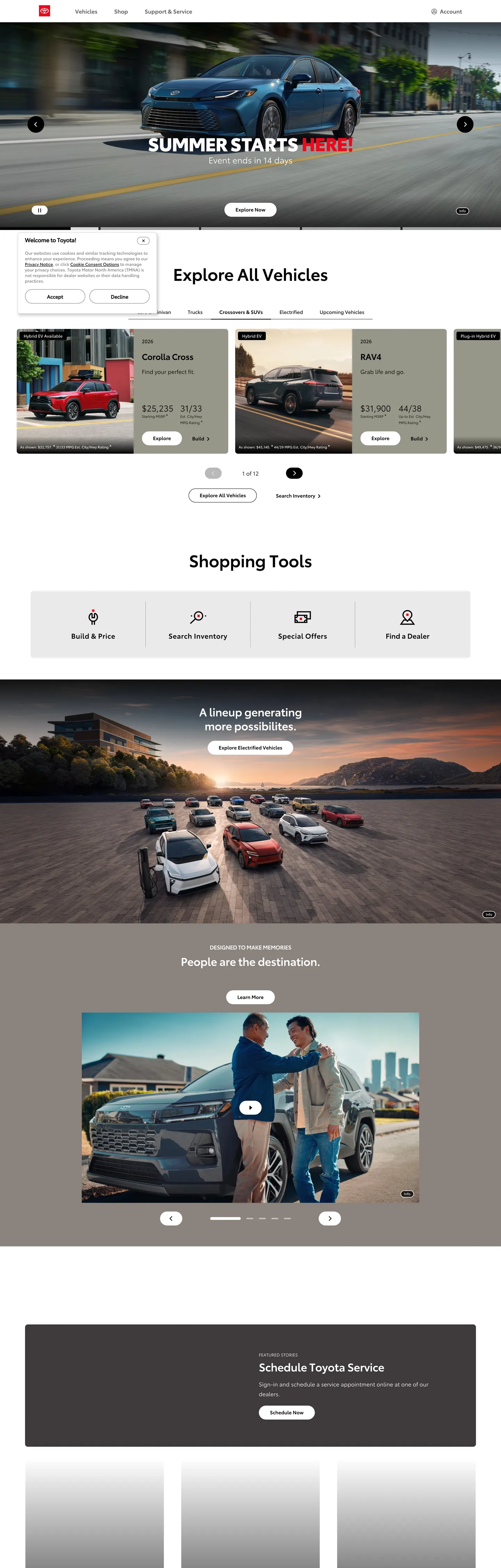
A snapshot of the brand in production. Scroll the frame to see the whole page.
Colors
15 colors
Toyota's system runs on #e10a1d as its primary voltage, used in 2 of 15 components. Type is set in tcomMed across 11 tokens from 10px to 48px, weights 400–400. Shape language is soft — components average 27px corner radius, with no sharp interactive edges.
Brand & Accent
Sparing, CTA-only voltage · 3
Surface
Page and card backgrounds · 1
Text
Headlines, body, captions · 1
Borders & Hairlines
Dividers, outlines, rules · 1
Other
Specialty colors · 9
Typography
11 type tokens
Set in tcomMed across 11 tokens, from 10px to 48px, weights 400–400. Shown in its own stack: where the font isn't installed, the fallback the file names stands in.
- display-xl48px · weight 400 · lh 56px · tracking -0.5pxThe quick brown fox jumps over the lazy dog
- display-md24px · weight 400 · lh 32px · tracking -0.5pxThe quick brown fox jumps over the lazy dog
- heading-md20px · weight 400 · lh 28px · tracking -0.05pxThe quick brown fox jumps over the lazy dog
- body-lg24px · weight 400 · lh 32pxThe quick brown fox jumps over the lazy dog
- body-md16px · weight 400 · lh 28pxThe quick brown fox jumps over the lazy dog
- body-sm14px · weight 400 · lh 22px · tracking -0.1pxThe quick brown fox jumps over the lazy dog
- label-md14px · weight 400 · lh 14pxThe quick brown fox jumps over the lazy dog
- caption10px · weight 400 · lh 18pxThe quick brown fox jumps over the lazy dog
- button-md16px · weight 400 · lh 28pxThe quick brown fox jumps over the lazy dog
- nav-link14px · weight 400 · lh 24px · tracking 1pxThe quick brown fox jumps over the lazy dog
- micro-uppercase14px · weight 400 · lh 24px · tracking 1pxThe quick brown fox jumps over the lazy dog
Layout
Radii and spacing
7 corner radii and 8 spacing values. Shape language: soft.
Radii
- none0px
- sm4px
- md8px
- lg20px
- xl28px
- pill50px
- full9999px
Spacing
- xxs5px
- xs6px
- sm8px
- md10px
- base16px
- lg20px
- xl24px
- 2xl32px
Components
15 components
Each rendered from its tokens (color, type, radius, padding) on Toyota's own canvas.
- Button Primarybutton-primaryButton Primary
- Button Primary Hoverbutton-primary-hoverButton Primary Hover
- Button Secondarybutton-secondaryButton Secondary
- Top Navtop-navTop Nav
- Nav Linknav-linkNav Link
- Brand Markbrand-markBrand Mark
- Hero Headinghero-headingHero Heading
- Section Headingsection-headingSection Heading
- Body Paragraphbody-paragraphBody Paragraph
- Body Paragraph Mutedbody-paragraph-mutedBody Paragraph Muted
- Vehicle Cardvehicle-cardVehicle Card
- Filter Chipfilter-chipFilter Chip
- Active Indicatoractive-indicatorActive Indicator
- Type here…text-inputText Input
- FooterfooterFooter
In use
The system, in use
Toyota's tokens on the kind of product it builds.
Build something people actually use.
A short paragraph of marketing copy that previews how the brand's display tier and body tier read together. Two sentences is usually enough.
FAQ
Toyota design system FAQ
Common questions about Toyota's tokens, components, and how to use this DESIGN.md in your project.
Read next
Related reading
Specs, directories, and component libraries that pair with this design system.
- Browse all design systemsThe full directory of DESIGN.md files on shadcn.io, with live mockups for each.shadcn.io
- Toyota — official siteToyota's public marketing site — the source of truth for the live tokens captured in this file.toyota.com (opens in a new tab)
- The DESIGN.md specificationGoogle Labs' open spec for machine-readable design system files — the format this page is built on.github.com (opens in a new tab)
Use it
Use Toyota in your project
One machine-readable file. Drop it into Claude, Cursor, or any AI tool that reads DESIGN.md.
Download the DESIGN.md
One machine-readable file: every color, type, radius, spacing, and component token of Toyota.
Feed it to your AI tool
Drop it into Claude, Cursor, or GitHub Copilot. The agent writes React components and Tailwind classes that match Toyota's visual language.
Reference the tokens directly
Or paste the values into your Tailwind config, CSS variables, or component library: every color, size and radius is a quoted, ready-to-copy value.
Read the full DESIGN.md: overview, rationale, do’s and don’ts
Overview
Toyota's marketing site inverts the automotive convention. Red as outline, not paint. Where Ferrari fills the page with crimson photography and Porsche reserves Guards Red for a single CTA on a white canvas, Toyota's signature red ({colors.primary} — #e10a1d) appears 662 times on the captured page and never once as a background fill. The breakdown is exact and intentional: 331 occurrences as text, 331 as 1px borders. The Toyota oval in the top-left nav, the underline beneath active section links, the hairline ring around an active filter chip, the heart on the favorites button — every chromatic moment in the system is hairline-thin or text-thin. The chrome itself stays black-on-white.
The system's typographic discipline reinforces the move. Three weights of Helvetica Neue (tcomLight, tcomMed, tcomSans) carry every tier from the 48px hero h2 down to the 10px footer caption, all wired at CSS weight 400 — the visual heft comes from the loaded font file, not from font-weight. There is no 700+ moment anywhere on the page. The hero h2 "2026 Sienna" at 48px / 56px / weight 400 in white over a vehicle photograph is the loudest typographic event in the system, and it still reads quieter than the 56px / 700 hero on a typical SaaS marketing page.
The radius scale is binary: 8px on every card surface (119 occurrences) and 50px on every CTA pill (104 occurrences). 4px appears 82 times but only on micro-chrome like checkbox corners and tabular-cell outlines — it is not a card option. There is no 12px or 16px middle tier. This binary makes the CTA pills read as the warmest, most-tappable elements on the page; introducing a middle radius would soften the contrast between content surfaces and action surfaces. Compared to Honda's softer 4px-everywhere chrome and Ferrari's near-zero-radius luxury treatment, Toyota's split between soft cards and fully-rounded pills is the most-considered radius decision in the mainstream-automotive directory.
Key Characteristics:
- Signature red (
{colors.primary}— #e10a1d) used 662 times but zero times as a background fill — exclusively text and 1px borders. - Three-weight Helvetica Neue stack (tcomLight / tcomMed / tcomSans) at uniform CSS weight 400; visual weight comes from the loaded font file.
- 48px hero h2 (
{typography.display-xl}at weight 400, -0.5px tracking) is the loudest typographic moment — no display-700 anywhere on the page. - Binary radius scale: 8px on every card, 50px pill on every CTA, no middle tier.
- Status palette declared in CSS but absent from the marketing surface —
{colors.pending}(#145fff),{colors.ready}(#009b0d),{colors.gold}(#b6a171) live in--dg_*vars but never render on the homepage. - Black
{colors.ink}(#000000) carries the dominant text load (1372 occurrences), with{colors.gray-dark}(#606060) the only secondary running-text tone. - 9px x 24px button padding and 12px caption type — the chrome reads as a transactional dealership tool, not editorial marketing copy.
- Hairline
{colors.hairline}(#d8d8d8) carries dropdown rules, vehicle-card outlines, and the top-nav bottom border; there is no second border tone.
Colors
Brand
- Toyota Red (
{colors.primary}— #e10a1d): frequency 662. Used as text (331), border (331), background (0). Wired in CSS as--dg_primaryand--dg_primaryLight. The signature voltage — paints the Toyota oval, underlines active CTAs, marks the active filter chip with a 6px dot, tints the heart on the favorites button. The zero background fill count is the system's most-disciplined choice. - Toyota Red Hover (
{colors.primary-hover}— #b00716): declared as--dg_hover. Reserved for the hover state on primary actions; appears in the captured page only on a single CTA-on-hover snapshot. - Toyota Red Active (
{colors.primary-active}— #890713): declared as--dg_active. The press / active state — slightly deeper. Not rendered in the captured marketing surface but available for component-state styling.
Surface
- Canvas (
{colors.canvas}— #ffffff): frequency 427. The page floor. Wired as--dg_white. Every section above the dark footer sits on pure white. - Off White (
{colors.off-white}— #f6f6f6): declared as--dg_offWhite. The single secondary surface tone — used inside disabled-state controls and certain subtle panel fills.
Text
- Ink (
{colors.ink}— #000000): frequency 2731 (1372 as text, 1313 as border). Wired as--dg_black. The dominant text and outline color across the entire page — section headings, body, vehicle-card titles, footer captions. Pure black, not a softened near-black. - Gray Dark (
{colors.gray-dark}— #606060): frequency 40. Wired as--dg_darkGrayand--dg_gray. The single secondary running-text tone — used for sub-labels under vehicle-card prices and inside the shopping-tools strip captions. - Gray (
{colors.gray}— #919191): frequency 26. Used on placeholder text inside dealership-tool search fields and on inactive-tab labels. - Gray Disabled Dark (
{colors.gray-disabled-dark}— #767676): wired as--dg_disabledDarkGray. Disabled-button text state. - Gray Disabled Light (
{colors.gray-disabled-light}— #bababa): wired as--dg_disabledLightGray. Disabled-control border state.
Hairline
- Hairline (
{colors.hairline}— #d8d8d8): frequency 56. Wired as--dg_lightGray. The dominant hairline tone — vehicle-card outlines, dropdown bottom rules, top-nav bottom border, search-field outlines. Lighter than the ink-on-white contrast would suggest, so it reads as a quiet division rather than a hard rule.
Tag
- Tag Background (
{colors.tag-bg}— #eef3ff): frequency 84. Wired as--dg_tagGray. A barely-tinted lilac-white used as the fill on inactive filter chips and category pills — soft enough to read as "off" but distinct from the page canvas.
Status (declared, mostly absent from homepage)
- Pending (
{colors.pending}— #145fff): frequency 42 as text. Wired as--dg_pending. A saturated blue used inside dealership-tools status badges for in-progress lease applications and vehicle-availability flags. - Ready (
{colors.ready}— #009b0d): wired as--dg_ready. The vehicle-available / lease-approved status tone. Declared but not rendered on the captured marketing surface. - Gold (
{colors.gold}— #b6a171): wired as--dg_gold. The certified-pre-owned accent tone. Declared but absent from the homepage.
Typography
Font Family
The system runs three weights of Helvetica Neue wired into Toyota-specific font names: tcomLight (Helvetica Neue Light), tcomMed (Helvetica Neue Medium), and tcomSans (regular Helvetica Neue / Helvetica). All three sit at CSS font-weight: 400 — the visual weight comes from the loaded font file. Fallbacks walk to Arial, sans-serif. There is no proprietary display family and no monospace tier; the page is sans-serif top to bottom.
Hierarchy
| Token | Size | Weight | Line Height | Letter Spacing | Use |
|---|---|---|---|---|---|
{typography.display-xl} | 48px | 400 (tcomMed) | 56px | -0.5px | Hero h2 ("2026 Sienna") |
{typography.display-md} | 24px | 400 (tcomMed) | 32px | -0.5px | Section headings ("Explore All Vehicles", "Shopping Tools") |
{typography.heading-md} | 20px | 400 (tcomMed) | 28px | -0.05px | Vehicle-card titles, sub-section labels |
{typography.body-lg} | 24px | 400 (tcomLight) | 32px | 0 | Generous body paragraphs, marketing-copy leads |
{typography.body-md} | 16px | 400 (tcomSans) | 28px | 0 | Default running text, button labels |
{typography.body-sm} | 14px | 400 (tcomLight) | 22px | -0.1px | Vehicle-card body, link captions |
{typography.label-md} | 14px | 400 (tcomMed) | 14px | 0 | Filter-chip labels, tab labels |
{typography.caption} | 10px | 400 (tcomLight) | 18px | 0 | Legal footer, fine-print disclaimers |
{typography.button-md} | 16px | 400 (tcomSans) | 28px | 0 | CTA pill labels |
{typography.nav-link} | 14px | 400 (tcomSans) | 24px | 1px | Top-nav uppercase link labels |
{typography.micro-uppercase} | 14px | 400 (tcomSans) | 24px | 1px | Eyebrow labels above section headings |
Principles
Every tier sits at CSS weight 400. The visual hierarchy is built entirely from font-size, line-height, and which Helvetica Neue variant the font-family resolves to — tcomLight for the airy body paragraphs, tcomMed for the firmer hero and section heads, tcomSans for utility surfaces like buttons and tabular text. The 48px hero at -0.5px tracking reads as confident-warm rather than aggressive; the same h2 token rendered at weight 700 would tip the brand voice into shouting-fintech territory and undercut the reliability positioning.
The system has no italic, no small-caps, and no monospace. Uppercase labels appear only at 14px / 1px tracking inside the top-nav and as eyebrow rows above section headings — the single typographic flourish in an otherwise austere stack.
Note on Font Substitutes
Toyota's tcomLight / tcomMed / tcomSans are licensed Helvetica Neue cuts. The closest open-source substitute is Inter at weights 300, 500, and 400 respectively — the proportions transfer cleanly at the 14-16px body sizes and Inter's slightly looser counters read close to Helvetica Neue at the 48px hero tier. Helvetica Now ships with the same proportions if licensing budget allows. Avoid Roboto — its taller x-height shifts the line-height math and the body copy reads too dense.
Layout
Spacing System
- Base unit: 8px (with 4px and 6px as the half/quarter steps).
- Tokens:
{spacing.xxs}5px ·{spacing.xs}6px ·{spacing.sm}8px ·{spacing.md}10px ·{spacing.base}16px ·{spacing.lg}20px ·{spacing.xl}24px ·{spacing.2xl}32px. - Button padding:
9px 24pxis the dominant value (98 occurrences) — a noticeably tight vertical for a 16px button label, which keeps the pill height compact at 44px. - Card padding:
{spacing.xl}(24px) on vehicle cards and the shopping-tools strip; the 24px appears 82 times in the captured page. - Top-nav padding:
12px 32px(30 occurrences). The 32px horizontal is the most-generous gap in the system.
Grid & Container
- Max content width: ~1280px on the vehicle grid and the shopping-tools strip; the hero photograph runs full-bleed.
- Hero: edge-to-edge vehicle photograph with the model-name h2 and a single pill CTA overlaid in the lower-left third.
- Vehicle grid: 4-column horizontal-scroll strip on desktop showing model cards (Corolla Hybrid, Ridgeline, Odyssey, Passport, etc. — the captured page renders the Camry / Corolla / RAV4 / Sienna tier).
- Shopping tools strip: 4-column equal grid for "Build & Price / Search Inventory / Special Offers / Find a Dealer."
Rhythm
The page alternates between full-bleed product photography and constrained dealership-tool chrome in a strict ABAB rhythm. The hero is photographic. Section 2 (Explore All Vehicles) is dense card grid. Section 3 (Shopping Tools) is sparse white. Section 4 (lineup photograph) is photographic. Section 5 (People Are The Destination) is photographic. Section 6 (Schedule Toyota Service) is the dark-footer transactional band. The rhythm carries the visitor from aspirational image to transactional action and back, never sitting on either tempo for more than one band.
Elevation
The system has essentially no shadow tier. The captured page has 1 shadow occurrence — a 2px soft drop under the active filter-chip ring. Every other surface depends on hairline {colors.hairline} borders for division and on photograph-vs-white contrast for figure-ground. The dealership-tool chrome below the fold uses zero shadow at all; the dropdown menus rely on a 1px ink-on-white border and a 4px corner radius.
- Flat (no shadow): hero, vehicle cards, shopping-tools strip, footer — 99.9% of surfaces.
- Hairline elevation:
{colors.hairline}(#d8d8d8) carries 51 of the 56 hairline occurrences as border lines on cards, dropdowns, search fields, and the top-nav bottom edge. - Active-state ring: the
{colors.primary}red 1px ring around an active filter chip is the only chromatic outline in the system; it does double duty as elevation and as state indicator.
Shapes
The radius scale is binary: cards round at 8px, CTAs round at 50px, with nothing in between.
{rounded.none}0px — section dividers, the hero photograph edge.{rounded.sm}4px (82 occurrences) — micro-chrome only (checkbox corners, tabular-cell outlines, search-field inner edges). Not used on any content surface.{rounded.md}8px (119 occurrences) — every card. Vehicle tiles, dropdown menus, dealership-tool panels, modal corners.{rounded.lg}20px (7 occurrences) — the slightly-larger model-card promo tiles in the shopping-tools strip.{rounded.xl}28px (12 occurrences) — the search-input pill on the global header.{rounded.pill}50px (104 occurrences) — every CTA. Primary action pills, secondary outline pills, filter chips, the favorites toggle.{rounded.full}9999px (4 occurrences) — the brand-mark hit area and the active-filter dot.
There is no 12px or 16px option. A vehicle card cannot become a slightly-rounded pill; a chip cannot become a slightly-square card. The system enforces the binary by omission — adding a middle radius would weaken the pill-equals-action signal.
Components
button-primary — The signature CTA. Ink {colors.ink} fill, white text, {rounded.pill} 50px radius, 9x24px padding, 44px height. The dominant call-to-action shape across the page ("Shop New Vehicles", "Build & Price", "Schedule Service") sits at this token. No border, no shadow.
button-primary-hover — Background flips to {colors.primary-hover} (#b00716). The brand red appears as a fill only in this single hover-state moment.
button-secondary — White {colors.canvas} fill, ink text, 1px ink border, {rounded.pill} 50px radius. Used for "Learn More" and "View Details" secondary actions on vehicle cards.
top-nav — White {colors.canvas} surface, 60px height, 1px {colors.hairline} bottom border, 12x32px padding. Houses the Toyota oval flush-left ({component.brand-mark}), the section links centered ("Shop", "Owners", "Service", "Build"), and the Sign In / Locate Dealer cluster flush-right.
nav-link — Transparent background, ink text in {typography.nav-link} (14px / weight 400 / 1px tracking, uppercase). 8x12px padding. No hover background.
brand-mark — Toyota oval rendered in {colors.primary} red — the most prominent appearance of the signature voltage on the page. Single occurrence at the top-left, scaled to fit the 60px nav band.
hero-heading — White text on the transparent hero photograph, {typography.display-xl} (48px / weight 400 tcomMed / -0.5px tracking). Sits in the lower-left third of the photograph above the primary CTA pill.
section-heading — Ink text on white, {typography.display-md} (24px / weight 400 tcomMed / -0.5px tracking). Used for "Explore All Vehicles", "Shopping Tools", and the lineup-photograph caption.
body-paragraph — Default ink running-text at {typography.body-md} (16px / tcomSans / 28px line-height).
body-paragraph-muted — {colors.gray-dark} (#606060) variant at {typography.body-sm} for secondary captions under vehicle-card prices and shopping-tools labels.
vehicle-card — White surface, 1px {colors.hairline} border, {rounded.md} 8px radius, 16px internal padding. Holds a vehicle photograph at the top, a {typography.heading-md} model name, a {typography.body-sm} price-from caption, and a secondary CTA pill. No shadow.
filter-chip — Lilac-white {colors.tag-bg} (#eef3ff) fill, ink text, {rounded.pill} 50px radius, 8x14px padding, 32px height. The inactive state. Filter chips read as soft "off" affordances against the white canvas.
active-indicator — Pure red {colors.primary} dot or 1px ring. The single chromatic affordance for "this filter is on" — sits inside or beside the filter-chip text label.
text-input — White surface, ink text, 1px {colors.hairline} border, {rounded.sm} 4px radius, 12x32px padding, 44px height. The dealership-tools search field uses this token; the global header search uses the larger {rounded.xl} 28px pill variant.
footer — Ink {colors.ink} canvas inversion — the only above-fold black surface besides the hero photograph. White text in {typography.caption} (10px), 32x24px padding. Houses the Schedule Service CTA, the legal disclaimers, and the dealer-locator strip.
Do's and Don'ts
Do keep {colors.primary} (#e10a1d) as a text-and-border-only token. The system's most-disciplined choice is that 331 + 331 split between text and border with zero background fills. Filling a card or button with the brand red dilutes the signal — the Toyota oval and the active-filter dot stop reading as Toyota-specific the moment the red becomes ambient.
Do use the binary radius scale exactly as declared. Every content surface gets {rounded.md} 8px; every CTA gets {rounded.pill} 50px. The two values do the entire system's work.
Do sit display headings at weight 400. The visual weight comes from the loaded tcomMed font file, not from font-weight: 700. Bumping to 700 turns the reliability-focused brand voice into a generic SaaS shout and undercuts the trust positioning.
Do render the Toyota oval in {colors.primary} at the top-left. It is the single most-prominent appearance of the brand voltage on the page and the only chromatic brand-mark anchor.
Don't introduce a 12px or 16px middle radius. The system is binary by design — adding a middle tier softens the contrast between content cards ({rounded.md} 8px) and action pills ({rounded.pill} 50px). Honda's softer 4px-everywhere chrome reads less-tappable as a direct result.
Don't use the status colors ({colors.pending} #145fff, {colors.ready} #009b0d, {colors.gold} #b6a171) on the marketing surface. They are dealership-tool state tokens declared in --dg_pending, --dg_ready, --dg_gold for inventory and lease flows; introducing them above the fold makes the marketing chrome read as a fragmented admin panel.
Don't swap the off-white tag fill {colors.tag-bg} (#eef3ff) for pure {colors.canvas} (#ffffff). The barely-tinted lilac is what lets inactive filter chips read as "off" against the white canvas; a pure-white chip disappears into the surface and the active-red dot loses its anchor.
Don't fill the hero with {colors.primary} red. The hero is a vehicle photograph with white display text overlaid — turning the canvas red would make the system look like a Cloudflare-style voltage-as-canvas brand, which it is structurally not.
Known Gaps
- Dark mode: the captured marketing surface is light-only. Dealership-tool surfaces may carry a dark variant but it is not represented here.
- Hover and focus states: documented for
{component.button-primary-hover}only; the full state matrix (focus rings, active press, disabled tints) is partially exposed via{colors.gray-disabled-dark}and{colors.gray-disabled-light}but not rendered on the homepage. - Status palette:
{colors.pending}(#145fff),{colors.ready}(#009b0d),{colors.gold}(#b6a171) and the active/hover red variants are declared in CSS but absent from the captured marketing chrome — they belong to the dealership-tools layer and are not part of the marketing-surface spec. - Motion: the hero vehicle-photograph swap animates between models on a slow cross-fade, but the spec captures end-state values only. Easing curves and crossfade duration live in the live page JavaScript.
- Product surfaces: this DESIGN.md captures toyota.com only. The dealership-tools surfaces (Build & Price configurator, Find a Dealer, Special Offers detail pages, the My Toyota authenticated portal) carry richer component sets — state-laden form controls, multi-step wizard chrome, vehicle-availability grids — that are not represented here.
- Sub-brand chrome: Toyota's Lexus, GR Performance, and Toyota Connected sub-brands sit on separate marketing surfaces with distinct color and typographic systems; only the parent toyota.com chrome is captured here.
Automotive
More systems like this
More DESIGN.md files in Automotive.
Pricing
Build it with Pro
The DESIGN.md files are free. Pro adds 6,000+ blocks, premium templates and the MCP server, so your AI editor builds in your system for you.
4.9/5 out of 5 · 150+ reviewsfrom 150+ founders and developers.
Billing
Billed once a year in USD. Cancel anytime.
- How many people can use the license.
- Client work, SaaS products and anything you charge for.
- Production-ready React sections: hero, pricing, features, dashboards and more.
- Complete multi-page sites you can ship as they are.
- React icons from every major library, installable with one command.
- Presets that restyle every block, in light and dark.
- Lets your AI editor search, preview and install blocks for you.
- Priority requests are answered first.
Individual
For personal projects & open source
$32instead of $49/mo
$389 billed yearly
- Seats: 1 seat
- Commercial use: Personal & open source only
- Pro blocks: 6,000+ blocks
- Templates: All 14 templates
- React icons: 294k+ icons
- Themes: All 59 themes
- MCP server: Basic usage
- Support: Standard
Team
Most popularFor freelancers, agencies & startups
$66instead of $99/mo
$789 billed yearly · ≈ $13/dev/mo
- Seats: Up to 5 seats
- Commercial use: Included
- Pro blocks: 6,000+ blocks
- Templates: All 14 templates
- React icons: 294k+ icons
- Themes: All 59 themes
- MCP server: High usage
- Support: Priority
Organization
For companies with larger teams
$132instead of $199/mo
$1,589 billed yearly
- Seats: Unlimited seats
- Commercial use: Included
- Pro blocks: 6,000+ blocks
- Templates: All 14 templates
- React icons: 294k+ icons
- Themes: All 59 themes
- MCP server: Unlimited usage
- Support: Priority
Billed once a year in USD. Cancel anytime.
Individual
For personal projects & open source
$32instead of $49/mo
$389 billed yearly
- How many people can use the license.Seats: 1 seat
- Client work, SaaS products and anything you charge for.Commercial use: Personal & open source only
- Production-ready React sections: hero, pricing, features, dashboards and more.Pro blocks: 6,000+ blocks
- Complete multi-page sites you can ship as they are.Templates: All 14 templates
- React icons from every major library, installable with one command.React icons: 294k+ icons
- Presets that restyle every block, in light and dark.Themes: All 59 themes
- Lets your AI editor search, preview and install blocks for you.MCP server: Basic usage
- Priority requests are answered first.Support: Standard
Team
Most popularFor freelancers, agencies & startups
$66instead of $99/mo
$789 billed yearly · ≈ $13/dev/mo
Everything in Individual, plus
- How many people can use the license.Seats: Up to 5 seats
- Client work, SaaS products and anything you charge for.Commercial use: Included
- Lets your AI editor search, preview and install blocks for you.MCP server: High usage
- Priority requests are answered first.Support: Priority
Organization
For companies with larger teams
$132instead of $199/mo
$1,589 billed yearly
Everything in Team, plus
- How many people can use the license.Seats: Unlimited seats
- Lets your AI editor search, preview and install blocks for you.MCP server: Unlimited usage
- Secure checkout via Stripe
- Code lives in your repo
- Keep what you've shipped if you cancel
- License terms
Your system, built for you
Every block, template and icon, installed by your AI agent in your design system. The DESIGN.md files stay free.