Subaru Design System
Subaru's marketing-site design system as a DESIGN.md file. Pleiades blue #1971d4 single voltage, Helvetica Neue three-weight family, dark-navy hero band over Crosstrek photography. For React, Next.js, and AI tools.
Add shadcn.io to your AI agent. · Pro It installs blocks, icons and templates in your design system from a prompt, with Pro.
Set up MCP- Primary
- #1971d4
- Typeface
- HelveticaNeueLTW05-75Bold
- Shape
- Sharp
- Base radius
- 5px
- Colors
- 11
- Type tokens
- 12
- Components
- 17
- Spacing values
- 8
About
About Subaru DESIGN.md
Curated by Dov Azencot · Updated May 19, 2026 · Source subaru.com (opens in a new tab)
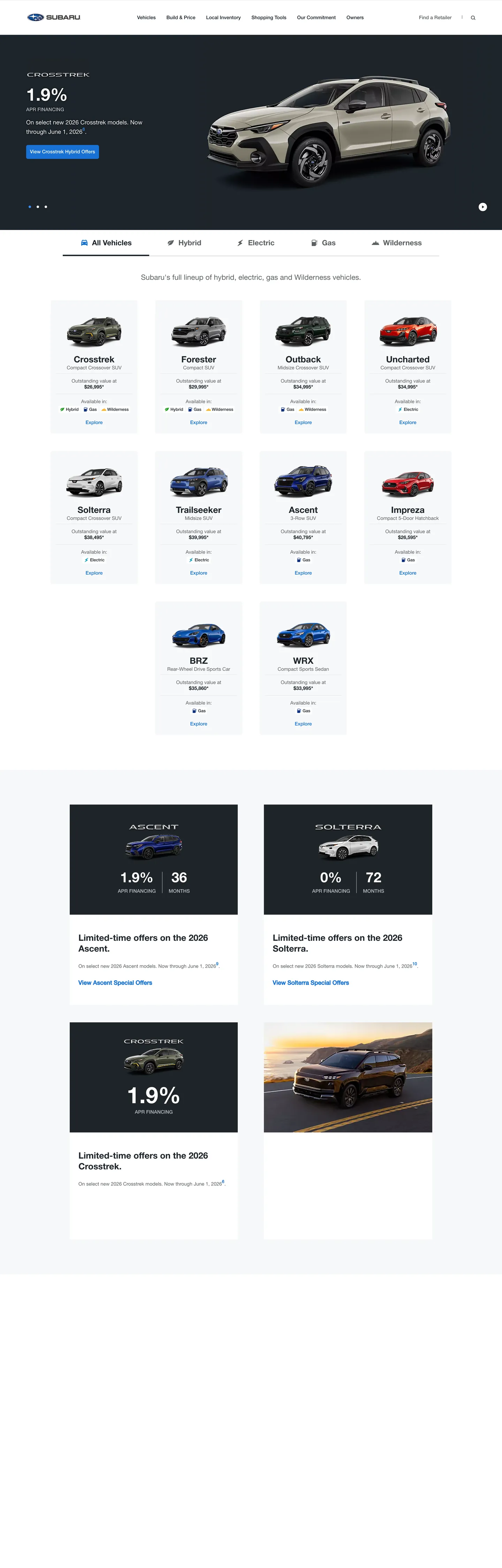
Subaru's marketing site does something almost no other dealer-funnel automotive brand attempts. The hero is a wide dark-navy band — captured ink at graphite-charcoal — carrying a 65px Helvetica Neue Bold display ("Built to Last" is the canonical instance, "1.9% APR Financing" on the Crosstrek capture) with the model photography rendered to the right and a single Pleiades-blue pill CTA beneath. The blue is the brand's signature voltage, drawn from the Pleiades star cluster the Subaru logo represents; it appears 508 times in the captured page as the single chromatic moment across CTAs, hyperlinks, active-tab indicators, and the model-grid Explore links. Where Toyota's marketing surface paints chromatic category chips and Honda runs a saturated red voltage at every CTA, Subaru holds a single Pleiades blue in reserve and lets the model photography do every other chromatic job.
The DESIGN.md file packages the system into a machine-readable spec for React tooling. Inside: 11 colors tokens drawn from a dark-navy hero band, the Pleiades blue voltage, a graphite-charcoal ink, and a B7BCC2 hairline neutral; 12 typography tokens running HelveticaNeueLTW05 across three weighted cuts — 55Roman for body, 65Medium for nav and metadata, 75Bold for hero display and model names; 6 radius tokens centered on 3-5px small-step rounding (no soft middle radius); 8 spacing values on a 4px base with a 50px section-padding rhythm; and 17 components definitions covering the Pleiades-blue primary button, the dark-navy hero band, the white model-card grid, the vehicle-class tab strip, and the offer-tile dark surface used for "1.9% APR" promotional cards.
Feed this file to Claude or Cursor and it will reproduce Subaru's specific moves: dark-navy above-fold band, single Pleiades-blue voltage, three-weight Helvetica Neue typography, 3-5px small-step rounding, and a model-card grid as the primary information surface. The token references resolve cleanly without invention. The one move worth borrowing only if your category needs a model-portrait grid is the trust in vehicle photography to carry chromatic interest — the chrome itself ships exactly one accent color, and any second voltage would dilute the Pleiades discipline.
What makes it distinct
5
- Single Pleiades-blue voltage#1971d4 carries every primary CTA, every link, every active-tab fill (508 occurrences); no second accent in the system
- Three-weight Helvetica Neue55Roman for body, 65Medium for nav and link text, 75Bold for display; one family does every typographic job
- Dark-navy hero band#1d252c carries the above-fold model-photography band; below the fold the system inverts to pure white with hairline B7BCC2 dividers
- Model-card grid as primary surface10 vehicle tiles in a 4-column grid, each carrying model name in Bold 25px and a single Pleiades-blue Explore link
- 3-5px small-step roundingevery card sits at 3px, every button at 5px, the model-photography hero is at 50% on the slider dots; no soft middle radius
subaru.com
Live at subaru.com
A snapshot of the brand in production. Scroll the frame to see the whole page.
Colors
11 colors
Subaru's system runs on #1971d4 as its primary voltage, used in 4 of 17 components. Type is set in HelveticaNeueLTW05-75Bold across 12 tokens from 12px to 65px, weights 400–400. Shape language is sharp — components average 2px corner radius, favoring crisp rectangles.
Brand & Accent
Sparing, CTA-only voltage · 3
Surface
Page and card backgrounds · 2
Text
Headlines, body, captions · 3
Borders & Hairlines
Dividers, outlines, rules · 3
Typography
12 type tokens
Set in HelveticaNeueLTW05-75Bold across 12 tokens, from 12px to 65px, weights 400–400. Shown in its own stack: where the font isn't installed, the fallback the file names stands in.
- display-xl65px · weight 400 · lh 70px · tracking -0.5pxThe quick brown fox jumps over the lazy dog
- display-lg50px · weight 400 · lh 37.5pxThe quick brown fox jumps over the lazy dog
- display-md40px · weight 400 · lh 46pxThe quick brown fox jumps over the lazy dog
- display-sm32px · weight 400 · lh 38px · tracking -0.5pxThe quick brown fox jumps over the lazy dog
- heading-lg25px · weight 400 · lh 31pxThe quick brown fox jumps over the lazy dog
- heading-md21px · weight 400 · lh 17pxThe quick brown fox jumps over the lazy dog
- body-lg17px · weight 400 · lh 27pxThe quick brown fox jumps over the lazy dog
- body-md14px · weight 400 · lh 24pxThe quick brown fox jumps over the lazy dog
- body-sm12px · weight 400 · lh 17pxThe quick brown fox jumps over the lazy dog
- button-md14px · weight 400 · lh 17pxThe quick brown fox jumps over the lazy dog
- nav-link14px · weight 400 · lh 27pxThe quick brown fox jumps over the lazy dog
- label-emphasis14px · weight 400 · lh 21pxThe quick brown fox jumps over the lazy dog
Layout
Radii and spacing
4 corner radii and 8 spacing values. Shape language: sharp.
Radii
- none0px
- xs3px
- sm5px
- full9999px
Spacing
- xs2px
- sm4px
- md12px
- base15px
- lg16px
- xl25px
- 2xl50px
- 3xl100px
Components
17 components
Each rendered from its tokens (color, type, radius, padding) on Subaru's own canvas.
- Button Primarybutton-primaryButton Primary
- Button Secondarybutton-secondaryButton Secondary
- Top Navtop-navTop Nav
- Nav Linknav-linkNav Link
- Hero Bandhero-bandHero Band
- Hero Headinghero-headingHero Heading
- Hero Eyebrowhero-eyebrowHero Eyebrow
- Section Headingsection-headingSection Heading
- Body Paragraphbody-paragraphBody Paragraph
- Link Bluelink-blueLink Blue
- Vehicle Class Tabvehicle-class-tabVehicle Class Tab
- Vehicle Class Tab Activevehicle-class-tab-activeVehicle Class Tab Active
- Model Cardmodel-cardModel Card
- Model Card Metamodel-card-metaModel Card Meta
- Offer Tile Darkoffer-tile-darkOffer Tile Dark
- Slider Dotslider-dotSlider Dot
- FooterfooterFooter
In use
The system, in use
Subaru's tokens on the kind of product it builds.
Build something people actually use.
A short paragraph of marketing copy that previews how the brand's display tier and body tier read together. Two sentences is usually enough.
FAQ
Subaru design system FAQ
Common questions about Subaru's tokens, components, and how to use this DESIGN.md in your project.
Read next
Related reading
Specs, directories, and component libraries that pair with this design system.
- Browse all design systemsThe full directory of DESIGN.md files on shadcn.io, with live mockups for each.shadcn.io
- Subaru — official siteSubaru's public marketing site — the source of truth for the live tokens captured in this file.subaru.com (opens in a new tab)
- The DESIGN.md specificationGoogle Labs' open spec for machine-readable design system files — the format this page is built on.github.com (opens in a new tab)
Use it
Use Subaru in your project
One machine-readable file. Drop it into Claude, Cursor, or any AI tool that reads DESIGN.md.
Download the DESIGN.md
One machine-readable file: every color, type, radius, spacing, and component token of Subaru.
Feed it to your AI tool
Drop it into Claude, Cursor, or GitHub Copilot. The agent writes React components and Tailwind classes that match Subaru's visual language.
Reference the tokens directly
Or paste the values into your Tailwind config, CSS variables, or component library: every color, size and radius is a quoted, ready-to-copy value.
Read the full DESIGN.md: overview, rationale, do’s and don’ts
Overview
Subaru's marketing site stages a different opener than its peers. Pleiades scarcity. Where Toyota lines its landing page with chromatic category chips and Honda runs a saturated red voltage on every CTA, Subaru holds a single Pleiades blue ({colors.primary} — #1971d4) in reserve and lets the model photography do every other chromatic job. The blue is named after the Pleiades star cluster the Subaru logo represents; in the captured page it appears 508 times — every hyperlink, every Explore link under a model tile, every active-tab underline, the primary CTA pill, and the focus rings on form fields. There is no second accent. The chrome ships exactly one chromatic moment.
The above-fold band inverts the page's lightness baseline. Dark hero, white grid. The top 600px renders on a graphite-charcoal canvas ({colors.ink} — #1d252c, captured 558 times) carrying the model-photography frame and the promotional offer ("1.9% APR Financing" on the Crosstrek capture, "Built to Last" on others). Below the fold the system inverts to pure white ({colors.canvas} — #ffffff) with hairline {colors.hairline} (#b7bcc2) dividers, the model-card grid renders as 10 tiles in a 4-column layout, and the Pleiades-blue voltage shifts from CTA fill to Explore-link tint. The dark-to-light transition is the page's primary structural device — it tells the visitor that the model showroom has begun.
Helvetica Neue runs three weighted cuts. One family, three voices. HelveticaNeueLTW05-55Roman handles body and footnote copy at 14-17px; 65Medium handles nav, metadata, and button labels at 12-14px; 75Bold handles hero display (65px on the hero h1, 50px on the secondary tile, 25px on the model-card name). The 75Bold cut is the loudest typographic moment in the system — confidence by industrial grotesk weight, not by tracking. Display tracking sits at -0.5px on the hero (tight), 0 everywhere else (neutral). The three-weight discipline is the brand's typographic signature: one industrial family doing every typographic job.
Key Characteristics:
- Single Pleiades-blue voltage (
{colors.primary}— #1971d4, frequency 508) reserved for primary CTAs, all hyperlinks, active-tab underlines, and the Explore link under every model tile. - Dark-navy hero band (
{colors.ink}— #1d252c, frequency 558) carries the above-fold model-photography frame and the promotional offer; the page inverts to pure{colors.canvas}(#ffffff) below the fold. - HelveticaNeueLTW05 in three weighted cuts — 55Roman, 65Medium, 75Bold. No additional weights, no alternate families.
- Hero display sits at 65px / 75Bold with -0.5px tracking — the industrial-grotesk treatment.
- Model-card grid is the page's primary content surface: 10 vehicle tiles in a 4-column layout, each carrying photo + Bold 25px model name + Medium 14px price meta + Pleiades-blue Explore link.
- Vehicle-class tab strip (All Vehicles / Hybrid / Electric / Gas / Wilderness) uses a Pleiades-blue underline to mark active; inactive tabs sit in graphite ink without any background fill.
- Small-step rounding: 3px on cards, 5px on buttons, 50% on slider dots. No soft middle radius between 5 and 50%.
- Offer-tile dark surfaces (
{component.offer-tile-dark}) below the model grid use the same graphite-charcoal as the hero band, creating visual rhyme between the promotional bands and the hero.
Colors
Brand
- Pleiades Blue (
{colors.primary}— #1971d4): frequency 508. Used as text (265), background (4), border (238), gradient (1). The single brand voltage — every hyperlink, every Explore link under model tiles, every active-tab underline, the primary CTA pill, the focus ring on form fields. Held strictly in reserve for actions and links; never appears as a body-text tint or a section-background fill. - Pleiades Light (
{colors.primary-light}— #3a8eee): frequency 10. Used as text (5), border (5). The hover variant — slightly lighter and brighter blue used on link-hover and active-tab-hover states. Reserved for interactive feedback only.
Ink
- Graphite Ink (
{colors.ink}— #1d252c): frequency 558. Used as text (271), background (14), border (273). The dark canvas of the hero band and the dark-surface offer tiles; also the primary text color on the white below-fold surface. The same token serves both the dark-canvas-background role and the dark-text-on-white role — a deliberate convergence that keeps the palette compact. - Ink Muted (
{colors.ink-muted}— #5c6163): frequency 1021. Used as text (513), border (508). The dominant text token across the captured page — body paragraphs, model-card price meta, footer category labels, footnote disclaimers. The 0.49 oklch lightness sits halfway between black and the canvas, giving the body copy a quiet grey rather than a hard ink. - Ink Deep (
{colors.ink-deep}— #000000): frequency 2. Pure black is essentially absent — only two captured occurrences in incidental UI fragments.
Surface
- Canvas (
{colors.canvas}— #ffffff): frequency 536. Used as text (220), background (94), border (218), gradient (4). The page floor below the hero, the model-card fill, the modal surface. Pure white reading the inversion against the dark hero band. - Surface-1 (
{colors.surface-1}— #f7f8f9, clustered with #ffffff): the off-white promotional-section background — slightly cooler than canvas, used as the "Special Offers" band fill that sits between the model grid and the footer.
Hairline
- Hairline (
{colors.hairline}— #b7bcc2): frequency 204. Used as text (102), border (102). The default neutral divider between model-card sections and inside the vehicle-class tab strip. A quiet warm-gray that reads softly against both the white canvas and the dark hero. - Hairline Soft (
{colors.hairline-soft}— #e7e7e8): frequency 2. The lightest neutral, used inside subtle dividers below the top-nav band and between footer category rails. - Hairline Dim (
{colors.hairline-dim}— #dbdbdb): frequency 1. A single border occurrence inside the form-field rest state.
Accent (incidental)
- Accent Purple (
{colors.accent-purple}— #483d8b): frequency 1, background only. Layer classified asbrandby the extractor but appears just once as an accidental background fragment — not a deliberate brand voltage. Don't treat as a token to deploy.
Typography
Font Family
The system runs HelveticaNeueLTW05 in three weighted cuts as the sole brand family. Fallbacks walk "Helvetica Neue", -apple-system, "Open Sans", Arial, sans-serif. There is no separate display serif, no monospace, no second sans. The three cuts are:
- 55Roman — body and footnote copy at 14-17px.
- 65Medium — navigation, metadata, button labels, and small caps at 12-14px.
- 75Bold — hero display, section h2, and model-card names at 14-65px.
Subaru's commitment to one industrial-grotesk family across every tier — without a second voice for display or annotation — is the system's typographic signature. Where Mazda introduces an uppercase-tracked treatment and Toyota carries multiple weight steps, Subaru holds the line at three cuts and lets size and weight do every hierarchical job.
Hierarchy
| Token | Size | Weight | Line Height | Letter Spacing | Use |
|---|---|---|---|---|---|
{typography.display-xl} | 65px | 75Bold | 70px | -0.5px | Hero h1 ("Built to Last", "Crosstrek") |
{typography.display-lg} | 50px | 75Bold | 37.5px | 0 | Promotional display ("1.9%" APR figure on Crosstrek hero) |
{typography.display-md} | 40px | 75Bold | 46px | 0 | Offer-tile dark surface display ("36 MONTHS", "72 MONTHS") |
{typography.display-sm} | 32px | 75Bold | 38px | -0.5px | Section h2 below the fold |
{typography.heading-lg} | 25px | 75Bold | 31px | 0 | Model-card name ("Crosstrek", "Forester", "Outback") |
{typography.heading-md} | 21px | 75Bold | 17px | 0 | Sub-section emphasis title |
{typography.body-lg} | 17px | 55Roman | 27px | 0 | Lead paragraph, hero sub-copy |
{typography.body-md} | 14px | 55Roman | 24px | 0 | Default running text, footnote disclaimers |
{typography.body-sm} | 12px | 65Medium | 17px | 0 | Metadata, footer labels, hero eyebrow ("APR FINANCING") |
{typography.button-md} | 14px | 65Medium | 17px | 0 | Primary CTA label ("View Crosstrek Hybrid Offers") |
{typography.nav-link} | 14px | 65Medium | 27px | 0 | Top-nav category links ("Vehicles", "Build & Price") |
{typography.label-emphasis} | 14px | 75Bold | 21px | 0 | Active vehicle-class tab ("All Vehicles" in active state) |
Principles
Display weight sits at 75Bold across every tier from 25px to 65px. There is no weight ladder — the system uses only three cuts (Roman, Medium, Bold), with Bold doing every display job and the lighter cuts handling body and navigation. Letter-spacing stays at 0 across almost every tier; the only departures are the hero (-0.5px tight) and the 32px section h2 (-0.5px tight). The result is a typographic system that reads as industrial-utility — confidence by weight and structure, not by tracking or family variation.
The display sizes follow a 5px ladder: 65 / 50 / 40 / 32 / 25 / 21. The 65px hero is unusually large for an automotive marketing site — larger than Toyota (typically 48-52px) and BMW (typically 56px). The choice signals dealer-funnel confidence: the hero copy is meant to read as an offer announcement, not a brand-name plate.
Note on Font Substitutes
HelveticaNeueLTW05 is the licensed Linotype Helvetica Neue. The fallback stack already walks to the system Helvetica Neue, so the page degrades gracefully on macOS / iOS. For full open-source substitution use Inter at weights 400, 500, and 700 — the proportions transfer cleanly and Inter's cap height reads close to Helvetica Neue at the 25-65px display sizes.
Layout
Spacing System
- Base unit: 4px (with 12px and 15px as the dominant modules).
- Tokens:
{spacing.xs}2px ·{spacing.sm}4px ·{spacing.md}12px ·{spacing.base}15px ·{spacing.lg}16px ·{spacing.xl}25px ·{spacing.2xl}50px ·{spacing.3xl}100px. - Section padding (vertical): ~50px on the hero band, ~50px on the offer-tile band; the model grid runs tighter at 25-32px between rows.
- Card internal padding:
{spacing.base}(15px) on{component.model-card}with a 20px bottom step for the Explore link;{spacing.xl}(25px) on{component.offer-tile-dark}. - Top-nav padding:
{spacing.md}(12px) vertical,{spacing.xl}(25px) horizontal.
Grid & Container
- Max content width: ~1290px on the model grid and the offer-tile band; the hero band extends to the viewport edge.
- Hero band: full-bleed graphite-charcoal canvas with model photography rendered to the right and offer copy (display + CTA) to the left.
- Model-card grid: 4-column desktop grid containing 10 tiles (Crosstrek, Forester, Outback, Uncharted / Solterra, Trailseeker, Ascent, Impreza / BRZ, WRX in the lower row). Each tile is roughly 280-300px wide.
- Vehicle-class tab strip: horizontal rail above the grid carrying All Vehicles / Hybrid / Electric / Gas / Wilderness tabs separated by 25-32px gaps.
- Offer-tile band: 2-column grid pairing dark
{component.offer-tile-dark}surfaces with a light promotional photograph tile to the right.
Rhythm
The page alternates between dark editorial and white grid. The hero band is dark, the model grid is white, the offer-tile band is dark again, the footer is the off-white {colors.surface-1}. The dark-to-light-to-dark rhythm is the page's primary structural device — every band-change is a content-context shift, not a visual flourish. There is no atmospheric gradient between bands.
Elevation
The system has essentially no shadow tier. The captured page records zero shadow occurrences. Depth comes from:
- Surface-color inversion: the graphite-charcoal hero band against the white model grid creates the primary depth illusion. The 0.74 oklch lightness gap reads as a strong figure-ground separation without any shadow being drawn.
- Hairline borders:
{colors.hairline}(#b7bcc2) on model-card outlines and tab-strip dividers;{colors.hairline-soft}(#e7e7e8) on subtle nav-band rules. - Photography depth: the model photographs themselves carry real-world depth — angled three-quarter views with ground reflections, soft natural lighting, foreshortened wheels.
No drop-shadow is rendered anywhere on the captured page, including under modals and the dropdown menus.
Shapes
The radius scale is small-step plus circle, with nothing in between.
{rounded.none}0px — the hero band, the offer-tile dark surfaces edge to edge, the vehicle-class tab strip dividers, every photograph edge.{rounded.xs}3px — frequency 45 + 1 occurrences. The model-card edges, the offer-tile-dark fills, and the vehicle-class tab background hover state. The default rounding tier.{rounded.sm}5px — frequency 27 + 4 occurrences. The primary CTA pill, secondary buttons, form fields.{rounded.full}9999px — frequency 13 + 8 occurrences. Slider-dot indicators below the hero band (50% on 8px square base), the favorite-heart icon button, the search-magnifier circle.
There is no 8 / 12 / 16px middle tier. Either a card uses 3-5px small-step rounding or it goes to a full circle on an icon-button. The discipline keeps the layout reading as engineering-precise rather than friendly-soft.
Components
button-primary — The signature CTA. Pleiades-blue {colors.primary} fill, white text, {rounded.sm} 5px radius, 10px padding, 40px height, {typography.button-md} (HelveticaNeueLTW05-65Medium / 14px). "View Crosstrek Hybrid Offers" is the canonical instance, sitting beneath the offer copy in the hero band.
button-secondary — White {colors.canvas} fill, Pleiades-blue text, 1px {colors.primary} border, otherwise identical. Used for tertiary actions ("Find a Retailer", "Compare Models").
top-nav — White surface, graphite-ink links, 64px height, 1px {colors.hairline-soft} bottom rule. Subaru wordmark + logo flush left, primary category links center (Vehicles / Build & Price / Local Inventory / Shopping Tools / Our Commitment / Owners), search and locator flush right.
nav-link — Graphite-ink text in {typography.nav-link} (HelveticaNeueLTW05-65Medium / 14px / 27px line-height). The 14px label with 27px line-height creates the wide click-target band typical of automotive nav rails.
hero-band — Graphite-charcoal {colors.ink} (#1d252c) canvas, full-bleed, 50px vertical padding. Holds the offer eyebrow ("APR FINANCING"), the offer display (65px), the sub-copy line, the primary CTA, and the model photograph rendered to the right.
hero-heading — White text on the dark canvas, HelveticaNeueLTW05-75Bold 65px / -0.5px tracking. "Built to Last" / "1.9%" sits as the loudest typographic moment in the system.
hero-eyebrow — White text at {typography.body-sm} (12px / 65Medium). The small label above the hero display ("APR FINANCING").
section-heading — Graphite ink, HelveticaNeueLTW05-75Bold 32px. Used for white-canvas section h2s ("Subaru's full lineup of hybrid, gas and Wilderness vehicles").
body-paragraph — {colors.ink-muted} (#5c6163) text at {typography.body-md} — the workhorse paragraph color.
link-blue — Pleiades-blue text at {typography.button-md}. The Explore link under every model tile, the Special Offers link below each offer-tile, every inline hyperlink on the page.
vehicle-class-tab — Transparent fill, graphite ink, no border. Inactive state of the tab strip.
vehicle-class-tab-active — Same fill, {typography.label-emphasis} (Bold 14px), with a 2px Pleiades-blue bottom border indicating active. The single chromatic tab-marker in the system.
model-card — White surface, 3px {rounded.xs} radius, 15x15x20 padding, 1px {colors.hairline-soft} border. Holds the vehicle photograph at 16:9, the model name in {typography.heading-lg} (Bold 25px), a price-meta sub-line, and a Pleiades-blue Explore link beneath. The primary information surface on the page.
model-card-meta — {colors.ink-muted} text at {typography.body-md} ("Starting value at $25,000"). Sits between the model name and the Explore link.
offer-tile-dark — Graphite-charcoal fill (same as the hero band), white text, 3px {rounded.xs} radius, 25px padding. Holds the model name in small-caps, a giant APR figure ("1.9%" / "0%"), a months indicator ("36 MONTHS" / "72 MONTHS"), and an inline link to the offer detail. Creates visual rhyme with the hero band.
slider-dot — Ink-muted fill on 8px square base, {rounded.full} 50% radius. The hero carousel pagination uses a row of these dots; active dot is Pleiades blue.
footer — Off-white {colors.surface-1} (#f7f8f9) surface, 50x25 padding. Category-rail labels in {typography.body-md} (HelveticaNeueLTW05-55Roman / 14px) with {colors.ink-muted} text.
Do's and Don'ts
Do hold the Pleiades-blue voltage in strict reserve for actions and links. The single chromatic moment in the system is Pleiades blue {colors.primary} (#1971d4); multiplying it into section backgrounds, photographic accents, or body-text emphasis dilutes the only chromatic brand signal on the page.
Do use the same {colors.ink} (#1d252c) for both the hero canvas and the offer-tile dark surfaces below the model grid. The visual rhyme between the hero band and the offer tiles is the system's primary structural device — using a different dark for offer tiles breaks the band rhythm.
Do keep display headlines at 75Bold with neutral or slightly-tight tracking. The hero at 65px / -0.5px tracking is the system's confidence signal; slipping to 65Medium reads as a sub-display and the offer copy loses its weight.
Do carry every link in Pleiades blue at {typography.button-md}. The Explore link under each model tile is the page's primary navigation device — making the link an underline-only treatment or a black text-link would lose the chromatic affordance.
Don't introduce a second accent color beside the Pleiades blue. The system has exactly one chromatic voltage; adding a green or orange for category-classes would create competing chromatic voices and weaken the single-voltage discipline. The vehicle-class tab strip uses the same Pleiades blue underline for active state — not a category-colored bar.
Don't use {colors.ink-muted} (#5c6163) for primary text or headlines — it is a body-and-disclaimer-only token (frequency 1021, all as text or border). For primary text on white, use {colors.ink} (#1d252c).
Don't introduce an 8 / 12 / 16px middle radius tier. The system runs binary small-step (3-5px) or full circle. Adding a soft middle radius reads as borrowed from a consumer-SaaS system and breaks the engineering-precise shape language.
Don't add tinted shadows under model cards or offer tiles. The captured page renders zero shadows; depth comes entirely from surface-color inversion (dark hero / white grid) and hairline borders. Adding a soft 0.04-alpha shadow under the model cards immediately reads as a different brand.
Known Gaps
- Hover and focus states: the captured page exposes
{colors.primary-light}(#3a8eee) but no hovered button, link-hover, or focused-input state was visible in the marketing surface. The full state matrix lives inside the configurator and dealer-locator product flows. - Form input states: no rendered text input was captured at the landing-page chrome layer; the input styling lives inside the configurator, the Find a Retailer modal, and the financing-calculator flow.
- Sub-brand surfaces: Wilderness, STI Performance, and Solterra EV each carry their own sub-brand typographic and chromatic accents inside the model-detail templates — not represented at the landing-page level.
- Motion: the hero carousel auto-rotates and the offer-tile band cross-fades on scroll-into-view; the spec captures end-state values only.
- Configurator and Build & Price surfaces: the model-build pipeline carries a much richer component set (color swatches, package toggles, trim chips) not exposed at the marketing chrome layer.
- Mobile breakpoints: the spec captures the 1440-viewport rendering. The 4-column model grid collapses to 2-column on tablet and single-column on mobile; the hero band stacks the photograph above the offer copy at narrower widths.
Automotive
More systems like this
More DESIGN.md files in Automotive.
Pricing
Build it with Pro
The DESIGN.md files are free. Pro adds 6,000+ blocks, premium templates and the MCP server, so your AI editor builds in your system for you.
4.9/5 out of 5 · 150+ reviewsfrom 150+ founders and developers.
Billing
Billed once a year in USD. Cancel anytime.
- How many people can use the license.
- Client work, SaaS products and anything you charge for.
- Production-ready React sections: hero, pricing, features, dashboards and more.
- Complete multi-page sites you can ship as they are.
- React icons from every major library, installable with one command.
- Presets that restyle every block, in light and dark.
- Lets your AI editor search, preview and install blocks for you.
- Priority requests are answered first.
Individual
For personal projects & open source
$32instead of $49/mo
$389 billed yearly
- Seats: 1 seat
- Commercial use: Personal & open source only
- Pro blocks: 6,000+ blocks
- Templates: All 14 templates
- React icons: 294k+ icons
- Themes: All 59 themes
- MCP server: Basic usage
- Support: Standard
Team
Most popularFor freelancers, agencies & startups
$66instead of $99/mo
$789 billed yearly · ≈ $13/dev/mo
- Seats: Up to 5 seats
- Commercial use: Included
- Pro blocks: 6,000+ blocks
- Templates: All 14 templates
- React icons: 294k+ icons
- Themes: All 59 themes
- MCP server: High usage
- Support: Priority
Organization
For companies with larger teams
$132instead of $199/mo
$1,589 billed yearly
- Seats: Unlimited seats
- Commercial use: Included
- Pro blocks: 6,000+ blocks
- Templates: All 14 templates
- React icons: 294k+ icons
- Themes: All 59 themes
- MCP server: Unlimited usage
- Support: Priority
Billed once a year in USD. Cancel anytime.
Individual
For personal projects & open source
$32instead of $49/mo
$389 billed yearly
- How many people can use the license.Seats: 1 seat
- Client work, SaaS products and anything you charge for.Commercial use: Personal & open source only
- Production-ready React sections: hero, pricing, features, dashboards and more.Pro blocks: 6,000+ blocks
- Complete multi-page sites you can ship as they are.Templates: All 14 templates
- React icons from every major library, installable with one command.React icons: 294k+ icons
- Presets that restyle every block, in light and dark.Themes: All 59 themes
- Lets your AI editor search, preview and install blocks for you.MCP server: Basic usage
- Priority requests are answered first.Support: Standard
Team
Most popularFor freelancers, agencies & startups
$66instead of $99/mo
$789 billed yearly · ≈ $13/dev/mo
Everything in Individual, plus
- How many people can use the license.Seats: Up to 5 seats
- Client work, SaaS products and anything you charge for.Commercial use: Included
- Lets your AI editor search, preview and install blocks for you.MCP server: High usage
- Priority requests are answered first.Support: Priority
Organization
For companies with larger teams
$132instead of $199/mo
$1,589 billed yearly
Everything in Team, plus
- How many people can use the license.Seats: Unlimited seats
- Lets your AI editor search, preview and install blocks for you.MCP server: Unlimited usage
- Secure checkout via Stripe
- Code lives in your repo
- Keep what you've shipped if you cancel
- License terms
Your system, built for you
Every block, template and icon, installed by your AI agent in your design system. The DESIGN.md files stay free.