Southwest Airlines Design System
Southwest Airlines marketing system as a DESIGN.md file — honey-yellow #ffbf27 Search button on navy chrome, Southwest Sans, 2px radius across every surface. Tokens for React and AI tools.
Add shadcn.io to your AI agent. · Pro It installs blocks, icons and templates in your design system from a prompt, with Pro.
Set up MCP- Primary
- #ffbf27
- Typeface
- Southwest Sans
- Shape
- Sharp
- Base radius
- 10px
- Colors
- 16
- Type tokens
- 11
- Components
- 18
- Spacing values
- 9
About
About Southwest Airlines DESIGN.md
Curated by Dov Azencot · Updated May 19, 2026 · Source southwest.com (opens in a new tab)
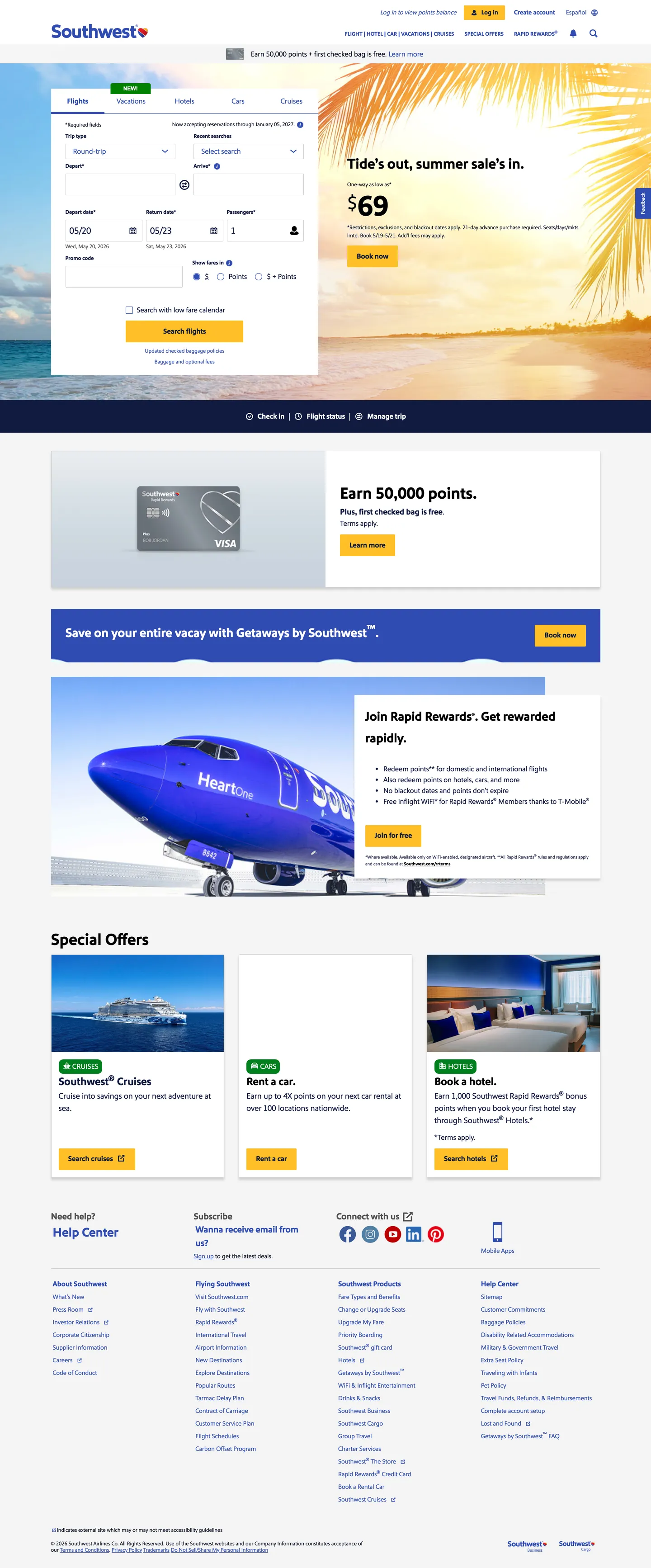
Southwest's marketing site does something almost no major US airline attempts: it puts a saturated honey-yellow button at the exact center of the booking widget and trusts it to do all the load-bearing CTA work. Above the fold, a navy-and-white booking lozenge floats over a beach-sunset photograph; the date pickers, passenger selector, and routing fields are framed in tight 2px-radius input boxes with hairline borders, and the Search button at the bottom of the lozenge sits in honey-yellow with deep navy text. Where Delta runs a near-black hero with a single thin red voltage and United stays on editorial blue across the chrome, Southwest holds the friendly-airline position by keeping its primary brand color warm — the yellow is the system's main brand handshake, not the navy that dominates the surrounding chrome.
The DESIGN.md file packages the system into a machine-readable spec. Inside: 16 colors tokens drawn from the page's --primary-100 / --primary-500 / --secondary-500 / --tertiary-500 family (a six-tone navy ladder from near-black ink down to a mid Southwest blue at #304cb2, the honey-yellow voltage, a warm-red danger tone, a success green, plus a small neutral set), 11 Southwest Sans typography tokens spanning the 36px / 700 hero h2 down to a 10px / 400 disclaimer, a polarized 2px-or-50% radius scale, an 8 / 16 / 32px spacing rhythm, and 18 components definitions covering the honey-yellow CTA, the navy-input booking lozenge, the Search-by-fare fare-tile cards, the Rapid Rewards card surface, and the top-nav.
Feed this file to an AI coding tool and it reproduces Southwest's specific moves: warm-yellow CTA against a navy structural chrome, six-tone navy ladder that handles every text and border tier, sharp 2px radii across every interactive surface, and Southwest Sans at modest weights. The one move worth borrowing only if your product is itself friendly-coded is the yellow-as-CTA choice — most airlines and SaaS products would read the saturated yellow as a warning rather than as an invitation, and the only reason Southwest gets away with it is the equity of the Heart logomark and forty years of consistent yellow-trim aircraft livery. Treat the navy stack as the reusable part; the yellow only works under those preconditions.
What makes it distinct
5
- Honey-yellow as load-bearing CTASouthwest yellow #ffbf27 carries the Search booking button while the navy chrome handles every other surface
- Six-tone navy stacksix near-identical blues (#090f23, #111b40, #1c2d6a, #1a2c80, #304cb2, plus #006bae link blue) ladder the chrome from ink to mid-link blue
- Sharp-corner radius2px appears 104 times on buttons, inputs, and cards; the only round shape is the 50% circle, used 14 times for avatars and icon dots
- Heart-coded brand voicethe Heart logomark plus a saturated #d5152e warm-red carry the friendly-airline positioning across rewards, danger states, and Pinterest social
- Southwest Sans across every tier36px / 700 h2 down to 10px / 400 disclaimer; no display ladder, no serif companion, no italic emphasis variant
southwest.com
Live at southwest.com
A snapshot of the brand in production. Scroll the frame to see the whole page.
Colors
16 colors
Southwest Airlines's system runs on #ffbf27 as its primary voltage, used in 2 of 18 components. Type is set in Southwest Sans across 11 tokens from 12px to 36px, weights 400–700. Shape language is sharp — components average 2px corner radius, favoring crisp rectangles.
Brand & Accent
Sparing, CTA-only voltage · 1
Surface
Page and card backgrounds · 2
Text
Headlines, body, captions · 8
Borders & Hairlines
Dividers, outlines, rules · 2
Semantic
Status, errors, success, links · 1
Other
Specialty colors · 2
Typography
11 type tokens
Set in Southwest Sans across 11 tokens, from 12px to 36px, weights 400–700. Shown in its own stack: where the font isn't installed, the fallback the file names stands in.
- display-md36px · weight 700 · lh 48pxThe quick brown fox jumps over the lazy dog
- display-sm28px · weight 700 · lh 42pxThe quick brown fox jumps over the lazy dog
- heading-md24px · weight 700 · lh 36pxThe quick brown fox jumps over the lazy dog
- heading-sm20px · weight 700 · lh 28pxThe quick brown fox jumps over the lazy dog
- body-lg18px · weight 400 · lh 27pxThe quick brown fox jumps over the lazy dog
- body-md16px · weight 400 · lh 24pxThe quick brown fox jumps over the lazy dog
- body-md-bold16px · weight 700 · lh 24pxThe quick brown fox jumps over the lazy dog
- body-sm14px · weight 400 · lh 20pxThe quick brown fox jumps over the lazy dog
- label-sm12px · weight 700 · lh 16pxThe quick brown fox jumps over the lazy dog
- label-eyebrow12px · weight 700 · lh 20pxThe quick brown fox jumps over the lazy dog
- input-md20px · weight 400 · lh 24pxThe quick brown fox jumps over the lazy dog
Layout
Radii and spacing
5 corner radii and 9 spacing values. Shape language: sharp.
Radii
- none0px
- xs2px
- sm4px
- md10px
- full50%
Spacing
- xxs2px
- xs4px
- sm8px
- md12px
- base16px
- lg20px
- xl24px
- 2xl32px
- 3xl40px
Components
18 components
Each rendered from its tokens (color, type, radius, padding) on Southwest Airlines's own canvas.
- Button Primarybutton-primaryButton Primary
- Button Secondarybutton-secondaryButton Secondary
- Button Loginbutton-loginButton Login
- Top Navtop-navTop Nav
- Nav Linknav-linkNav Link
- Hero Headinghero-headingHero Heading
- Section Headingsection-headingSection Heading
- Body Paragraphbody-paragraphBody Paragraph
- Body Paragraph Mutedbody-paragraph-mutedBody Paragraph Muted
- Eyebrow Labeleyebrow-labelEyebrow Label
- Type here…text-inputText Input
- Booking Lozengebooking-lozengeBooking Lozenge
- Fare Cardfare-cardFare Card
- Rewards Bandrewards-bandRewards Band
- Card Rewardscard-rewardsCard Rewards
- Danger Linkdanger-linkDanger Link
- Success Linksuccess-linkSuccess Link
- FooterfooterFooter
In use
The system, in use
Southwest Airlines's tokens on the kind of product it builds.
Build something people actually use.
A short paragraph of marketing copy that previews how the brand's display tier and body tier read together. Two sentences is usually enough.
FAQ
Southwest Airlines design system FAQ
Common questions about Southwest Airlines's tokens, components, and how to use this DESIGN.md in your project.
Read next
Related reading
Specs, directories, and component libraries that pair with this design system.
- Browse all design systemsThe full directory of DESIGN.md files on shadcn.io, with live mockups for each.shadcn.io
- Southwest Airlines — official siteSouthwest's public marketing site — the source of truth for the live tokens captured in this file.southwest.com (opens in a new tab)
- The DESIGN.md specificationGoogle Labs' open spec for machine-readable design system files — the format this page is built on.github.com (opens in a new tab)
Use it
Use Southwest Airlines in your project
One machine-readable file. Drop it into Claude, Cursor, or any AI tool that reads DESIGN.md.
Download the DESIGN.md
One machine-readable file: every color, type, radius, spacing, and component token of Southwest Airlines.
Feed it to your AI tool
Drop it into Claude, Cursor, or GitHub Copilot. The agent writes React components and Tailwind classes that match Southwest Airlines's visual language.
Reference the tokens directly
Or paste the values into your Tailwind config, CSS variables, or component library: every color, size and radius is a quoted, ready-to-copy value.
Read the full DESIGN.md: overview, rationale, do’s and don’ts
Overview
Southwest's marketing site does something almost no major US airline attempts. Warm-CTA inversion. Where Delta runs a near-black hero with a single thin red voltage and United stays on editorial-blue chrome across every surface, Southwest gives the load-bearing booking CTA to a saturated honey-yellow ({colors.primary} — #ffbf27) and lets a six-tone navy stack carry the structural chrome around it. The Search booking button sits at the exact center of the hero booking widget over a beach-sunset photograph; the input fields, the autocomplete dropdowns, the date pickers, and the passenger selector are framed in tight 2px-radius boxes in deep navy ({colors.ink-heading} — #111b40) ink on a white canvas, and the yellow button is the warmest surface on the page. The honey-yellow appears 18 times across the captured surface — 9 as background, 9 as border — almost entirely on the Search CTA and the top-nav Log In button.
The chrome layers a six-tone navy ladder. Near-black ink ({colors.ink} — #090f23) carries 702 of the captured page's text and border occurrences as the dominant ink; the mid Southwest link blue ({colors.link-blue} — #304cb2) carries 394 occurrences as the link and active-state color across nav, autocomplete, search icon, and footer content; a darker primary navy ({colors.ink-heading} — #111b40) handles 286 occurrences as the heading and button-text color. Three intermediate navies ({colors.ink-tier}, {colors.ink-deep}, plus the --primary-300/350 variants) carry the dark-blue Save-on-vacation band and the A-List tier badges. The ladder is a structural device — every tier maps to a fixed step on the navy scale rather than to an opacity blend.
The radius scale is sharp. Square-corner discipline. 2px appears 104 times on buttons, inputs, and cards; 50% appears 14 times for circular avatars and icon dots; nothing else is rendered at frequency above 3. There is no 4 / 8 / 12 / 16px middle tier. The sharp corner is the airport-signage geometry: every interactive surface, every fare-tile card, every booking-widget input gets the same 2px corner, and the warmth of the page comes from the yellow CTA plus the beach-sunset photography rather than from generous rounding.
Key Characteristics:
- Single load-bearing CTA color (
{colors.primary}— #ffbf27) — honey-yellow on the Search booking button, the Log In button, and the rewards badge. 18 total occurrences, 9 as background, 9 as border. - Six-tone navy ladder —
{colors.ink}(#090f23),{colors.ink-heading}(#111b40),{colors.ink-tier}(#1c2d6a),{colors.ink-deep}(#1a2c80),{colors.link-blue}(#304cb2), plus a{colors.civic-blue}LinkedIn-tone link — carries the chrome from near-black ink down to mid-link blue. - Sharp-corner radius —
{rounded.xs}2px renders on every interactive surface (104 occurrences);{rounded.full}50% renders only on avatars and icon dots (14 occurrences). - Southwest Sans across every tier — 36px / 700 hero h2 down to 10px / 400 disclaimer. No display ladder above 36px, no serif companion, no italic emphasis variant.
- Warm-red danger token (
{colors.danger}— #d5152e) scoped to form-error, password-validation, overnight-indicator, Pinterest, and cancel-button — never on commercial CTAs. - Success green (
{colors.success}— #00801f) scoped to confirmation-number text, flight-status-success, and password-validation-valid — three occurrences, all as background. - 8 / 16 / 32px spacing rhythm with a tight 2px micro-gap inside booking-widget inputs.
- Heart-coded brand voice — the Heart logomark in the wordmark and the saturated
{colors.danger}red are the brand's only chromatic warmth outside the honey-yellow CTA.
Colors
Brand
- Honey Yellow (
{colors.primary}— #ffbf27): frequency 18. Used as background (9) and border (9). The load-bearing CTA color — Search booking button, top-nav Log In button, and the rewards-badge background. Wired in CSS as--secondary-500,--primary-badge-background,--search-autocomplete-button-background,--search-autocomplete-button-border-color, and--tier-pending-background. The single warm chromatic moment on the chrome and the brand's primary interactive handshake. - Danger Red (
{colors.danger}— #d5152e): the brand's warm-red secondary, declared in CSS but absent from the captured render frequency tally. Wired as--danger-500,--tertiary-500,--upcoming-trips-cancel-button-color,--flight-status-danger,--form-field-error,--password-validation-message-error, and--secondary-youtube. Scoped to form-error, password-validation, overnight-indicator, and cancel-button surfaces — never on commercial CTAs.
Chrome Navy Ladder
- Ink (
{colors.ink}— #090f23): frequency 702. Used as text (359) and border (343). The dominant ink across the captured page — body paragraphs, form-field labels, autocomplete text, calendar dates. Wired as--primary-100,--upcoming-trips-cutoff-dialog-message-color,--itinerary-stations-secondary. The near-black baseline of the navy ladder. - Ink Heading (
{colors.ink-heading}— #111b40): frequency 286. Used as text (153), border (132), background (1). Display headings, h2s on rewards-band, primary-button text color, search-icon. Wired as--primary-200,--recent-search-text-color,--form-field-label,--primary-header-search-icon,--tier-a-list-preferred-background. The heading-and-button-label tier of the navy ladder. - Ink Tier (
{colors.ink-tier}— #1c2d6a): the third step of the navy ladder. Wired as--primary-300,--secondary-header-title-section-background,--gradients-bold-blue-0-percent,--flight-status-neutral,--primary-header-horizontal-list-menu-dark-background. Used on the dark-blue secondary-header band and on neutral flight-status badges. - Ink Deep (
{colors.ink-deep}— #1a2c80): the fourth step. Wired as--primary-350,--package-savings-amount-foreground,--tier-a-list-background,--gradients-paid-tier-100-percent,--gradients-paid-tier-radial-25-percent(the captured CSS family). The dark band behind the "Save on your entire vacay with Getaways by Southwest" callout and the A-List Preferred member-tier surface. - Link Blue (
{colors.link-blue}— #304cb2): frequency 394. Used as text (195), border (197), background (2). The mid Southwest blue and the page's link / active-state color. Wired as--primary-500,--primary-header-logo,--header-link,--footer-content,--option-button-foreground,--itinerary-stations-primary. The single brand-coded chrome tone after the navy ink — every link, every active autocomplete state, every footer category label.
Secondary Blue
- Civic Blue (
{colors.civic-blue}— #0077b7): the LinkedIn-shaped second blue, declared as--primary-linkedin,--secondary-linkedin, and--gradients-turquoise-100-percent. Scoped to the LinkedIn social-link affordance in the footer and to the turquoise gradient ramp. Not a chrome color outside those two contexts.
Surface
- Canvas (
{colors.canvas}— #ffffff): frequency 76. Used as text (29), background (18), border (29). The page floor, the booking-lozenge surface, the primary-header background, and the inverse text color on the dark-blue rewards band. Wired across the system as--page-background,--primary-header-background,--tier-a-list-text, and 27 other variables. - Surface-1 (
{colors.surface-1}— #f4f4f4): frequency 5 as background. The light-gray surface on the Rapid Rewards card band and the special-offer card containers. Wired as--neutral-800,--system-message-background,--primary-950,--passenger-type-message-background-color.
Text Muted
- Muted (
{colors.muted}— #515151): frequency 16. Used as text (8) and border (8). Secondary running text — disclaimers, password-validation messages, flight-summary date text, form-field captions. Wired as--neutral-200,--disclaimer-text,--form-field-caption,--flightStopsTracker-label. - Muted Soft (
{colors.muted-soft}— #7a7a7a): the third-tier neutral, declared as--neutral-300,--secondary-container,--flight-status-scheduled,--itinerary-flight-airline-operator-text. Used on tertiary captions and the scheduled-flight status row.
Hairline
- Hairline (
{colors.hairline}— #cccccc): frequency 12. Used as border (12). The default 1px input border and card-divider rule. Wired as--neutral-500,--autocomplete-separator,--footer-separator,--recent-search-container-border,--upcoming-trips-banner-separator-color,--form-field-disabled. - Hairline Soft (
{colors.hairline-soft}— #e0e0e0): declared as--neutral-700,--autocomplete-disabled,--secondary-header-navigation-link-section-foreground. The softer secondary divider tone.
Semantic
- Success (
{colors.success}— #00801f): frequency 3 as background. Wired as--success-500,--flight-status-success,--confirmation-number-text,--password-validation-message-valid,--username-available,--next-day-indicator. Scoped to confirmation messages, validation success states, and the next-day-departure indicator. - Ink Strong (
{colors.ink-strong}— #000000): frequency 56. Used as text (26), border (25), shadow (5). Wired as--neutral-100,--option-button-border-hover,--upcoming-trips-trip-actions-text-color,--flight-bound-button-unselected. Used on the option-button hover-border, the unselected flight-bound button, and the shadow-ink layer.
Typography
Font Family
The system runs Southwest Sans across every tier — a custom proprietary sans-serif Southwest commissioned for the airline. Fallbacks walk Arial, sans-serif. There is no separate display family, no serif companion, no italic emphasis variant on the captured surface. One sans-serif does every job — display, heading, body, button, label, input.
Hierarchy
| Token | Size | Weight | Line Height | Use |
|---|---|---|---|---|
{typography.display-md} | 36px | 700 | 48px | Hero h2 ("Join Rapid Rewards. Get rewarded rapidly."), section h2 |
{typography.display-sm} | 28px | 700 | 42px | Smaller section displays, dark-band callout headlines |
{typography.heading-md} | 24px | 700 | 36px | Card-band h3 ("Special Offers", "Save on your entire vacay") |
{typography.heading-sm} | 20px | 700 | 28px | Fare-tile prices, callout headlines |
{typography.body-lg} | 18px | 400 | 27px | Lead paragraphs, hero sub-copy |
{typography.body-md} | 16px | 400 | 24px | Default running text |
{typography.body-md-bold} | 16px | 700 | 24px | Primary and secondary button labels, emphasized inline copy |
{typography.body-sm} | 14px | 400 | 20px | Nav links, secondary metadata, captions (53 occurrences — the workhorse small-text tier) |
{typography.label-sm} | 12px | 700 | 16px | Form-field labels above booking inputs |
{typography.label-eyebrow} | 12px | 700 | 20px | Uppercase eyebrow labels above section headings |
{typography.input-md} | 20px | 400 | 24px | Booking-widget input field text |
Principles
The 36px / 700 h2 is the loudest typographic tier in the system — there is no 48 / 56 / 64px display moment. Body sits at 16px / 400 with a 24px leading; the 14px / 400 body-sm carries 53 occurrences on the captured page and is the workhorse small-text tier. Button labels at 16px / 700 are deliberately heavier than the body to make the yellow Search CTA read as the warmest interactive surface. There is one all-caps treatment in the system — the 12px / 700 eyebrow label above section headings — and it is the only place small-caps appear at any tier.
The input-md tier (20px / 400) is the largest input-field text size on the captured page; the booking-widget date pickers and airport-code fields use it to make the form readable at a glance from the hero photograph behind them.
Note on Font Substitutes
Southwest Sans is proprietary. Inter at the same weights is the closest open-source substitute; the proportions transfer cleanly and Inter's slightly looser counters read close to Southwest Sans at 14-18px body sizes. For the 36px hero size, Geist holds the cap height and weight-700 stem thickness. The system uses 0 letter-spacing across the board — no tracking adjustments needed when substituting.
Layout
Spacing System
- Base unit: 4px — the page's micro-gap. Combined with an 8px module (19 occurrences) and a 16px macro-module (14 occurrences) for the dominant rhythm.
- Tokens:
{spacing.xxs}2px ·{spacing.xs}4px ·{spacing.sm}8px ·{spacing.md}12px ·{spacing.base}16px ·{spacing.lg}20px ·{spacing.xl}24px ·{spacing.2xl}32px ·{spacing.3xl}40px. - Booking lozenge padding:
{spacing.base}16px internal, with a tight 2px micro-gap between adjacent input boxes. - Section padding:
{spacing.base}16px vertical,{spacing.2xl}32px horizontal on the rewards band and the dark-blue Getaways callout. - Button padding: 11 / 20px on the primary Search CTA (the asymmetric padding centers the bold Southwest Sans optically on the 48px button height).
Grid & Container
- Max content width: ~1024px on the booking lozenge, ~1200px on the special-offers card row.
- Hero block: the hero photograph extends edge-to-edge behind the booking lozenge; the lozenge floats centered with a 1px hairline outline and a tight 2px-radius corner. To the right of the lozenge sits a "Tides out, summer sale's in." callout with a $69 fare tile and a yellow-bordered Book Now button.
- Below the booking widget: a Rapid Rewards card band (full-width pale
{colors.surface-1}band with a credit-card mockup and a yellow Apply Now CTA), a dark-blue Getaways callout, a Heart Plane "Join Rapid Rewards" band with a Southwest aircraft photograph, and a 3-up Special Offers card row (Cruise / Rent a car / Book a hotel) with cyan / green / blue accent corners on each card. - Footer: multi-column civic-link grid with
{colors.link-blue}text and a 1px{colors.hairline}divider.
Rhythm
The page alternates booking dense / marketing dense / footer dense — there is no editorial breathing band. Above the fold the booking lozenge plus the right-rail callout pack the hero with form fields, prices, and CTAs; below the fold the Rapid Rewards, Getaways, and Special Offers bands stack at tight 32-40px vertical gaps. This is the opposite of the magazine-style cadence on Cloudflare or Spline — Southwest's page is a transactional surface first and a marketing surface second, and the spacing rhythm reflects it.
Elevation
The system has essentially no shadow tier. The captured page renders 5 occurrences of {colors.ink-strong} as shadow ink, all confined to faint elevations on the booking-lozenge surface, the autocomplete dropdown, and the option-button focus state. The fare-tile cards, the Rapid Rewards band, and the Special Offers cards all use a 1px {colors.hairline-soft} border rather than a drop shadow.
- Flat (no shadow): body, hero photograph, marketing bands, footer — 99% of surfaces.
- Lozenge elevation: the booking widget sits with a faint shadow halo over the beach-sunset photograph; the shadow uses
{colors.ink-strong}at low opacity rather than a tinted navy. - Autocomplete dropdown: faint shadow on the focus state. No drop shadow on the resting state.
- Hairline borders: the system uses 12 captured occurrences of
{colors.hairline}and additional uses of{colors.hairline-soft}to carry the work that shadows would otherwise carry.
Shapes
The radius scale is polarized: a tight 2px on every interactive surface, plus a 50% circle for avatars and icon dots, with almost nothing between.
{rounded.none}0px — display headings, body text, the dark-blue rewards band.{rounded.xs}2px — frequency 104. The dominant interactive radius: primary Search CTA, secondary Log In button, every input box in the booking widget, every fare-tile card, every option-button, every autocomplete row.{rounded.sm}4px — frequency 1. A rare middle radius captured once on a small chip.{rounded.md}10px — frequency 3. The slightly-rounder badge variant used on rewards-tier indicators and the "Earn 50,000 points" callout pill.{rounded.full}50% — frequency 14. Circular avatars, icon dots, the social-link icon row in the footer.
There is no 6 / 8 / 12 / 16 / 20px middle tier. The sharp corner is the system's main visual signature and the warmth of the page comes from the yellow CTA plus the beach-sunset photography rather than from generous rounding. Compare to Spline's 16px-default rounding or to Cloudflare's binary 3px-or-pill scale — Southwest takes a third position: sharp everywhere except a single full-circle for avatars.
Components
button-primary — The signature CTA. Honey-yellow {colors.primary} (#ffbf27) fill, navy {colors.ink-heading} text, {rounded.xs} 2px radius, 11x20 padding, 48px height. The Search booking button at the bottom of the hero lozenge is the canonical instance.
button-secondary — White {colors.canvas} fill, link-blue text and 1px border, {rounded.xs} 2px radius. Used for "Manage trip" / "View details" / secondary CTAs across the marketing bands.
button-login — Same honey-yellow fill but at 32px height — the top-nav Log In button. A miniature variant of the primary CTA.
top-nav — White {colors.canvas} surface, 64px height, {spacing.2xl} 32px horizontal padding, 1px {colors.hairline-soft} bottom border. Houses the Heart-logomark Southwest wordmark flush left, the primary nav cluster center (Flight / Hotel / Car / Vacations / Cruises), and the right-aligned "Special offers" / "Help" / "Log In" cluster.
nav-link — Transparent background, link-blue {colors.link-blue} text in {typography.body-sm} (14px / 400), 0 / 12px padding.
hero-heading — Navy {colors.ink-heading} text on the white canvas, {typography.display-md} (36px / 700 / 48px leading). The h2 inside the Rapid Rewards band ("Join Rapid Rewards. Get rewarded rapidly.").
section-heading — Same 36px / 700 token, used for "Special Offers" and other below-fold section h2s.
body-paragraph — Default ink running-text at {typography.body-md} (16px / 400 / 24px leading). The single-paragraph dek beneath each section headline.
body-paragraph-muted — {colors.muted} variant for disclaimer text and secondary footer captions.
eyebrow-label — {typography.label-eyebrow} (12px / 700 uppercase) above section headings.
text-input — White {colors.canvas} fill, navy {colors.ink-heading} text at {typography.input-md} (20px / 400), 1px {colors.hairline} border, {rounded.xs} 2px radius, 4/8/3 asymmetric padding, 48px height. The booking-widget date pickers and airport-code fields.
booking-lozenge — White surface, 1px {colors.hairline} border, {rounded.xs} 2px radius, 16px internal padding. The hero booking widget that floats over the beach-sunset photograph.
fare-card — White surface, 1px {colors.hairline-soft} border, {rounded.xs} 2px radius, 16px padding. The Special Offers cards (Cruise / Rent a car / Book a hotel) and the fare-tile cards.
rewards-band — Dark-blue {colors.ink-deep} fill, white text, no border-radius, 16/32 padding. The "Save on your entire vacay with Getaways by Southwest" callout band and the paid-tier / A-List Preferred tier surfaces.
card-rewards — Pale {colors.surface-1} (#f4f4f4) fill, navy text, {rounded.xs} 2px radius, 16px padding. The Rapid Rewards credit-card band ("Earn 50,000 points. Plus 7,500 anniversary points each year") with the credit-card mockup on the left.
danger-link — Transparent fill, danger-red {colors.danger} text at body-md typography. Scoped to error messages, cancel-trip links, and the password-validation-error state.
success-link — Transparent fill, success-green {colors.success} text. Scoped to confirmation numbers, password-validation-valid messages, and the username-available indicator.
footer — White canvas, link-blue text at {typography.body-sm} (14px / 400), 32px padding, 1px {colors.hairline} top divider. Multi-column civic-link grid with the link-blue carrying every footer link.
Do's and Don'ts
Do hold the honey-yellow {colors.primary} (#ffbf27) for the load-bearing booking CTA and the rewards-tier badge. The yellow appears 18 times on the captured surface and almost all of those occurrences cluster on Search, Log In, and the rewards badge. Spreading it across multiple secondary CTAs on the same page dilutes the brand's main interactive handshake.
Do use the six-tone navy ladder as a structural device — every tier of the chrome maps to a fixed step on the scale ({colors.ink} for body ink, {colors.ink-heading} for headings + button text, {colors.link-blue} for links, etc.). Picking a navy at the wrong step breaks the chrome's internal logic.
Do keep the radius at {rounded.xs} 2px on every interactive surface. The sharp corner is the airport-signage geometry and the system's main visual signature; rounding the Search button to 8 or 12px softens the brand and breaks the geometric discipline.
Do scope the warm-red {colors.danger} (#d5152e) to form-error and cancel-trip surfaces only. The brand's Heart logomark plus the danger red are the only chromatic warmth outside the yellow CTA, and using the red on a commercial chrome surface reads as a warning rather than as warmth.
Don't introduce a 4 / 8 / 12 / 16px middle radius tier. The system is polarized at 2px on every interactive surface and 50% on avatars; adding a middle softens the sharp-corner discipline. The captured page renders 2px 104 times and 50% 14 times — every other radius is at frequency 3 or below.
Don't flip the chrome to a yellow-dominant surface. The yellow carries 18 occurrences against the navy ladder's combined 1380+ — the saturated yellow only works at small surface area against the calm navy chrome around it, and a full-bleed yellow band would read as a warning page.
Don't use the civic blue {colors.civic-blue} (#0077b7) as a link color outside the LinkedIn social affordance. It is wired only as --primary-linkedin and --secondary-linkedin in the captured CSS; treating it as a general link tone breaks the chrome's structural color scoping.
Don't add a third typeface or a serif emphasis tier. The system runs Southwest Sans across every tier of the page, with no italic or serif companion. Adding a serif emphasis or a display-mono tier would read as borrowed from a magazine system rather than from the airline's transactional chrome.
Known Gaps
- Hover and focus states: the captured surface exposes a small set of
--option-button-border-hover/--option-button-background-focus/--option-button-background-focus-visiblevariables but the full state matrix (disabled, pressed, error focus) is not captured. - Mobile breakpoints: the captured surface is the 1440px desktop view. The mobile booking-lozenge collapse, the hamburger nav, and the bottom-aligned Search CTA are not represented in the tokens.
- Form validation states: the password-validation, username-availability, and form-field-error styles are wired in CSS but only the resting state appears on the captured page. The active-error UI with the warm-red message text is not represented visually.
- Motion: the booking lozenge carries no visible scroll-driven animation on the captured surface, but the production page has subtle hover-driven autocomplete dropdowns that are not captured.
- Authenticated chrome: the My Account / Rapid Rewards member dashboard surface uses a darker primary-200 chrome and an expanded set of trip-management tokens that are not represented here.
- Product sub-brands: Southwest Vacations, Getaways by Southwest, and the Southwest Business surface each carry sub-brand chrome variants — the magenta
--tertiary-vacations-300/400/500family and the cyan--secondary-vacations-700family are declared but absent from the captured render. None of those sub-brand tokens are in the captured page. - Rapid Rewards tier badges: the A-List Preferred, A-List, paid-tier, and Pending tier-badge surfaces are wired into the CSS (six gradient tokens) but only the A-List Preferred background appears on the captured page; the gradient end-stop values for the other tiers live in the member dashboard.
Travel & Hospitality
More systems like this
More DESIGN.md files in Travel & Hospitality.
Pricing
Build it with Pro
The DESIGN.md files are free. Pro adds 6,000+ blocks, premium templates and the MCP server, so your AI editor builds in your system for you.
4.9/5 out of 5 · 150+ reviewsfrom 150+ founders and developers.
Billing
Billed once a year in USD. Cancel anytime.
- How many people can use the license.
- Client work, SaaS products and anything you charge for.
- Production-ready React sections: hero, pricing, features, dashboards and more.
- Complete multi-page sites you can ship as they are.
- React icons from every major library, installable with one command.
- Presets that restyle every block, in light and dark.
- Lets your AI editor search, preview and install blocks for you.
- Priority requests are answered first.
Individual
For personal projects & open source
$32instead of $49/mo
$389 billed yearly
- Seats: 1 seat
- Commercial use: Personal & open source only
- Pro blocks: 6,000+ blocks
- Templates: All 14 templates
- React icons: 294k+ icons
- Themes: All 59 themes
- MCP server: Basic usage
- Support: Standard
Team
Most popularFor freelancers, agencies & startups
$66instead of $99/mo
$789 billed yearly · ≈ $13/dev/mo
- Seats: Up to 5 seats
- Commercial use: Included
- Pro blocks: 6,000+ blocks
- Templates: All 14 templates
- React icons: 294k+ icons
- Themes: All 59 themes
- MCP server: High usage
- Support: Priority
Organization
For companies with larger teams
$132instead of $199/mo
$1,589 billed yearly
- Seats: Unlimited seats
- Commercial use: Included
- Pro blocks: 6,000+ blocks
- Templates: All 14 templates
- React icons: 294k+ icons
- Themes: All 59 themes
- MCP server: Unlimited usage
- Support: Priority
Billed once a year in USD. Cancel anytime.
Individual
For personal projects & open source
$32instead of $49/mo
$389 billed yearly
- How many people can use the license.Seats: 1 seat
- Client work, SaaS products and anything you charge for.Commercial use: Personal & open source only
- Production-ready React sections: hero, pricing, features, dashboards and more.Pro blocks: 6,000+ blocks
- Complete multi-page sites you can ship as they are.Templates: All 14 templates
- React icons from every major library, installable with one command.React icons: 294k+ icons
- Presets that restyle every block, in light and dark.Themes: All 59 themes
- Lets your AI editor search, preview and install blocks for you.MCP server: Basic usage
- Priority requests are answered first.Support: Standard
Team
Most popularFor freelancers, agencies & startups
$66instead of $99/mo
$789 billed yearly · ≈ $13/dev/mo
Everything in Individual, plus
- How many people can use the license.Seats: Up to 5 seats
- Client work, SaaS products and anything you charge for.Commercial use: Included
- Lets your AI editor search, preview and install blocks for you.MCP server: High usage
- Priority requests are answered first.Support: Priority
Organization
For companies with larger teams
$132instead of $199/mo
$1,589 billed yearly
Everything in Team, plus
- How many people can use the license.Seats: Unlimited seats
- Lets your AI editor search, preview and install blocks for you.MCP server: Unlimited usage
- Secure checkout via Stripe
- Code lives in your repo
- Keep what you've shipped if you cancel
- License terms
Your system, built for you
Every block, template and icon, installed by your AI agent in your design system. The DESIGN.md files stay free.