Soho House Design System
Soho House's marketing system as a DESIGN.md file. Ink black on warm parchment, Cardo serif display at 56px, HK Grotesk sans for navigation, zero brand color. Tokens for React, Next.js, and AI coding tools.
Add shadcn.io to your AI agent. · Pro It installs blocks, icons and templates in your design system from a prompt, with Pro.
Set up MCP- Primary
- #121212
- Typeface
- HK Grotesk
- Shape
- Mixed
- Base radius
- 15px
- Colors
- 7
- Type tokens
- 11
- Components
- 16
- Spacing values
- 8
About
About Soho House DESIGN.md
Curated by Dov Azencot · Updated May 19, 2026 · Source sohohouse.com (opens in a new tab)
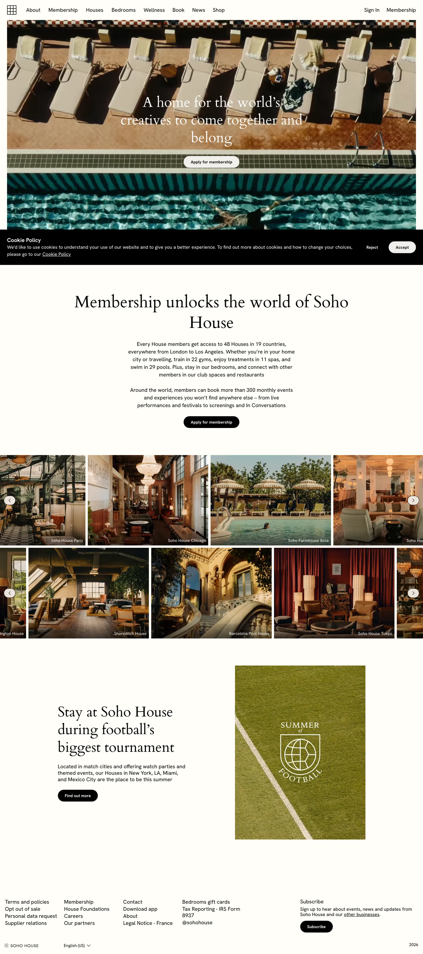
Soho House's marketing site is built on a fundamental substitution: it puts photography where other membership brands would put brand color. The above-fold hero is a full-bleed photograph — candlelit interiors, a mosaic pool, a terrace at dusk — with a Cardo serif headline in black dropped over a light overlay. There is no voltage orange, no cobalt accent, no brand-coded blue link. The only chromatic moves on the page come from the photography grid below the fold, where seven room and venue photographs sit edge-to-edge without borders or captions competing for attention. Where Equinox uses a heavy black-plus-gold system and WeWork uses a coral-accent UI, Soho House removes color from the brand chrome entirely and lets the spaces speak.
The DESIGN.md file packages the system into a machine-readable spec for React and AI tools. Inside: 7 colors tokens — ink black, pure white, two warm parchment tones (#f0eeeb and #ebe3db), and graduated ink shades for structural use; 11 typography tokens spanning Cardo at 56px and 48px for editorial display, and HK Grotesk from 14px to 18px for body and functional chrome; a single radius tier (40px pill for the CTA button, 0px everywhere else); 8 spacing tokens on a 8px base unit; and 16 components definitions covering the full-bleed hero module, the photography grid, the editorial section layout, the pill membership CTA, and the footer.
Feed this file to an AI coding tool and it will reproduce Soho House's specific restraint: no accent colors to reach for, Cardo only for h1 and h2, HK Grotesk for everything a user might click, warm parchment surfaces instead of pure white, and photography-first composition where the image block carries the emotional weight that a gradient or brand color would carry on a conventional SaaS or hospitality site. The system is worth studying precisely because it achieves brand recognition through what it omits rather than what it asserts.
What makes it distinct
5
- Photography as sole brand colorthe page declares no chromatic brand token; editorial images carry every warm and saturated moment the text never does
- Cardo at weight 400 for displaythe 56px serif hero headline and 48px h2 both run at weight 400, trusting letterform structure over weight for authority
- Dual typeface splitCardo for editorial identity, HK Grotesk for functional chrome; the two families share a page without competing because they operate in non-overlapping size bands
- Pill-pill radius at 40pxthe membership CTA uses a fully-rounded pill on a 40px-height element, the only rounding in the system; every other surface is sharp-cornered at 0px
- Warm parchment as the only surface tonetwo off-white values (#f0eeeb and #ebe3db) appear on membership CTA fills and section backgrounds; neither is pure white
sohohouse.com
Live at sohohouse.com
A snapshot of the brand in production. Scroll the frame to see the whole page.
Colors
7 colors
Soho House's system runs on #121212 as its primary voltage, used in 1 of 16 components. Type is set in HK Grotesk across 11 tokens from 14px to 56px, weights 400–700. Shape language is mixed across 16 components, blending pills, soft rounds, and squarer corners.
Surface
Page and card backgrounds · 1
Text
Headlines, body, captions · 3
Borders & Hairlines
Dividers, outlines, rules · 1
Other
Specialty colors · 2
Typography
11 type tokens
Set in HK Grotesk across 11 tokens, from 14px to 56px, weights 400–700. Shown in its own stack: where the font isn't installed, the fallback the file names stands in.
- display-xl56px · weight 400 · lh 70pxThe quick brown fox jumps over the lazy dog
- display-lg48px · weight 400 · lh 60pxThe quick brown fox jumps over the lazy dog
- body-lg18px · weight 400 · lh 26pxThe quick brown fox jumps over the lazy dog
- body-md16px · weight 400 · lh 18pxThe quick brown fox jumps over the lazy dog
- body-md-medium16px · weight 500 · lh 24pxThe quick brown fox jumps over the lazy dog
- label-md14px · weight 400 · lh 18pxThe quick brown fox jumps over the lazy dog
- label-bold14px · weight 700 · lh 18pxThe quick brown fox jumps over the lazy dog
- nav-link16px · weight 500 · lh 24pxThe quick brown fox jumps over the lazy dog
- button-md14px · weight 700 · lh 18pxThe quick brown fox jumps over the lazy dog
- heading-sm18.72px · weight 700 · lh 24pxThe quick brown fox jumps over the lazy dog
- caption14px · weight 400 · lh 18pxThe quick brown fox jumps over the lazy dog
Layout
Radii and spacing
4 corner radii and 8 spacing values. Shape language: mixed.
Radii
- none0px
- md15px
- lg20px
- pill40px
Spacing
- xs2px
- sm6px
- md8px
- base12px
- lg16px
- xl24px
- 2xl32px
- 3xl92px
Components
16 components
Each rendered from its tokens (color, type, radius, padding) on Soho House's own canvas.
- Button Primarybutton-primaryButton Primary
- Button Secondarybutton-secondaryButton Secondary
- Top Navtop-navTop Nav
- Nav Linknav-linkNav Link
- Hero Sectionhero-sectionHero Section
- Hero Headinghero-headingHero Heading
- Section Headingsection-headingSection Heading
- Body Paragraphbody-paragraphBody Paragraph
- Body Paragraph Mutedbody-paragraph-mutedBody Paragraph Muted
- CardcardCard
- Photo Tilephoto-tilePhoto Tile
- Section Parchmentsection-parchmentSection Parchment
- Membership Cta Sectionmembership-cta-sectionMembership Cta Section
- Type here…text-inputText Input
- FooterfooterFooter
- Footer Linkfooter-linkFooter Link
In use
The system, in use
Soho House's tokens on the kind of product it builds.
Build something people actually use.
A short paragraph of marketing copy that previews how the brand's display tier and body tier read together. Two sentences is usually enough.
FAQ
Soho House design system FAQ
Common questions about Soho House's tokens, components, and how to use this DESIGN.md in your project.
Read next
Related reading
Specs, directories, and component libraries that pair with this design system.
- Browse all design systemsThe full directory of DESIGN.md files on shadcn.io, with live mockups for each.shadcn.io
- Soho House — official siteSoho House's public marketing site — the source of truth for the live tokens captured in this file.sohohouse.com (opens in a new tab)
- The DESIGN.md specificationGoogle Labs' open spec for machine-readable design system files — the format this page is built on.github.com (opens in a new tab)
Use it
Use Soho House in your project
One machine-readable file. Drop it into Claude, Cursor, or any AI tool that reads DESIGN.md.
Download the DESIGN.md
One machine-readable file: every color, type, radius, spacing, and component token of Soho House.
Feed it to your AI tool
Drop it into Claude, Cursor, or GitHub Copilot. The agent writes React components and Tailwind classes that match Soho House's visual language.
Reference the tokens directly
Or paste the values into your Tailwind config, CSS variables, or component library: every color, size and radius is a quoted, ready-to-copy value.
Read the full DESIGN.md: overview, rationale, do’s and don’ts
Overview
Soho House's marketing site treats photography as the brand's chromatic voice. Absent color as identity: there is no declared brand voltage, no accent hex, no color-coded CTA. The extracted palette runs to five structural tones — ink black, a near-black, pure white, and two warm parchments — and that is the entire system. Where Equinox commands the page with heavy black and a gold accent, and where Four Seasons uses a muted teal-gold system, Soho House makes the deliberate move of keeping all color in the photographs. The brand chrome — navigation, headline type, button labels, hairlines — stays ink-on-white. The membership page at full scroll is a series of framed photographs with restrained black text beneath them.
Serif-sans split as editorial signal: Cardo carries every h1 and h2 at weight 400, at 56px and 48px respectively. The thin-stroke classical serif at large sizes reads as print-quality editorial — a house magazine, not a booking app. HK Grotesk covers every functional surface below h2: nav links, body copy at 14-18px, button labels, metadata captions. The two families operate in non-overlapping size bands; there is no blurred boundary where you might choose one or the other.
Key Characteristics:
- Zero brand color — the marketing chrome declares no chromatic accent; all saturated color on the page arrives through photography.
- Cardo at weight 400 for display: 56px h1 and 48px h2, trusting letterform structure over weight hierarchy.
- HK Grotesk for all functional surfaces — 14-18px, weight 400-700, across nav, body, and button labels.
- Pill CTA at 40px radius on 40px height, fully-rounded; 0px radius on every content surface.
- Warm parchment (#f0eeeb and #ebe3db) for button fills and warm section backgrounds — neither is pure white.
- Full-bleed photography hero with headline text in ink black dropped over a light image overlay.
- 92px vertical rhythm between major page sections — generous breathing room between editorial bands.
- Ink black (#000000) carries 622 of the 623 border and text occurrences: the sole structural mark-making color.
Colors
Ink
- Ink (
#000000): frequency 623. Used as text (322), border (296), background (5). The dominant structural tone — every hairline rule, nav link, heading, and form border in the system. Not tempered by a slight blue undertone the way Linear or Vercel use near-black; this is pure black on a white page. - Ink Mid (
#121212): frequency 7. Used as text (2), border (5). A near-black that appears on the membership CTA button text and a small set of borders — close enough to pure black to read as a single family but distinct enough the extractor separated them. - Ink Soft (
#313131): a structural dark used sparingly in sub-section text — referenced for body-copy contexts where pure black would feel too heavy at small sizes.
Surface
- Canvas (
#ffffff): frequency 160. Used as text (80, over dark surfaces), border (77, as light hairlines over the dark hero), background (3). The default page floor — nav surface, between-section white, footer contrast pair. - Parchment (
#f0eeeb): frequency 2, as background fill. The button background for the primary membership CTA. Warmer than white, cooler than the warm parchment — the least saturated possible surface still distinguishable from pure white. - Parchment Warm (
#ebe3db): frequency 4, all as background. The warm-section page band — used behind the "Membership unlocks the world" editorial section. Has a faint biscuit quality; the warmth signals shelter and invitation without color.
Hairlines
- Hairline (
#000000): the ink family serves dual duty as both text and border — 296 of the 623 ink occurrences are border uses. There is no dedicated mid-gray hairline; the system uses 1px pure-black rules throughout.
Typography
Font Families
The system runs two families: Cardo for editorial display and HK Grotesk for functional chrome. Cardo is an open-source classical serif (Google Fonts); HK Grotesk is a commercial humanist sans-serif by Hanken Design Co. The pairing signals a distinct intent — Cardo establishes the house-magazine editorial register, HK Grotesk handles the membership-app register. They do not share size ranges.
Hierarchy
| Token | Family | Size | Weight | Line Height | Use |
|---|---|---|---|---|---|
{typography.display-xl} | Cardo | 56px | 400 | 70px | Hero h1 ("Membership unlocks the world of Soho House") |
{typography.display-lg} | Cardo | 48px | 400 | 60px | Section h2 ("Stay at Soho House during football's biggest tournament") |
{typography.body-lg} | HK Grotesk | 18px | 400 | 26px | Lead-paragraph body copy and membership benefit descriptions |
{typography.body-md-medium} | HK Grotesk | 16px | 500 | 24px | Paragraph body and cookie-bar text |
{typography.body-md} | HK Grotesk | 16px | 400 | 18px | Tighter body variant used inside narrow editorial columns |
{typography.label-md} | HK Grotesk | 14px | 400 | 18px | Default label for nav, footer links, metadata |
{typography.label-bold} | HK Grotesk | 14px | 700 | 18px | Button labels and h3 secondary-level call-to-action text |
{typography.nav-link} | HK Grotesk | 16px | 500 | 24px | Top-nav link labels |
{typography.button-md} | HK Grotesk | 14px | 700 | 18px | Membership CTA pill label ("Apply for membership") |
{typography.heading-sm} | HK Grotesk | 18.72px | 700 | 24px | h3-level card headings in the feature grid |
{typography.caption} | HK Grotesk | 14px | 400 | 18px | Footer metadata, sub-labels |
Principles
Display weight stays at 400. The Cardo h1 at 56px / 400 is the loudest typographic moment — the thin strokes of the classical serif at that scale carry authority without force. HK Grotesk's weight ceiling for functional text is 700, reserved for button labels and small call-to-action anchors; body copy stays at 400-500.
Note on Font Substitutes
Cardo is available free on Google Fonts. For a closer editorial-serif alternative: Cormorant Garamond or EB Garamond at the same weight 400 transfer the thin-stroke character, though Cardo has slightly shorter x-height. For HK Grotesk: Inter at 95% line-height or DM Sans are the closest open-source substitutes. Preserve weight 700 for button labels — dropping to 500 softens the CTA distinction from body copy.
Layout
Spacing System
- Base unit: 8px — the primary internal rhythm.
- Tokens:
{spacing.xs}2px ·{spacing.sm}6px ·{spacing.md}8px ·{spacing.base}12px ·{spacing.lg}16px ·{spacing.xl}24px ·{spacing.2xl}32px ·{spacing.3xl}92px. - Section padding (vertical): 92px between major page bands — the hero, the editorial membership description, the photography grid, and the article section each sit 92px apart.
- Horizontal padding: 24px on the left nav rail; content sections use a centered column with generous horizontal margins.
- Button padding: 0×24px (zero vertical, 24px horizontal) on the pill CTA — height is controlled by a fixed 40px value, not by padding.
Grid & Container
- Max content width: ~960px for text columns; the photography grid extends to the full 1440px viewport.
- Hero: full-bleed photography at 1440px, content (headline + CTA) centered over a mid-image position.
- Photography grid: 3-column asymmetric mosaic below the hero — a large editorial photograph on the left spanning two rows, three smaller photographs on the right at equal width.
- Article section: 2-column 50/50 split — text on left, a bracketed square photograph on the right.
- Footer: 5-column grid for link categories (Terms, Membership, Contact, etc.) with a newsletter subscribe form on the far right.
Rhythm
The page alternates between full-bleed photography and constrained white editorial. The hero is edge-to-edge dark image. The membership description section sits on parchment-warm (#ebe3db) at 92px top/bottom. The photography grid returns to edge-to-edge. The article section returns to white. The 92px section padding is the pace-setter; the page never rushes.
Elevation
The system has no elevation layer. There are no drop shadows, no box-shadow tokens, and no surface ladders. Depth on the page comes entirely from photographic depth — the images have natural spatial depth that no shadow token can replicate. Card surfaces sit flush with the page floor; the 1px ink hairline is the only structural signal of a container boundary. Where a SaaS system would layer surfaces with box-shadow increments, Soho House keeps everything flat and relies on the photographs to create the perception of space.
Shapes
The radius system is binary plus one transition value:
{rounded.none}0px — the default. Every card, section container, image tile, nav, footer cell, text input, and editorial layout element is sharp-cornered. This is the overwhelming majority of the page.{rounded.md}15px — a single mid-range radius that appears on secondary rounded elements (badge-style chips in the nav area).{rounded.lg}20px — appears on some secondary pill elements and category labels.{rounded.pill}40px — the primary membership CTA buttons ("Apply for membership", "Find out more"). On a 40px-height element this renders as fully-rounded. The pill is reserved exclusively for action elements.
The binary character — sharp everywhere except the action pill — makes every membership CTA immediately readable as the single soft-edged element on an otherwise architectural page.
Components
button-primary — The membership CTA. Warm parchment {colors.parchment} fill, near-black {colors.ink-mid} text, weight 700 HK Grotesk label, {rounded.pill} 40px radius, 0×24px padding, 40px height. "Apply for membership" is the canonical instance. No border.
button-secondary — Transparent fill, ink text, 1px ink border, same pill radius. Used for "Find out more" style secondary calls to action that sit beneath editorial content sections.
top-nav — White {colors.canvas} surface, 64px height, 24px horizontal padding. Soho House wordmark flush left, navigation links (Membership, Houses, Bedrooms, Wellness, Shop, etc.) distributed center, Sign in + Membership pill CTA flush right. 1px ink bottom rule.
nav-link — Transparent, ink text at {typography.nav-link} (16px / 500), 8×12px padding. No hover surface visible in the captured marketing page.
hero-section — Full-bleed photography behind a constrained text+CTA stack. No background token: the image IS the surface. The heading and sub-copy overlay the photograph with natural contrast from the image's composition.
hero-heading — Ink text at {typography.display-xl} (Cardo, 56px / 400 / 70px line-height). The typographic heart of the system.
section-heading — Ink text at {typography.display-lg} (Cardo, 48px / 400 / 60px). Used for secondary editorial article sections below the main photography grid.
body-paragraph — Ink text at {typography.body-lg} (HK Grotesk, 18px / 400 / 26px). The editorial description of membership benefits beneath the hero section.
body-paragraph-muted — Ink text at {typography.label-md} (HK Grotesk, 14px / 400 / 18px). Sub-copy and secondary descriptive paragraphs beneath article sections.
card — White {colors.canvas} surface, 1px ink hairline border, 0px radius, 16px internal padding. The default content container in editorial sections.
photo-tile — Dark background behind photography in the mosaic grid, 0px radius, no padding (image fills edge-to-edge). Three sizes in the asymmetric 3-column grid.
section-parchment — Warm parchment {colors.parchment-warm} background band, 92px vertical padding. The above-fold membership-description section sits on this surface.
membership-cta-section — White canvas section with 92px vertical padding. Houses the "Membership unlocks the world of Soho House" headline plus the primary CTA pill.
text-input — White fill, ink text, 1px ink border, 0px radius, 12×16px padding, 44px height. The newsletter email field in the footer subscribe area.
footer — Ink black {colors.ink} fill, white text, 24px padding. Five-column link grid. The only dark surface outside the photography hero.
footer-link — White text at {typography.label-md}, transparent background, 2px top padding to create vertical separation between stacked link items.
Do's and Don'ts
Do use full-bleed photography as the primary chromatic event above the fold. The system has no brand voltage to carry that role; a white or gradient hero with Cardo headlines but no photograph would read as a typographic exercise, not as the world of Soho House.
Do reserve Cardo exclusively for h1 and h2. The system's editorial register depends on Cardo appearing only where the brand is making a statement — once it descends to h3, body copy, or button labels, the editorial signal is gone.
Do use {colors.parchment} (#f0eeeb) for the primary button fill and {colors.parchment-warm} (#ebe3db) for warm section backgrounds. Substituting either with pure #ffffff removes the warmth signal that distinguishes the page from a generic white-canvas hospitality site.
Do keep the pill radius ({rounded.pill} — 40px) reserved for membership CTAs only. The contrast between the rounded button and the sharp-cornered page everywhere else is what makes the CTA readable as the sole action invitation.
Don't introduce a brand accent color to "identify" the system. The system is structured around the absence of a chromatic accent; adding one — a warm amber, a muted teal, a heritage burgundy — would immediately shift the brand register from members' club to hotel booking app. Use the photography for color.
Don't use Cardo at display sizes below 40px. At 48-56px the thin-stroke hairlines read as architectural; below 32px they read as fragile or fussy and lose authority. For sub-heading sizes, switch to {typography.heading-sm} (HK Grotesk, 18.72px / 700).
Don't apply border-radius to cards or content containers. Introducing a 4px or 8px radius on image tiles or editorial cards invites them into a softer, more app-like register (Airbnb, Booking.com) and away from the architectural sharpness that signals a physical place rather than a digital product.
Don't put body copy in Cardo. The two-family system only works when the families divide labor cleanly: Cardo speaks, HK Grotesk serves. Running editorial body paragraphs in a 16px serif dissolves the hierarchy that makes the display moments legible as moments.
Known Gaps
- Brand accent in authenticated surfaces: the members-only dashboard and house-specific booking flows likely carry additional color tokens (e.g., house-specific tones per location) not captured on the public marketing page.
- Dark mode: the photography-led sections use both light and dark photography depending on the image; no explicit dark-mode palette is exposed in the extracted CSS.
- Hover and focus states: documented for button-primary and button-secondary shapes; focus rings, active press states, and disabled variants are not captured from the marketing surface.
- Motion: the hero photography module appears to include a crossfade carousel; no animation easing, timing, or transition tokens are captured in this spec.
- Mobile breakpoints: the extracted surface is 1440px desktop. The photography grid, nav, and section layout collapse at mobile breakpoints with different padding scales not represented here.
- Product surfaces: this DESIGN.md captures the public marketing site only. The Soho House app and the members-only booking portal carry their own functional component systems not reflected here.
- Type size scale precision: several HK Grotesk sizes (e.g., 18.72px) appear to be the browser's computed value from a fluid-type scale rather than a round design token; the rounded values used in this spec (18px, 19px) are the closest stable anchor.
Travel & Hospitality
More systems like this
More DESIGN.md files in Travel & Hospitality.
Pricing
Build it with Pro
The DESIGN.md files are free. Pro adds 6,000+ blocks, premium templates and the MCP server, so your AI editor builds in your system for you.
4.9/5 out of 5 · 150+ reviewsfrom 150+ founders and developers.
Billing
Billed once a year in USD. Cancel anytime.
- How many people can use the license.
- Client work, SaaS products and anything you charge for.
- Production-ready React sections: hero, pricing, features, dashboards and more.
- Complete multi-page sites you can ship as they are.
- React icons from every major library, installable with one command.
- Presets that restyle every block, in light and dark.
- Lets your AI editor search, preview and install blocks for you.
- Priority requests are answered first.
Individual
For personal projects & open source
$32instead of $49/mo
$389 billed yearly
- Seats: 1 seat
- Commercial use: Personal & open source only
- Pro blocks: 6,000+ blocks
- Templates: All 14 templates
- React icons: 294k+ icons
- Themes: All 59 themes
- MCP server: Basic usage
- Support: Standard
Team
Most popularFor freelancers, agencies & startups
$66instead of $99/mo
$789 billed yearly · ≈ $13/dev/mo
- Seats: Up to 5 seats
- Commercial use: Included
- Pro blocks: 6,000+ blocks
- Templates: All 14 templates
- React icons: 294k+ icons
- Themes: All 59 themes
- MCP server: High usage
- Support: Priority
Organization
For companies with larger teams
$132instead of $199/mo
$1,589 billed yearly
- Seats: Unlimited seats
- Commercial use: Included
- Pro blocks: 6,000+ blocks
- Templates: All 14 templates
- React icons: 294k+ icons
- Themes: All 59 themes
- MCP server: Unlimited usage
- Support: Priority
Billed once a year in USD. Cancel anytime.
Individual
For personal projects & open source
$32instead of $49/mo
$389 billed yearly
- How many people can use the license.Seats: 1 seat
- Client work, SaaS products and anything you charge for.Commercial use: Personal & open source only
- Production-ready React sections: hero, pricing, features, dashboards and more.Pro blocks: 6,000+ blocks
- Complete multi-page sites you can ship as they are.Templates: All 14 templates
- React icons from every major library, installable with one command.React icons: 294k+ icons
- Presets that restyle every block, in light and dark.Themes: All 59 themes
- Lets your AI editor search, preview and install blocks for you.MCP server: Basic usage
- Priority requests are answered first.Support: Standard
Team
Most popularFor freelancers, agencies & startups
$66instead of $99/mo
$789 billed yearly · ≈ $13/dev/mo
Everything in Individual, plus
- How many people can use the license.Seats: Up to 5 seats
- Client work, SaaS products and anything you charge for.Commercial use: Included
- Lets your AI editor search, preview and install blocks for you.MCP server: High usage
- Priority requests are answered first.Support: Priority
Organization
For companies with larger teams
$132instead of $199/mo
$1,589 billed yearly
Everything in Team, plus
- How many people can use the license.Seats: Unlimited seats
- Lets your AI editor search, preview and install blocks for you.MCP server: Unlimited usage
- Secure checkout via Stripe
- Code lives in your repo
- Keep what you've shipped if you cancel
- License terms
Your system, built for you
Every block, template and icon, installed by your AI agent in your design system. The DESIGN.md files stay free.