Rolls-Royce Design System
Rolls-Royce's marketing-site design system as a DESIGN.md file. Monochromatic white-on-black palette, Riviera Nights at uniform small-caps with 2px letter-spacing, ghost-pill CTAs, 14 components. For React, Next.js, and AI tools.
Add shadcn.io to your AI agent. · Pro It installs blocks, icons and templates in your design system from a prompt, with Pro.
Set up MCP- Primary
- #ffffff
- Typeface
- Riviera Nights
- Shape
- Soft
- Base radius
- 0px
- Colors
- 6
- Type tokens
- 9
- Components
- 14
- Spacing values
- 7
About
About Rolls-Royce DESIGN.md
Curated by Dov Azencot · Updated May 19, 2026 · Source rolls-roycemotorcars.com (opens in a new tab)
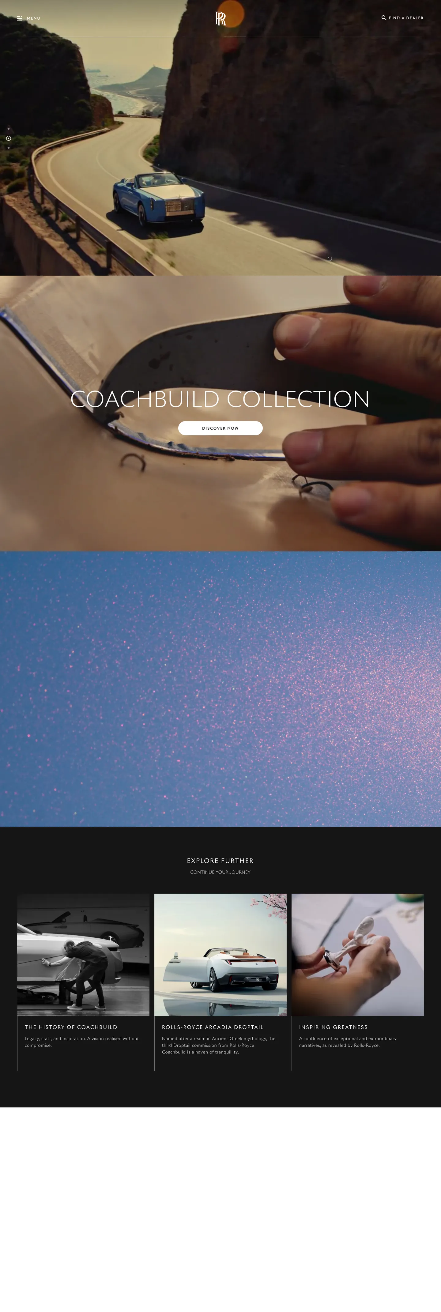
Rolls-Royce Motor Cars' marketing site operates by subtraction. Where Ferrari fills its hero with saturated racing red and Lamborghini wires the viewport with hexagonal geometry, Rolls-Royce places a single cinematic photograph edge-to-edge and layers six words of white uppercase type at weight 300. The headline for the Coachbuild Collection — "COACHBUILD COLLECTION" — runs at 70px in Riviera Nights with 2.5px letter-spacing. There is no background color behind it. There is no CTA button in the hero fold. The car is the design system.
The DESIGN.md file packages the system into a machine-readable spec for React and AI tools. Inside: 6 colors tokens, all monochromatic — pure white for text and borders, three steps of near-black for surfaces, a light grey for a single background instance, and a medium grey used once as a shadow ink. No brand accent color appears anywhere in the captured chrome. Nine typography tokens run a single family, Riviera Nights, in a uniform weight band of 300–500, with every nav, button, and heading surface forced to uppercase and tracked at 2–2.5px. The radius scale jumps directly from 0 to 30px to 99px — no small-step tier. Fourteen components cover the ghost-pill button, the all-caps nav link, the cinematic hero heading, and the sparse card grid below the fold.
Feed this file to an AI coding tool and it reproduces Rolls-Royce's specific moves: zero brand accent color, Riviera Nights small-caps across every chrome surface, transparent ghost-pill CTAs, and ultra-light display weight. The one discipline worth borrowing only if your product can carry the visual weight of a hero image this strong: trust the photography entirely and give the type system almost nothing to do. Rolls-Royce gets away with this because the cars are among the most visually arresting objects a camera can capture. Most brands need a supporting chromatic layer.
What makes it distinct
5
- Monochromatic atelier palettethe system carries zero brand accent colors; the only chromatic elements are the photography itself, making the cars the sole color statement
- Riviera Nights at small-caps everywhereevery heading, button, nav link, and label runs uppercase with 2–2.5px letter-spacing; no mixed-case prose in the chrome
- Ghost-pill CTAsbuttons are transparent with a white border at 30px or 99px radius; no fill, no brand color, no icon — the car image behind the button does the selling
- Weight 300 display at 70pxthe hero h2 is the lightest heavy headline in any automotive system; Ferrari and Lamborghini go to 700 and above, Rolls-Royce stays at 300
- Negative-space compositionthe design system's primary layout device is restraint; large-format photography bleeds edge-to-edge with text placed as sparse white type on dark imagery
rolls-roycemotorcars.com
Live at rolls-roycemotorcars.com
A snapshot of the brand in production. Scroll the frame to see the whole page.
Colors
6 colors
Rolls-Royce's system runs on #ffffff as its primary voltage, used in 13 of 14 components. Type is set in Riviera Nights across 9 tokens from 12px to 70px, weights 300–500. Shape language is soft — components average 32px corner radius, with no sharp interactive edges.
Surface
Page and card backgrounds · 2
Text
Headlines, body, captions · 2
Borders & Hairlines
Dividers, outlines, rules · 1
Other
Specialty colors · 1
Typography
9 type tokens
Set in Riviera Nights across 9 tokens, from 12px to 70px, weights 300–500. Shown in its own stack: where the font isn't installed, the fallback the file names stands in.
- display-xl70px · weight 300 · lh 80px · tracking 2.5pxThe quick brown fox jumps over the lazy dog
- heading-lg20px · weight 400 · lh 30px · tracking 2.5pxThe quick brown fox jumps over the lazy dog
- heading-sm16px · weight 400 · lh 26px · tracking 2.5pxThe quick brown fox jumps over the lazy dog
- body-md14px · weight 300 · lh 22px · tracking 0.8pxThe quick brown fox jumps over the lazy dog
- body-sm14px · weight 300 · lh 28px · tracking 0.5pxThe quick brown fox jumps over the lazy dog
- body-lg16px · weight 400 · lh 24px · tracking 0.5pxThe quick brown fox jumps over the lazy dog
- label-md12px · weight 500 · lh 24px · tracking 2pxThe quick brown fox jumps over the lazy dog
- button-md12px · weight 400 · lh 20px · tracking 2pxThe quick brown fox jumps over the lazy dog
- nav-link12px · weight 400 · lh 20px · tracking 2pxThe quick brown fox jumps over the lazy dog
Layout
Radii and spacing
4 corner radii and 7 spacing values. Shape language: soft.
Radii
- none0px
- pill30px
- full99px
- circle50%
Spacing
- xs8px
- sm15px
- base16px
- lg24px
- xl32px
- 2xl48px
- section50px
Components
14 components
Each rendered from its tokens (color, type, radius, padding) on Rolls-Royce's own canvas.
- Button Primarybutton-primaryButton Primary
- Button Secondarybutton-secondaryButton Secondary
- Top Navtop-navTop Nav
- Nav Linknav-linkNav Link
- Hero Headinghero-headingHero Heading
- Section Headingsection-headingSection Heading
- Body Paragraphbody-paragraphBody Paragraph
- CardcardCard
- Card Labelcard-labelCard Label
- Hero Sectionhero-sectionHero Section
- FooterfooterFooter
- Discover Labeldiscover-labelDiscover Label
- Category Stripcategory-stripCategory Strip
- Image Captionimage-captionImage Caption
In use
The system, in use
Rolls-Royce's tokens on the kind of product it builds.
Build something people actually use.
A short paragraph of marketing copy that previews how the brand's display tier and body tier read together. Two sentences is usually enough.
FAQ
Rolls-Royce design system FAQ
Common questions about Rolls-Royce's tokens, components, and how to use this DESIGN.md in your project.
Read next
Related reading
Specs, directories, and component libraries that pair with this design system.
- Browse all design systemsThe full directory of DESIGN.md files on shadcn.io, with live mockups for each.shadcn.io
- Rolls-Royce — official siteRolls-Royce Motor Cars' public marketing site — the source of truth for the live tokens captured in this file.rolls-roycemotorcars.com (opens in a new tab)
- The DESIGN.md specificationGoogle Labs' open spec for machine-readable design system files — the format this page is built on.github.com (opens in a new tab)
Use it
Use Rolls-Royce in your project
One machine-readable file. Drop it into Claude, Cursor, or any AI tool that reads DESIGN.md.
Download the DESIGN.md
One machine-readable file: every color, type, radius, spacing, and component token of Rolls-Royce.
Feed it to your AI tool
Drop it into Claude, Cursor, or GitHub Copilot. The agent writes React components and Tailwind classes that match Rolls-Royce's visual language.
Reference the tokens directly
Or paste the values into your Tailwind config, CSS variables, or component library: every color, size and radius is a quoted, ready-to-copy value.
Read the full DESIGN.md: overview, rationale, do’s and don’ts
Overview
Rolls-Royce Motor Cars' marketing site operates by the principle of absolute restraint. Atelier by subtraction. Where Ferrari fills its hero canvas with saturated red and Lamborghini deploys geometric accents, Rolls-Royce places a single cinematic photograph at full bleed and overlays six words of white uppercase type at weight 300. There is no brand accent color. There is no filled CTA button. The photography carries all chromatic and emotional labor; the design system exists only to frame it.
The comparison to peer ultra-luxury automotive brands makes the move legible. Aston Martin uses a dark teal accent and fills its primary button. McLaren wires orange voltage into its chrome. Bugatti uses a red-and-blue racing identity on every surface. Rolls-Royce holds the chrome neutral through the full page — not as an absence of decision but as the most deliberate one available to a brand whose product costs as much as a house.
Typography is Riviera Nights across every tier — a single proprietary sans-serif family running from the 70px display headline to the 12px navigation label, with every surface set in uppercase and tracked at 2–2.5px. Weight never exceeds 500. The display sits at weight 300, lighter than any comparable automotive hero headline in the directory.
Key Characteristics:
- Monochromatic chrome — pure white text and borders on near-black surfaces throughout, zero chromatic brand accent anywhere in the captured page.
- Riviera Nights small-caps across every tier — navigation, hero heading, body copy, buttons, and labels all use uppercase text-transform with 2–2.5px letter-spacing.
- Weight 300 display at 70px — the lightest heavy-headline treatment in the automotive category; Ferrari, Lamborghini, and Aston Martin all go to 600+ on their display tiers.
- Ghost-pill CTAs — transparent background, 1px white border, 30px or 99px radius, no fill, no brand color, no hover state captured.
- Zero radius on content surfaces — every card, section panel, and content container runs at 0px; the pill radius appears only on buttons.
- Full-bleed cinematic photography as the only chromatic voice — the cars' paint, interiors, and settings supply all color.
- 16px base spacing with 50px section gaps — sparse vertical rhythm that keeps the page from feeling dense.
Colors
Text
- Ink (
{colors.ink}— ): frequency 151. Used as text (72), border (73), bg (6). The sole text and border color across the entire chrome — white on dark photography throughout every section. - Ink Muted (
{colors.ink-muted}— ): frequency 100. Used as text (50), border (50). A very dark charcoal used in lower-contrast footer and sub-panel contexts — nearly black but distinct from the true canvas.
Surface
- Canvas (
{colors.canvas}— ): frequency 23. Used as bg (1), text (11), border (10), gradient (1). The deepest black, used on the page floor and inside gradient overlays behind photography. - Surface-1 (
{colors.surface-1}— ): frequency 14. Used as bg (2), text (6), border (6). An elevated dark surface for card containers and the discover-content grid below the fold. - Shadow (
{colors.shadow}— ): frequency 1, as shadow ink. Used once for a subtle elevation halo — the system has nearly no shadow presence.
Hairline
- Hairline (
{colors.hairline}— ): carried by the ink token at border contexts (73 occurrences). White borders on dark surfaces are the only divider and button-edge treatment in the system.
Typography
Font Family
The system runs Riviera Nights exclusively — a proprietary display-and-text sans-serif shipped by Rolls-Royce as part of its global brand identity. Fallbacks walk Helvetica, Arial, -apple-system, sans-serif. There is no second voice, no serif, no monospace tier. The entire typographic range — 70px hero down to 12px label — uses one family at one transform setting: uppercase.
Hierarchy
| Token | Size | Weight | Line Height | Letter Spacing | Use |
|---|---|---|---|---|---|
{typography.display-xl} | 70px | 300 | 80px | 2.5px | Hero h2 — "Coachbuild Collection" |
{typography.heading-lg} | 20px | 400 | 30px | 2.5px | Section h3 headings |
{typography.heading-sm} | 16px | 400 | 26px | 2.5px | Sub-section h4 titles |
{typography.body-lg} | 16px | 400 | 24px | 0.5px | Lead body text |
{typography.body-md} | 14px | 300 | 22px | 0.8px | Standard body paragraph |
{typography.body-sm} | 14px | 300 | 28px | 0.5px | Secondary body / captions |
{typography.label-md} | 12px | 500 | 24px | 2px | Category labels, section tags |
{typography.button-md} | 12px | 400 | 20px | 2px | CTA button labels |
{typography.nav-link} | 12px | 400 | 20px | 2px | Navigation links |
Principles
Display sits at weight 300 — the lightest treatment for a headline this large anywhere in the automotive directory. Ferrari and Lamborghini use 600+ for their display tiers; Rolls-Royce's 70px / 300 reads as a whisper rather than a proclamation, which is the intended effect for a brand where the car itself is meant to speak. Weight 500 is reserved for the smallest label tier — 12px small-caps tags — where it prevents thin letterforms from disappearing at small sizes. The 2–2.5px letter-spacing is the system's defining typographic move: applied universally, it transforms Riviera Nights from a text sans into an atelier-display face at every size.
Note on Font Substitutes
Riviera Nights is proprietary. For the display tier (70px / 300), Cormorant Garamond Light in uppercase achieves a similar high-contrast, calibrated quality. For the navigation and button tiers (12px / 400 / uppercase / 2px tracking), Josefin Sans Light is the closest open-source match — it was designed specifically for the small-caps tracking treatment. For body paragraphs in the 14px range, Montserrat Light at 0.08em tracking transfers cleanly.
Layout
Spacing System
- Base unit: 16px — the dominant padding token, appearing 19 times in the captured page.
- Tokens:
{spacing.xs}8px ·{spacing.sm}15px ·{spacing.base}16px ·{spacing.lg}24px ·{spacing.xl}32px ·{spacing.2xl}48px ·{spacing.section}50px. - Section spacing: 50px bottom on hero content; 64px between discover content and the editorial grid.
- Card internal padding:
{spacing.lg}(24px) on the discover-category cards.
Grid & Container
- Hero: full-bleed photography, no max-width constraint, text overlaid centered with left-aligned positioning at a 16px horizontal margin.
- Discover grid: 3-column card layout below the fold — the "Discover Further" section shows vehicle category tiles with 24px internal padding and no border.
- Navigation: horizontal top-nav with no background fill — transparent over the hero photography until a scroll threshold.
Rhythm
The page paces slowly. The hero photograph occupies nearly the full viewport; the first text moment is sparse white type at the bottom third. Below the fold, content arrives in generous single-panel sections with 50px of breathing room between them. The discover grid is the densest section — three cards at equal width — and even there, the typography-to-image ratio favors the image. The rhythm is the brand promise made spatial.
Elevation
The system has essentially no shadow tier. The captured page records one shadow occurrence, using a mid-grey ({colors.shadow} — grey) ink at low opacity. No cards use drop shadows. Depth comes from placing content against full-bleed photography rather than from surface layering — the car's three-dimensional form in the photograph provides all perceived depth.
- Flat (no shadow): 99% of all surfaces — navigation, cards, hero, footer.
- Single shadow: one subtle halo on an interactive element; the grey ink reads softer than pure black and avoids drawing attention away from the photography.
Shapes
The radius scale has three values and two contexts:
{rounded.none}0px — all content surfaces including every card, panel, and page section. Sharp corners on every container throughout the page.{rounded.pill}30px — the primary CTA buttons ("VIEW THE COLLECTION", "CONFIGURE YOUR CAR"). Applied to the ghost-pill buttons with 15px vertical and 16px horizontal padding.{rounded.full}99px — the secondary pill variant used in the discover/explore navigation rows. Renders as a fully-rounded capsule on small label-height elements.{rounded.circle}50% — avatar and icon treatments in profile and media contexts.
There is no 4 / 8 / 12 / 16px middle tier. Content surfaces are always sharp; interactive pill surfaces jump to 30px or 99px. The contrast between sharp cards and pill buttons is the system's only shape-language device.
Components
button-primary — The signature ghost pill. Transparent background, white border 1px, white text in {typography.button-md} (12px / 400 / uppercase / 2px tracking), {rounded.pill} 30px radius, 15×16px padding, 44px height. "VIEW THE COLLECTION" is the canonical instance, placed at the center of the hero after the heading. No fill, no background color behind it — the car photograph shows through.
button-secondary — Same ghost treatment with a {rounded.full} 99px radius. Used in the discover-category navigation rows for shorter action labels. Same border, text, and sizing discipline as the primary.
top-nav — Transparent background on page load, white text, 65px height, 16px horizontal padding. The Rolls-Royce wordmark and Spirit of Ecstasy mark sit flush left; navigation links (Models, Bespoke, World of Rolls-Royce, Dealers, My Rolls-Royce) run center; a single account link sits right. No nav background fill is visible on the captured static surface.
nav-link — Transparent background, white text, {typography.nav-link} (12px / 400 / uppercase / 2px tracking), 16px horizontal padding. The smallest interactive text element in the system — yet the same tracked uppercase as the hero heading.
hero-heading — White text on transparent overlay, {typography.display-xl} (70px / 300 / uppercase / 2.5px tracking). 0 horizontal padding — the text sits directly in the compositional space of the photograph. The lightest display weight in the automotive category.
section-heading — White text, {typography.heading-lg} (20px / 400 / uppercase / 2.5px tracking). Section h3 markers — "DISCOVER FURTHER", "COACHBUILD COLLECTION".
body-paragraph — White text, {typography.body-md} (14px / 300), 12px top padding on a 24px left indent. The descriptive copy beneath vehicle names — sparse, never more than 2–3 lines.
card — Dark {colors.surface-1} fill, white text, 0px radius, 24px internal padding. Holds the three-tile discover grid images and their below-image text labels.
card-label — Transparent, white text, {typography.label-md} (12px / 500 / uppercase / 2px tracking). The category tags above discover grid items — "THE SPIRIT OF INNOVATION", "ROLLS-ROYCE MOTOR CARS BESPOKE".
hero-section — Full-bleed canvas black floor beneath the photography, text overlaid, no radius, no border.
discover-label — White text at {typography.heading-sm} (16px / 400 / uppercase / 2.5px tracking). The per-card title beneath discover-grid images.
category-strip — Transparent, white text, {typography.label-md}, 8×16px padding. The horizontal navigation categories in the discover row — "MOTOR CARS", "BESPOKE", "EXPERIENCES".
image-caption — White text, {typography.body-sm} (14px / 300 / 0.5px tracking), 12px top padding. Descriptive captions beneath vehicle images in the editorial sections.
footer — Dark {colors.surface-1} surface, charcoal {colors.ink-muted} text, 48×16px padding. No elevated border from the page floor — the footer continues the dark surface directly.
Do's and Don'ts
Do let the photography carry all chromatic weight. The design system is built on the assumption that a Rolls-Royce photograph — whether the Droptail's iridescent paint on a mountain road or the Phantom's interior detail — contains more visual authority than any brand color applied to chrome.
Do apply uppercase and 2px letter-spacing to every text element regardless of size. The tracked small-caps treatment is the single typographic identity token; departing from it at any tier — even the smallest label — breaks the system's internal consistency.
Do use {rounded.pill} 30px or {rounded.full} 99px on buttons and pill labels only. The sharp/pill radius contrast is the system's only shape-language move — introducing a 4 / 8 / 16px middle tier softens the contrast and makes buttons read as ordinary interface elements rather than deliberate framing devices.
Do keep display weight at 300. The ultra-light hero headline at 70px / 300 is the system's most counter-discoverable typographic decision and its most precise brand signal — bumping to 500 or 600 moves it toward Ferrari or Aston Martin territory.
Don't introduce any accent color into the chrome. Not a hover state in brand gold, not a CTA button in heritage green, not an icon in teal. The monochromatic discipline is the design system's single hardest constraint and its clearest brand statement. Any chromatic addition reads as lacking conviction.
Don't use a filled button background. The ghost-pill treatment — transparent with a 1px white border — is the only CTA treatment in the system. Filling it with even a near-white or off-white tone (, as Cloudflare uses for cream) would change the figure-ground relationship between the button and the photography behind it.
Don't use shadows on any card or content surface. There is one shadow occurrence in the entire captured page. The system achieves separation between surfaces through dark tonal contrast ({colors.surface-1} on {colors.canvas}) rather than shadow. Adding shadows makes the surfaces feel like UI components rather than gallery frames.
Don't set body copy at weight 400 or above. The body tier runs at 300 — the same weight as the 70px display headline. Weight 400 appears only on navigation and sub-heading tiers; weight 500 only on the smallest labels. Increasing body weight makes the text compete with the imagery rather than recede gracefully beneath it.
Known Gaps
- Hover and focus states: no hover or active states were captured from the static marketing surface — it is likely that ghost-pill buttons have a subtle white-fill or opacity transition, but this is not documented here.
- Dark/light mode: the site is dark-only on the captured surface; a light-mode variant may exist for editorial content pages (model specification sheets, dealer locator) but is not represented.
- Animation: the hero photography transitions between multiple vehicle images on a slow dissolve cycle; the duration and easing curves are not captured.
- Configurator surface: the Rolls-Royce bespoke configurator (
www.rolls-roycemotorcars.com/configure) likely carries a much richer token set with color swatch selectors, material-picker components, and multi-step wizard layouts that are not exposed on the marketing homepage. - Bespoke variant palette: the Black Badge sub-brand uses a near-identical chrome system but with a distinct set of darkness levels — the system may have a
surface-2token for the deeper-black Black Badge contexts. - Responsive breakpoints: the mobile navigation drawer, hamburger state, and image-crop behavior at mobile widths are not represented in the captured desktop tokens.
- Typography at mobile sizes: the 70px display headline almost certainly scales down significantly on mobile; the scale factor and breakpoint are not captured.
Automotive
More systems like this
More DESIGN.md files in Automotive.
Pricing
Build it with Pro
The DESIGN.md files are free. Pro adds 6,000+ blocks, premium templates and the MCP server, so your AI editor builds in your system for you.
4.9/5 out of 5 · 150+ reviewsfrom 150+ founders and developers.
Billing
Billed once a year in USD. Cancel anytime.
- How many people can use the license.
- Client work, SaaS products and anything you charge for.
- Production-ready React sections: hero, pricing, features, dashboards and more.
- Complete multi-page sites you can ship as they are.
- React icons from every major library, installable with one command.
- Presets that restyle every block, in light and dark.
- Lets your AI editor search, preview and install blocks for you.
- Priority requests are answered first.
Individual
For personal projects & open source
$32instead of $49/mo
$389 billed yearly
- Seats: 1 seat
- Commercial use: Personal & open source only
- Pro blocks: 6,000+ blocks
- Templates: All 14 templates
- React icons: 294k+ icons
- Themes: All 59 themes
- MCP server: Basic usage
- Support: Standard
Team
Most popularFor freelancers, agencies & startups
$66instead of $99/mo
$789 billed yearly · ≈ $13/dev/mo
- Seats: Up to 5 seats
- Commercial use: Included
- Pro blocks: 6,000+ blocks
- Templates: All 14 templates
- React icons: 294k+ icons
- Themes: All 59 themes
- MCP server: High usage
- Support: Priority
Organization
For companies with larger teams
$132instead of $199/mo
$1,589 billed yearly
- Seats: Unlimited seats
- Commercial use: Included
- Pro blocks: 6,000+ blocks
- Templates: All 14 templates
- React icons: 294k+ icons
- Themes: All 59 themes
- MCP server: Unlimited usage
- Support: Priority
Billed once a year in USD. Cancel anytime.
Individual
For personal projects & open source
$32instead of $49/mo
$389 billed yearly
- How many people can use the license.Seats: 1 seat
- Client work, SaaS products and anything you charge for.Commercial use: Personal & open source only
- Production-ready React sections: hero, pricing, features, dashboards and more.Pro blocks: 6,000+ blocks
- Complete multi-page sites you can ship as they are.Templates: All 14 templates
- React icons from every major library, installable with one command.React icons: 294k+ icons
- Presets that restyle every block, in light and dark.Themes: All 59 themes
- Lets your AI editor search, preview and install blocks for you.MCP server: Basic usage
- Priority requests are answered first.Support: Standard
Team
Most popularFor freelancers, agencies & startups
$66instead of $99/mo
$789 billed yearly · ≈ $13/dev/mo
Everything in Individual, plus
- How many people can use the license.Seats: Up to 5 seats
- Client work, SaaS products and anything you charge for.Commercial use: Included
- Lets your AI editor search, preview and install blocks for you.MCP server: High usage
- Priority requests are answered first.Support: Priority
Organization
For companies with larger teams
$132instead of $199/mo
$1,589 billed yearly
Everything in Team, plus
- How many people can use the license.Seats: Unlimited seats
- Lets your AI editor search, preview and install blocks for you.MCP server: Unlimited usage
- Secure checkout via Stripe
- Code lives in your repo
- Keep what you've shipped if you cancel
- License terms
Your system, built for you
Every block, template and icon, installed by your AI agent in your design system. The DESIGN.md files stay free.